Welcome to the Rivertown remodeling project that we are so excited to share with you all! This condo is located in the beautiful town of Stillwater, which runs along the banks of the St.Croix River. Our friends, Renee & Doug, had just downsized from a very large suburban home and longed for simpler living in a nice area. This condo had the perfect location – walking distance to several shops, restaurants and marinas, and all the space they really needed for their new lifestyle. Nonetheless, it was still quite a bit smaller and posed a big challenge in figuring out how to carve out room for dining, living, and cooking all in a condensed open space. Furthermore, it lacked the style and personality that Doug & Renee craved for their new home. We were thrilled when they came to us for help and gratefully accepted the challenge!
THE living room
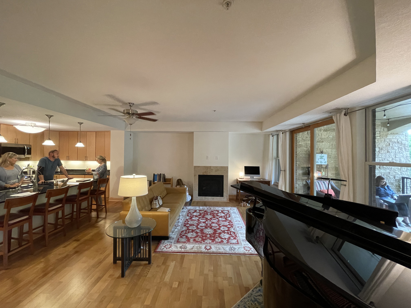
There were several challenges we faced with the living room/great room: Where could we fit a dining table? The fireplace was not centered on the living room wall and lacked style. The layout of the furniture was awkward – should the sofa face the patio door, or the fireplace? The placement of a ceiling fan was not centered in the room. The window treatments were inexpensive draperies that didn’t quite work with the windows or patio door. The hardwood floors were very yellow and dated. There was no recessed lighting and the room was very poorly lit.
THE BEFORE
the design process
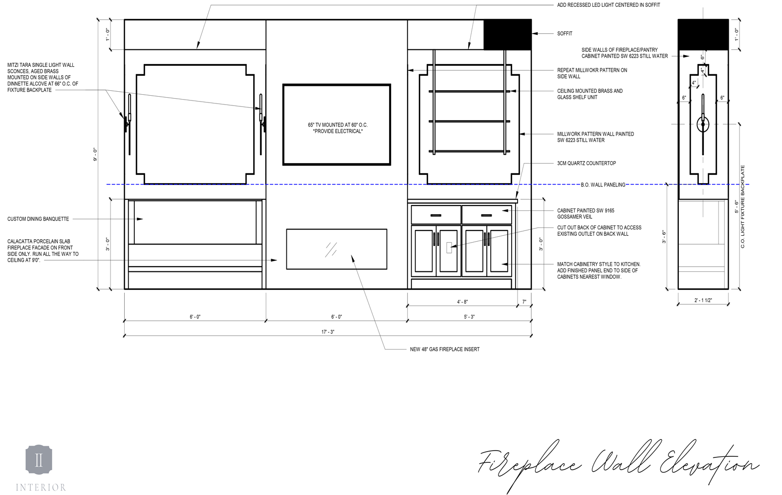
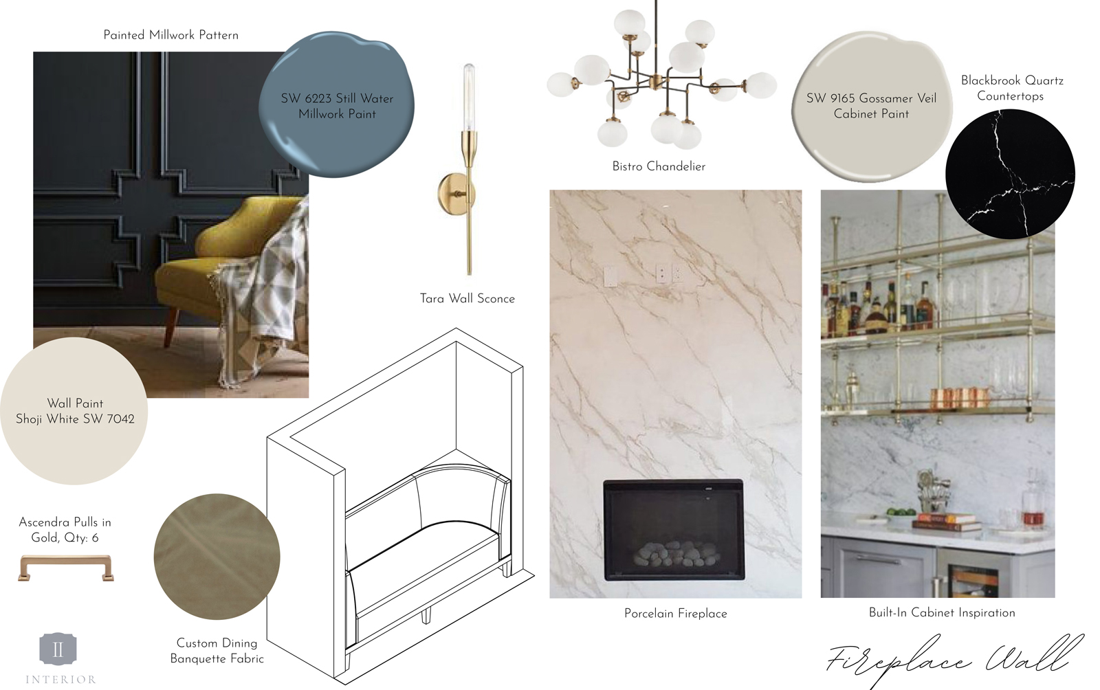
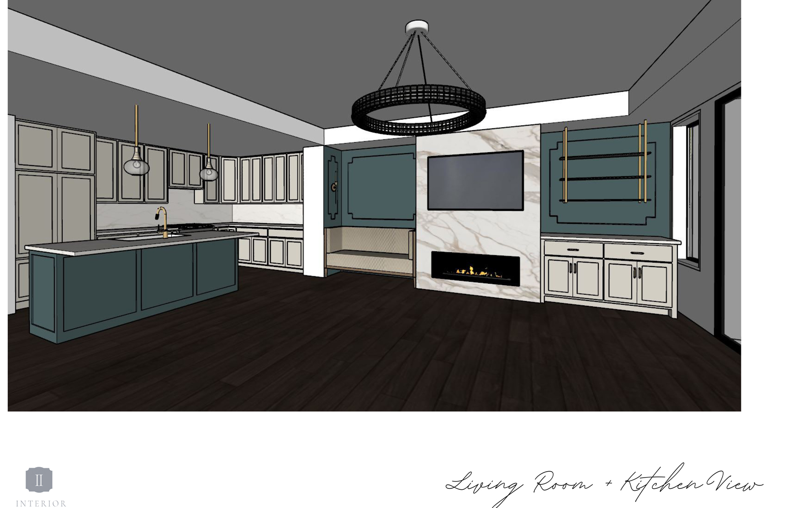
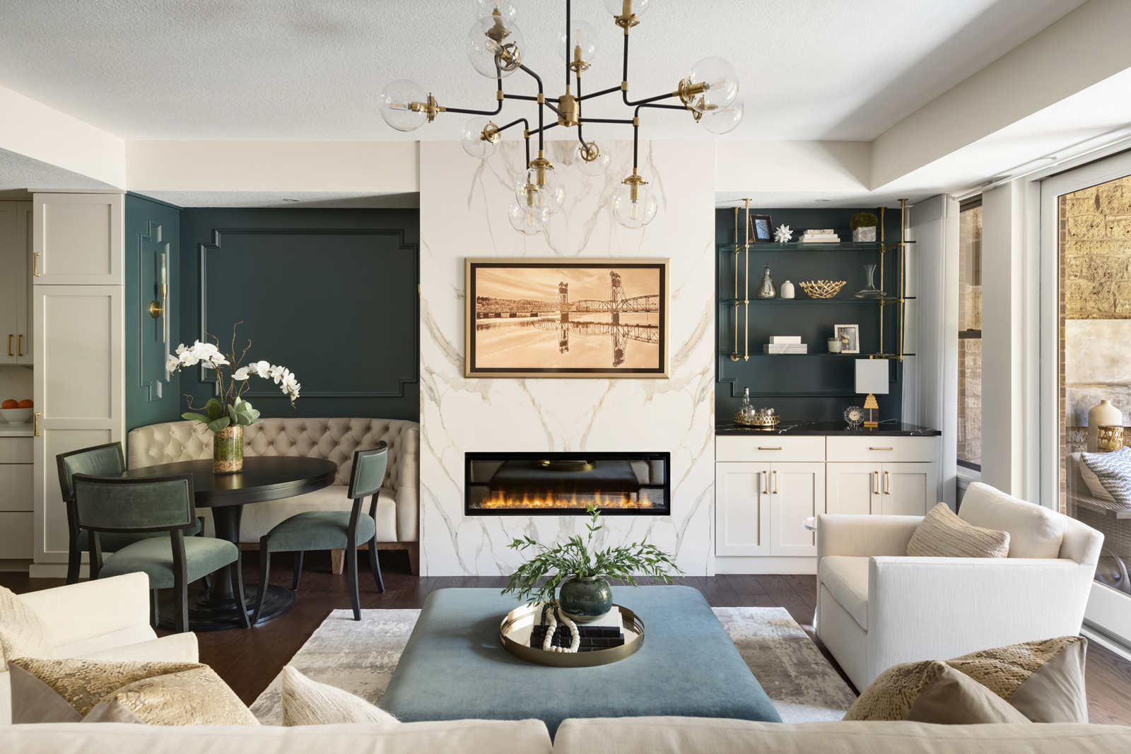
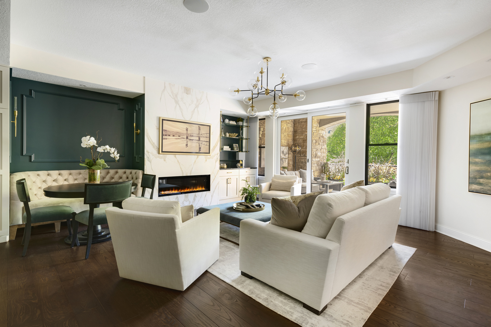
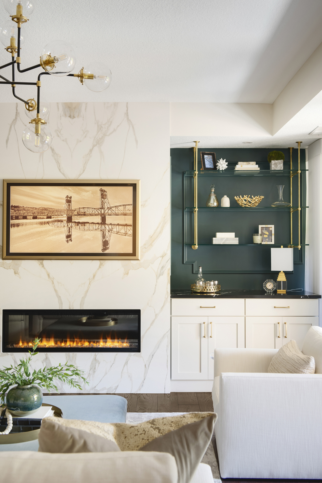
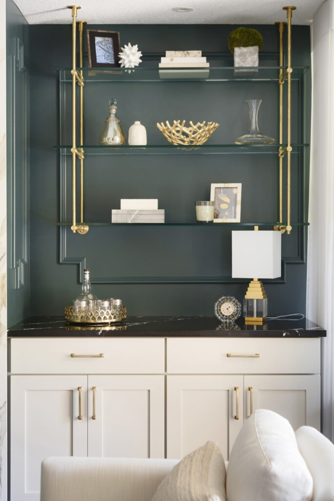
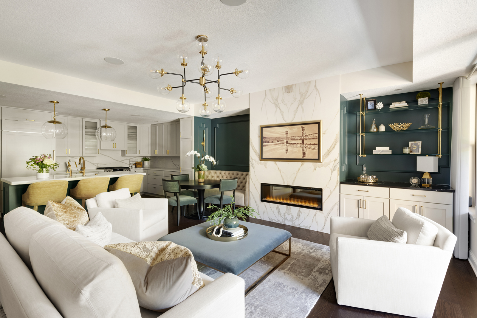
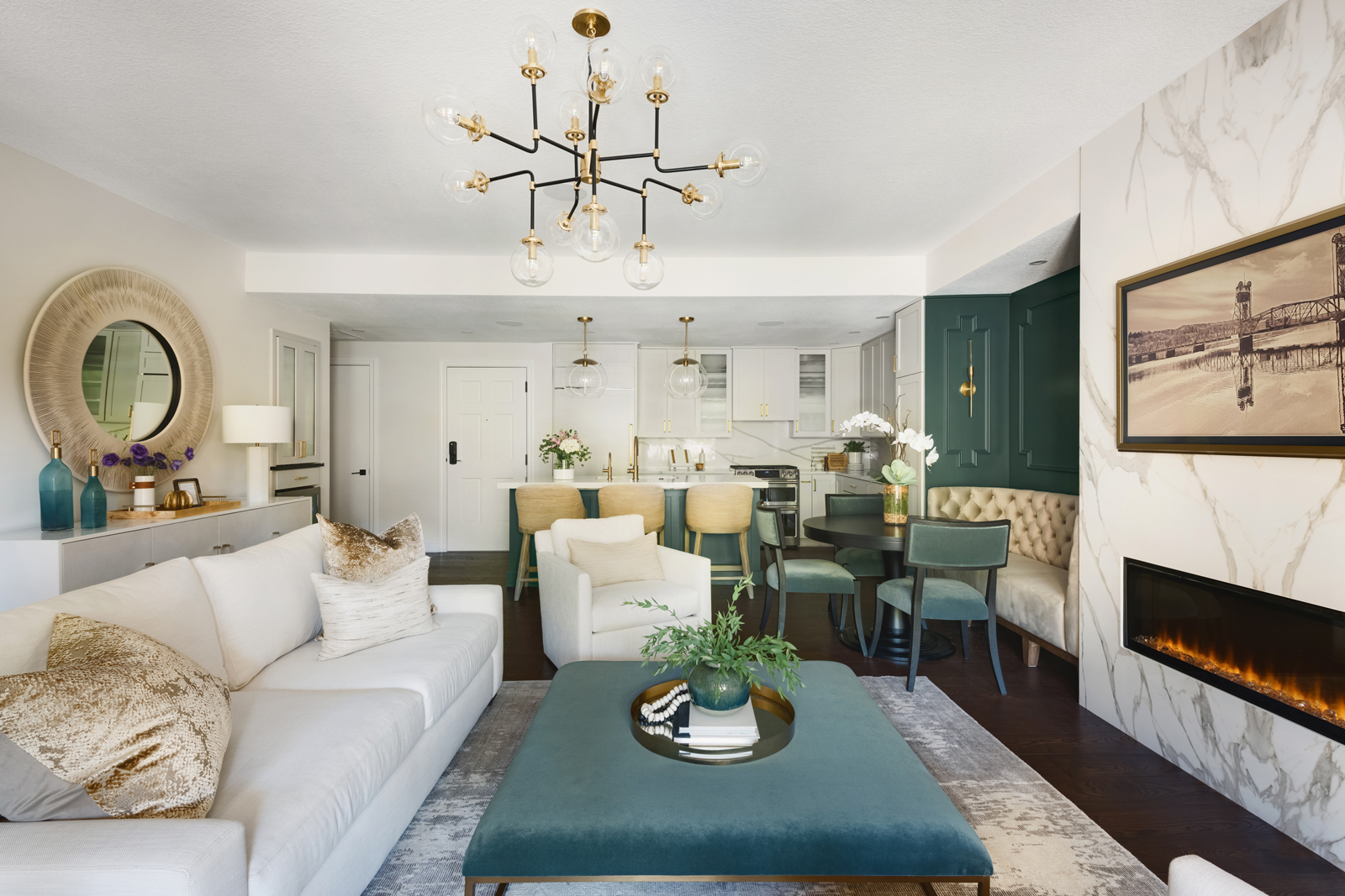
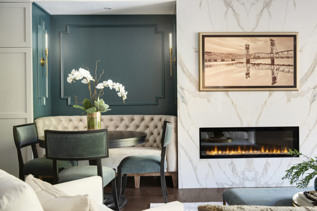
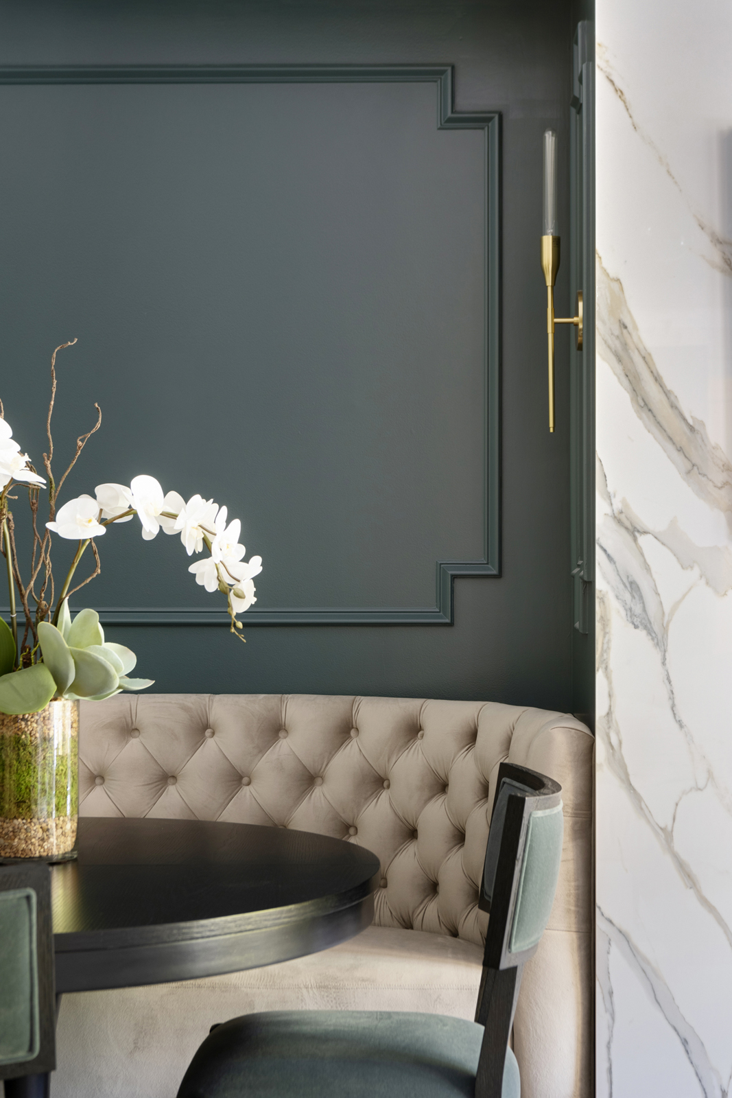
Priority #1 was figuring out a way to make room for a dining table without taking away too much of the living space. Renee actually had the brilliant idea of putting a banquette seating area on the left side of the fireplace. We wanted the fireplace to be more centered as well, so we created a plan to rebuild the fireplace with an entirely new fireplace insert, widen the fireplace wall to make it more dramatic and fit the new linear fireplace, and add storage to the right side of the fireplace. The overall vibe we were going for was an elegant New York loft feel, so we added some beautiful millwork detailing on the walls and opted for a gorgeous brass and glass suspended shelving unit to bring in some glam. Ambient lighting was added with 2 brass wall sconce lights in the banquette alcove, as well as spot recessed lights centered over the banquette and the glass shelves. We removed the ceiling fan and decided to put a gorgeous modern light fixture in the center of the living room.
THE after
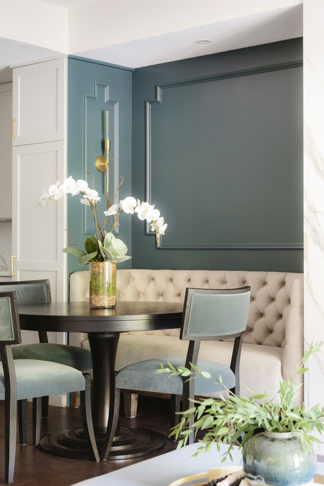
We designed a beautiful curved banquette and had it custom made in a luxurious sand colored velvet fabric. It serves as an intimate space to host a few friends for a dinner party. The dining table can extend to an oval when more seating is needed. We originally wanted to use a marble slab for the fireplace face but it would have required multiple seams and a lot of extra support for the weight of a large slab. We found this beautiful porcelain slab that came in a mirrored image. The two slabs side by side create a dramatic and symmetrical design that we love. The Samsung frame tv allows for perfect placement of tv watching, but looks like beautiful artwork when the tv is turned off. The lovely photo of the Stillwater bridge and river view displayed on their tv is a photo that Doug took himself! The walls on the sides of the fireplace would have felt lost if we painted them the same color as the other walls. When it came to deciding on an accent color, we wanted something that evoked a touch of a waterside feel. We all loved the idea of a deep teal, and when one of the paint swatches we liked was named “Stillwater” (the name of the town they live in) we knew it was meant to be! We love how it brings in a dramatic depth and evokes a classy, cosmopolitan feel. The new cabinetry next to the fireplace provides extra storage and also can serve as a little dry bar when needed. We used a beautiful black & white Cambria quartz countertop for durability. Beautiful Hunter Douglas Luminette shades were installed for privacy and light control, and all new hardwood floors were installed, which significantly richened the look of the entire home.
THE KITCHEN
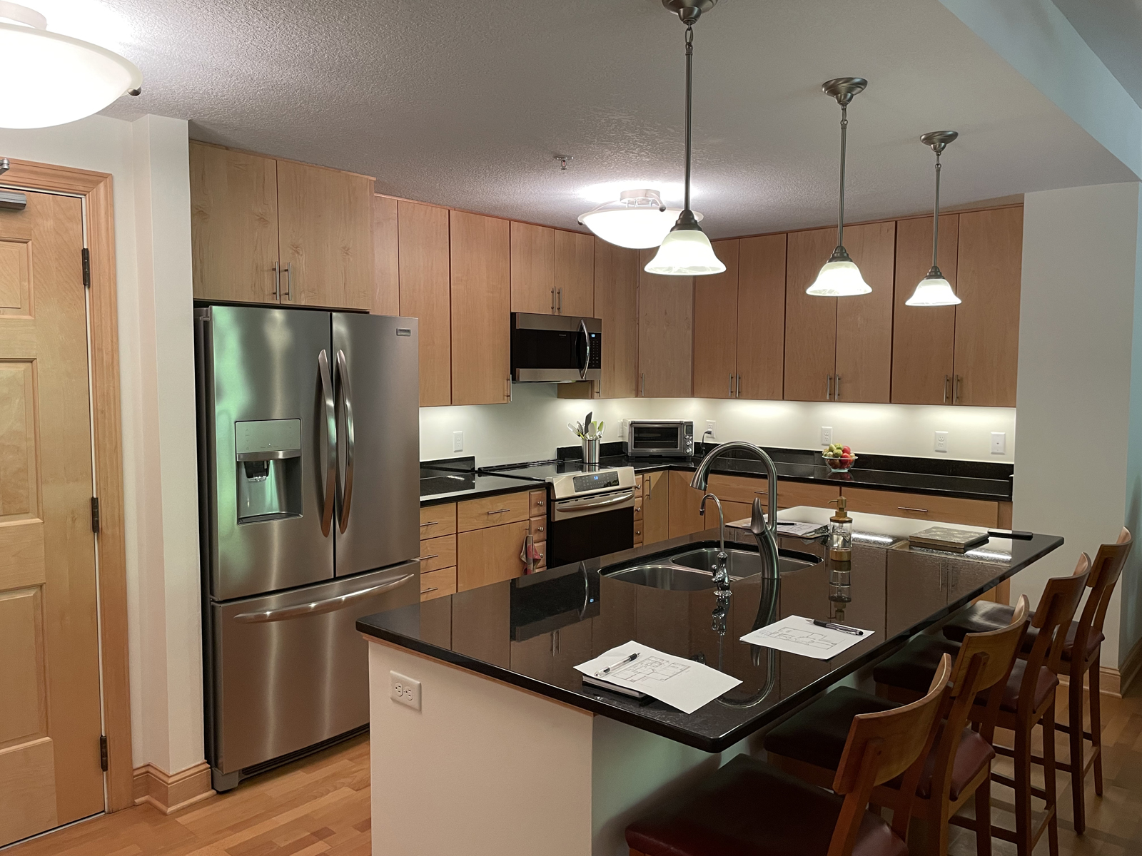
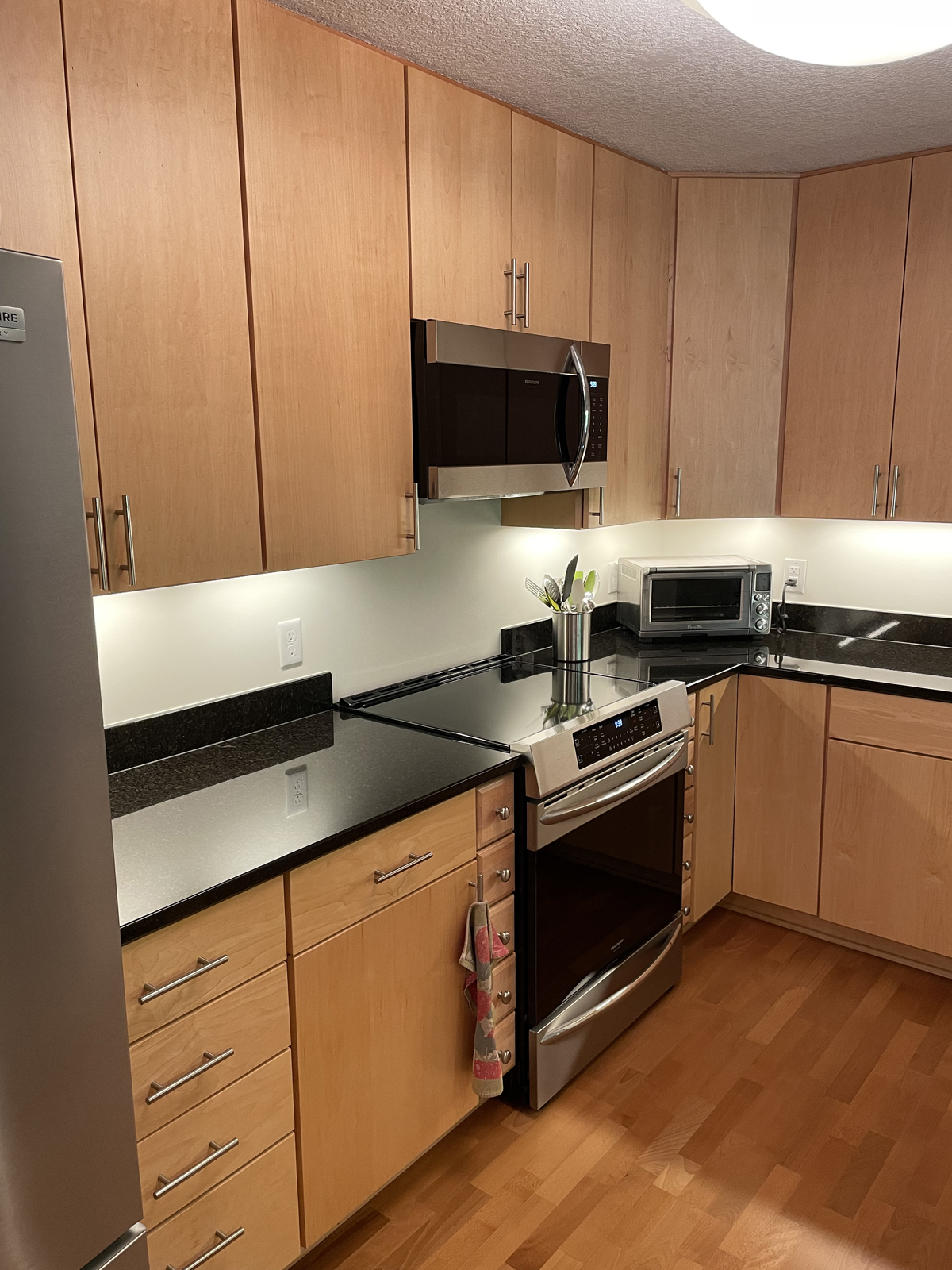
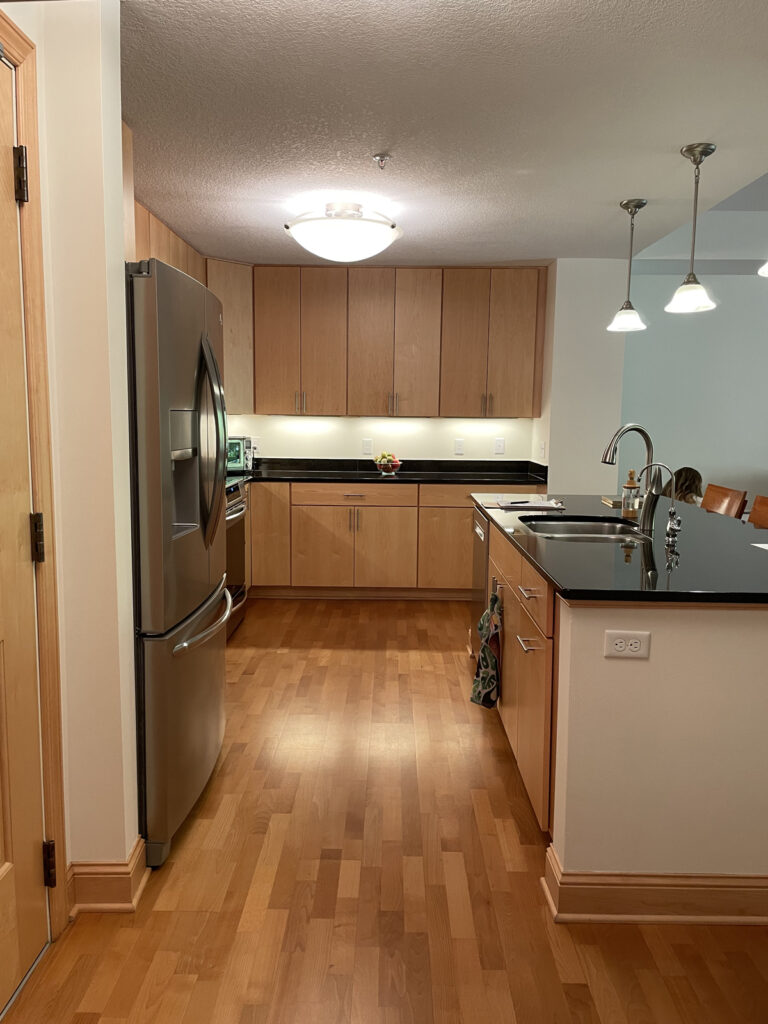
The kitchen definitely lacked personality and felt drab and dark. The light fixtures did not adequately illuminate the kitchen and they were awkwardly placed. The island needed to be reconfigured and shifted in order to allow enough space for the dining area. We decided we would need to have an entirely new center island made. The microwave above the stove needed to go, and Renee and Doug really wanted all new appliances. The countertops were very dark, and the overall look was a little dated.
THE BEFORE
the design process
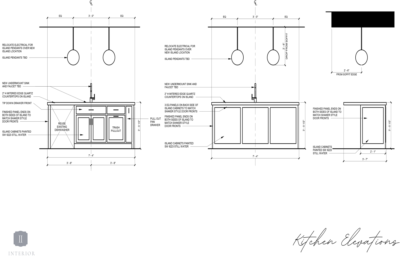
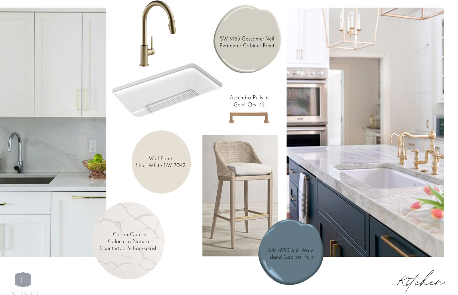
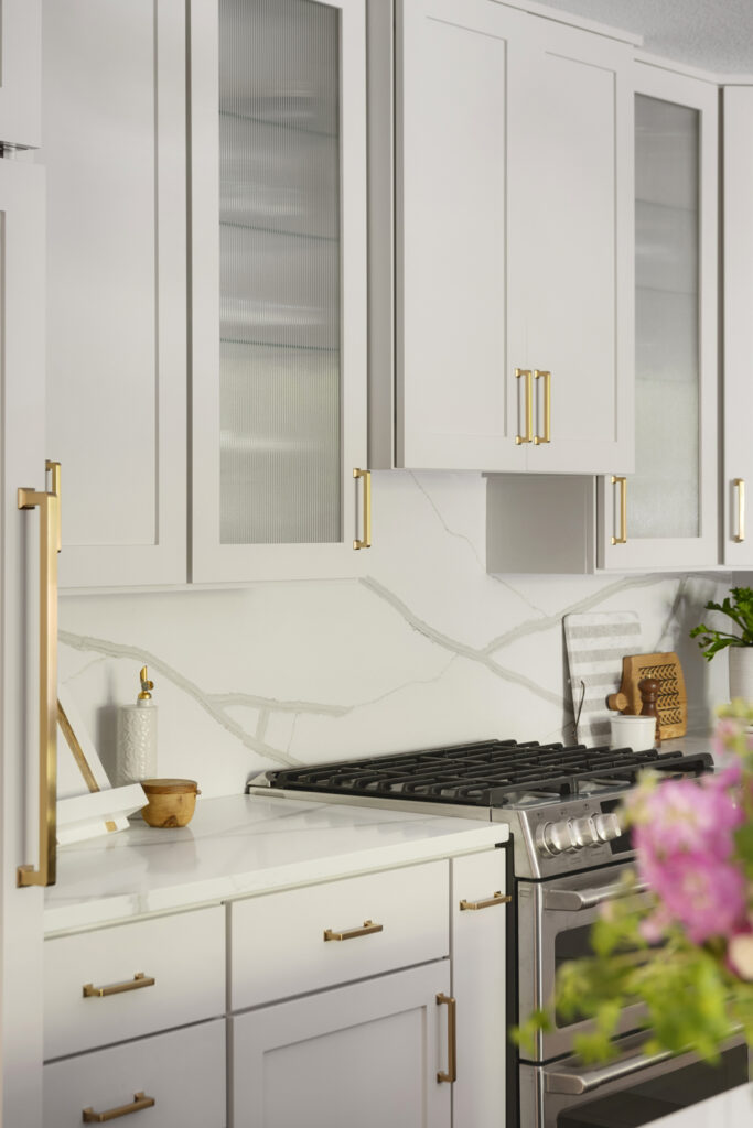
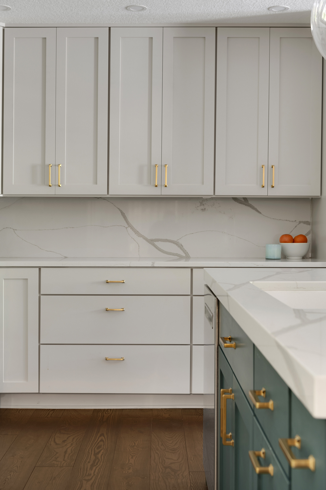
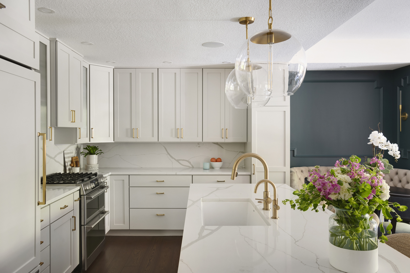
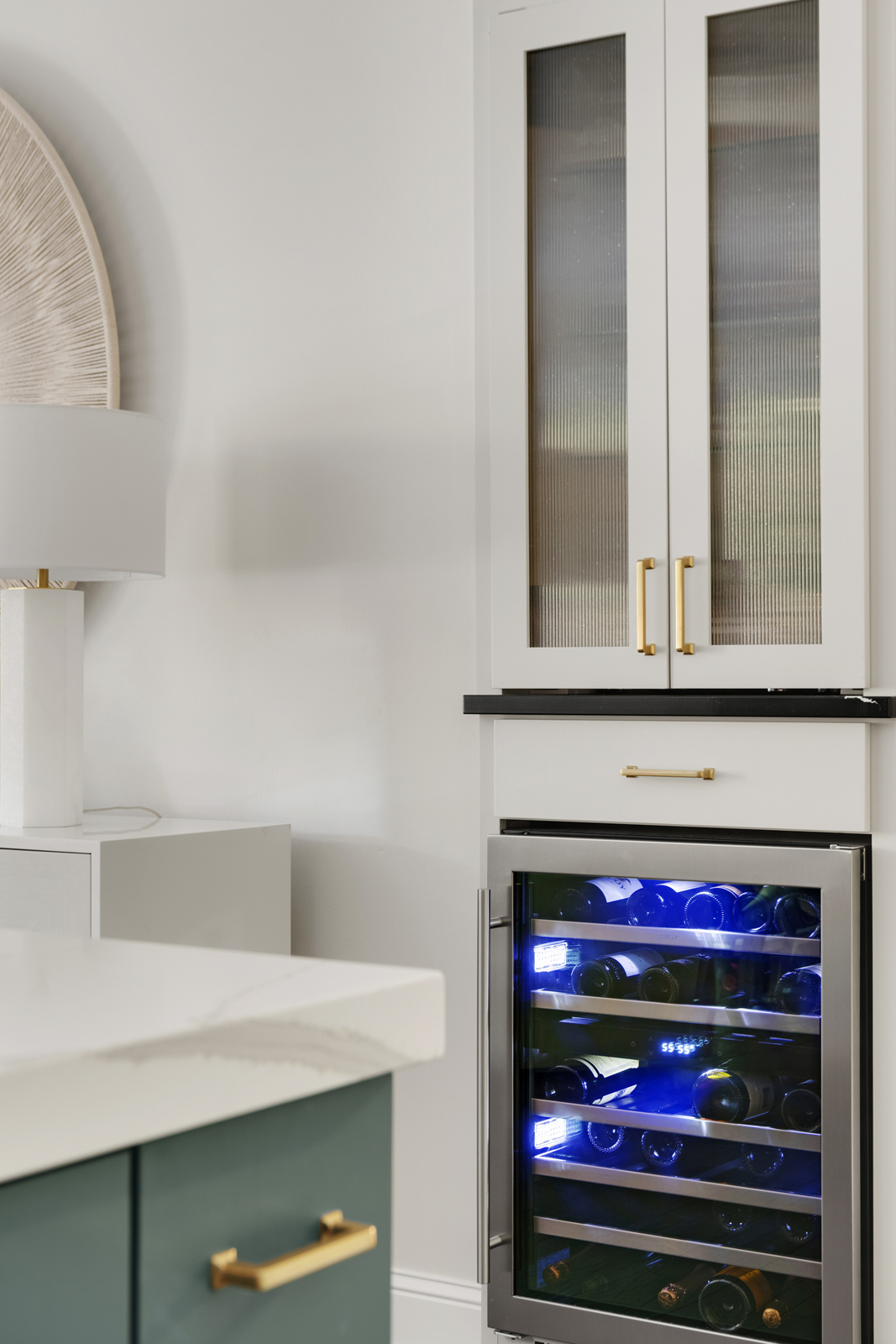
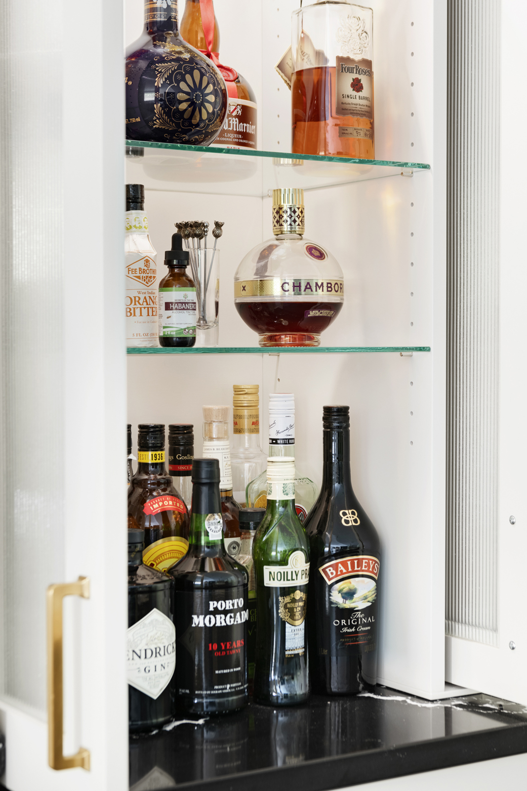
We designed a new center island with a double trash pullout cabinet, new large basin sink, faucet, disposal, and beautiful quartz countertops. The cabinets were reconfigured to remove the microwave over the stove, add a hood vent, add some glass cabinets, a new paneled refrigerator, and more functional drawer storage in several of the lower cabinets. All of the cabinets received new fronts and we used most of the existing frames to utilize what we could. We discovered that there was a hollow wall at the end of the kitchen cabinets, next to where we were building the banquette. We removed the wall completely and had a full height pantry cabinet built there to provide additional storage to the kitchen. The new hardwood floors ran through the kitchen as well. All of the cabinets were painted a light taupe color to make the kitchen feel light and bright. The flush mount ceiling lights were removed and all of the ceilings were patched, resurfaced with a knockdown texture, and painted a fresh white. Across from the kitchen, a decorative niche in the wall was opened up and lengthened to create a small bar area. We added a beverage refrigerator, a storage drawer, a quartz countertop, and an upper section of glass shelving that is hidden by recessed doors with reeded glass. It’s not only pretty, but it is so functional as well!
the after
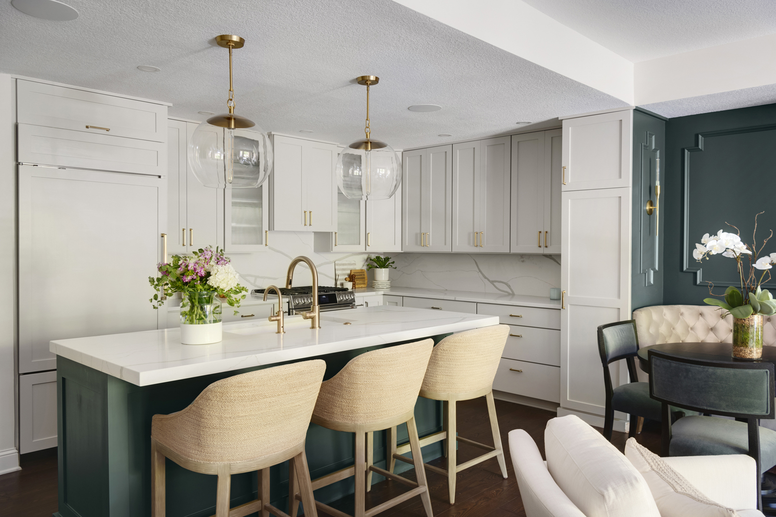
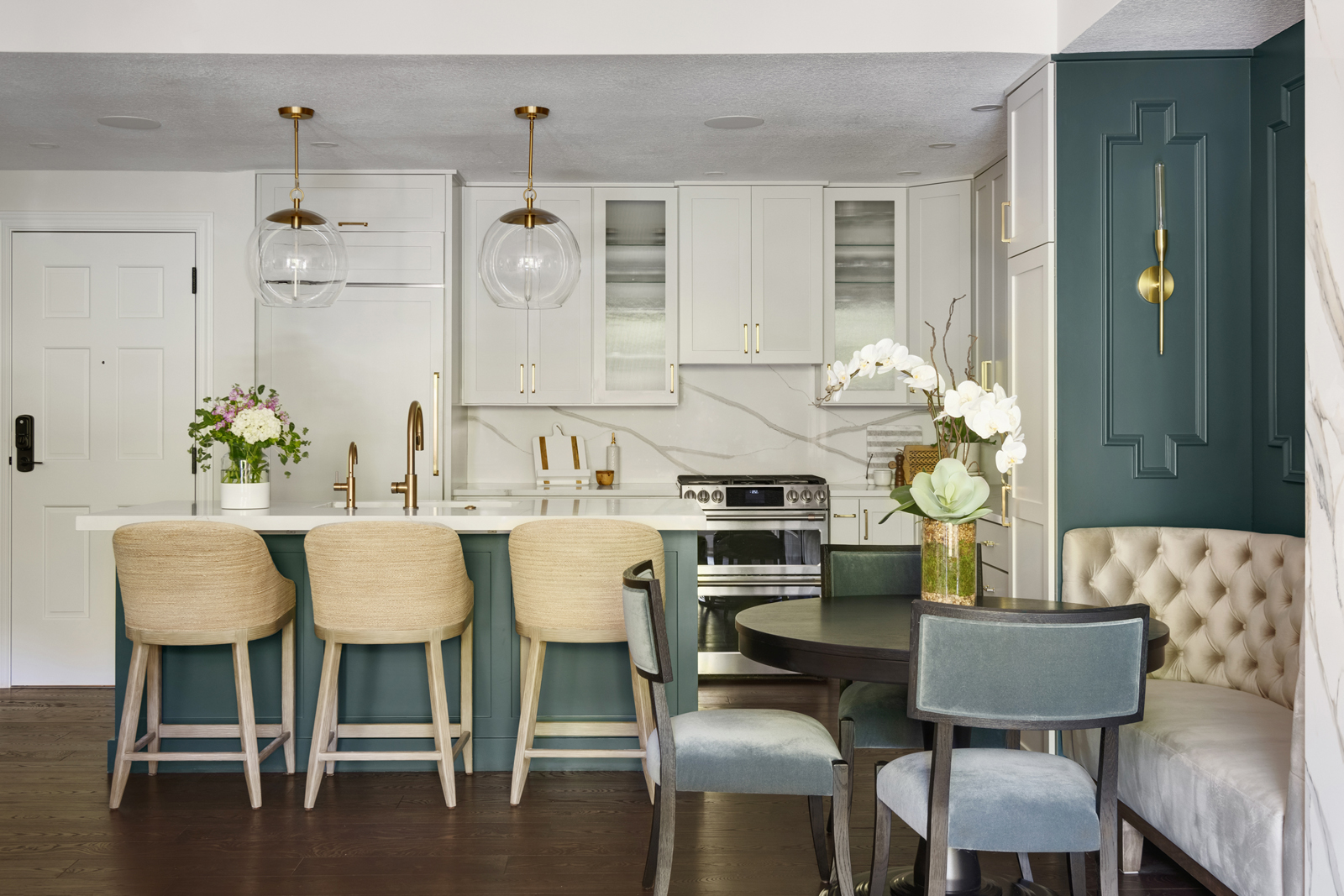
The transformation is just as dramatic in the kitchen! We love how fresh and bright it feels now. The gorgeous quartz countertops run up as the backsplash as well to keep a sleek, clean look. The electrical outlets and undercabinet lighting are hidden under the upper cabinets, so the backsplash is undisturbed and free of any visible outlets. The pops of brushed gold on the light fixtures, the faucets, and cabinet hardware add a little glamour and add warmth to the neutral space. The teal color was brought over to the island to carry the pop of color over to that side of the open space. Beautiful oversized pendant lights anchor the space and add glamor to the kitchen. This condo is now perfectly designed for creating delicious meals and entertaining friends!
THE LAUNDRY ROOM
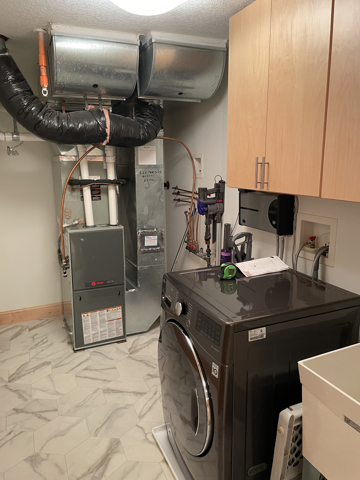
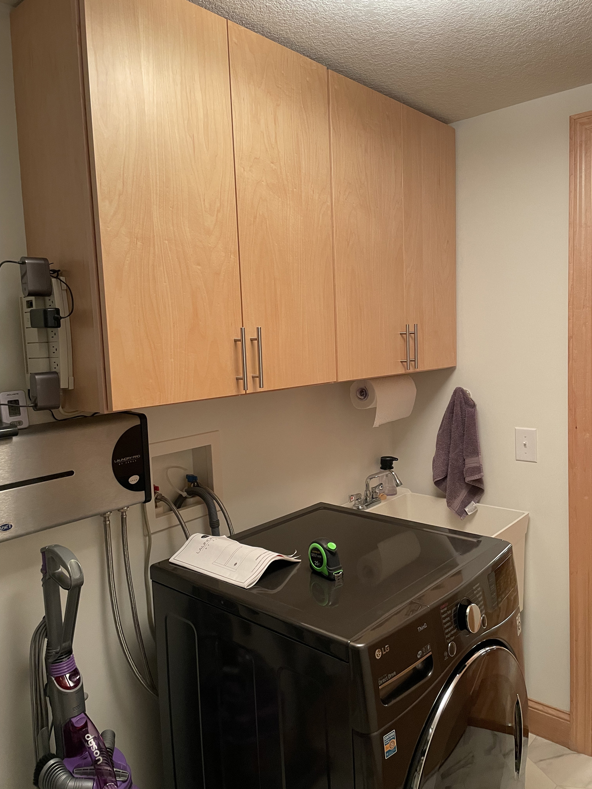
The challenge we had with the laundry room was that it was also the utility room, and we wanted to make it a pantry as well since the condo didn’t have a walk-in pantry. Our creativity was put to the test as we tried to figure out clever ways to make this room multi-functional, AND look good. I think I have a good idea of what “tiny house” designers go through now! Renee wanted to relocate the microwave and coffee makers into this space to keep them out of the main kitchen.
THE BEFORE
the design process & THE AFTER
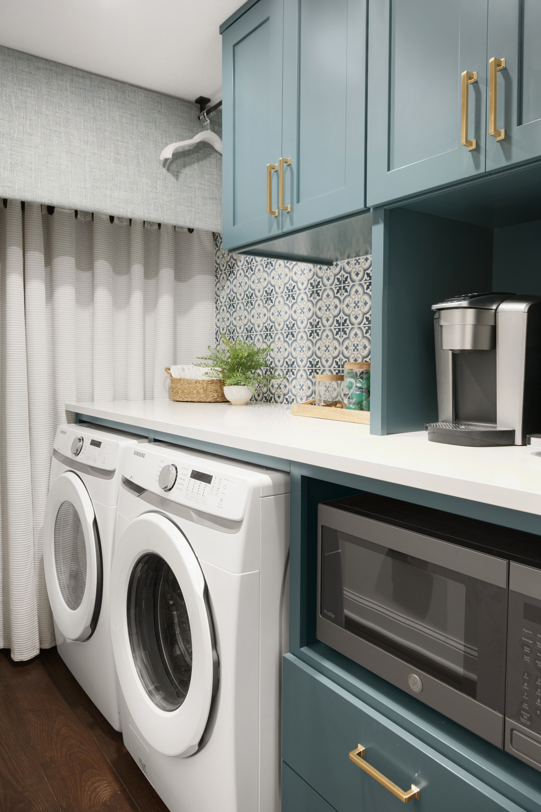
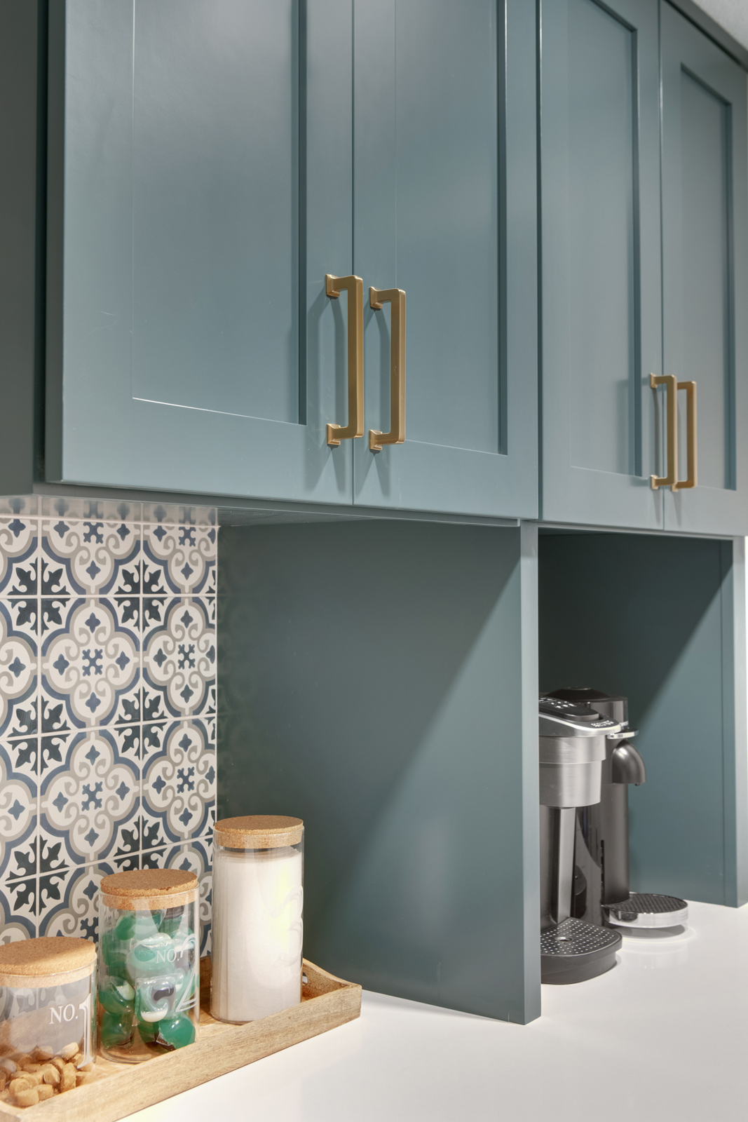
We felt like this was the perfect space to go a little bolder with the cabinet color to add style, so we carried the teal color into this space as well. All new cabinets were designed and the utility sink was removed to make space for the cabinets. We even had a cabinet on wheels designed (hidden behind the curtain) to hold extra small appliances and cleaning products. It can be wheeled out when access to the furnace is required to change filters, etc. We created a space for a coffee station and a cabinet opening for the microwave, add a hanging rod for laundry, and plenty of cabinet storage for laundry and cleaning products. We added curtains to hide the utility area, and Renee made the fabric covered valance herself to hide the upper area above the curtains! Lastly, we added a fresh white quartz countertop, a beautiful tile backsplash and gold cabinet hardware to make the space feel as pretty as the rest of the house.
the patio
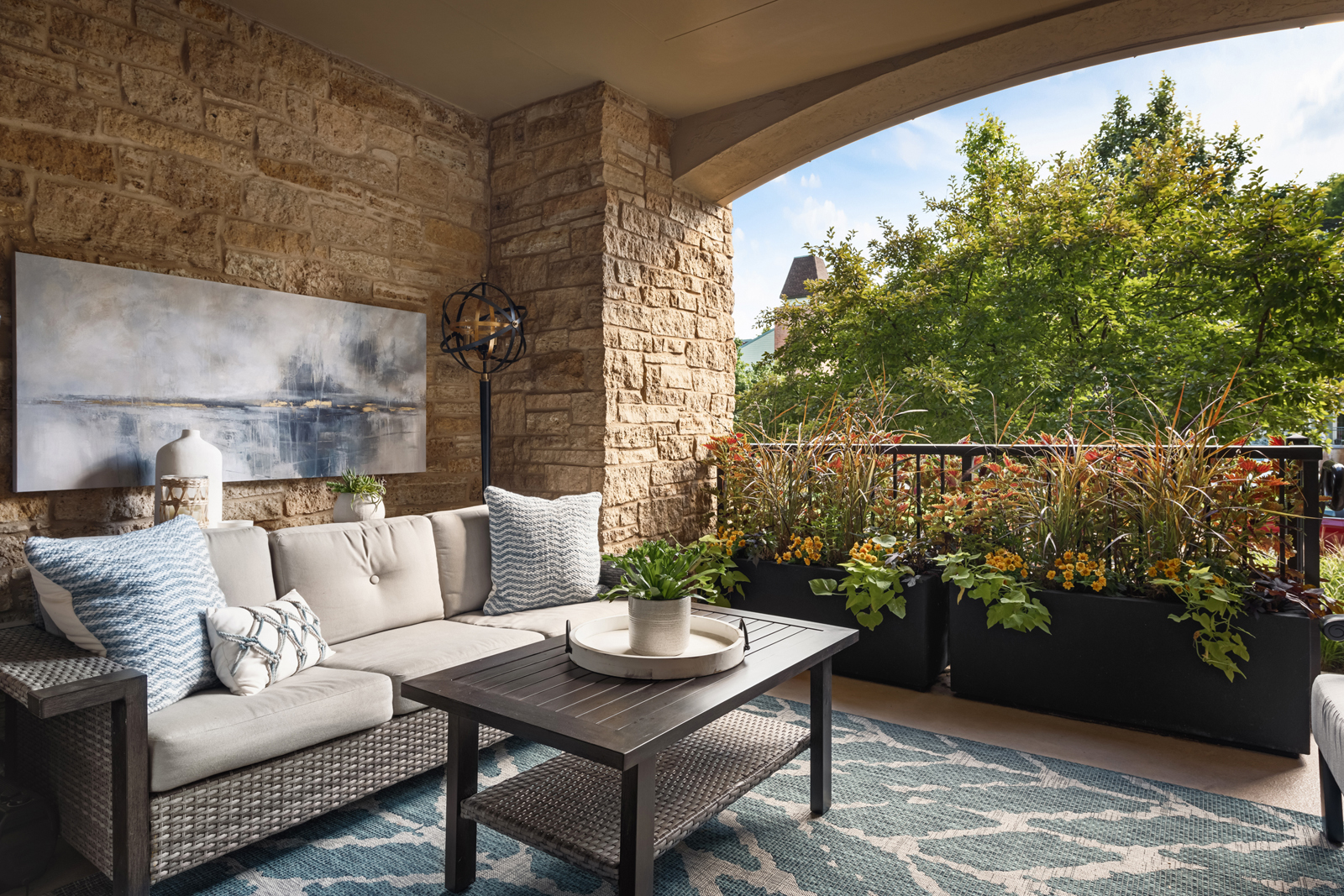
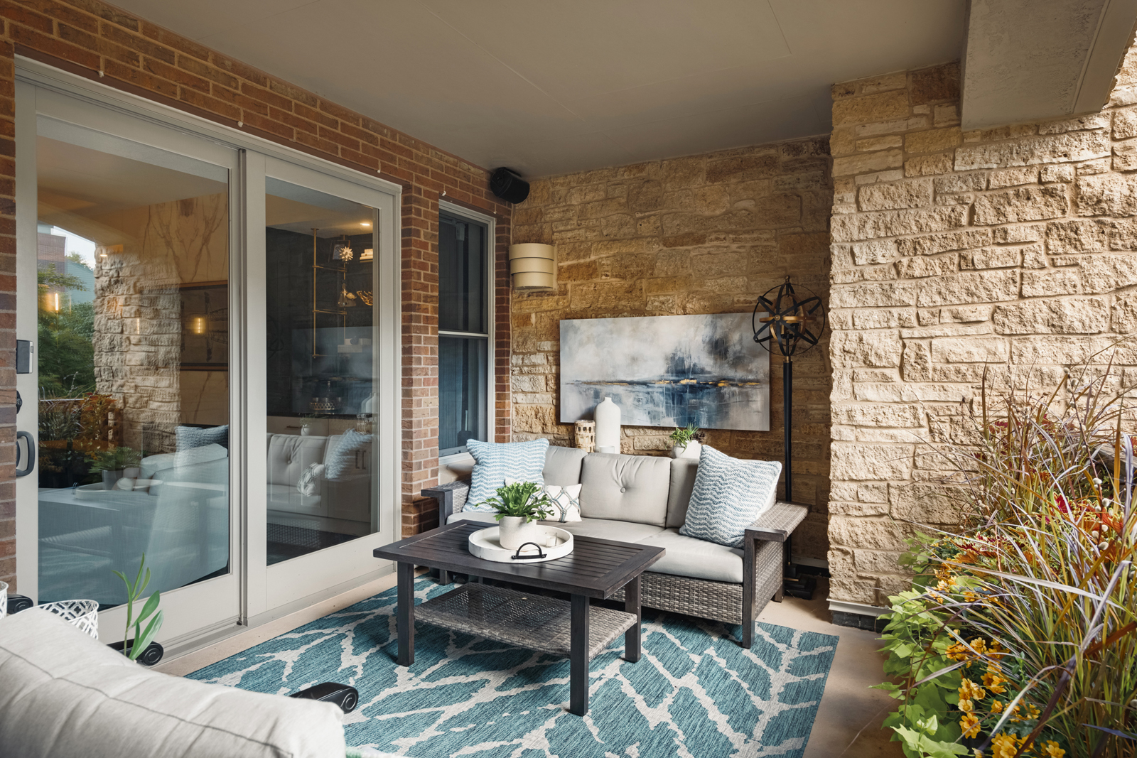
We didn’t do much to the outdoor patio space, other than add some new pillows, artwork and accessories. (Yes you can put artwork outside! This was specially made to withstand the elements) The outdoor space is still a little bit of a work in progress, but it’s fun to have another project to do in the future, right? It is such a relaxing space and it has just the right amount of privacy. Just steps away are so many fun things to do in this quaint, riverfront city. It’s quite a change from their big, suburban home and they are absolutely loving it!
Want to see more? Check out Part II of our Rivertown Remodel Reveal here! Be sure to subscribe to our newsletter to have the project reveal sent right to your inbox.
XO,
Amy & the Interior Impressions Team
Absolutely love this latest remodel! The banquet is so perfect in that space! (I absolutely love banquets & always wanted one! Each room is perfectly utilized even the laundry area! Also, a new idea to run the countertop up for a backsplash! Looks great!
Such a beautiful condo!
Linda Thompson
Thank you so much! I’m thrilled that you love it!
love the dining/banquets chairs…I’ve been searching for a Grecia klismos-style chair! Would you mind disclosing the furniture manufacturer & chair name/style number?
Hello Maria, They are actually from Restoration Hardware!
Best regards, Amy
What a Stunning example of Design transformation Amy. KUDO’S
Wayne Anthony
enVision Designed Living
Minnesapolis
Thank you so much! We are thrilled that you love it!