In early 2019, we began on a new commercial project in Woodbury, MN: Horton Ortho. This new build space was vast with opportunities to fill with fun textures, patterns and colors. The orthodontist isn’t always the most fun visit, but we created a relaxing, upscale space to make clients and their families feel at ease while visiting. We used soft blues and cheerful yellow to give a calm energy and futuristic silvers to have clients smiling from the moment they walk in the door.
RECEPTION
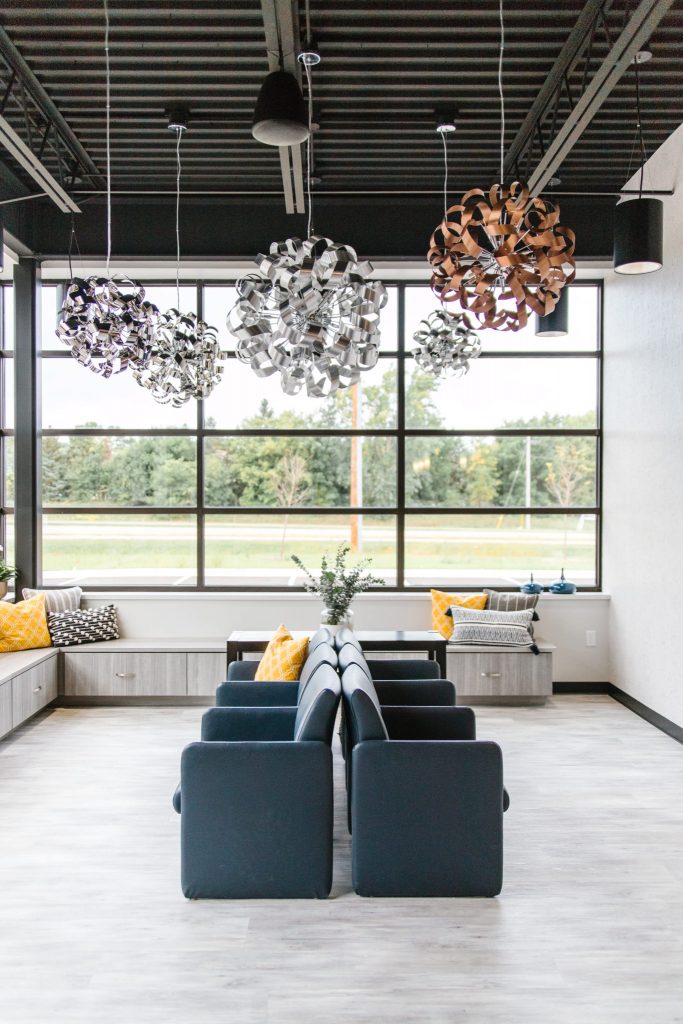
With gorgeous windows and lighting, we wanted to keep the reception area minimal, functional, and with a few highlighted pieces. Horton Orthodontics owner wanted some fun, metallic light fixtures that would stand out. We worked with local company, Woodchuck USA, to create two custom panels to compliment the industrial space and add warmth with wood tones. In the entrance vestibule, a shimmery vinyl grasscloth wallpaper was installed and another glitzy light fixture. In the reception area, a subtle metallic and white wallpaper was added. A gorgeous marble tile in a herringbone pattern greets you at the reception desk. You will find pops of glam throughout the Horton Orthodontics office, which we love and so does Dr. Horton!
TOOTH BRUSHING STATION
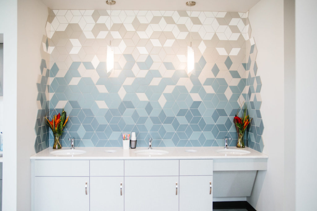
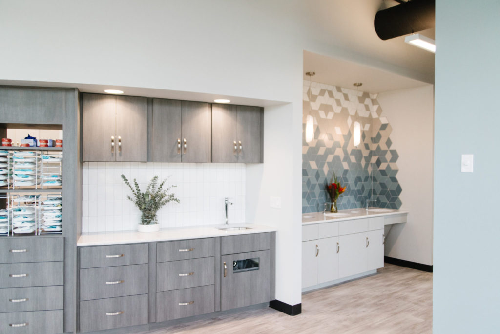
The tile in the toothbrushing station is one of our favorite features of the space. It was so fun to help design the pattern of this tile and the installers did an excellent job of executing! Mirrors have since been added, but you can see how gorgeous the tile pattern is in the photo below. Cabinetry was kept light and bright in this area with chrome hardware.
EXAM ROOM
In the exam rooms, decorative lighting brightens up the space and shines on the gorgeous wallpaper that follows the metallic and soft blue palette. The two spaces were kept clean, open and inviting for patients.
OPEN EXAM ROOM
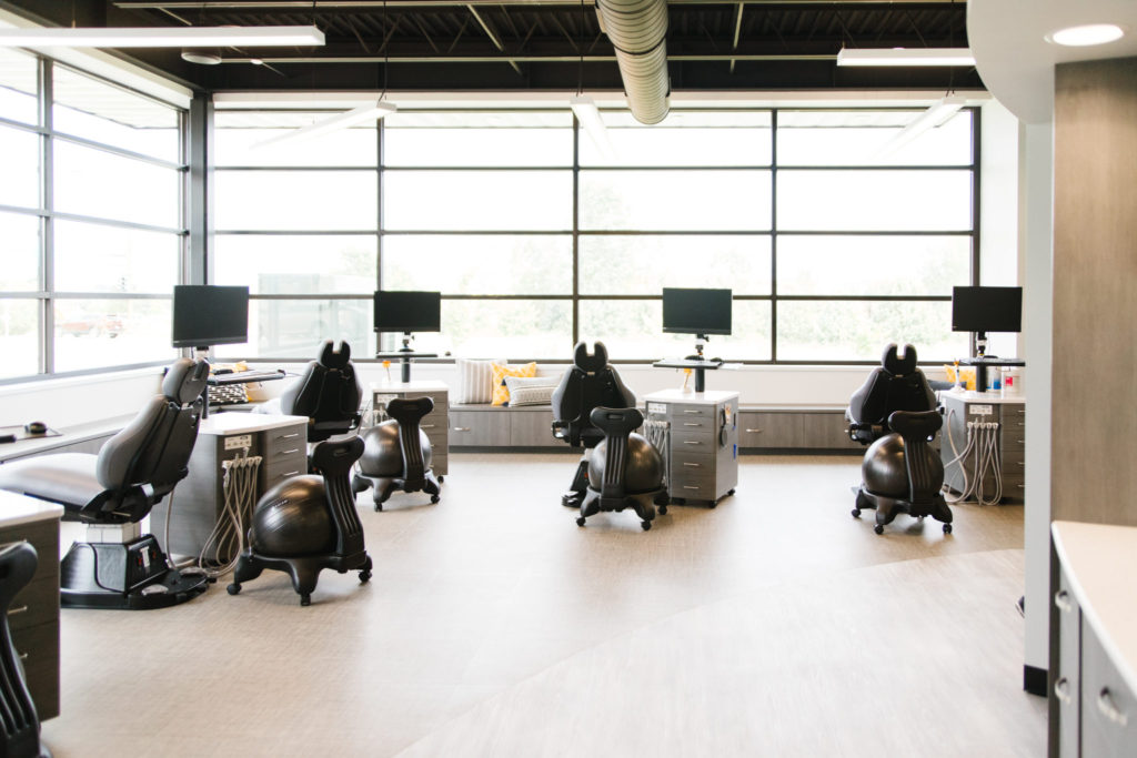
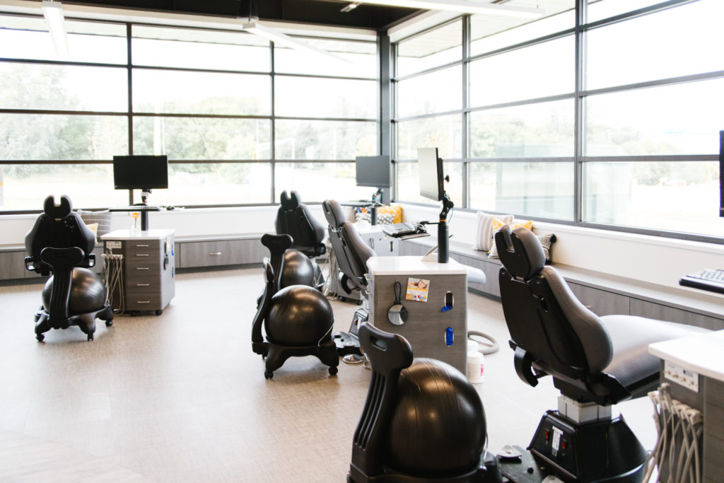
Like the reception area, the bench along the window walls lends more storage and seating options. Throughout the space, you will see that the walls were kept a light, soft gray, a soft blue, and the ceiling a black for contrast. The gray flooring has a slight linen pattern. The black grid windows are a favorite feature of the space. Overall, the open exam room feels bright and spacious.
OFFICE
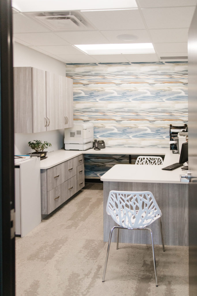
The office was kept soft and neutral, with a pop of color in the abstract patterned wallpaper. The soft gray, natural grain look on the cabinets adds warmth through cool colors.
BATHROOMS
As many of you already know, we love to have fun with bathrooms at Interior Impressions! These bathrooms were no exception. We added visually stunning and vibrant wallpaper, a gorgeous artisan square tile in Dr. Horton’s bathroom, and a classic white, textured and vertically stacked tile in the patient bathroom. We also had fun with the floor tile, especially in the patient bathroom – see the “Smile” in the floor tile. For some glam, we picked gold faucets and tile edging, rose gold, and chrome finishes.
We had so much fun during this project and are thrilled with the end result. What a beautiful space to work in. If you need any orthodontic services, we highly recommend visiting Dr. Horton and her team! Check out their website here.
Interior Impressions Team

Leave a Reply