HORTON ORTHODONTICS
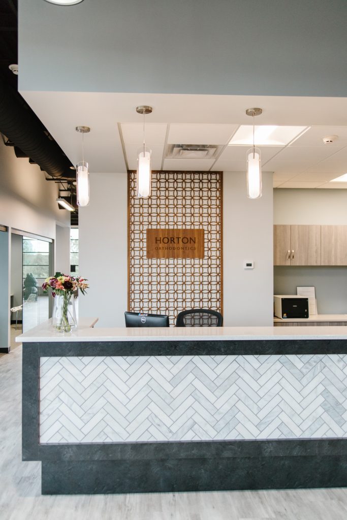
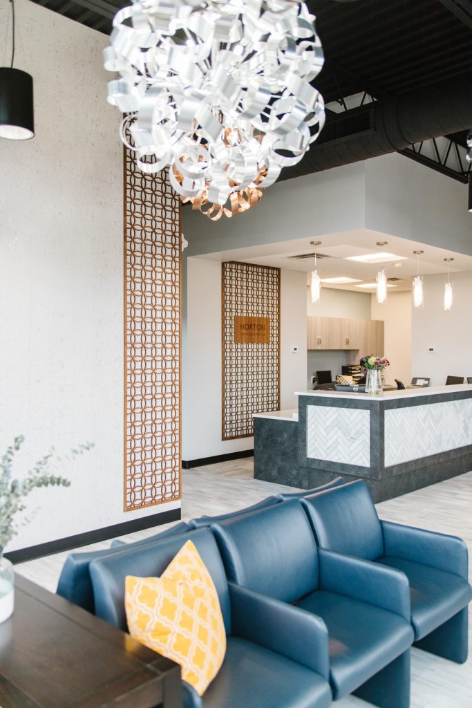
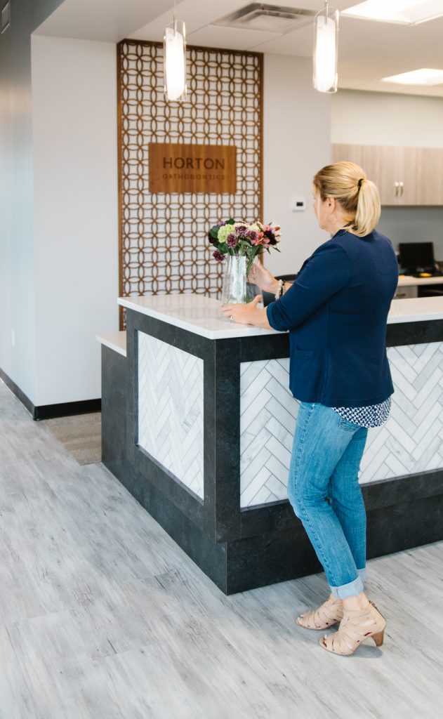
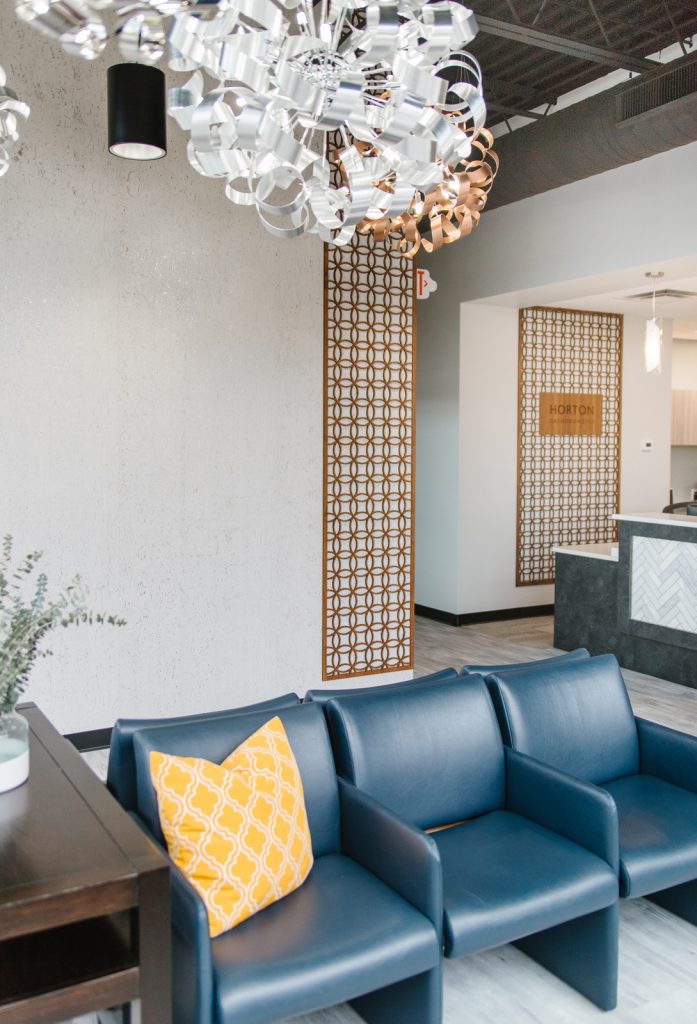
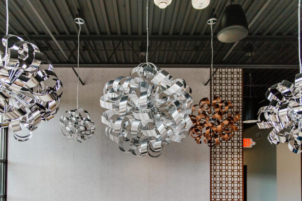
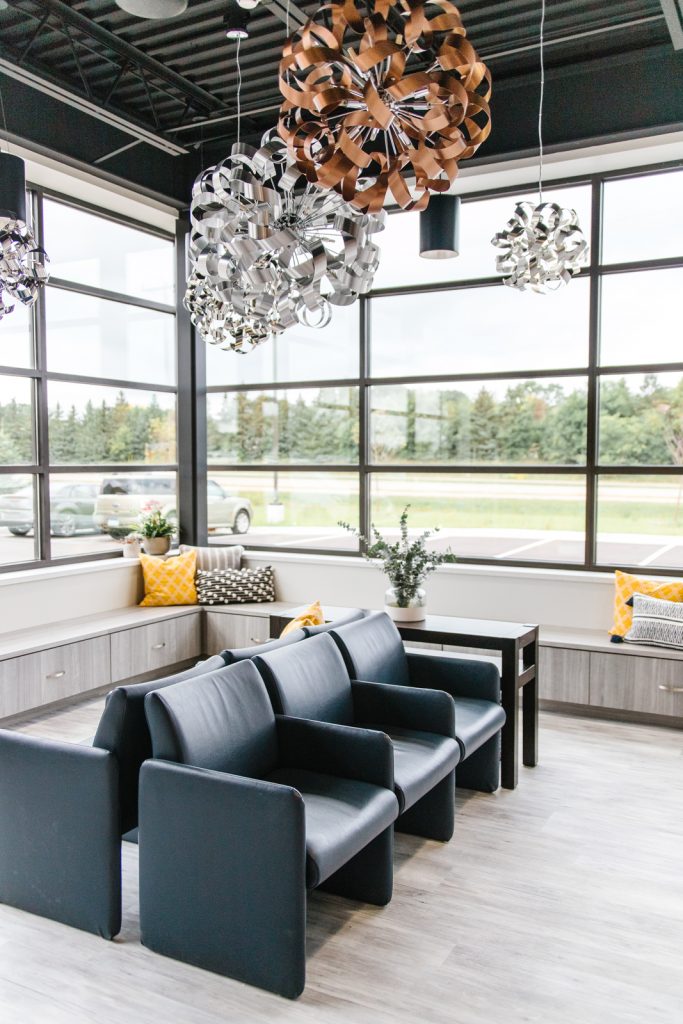
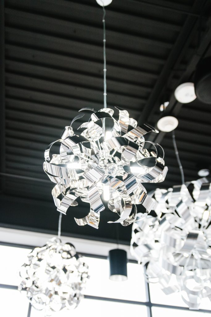
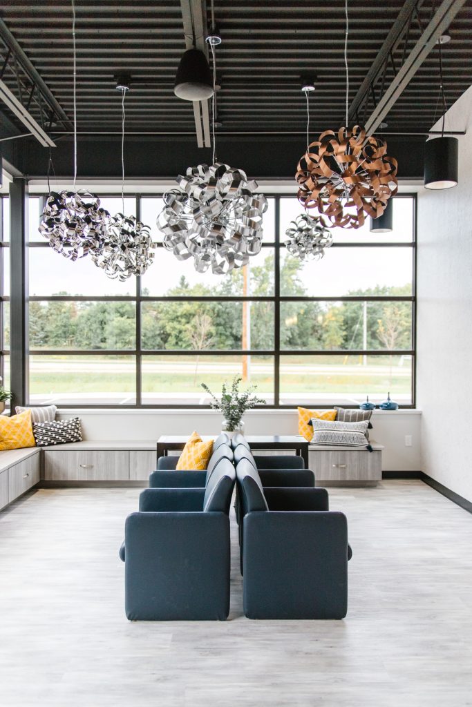
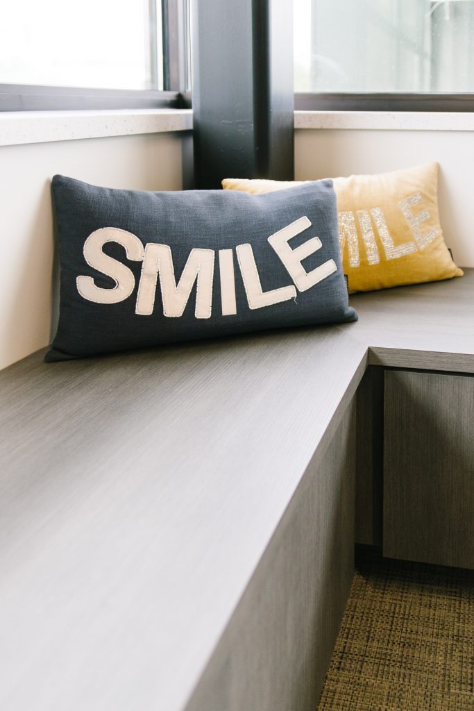
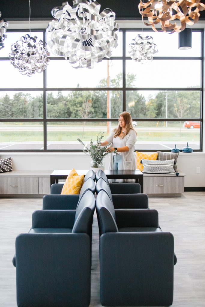
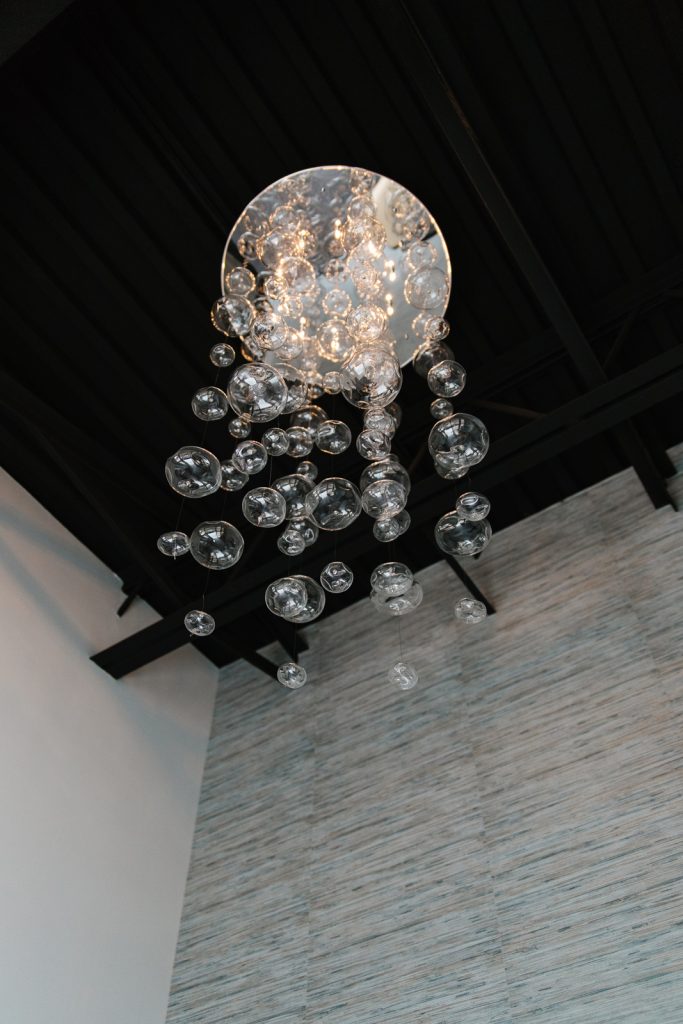
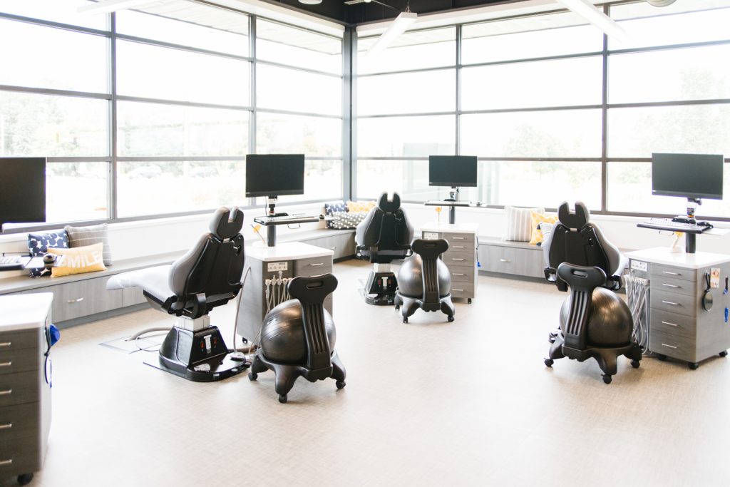
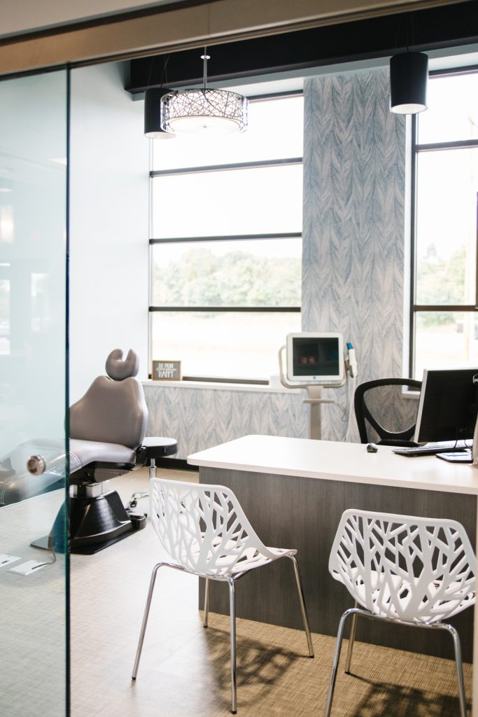
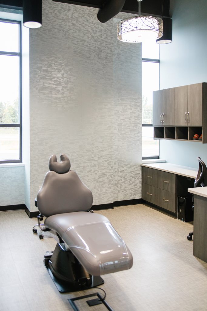
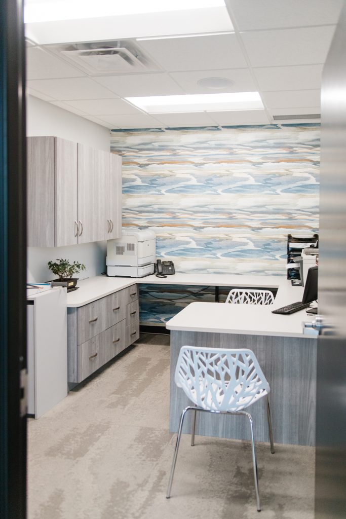
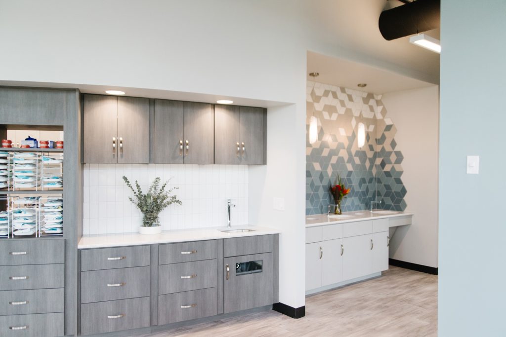
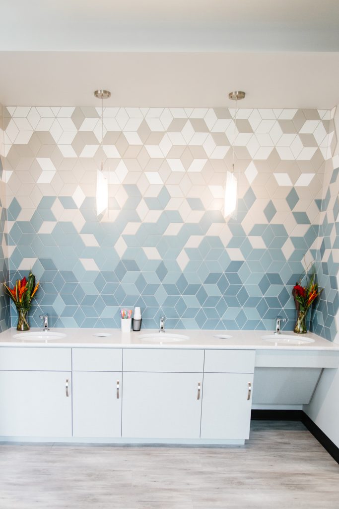
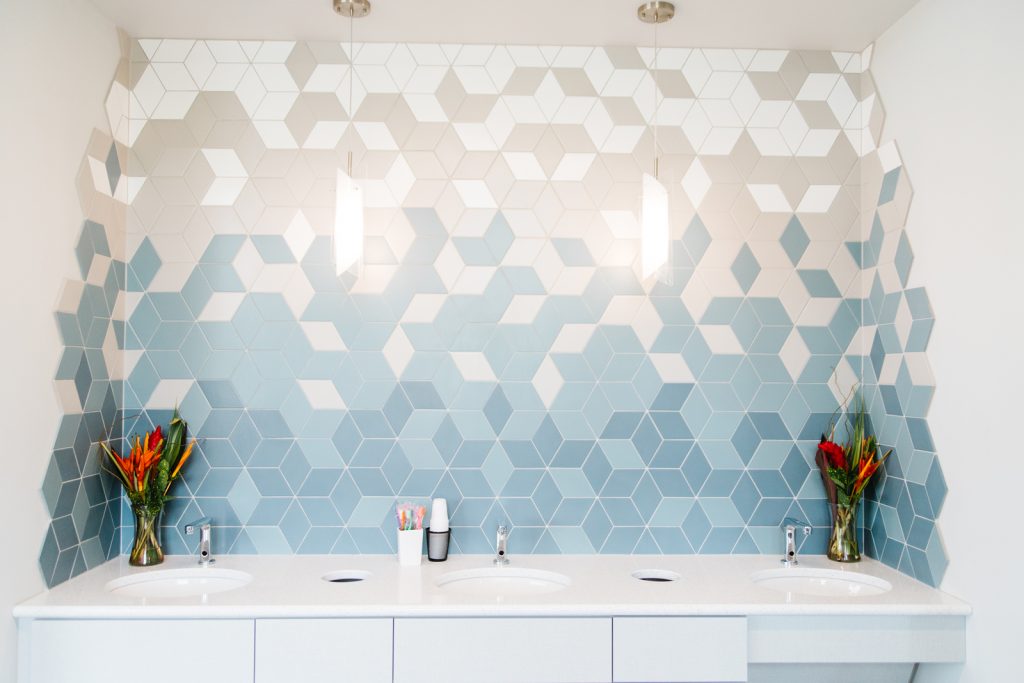
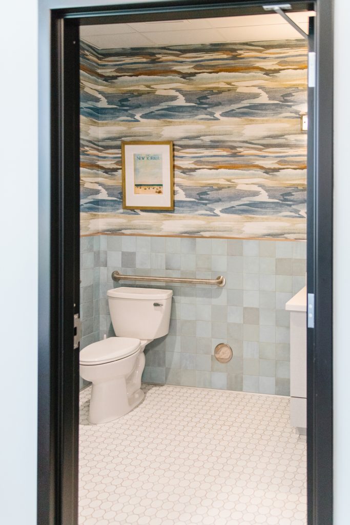
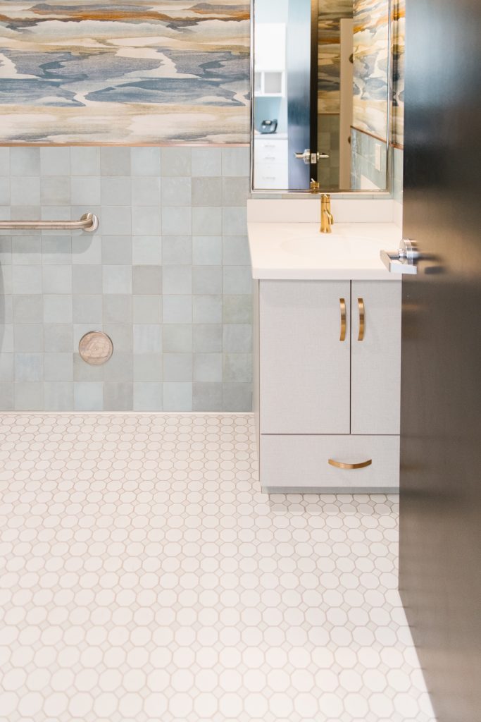
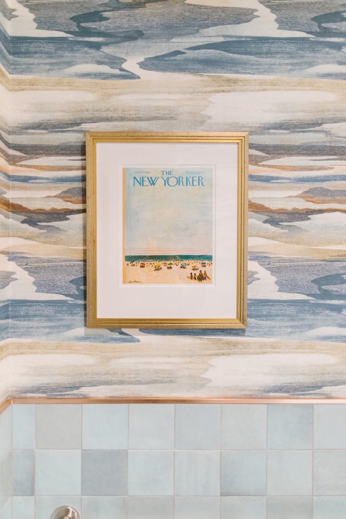
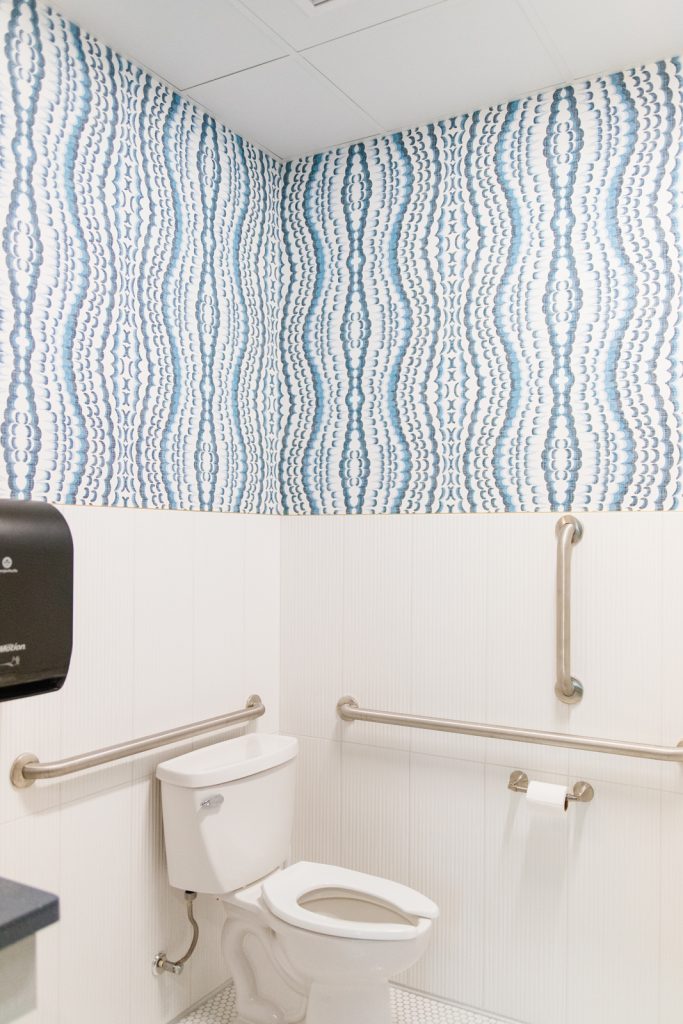
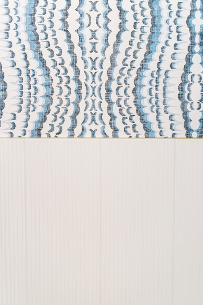
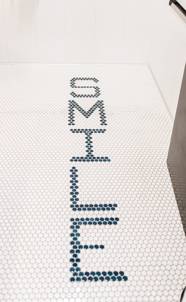
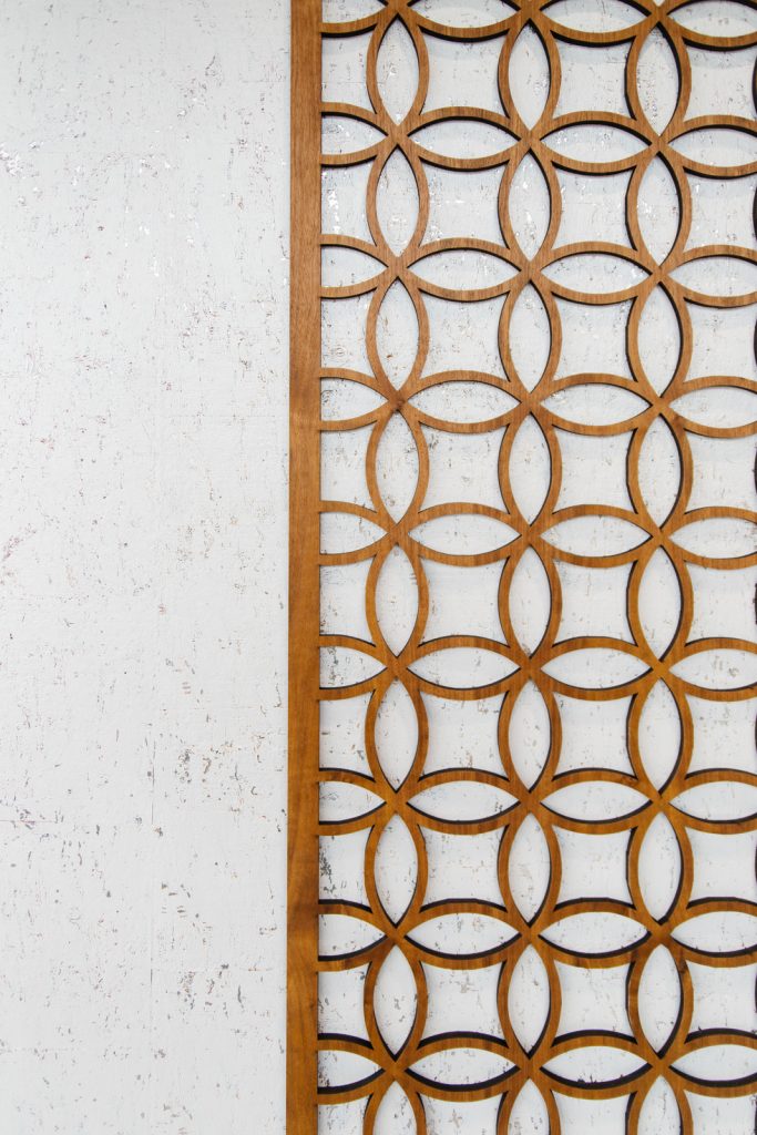
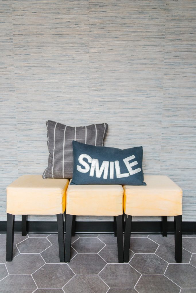
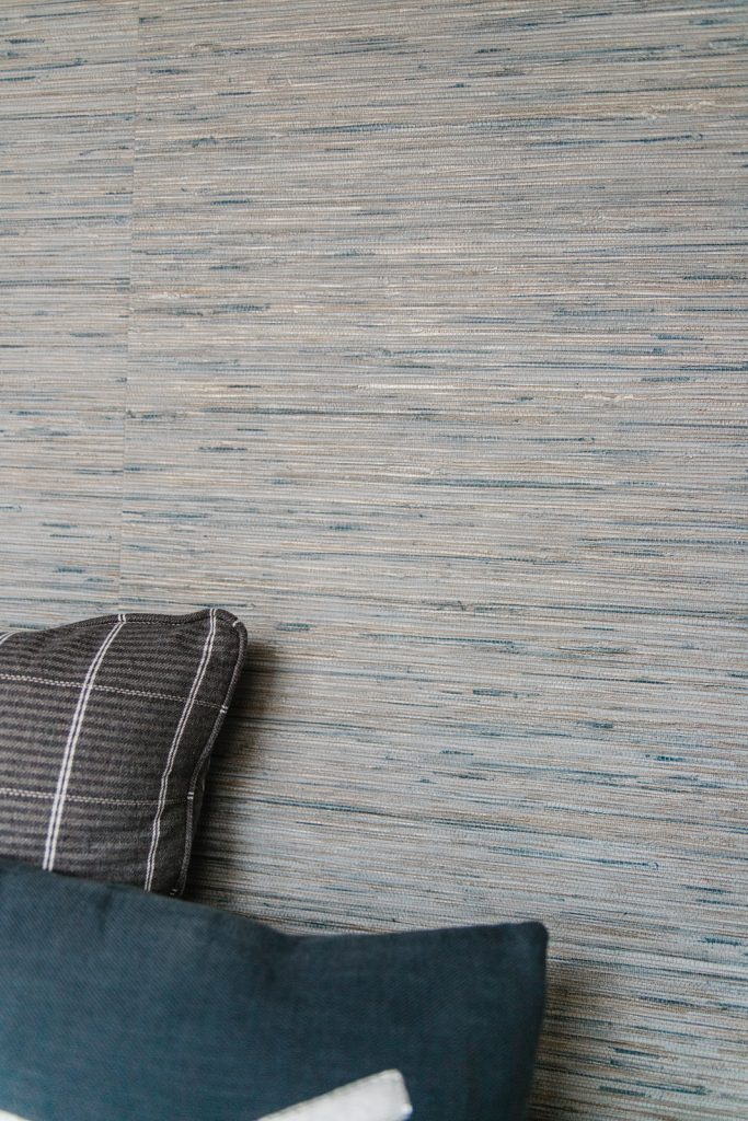
This new build space was vast with opportunities to fill with fun textures, patterns and colors. The orthodontist isn’t always the most fun visit, but we created a relaxing, upscale space to make clients and their families feel at ease while visiting. We used soft blues and cheerful yellow to give a calm energy and futuristic silvers to have clients smiling from the moment they walk in the door.
LOCATION
Woodbury, MN
CREDITS
Mackenzie Merrill Photography
YEAR COMPLETED
2020
KIND WORDS
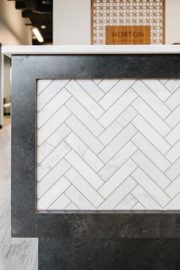
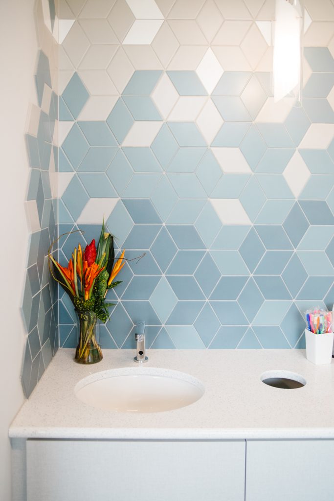
“Amy and her team are outstanding. As a new construction from literally the grass up, there were so many decisions that needed to be made. I didn’t want the interior design to get lost in the construction process, which is why I contacted Amy for help. She and her team made it possible to realize my vision for the space by really listening to me and then presenting options that really worked! Three of my favorite aspects of my design are the wallpaper, an hombre tile wall, and wood veneer accents. I would never have had the time to scour through books of wallpaper to find the amazing options they gave me, and they all worked great with our color scheme. Jordan was there directing the tile layers for the ombre wall, and it turned out magnificent! And Amy helped design the concept I had for the wood veneer, and we consistently get compliments on how nice it is. This is certainly a strength of Amy’s and her team – they are able to help you realize and implement your vision. I will forever be grateful for them!”
– Dr. Heather Horton
–
