We’re thrilled to finally share with you the transformation of our latest project, “Silver Lake”. Our clients reached out to us because they were ready to refresh the look of their home. They loved the location and structure of their house but wanted it to feel fresh and new again with updated finishes and furniture. Most of their home just needed cosmetic changes (paint, carpeting, new light fixtures, etc) but their primary bathroom needed a complete remodel. Their home has now been transformed into a bright, fresh, and inviting space. We can’t wait to take you on a journey through the before and after photos and share with you the design process and the inspiration behind the final result. So without further ado, let’s dive into the world of “Silver Lake”
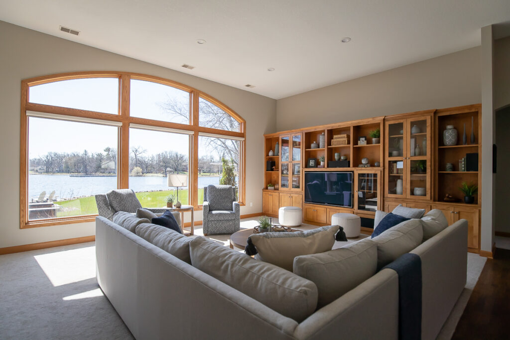
LIVING ROOM
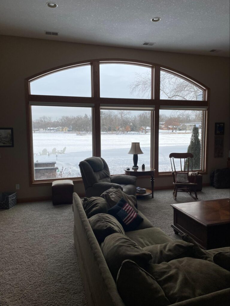
Living Room Before 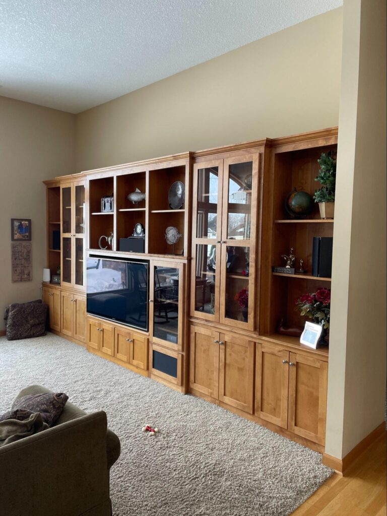
Living Room Before 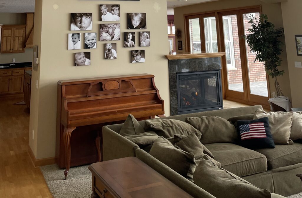
Fireplace Before
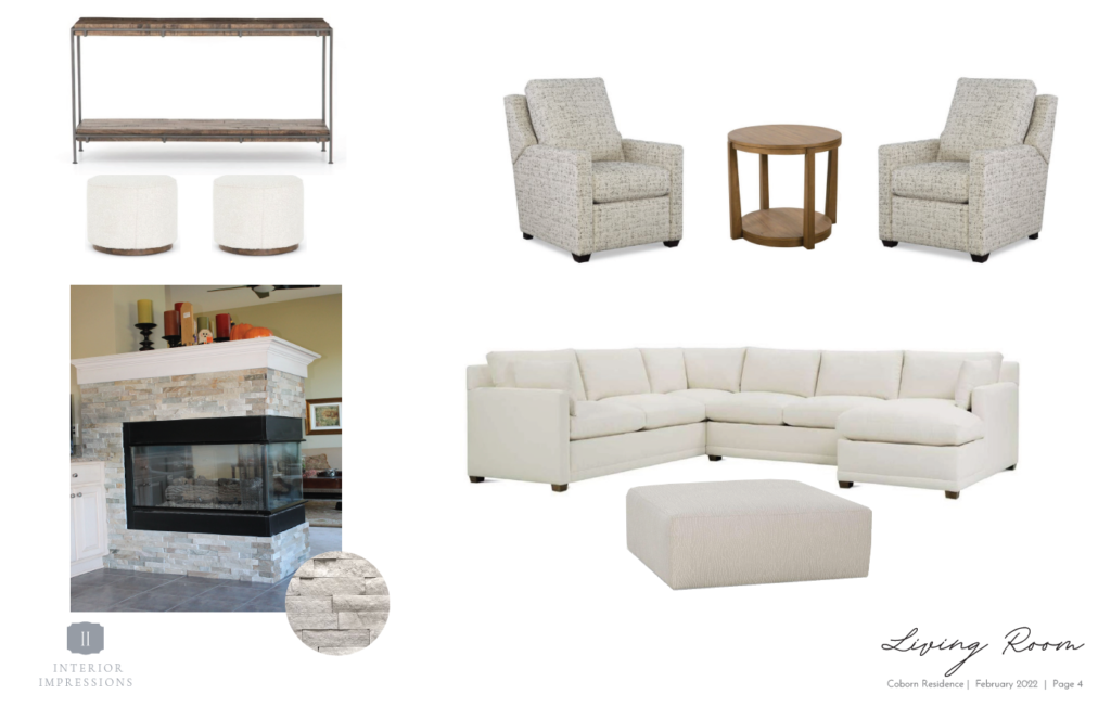
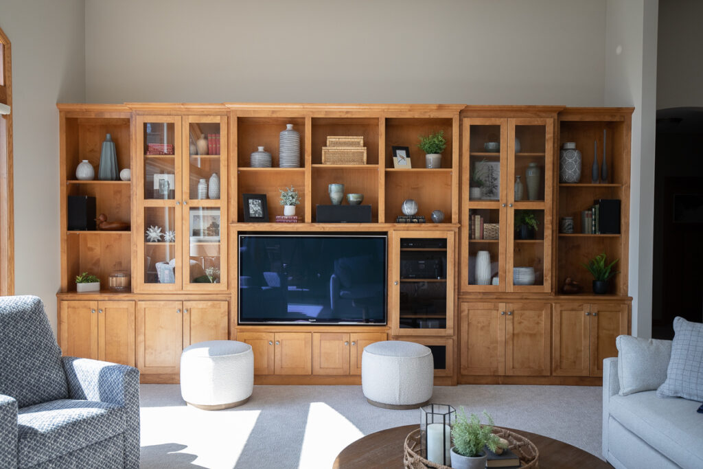
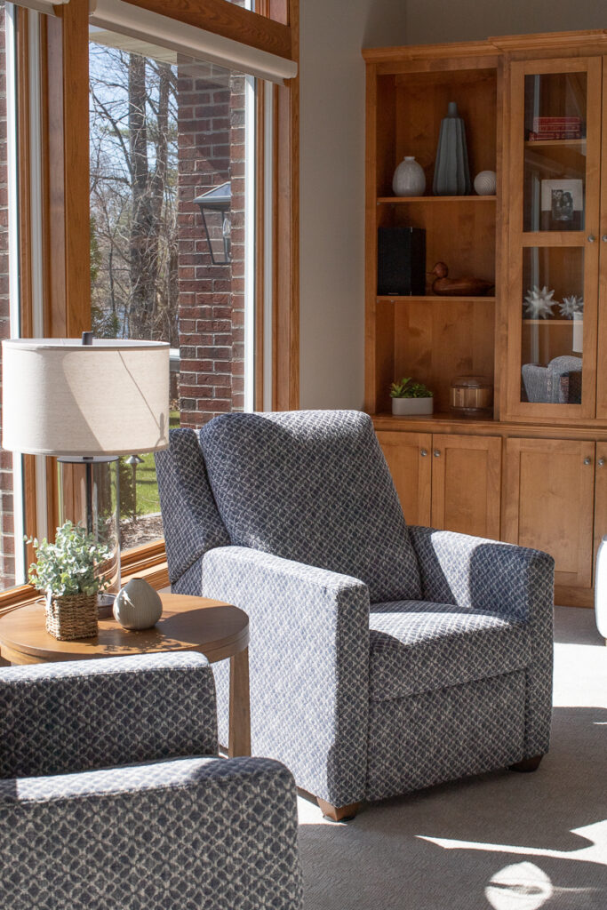
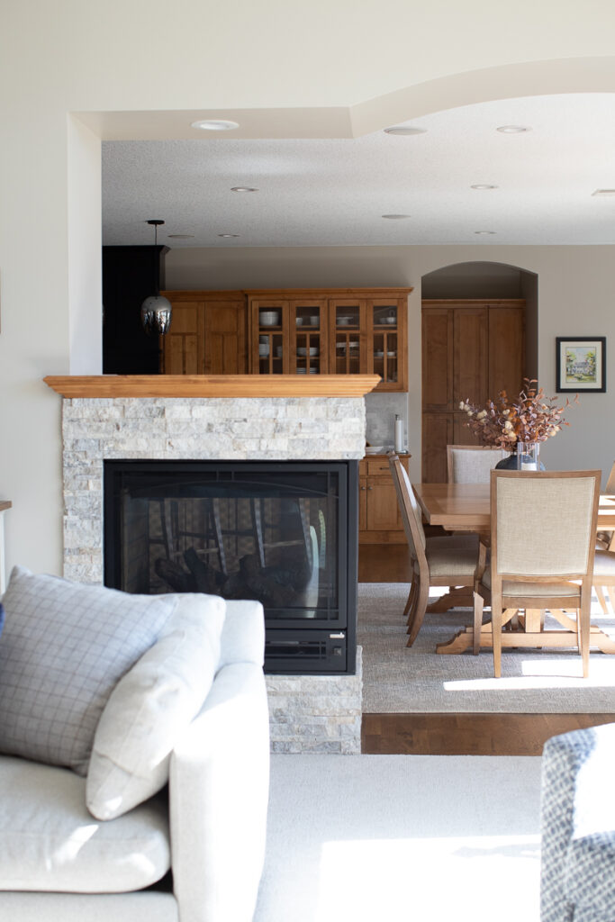
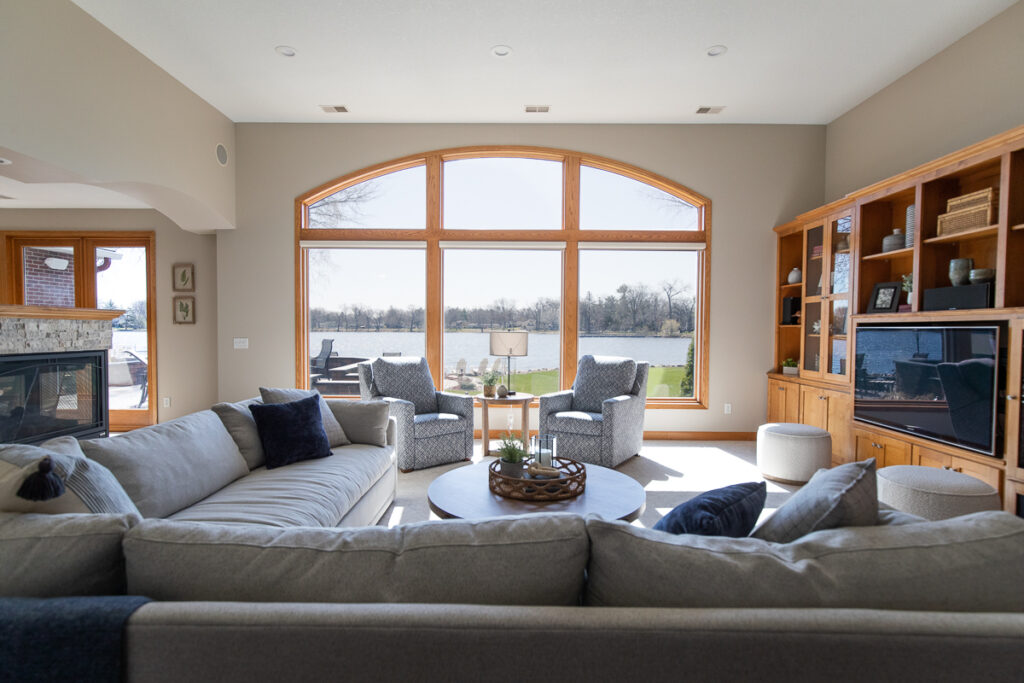
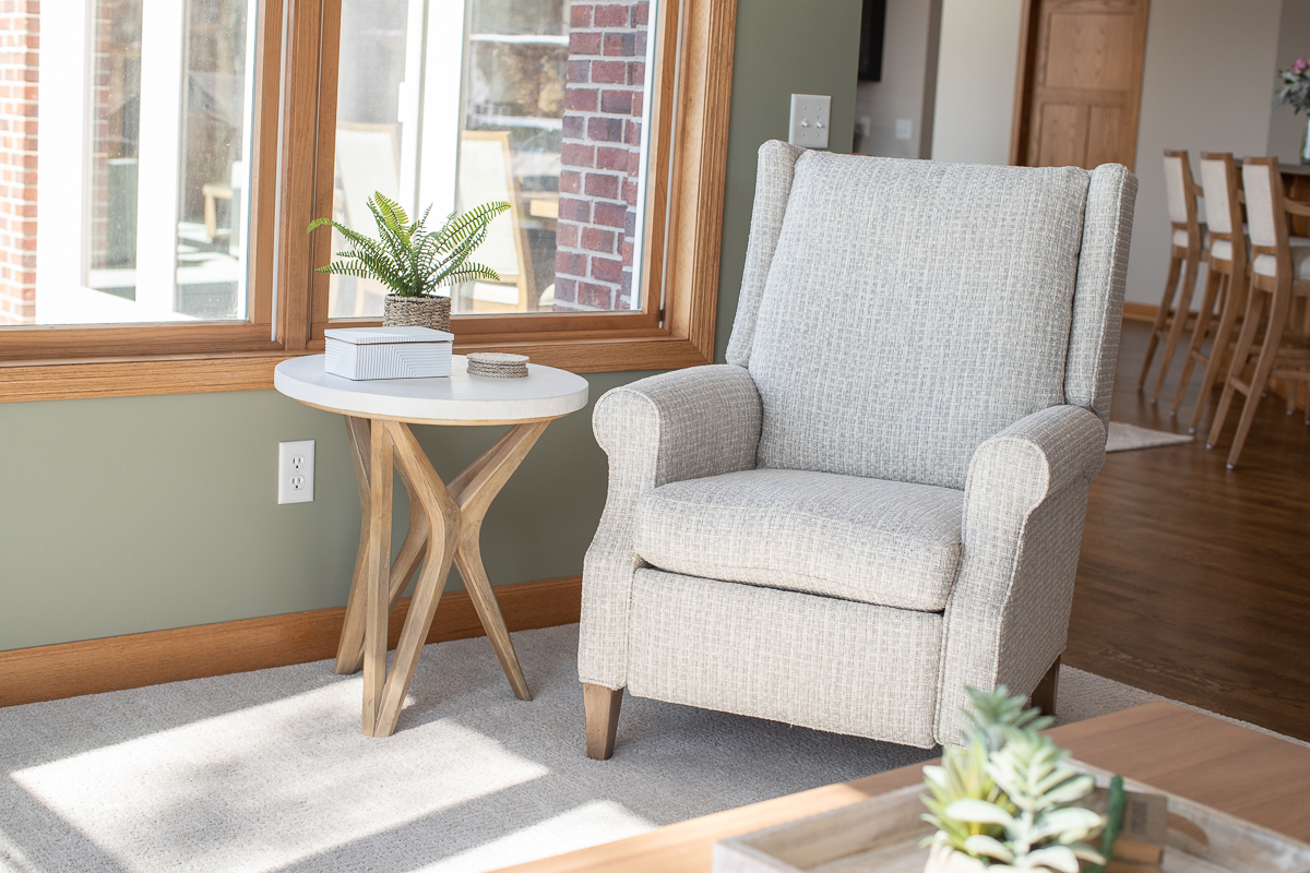
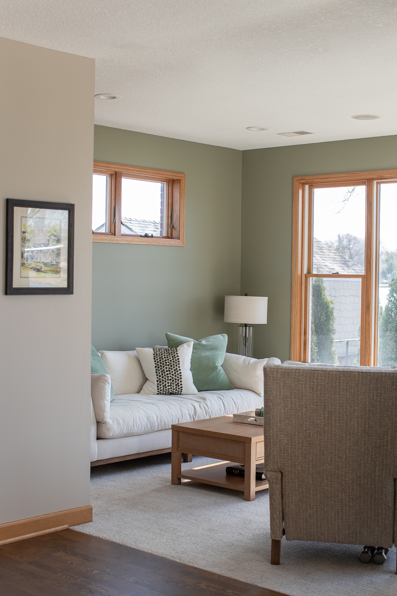
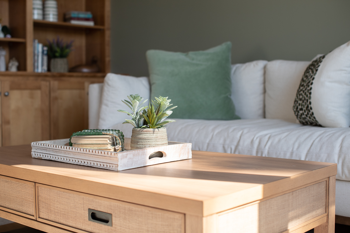
The main priority for the living room was to replace the outdated and worn furniture, put a fresh coat of paint on the walls, and replace the carpeting. Our clients did not want to paint the cabinets or wood trim, so we worked with the warm wood tones and brought in a much lighter and brighter palette. The fireplace also received a facelift. The old, dark and boring tile surround was removed and a beautiful ledgestone was used to blend a warm and cool combination of colors and interesting texture.
THE BAR AREA
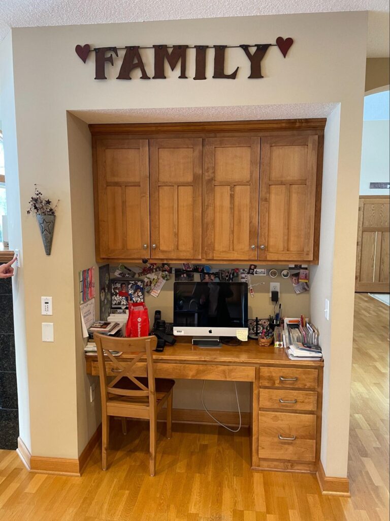
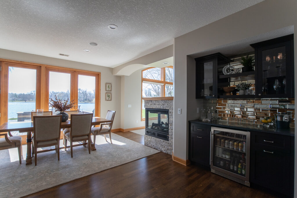
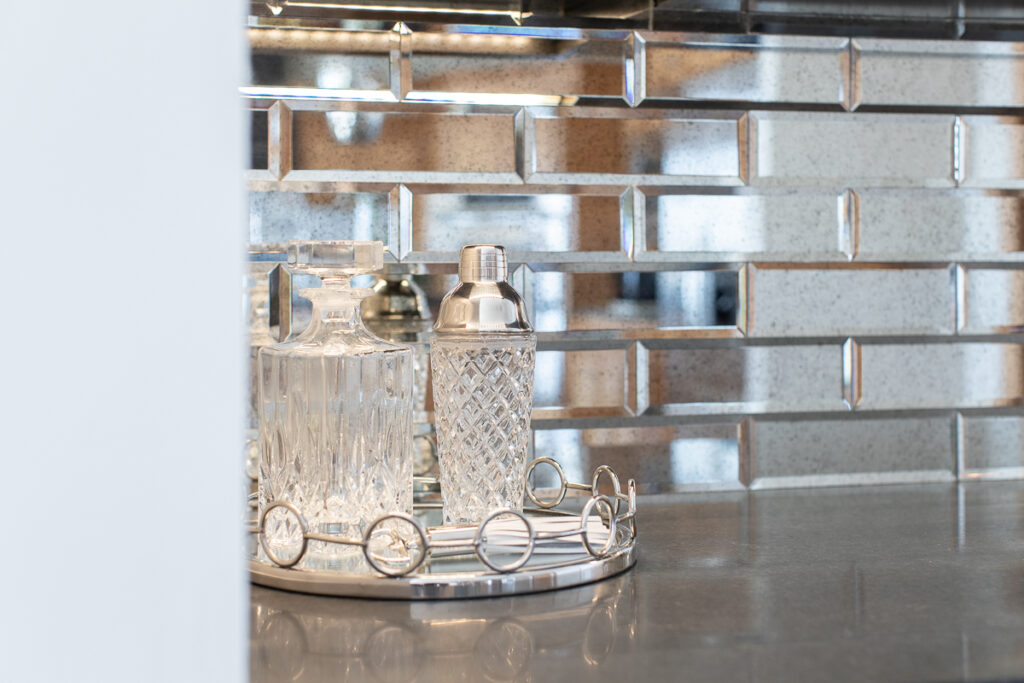
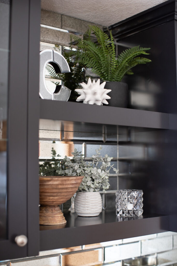
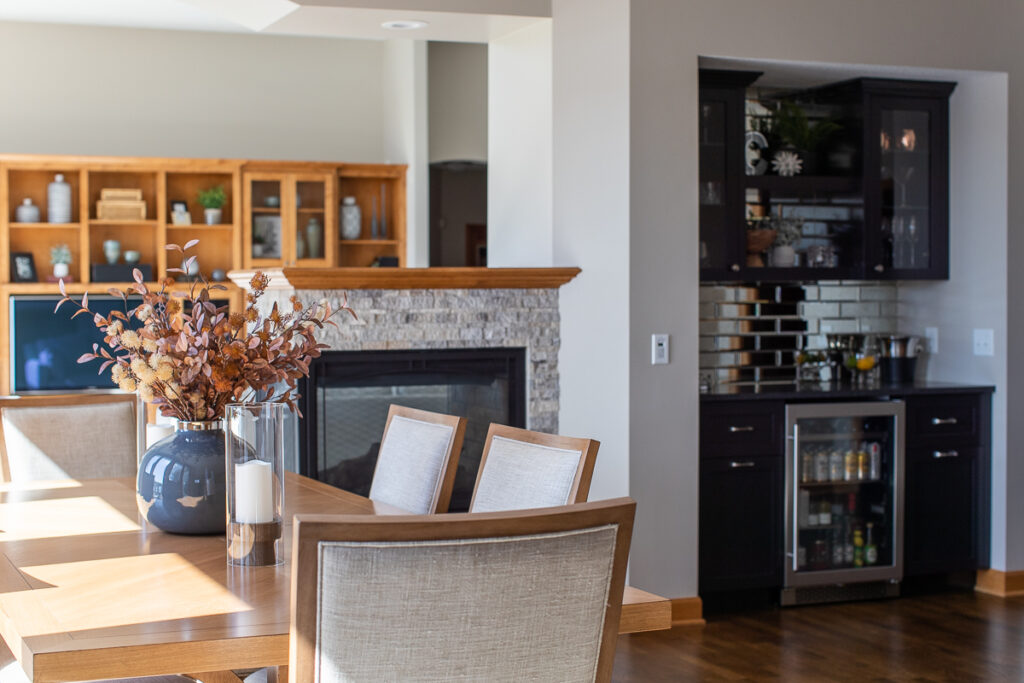
As many homes built in the late 90s had, a desk area was part of their kitchen space. I’m not sure why everyone thought desks in the kitchen were such a great idea at the time, but I feel like most people want to rip them out in current times! We realized that they rarely get used, and always look cluttered and messy. Our clients felt exactly that, and we suggested turning it into more of a dry bar for entertaining friends and family. All cabinetry was removed completely and a beautiful new bar area was custom-built to make this space functional and also fun! The glass cabinets with internal lighting and the antiqued mirror backsplash really make the space feel special. I have a feeling that this little spot will become a favorite for everyone!
SUNROOM
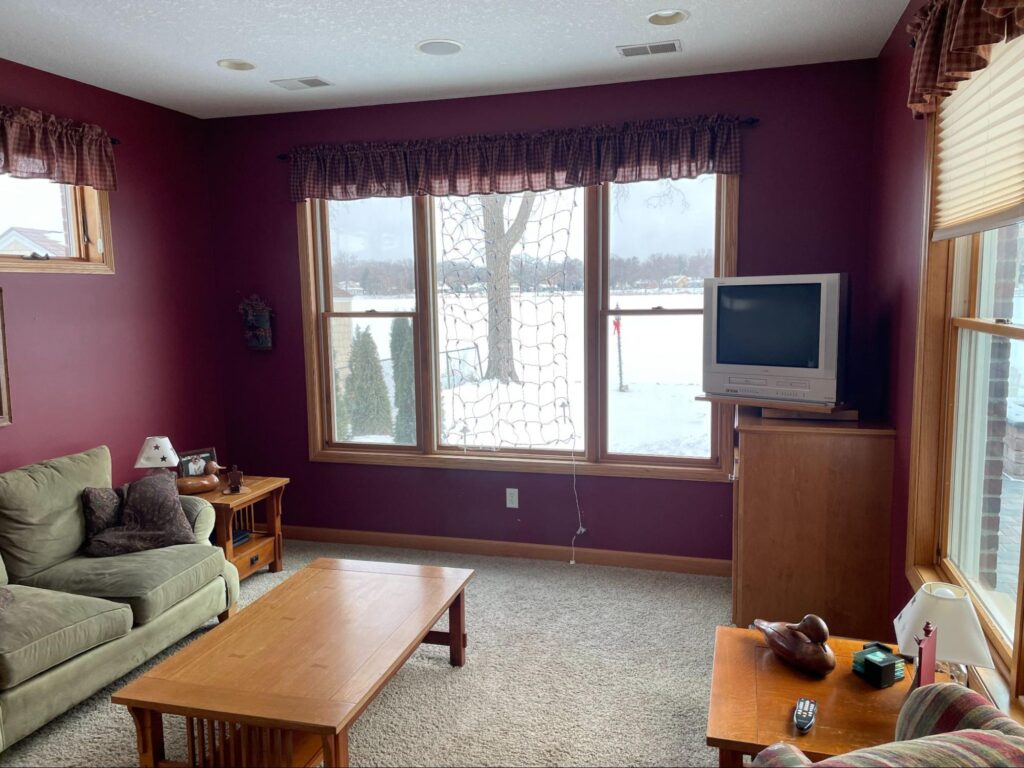

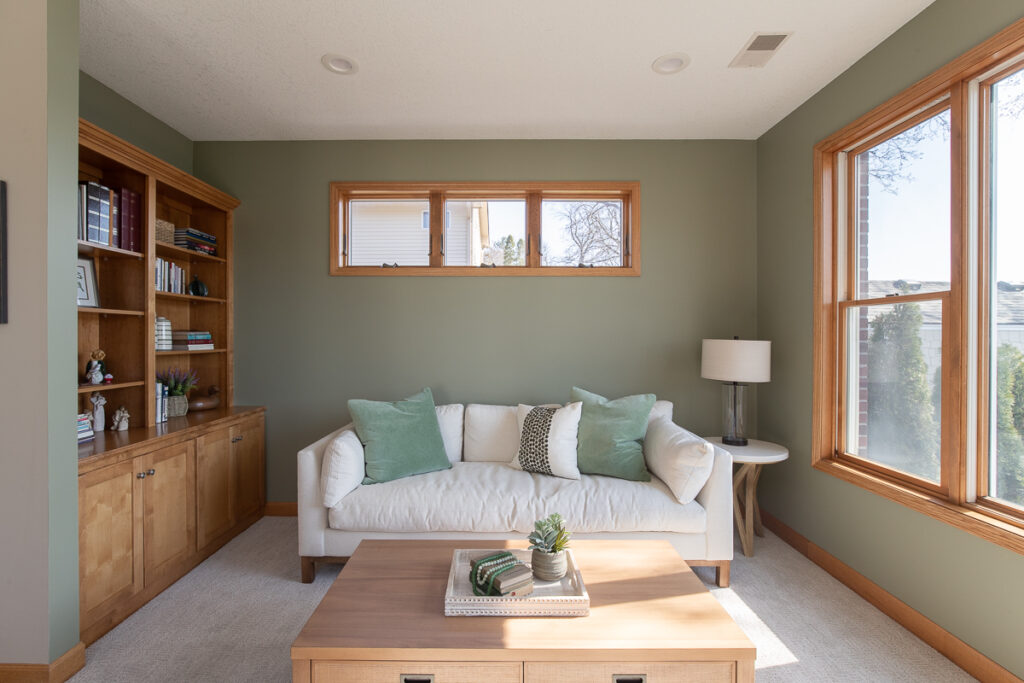
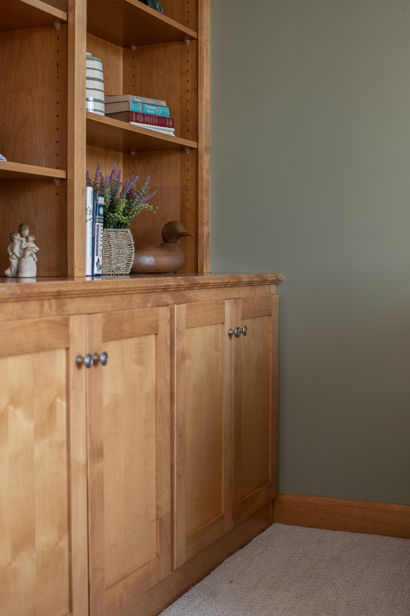
The sunroom was one of the favorite spots for our clients to hang out, but it was feeling quite dark and dated and needed some love. We removed the dark red walls, painted the room a happy shade of green, had a new custom-made corner cabinet, and added new carpeting. We then had the joy of adding furniture, window treatments, and accessories. The sunroom now feels like a sunroom – bright, sunny, fresh, and comfortable. I’m sure they will enjoy spending a lot of time here, even more than before. And the bonus is the beautiful view of the lake!

THE KITCHEN & DINING AREA
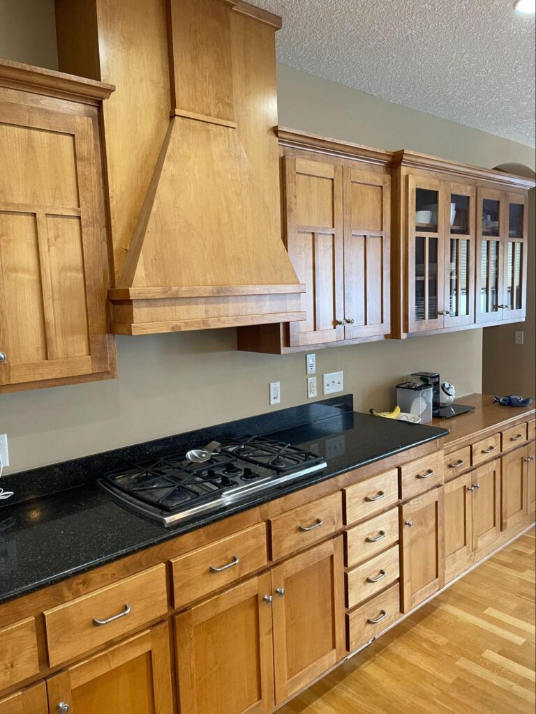
Kitchen Before 
Kitchen Before 
Dining Room Before
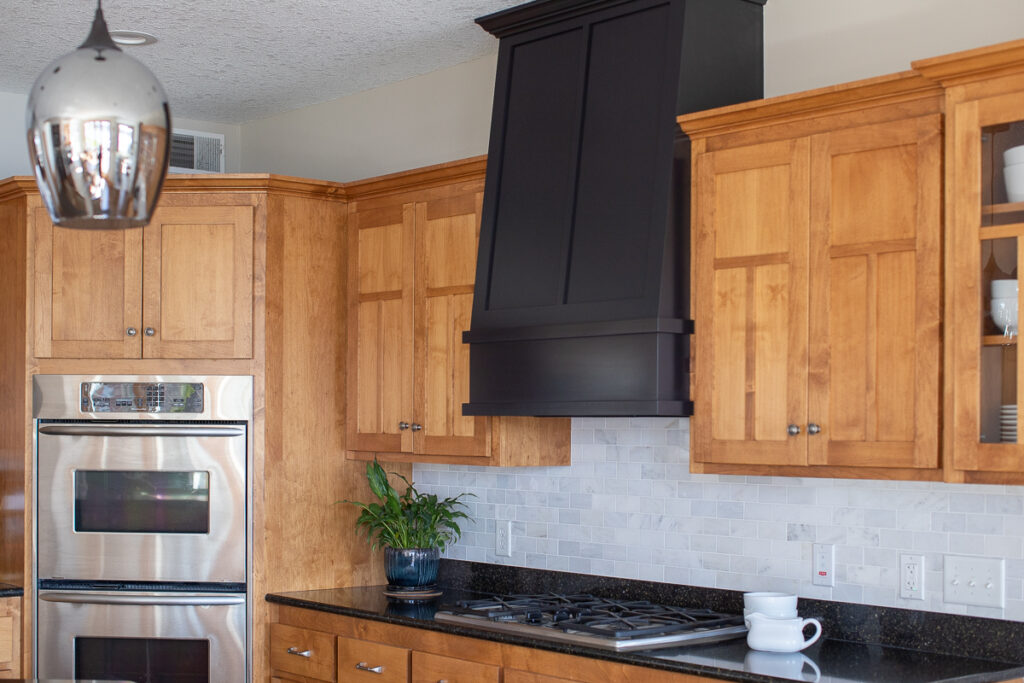
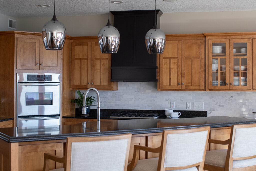
The kitchen and dining area just needed a few changes to make it feel more current. We redesigned the hood vent cover and painted it black to tie it in the with new bar and add a contrast to the warm wood cabinets. We added a pretty cararra marble backsplash tile to dress up the kitchen and brighten it up a bit. Lastly, we updated the light fixtures and brought in gorgeous bar stools and a new dining set from Barclay Butera for Lexington furniture. This house is now ready to host all the holidays in style!

GUEST BATHROOM

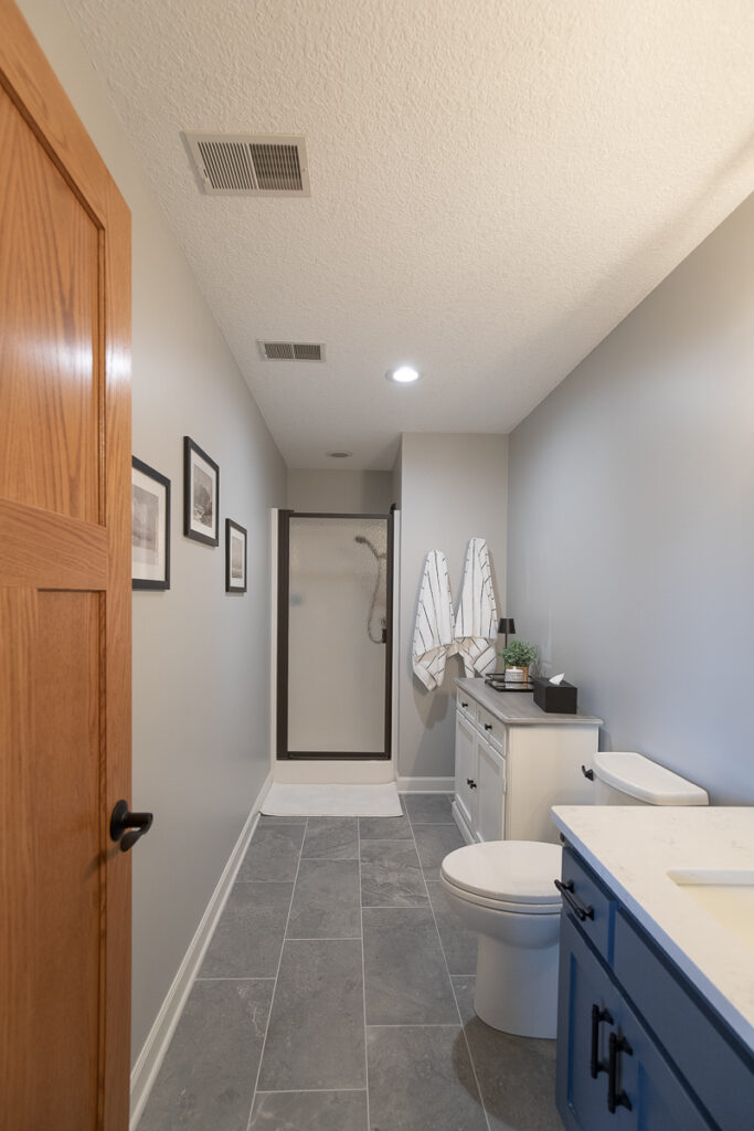
The guest bathroom had an awkward locker-style cabinet that was a point of contention between our clients. We had a lot of laughs about their disagreement as to whether it should stay or go, but in the end, SHE won and the locker cabinet was removed! We updated the bathroom by replacing the floor tile, vanity, toilet, all plumbing fixtures, mirror and light fixtures, and it got a fresh coat of paint.

PRIMARY SUITE
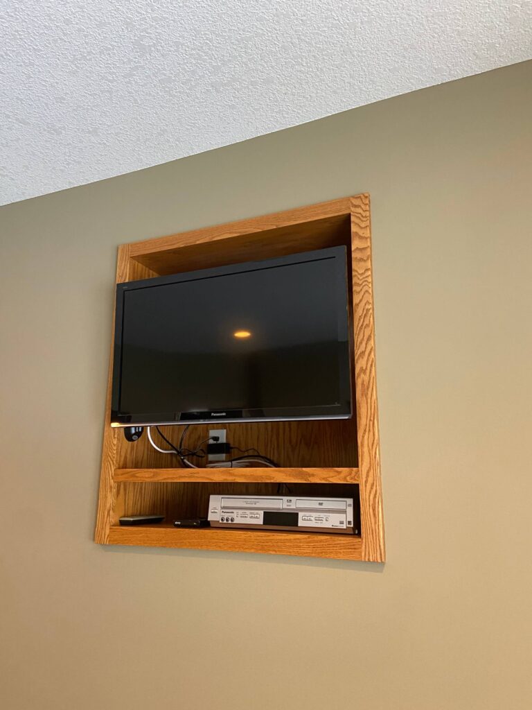
TV Wall Before 
Bedroom Before 
Bedroom Before
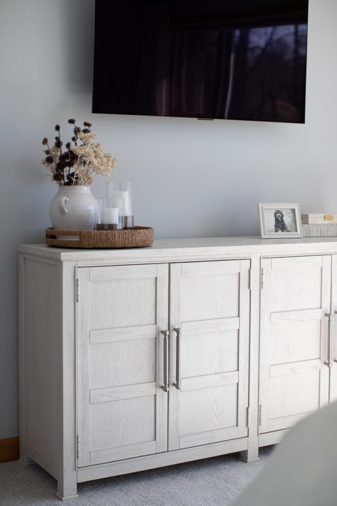
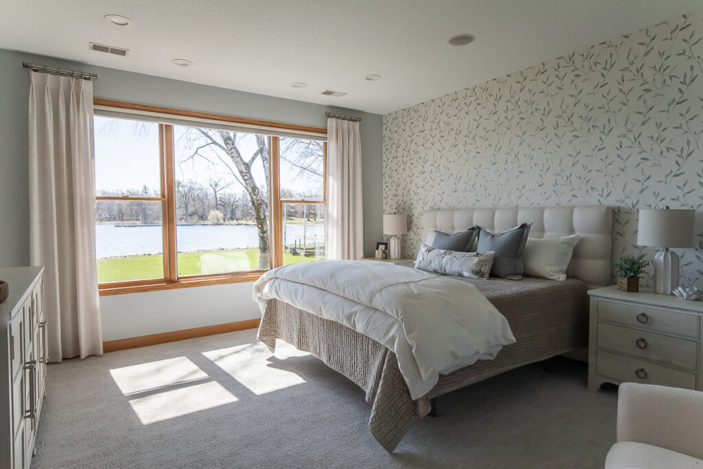
We painted the bedroom walls a pretty silvery blue, added gorgeous draperies and wallpaper, all new luxurious bedding, all new furniture, and new carpeting. Every square inch of this primary bedroom feels light, bright and elegant. I love how beautiful and fresh it feels when you enter the room!
PRIMARY BATHROOM
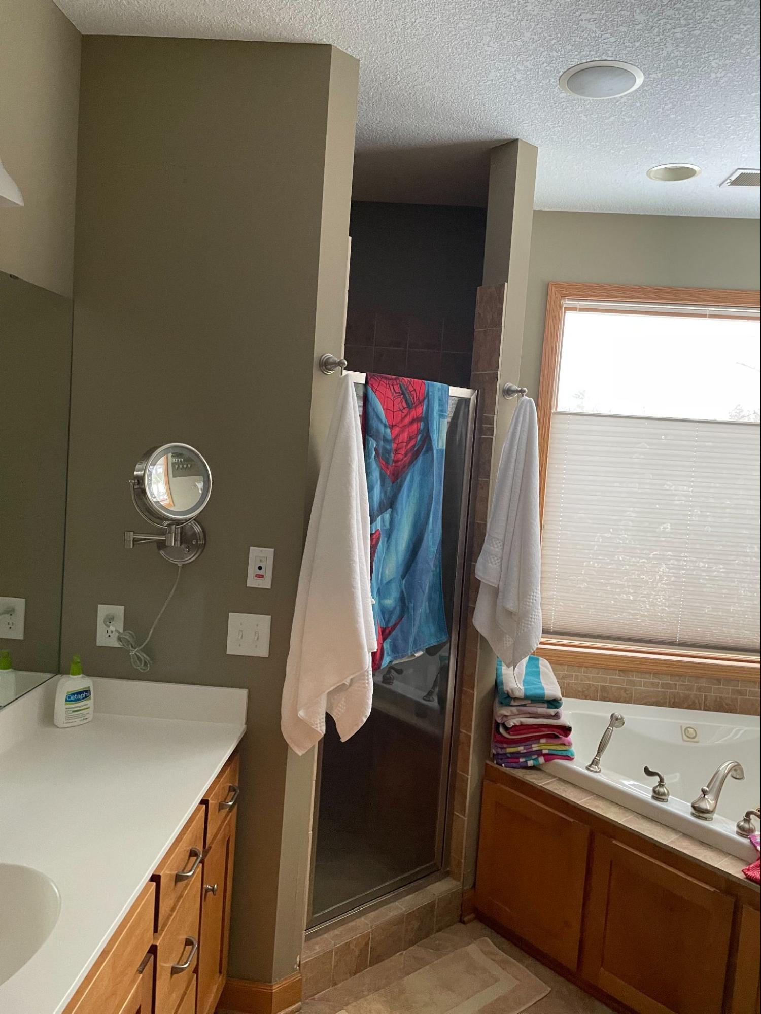
Bathroom Before 
Bathroom Before 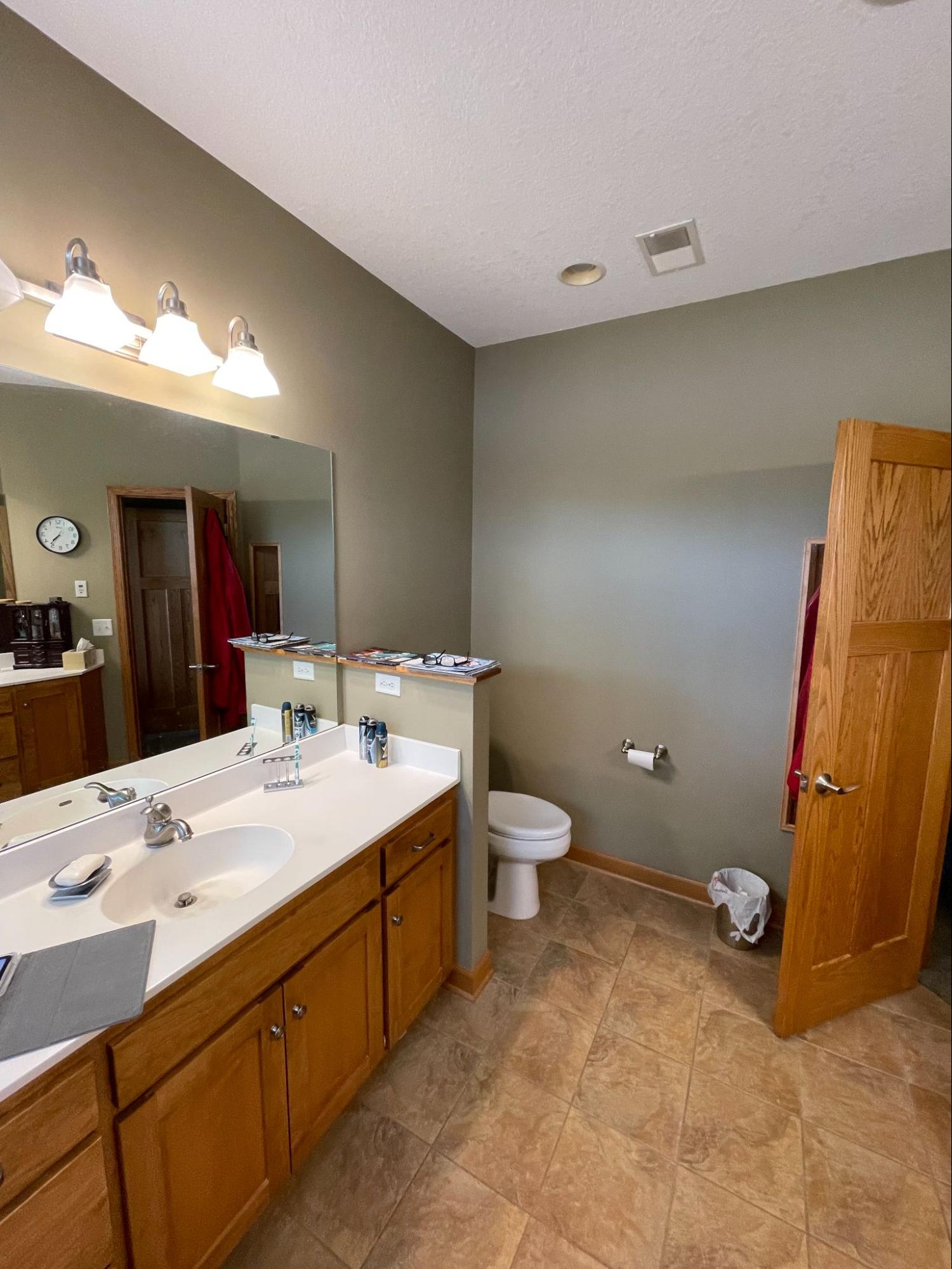
Bathroom Before
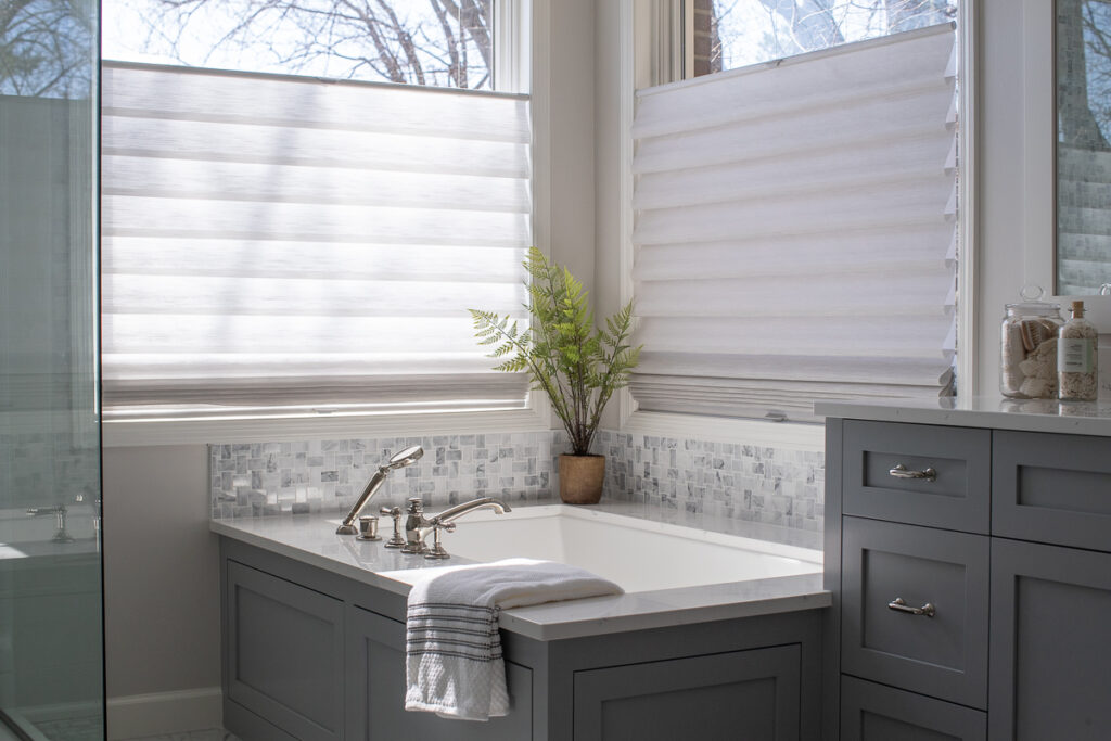
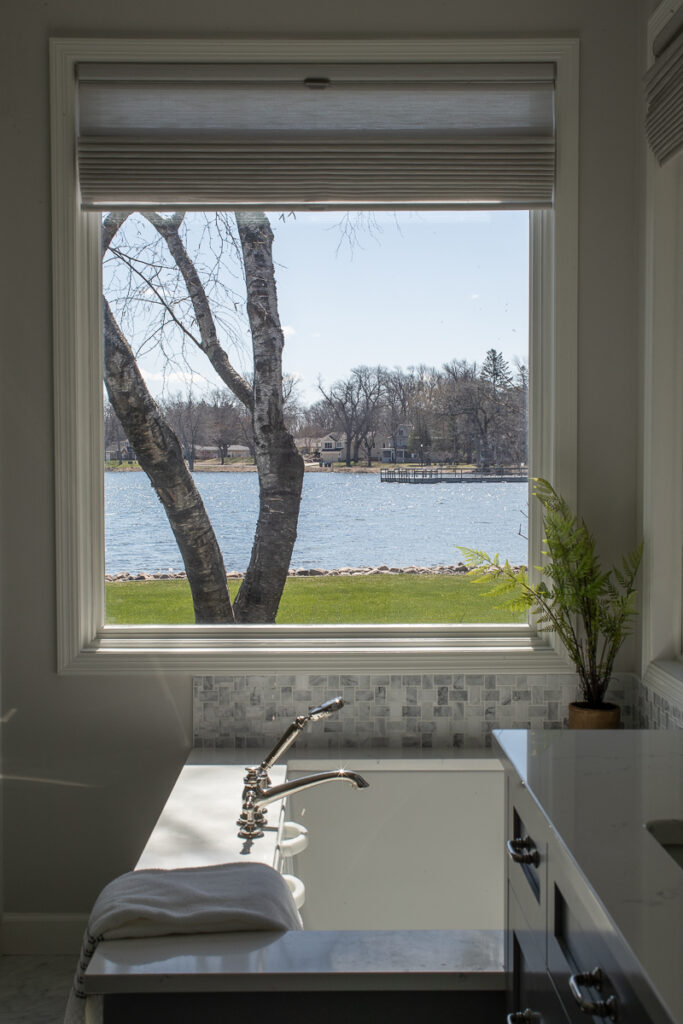
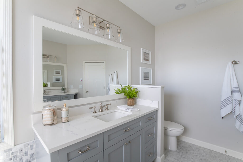
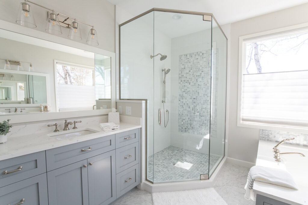
The bathroom needed a full gut and remodel. Our biggest challenge was the bathtub. Their corner jacuzzi tub had plumbing that ran underneath the corner that stuck out into the bathroom further than a new tub would. Due to the home being on a slab and having heating run through the poured foundation, we were very limited on moving the plumbing and thus very limited on the placement, size, and configuration of a new tub. Our homeowners really wanted a free-standing bathtub with a floor-mounted tub filler, but that option was not feasible. Our final choice ended up being a very nice compromise and they now have a nice deep soaking tub with a beautiful tile surround. All new custom cabinets were made with a pretty blue paint color and gorgeous quartz countertops. Custom framed mirrors, all-new plumbing and light fixtures, and pretty Hunter Douglas Roman shades all work together to make this bathroom feel fresh and bright. The icing on the cake is the new shower! It is so much more spacious and functional. Beautiful marble tile accents and a double showerhead and built-in shelving provide everything they need. Getting rid of the walls and adding a new frameless glass surround makes the shower feel twice as large and allows the sunlight to pour in. Starting the day out in this room has got to make our clients happy! And shout out to APEX Construction for the beautiful remodeling work on the bathrooms and kitchen!

We had so much fun working with this wonderful family, adding more spaces and rooms as we went along! We would keep working with them forever if we could! 😊 Maybe they’ll want to do their 2nd level or garage next, haha! We hope they absolutely love their new look and get many years of enjoyment out of it!
Love reading project reveals and learning about the design behind the photos? Be sure to subscribe to our newsletter to the blogs sent straight to your inbox!
XO,
Amy & The Interior Impressions Team




Love it!
Thank you!