A NEUTRAL, VINTAGE-INSPIRED BATHROOM REMODEL
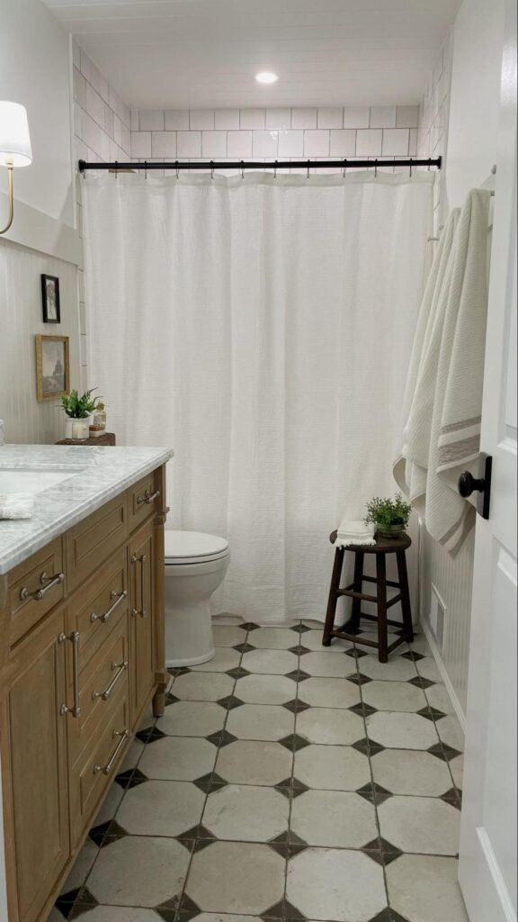
At Interior Impressions, we take pride in regularly offering updates and glimpses into our ongoing projects with our valued clients. This time, we are thrilled to shift the spotlight onto a personal home project from one of our very own. Our Senior Designer, Kierstyn, recently renovated her main level bathroom and we are loving the transformation. In this blog post, Kierstyn will share the details of her remodel, including her sources of inspiration, material selections, and remarkable before-and-after photos. Please join us as we take a closer look at Kierstyn’s exceptional work!
KIERSTYN UNVEILS THE BACKSTORY
My husband and I bought and moved into our first home in 2019. It wasn’t anything special– your standard split level, early-2000s, builder-grade home. We loved the location, the big yard for our pups, the thought of starting a family here, but most importantly, the house was a dated, blank slate to make our own. We started with small, cosmetic upgrades to the house, like painting all the walls and trim and swapping out light fixtures. Within the first few years we moved onto larger projects, like replacing all of the doors, ripping out all of the carpet and linoleum tile and upgrading to engineered hardwood floors, and even remodeling the kitchen. At this point, we had nearly touched every surface of the interior, but we still had one project on our list that we knew we wanted to tackle– our main level bathroom.
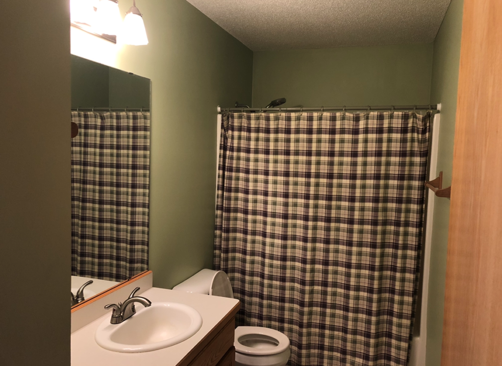
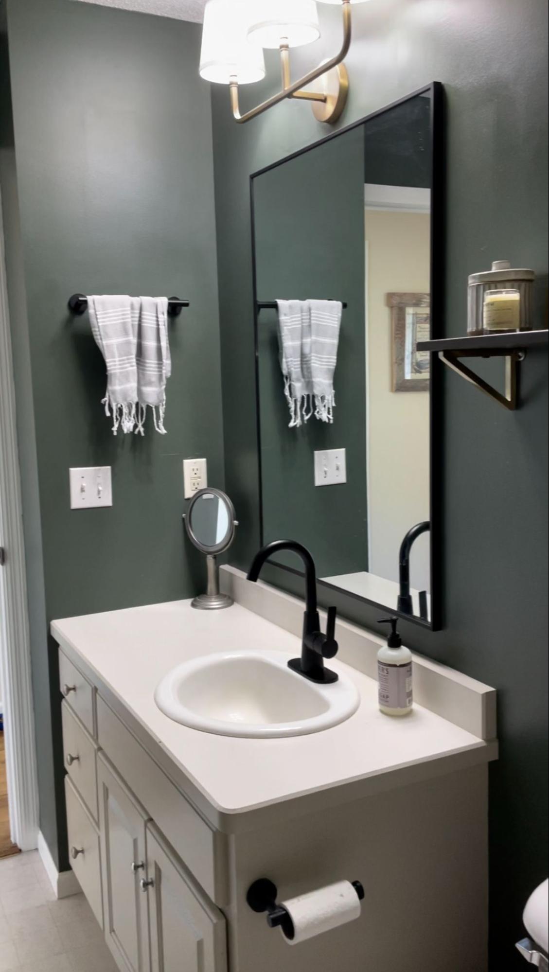
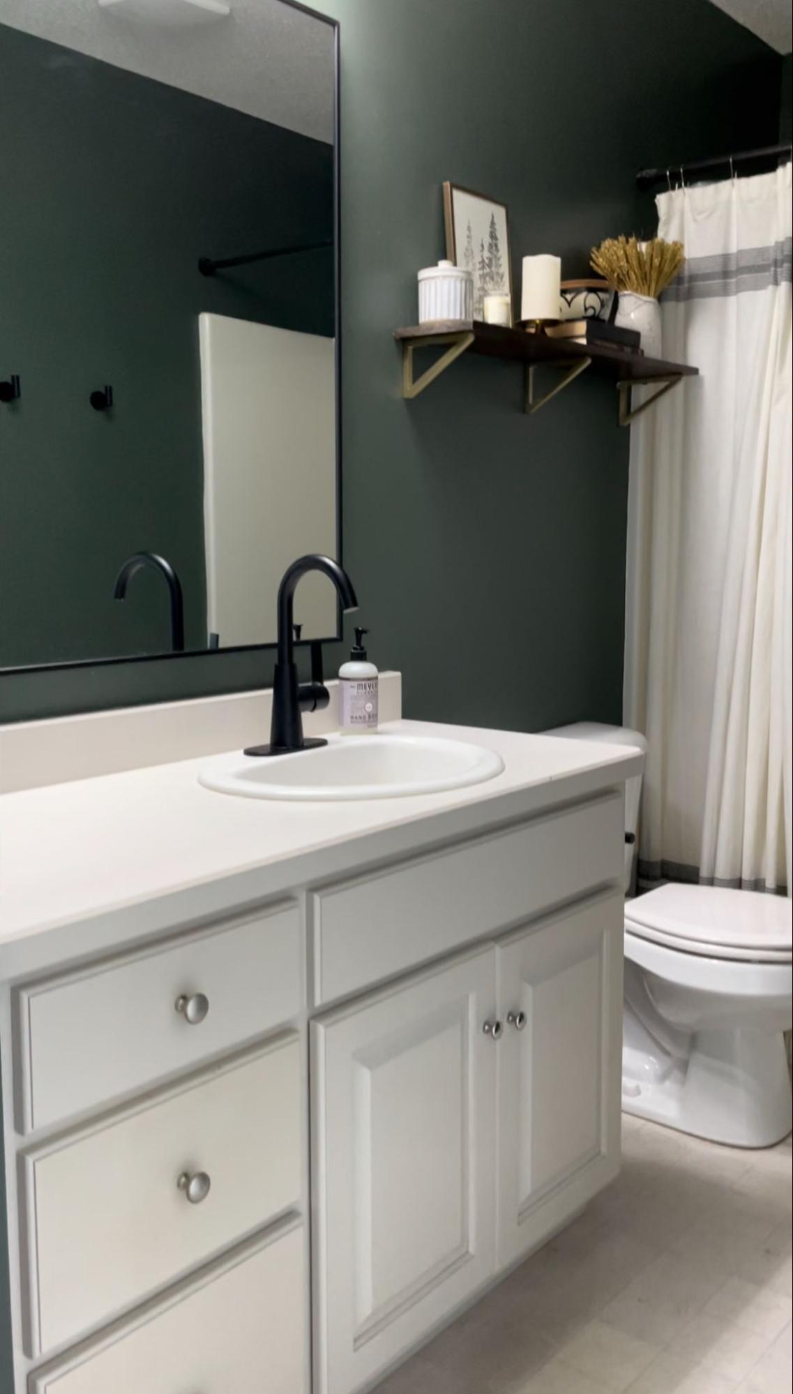
When we first moved in, this bathroom was the definition of dated. Mint green walls, honey oak cabinets, laminate countertops, vinyl flooring. We immediately made some cosmetic upgrades, like painting the walls and vanity and upgrading the fixtures. But this was just a band aid on the wound, I had bigger and better ideas for the space! I woke up one morning, looked at my husband and said, “We’re going to start the bathroom project today.” And that’s we did!
THE INSPIRATION
If you know me, you know I have a deep love for all things vintage. Many of the furniture pieces, artwork and knick-knacks in my home are vintage or thrifted. I appreciate the stories they tell and the sustainability of reusing found pieces in your home. The essence of my design style is really about the balance of the old with the new. When it came to designing the bathroom, I knew there wasn’t much room for bringing in vintage items to the design. Instead, I focused on a vintage-inspired aesthetic and selections that were quality, but that weren’t going to break the bank.
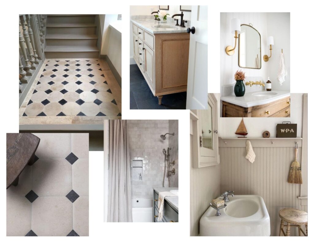
When it came to the bathroom inspiration, I knew I wanted to keep things very light, bright and neutral. Our bathroom did not have any windows, and the lighting was definitely lacking. There were a few materials that I knew I wanted to incorporate. First, the tile. I knew I wanted a simple, clean looking bathroom, but I didn’t want it to be boring. So how could I bring in some pattern and personality with a look that I wouldn’t be sick of in a few years? One of my favorite, old-world looks is an octagon style tile. It’s classic, it’s vintage-y and it’s just the right amount of personality that the bathroom needed. Second, I knew I wanted to bring some sort of millwork pattern on the walls. Beadboard was the immediate answer, as it’s a nod to traditional, Victorian homes. Lastly, considering that I wanted to stay neutral with all of the finishes, a wood vanity was a must to bring in some warmth.
THE SELECTIONS
THE TILE
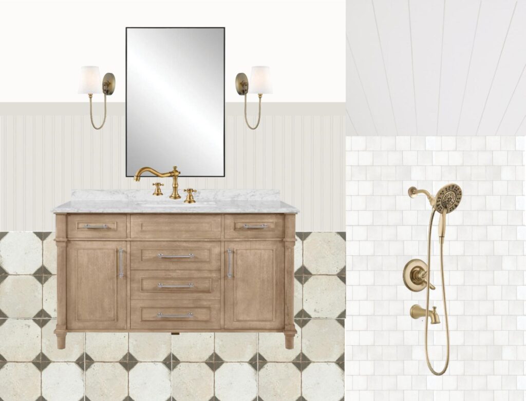
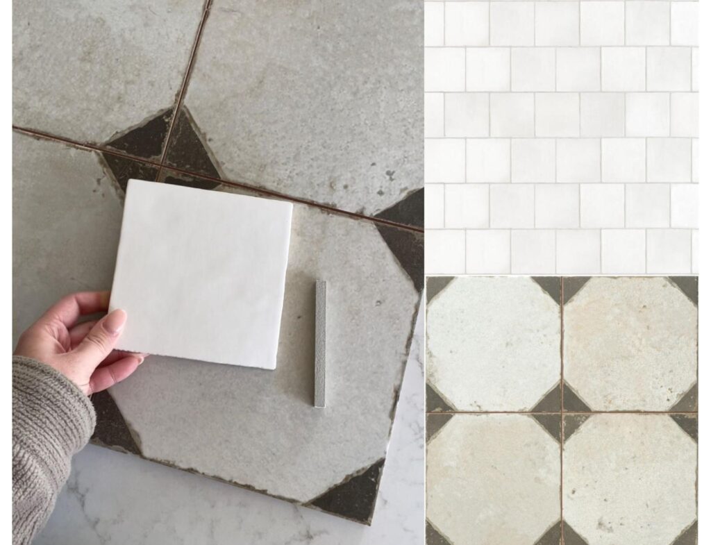
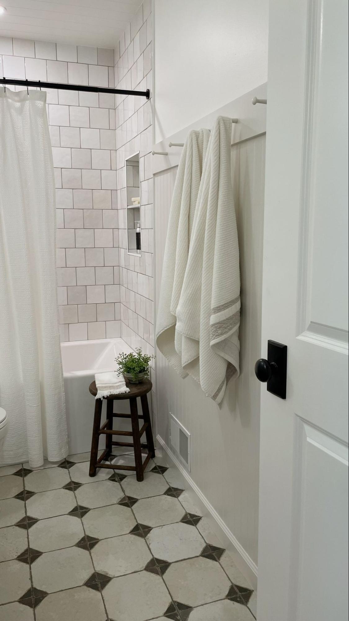
Again, the goal was to get the look without blowing the budget. The octagon floor tile I loved– typically a stone and marble combination– was way out of my budget. So I researched and I researched and landed on this porcelain dupe from The Tile Shop that gave me the same look for a lot less. Sold!
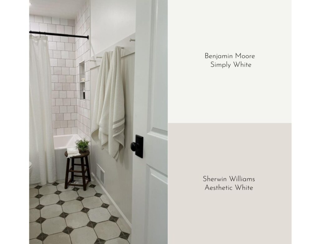
Knowing that we wanted to keep a bathtub in this bathroom, I wanted the shower wall tile to stay simple and neutral. We opted for this warm white, artisan-style, square tile from Ceramic Tile Works with a little bit of color variation for some texture and interest. We went full height to the ceiling with the tile (always go full height!) and installed it in a half-set pattern, because I felt like a straight set pattern would feel too modern.
VANITY
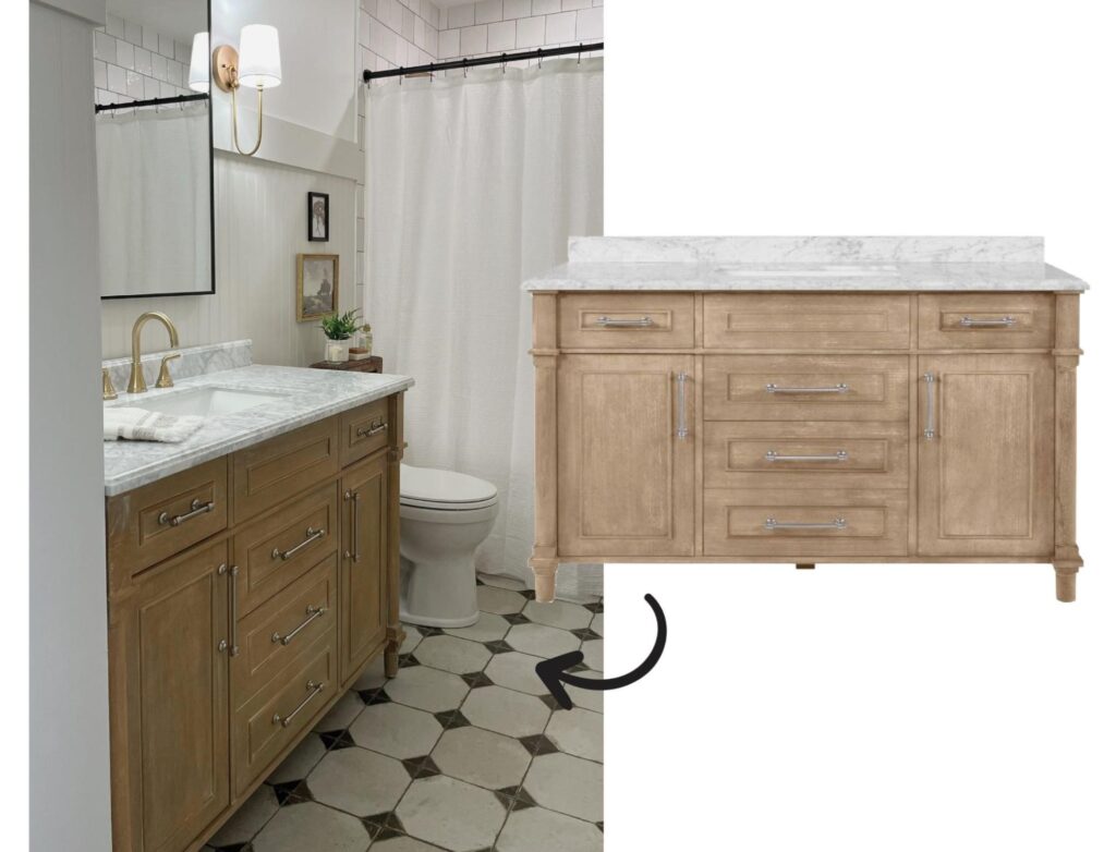
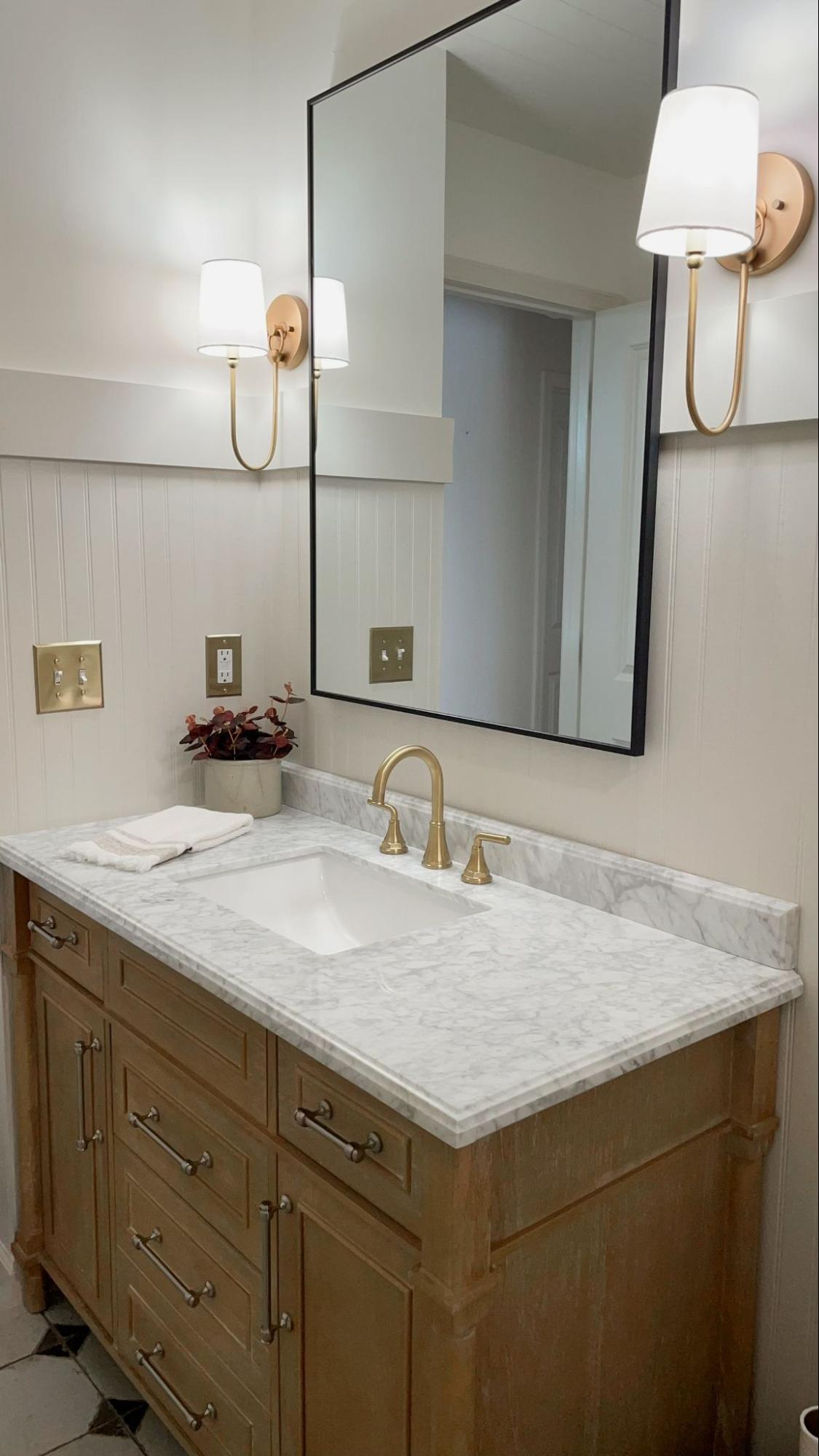
I was in search of a wood vanity that had a little bit of a traditional look to it and that had lots of storage. I found this option for under $1000 from Home Depot, and bonus that it had a Carrara marble countertop!
PLUMBING FIXTURES
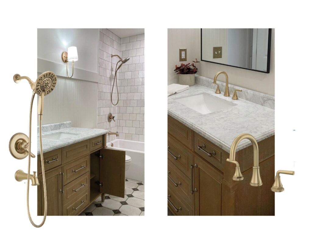
I wanted to bring in brass accents, and plumbing fixtures were the perfect area to do this. A minimal, but impactful look. For the shower faucet, I wanted a shower head that had the functionality of a sprayer so that we could bathe our pups. This Delta style was the perfect fit.
I swear I ordered two or three different sink faucets trying to find the right brass color to go with the vanity sconces I wanted. I finally landed on this option from Floor & Decor.
LIGHTING
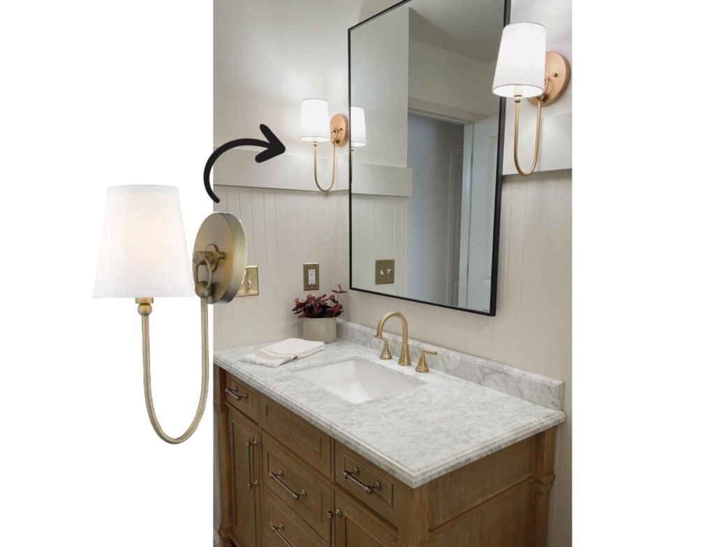
As mentioned previously, this bathroom lacked good lighting, especially with not having any windows. To fix this, I opted to split the old overhead vanity light into two wall sconces from more direct lighting, and we also added a recessed light over the shower.
Picking out the vanity sconces was one of the hardest decisions I made! There are just so many options out there, and I toggled back and forth for several weeks. Finally, I landed on one of the first options I chose. I love the mix of the brass and linen shade, and the soft curves that give it a more traditional feel.
PANELING & PAINT
One of the first things to go in the bathroom was the good ol’ popcorn ceilings. I thought about just having the ceilings textured and painted, but decided to bring in some shiplap paneling instead to add some interest.
Adding beadboard paneling to all of the walls was a must to bring an elevated look to the bathroom instead of just paint on the walls. The big question was whether to bring the beadboard full height to the ceiling, or bring it up two-thirds of the wall. Ultimately I decided to only bring it up two-thirds of the wall because one, I didn;t like all of the lines with both the walls and ceiling having paneling and two, it gave the wall a good stopping point for a paint transition and I could add the peg hooks to the railing for towels.
I explored several paint colors for the beadboard paneling. Generally, I wanted to stick with a neutral, taupe color. I was afraid of going too dark because I wanted to keep the entire space feeling light and bright, so I went with Sherwin Williams Aesthetic White which compliments the color of the shower wall tile nicely. For the upper half of the walls and ceiling, I chose Benjamin Moore Simply White– a warm, creamy white offering a subtle contrast to the beadboard paint color.
THE PROCESS
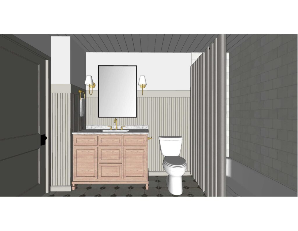
Once I had my selections nailed down, I used my designer skills and resources and created 3D renderings of the bathroom in Google Sketchup to help me visualize the space. It’s funny how easy it is as a designer to make decisions for your clients’ projects, but when it comes to your own house it takes ten times longer to process and come to a decision. Being able to play around in the 3D model and test out different materials, colors, etc. was very helpful for myself, and helped me feel confident in the decisions I was making.
All in all, because we did most of the bathroom work ourselves, the project took us about six months to complete. A verrrrrrry long six months if you ask my husband, but also a very rewarding experience being able to make this bathroom our own.
Here’s a quick 60 second recap of the entire bathroom remodel from my Instagram!
BEFORE & AFTER
PROJECT SOURCES
Like something you see? Here’s a full list of links for all the products used in our bathroom!
Vanity | Floor Tile | Shower Tile | Tub Insert | Shower Faucet | Sink Faucet | Mirror | Vanity Sconces | Brass Outlet Covers | Peg Hooks | Towels (Home Goods) | Shower Curtain (Home Goods) | Accessories (Thrifted from various sources)
Be sure to subscribe to our newsletter to get all of our blogs sent straight to your inbox!


I so enjoy reading these posts from all of the designers! Loved everything you did with your bathroom! Great idea for pegs to hang towels instead of towel bars! So fun!
Thank you so much Linda!