Welcome back to Part II of our X-Golf American Family Field project reveal! We’re so excited to continue sharing this project with you in detail, area by area. And let’s just say, we saved the best for last! So, let’s get to it.
the level two bar
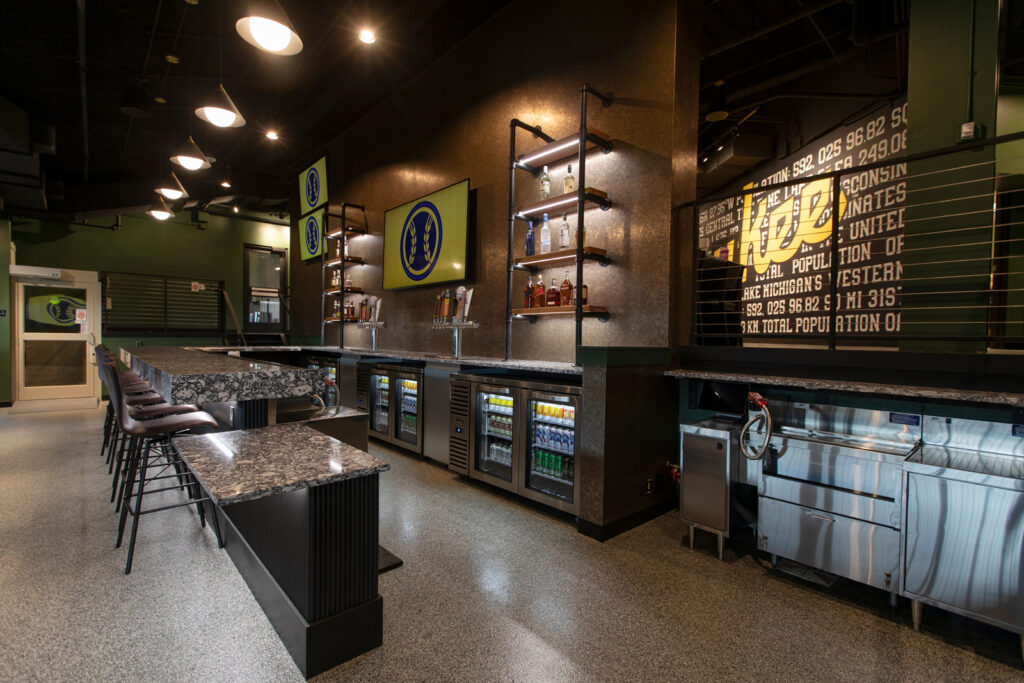
In Part I of the reveal, we shared with you the Level 1 bar area. Mirroring the Level 1 bar, we have the Level 2 bar with identical finishes. We wanted this space to feel like a continuation of the main bar, but slightly scaled down as it will only be used on game days at the ballpark. It’s main goal was to offer overflow bar service and seating, while giving awesome views of the ballpark.
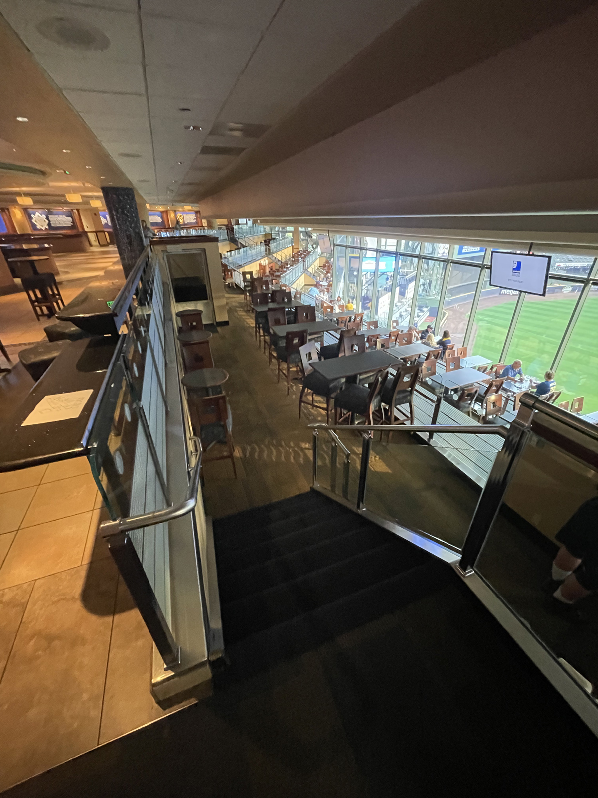
the before
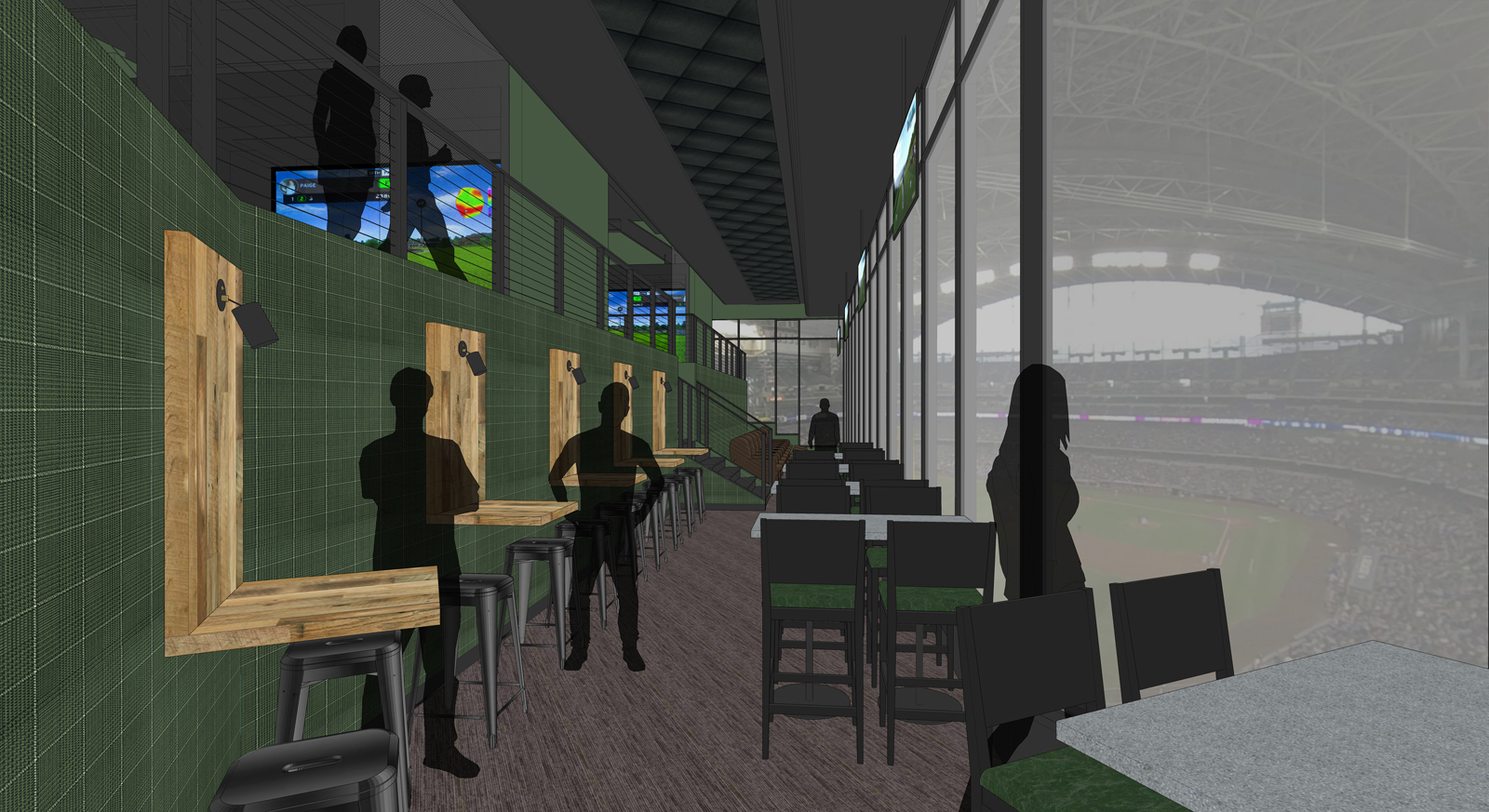
This space was previously used for dining seating with two different levels of seating. In the new design, we decided to extend the second level out further to gain more usable floor space and make a nice large bar area where people could gather and look out at the ballpark.
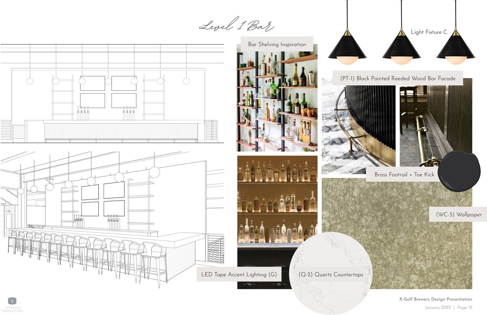
the Design Process
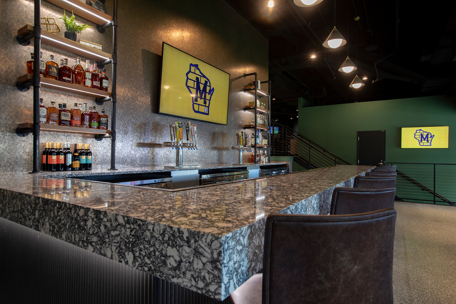
We mimicked the same finishes from the Level 1 bar area to make it feel cohesive and give the same, modern, industrial aesthetic. Once of the main features is the custom bar shelving, which we wanted to be both functional for liquor bottle storage, as well as a decorative element.
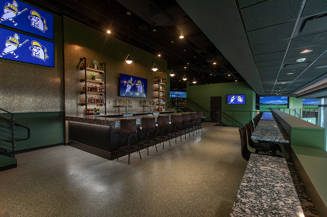
THE after
In addition to the bar area, we also added a bar ledge with seating looking out to the ballpark. This space is perfect for overflow seating and to give people a stellar place to sit, sip on a beverage and enjoy the views.
the banquettes + floating hightops
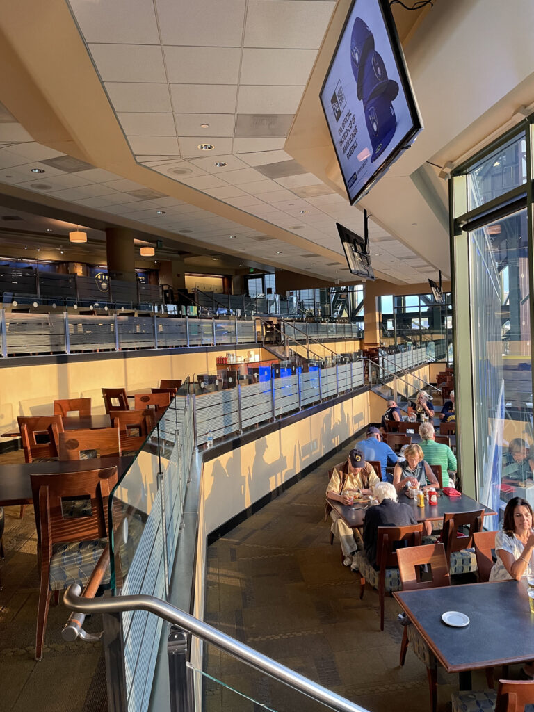
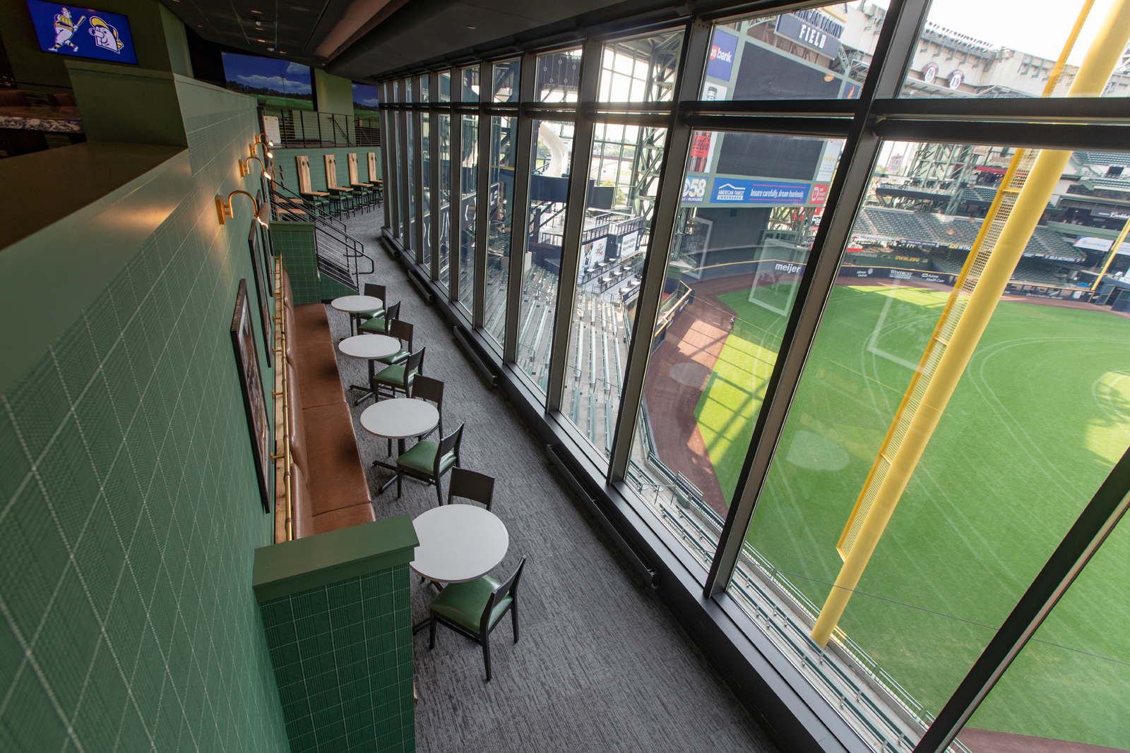
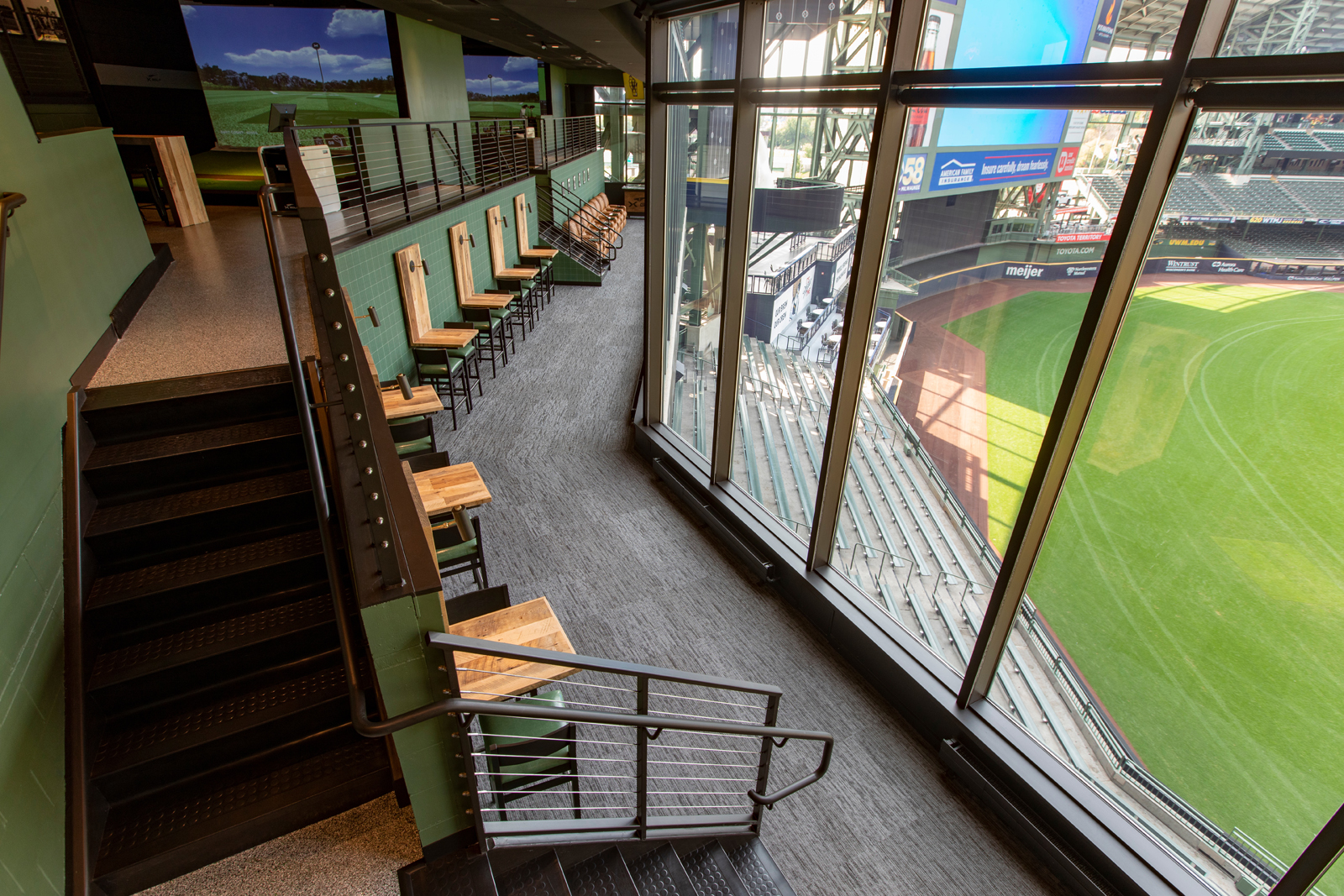
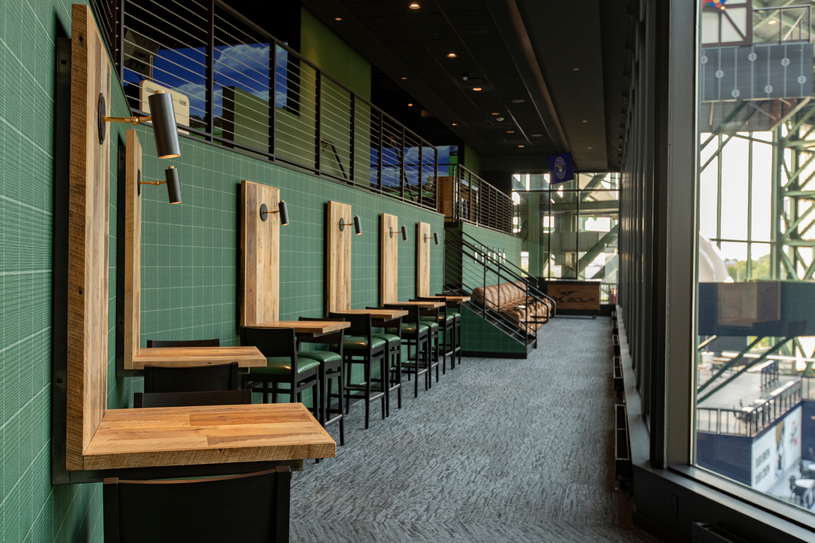
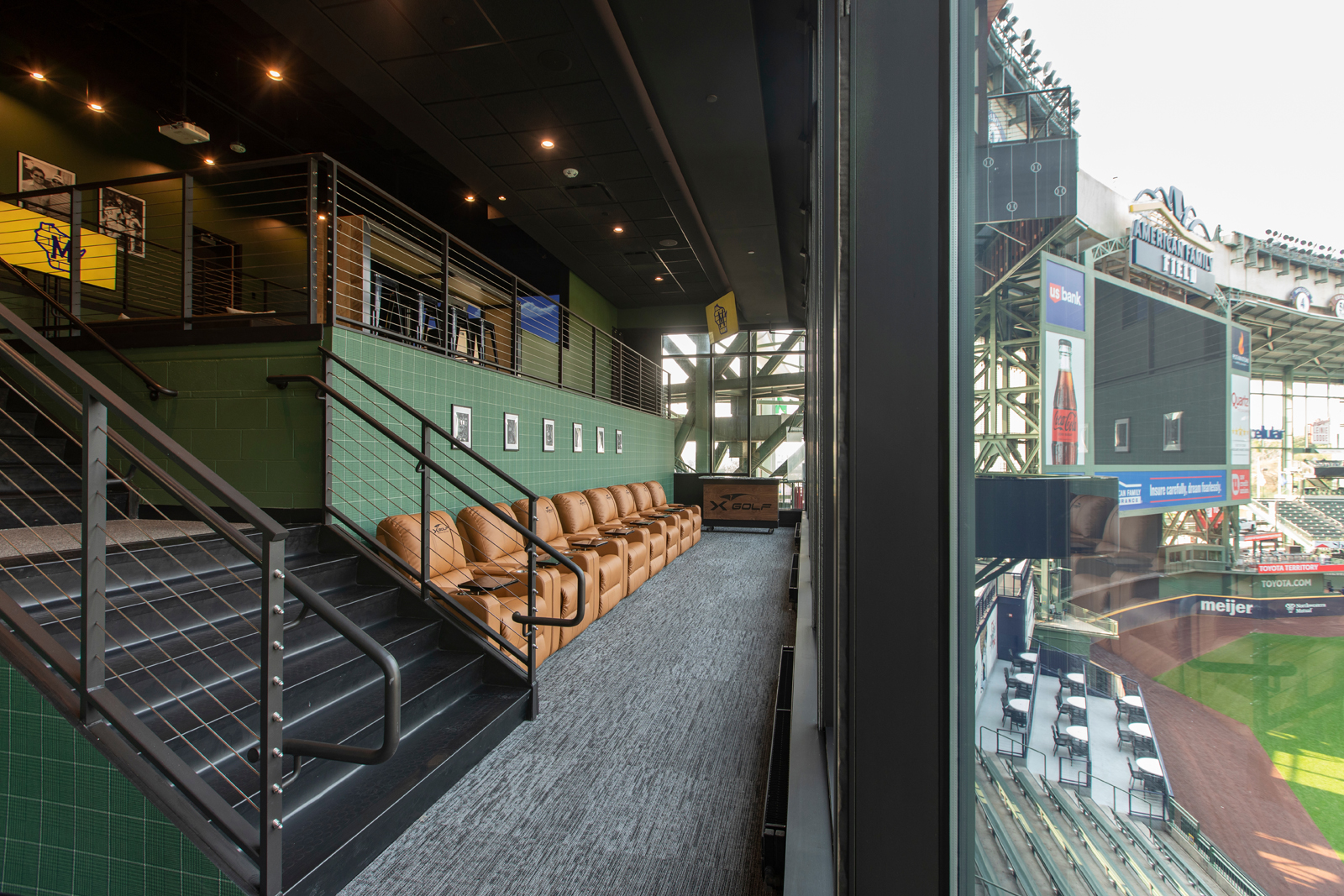
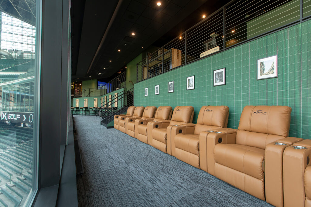
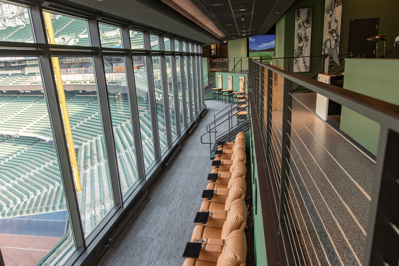
Perhaps our favorite design feature of the entire space, the lower level seating area was designed with one thing in mind: the best seats in the entire ballpark.
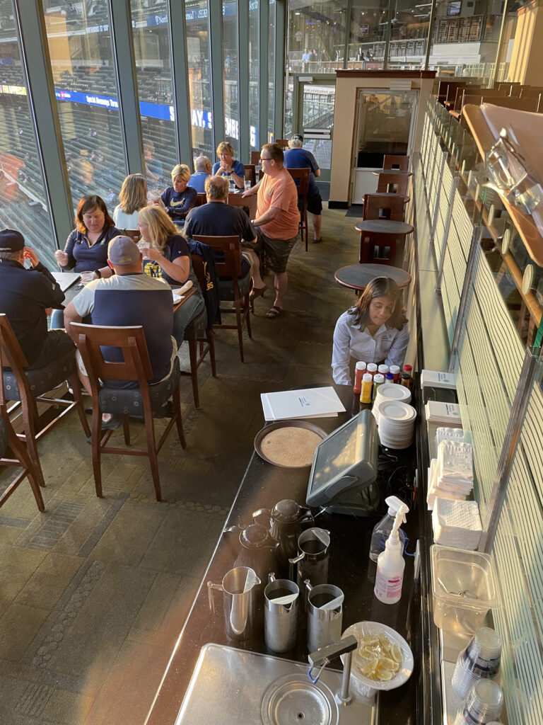
the before
When we first visited the previous space, we enjoyed some drinks and appetizers in this very area while watching a ballgame. We were so amazed at the killer views of the ballpark, being able to see everything from a unique perspective. Yet, something about the environment in which we were experiencing it didn’t feel right. The previous space was dated, had cramped seating and felt very bland. So we thought, how can we change this perception and utilize this space to its full potential?
the Design Process
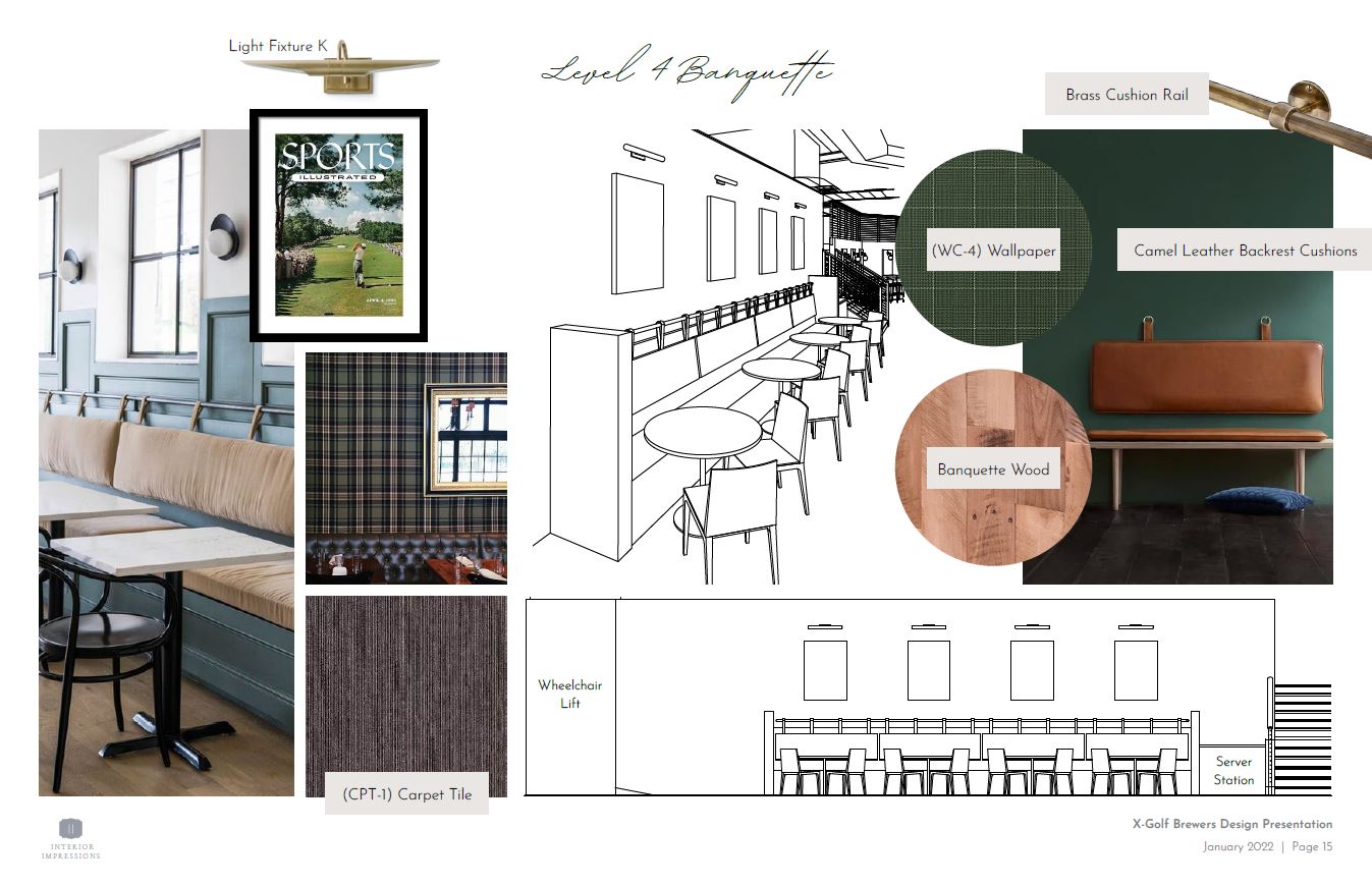
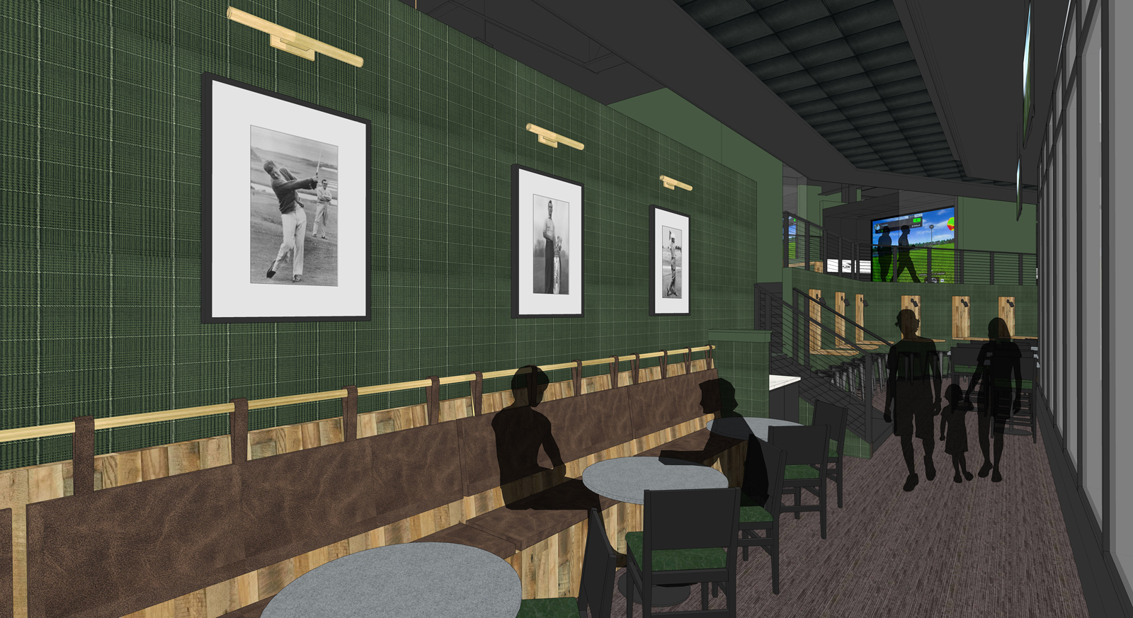
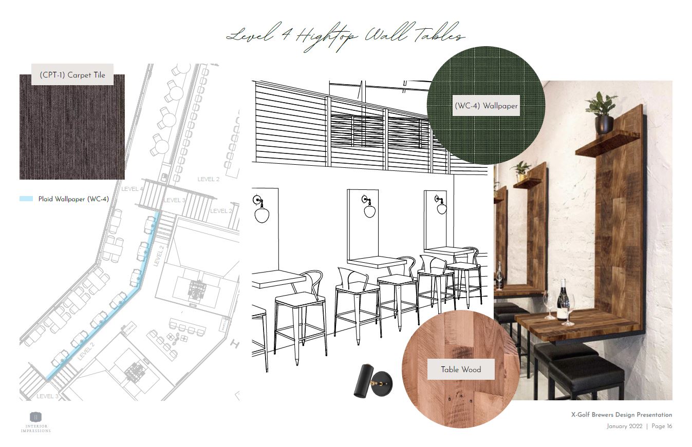
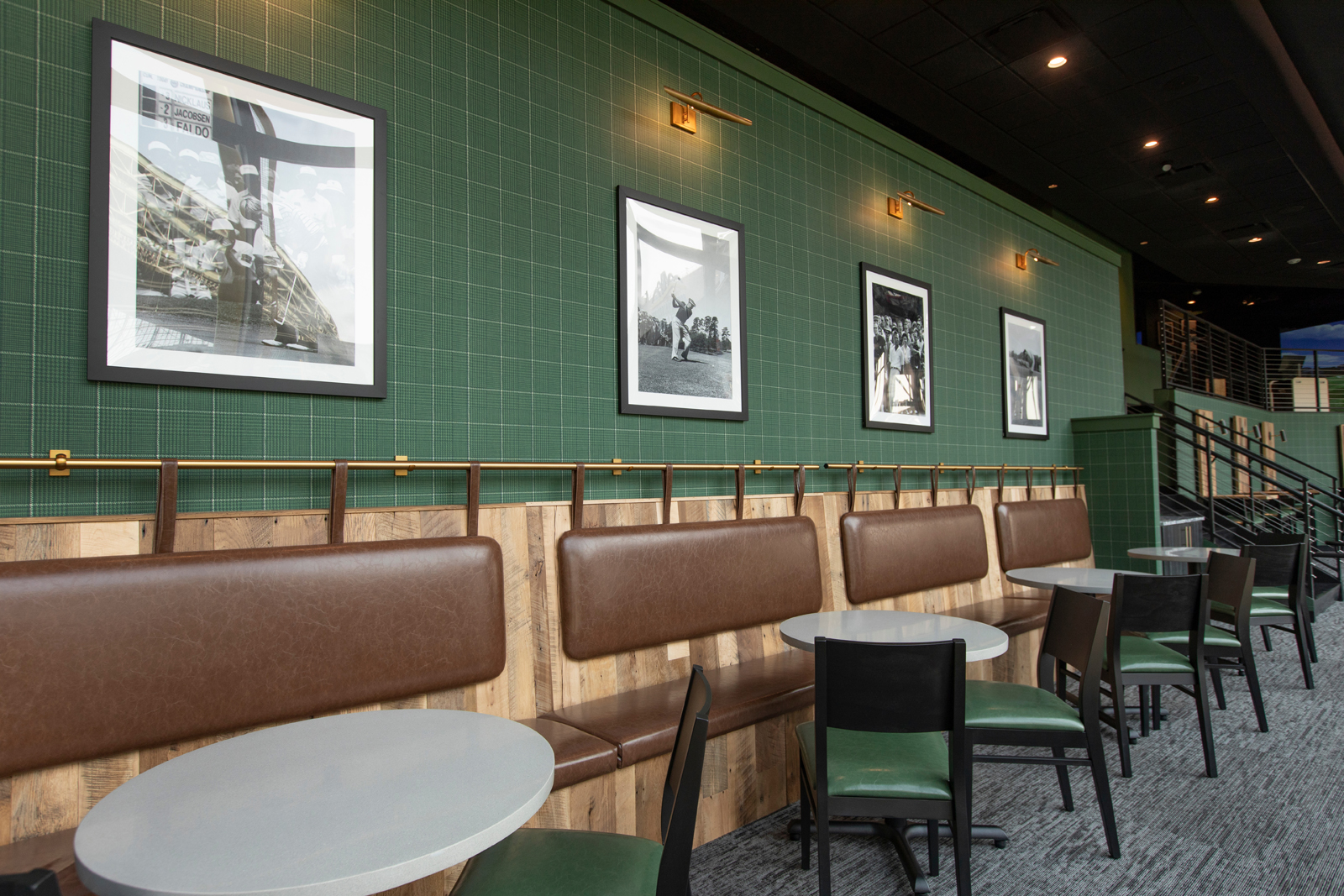
We wanted to create a relaxed, yet elevated aesthetic that made people think “I want to sit there”. The lower level is split into three sections, and we wanted each section to have their own unique features. With that, we designed a custom banquette in one section and floating hightop tables in another that offer a variety of seating styles for people to choose from. We’re obsessed with how these areas turned out and loved collaborating with local crafters, Urban Evolutions, to make the designs we created come to life!
THE after
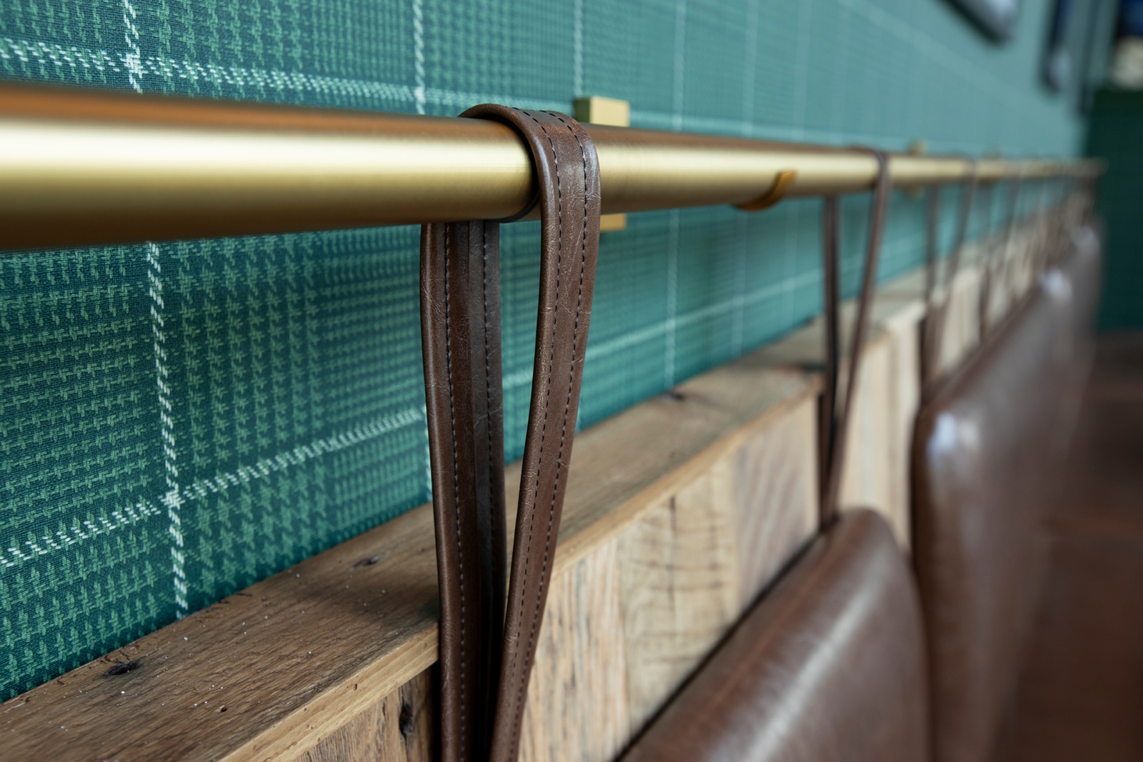
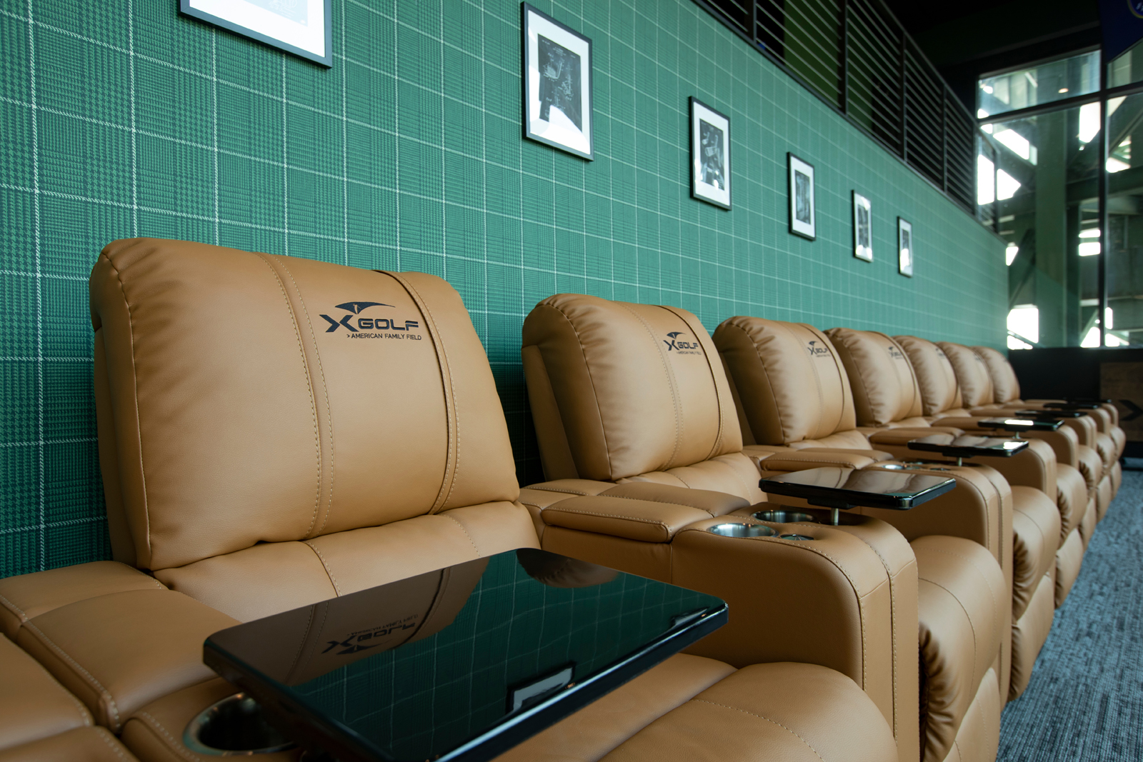
I mean, look at these views! Pictures don’t even do this space justice. We love how the signature, X-Golf green plaid wallpaper brings in a playful pattern and how the wood, brass and leather accents make it feel very warm and lounge-like. Who wouldn’t want to hang out here?
the vip Lounge
In Part I of the reveal, we shared the simulator areas, including the VIP simulator with a more secluded setting and lounge style seating. Adjacent to the VIP simulator is the VIP lounge, equipped with a private bar and custom, power reclined seating.
the before
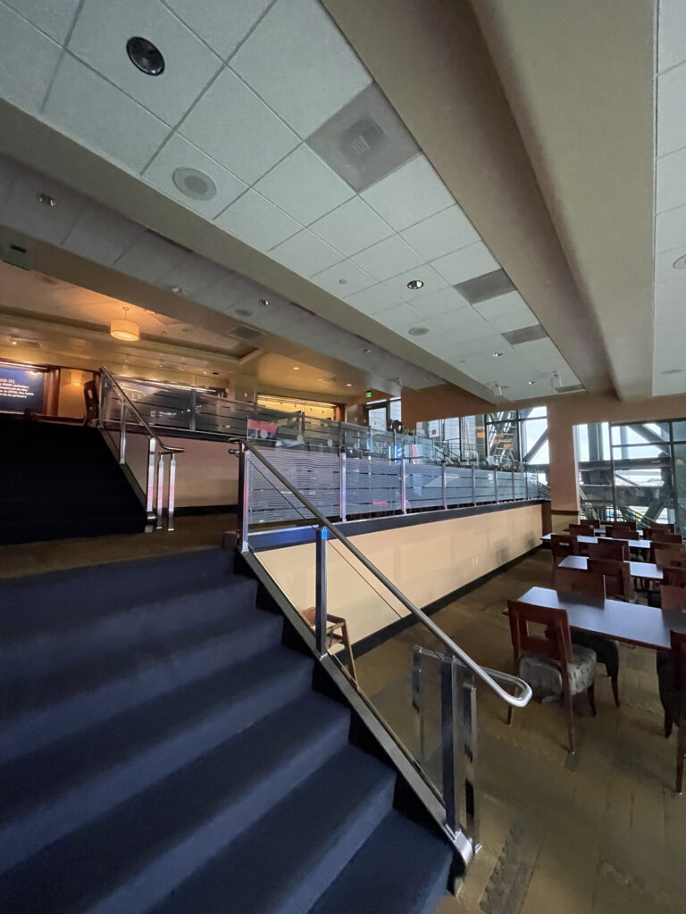
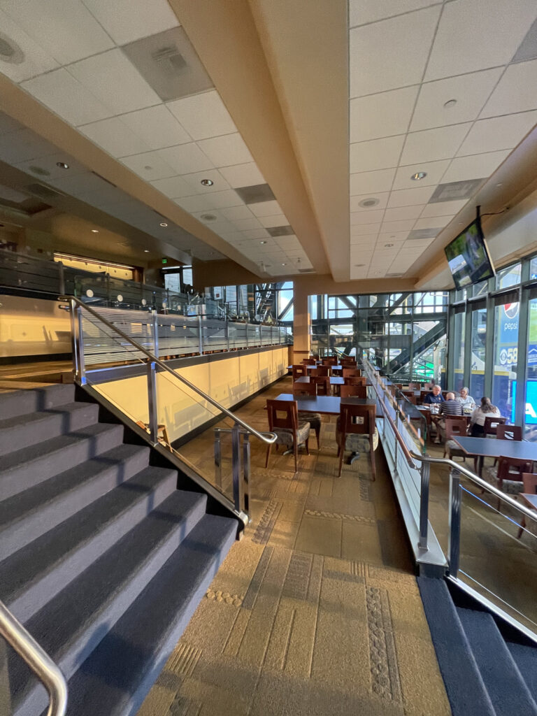
As the third and final section of the lower level, we wanted this space to feel undoubtedly like the best seats in the house. The previous space fell quite short of this, with dated, fine-dining seating that was underutilized.
THE after
We continued the signature, green plaid wallpaper into this area to make this entire lower level space feel especially elevated. The warm, buttery, brown leather power recliners with custom embroidered X-Golf logos, cup holders and food trays give you everything you need to sit, relax and enjoy the ballgame. The addition of the private, mobile bar gives you the full VIP experience having everything you need in this secluded, one-of-a-kind space.
the RESTROOMS
One of our favorite spaces to design at every X-Golf location we work on is– you guessed it– the restrooms! Often times in commercial space, the restrooms are simply an afterthought and lack personality. We like to bring a little extra “oomph” to these spaces, as an unexpected, elevated surprise to the guest experience.
the before
Safe to say, like much of the other spaces, the previous restrooms simply lacked in character.
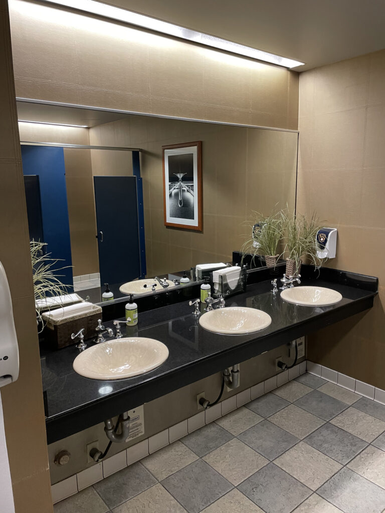
the Design Process
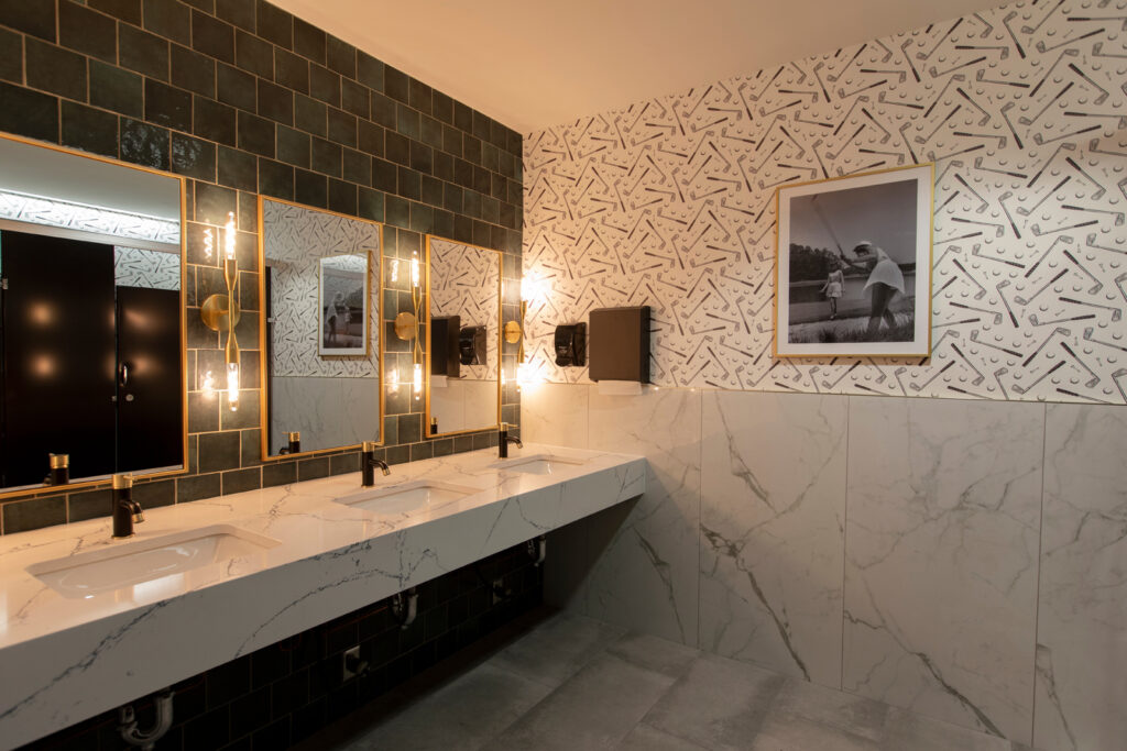
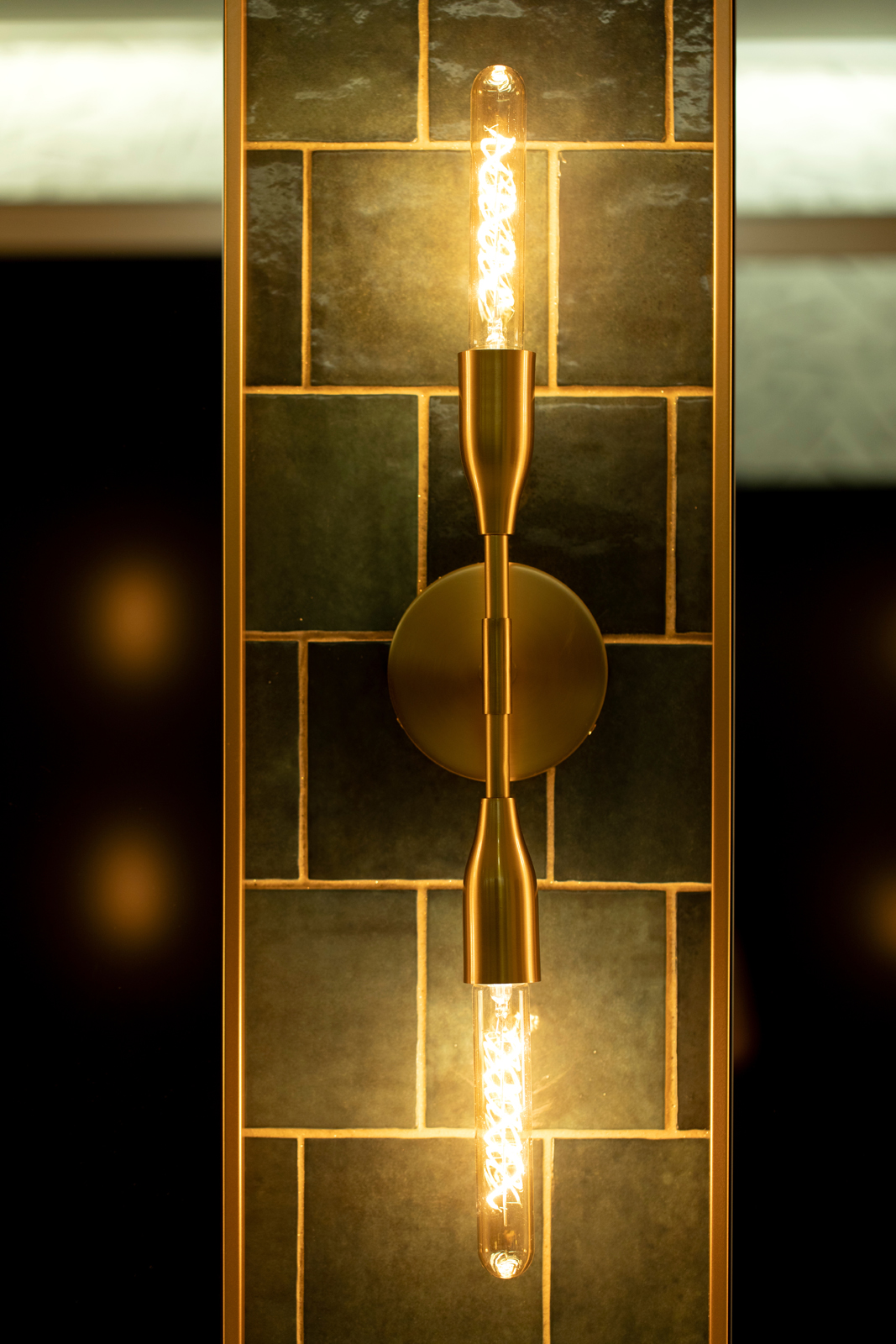
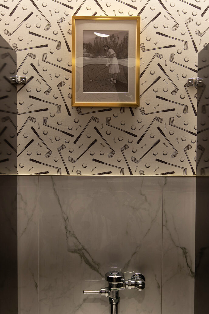
Three things we like to have fun with in X-Golf restrooms: wallpaper, tile and metal finishes. We always like to bring in a little personality with golf themed wallpaper. Both the Men’s and the Women’s restrooms have a different style wallpaper, and then we kept consistency with the tile and fixture selections. One of other favorite features is the green tile on the vanity wall, bringing in a pop of color with the signature X-Golf green.
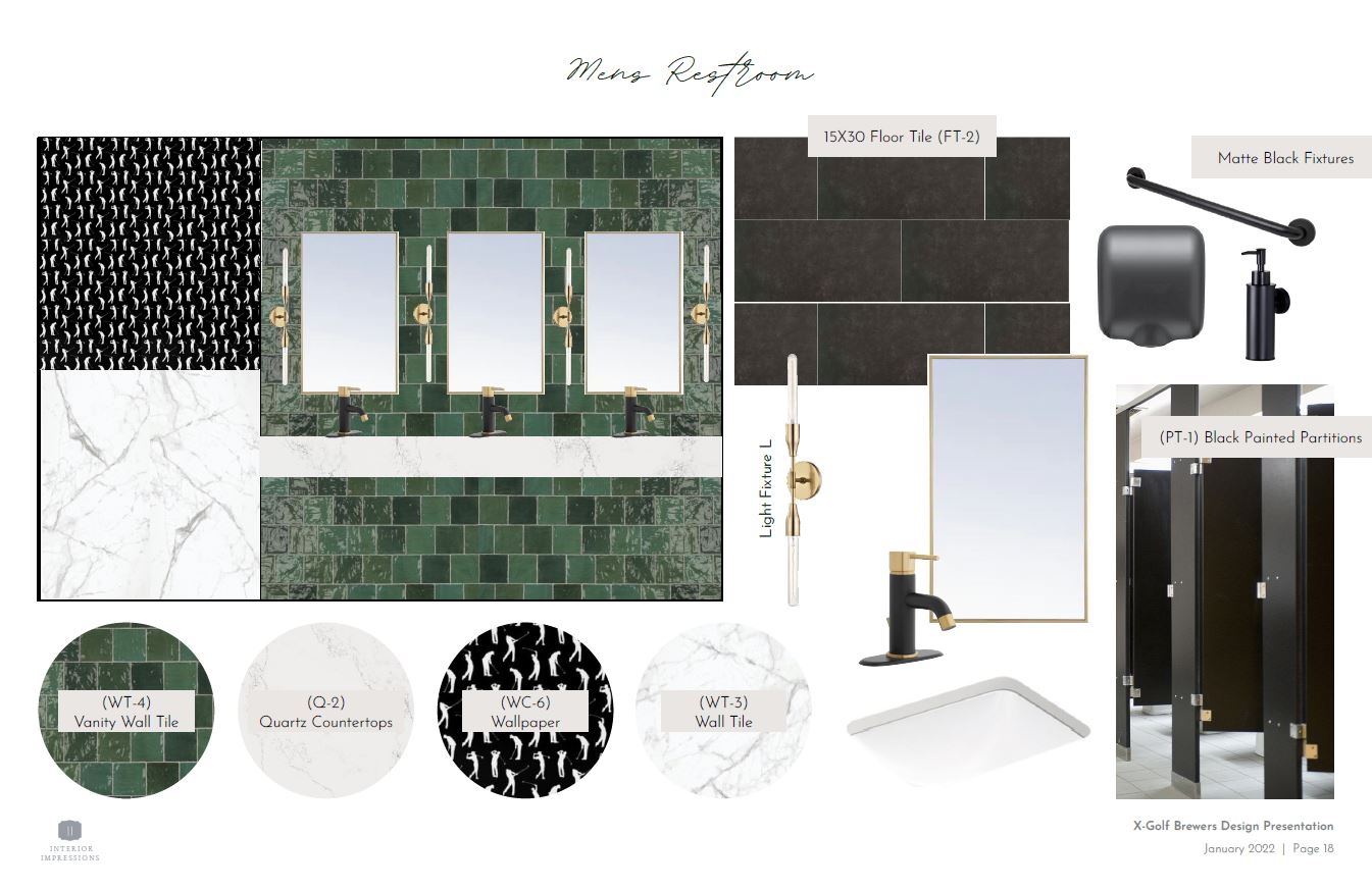
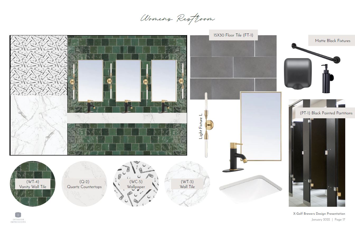
THE after
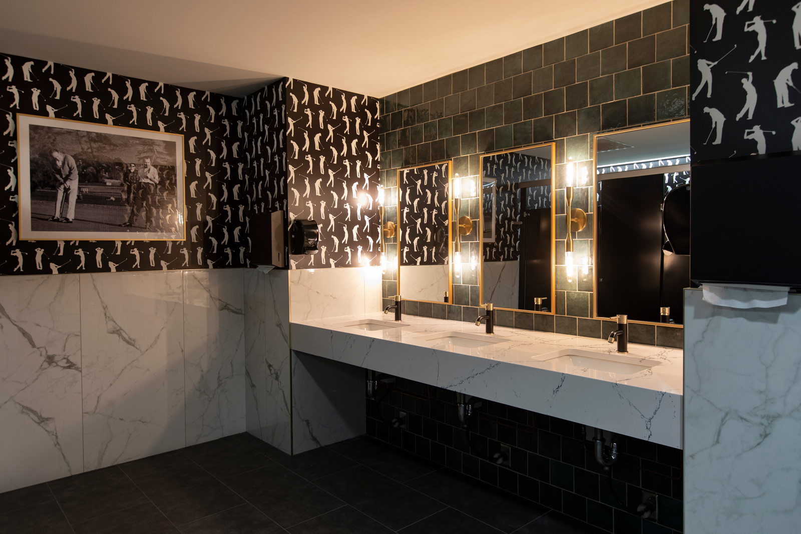
The end results are a moody, charismatic vibe and as finishing touches we added quirky, vintage golf artwork to each restroom as a fun little touch.
After well over a year in the works, and so much love poured into this project, we are so honored to have been part of the process and to work with such an amazing team– from owners Shawn and Luke, to the team at the Brewers, the architect and the construction crew at Hunzinger Construction Company. Baseball fans or not, if you have the chance, we hope you can make it out to Milwaukee to see the space for yourself. We promise you won’t be disappointed!
Be sure to check out Part I of the project reveal to learn more about the other spaces in this project.
Love reading project reveals and learning about the design behind the photos? Be sure to subscribe to our newsletter to the blogs sent straight to your inbox!
XO,
Amy & the Interior Impressions Team
Leave a Reply