the primary bedroom
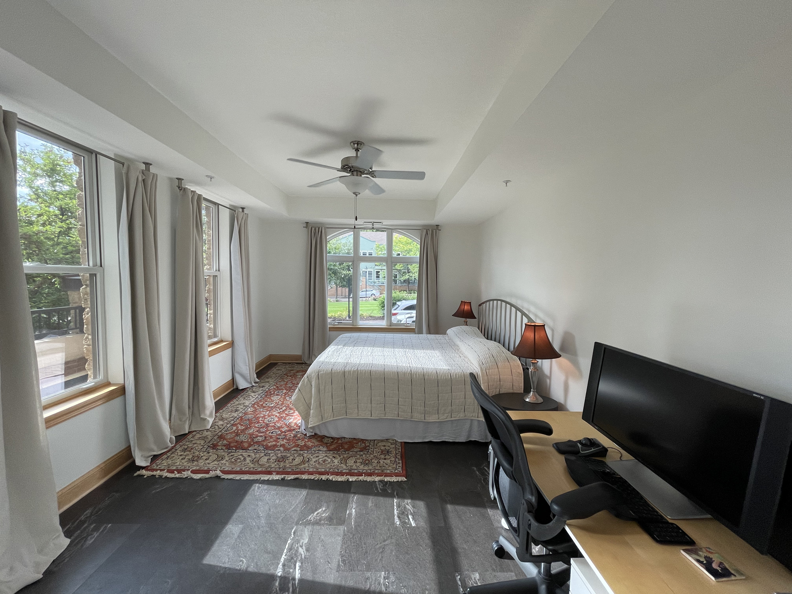
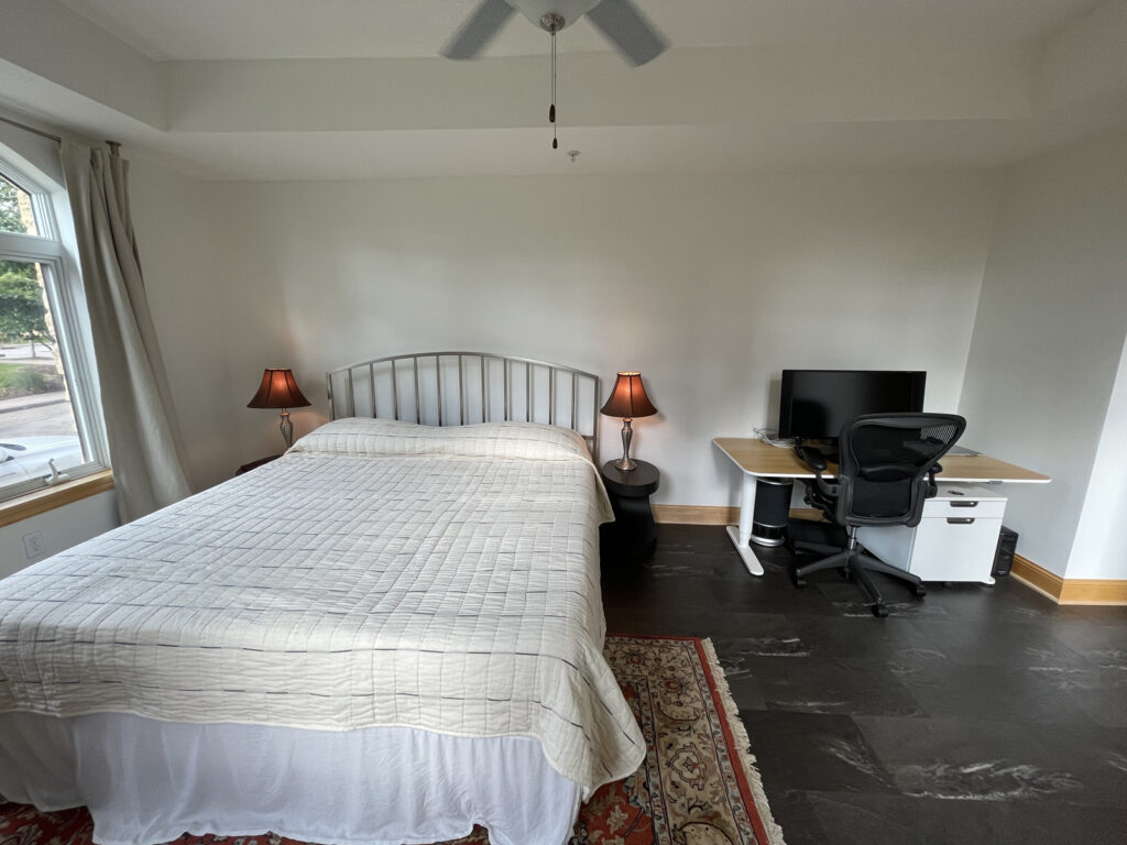
Welcome to part 2 of this beautiful condo remodel! We’ll begin with the primary bedroom. This room is long and narrow and lacked interest. When our friends, Doug & Renee, purchased this home, it had black vinyl flooring and the room felt cold and institutional. Lighting was poor, with only a weak overhead light from the ceiling fan. The window treatment system wasn’t working out very well either.
the before
the design process
the after
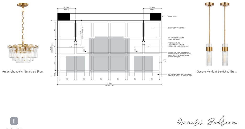
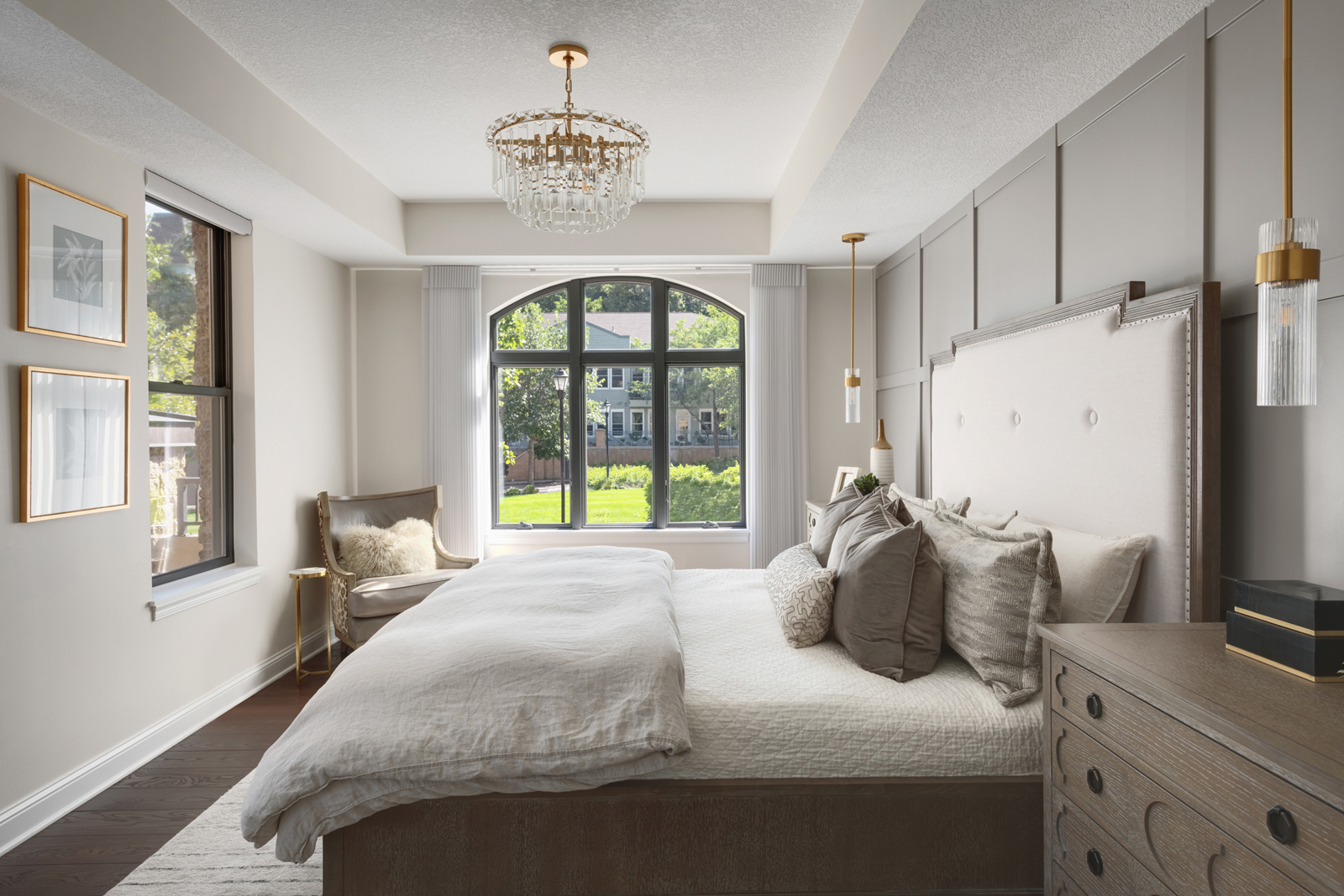
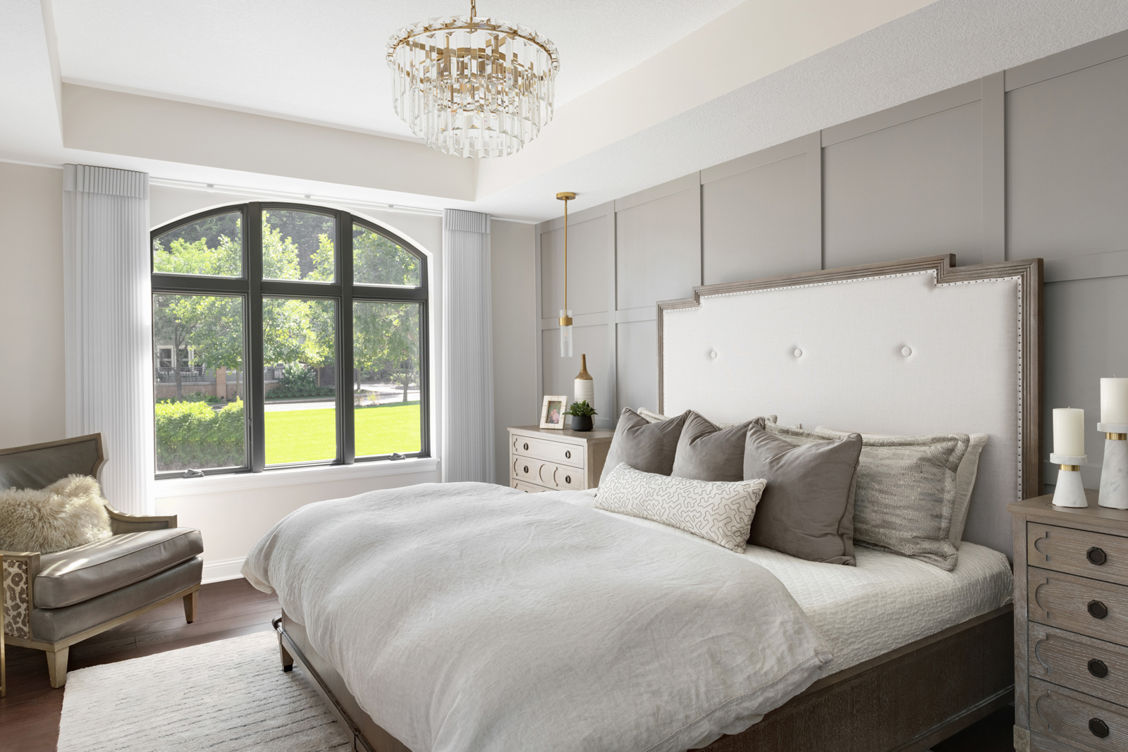
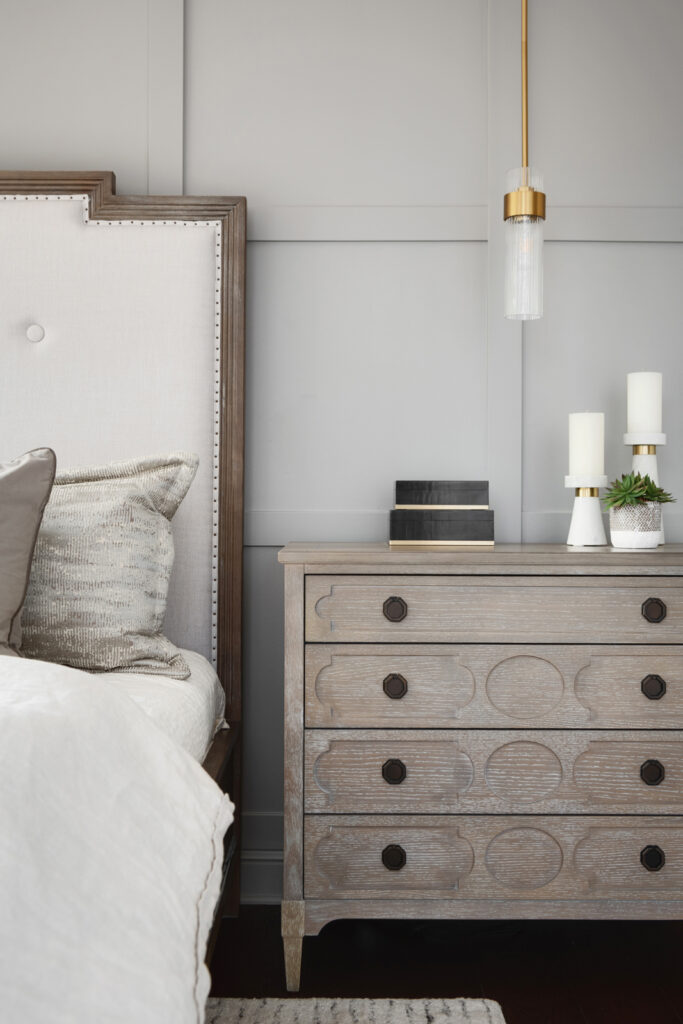
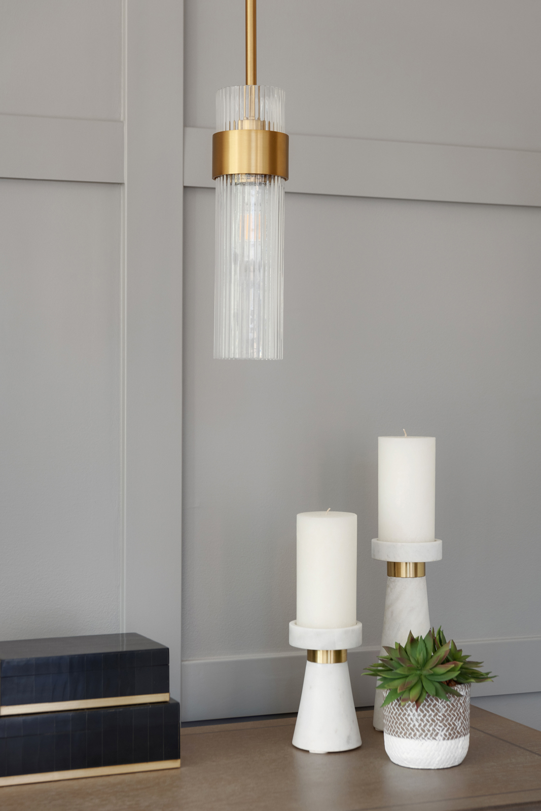
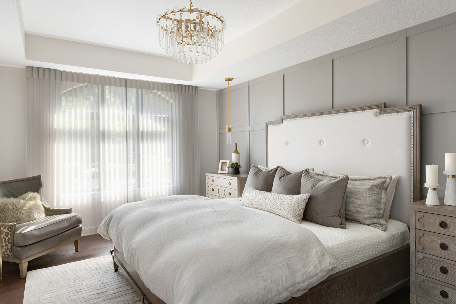
We designed a grid millwork wall to become the focal point of this room. It makes the space feel much warmer and adds a lot of personality as well. A gorgeous chandelier and 2 hanging pendants now give the room ample lighting, with the flexibility of dimming any of the fixtures to provide just the right amount of light, depending on the setting. We carried the new hardwood floors into this room, making it feel much more rich and comfortable. The window coverings got a huge upgrade! It was very challenging because of the arched window. We didn’t want to cover the pretty upper arch all the time, but we wanted to have room darkening shades to keep the light out when sleeping. Motorized Hunter Douglas Luminettes were the perfect choice for this window, and we complimented it with matching fabric Silhouettes in the other windows and on the patio door. They add so much elegance and softness to the room. The icing on the cake was the beautiful new furniture that makes this primary suite feel like a cozy, high-end hotel room. We love how the slightly rustic wood finish, paired with luxurious, washable Belgian linen bedding and custom made velvet pillows make this bedroom so inviting and comfortable. I can imagine wanting to stay in bed a little longer on a Saturday morning!
the primary bathroom
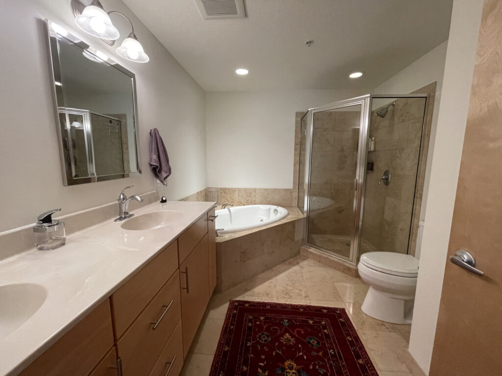
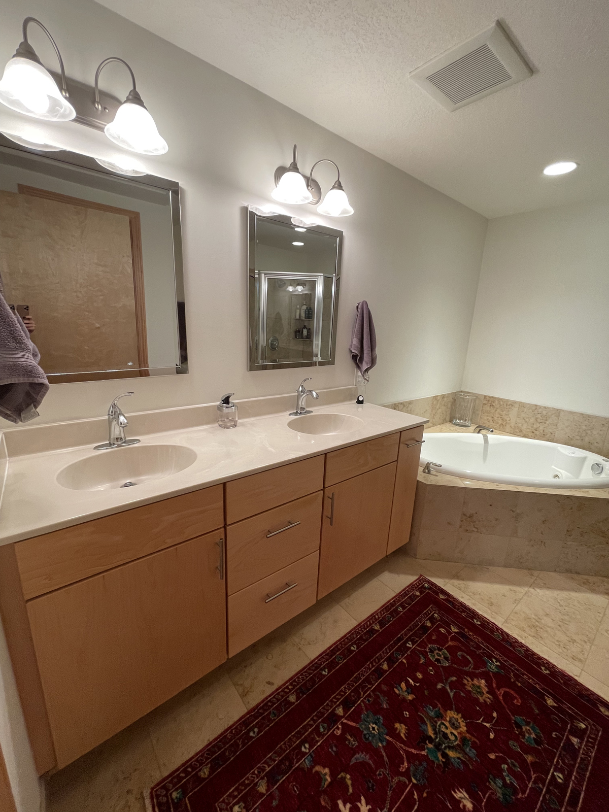
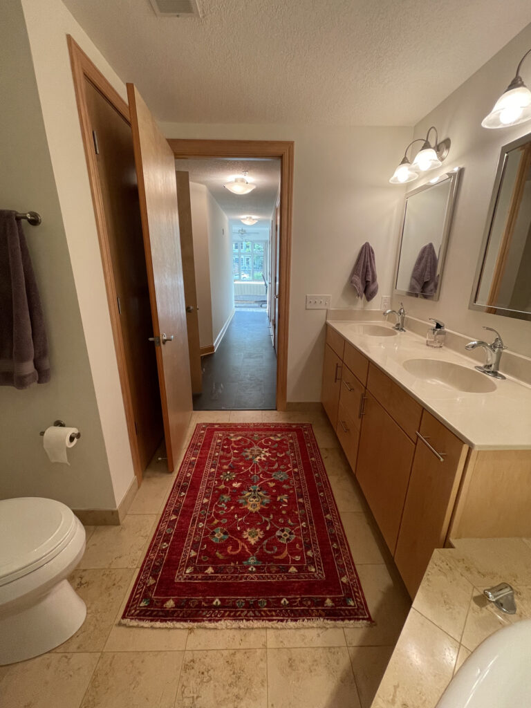
What can we say? This bathroom was just SO dated! It felt drab and boring and the shower was smaller than our clients liked. It was a very tough decision, but Renee & Doug decided to omit the bathtub altogether and just go ALL IN on a big shower. We had alternative design plans that included a free-standing tub, but at the end of the day, they felt they would use and appreciate a large walk-in shower much more. We decided that everything in this room needed to go, with the exception of the vanity cabinet. It was in good shape and just needed a facelift and paint.
the before
the design process
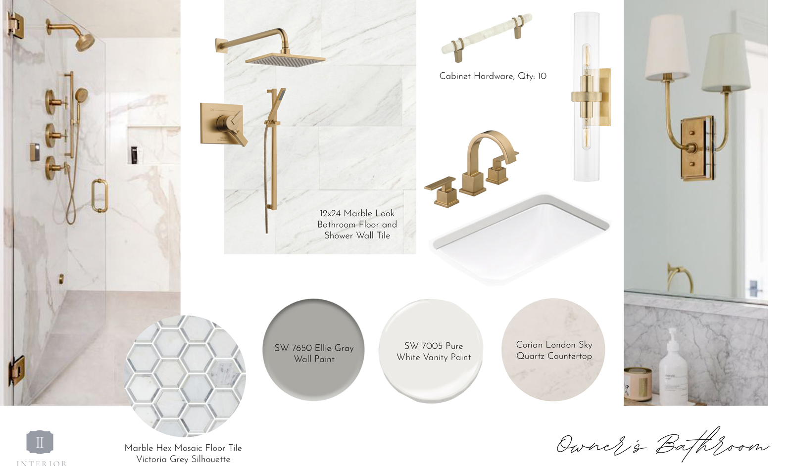
the after
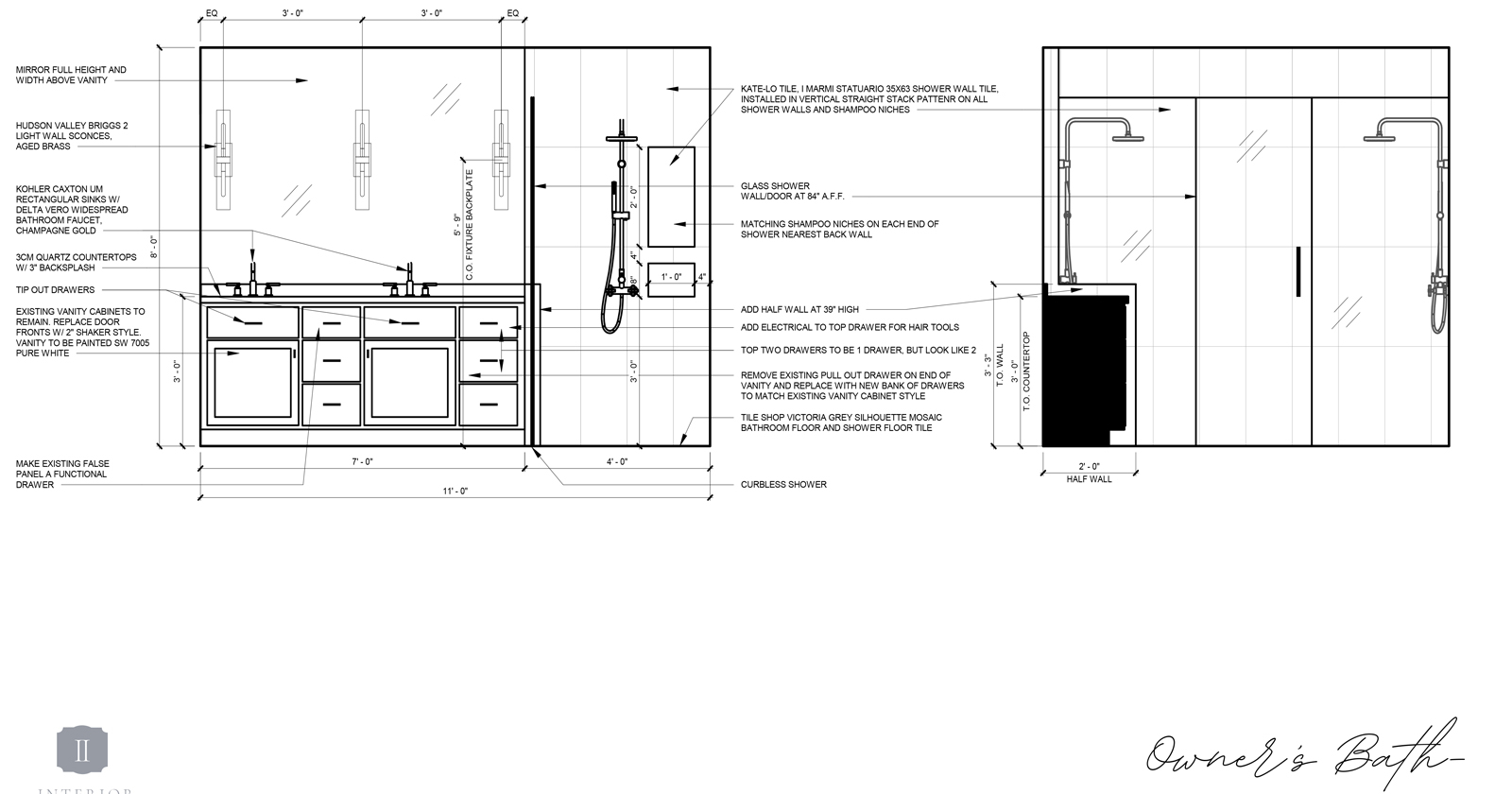
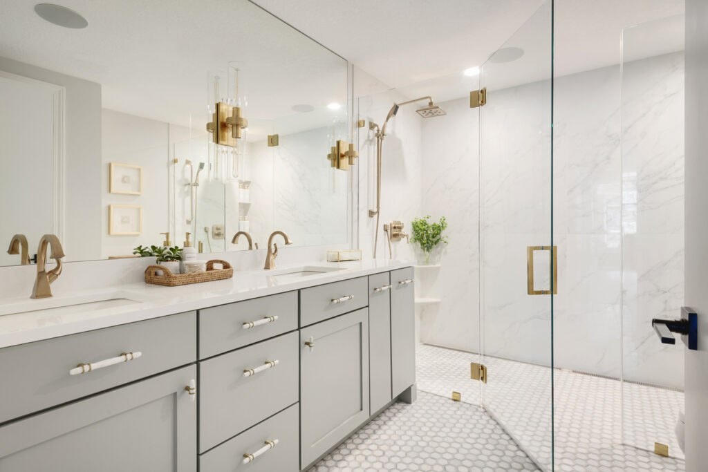
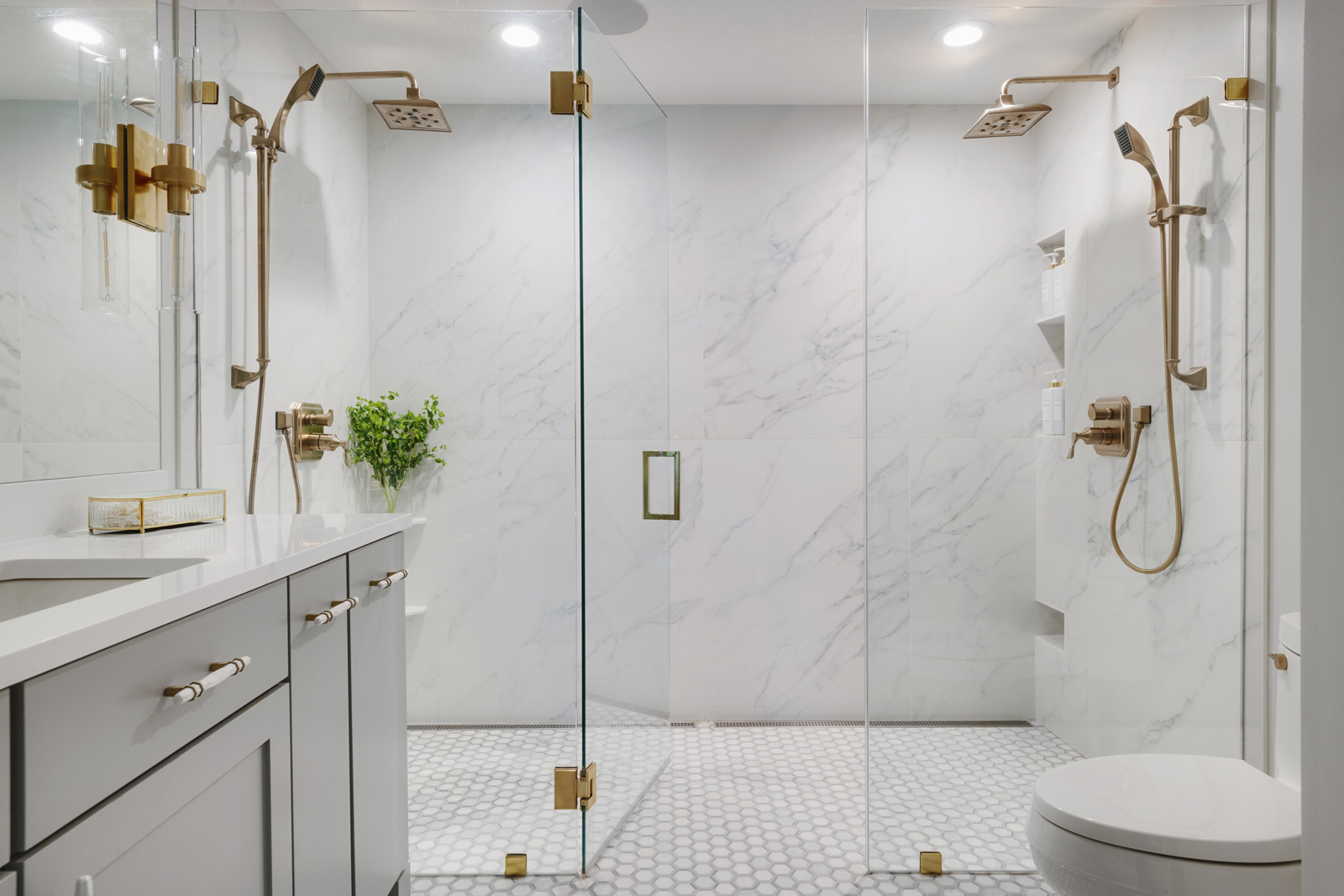
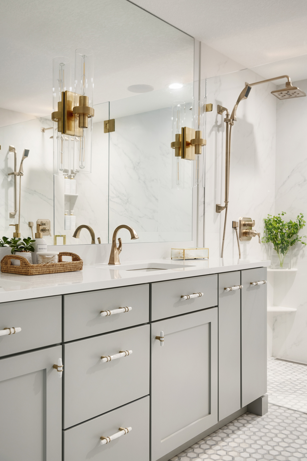
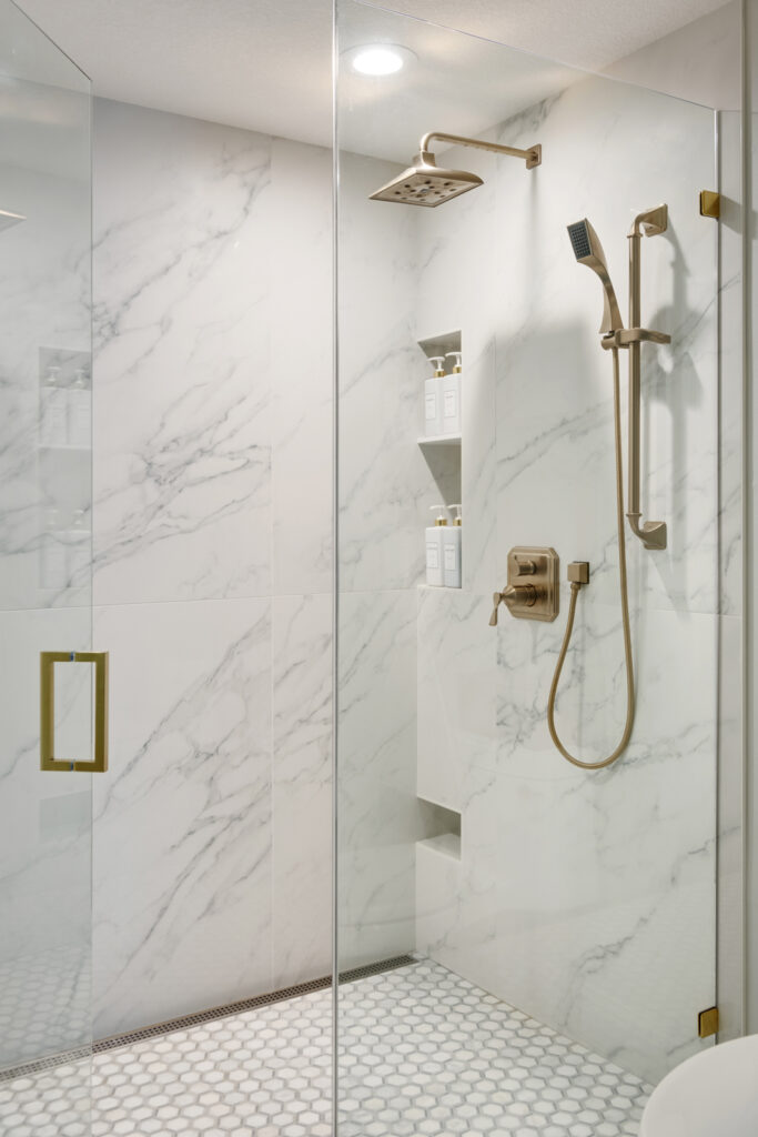
Hello gorgeous! I mean, wow, this bathroom is a stunner! It is one of my personal favorite transformations to date. We had our cabinet maker add on to the end of the vanity cabinet and make new drawer and door fronts. We had it painted a pretty shade of blue-gray and added some beautiful cabinet hardware. Brushed gold fixtures were chosen to bring in warmth and contrast against the cooler grays and whites. We decided to make the entire length of the bathroom into a huge shower. There’s a “his and hers” side now with shelves and niches for storing supplies, and even a foot ledge for shaving. The frameless glass door and panels almost disappear, allowing full views of the beautiful shower. We used large scale porcelain panels for the walls to minimize grout lines and to create a seamless, clean look that mimics cararra marble slabs. We were able to remove the shower curb and create a level floor that carries all the way through. It not only looks great, but it allows for wheelchair access and aging in place functionality, should it ever be needed. The floor is a fabulous marble hexagon that adds just the right amount of pattern to the room. We had a full height mirror installed and the lovely wall sconce lights were mounted into the mirror. They are like jewelry in this pretty bathroom! A beautiful new Corian quartz countertop was added, with updated undermount sinks. Getting ready in the morning is now so much more pleasant, and I am hoping that it makes each day start out so happy for Renee & Doug!
the guest + flex room
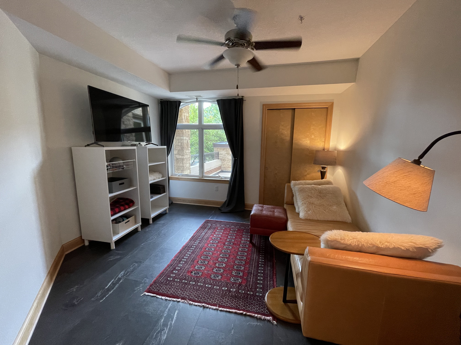
The challenge of downsizing was trying to figure out how to make room for guests, a home office, and an exercise room, when you only have 2 bedrooms to work with. This secondary bedroom isn’t large, and has some awkward angles, but we were up for the challenge of making it multifunctional! Not a lot of remodeling was needed in this room, but we needed better lighting, better flooring, and better window treatments.
the before
the after
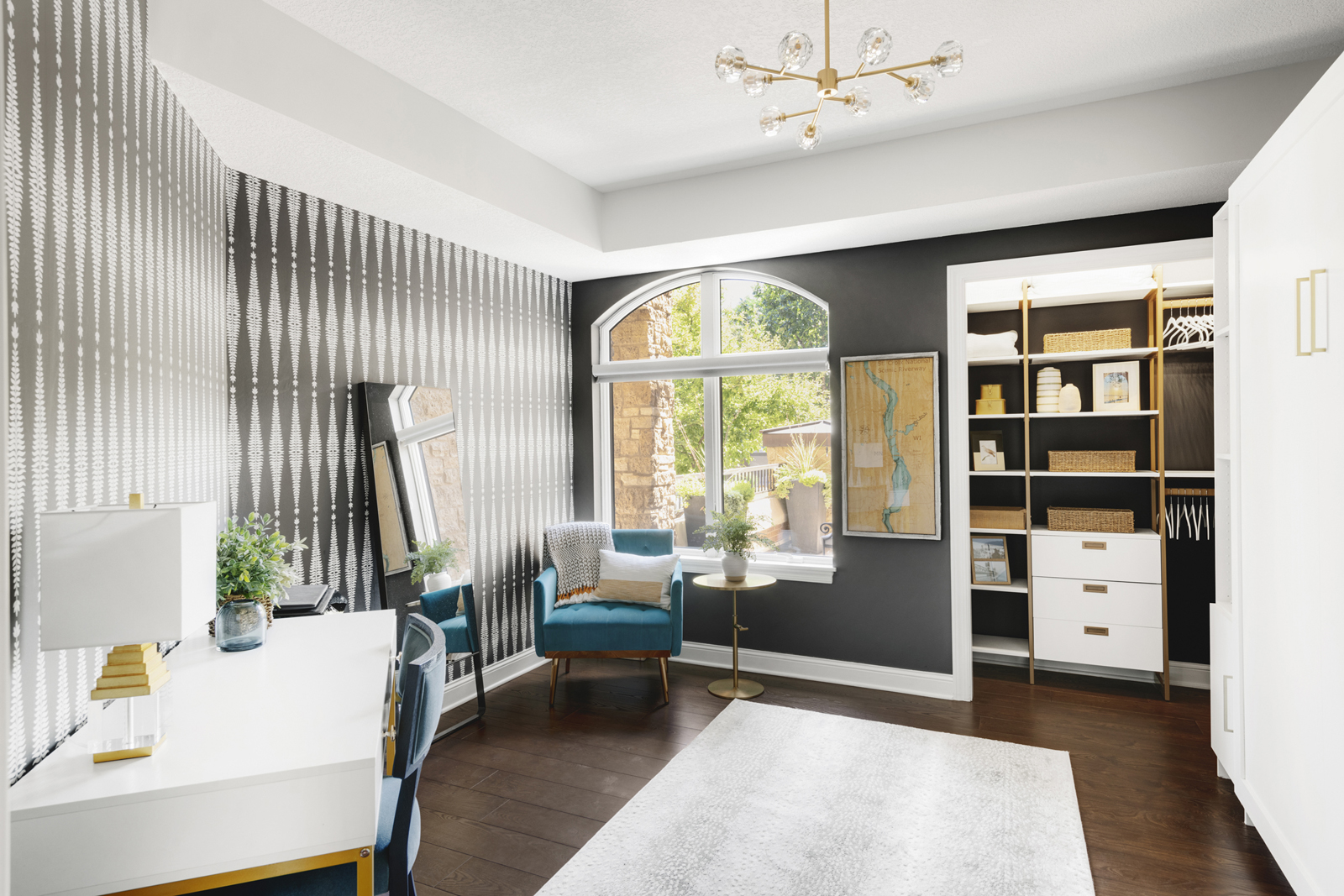
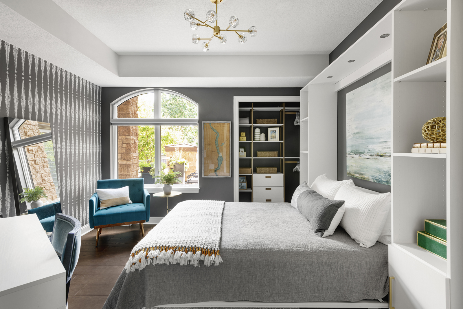
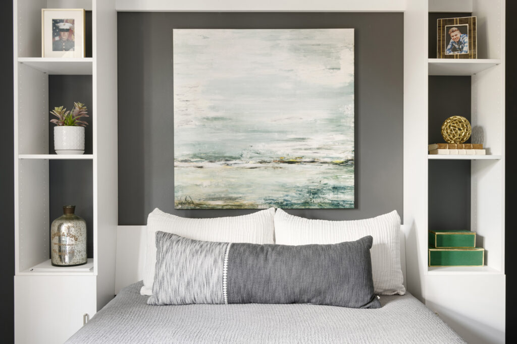
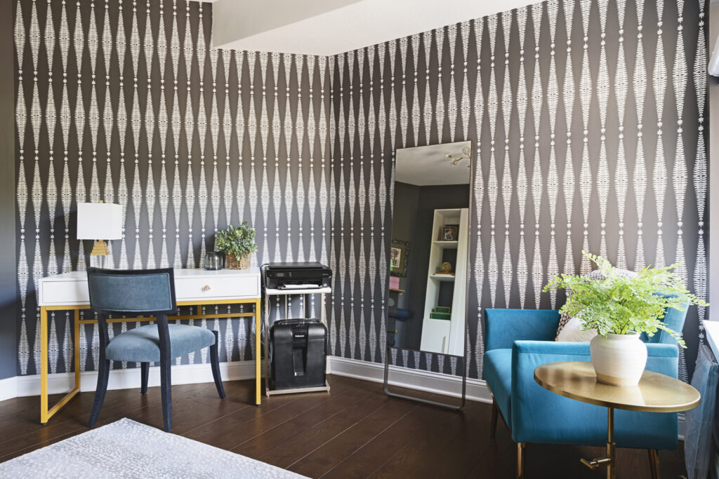
Ta Da! Welcome to the guest bedroom, home office, exercise, and “sit by the window and chill” room. What did we do? We carried the hardwood floors into this room, keeping it cohesive with the rest of the condo. We added an area rug to soften the room and provide a place to exercise or add a yoga mat. Renee has The Mirror which is such a great exercise tool that doesn’t take up much space at all and functions as an actual mirror when it isn’t turned on. I have one in my own home as well and I love it! A small rack for weights, the yoga mat and stretch bands sits inconspicuously behind the door, making it convenient as well. A small desk and a printer provides just the right amount of workspace, and a Murphy bed system was the perfect solution to give the room capability of being a guest suite when they have visitors, or when their sons come to stay. The final change was removing the closet doors and adding a functional, but pretty, closet system from California Closets. It gives extra storage and a place for guests to put their clothes when staying overnight. My favorite part of this room is the beautiful wallpaper. It adds a lot of interest and I love how the charcoal gray and white is carried throughout the room and makes it feel so much more elevated than it would with basic painted walls.
the guest bathroom
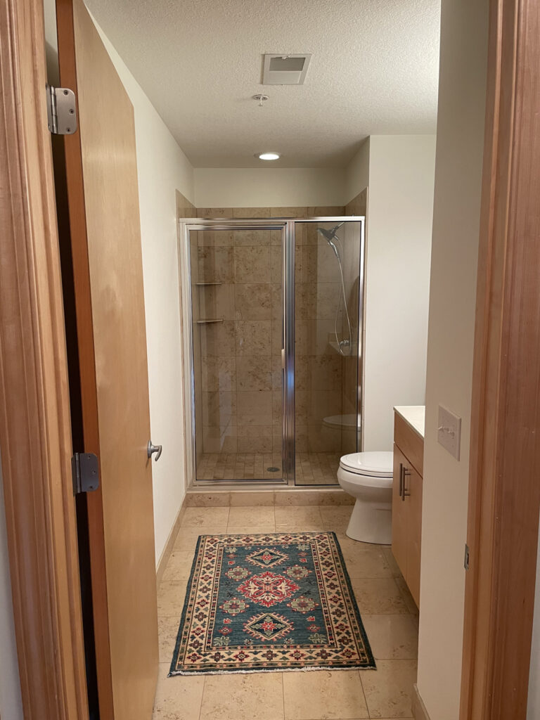
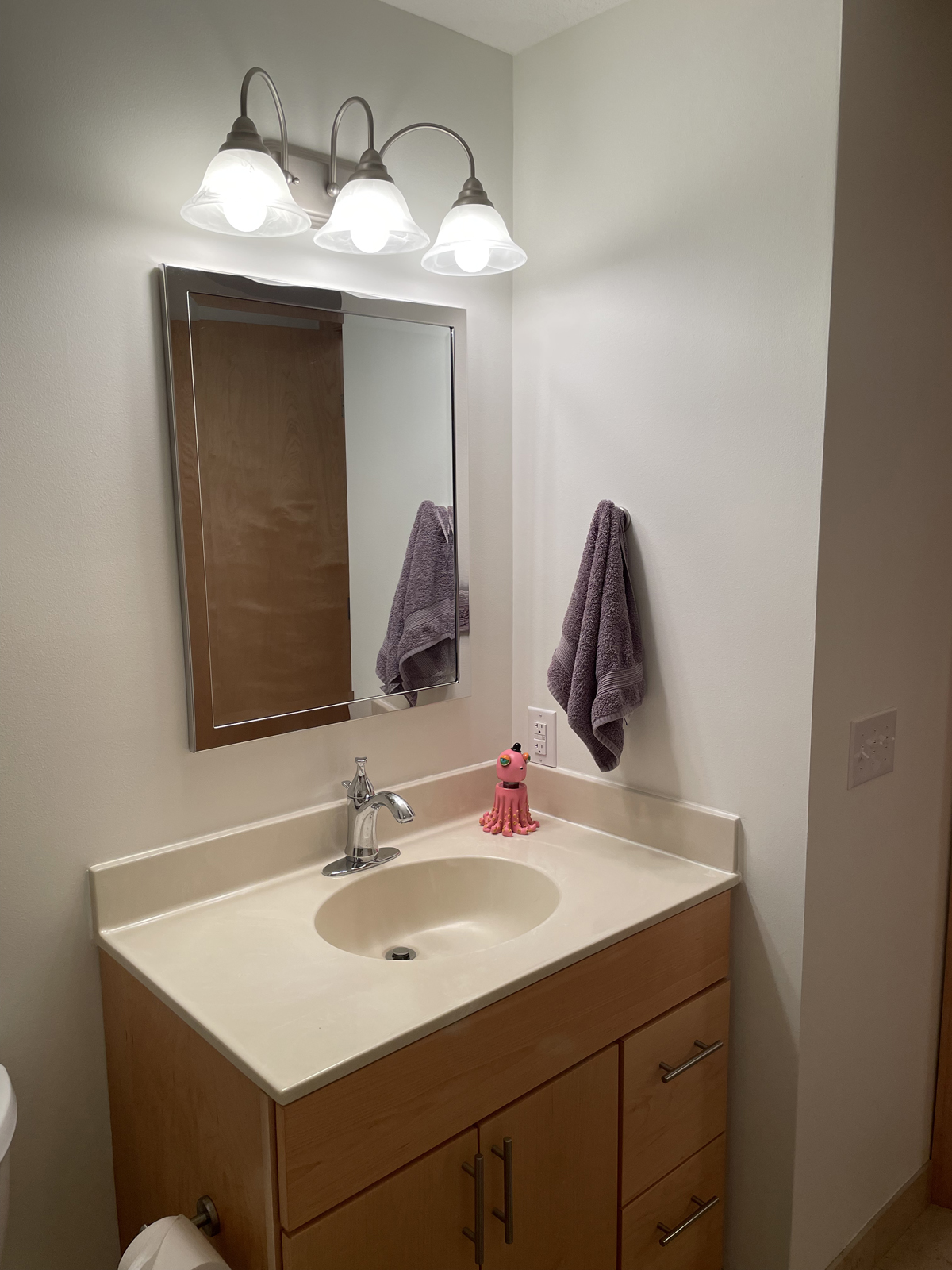
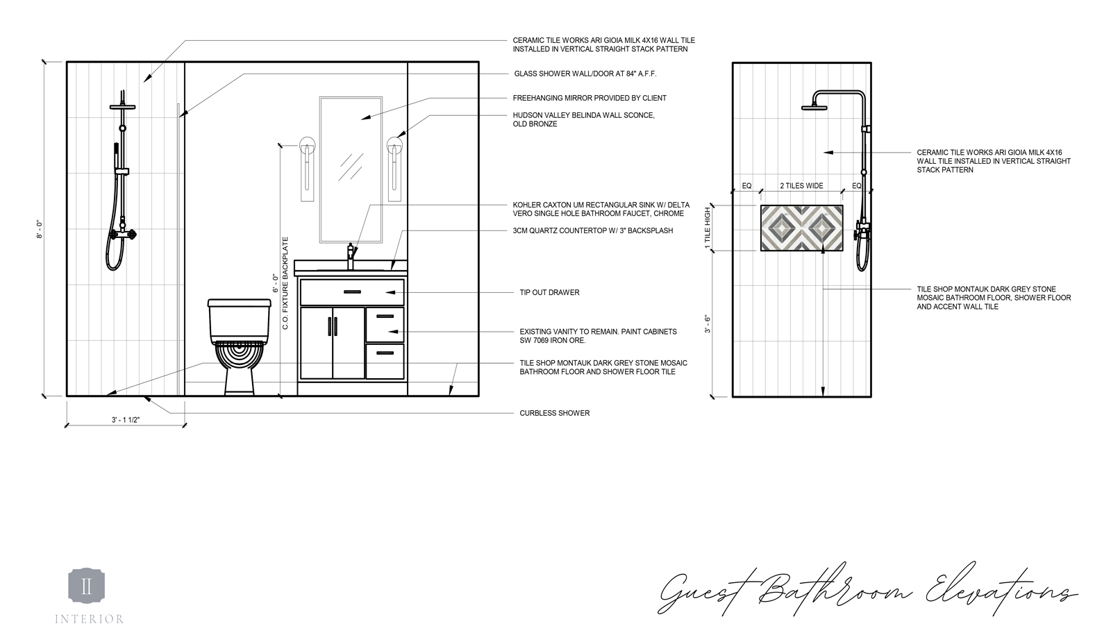
This secondary bathroom had the same dated features as the primary bathroom. No structural changes were needed, but all of the materials needed to be updated. We wanted to give the shower a curbless entry and a wider shower door, as well as add all new tile and updated features.
the before
the design process
the after
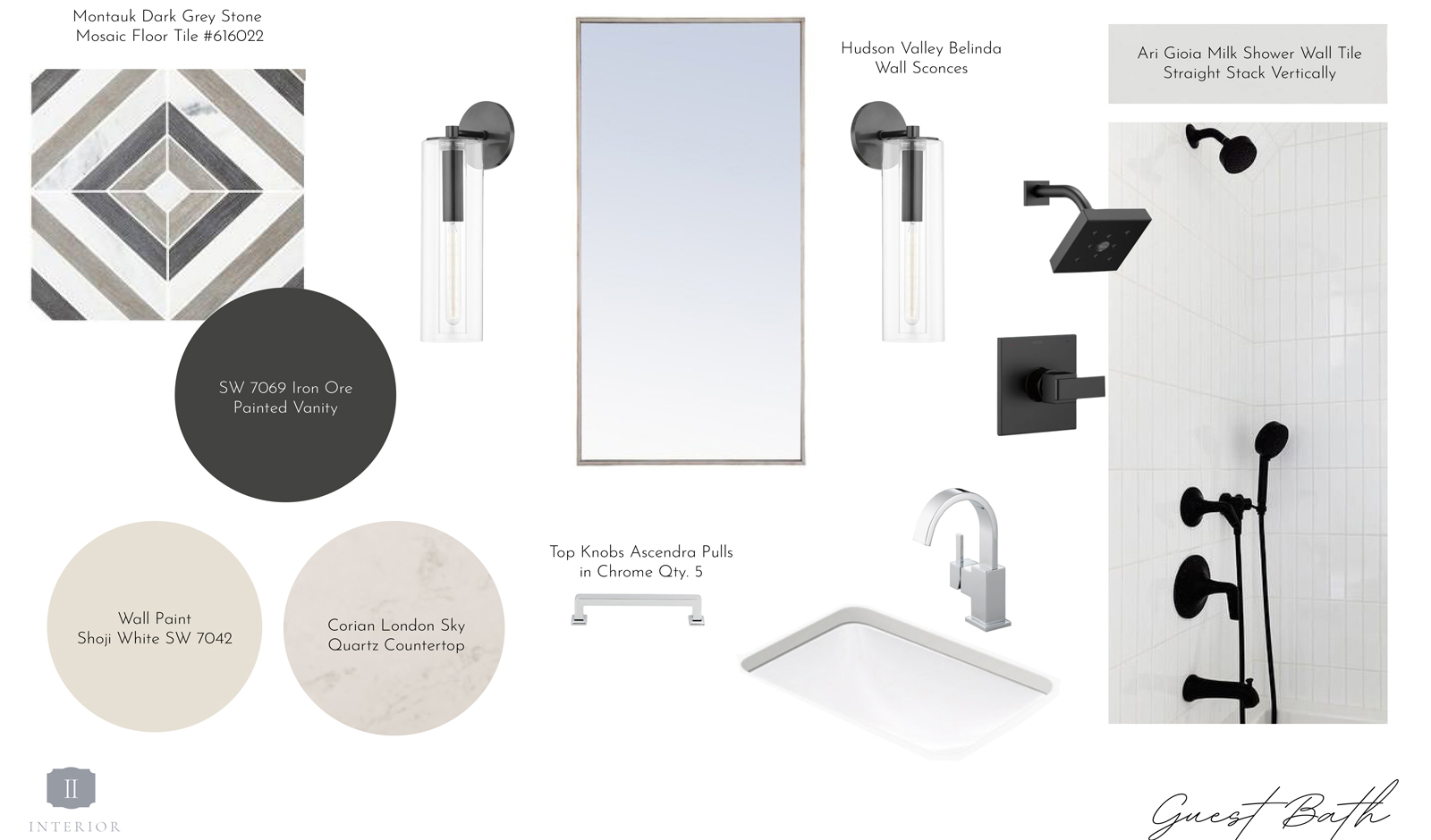
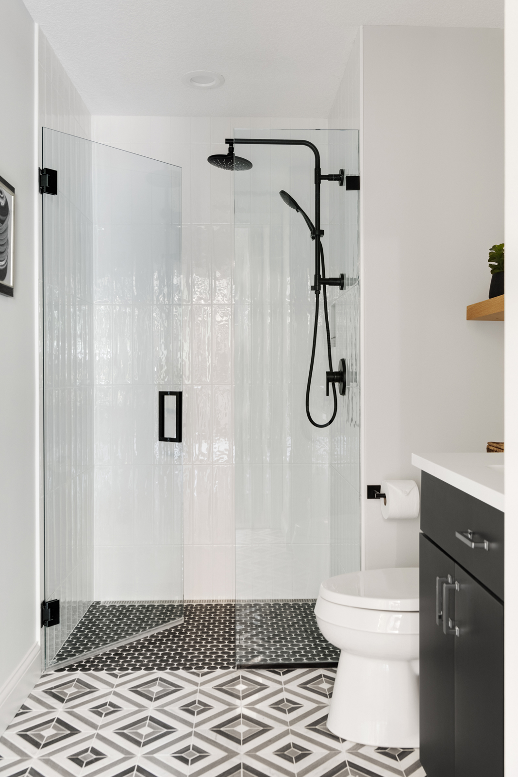
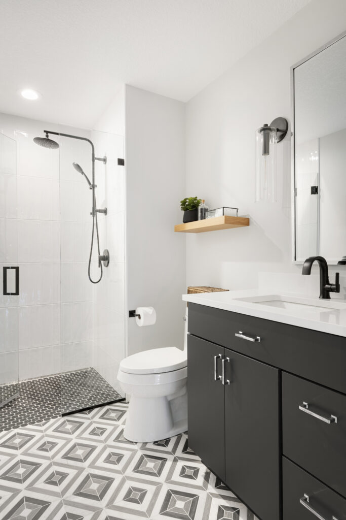
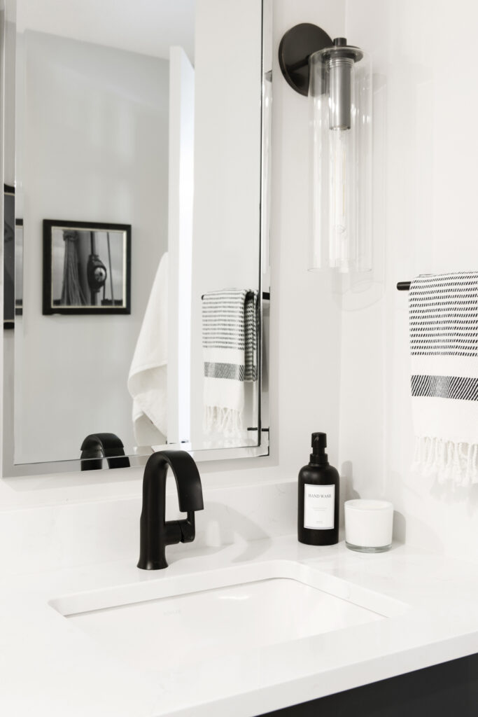
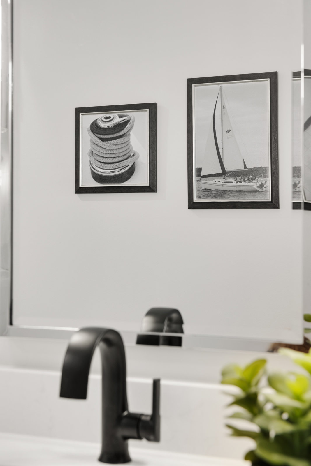
Our design theme was black and white, with a shiny chrome as the metal accent. The jumping-off point for this bathroom was the stunning black and white and gray patterned floor tile. It is made of marble mosaic and we all fell in love with it right away and knew it would be the star of the show for this bathroom. We wanted to carry it through the entire floor, but ended up having to put a smaller scale tile in the shower due to draining operations. We chose a beautiful complimentary black circle tile with a subtle marble veining to tie in with the diamond pattern tile. The shower walls were kept simple with a white glossy elongated subway tile. We chose to install it vertically with a straight stack for a more modern look. Matte black shower fixtures, shower glass hardware, and sink faucet provide a sleek, modern look. We added a chrome framed mirror and black and glass wall sconce lights to provide better lighting and more interest. A quartz countertop and undermount porcelain sink update the vanity, and a wood shelf adds just a touch of warmth and decor to the room.
We hope you enjoyed seeing the dramatic transformation of this riverside condo from a basic, boring space into a gorgeous, elegant new “right-sized” home for our friends. You don’t need a lot of space to live well, but how it is designed can make all the difference! We wish Doug & Renee many years of happiness and enjoyment in their beautiful new home.
Did you catch Part I of our Rivertown Remodel Project Reveal? Be sure to subscribe to our newsletter to have the project reveal sent right to your inbox.
Cheers!
Amy & the Interior Impressions Team
Leave a Reply