We’re excited to share the rest of this lovely home remodel with you! If you missed part one of this two-part project reveal, be sure to check it out! Oftentimes, we have clients that buy a new home but aren’t sure how to make it their own. While searching for their next home, it can be hard to visualize what the house could become and how it could be updated to fit their needs. We are available for consultations to look at potential properties with you and your realtor to talk about options and different ways that you could update and make the house fit your current lifestyle. We can also help to give you an estimated idea of how much it would cost to make those updates. These decisions are always best made before you lock in to a sale, so you can make an educated decision on whether or not the new home could be made to fit your needs and desires. In this case, Michelle & Chris had already decided they loved this property and made an offer on the house, but they brought us in very early in the process and we were able to talk through a lot of ideas and help them see how they could make this house their “own”. We love how beautiful this home turned out to be after we brought in more of the things they love and made it more harmonious with their style and personalities!
his office space
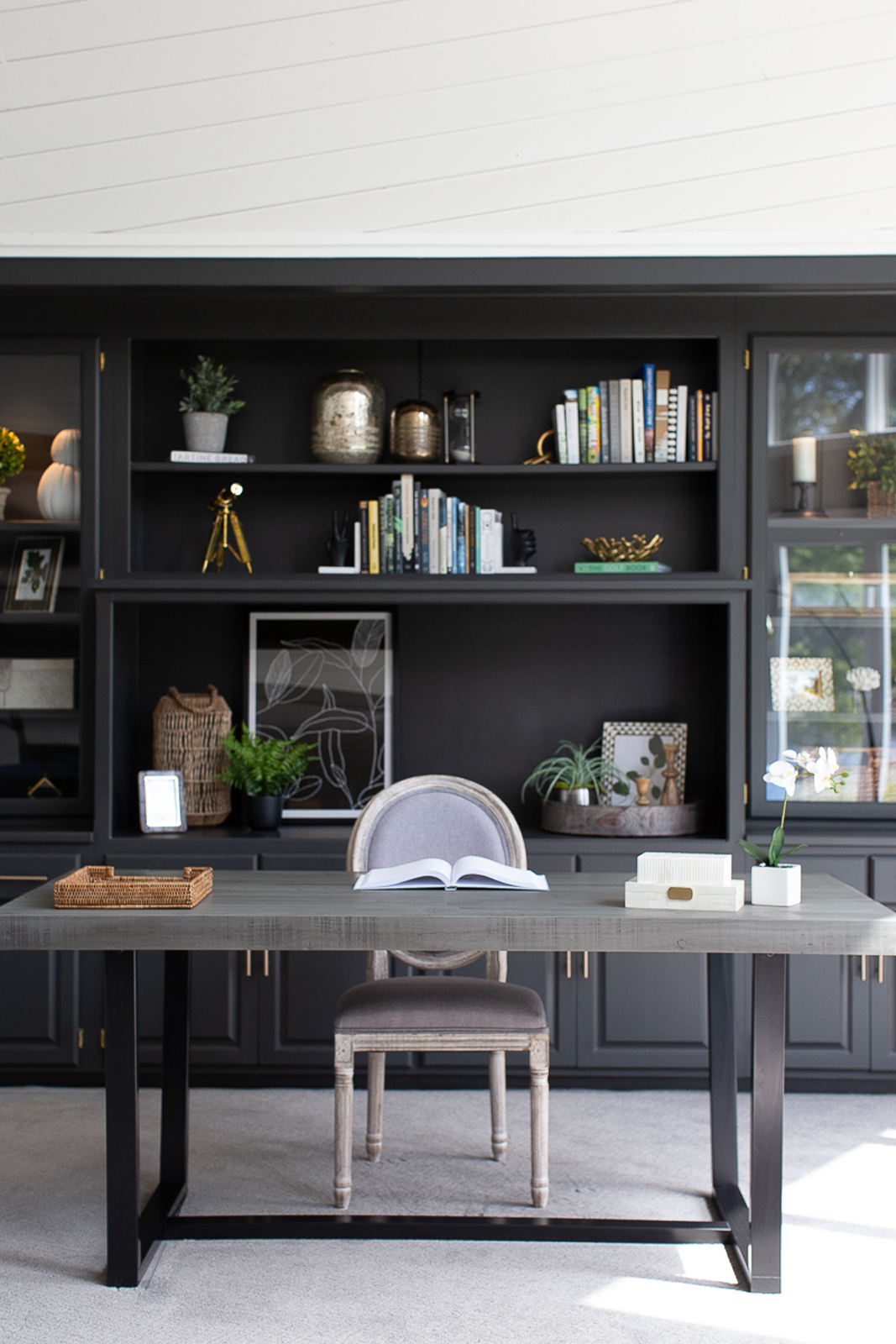
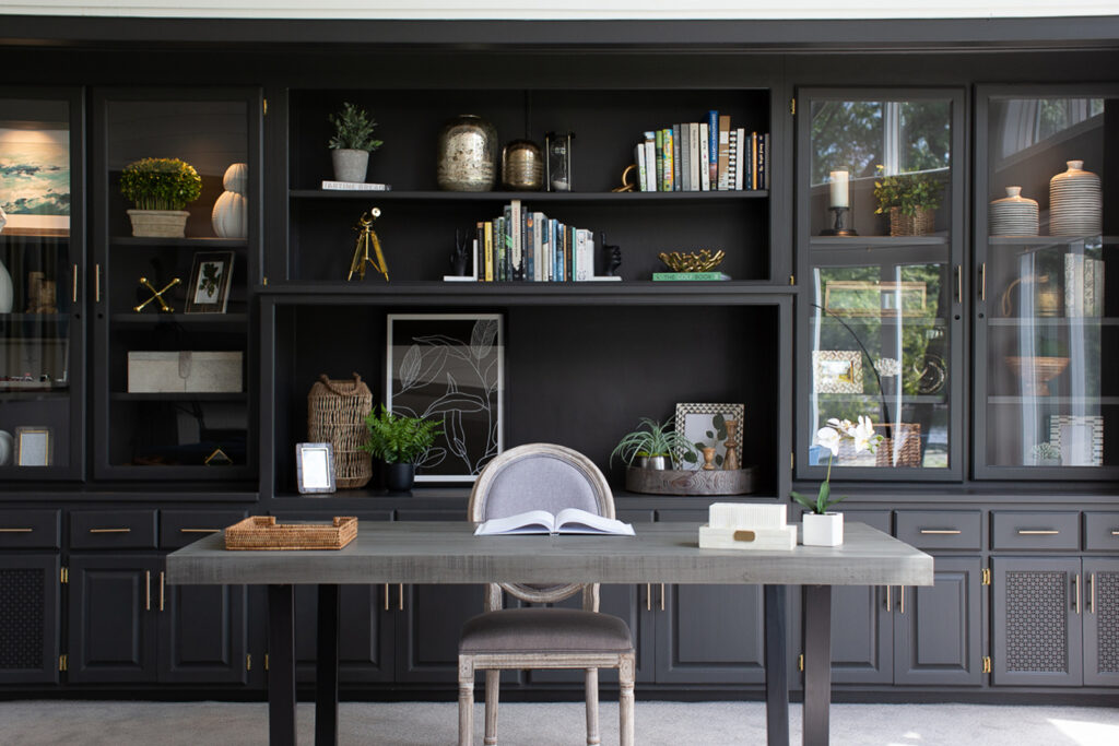
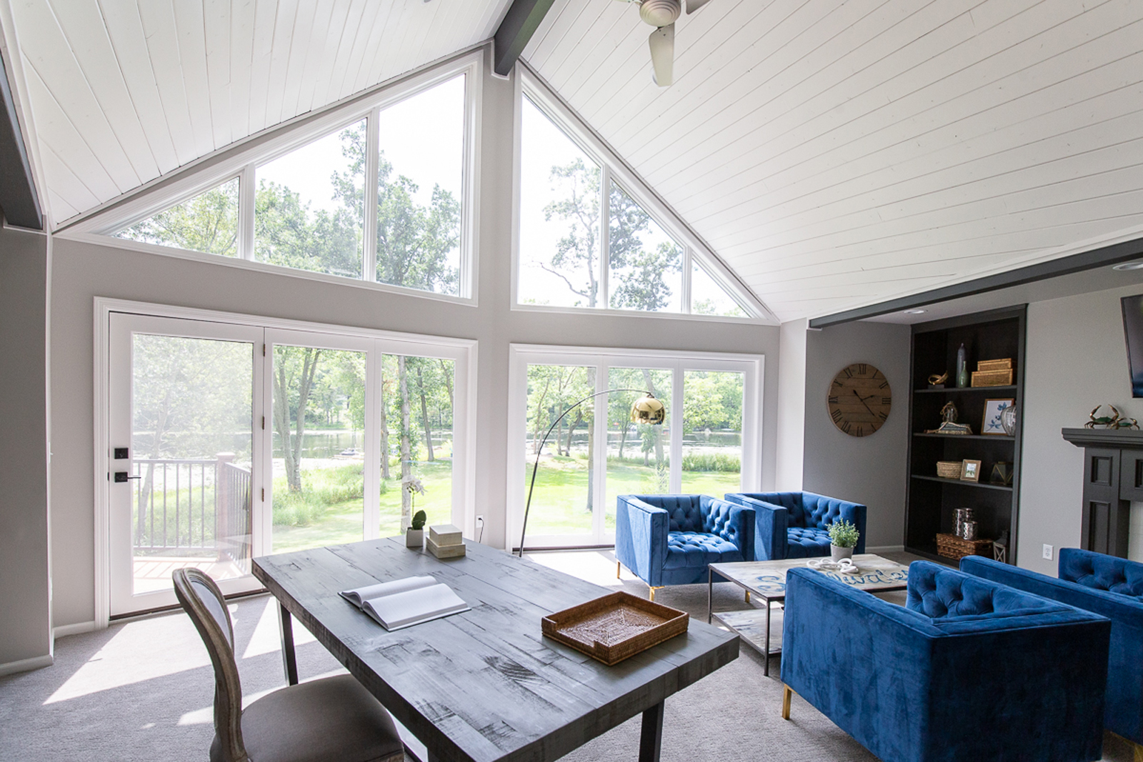
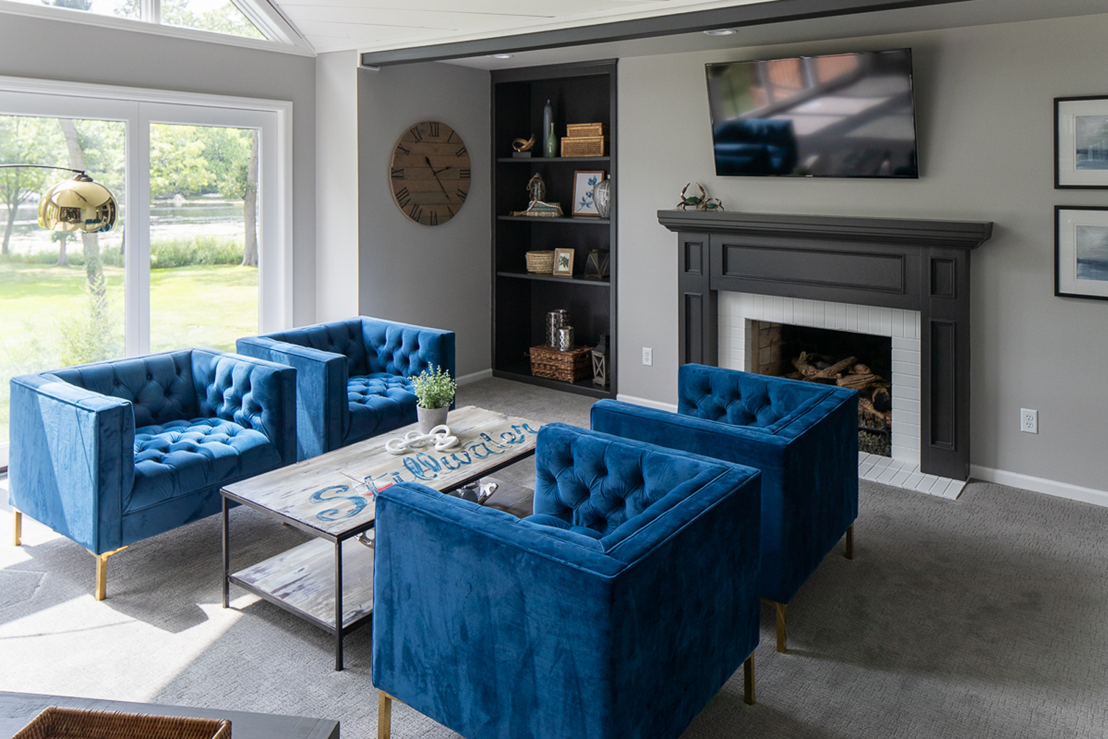
This room is so impressive, with tall vaulted ceilings, tongue & groove wood ceiling accents, a full wall of windows, a fireplace, and a wall filled with built-in cabinetry. Our main goal was to tone down some of the bold colors and to update the look and feel to project a more elevated space. We wanted to keep a touch of masculinity though, as Chris would be using this room as his home office. I’m not sure which office space I love more (Michelle’s or Chris’), and they both have lots of windows with a beautiful view of the waterfront!
the before
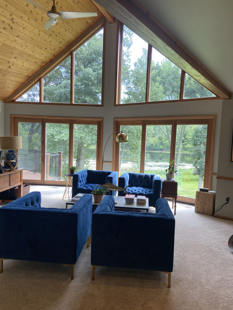
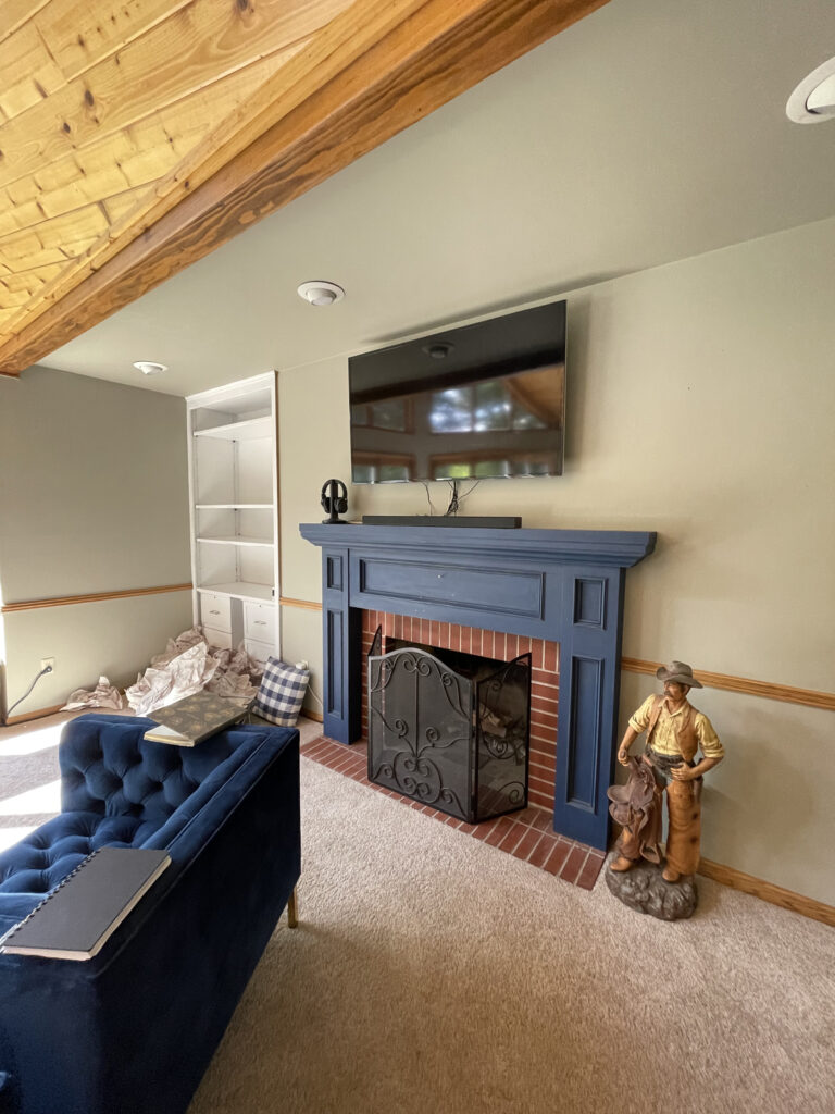
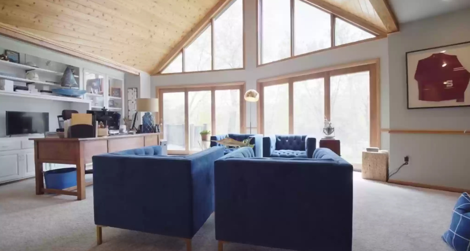
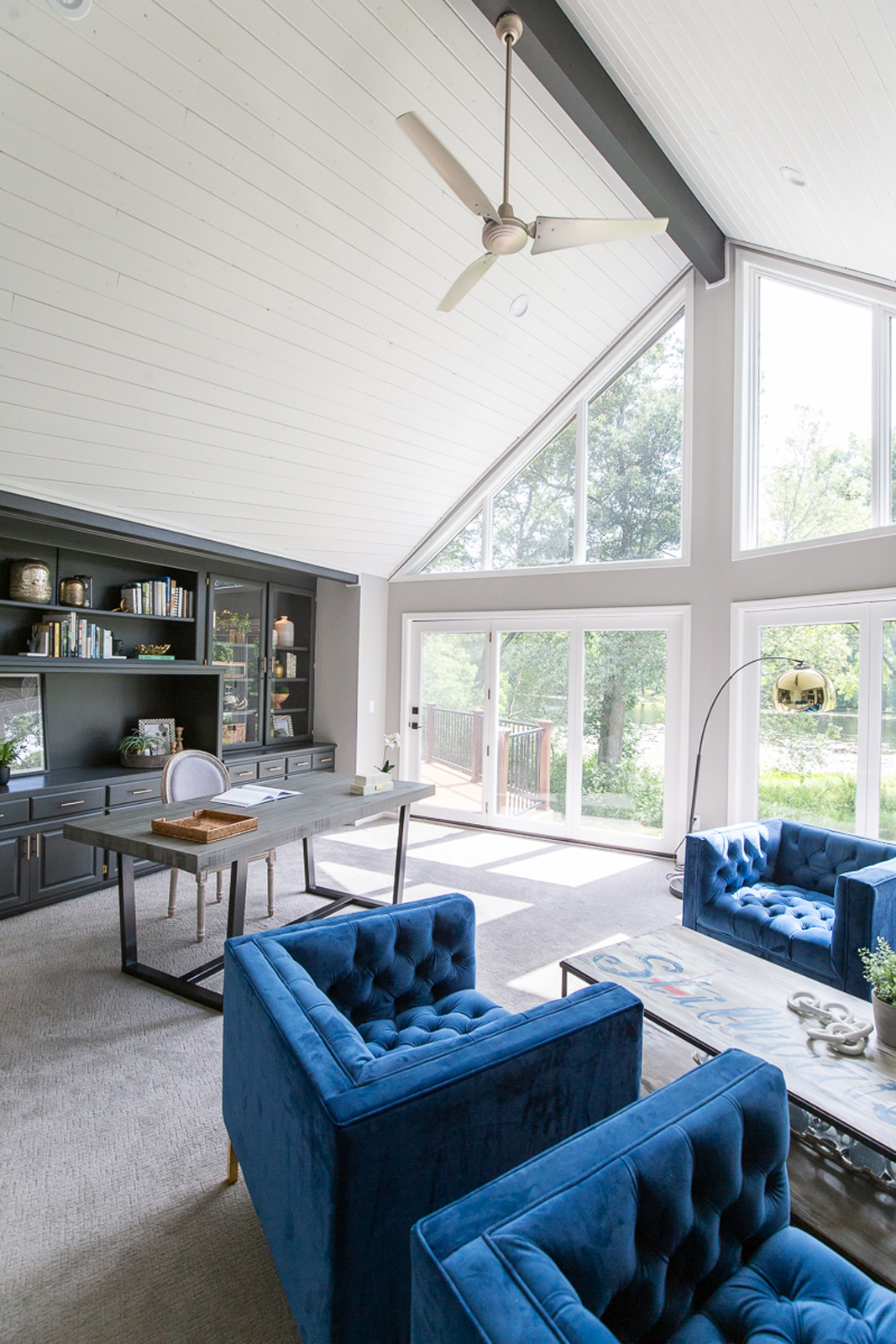
the after
Because of the generous amount of light that pours through the large floor-to-ceiling windows, we felt confident that we could go dark with the built-in cabinetry. It was a favorite feature of this room, so why not go bold and make it feel special? Brushed gold hardware was added to really make it pop. We also painted the fireplace surround and smaller bookshelf the dark charcoal gray color. We removed a couple of shelves to quiet down all of the “stuff” on the shelves. We brought in their favorite books, and many of the accessories give nod to a coastal look, as they both love oceanside getaways. The red brick was toned down with a coat of white paint also. The accent beam in the ceiling popped so much more after that was painted the dark charcoal color also. We replaced the carpeting, painted all of the trim and the ceilings white, Now this office space feels more sophisticated and classy.
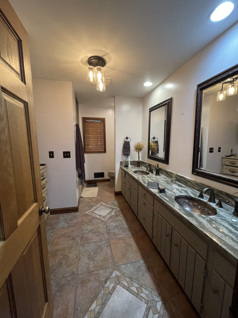
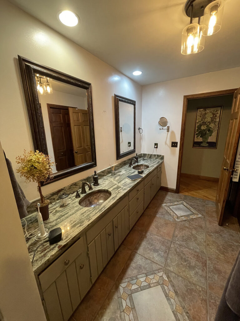
the guest bathroom
Oh boy, where do we start? The before photos truly speak for themselves! The biggest problem we were trying to solve (besides being dated) was that this room felt so dark and drab. The shower was also very dark and closed off. The vanity cabinet style was too dated to be worth just being painted, so we decided we would need an entire new vanity. The green countertops were also not representative of Chris & Michelle’s style, so we said “AuRevoir” to all of the old finishes in this room!
the before
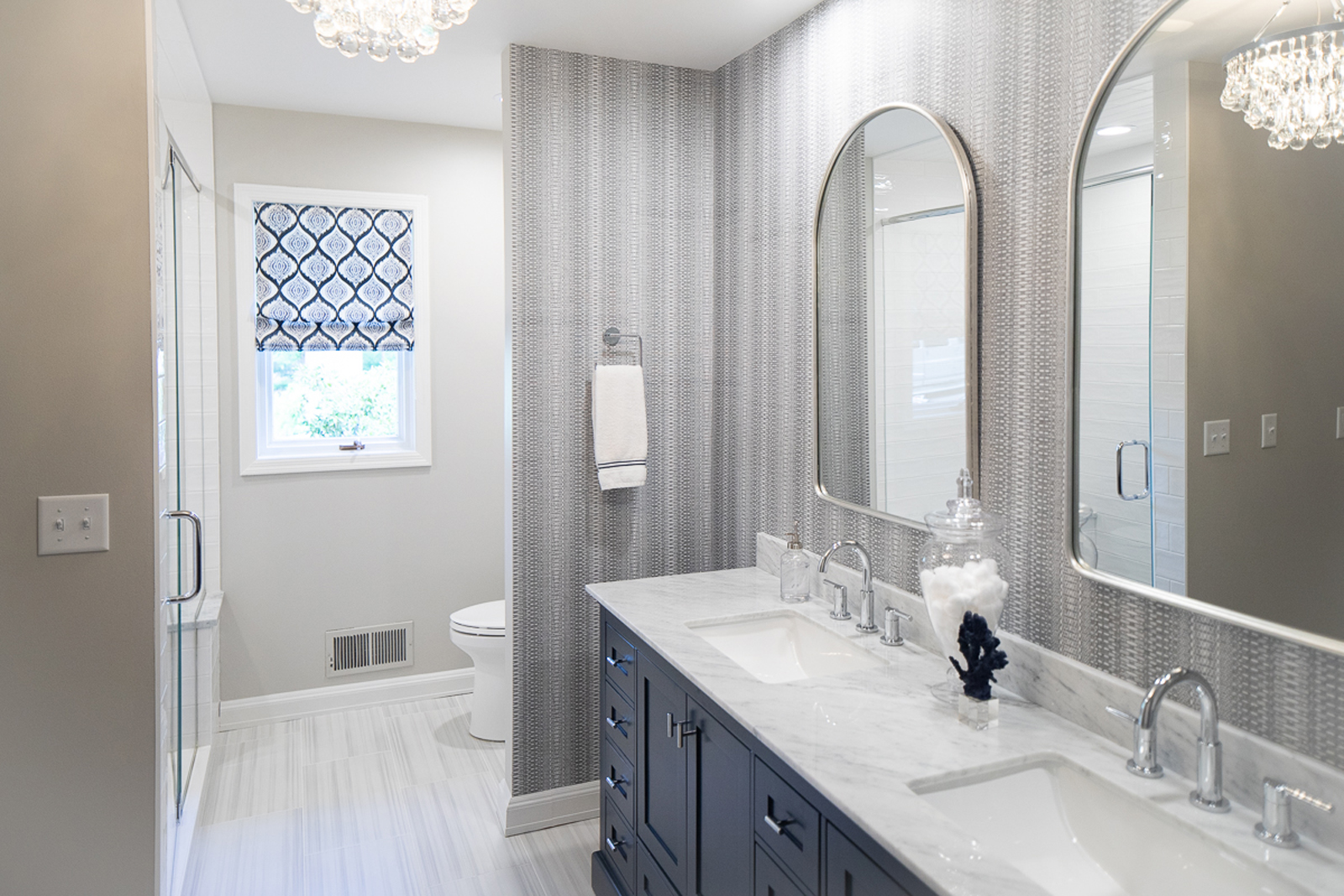
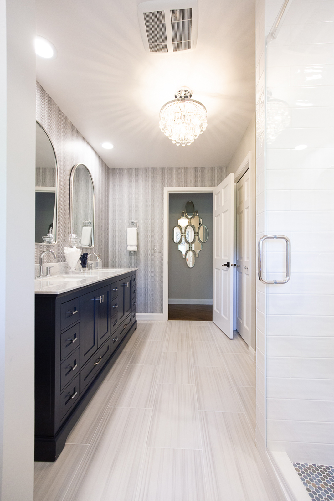
the after
Bon Jour light and bright! All new floor tile, a new pretty blue free-standing vanity, beautiful cararra marble countertop, all new plumbing fixtures, shower tile, a full glass shower door, new light fixtures, mirrors, a custom window treatment, and new sinks make this feel like a brand new home. One of my favorite parts is the gorgeous wallpaper. It really elevated this room to another level!
the primary bedroom
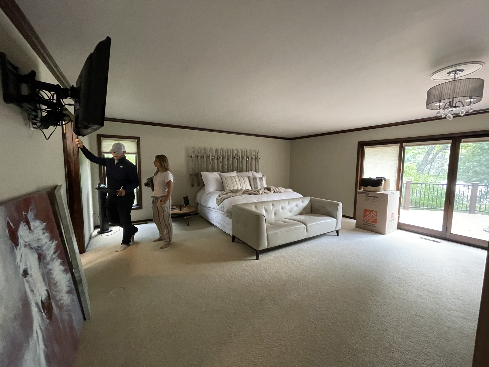
the before
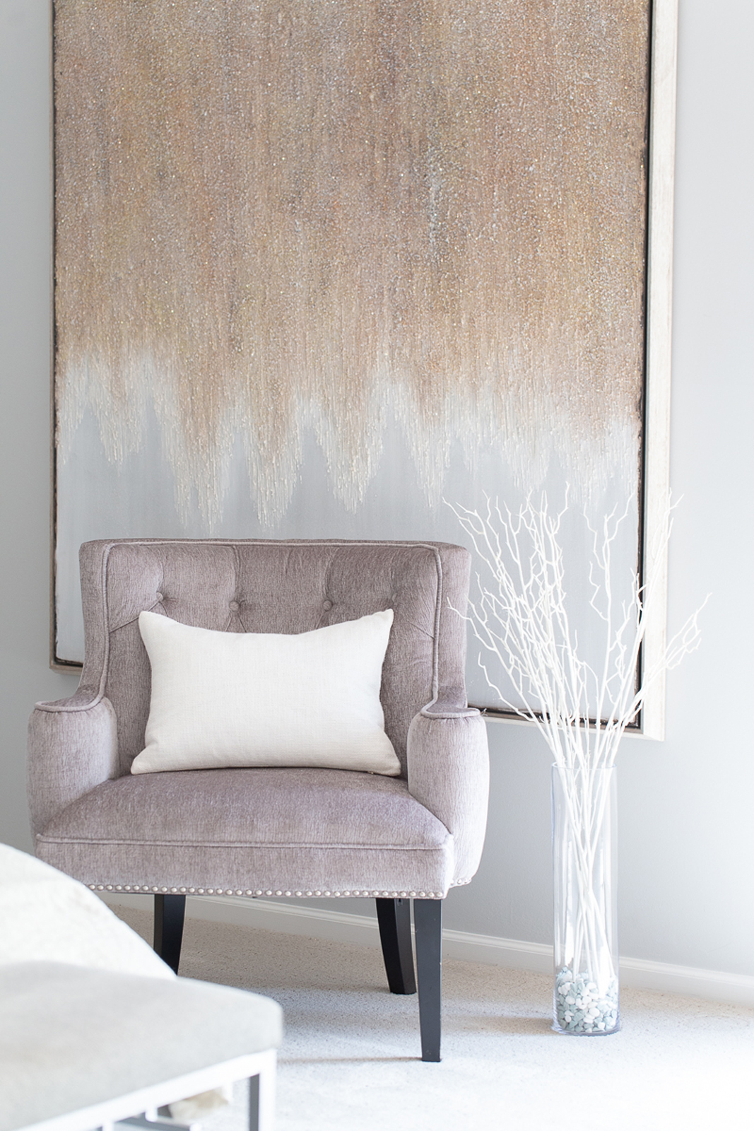
Nothing was terribly wrong with this room, but it felt a little dark and gloomy. The darker wood was dragging it down a bit and there was a full wall of dark wood closet doors (not pictured). Our goal was to make this primary suite feel restful and serene and to bring it up to a more current look.
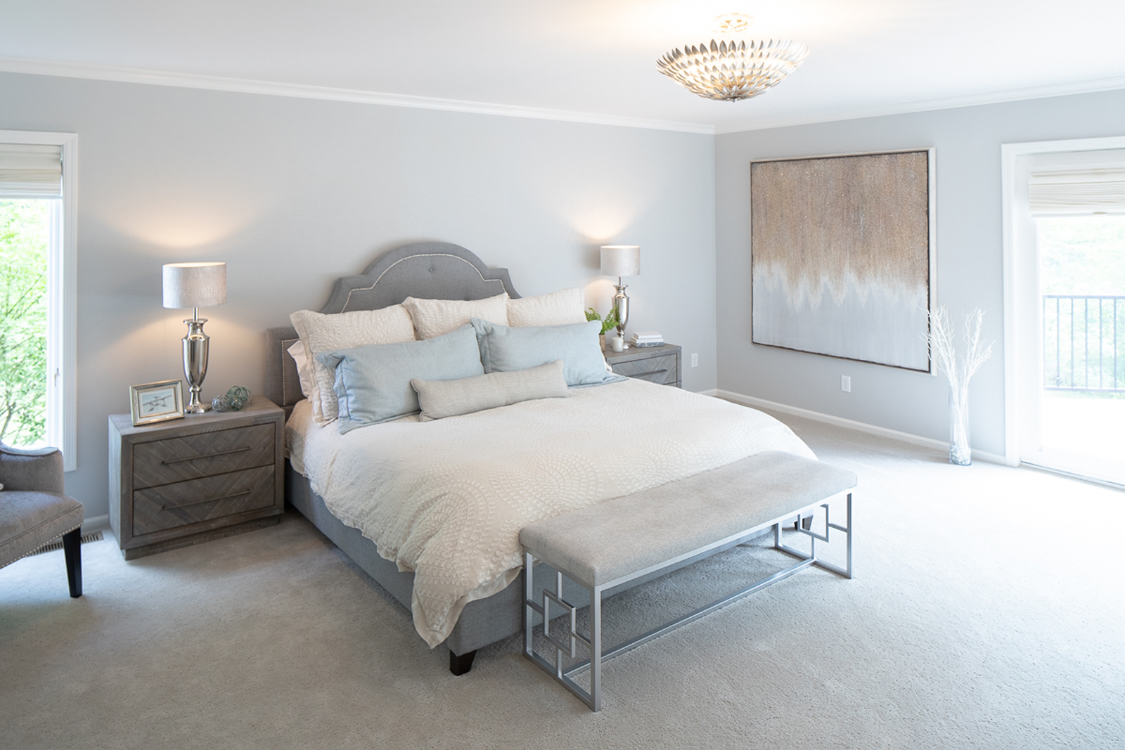
the after
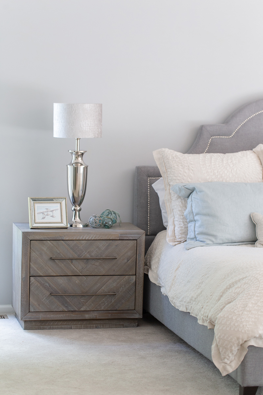
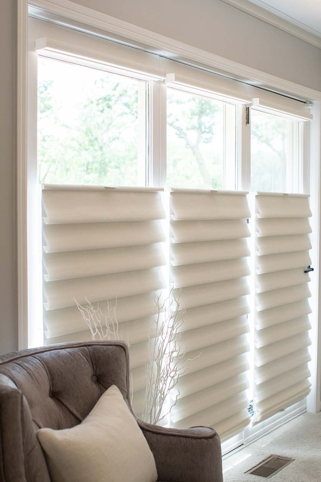
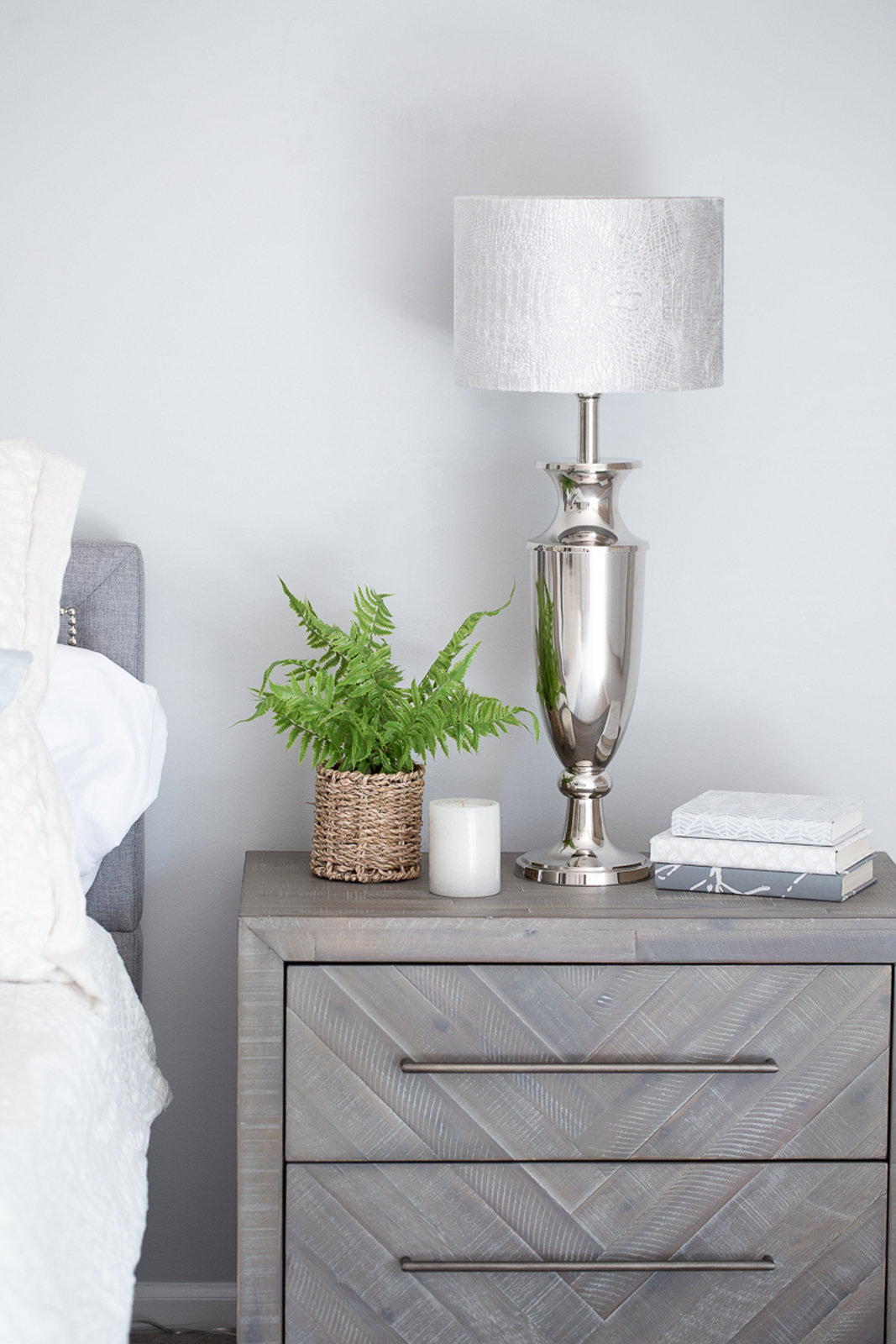
New paint, carpet, closet doors, and lighting really helped this room feel fresh and bright. Painting the woodwork made a huge difference in the overall look of this space. The look is a refined coastal feel and it now feels very welcoming and soft.
the primary bathroom
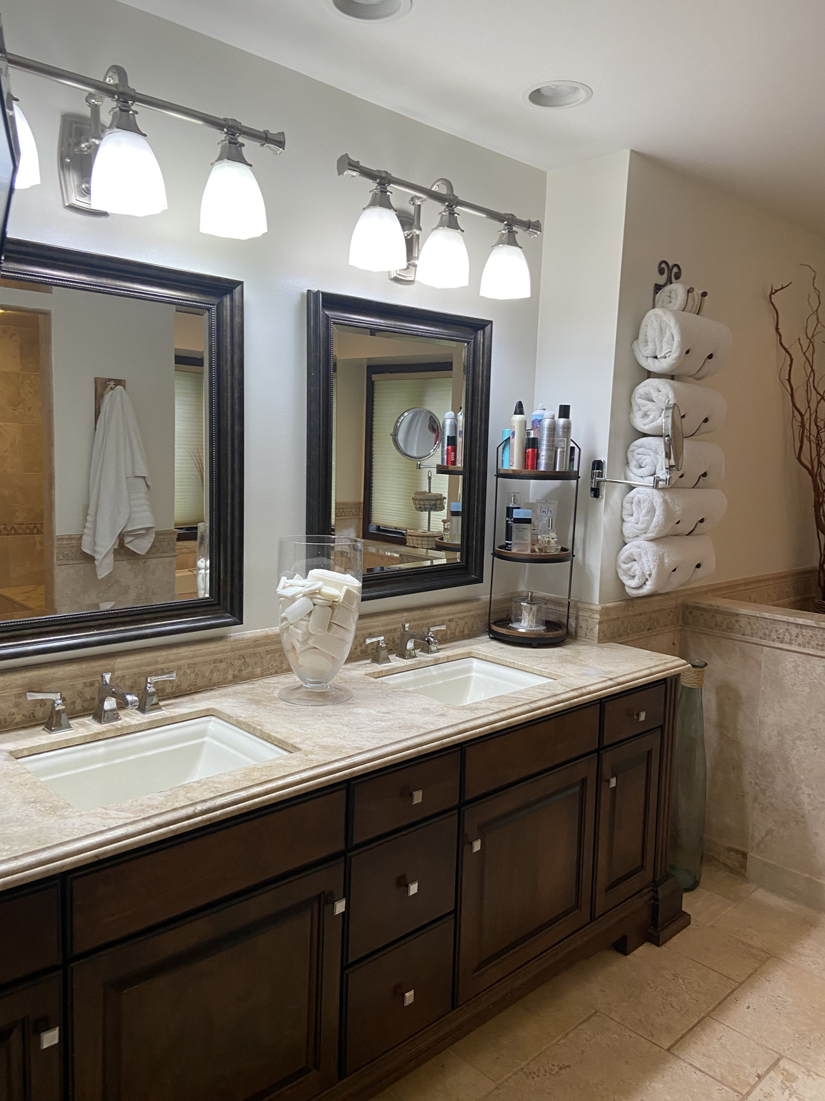
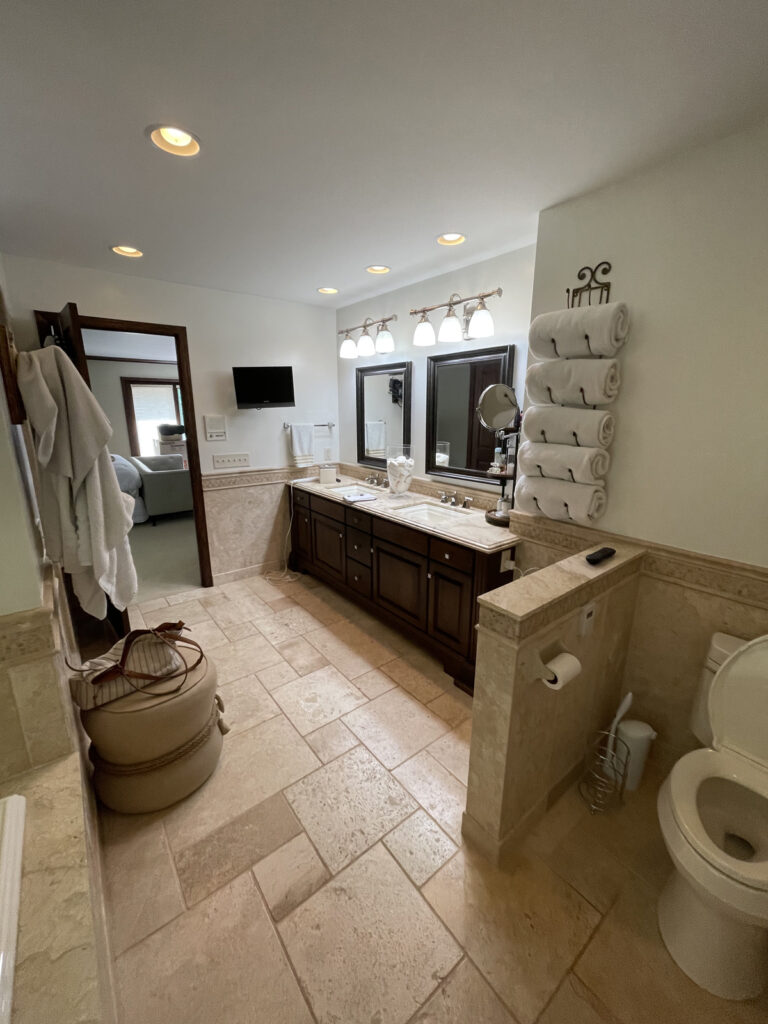
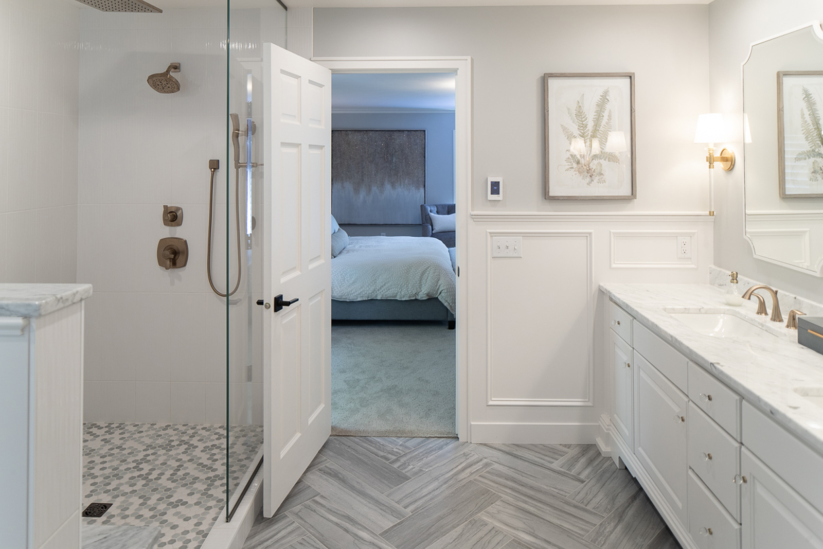
Here comes my favorite transformation in this home! I mean, WOW! It was so dated and dark and did not reflect the bright, cheery and energetic personalities of our clients. There was a lot of heavy brown travertine tile everywhere. The shower was enclosed and felt like a dark cave inside. The old jetted tub was heavily encased in a tile ledge surround and took up a lot of the floor space. A half wall next to the toilet also just added to the choppy layout and made the bathroom feel smaller than it was. The vanity had nice structure, but felt heavy and outdated.
the before
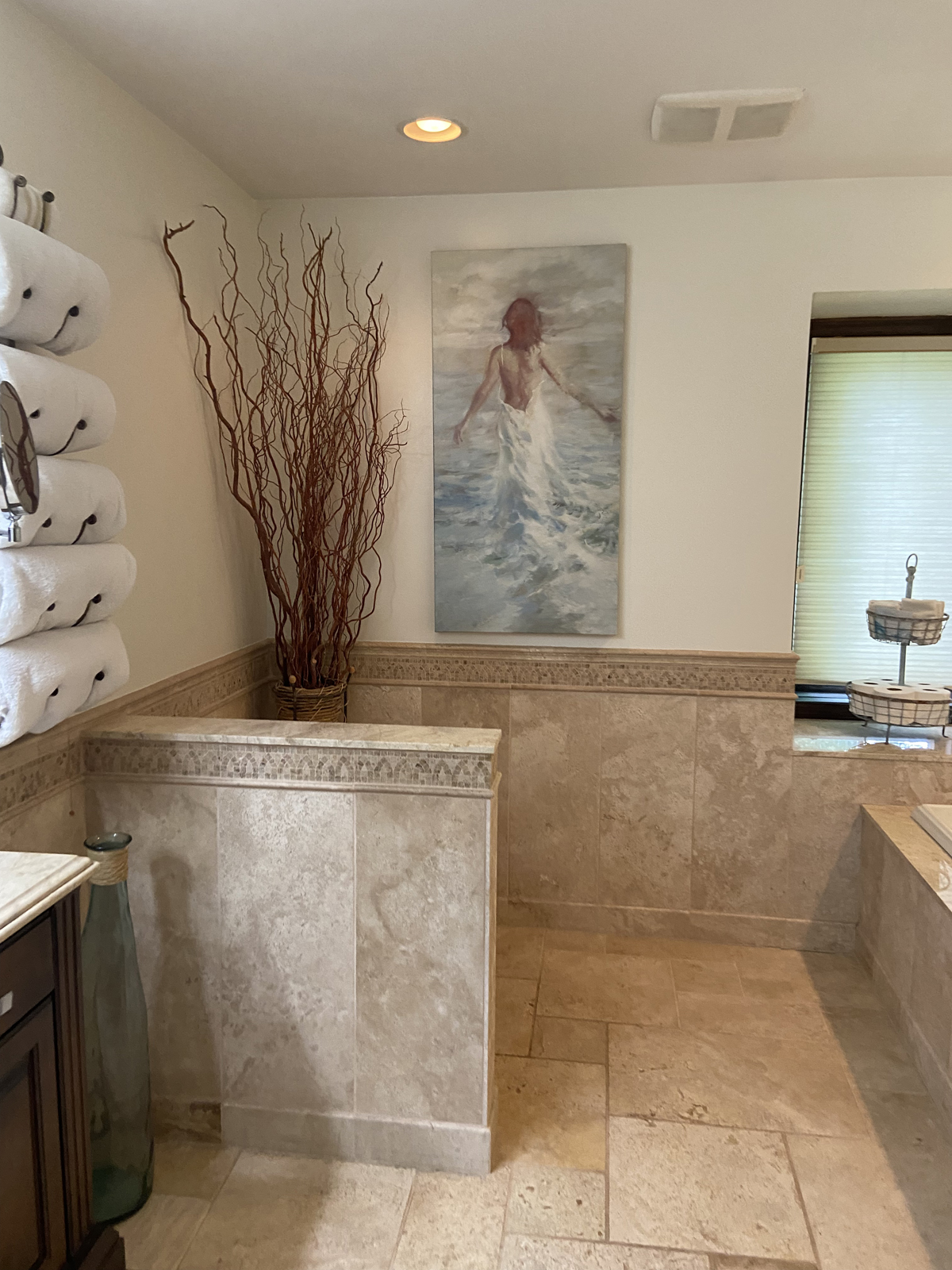
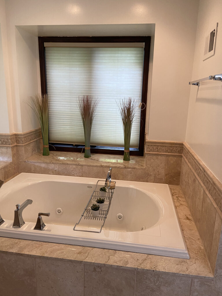
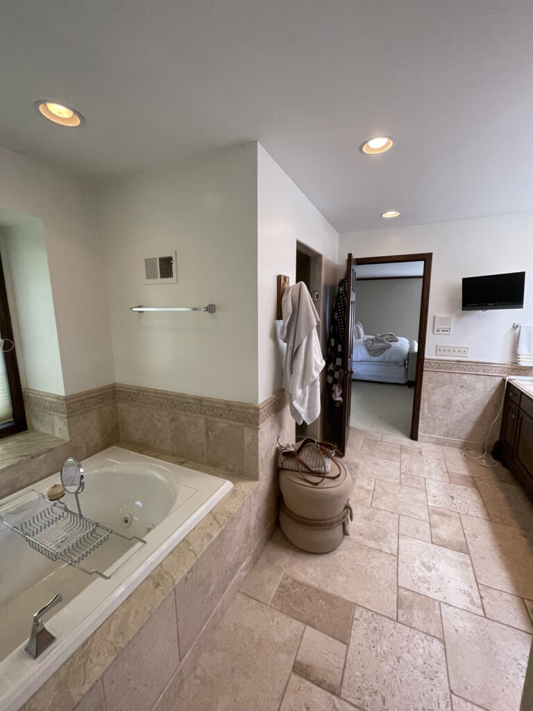
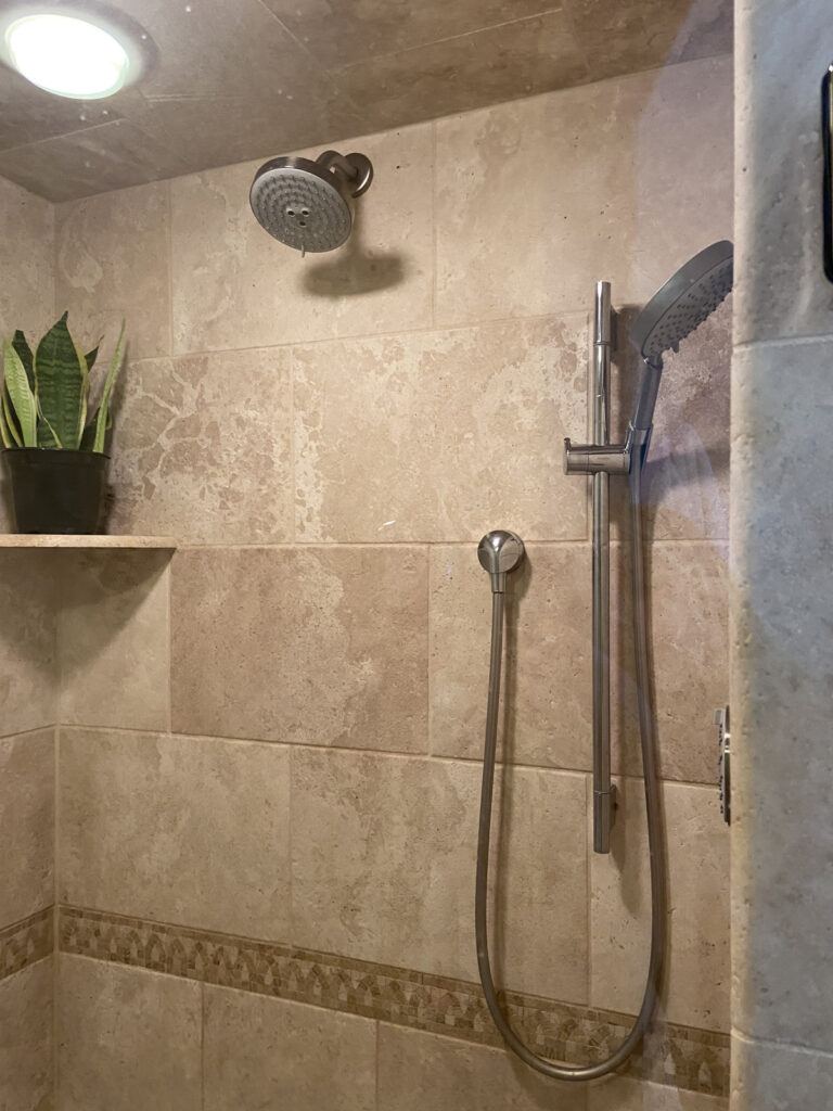
the after
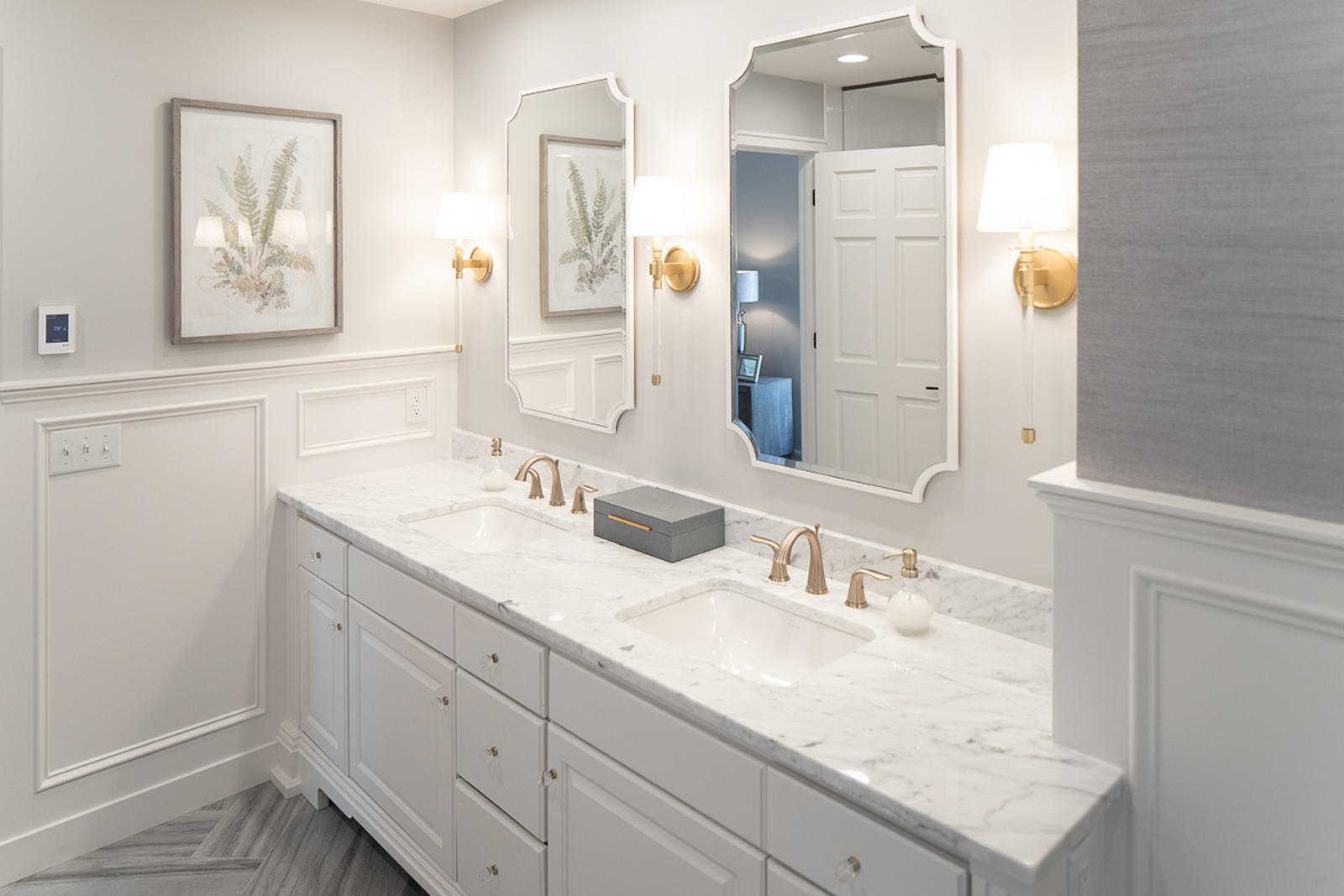
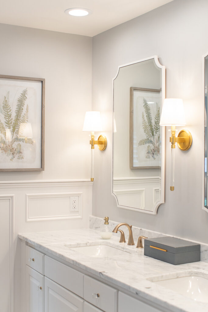
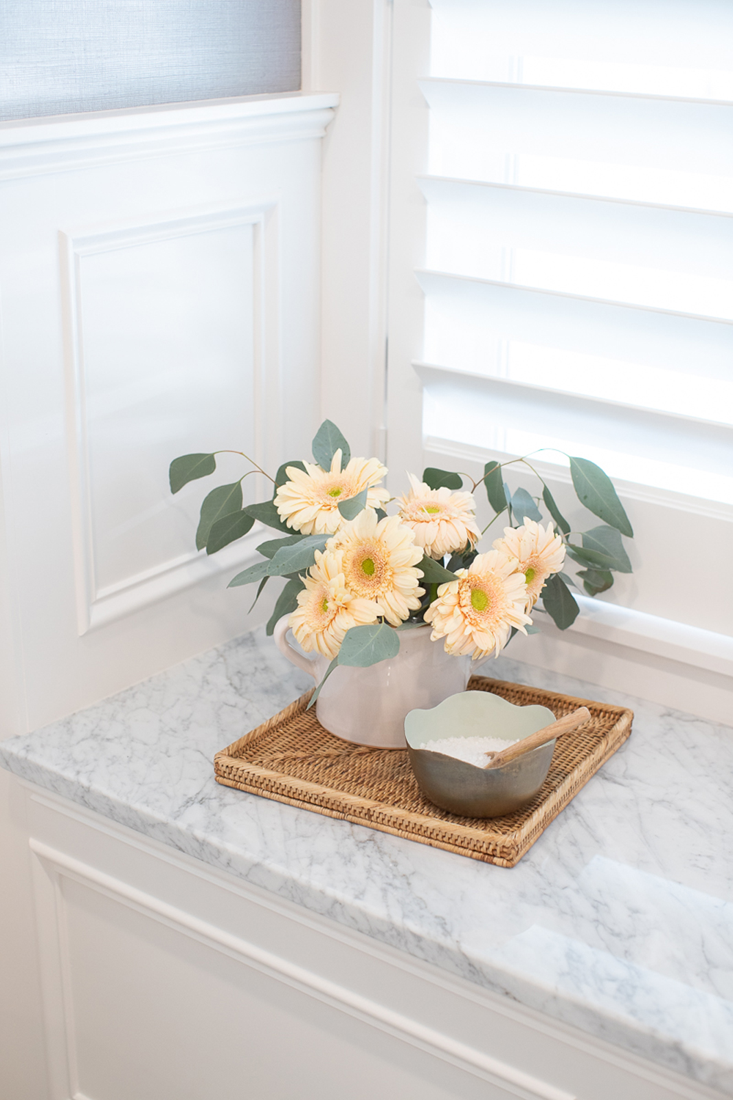
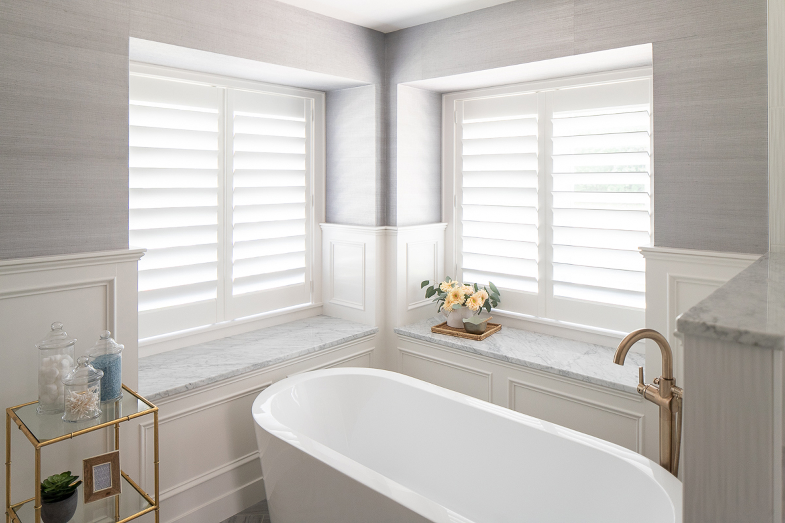
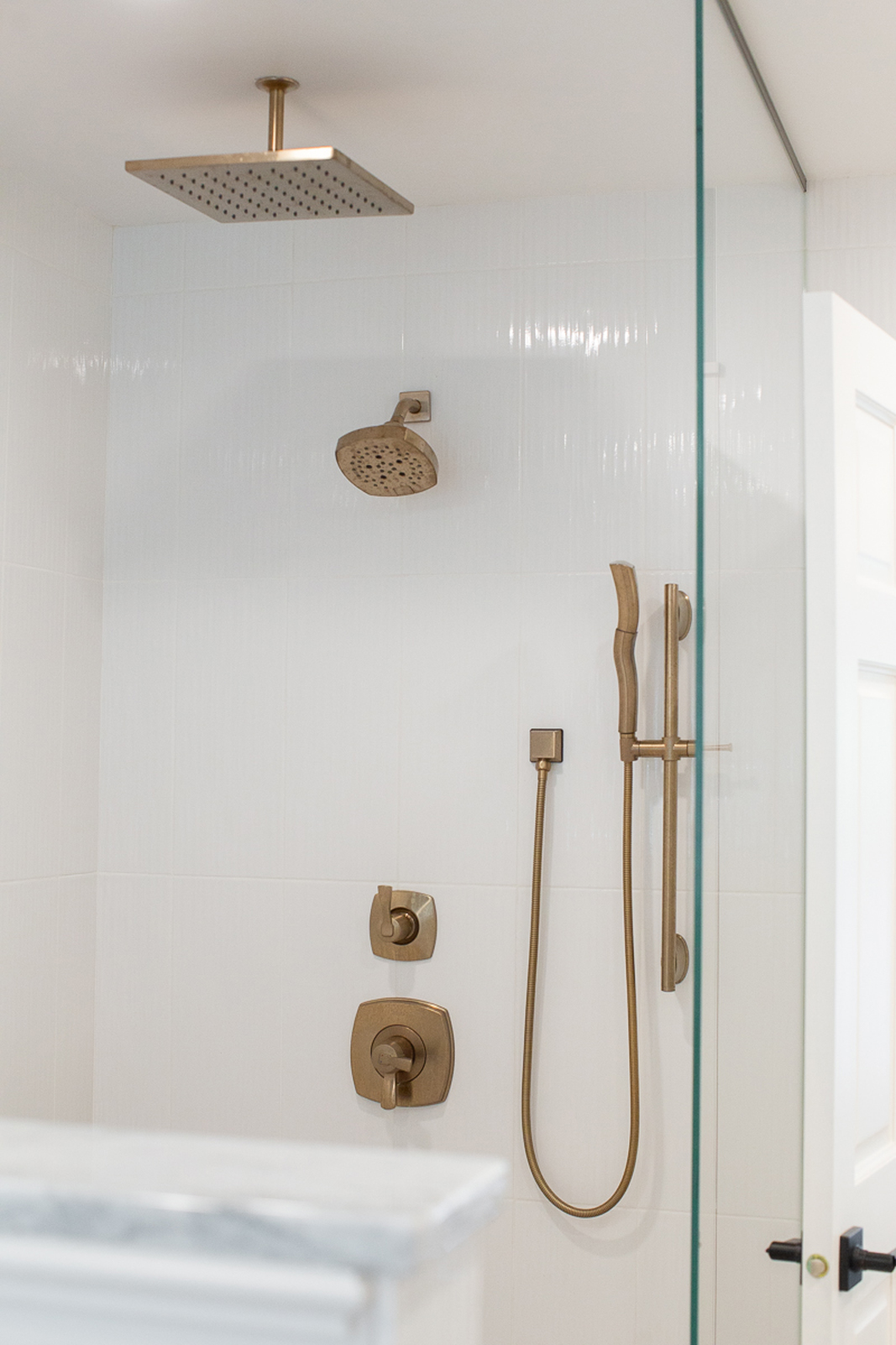
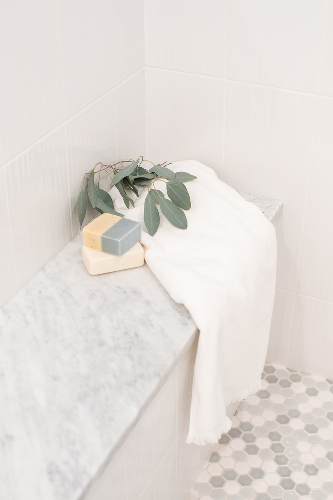
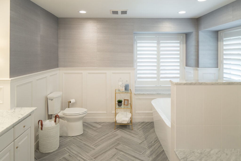
The shower was opened up completely and a glass wall only covers half of the shower to keep an open concept for the shower. I really love how modern and fresh this bathroom looks now! We kept the existing vanity but had it painted white. A new cararra marble countertop, faucets, sinks, wall sconce lights, and new mirrors make the vanity area a beautiful space. A new soaking tub makes this a very inviting and enticing room. All new tile on the floors and shower walls add a lot of value. The herringbone installation of the floor tile takes your breath away! The wall tile was removed and custom millwork was added to give dimension and elegance. The window ledges were capped in cararra marble as well, and custom shutters were added to the windows (also replaced with new windows). Fresh paint and a beautiful textural wallpaper really makes this bathroom special! I feel like I am walking into a gorgeous Four Seasons villa whenever I enter this beautiful primary suite!
the stairwell
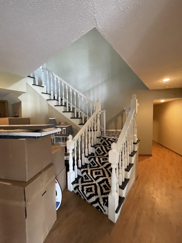
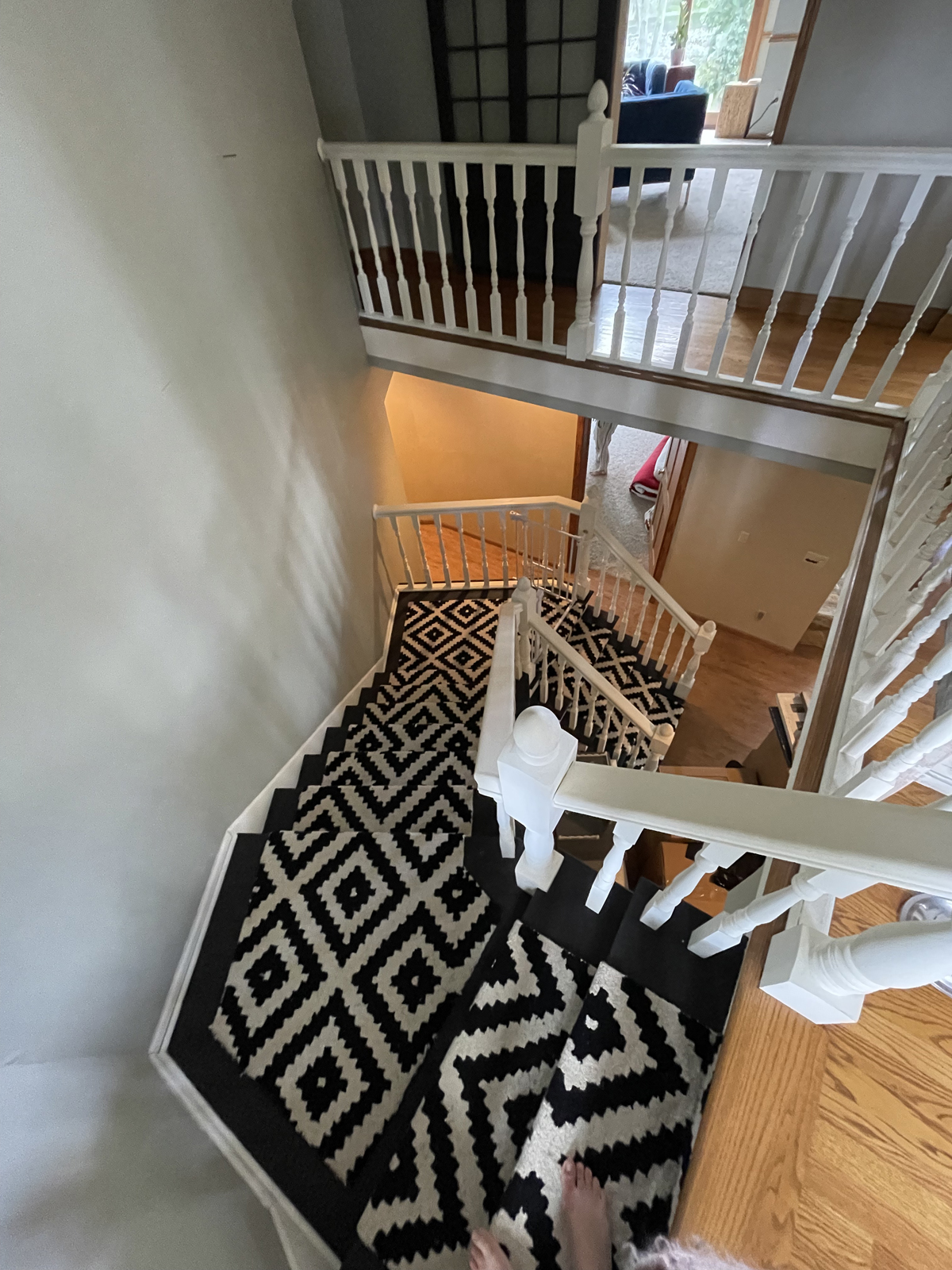
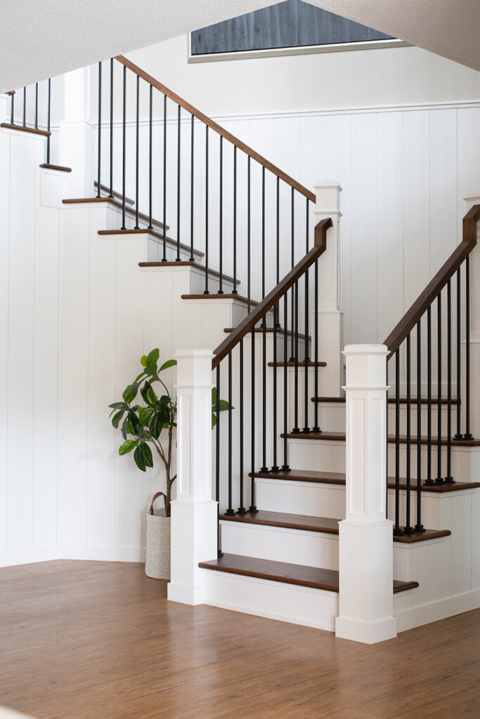
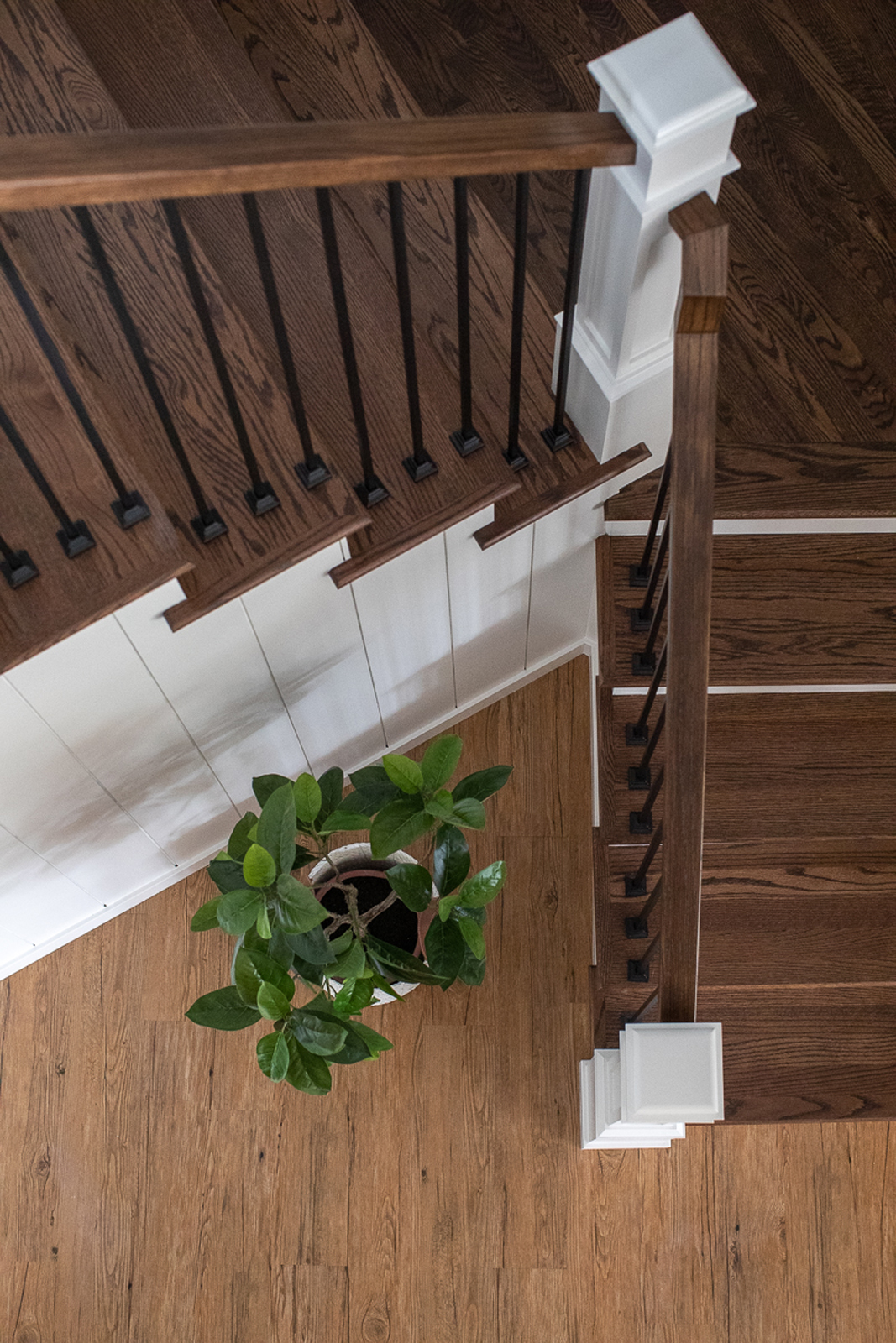
The stairway was dated and lacked pizazz and was falling apart. All new stairway parts were put in and vertical tongue & groove wood paneling accents really add a lot of interest. the busy runner was removed and beautiful wood stair treads were added instead, making this staircase elegant and classic.
the before
the after
the daughter’s bathroom
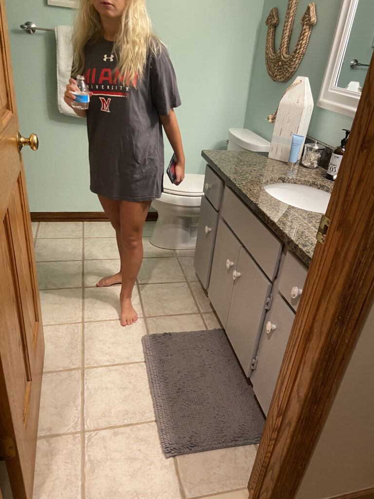
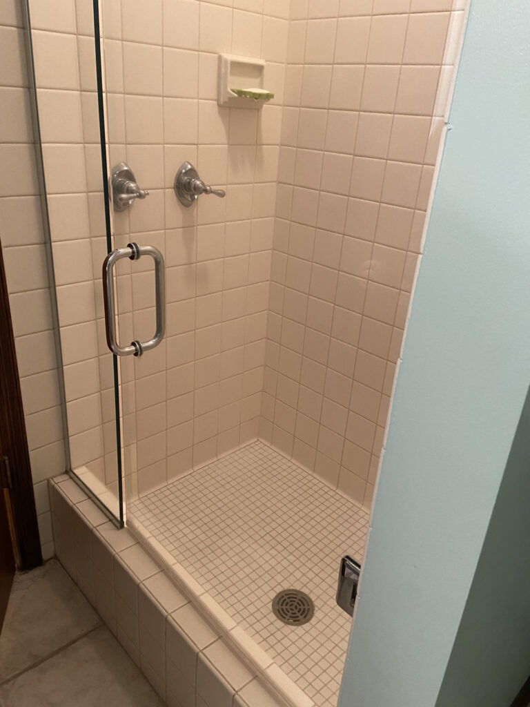
the before
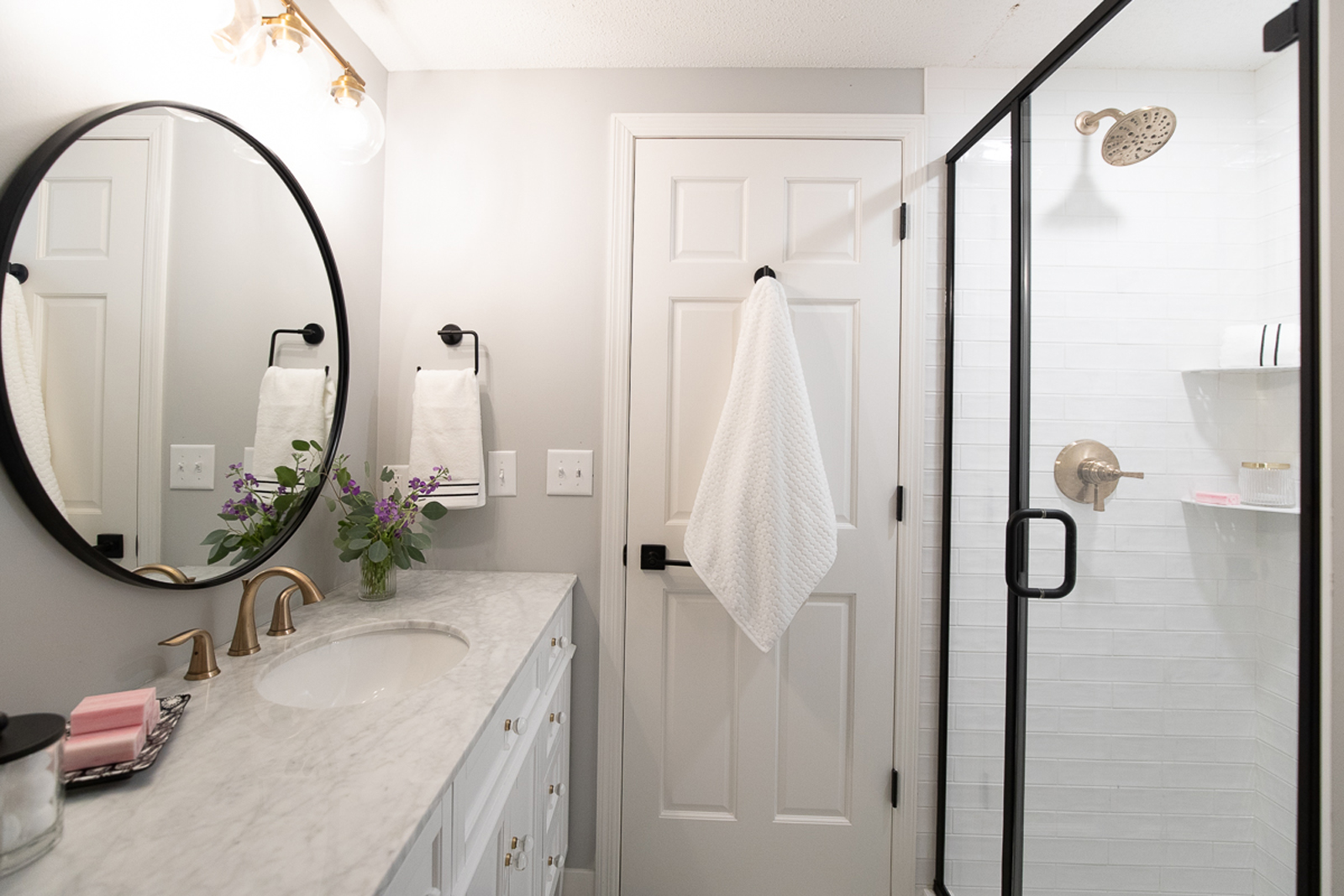
The tile was quite dated and the vanity and bathroom in general lacked interest. The vanity cabinet was old and lacked stability. All new tile, a new vanity with a pretty marble countertop, a new sink, faucets, mirror, and paint gave this room the makeover it truly deserved.
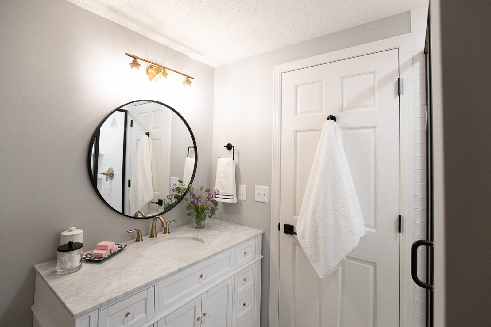
the after
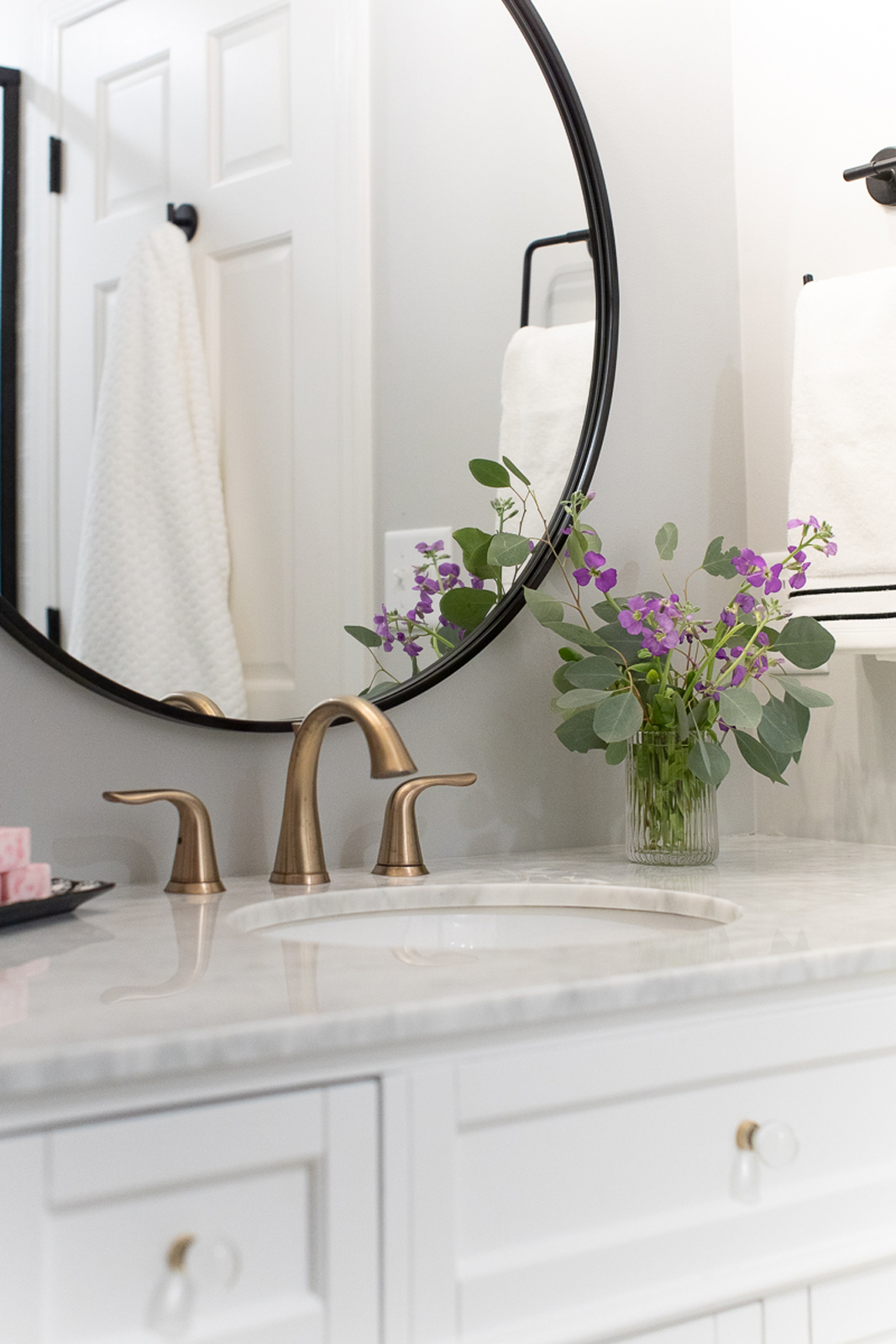
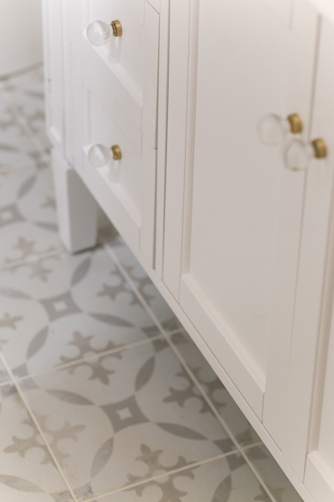
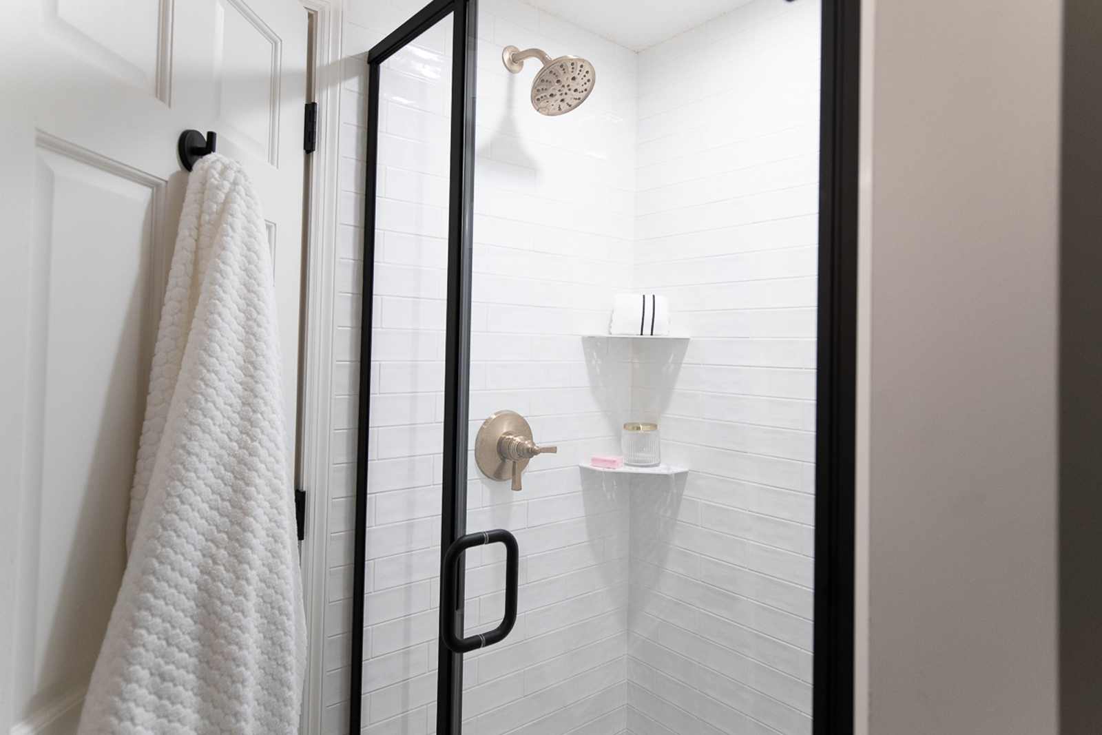
Pretty new floor tile was a jumping off point for this room. We loved the pattern and soft colors and interest it adds. In order to not feel too “girly” or young, we used a sophisticated mixture of black metals (on the shower surround, mirror, door hardware and bath hardware), and some brushed gold to add a touch of glam (on the light fixture, faucet, and cabinet hardware). We love mixing metals in bathrooms. When you think about it, there are so many different metals in a small space. Mixing it up a little feels more interesting than having every finish be the same. I love how pretty this bathroom is now! It’s so nice that it feels like a mini primary bathroom!
the laundry room/MUDROOM/PANTRY CLOSET
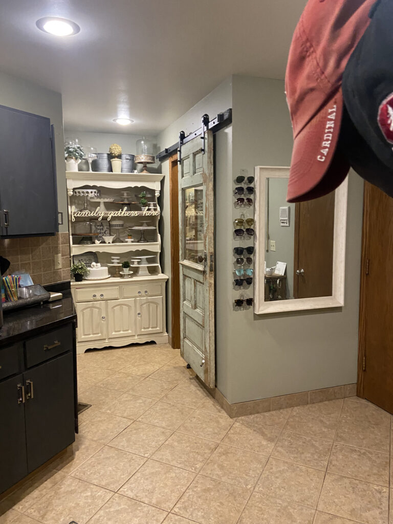
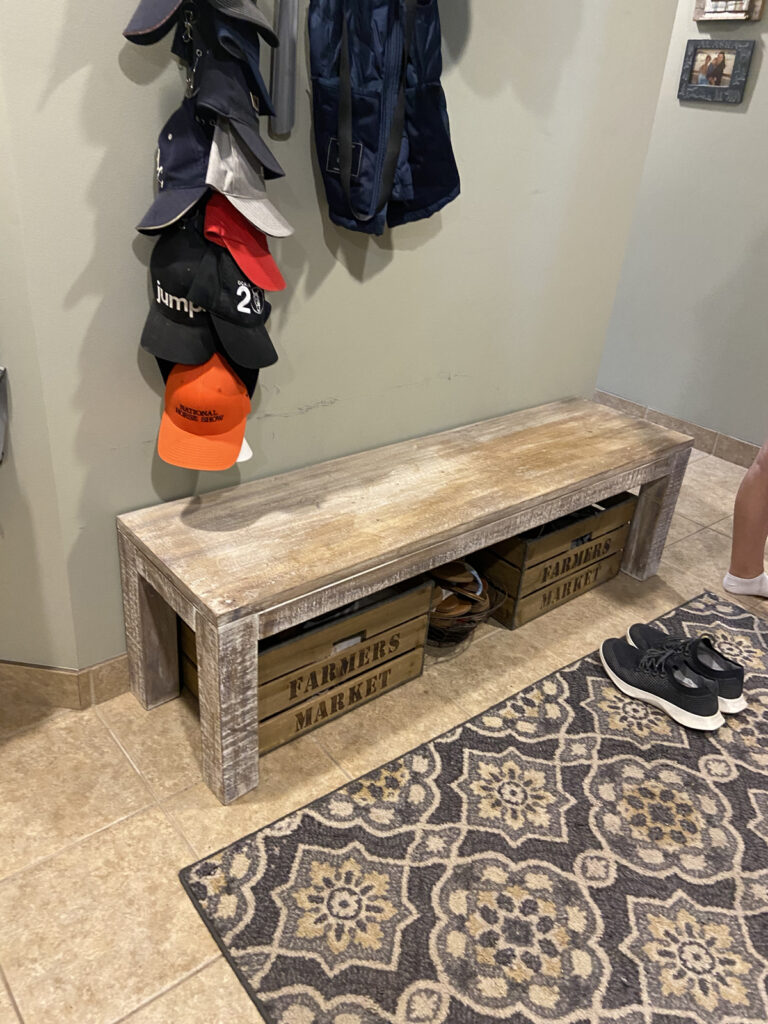
the before
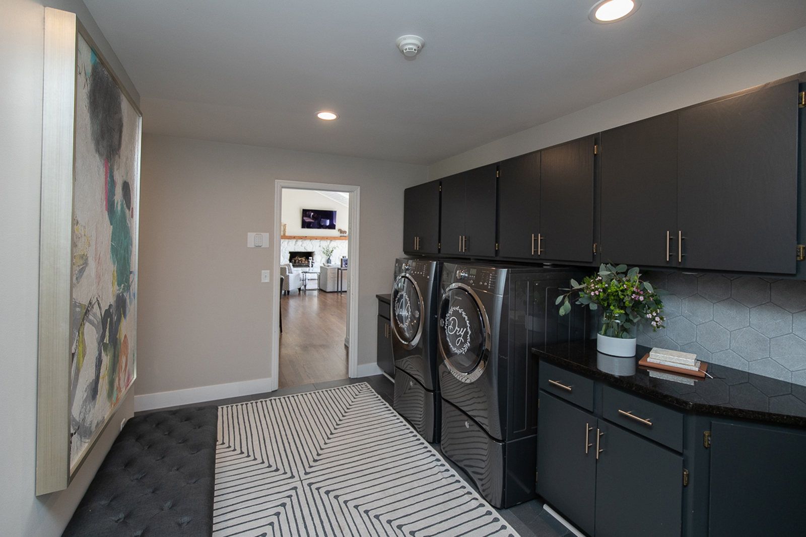
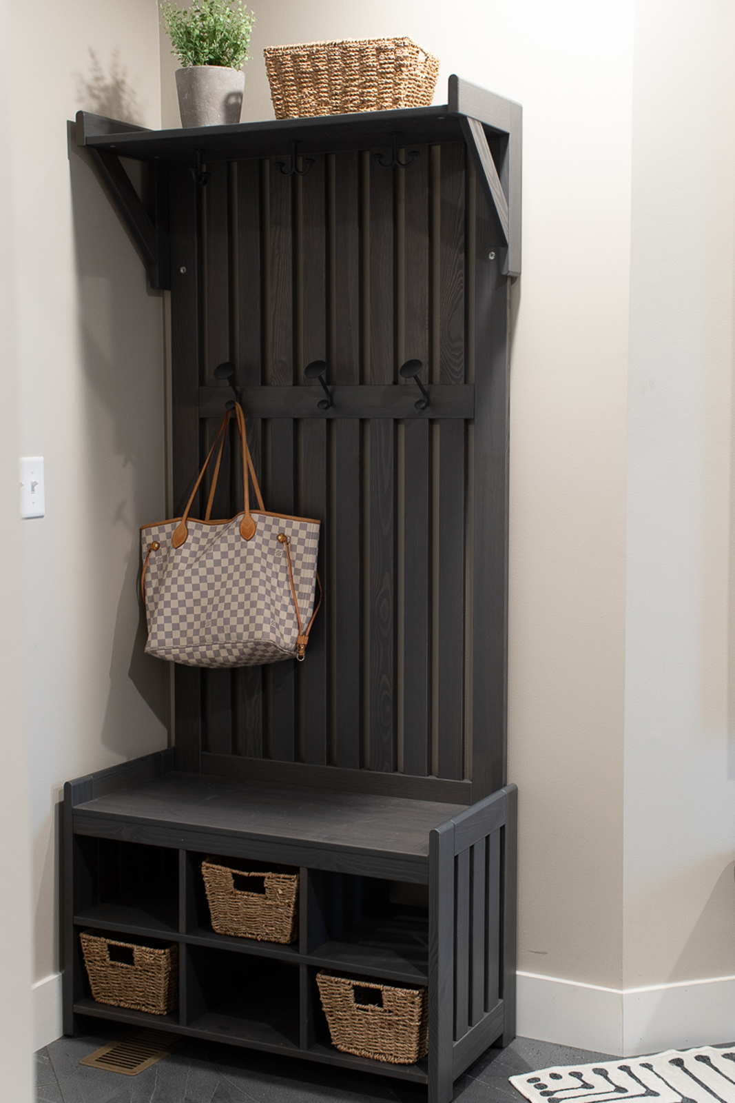
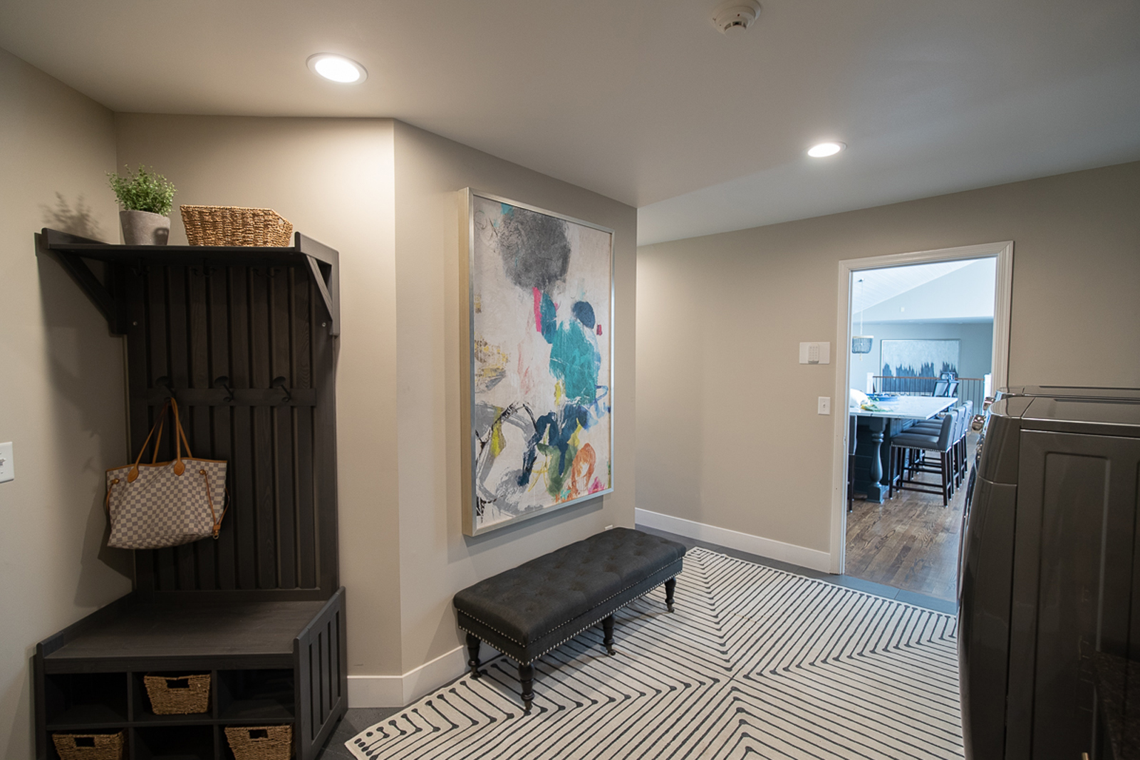
There was just a lot of brown tile going on here, and it felt busy and cluttered. We simplified this multi-functional space by removing a lot of the fluff and adding fresh new finishes.
the after
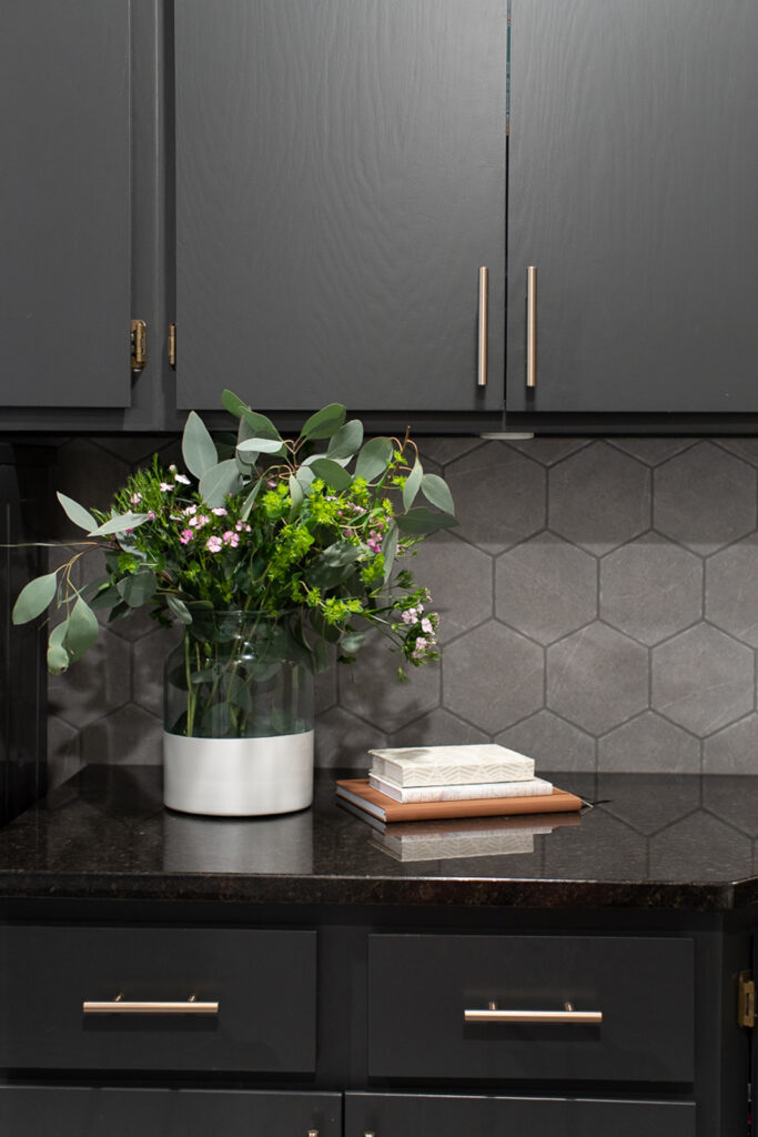
The cabinets got a fresh coat of deep gray paint, with brushed gold hardware, new slate gray floor tile, lighter paint on the walls, a new tile backsplash, and a more simple storage solution all combine to make this space feel a little more serene when you get home from a busy day.
the powder bathroom
the after
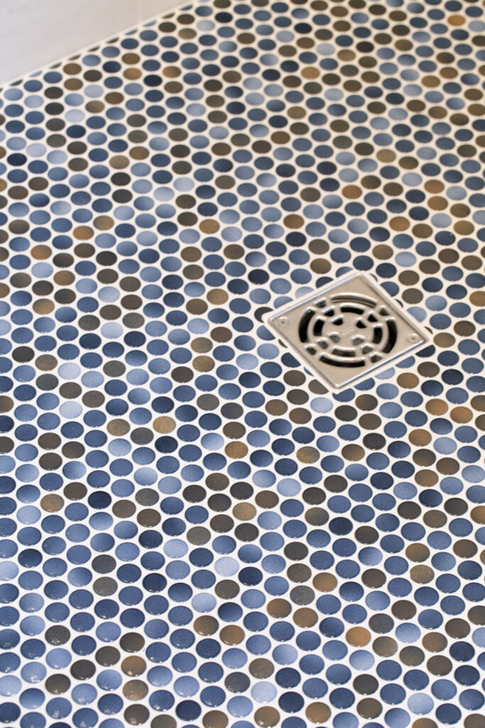
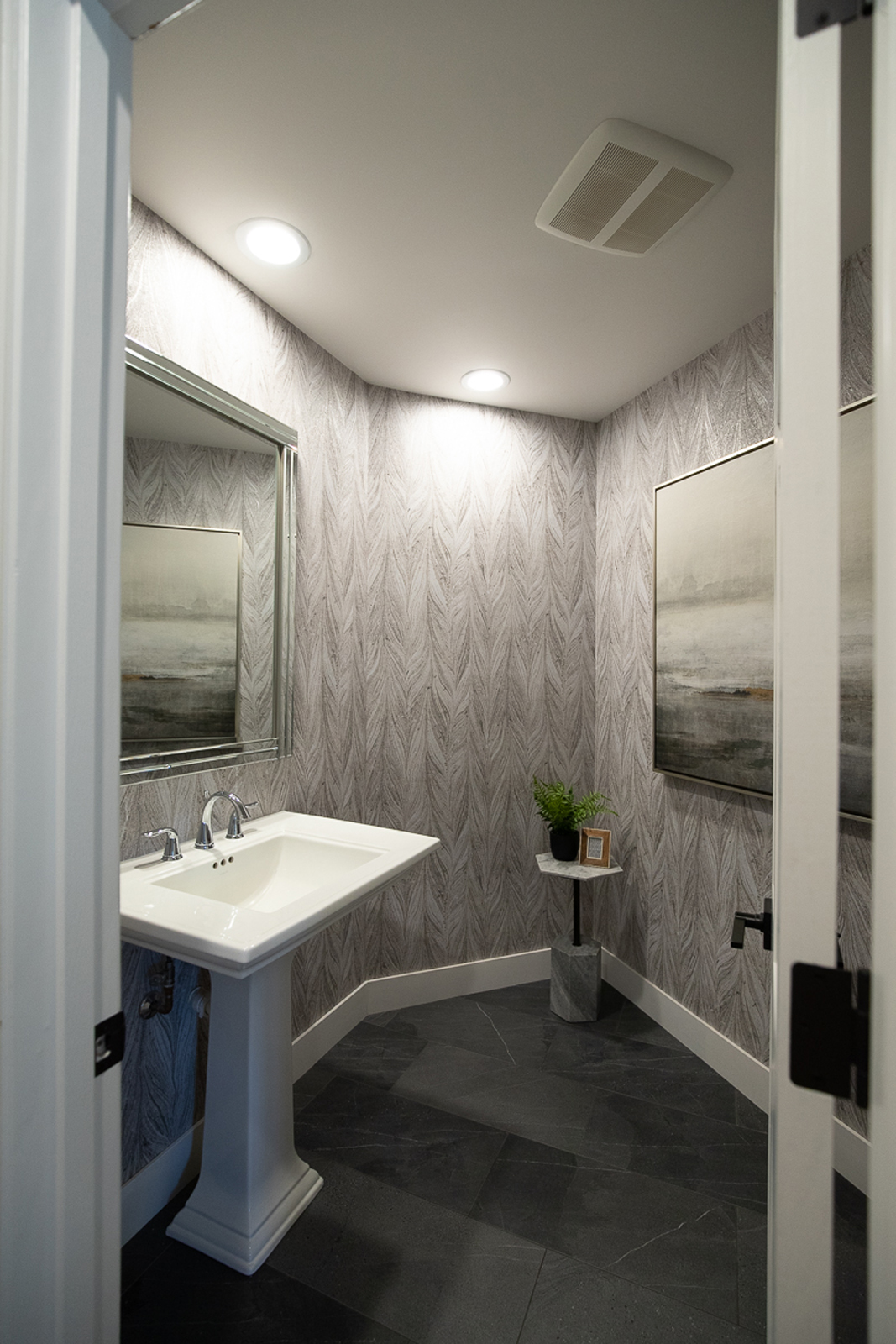
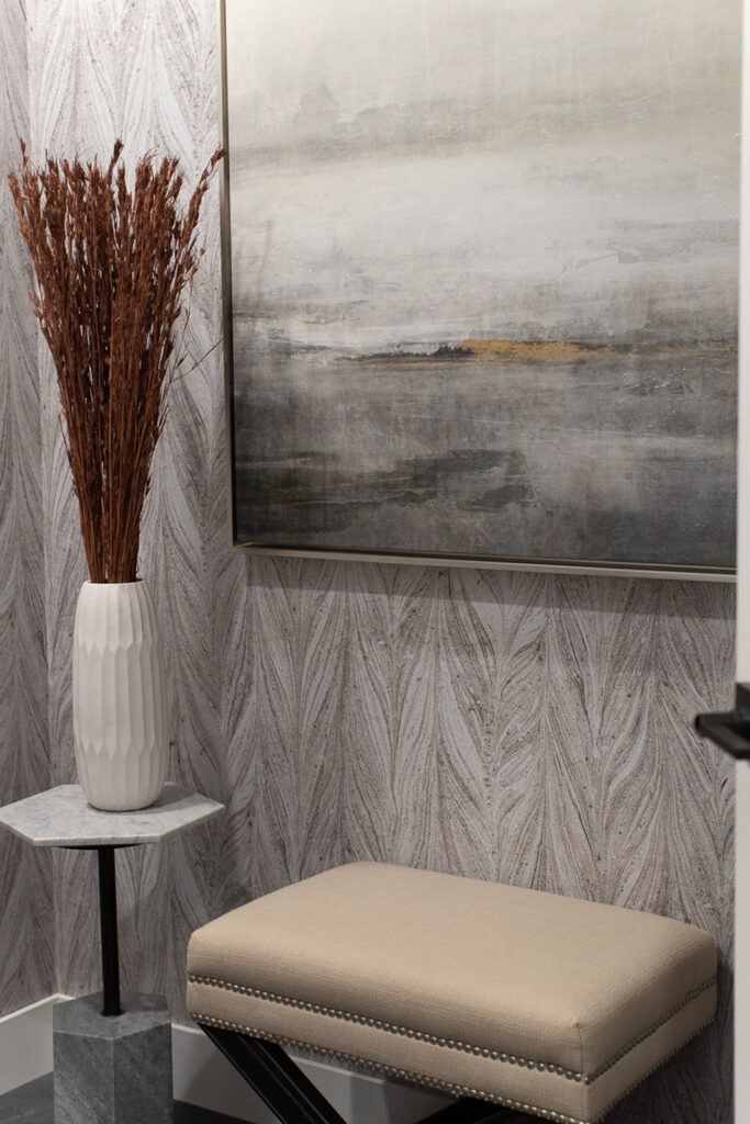
Unfortunately, I forgot to take before pics of the powder bath, but it had the same brown tile from the mudroom area, a darker paint color on the walls, and just felt a little boring. We added a beautiful marbled wallpaper, new floor tile, a new mirror and some pretty artwork. It did not take much to make this powder bathroom feel special!
I hope you enjoyed seeing this beautiful lakeside home! We had so much fun helping Michelle & Chris on this home. As always, I absolutely love working with them and hope to continue our friendship for many years to come! What’s next? I am working on getting them to buy an oceanside vacation home so we can have a #6 to work on together (wink wink)!!
Cheers to a fabulous weekend,
Amy & the Interior Impressions team
Leave a Reply