The highest compliment we can ever receive is a client that wants to work with us again. In this situation, I have had the privilege of working with Michelle & Chris and their family on 5 homes! It’s been an honor to be a part of the transitions and growth over the years. This home is very special and it has a beautiful location in Mahtomedi, situated on a lovely lake, nestled in the woods. It was already a lovely home when they purchased it, but our goal was to make it more representative of Michelle and her family. We love helping families make their house a “home”!
THE ENTRY + SITTING AREA
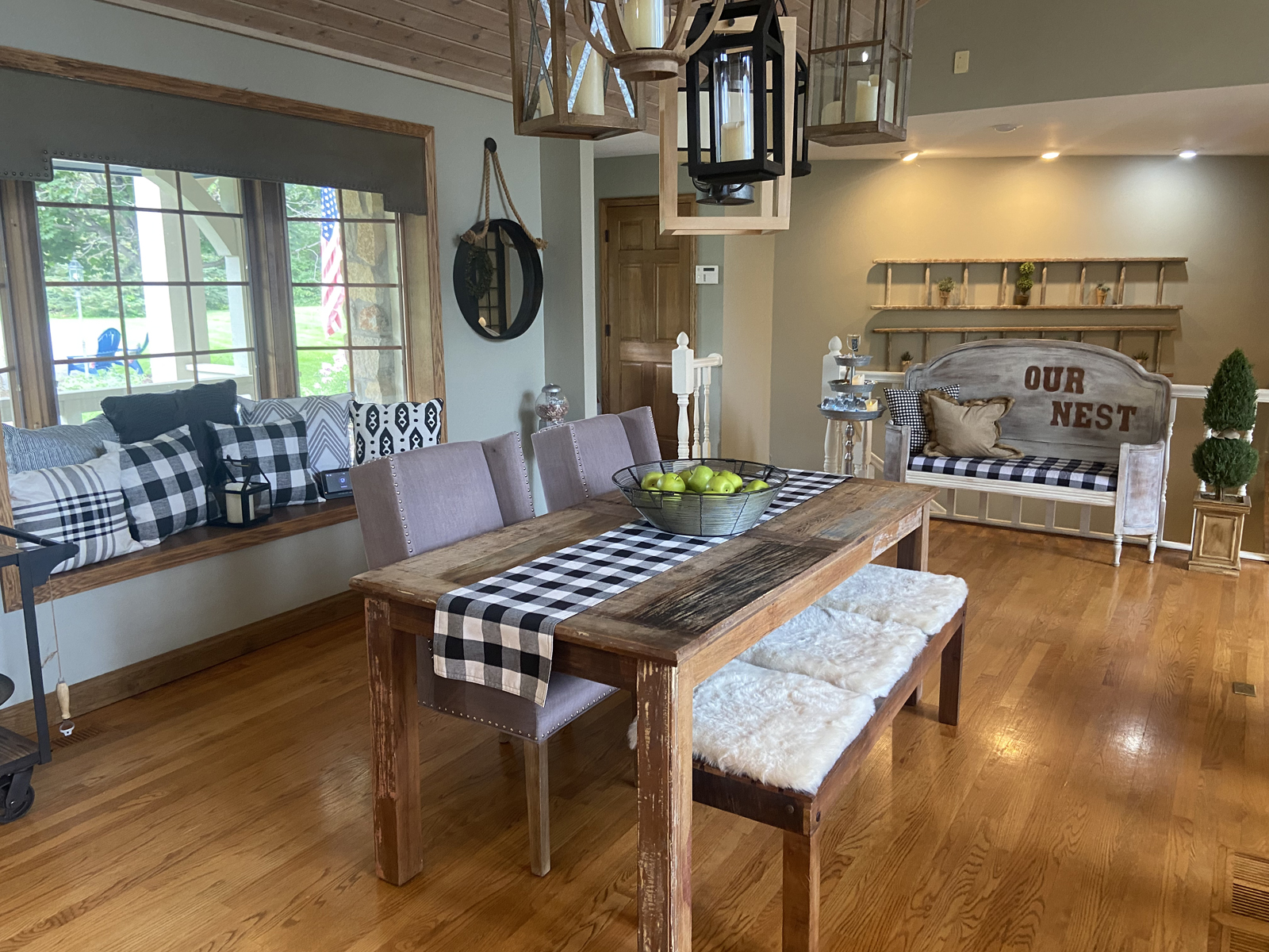
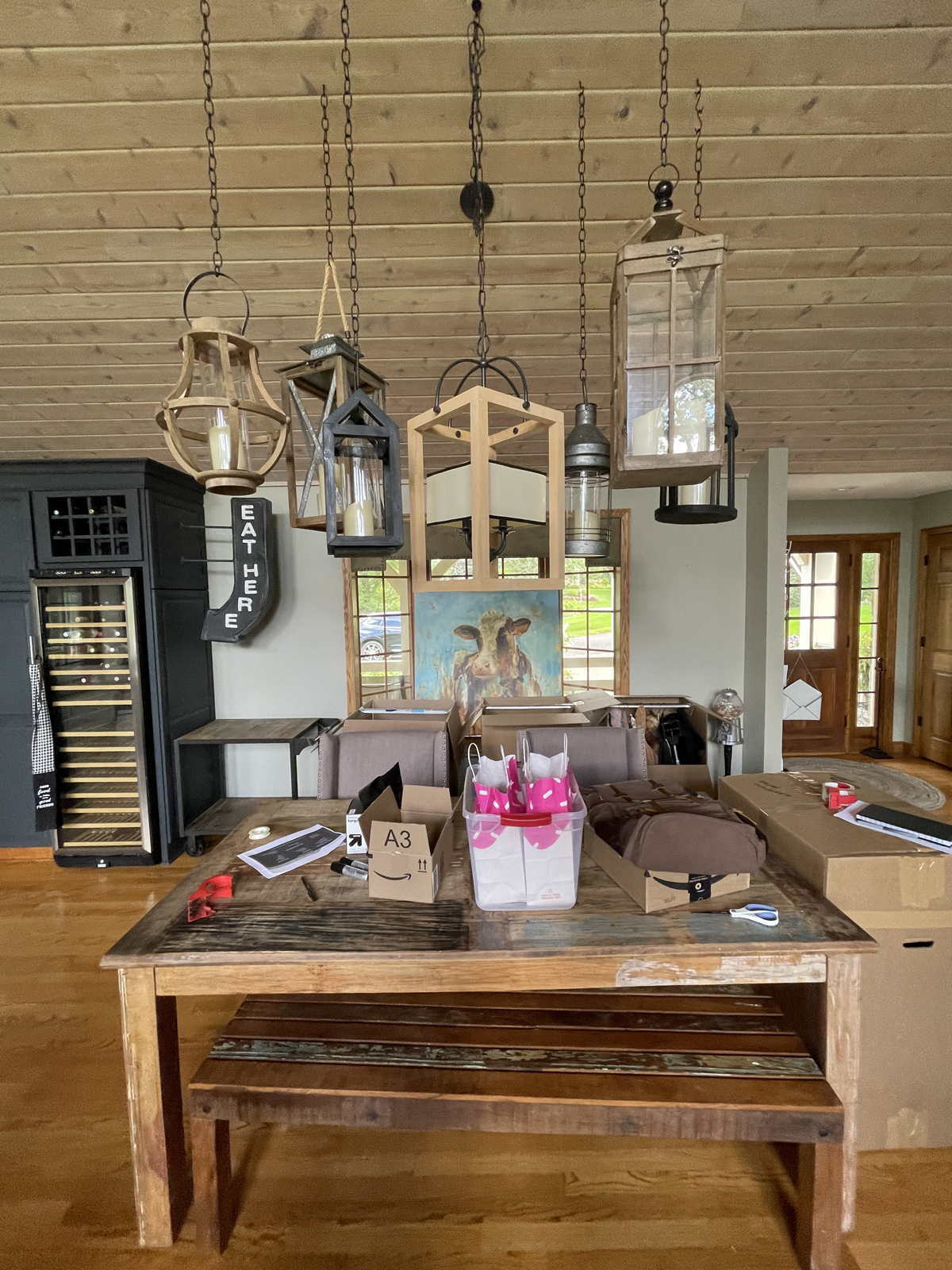
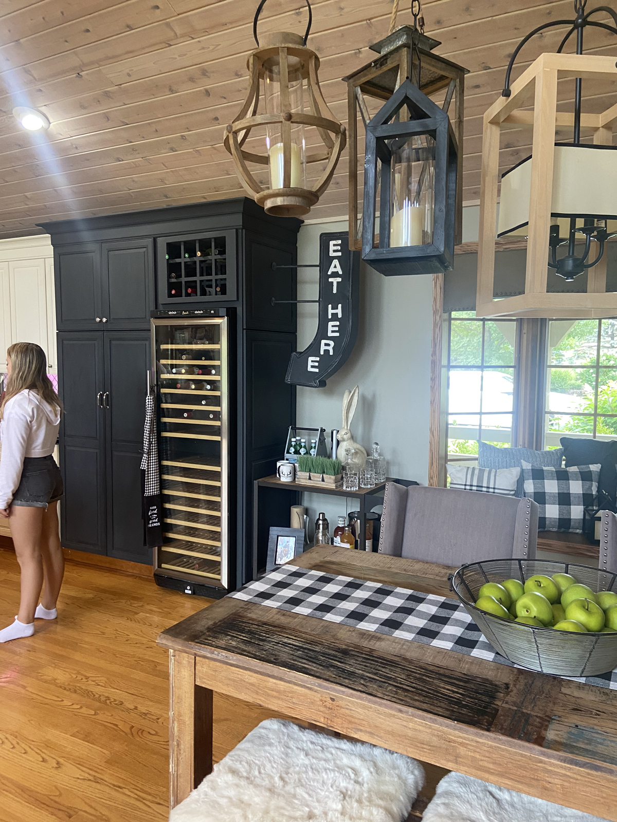
Both a benefit and a challenge, this house has a very large open floorplan with the foyer, living room, dining area, and kitchen all in one large space. It is filled with light and spacious, but it was also tricky to determine how to create functional zones that felt comfortable and purposeful. The front entrance felt a little awkward. The actual foyer space was tiny, and there were 2 dining spaces which were not really needed. The ceilings were tongue and groove wood slats, which is a gorgeous feature, but it felt heavy. All of the woodwork was honey oak, and was in need of a refresh. The hardwood floors had a lot more orange/gold coloring than our clients wanted. The window cornice blocked a lot of the light from the bay window, and the gathering of decorative lanterns hanging above the informal dining space was too farmhouse feeling for our client’s style.
THE BEFORE
THE AFTER
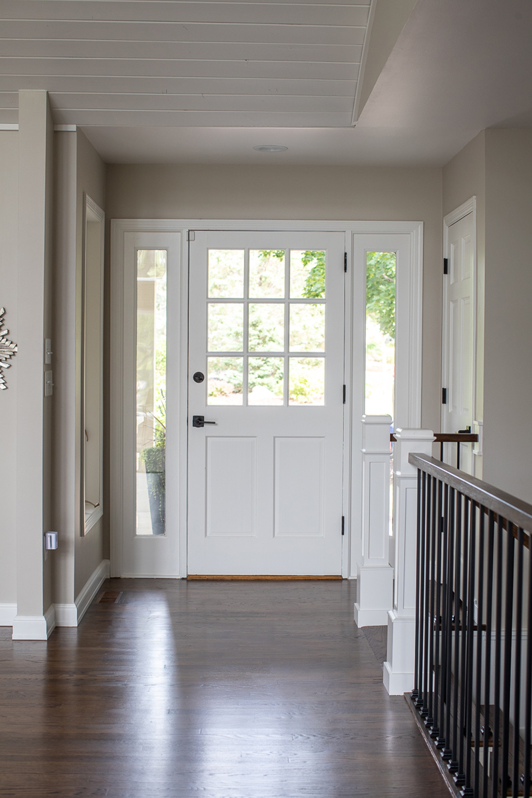
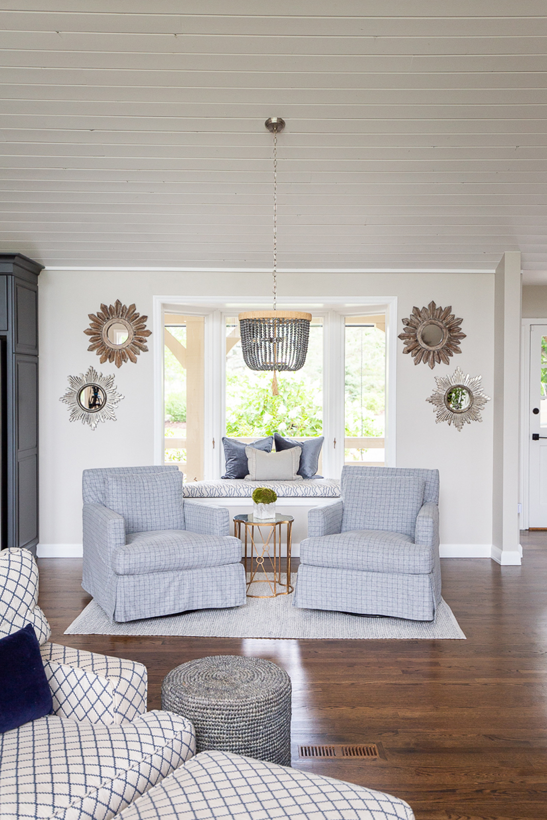
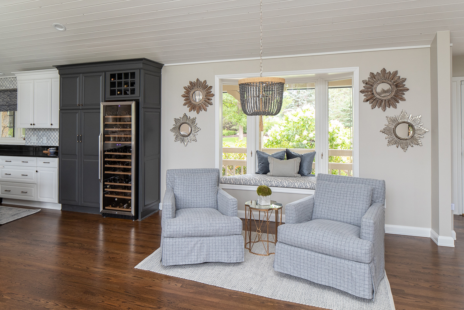
What a difference paint can make! By painting the trim, doors and ceiling white, the entire space immediately felt so much brighter and updated the look completely! We had the floors sanded and refinished, with a darker, warmer brown toned stain. We made the informal dining area into a cozy little sitting area with 2 swivel chairs. You can look out the front bay window, or swivel to look out the big arched windows to the back yard and lake. We made the bay window cozy and inviting with a custom cushion and pillows. Removing the cornice window treatment opened up the window and lets all the lovely sunshine pour in. We added the cutest beaded wood chandelier and simplified the items hanging from the ceiling. This was the perfect example of “Less is more”.
thE kitchen
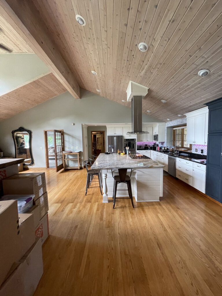
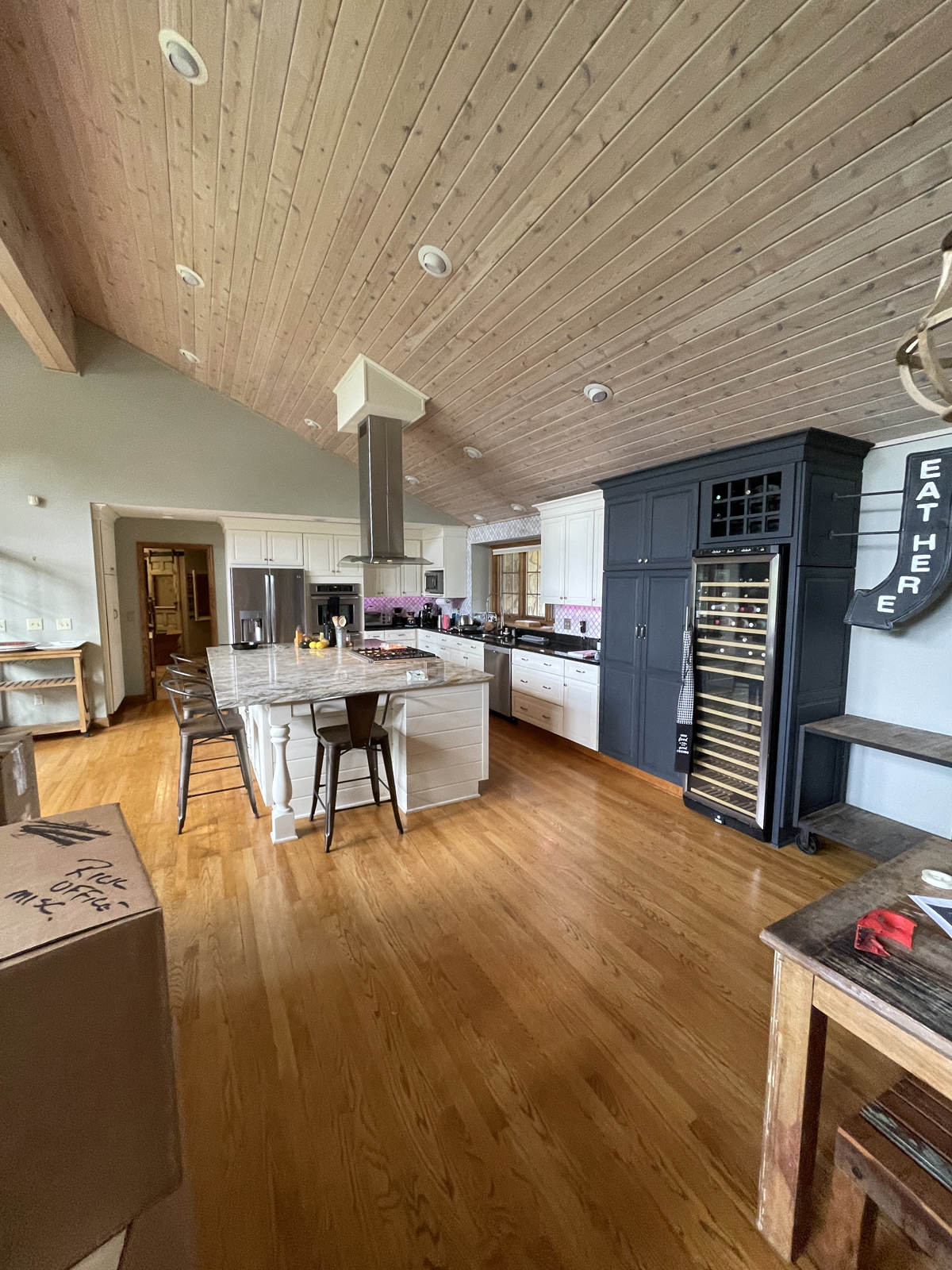
The kitchen has a large center island, which is a huge plus. The granite was a little bit busy, and the coloring was not in sync with the color palette our clients wanted. Again, the wood ceiling felt too heavy and overwhelmed the space. The section of cabinetry that was painted navy blue felt a little unbalanced and out of place.
THE BEFORE
THE after
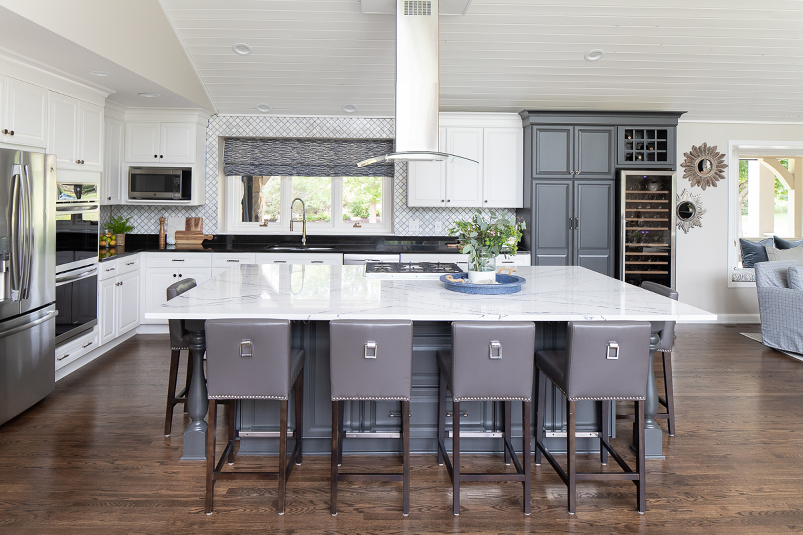
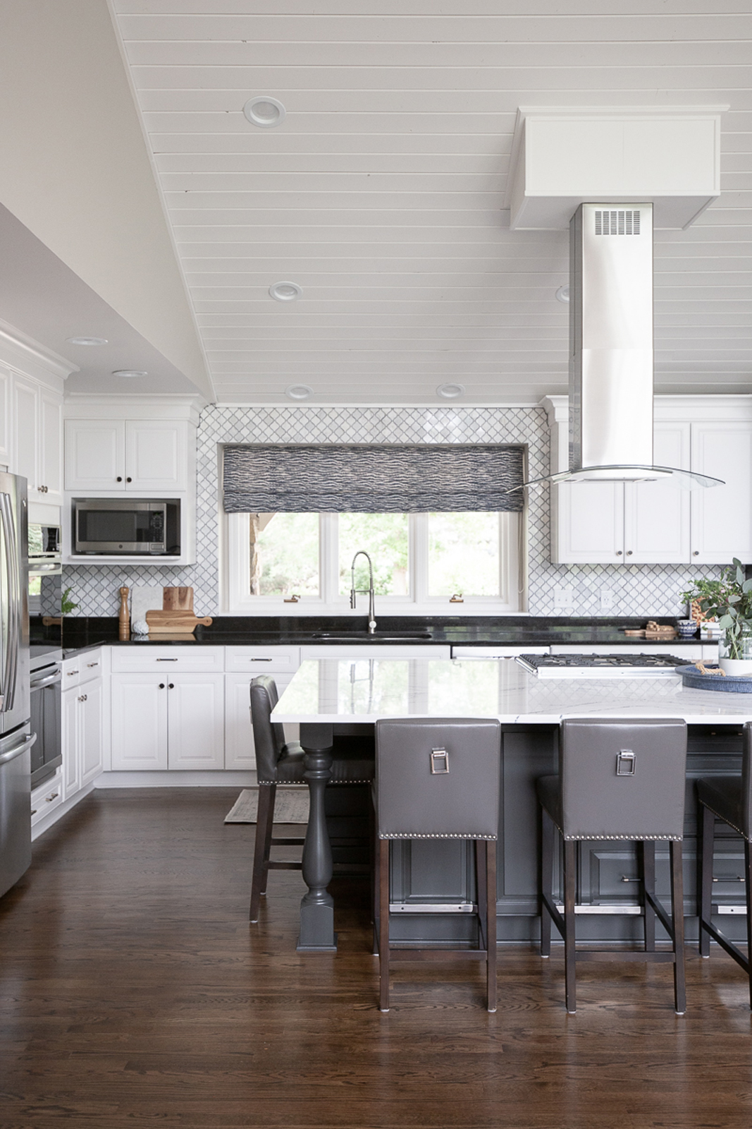
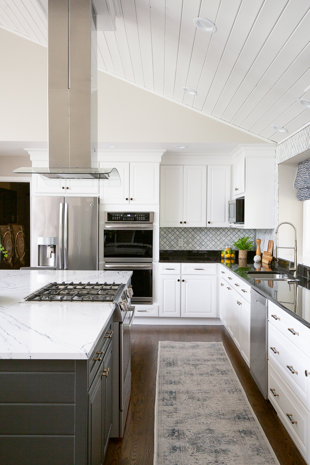
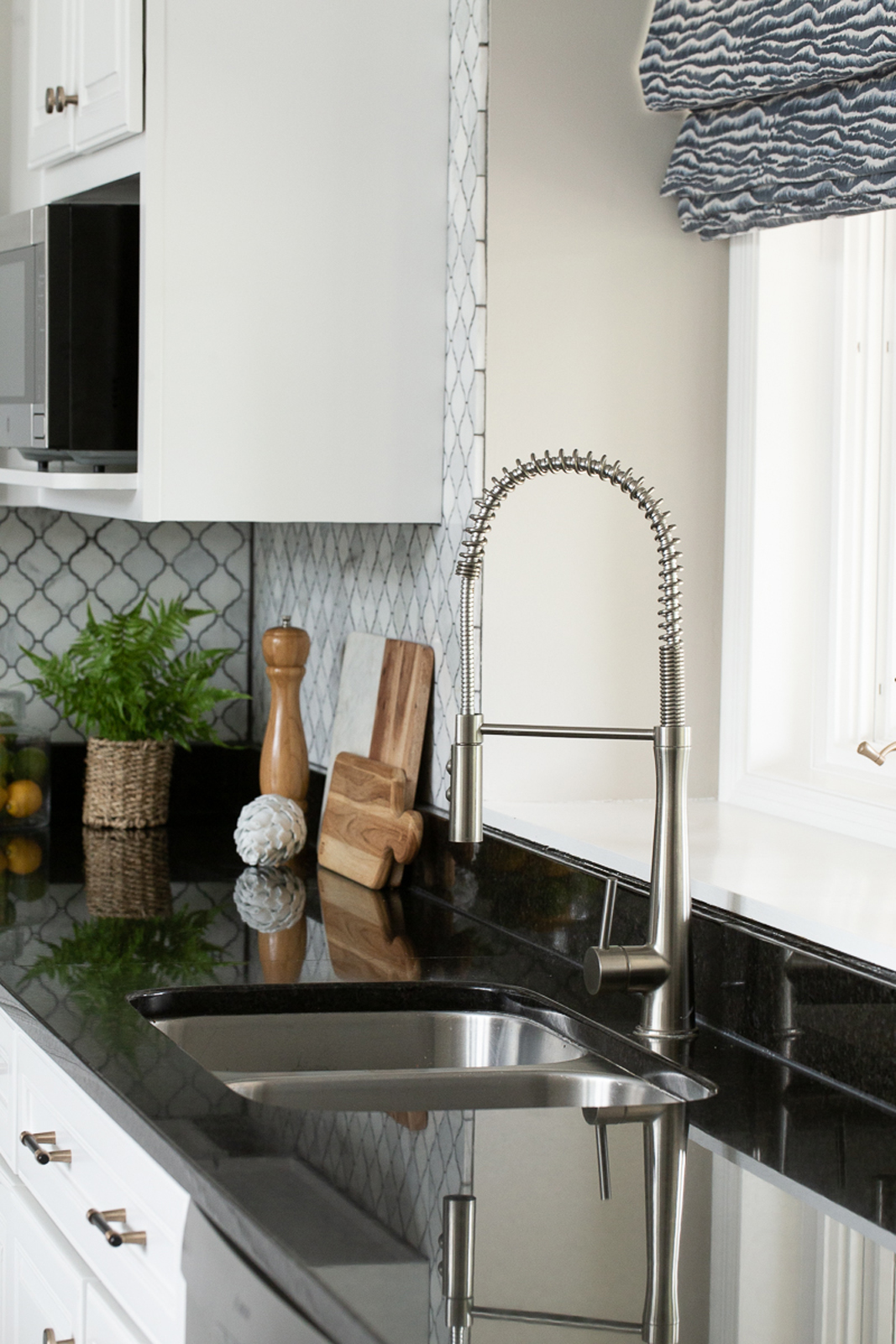
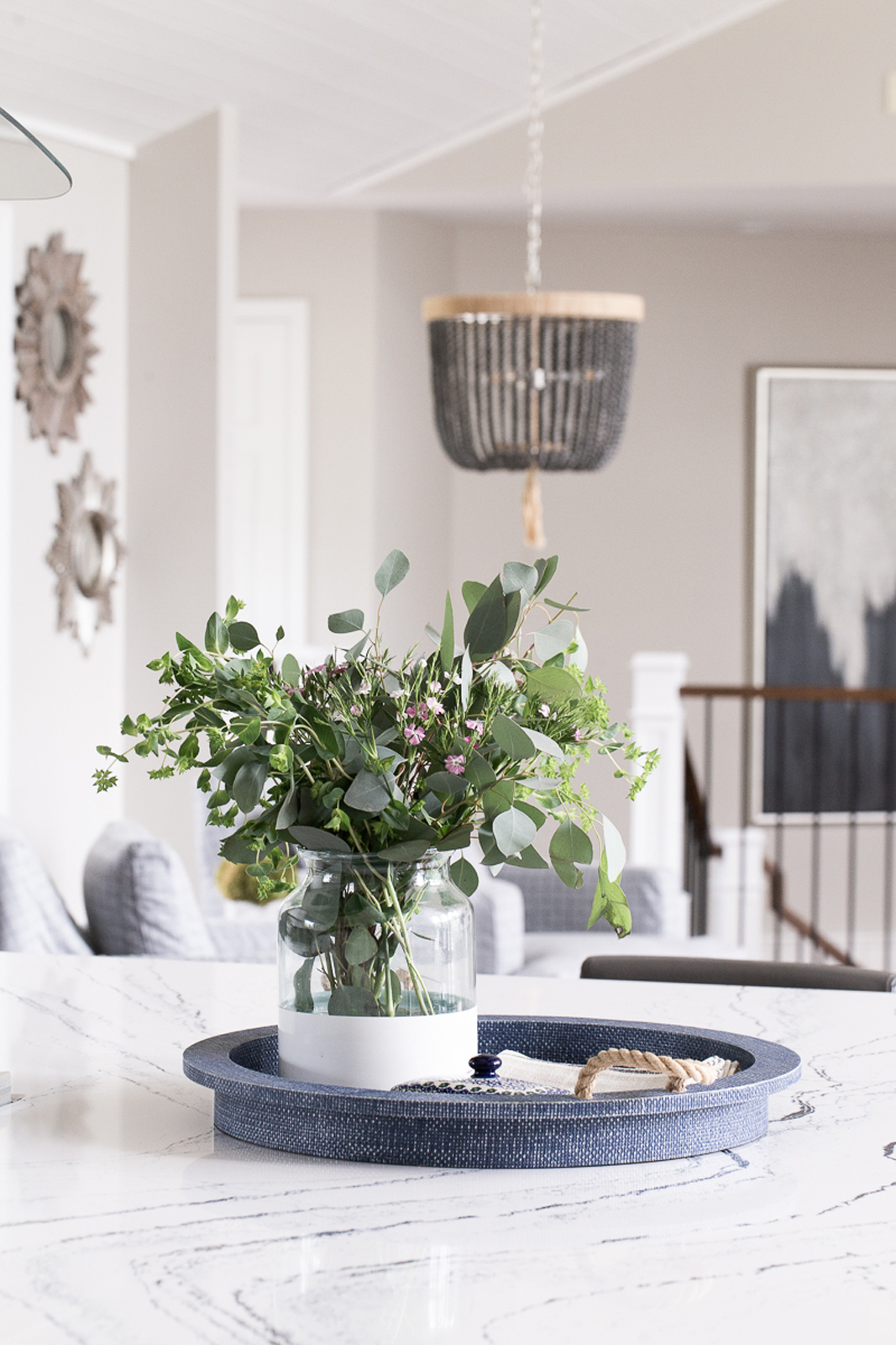
We had all of the cabinets repainted with a fresh, bright white, but painted the center island and wine cabinetry a dark charcoal gray to add interest and depth. We kept the black quartz countertops on the perimeter but replaced the center island countertop with a beautiful Cambria quartz. It really helped to brighten up the kitchen and give it an updated look. A custom fabric roman shade over the sink window added some color and softness as well.
The living Room
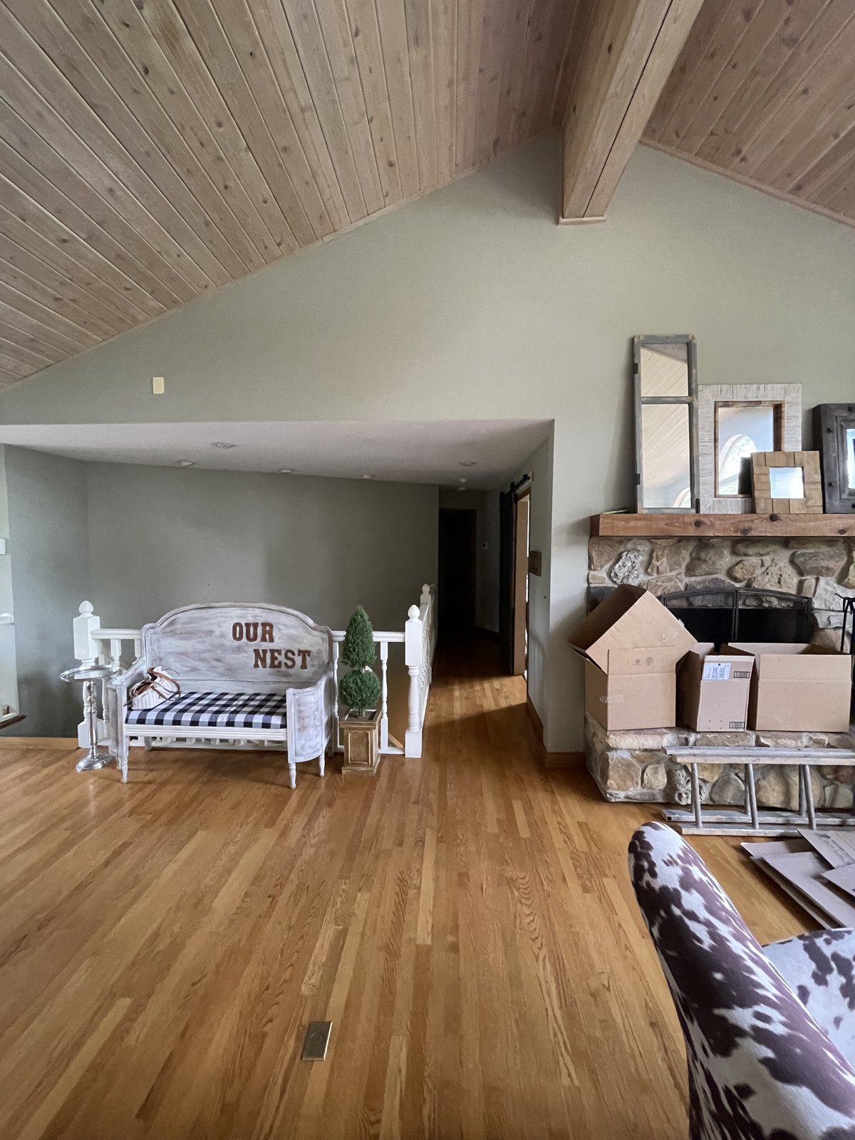
The before
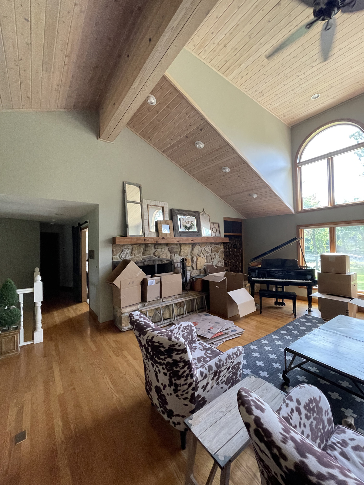
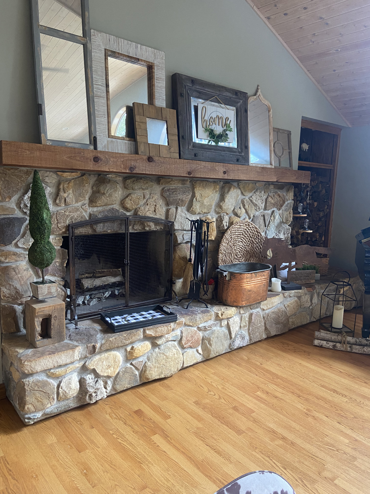
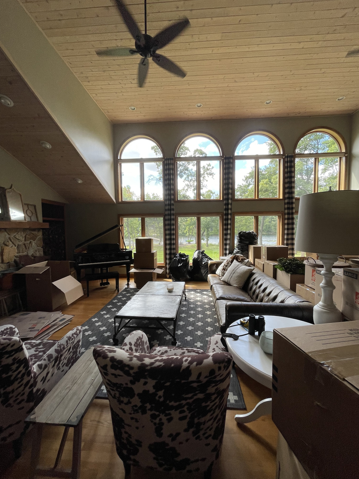
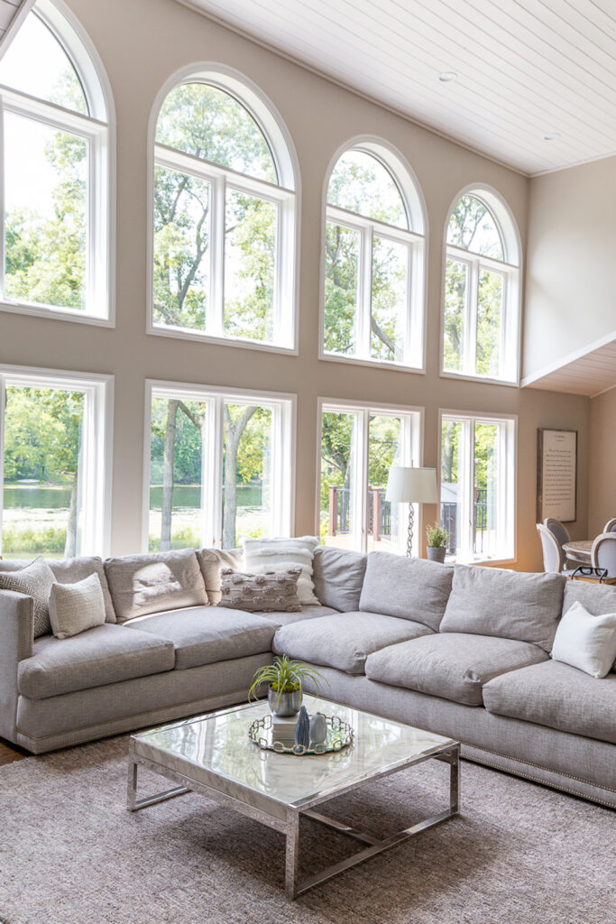
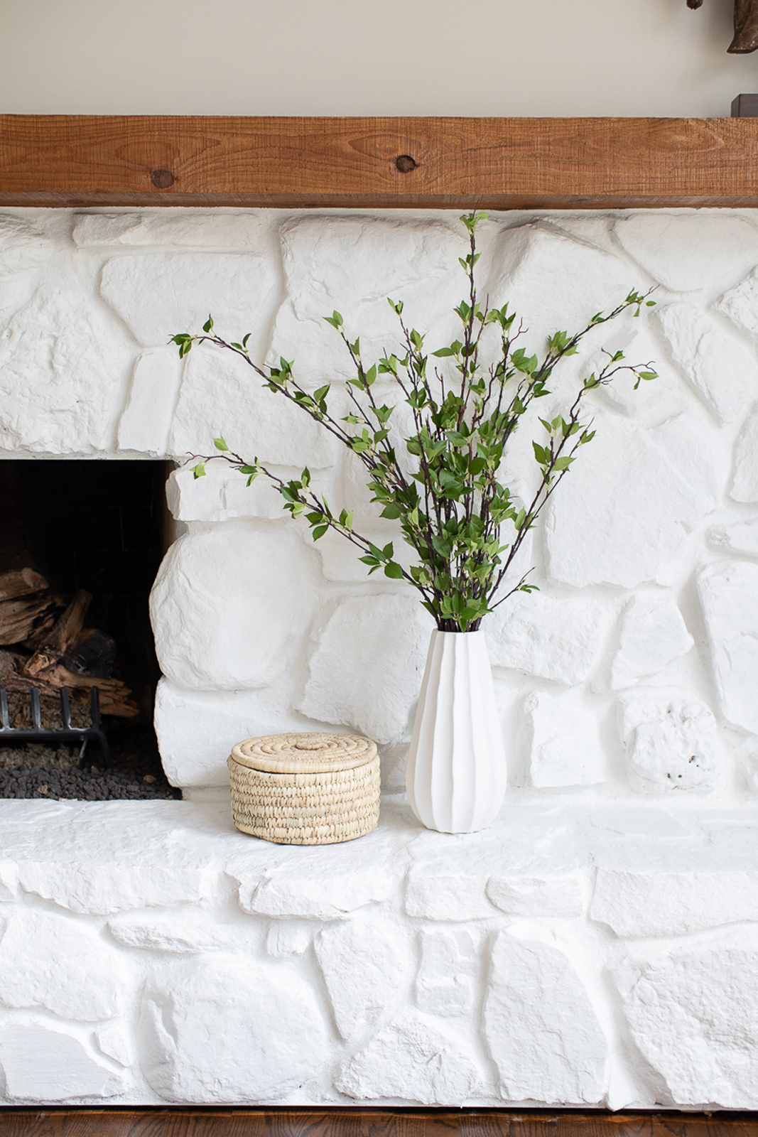
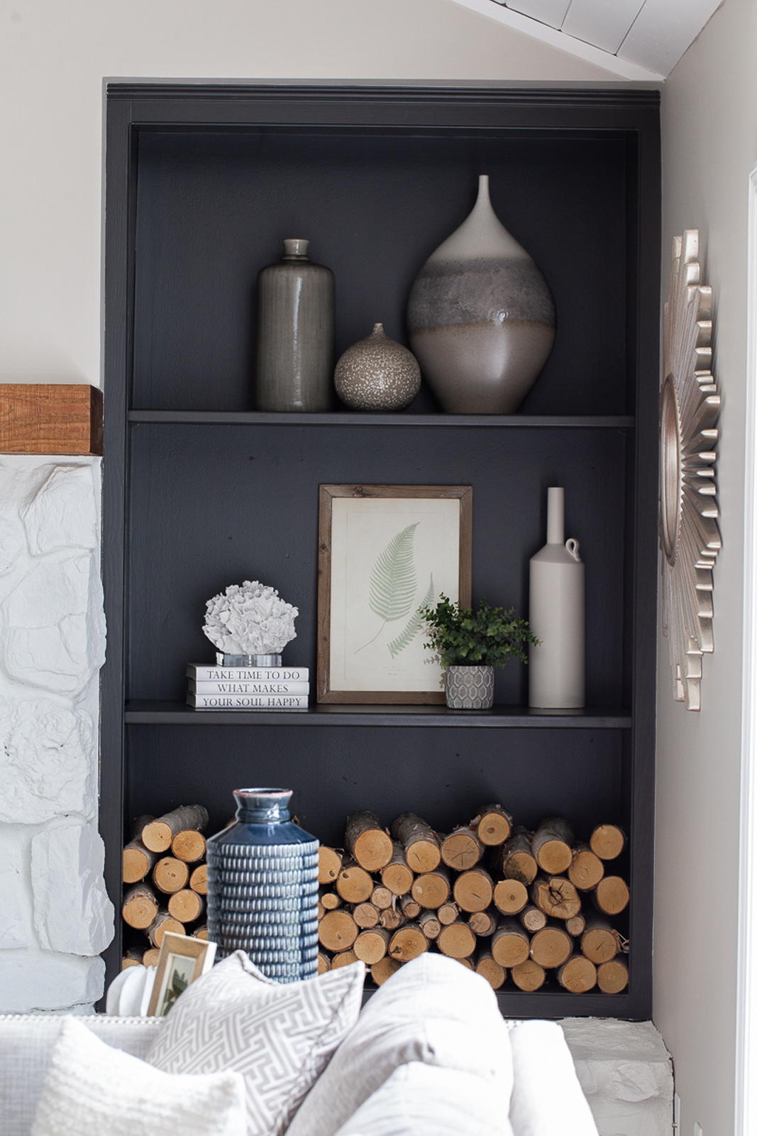
The wood-burning fireplace was beautiful, but also felt very heavy and a little more rustic than our clients wanted. The large arched windows were gorgeous but felt dated with dark wood framing and unnecessary draperies that distracted from the view. The bookshelf area next to the fireplace was filled with wood – also very heavy and lacking interest.
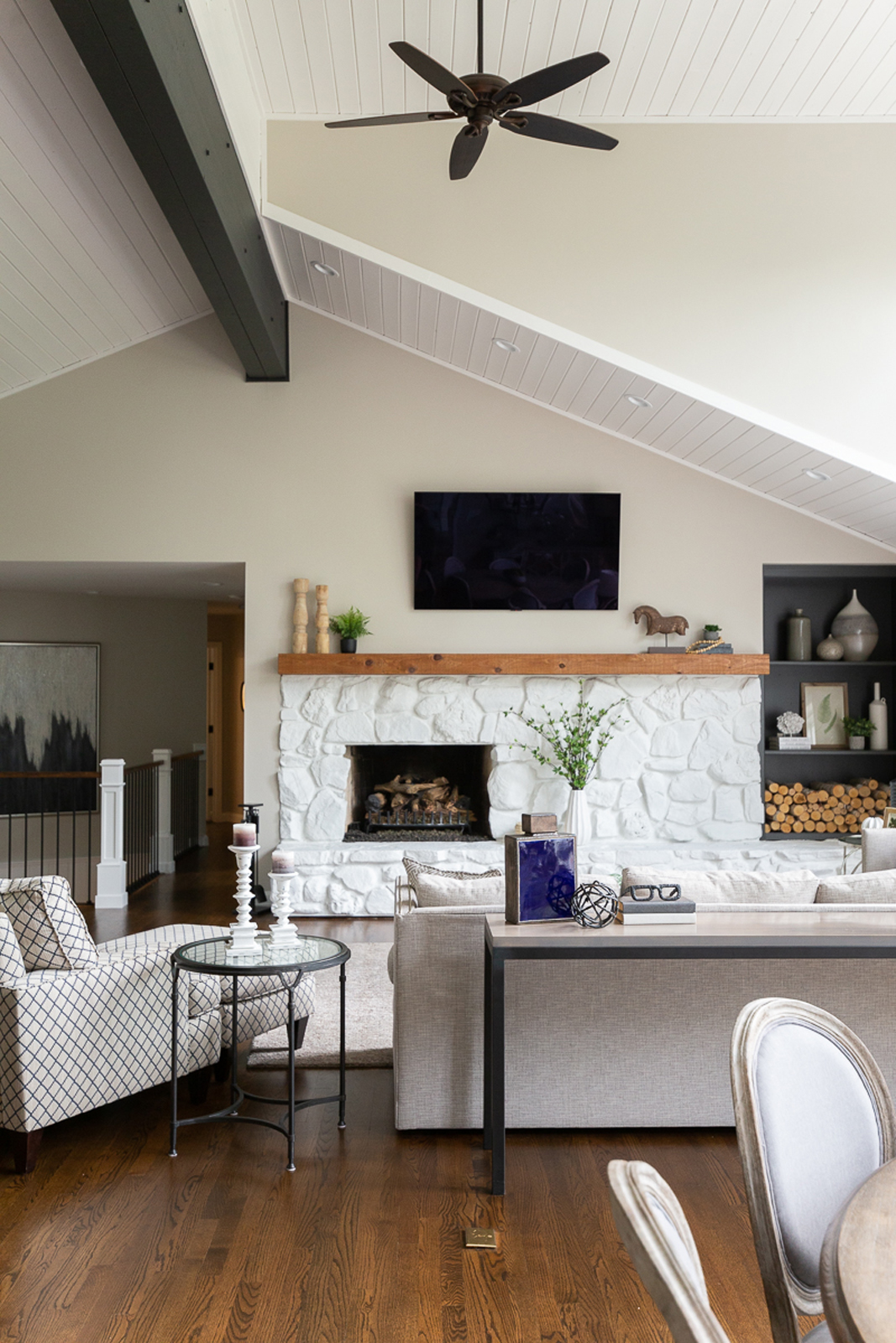
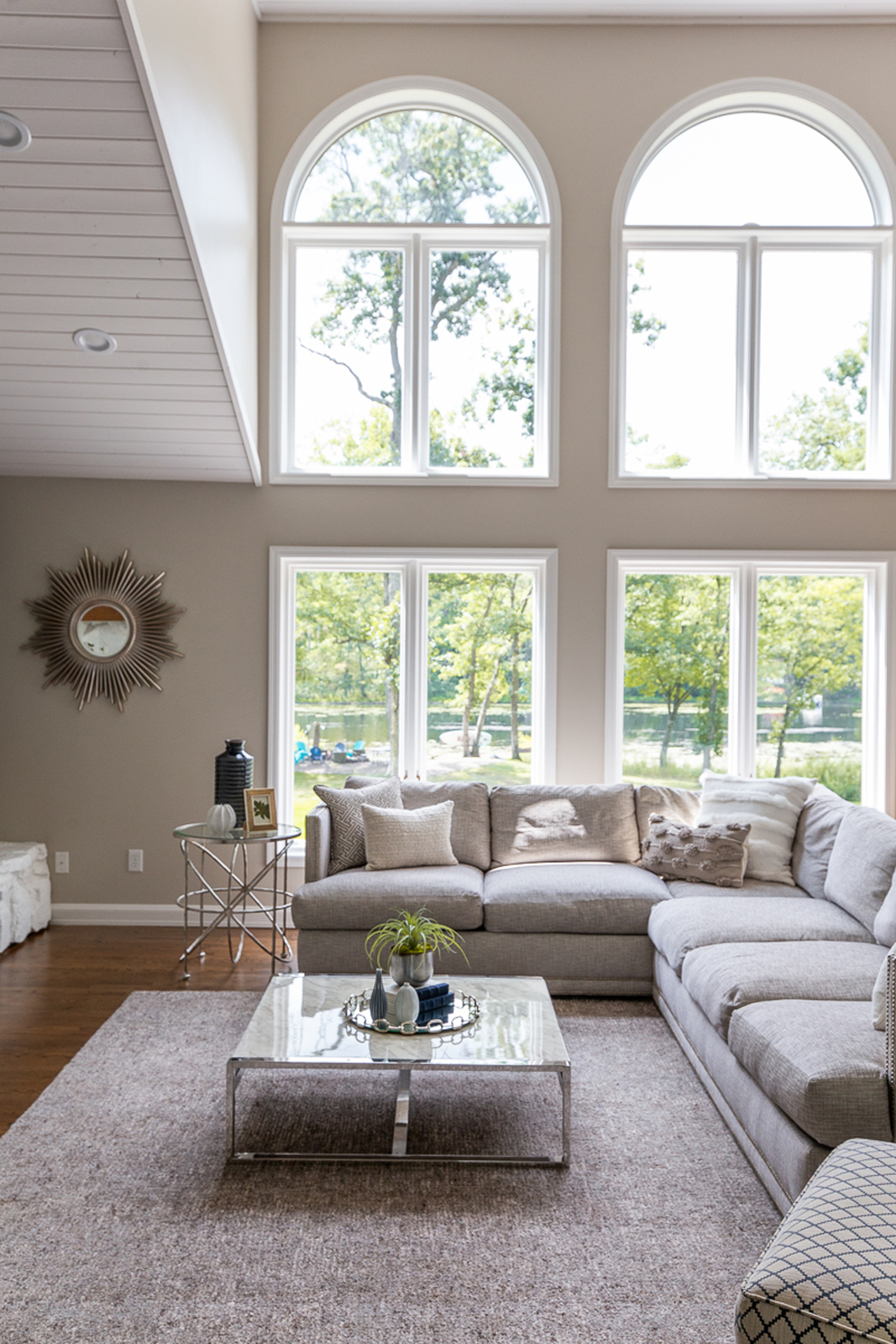
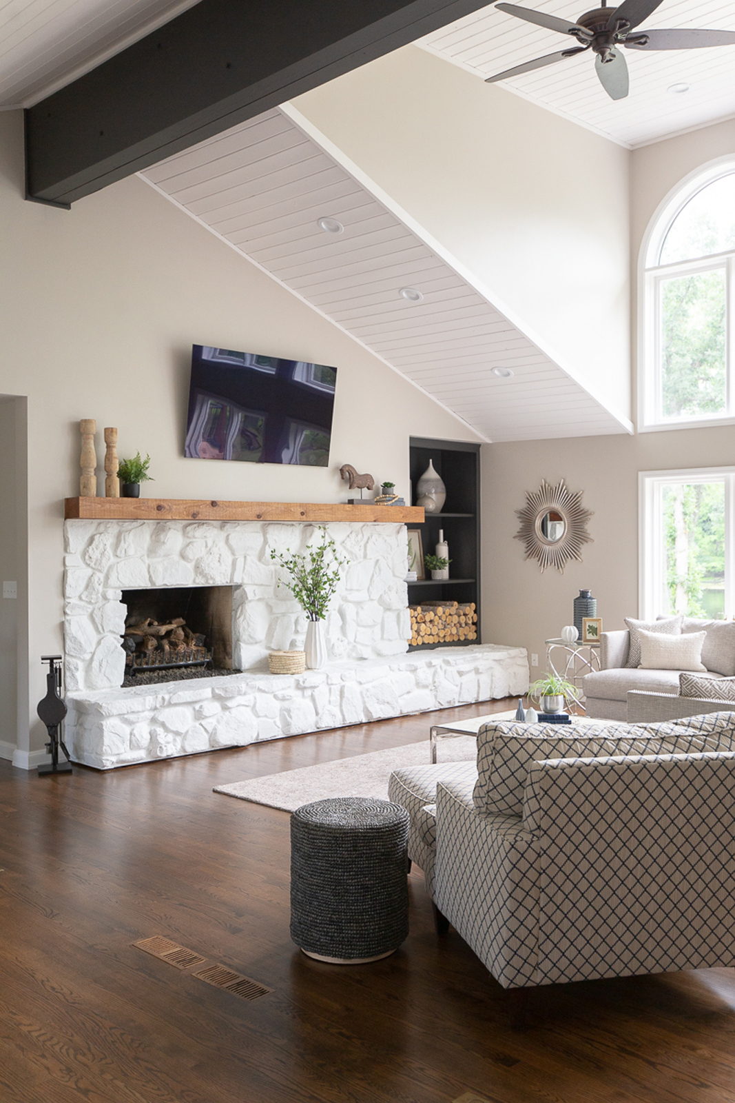
The after
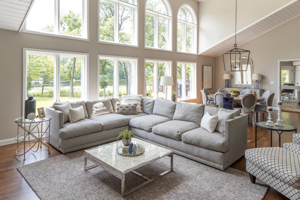
Once again, paint transformed the entire feel of this room. It was a bold move, but we took a risk by painting all of the fireplace stone white. Additionally, the center beam section was painted charcoal color to match the island and bookshelves. I’d say it was a good call! Fresh white paint also brightened up the arched windows and gave them new life. We painted the bookshelf the same charcoal gray/black as the kitchen island, and added shelving and pretty decor to add interest to the room. The furnishings were simplified and this room now feels relaxing, calming, fresh and inviting!
THe dining area
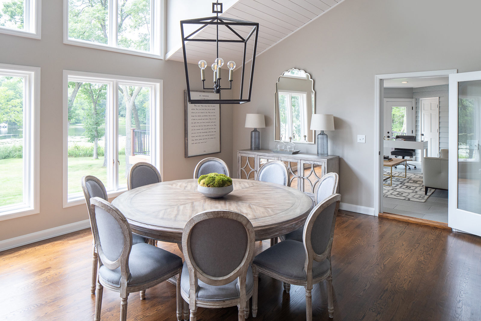
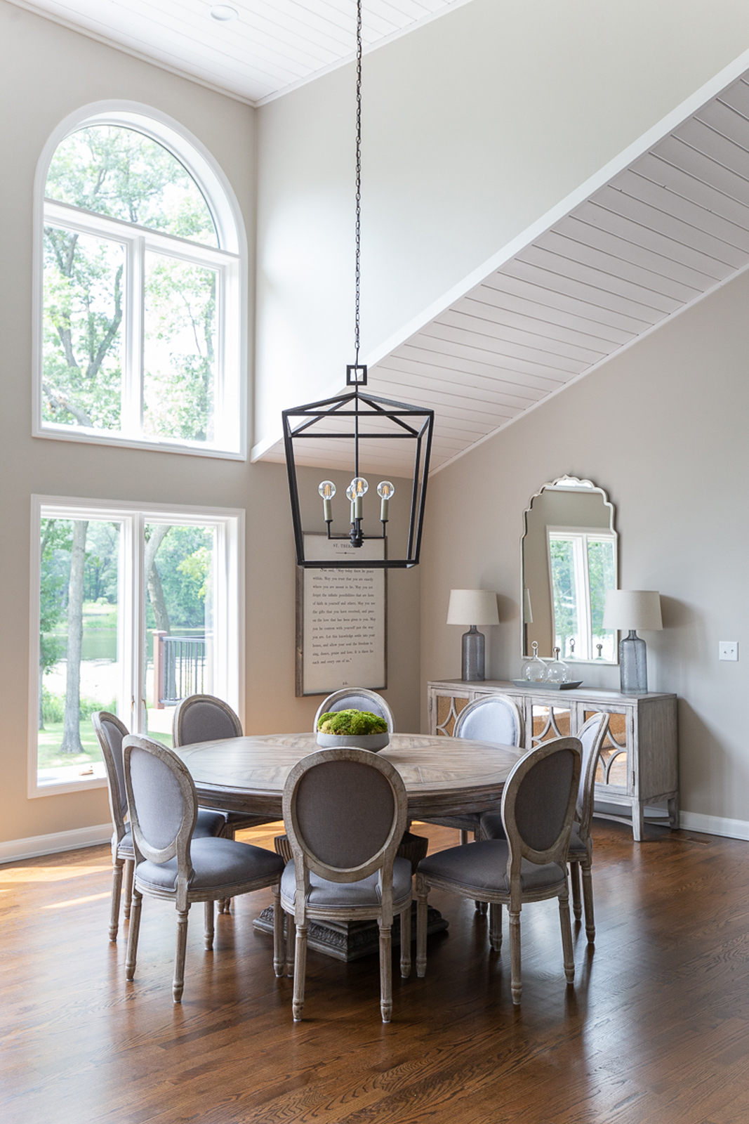
The dining space is informal and open, but it was important to be able to offer seating for the whole family, since this would be the only dining area in the home. A round table seemed like the perfect shape to hold a lot of people without making the space feel too tight. It’s nice for 8 people to be able to sit and face each other also, which the round table allows you to do.
THe before
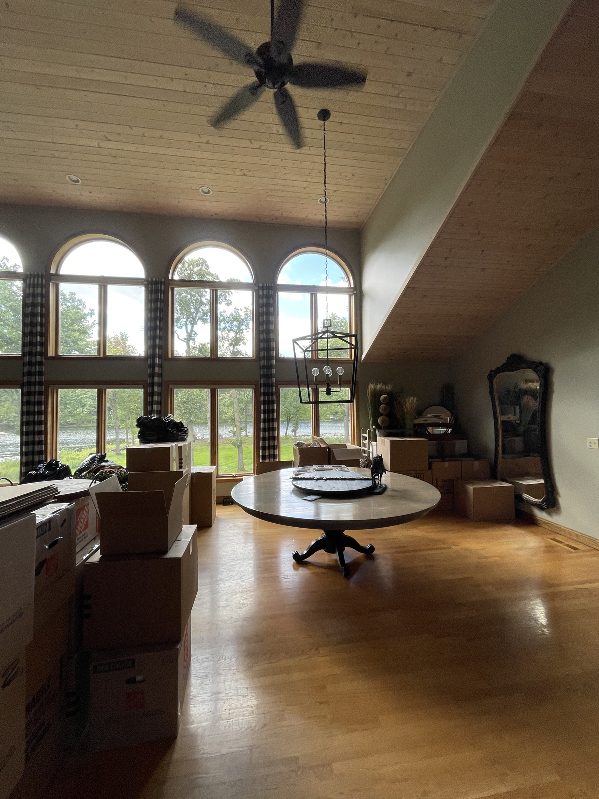
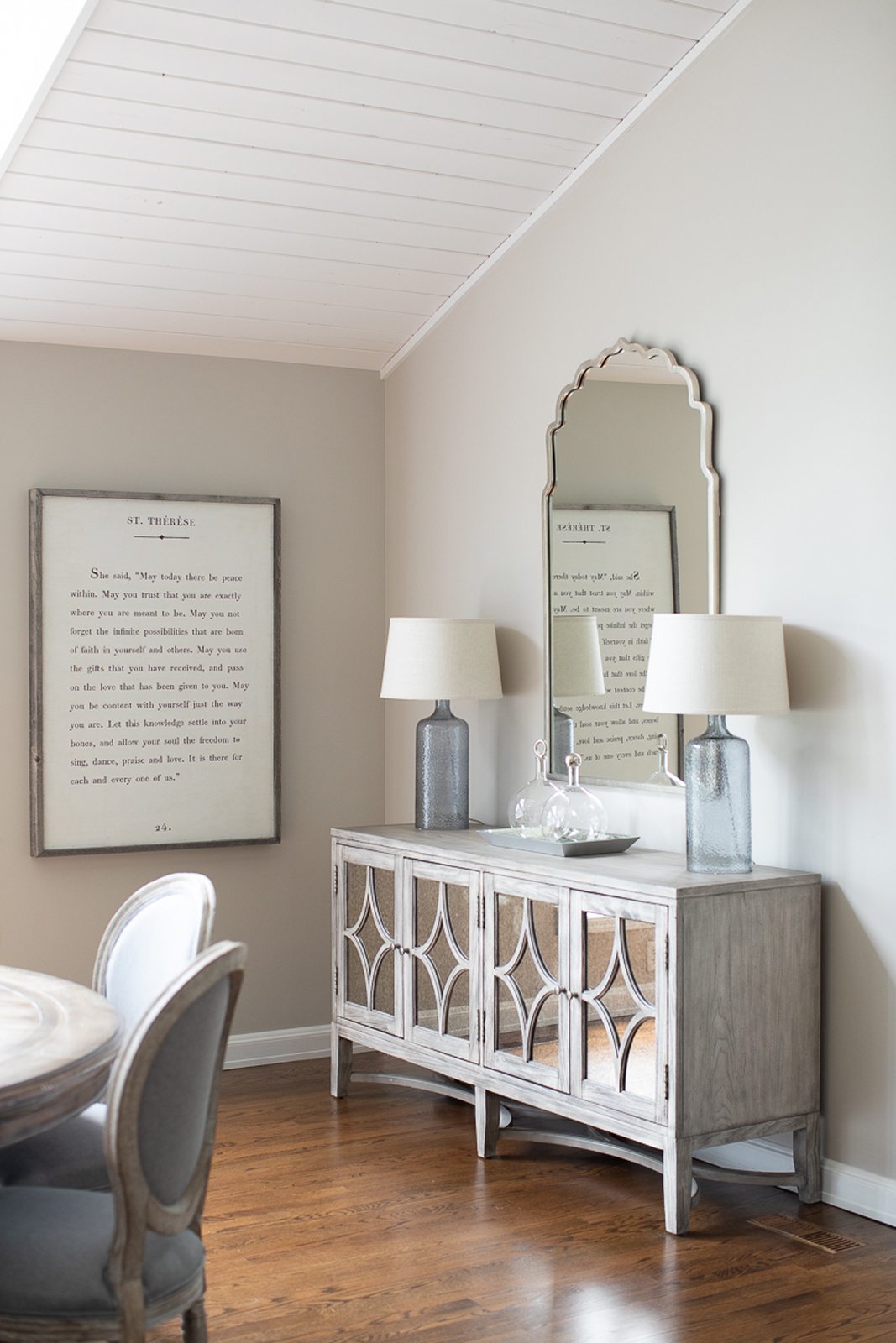
THe after
Fresh paint on all of the walls and ceilings brightened up the room. New furnishings created a lovely gathering space for family dinners and game nights. This open concept main floor is the perfect place to host family and friends for life’s special events.
HER OFFICE SPACE
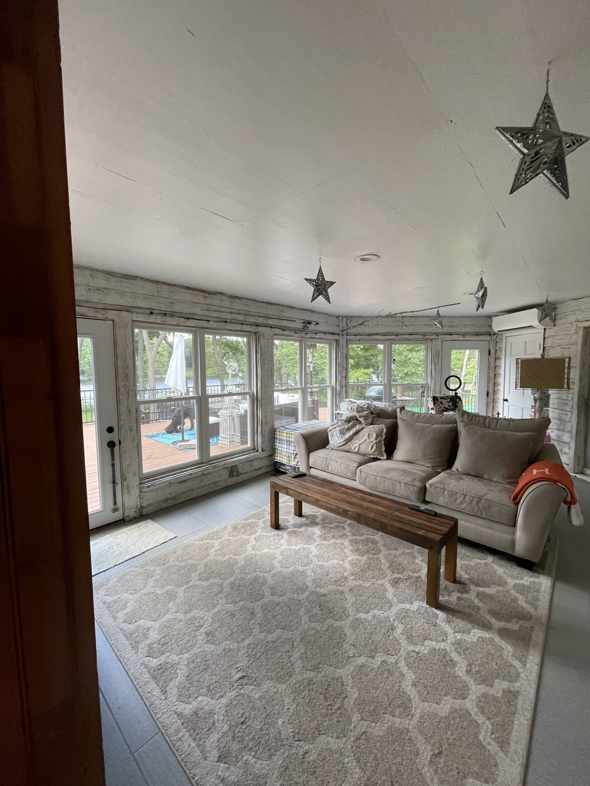
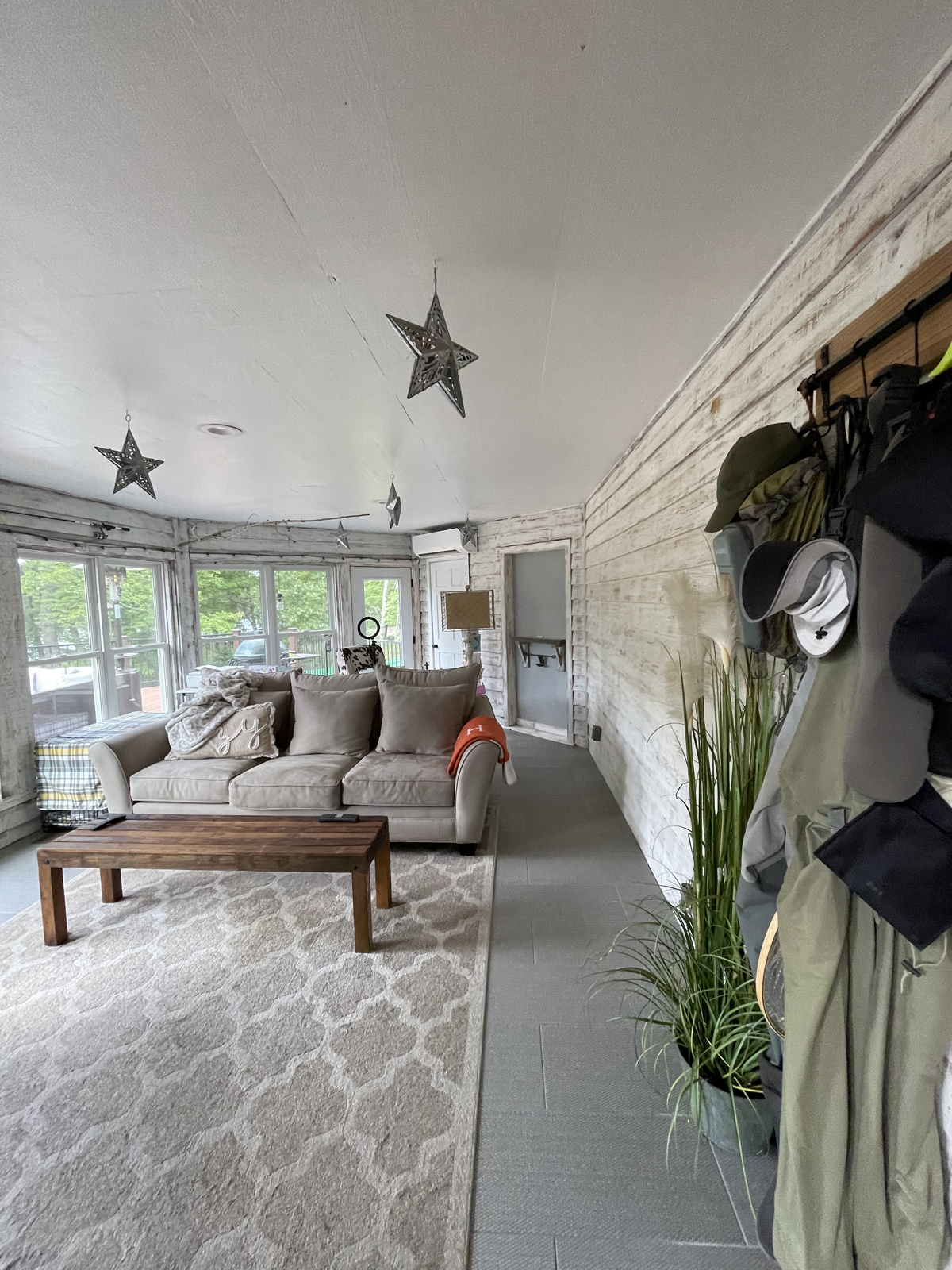
THE BEFORE
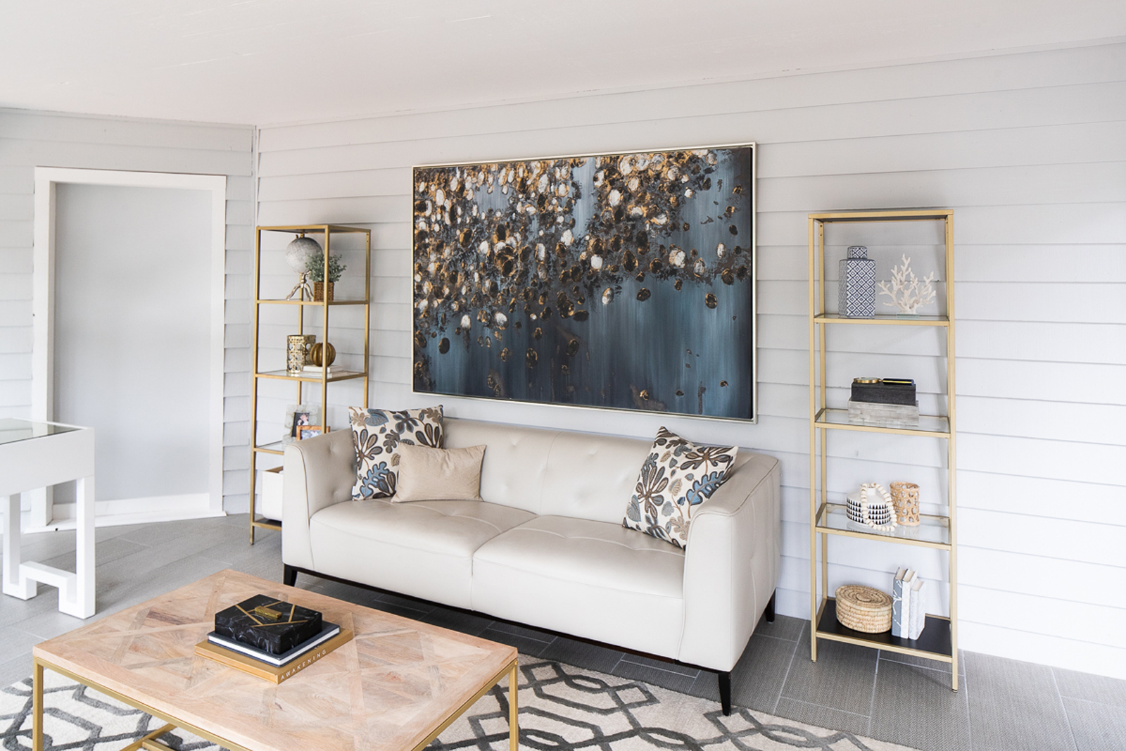
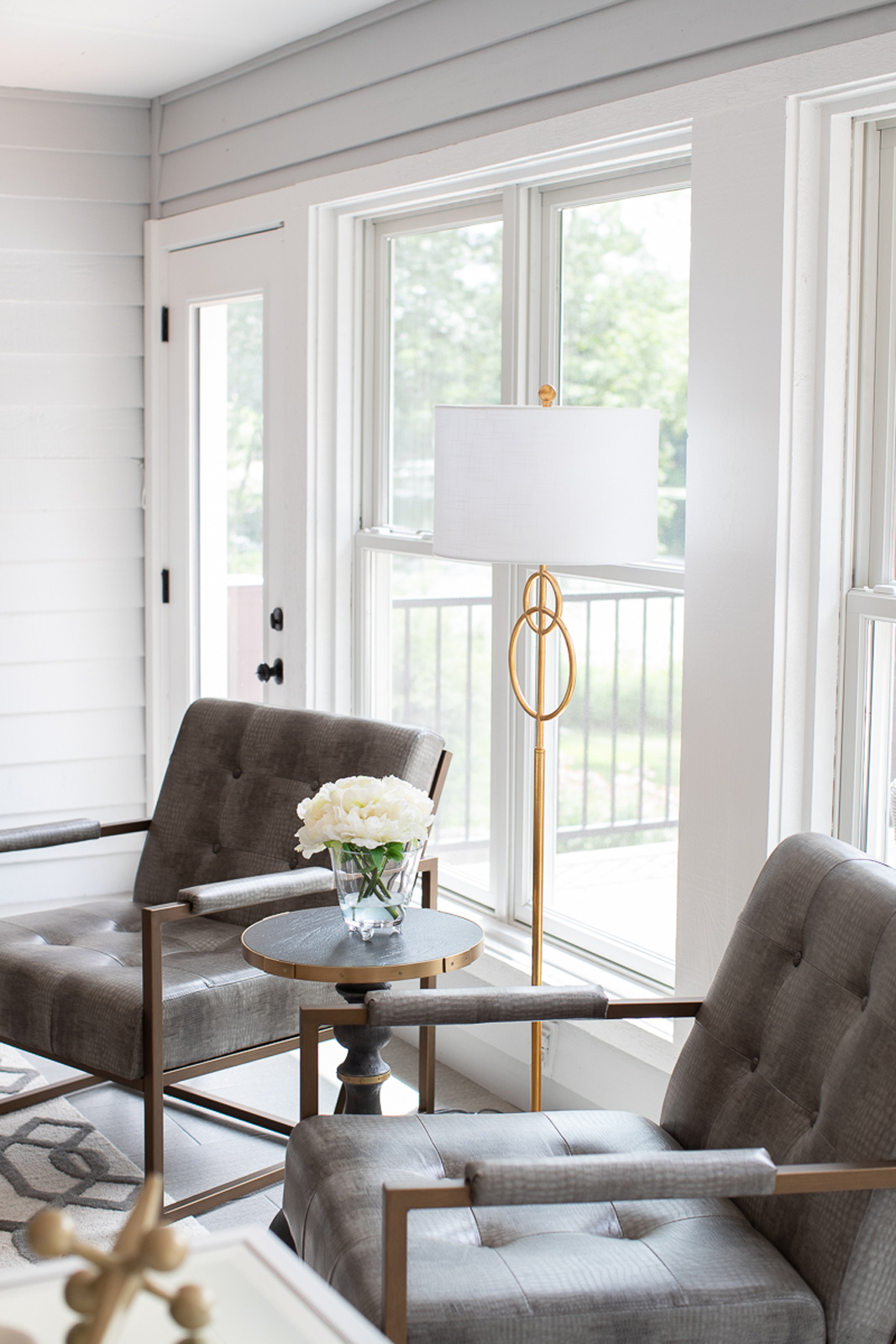
This multi-functional room was previously used as a 2nd home office, as well as a tv room. It could easily be converted to a sun room or hearth room, if desired. It is filled with light and just feels happy, no matter what it is used for. Our clients wanted to use it primarily as a home office.
THE AFTER
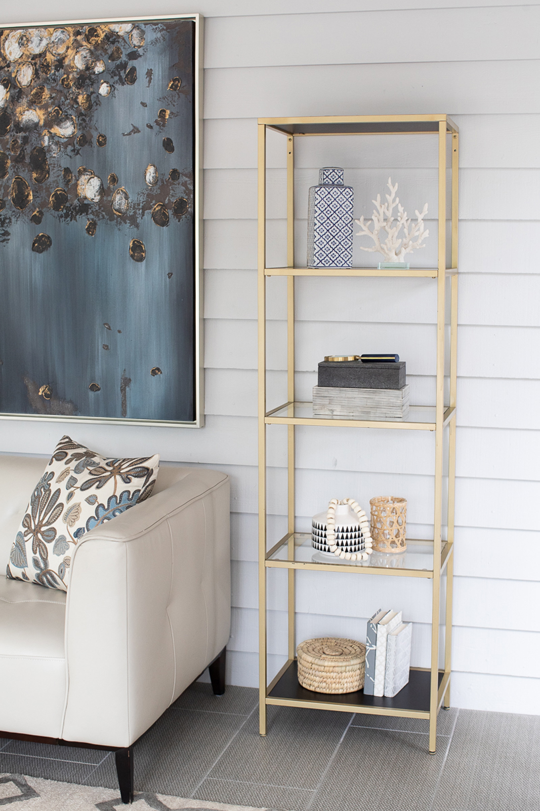
We toned down the farmhouse feel by sanding the worn finish on the walls and adding a soft gray coat of paint. The trim was painted white to freshen it up also. Furnishings create 2 functional zones – a desk for working (with an amazing view, I might add!), and a sitting area to watch tv or work in a more comfortable spot. This room is truly a multi-functional space as it can be enjoyed for several uses by the entire family.
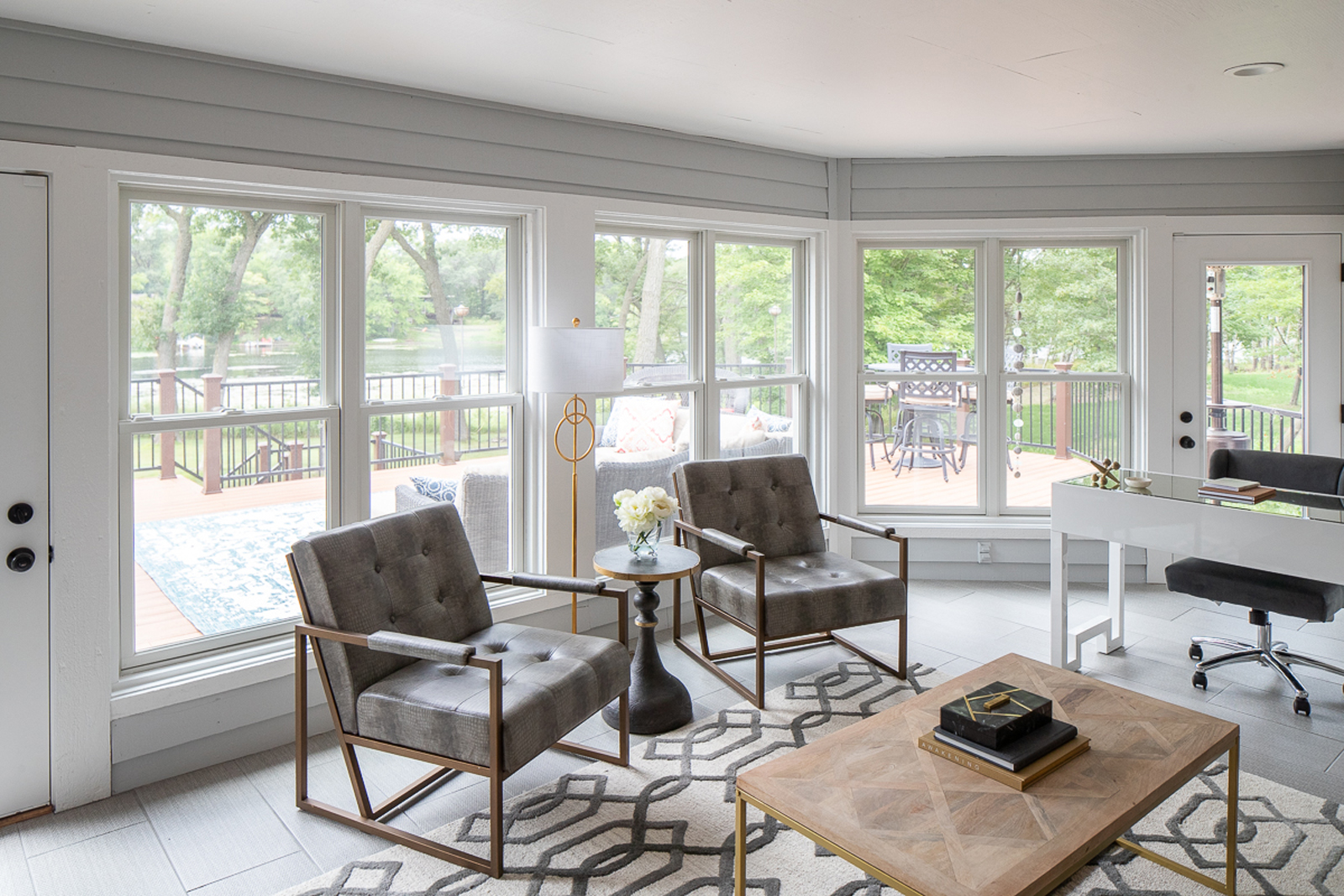
I hope you enjoyed seeing this lovely light-filled renovation! Our clients (who have truly become friends after working together for so long!) are truly enjoying their new home and loving the lakeside living.
Stay tuned for part two of this project reveal which will include the primary suite, a couple of bathroom remodels and more!
XO,
Amy & the Interior Impressions Team
Very nice improvements to a beautiful home. I love the updates and wonder when you can start on mine.
Thank you so much! We’d love to help you with yours 😄 Please give us a call! 651-337-2184