When my friend came to me and said “We just bought a wooded lot and we’d like you to help us design our forever home”, I had to pinch myself to see if it was truly real life! Especially when that same friend came to me a few years ago and said, “Guess what! We bought a business and we need your help with the design”. I love their surprises and the fact that I’ve been able to be a participant in their exciting life journeys. They have been so incredible to work with. I’m so excited to share this lovely newly built home with you all.
The vision for this home was modern farmhouse, but not too much farmhouse. With the beautiful wooded setting, we wanted to keep things clean and simple, but also feel very welcoming and comfortable. It started with a home that was on a tv show as inspiration. We worked with our clients to modify the plans to better fit their needs. Once we had the layout figured out for the most part, they worked on finding a builder to make this home a reality. They chose Cardinal Homebuilders to do the construction and this home really turned out to be spectacular!
the exterior & front porch
The choice of materials on the exterior was very important in creating a modern feel without being too cold and stark. It was a tricky combination, but we chose to mix up white, black, charcoal gray, and wood tones to add a touch of warmth. If this same home would have been done in all one siding color, it would carry a completely different look and would have looked more farmhouse than modern. Black windows and black metal roof accents help to add that modern contrast. Beautiful landscaping and different zones to enjoy the outdoors make this home a retreat and provide plenty of spaces to relax or entertain guests. The backyard pool will provide much enjoyment for the whole family as well. 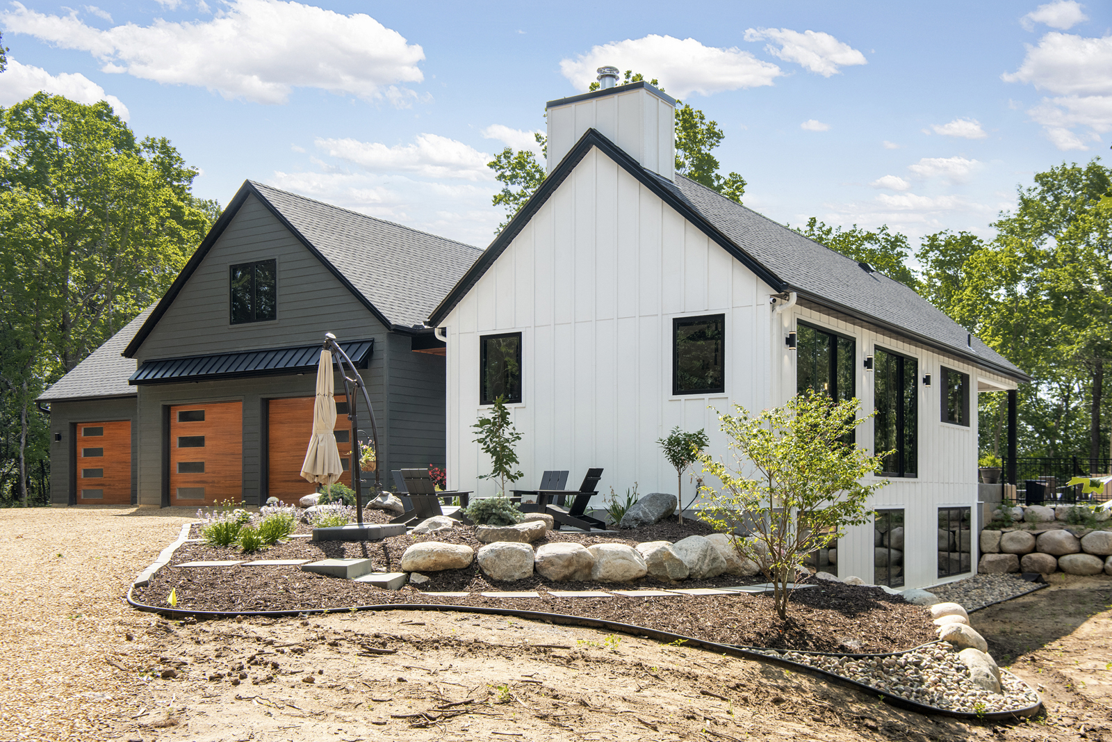
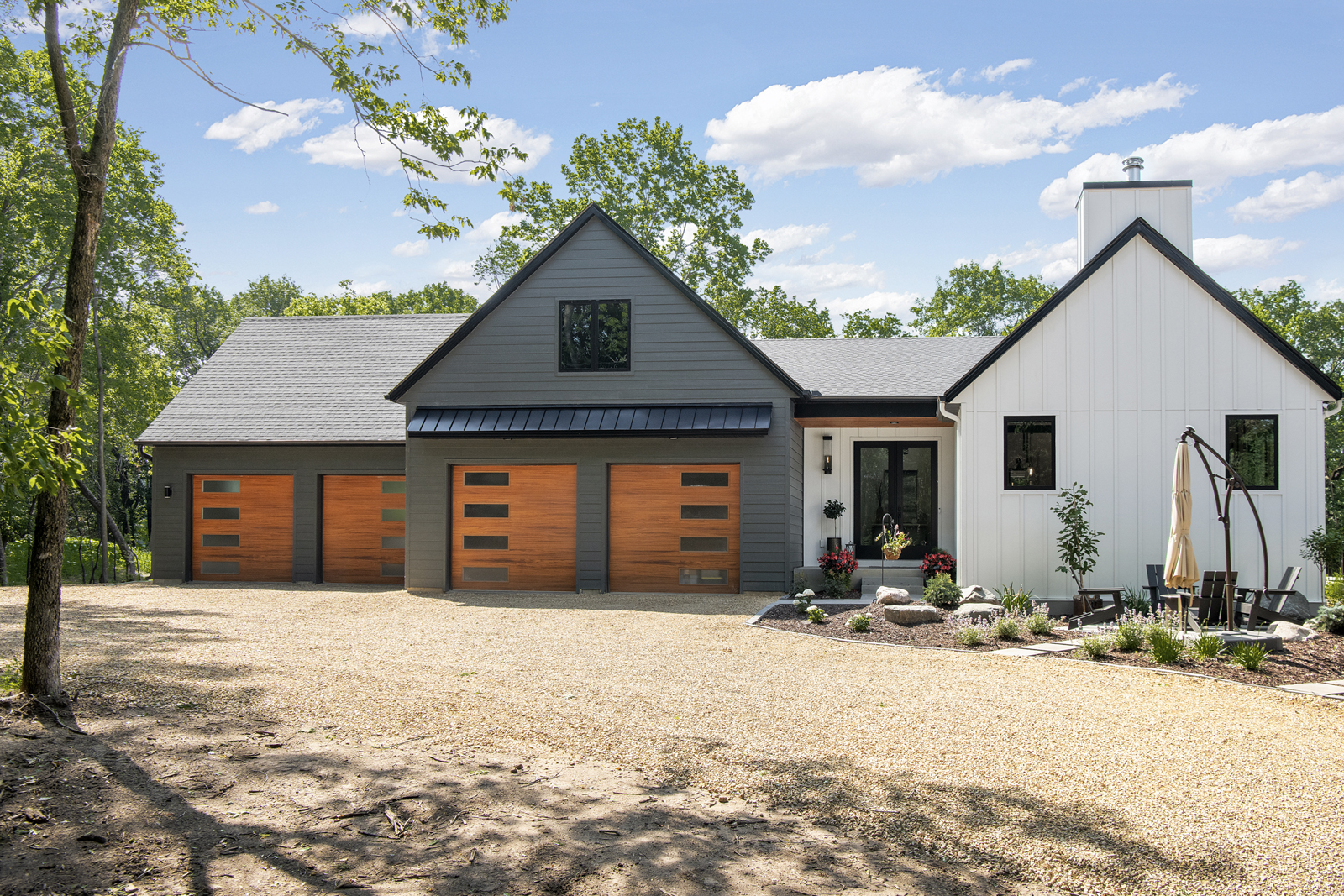
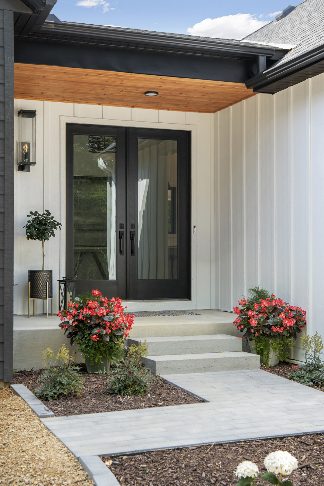
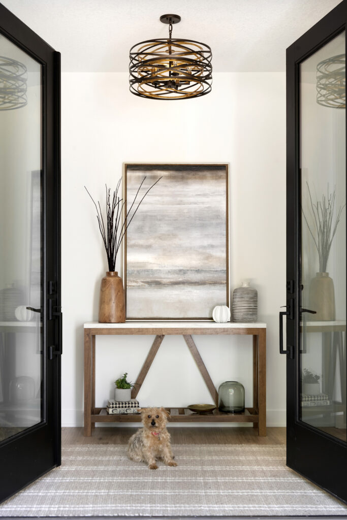
Modern concrete pavers and a firepit area in the front of the house provides an unexpected welcome as you drive up to the house. Of course, the best “Welcome” you’ll get when arriving is from adorable little Lucy!
THE LIVING ROOM
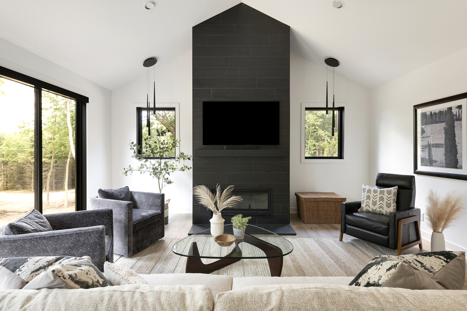
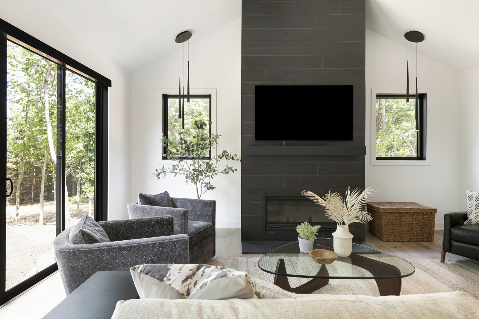
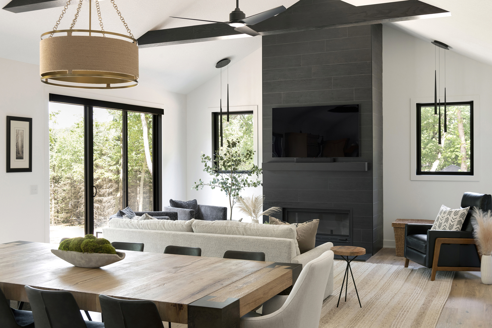
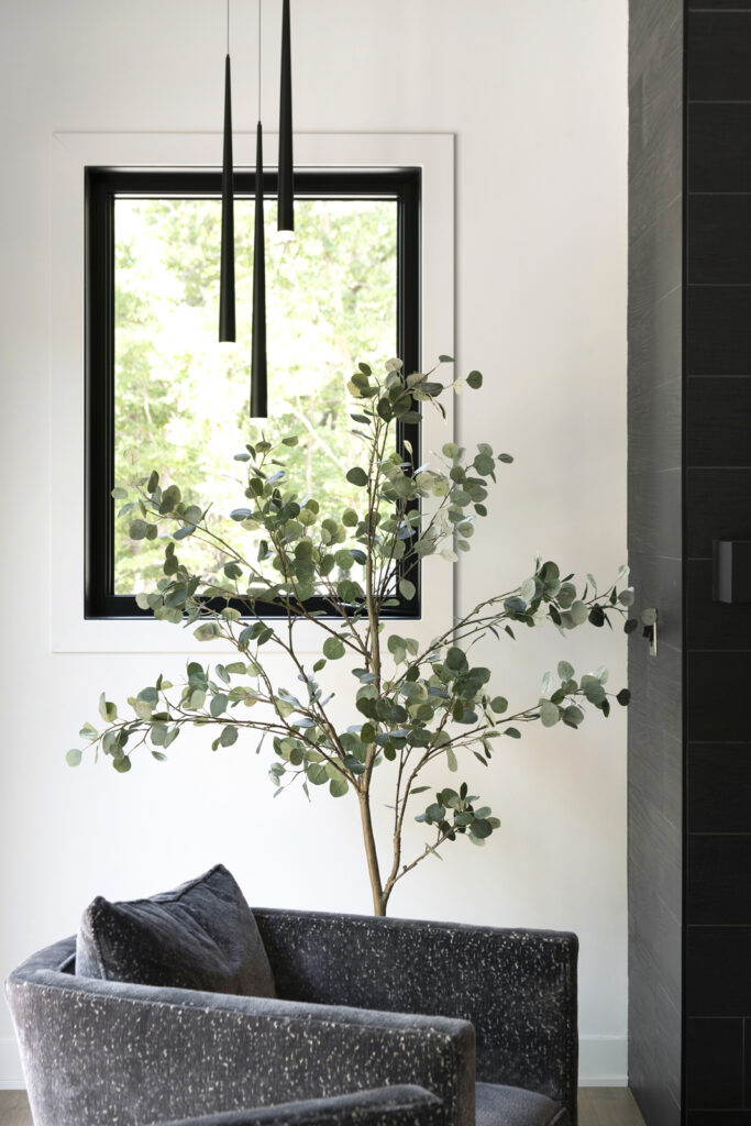
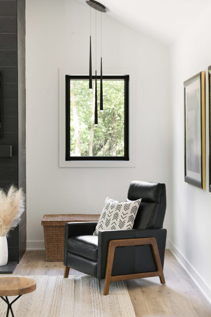
One of the most important features our clients wanted was a real wood-burning fireplace. It doesn’t seem like it would be that big of a deal to install one, but we had a few challenges getting the right mix of materials and finding a modern linear wood-burning fireplace. Because it gives off more heat than a gas fireplace, there needs to be a larger area of non-combustible material surrounding it, and the mantle needs to be quite a bit higher than normal. Therein lies a challenge of the tv placement, and trying to keep it from being too high. We ended up finding a concrete mantle that looks like black wood, which allowed us to keep the tv at a reasonable height. We used porcelain tile to create a sleek black fireplace wall with lots of drama as it goes to the ceiling. Modern pendant lights balance out the span of interest on the fireplace wall, and cozy seating makes this room a favorite spot for everyone.
the kitchen & dining area
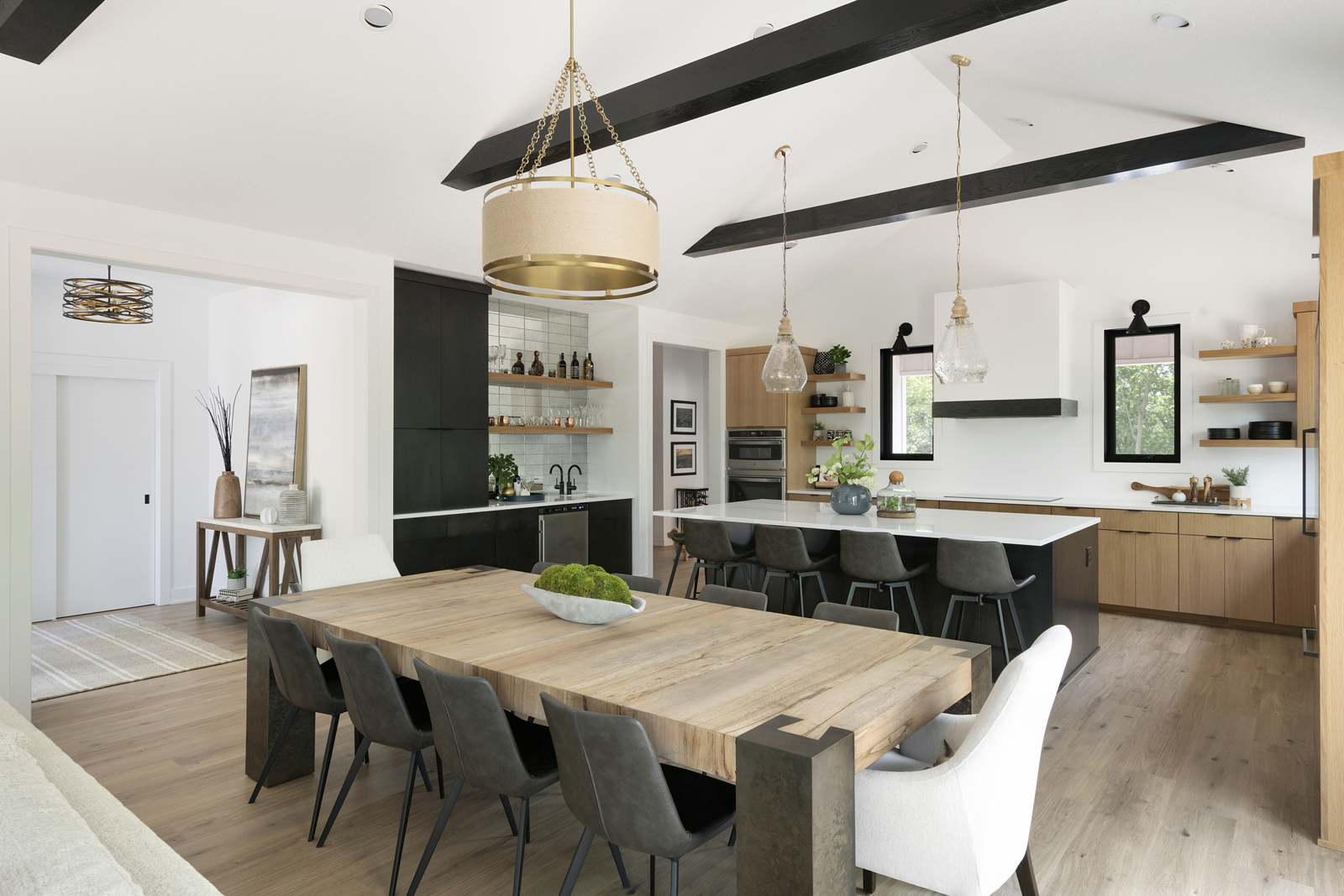
The positive part of having a big open-concept space is that it is great for hosting friends and family and keeping everyone together. The challenge with design can be making sure that all of the spaces feel cohesive, but yet have special features in each zone. All of the flooring is the same throughout the entire space, but area rugs are added in the foyer and living room to add softness. All of the lighting is different but complements each other with having either black or gold (or both) finishes. The dining area has a fun rope detail, which brings in a touch of rustic. The dining table is the perfect size to host family and friends at any time.
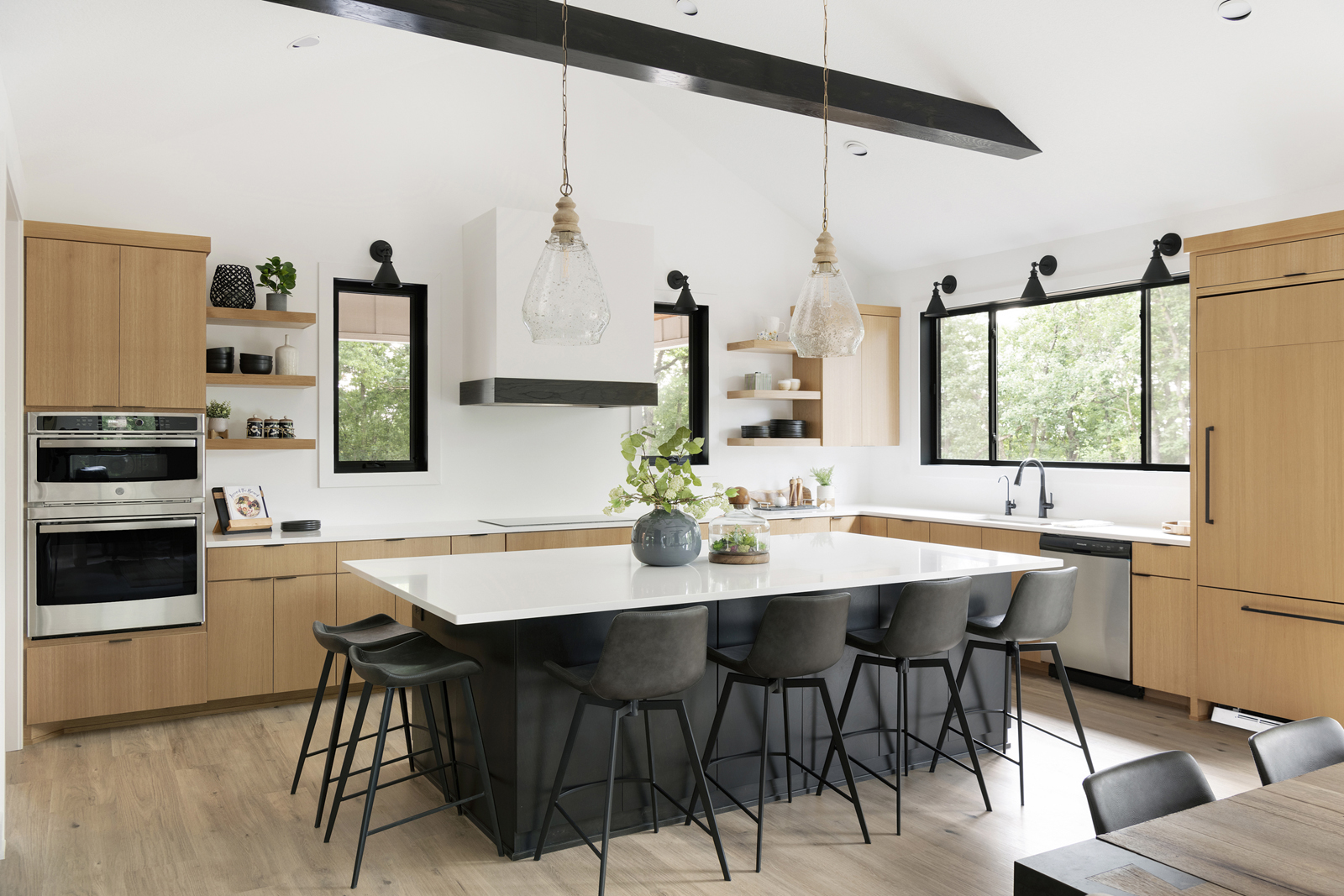
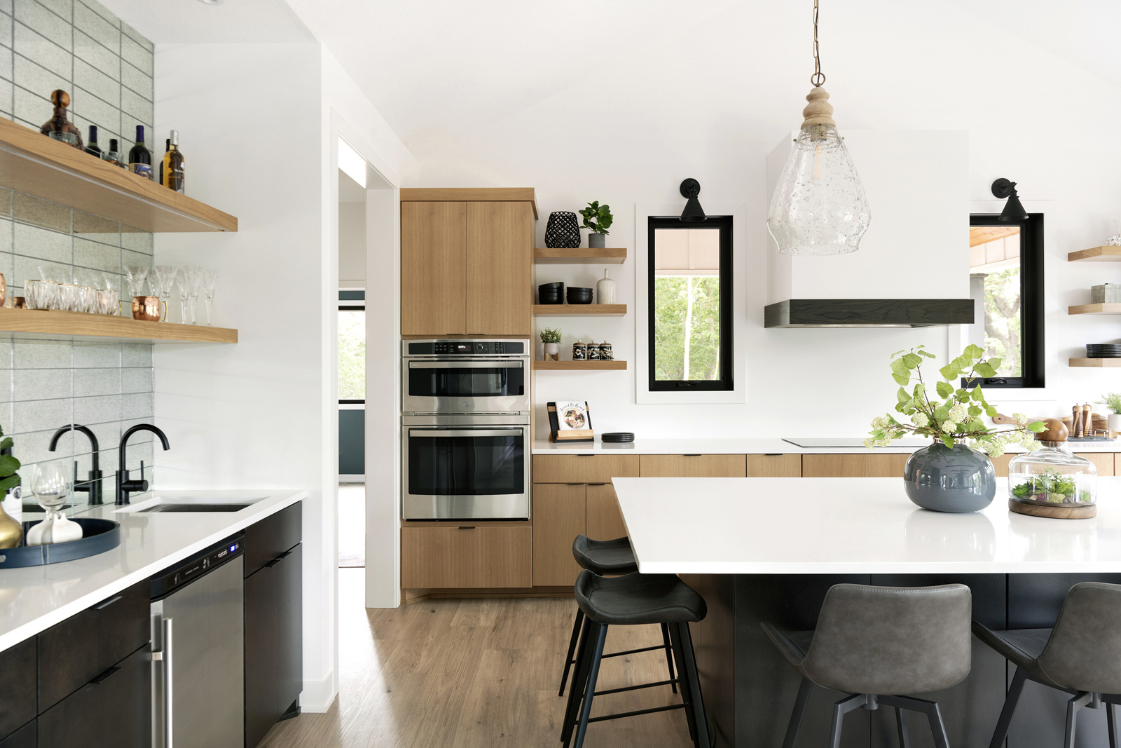
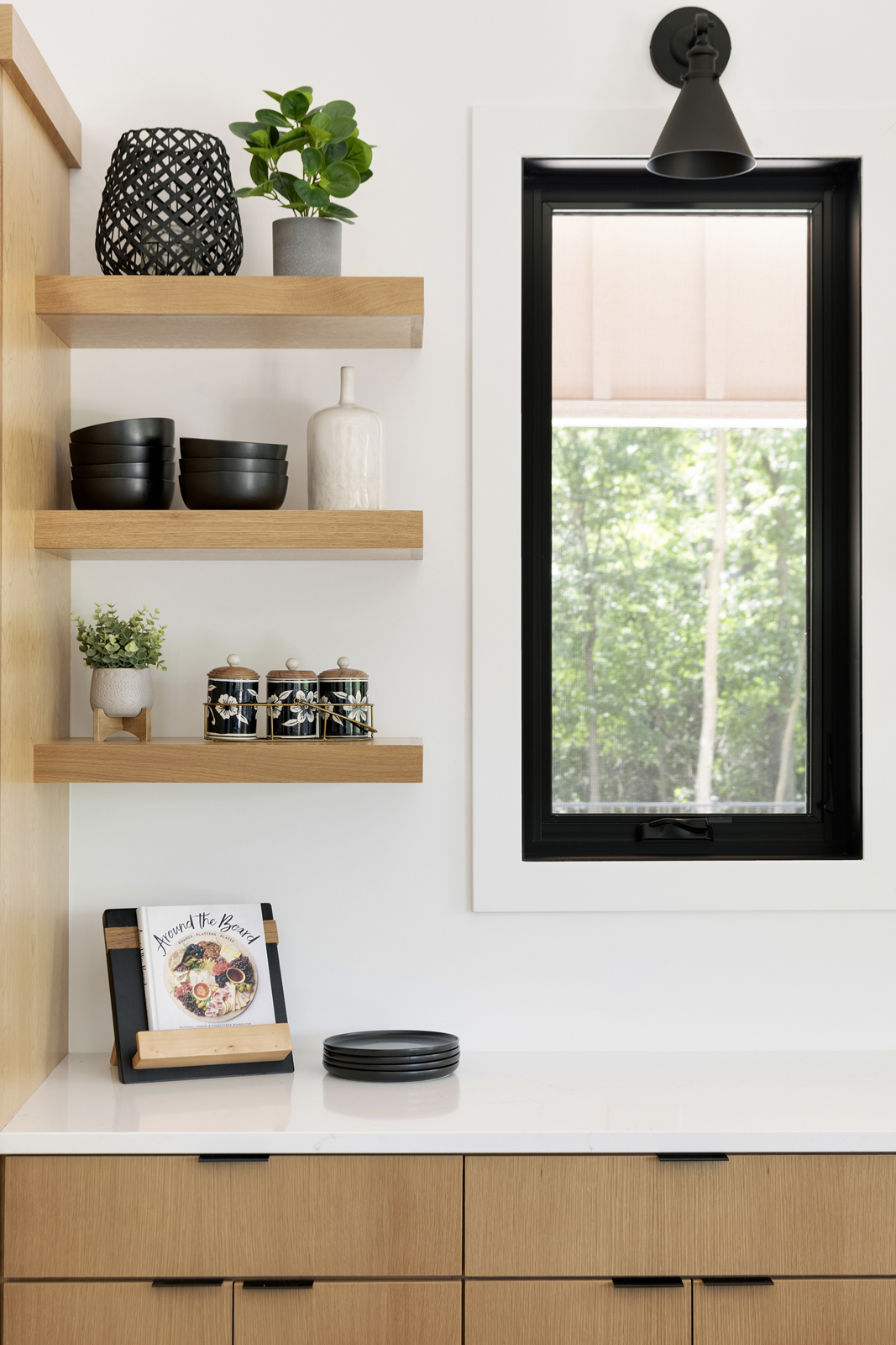
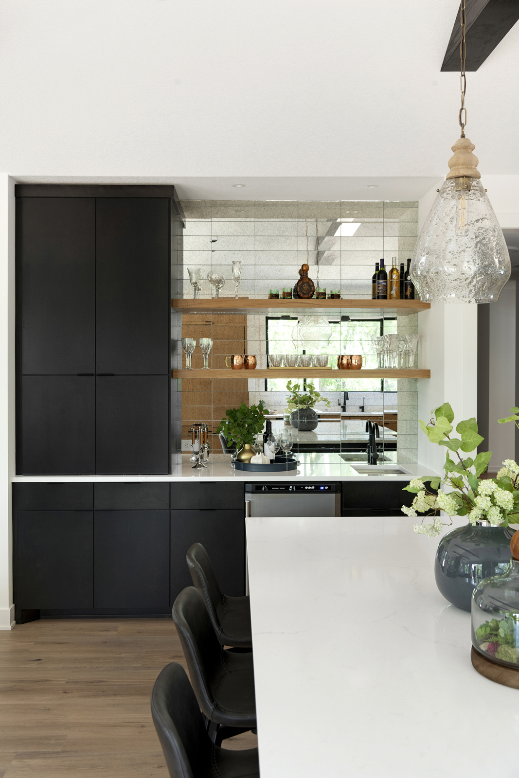
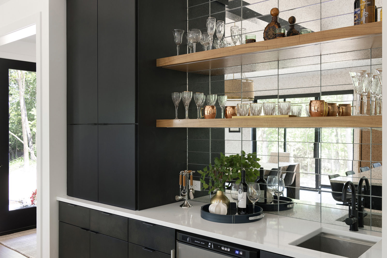
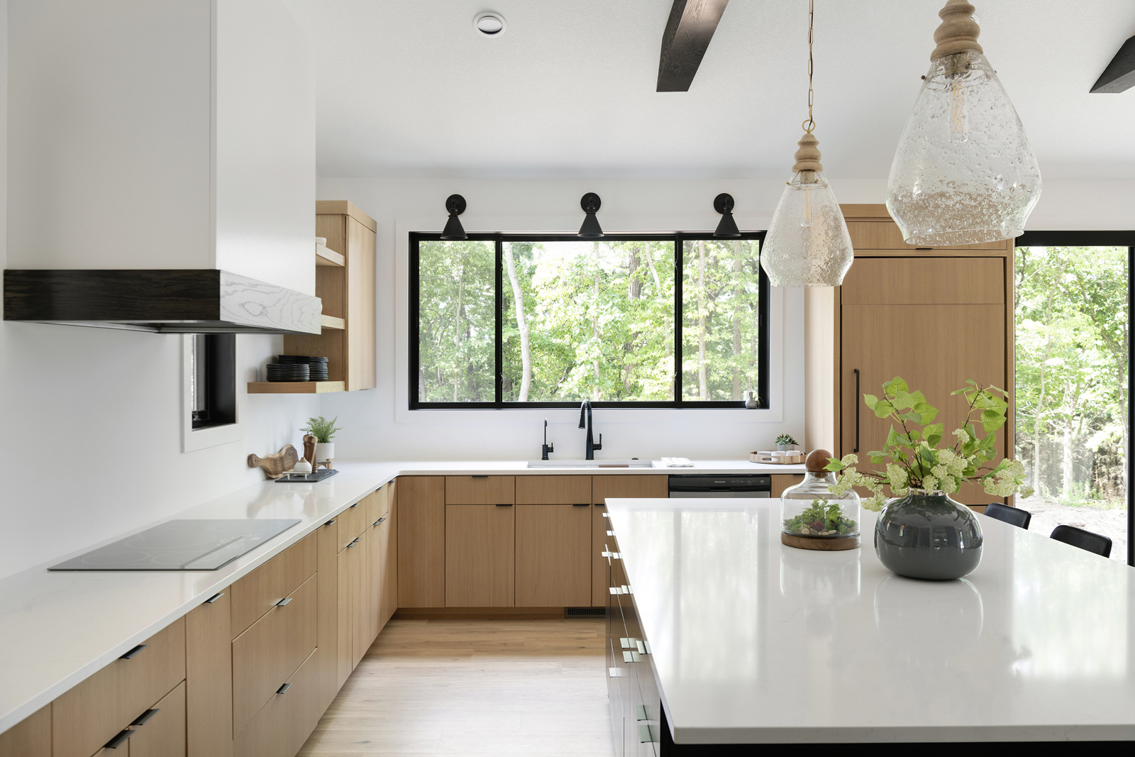
Now for the kitchen…I mean, I can’t say how much I LOVE this kitchen!! I visualized it in my brain when we were designing it, but when it was actually completed, it was truly a dream come true! I love how the mixture of rift sawn white oak, black stained cabinetry with the grain showing through, black stained wood beams in the ceiling, beautiful quartz countertops, and the coveted beverage center with mirrored glass tile and open shelves – all combine together to create such a dreamy space. One of my favorite features is that there are so many windows and the upper cabinetry is very minimal, which allows it to feel light and bright and maximizes the views of the beautiful outdoor spaces. Every morning must be a good morning in this house, I’d say!
the pantry
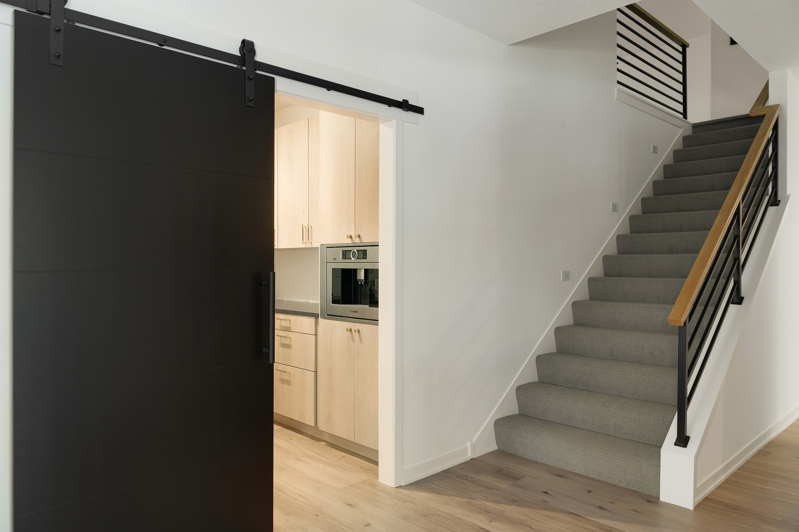
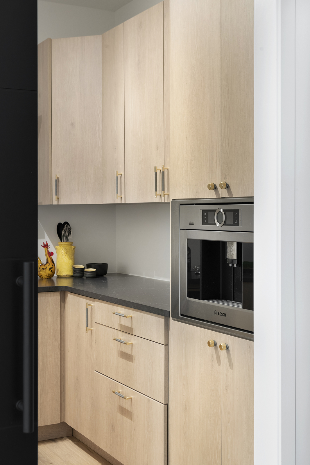
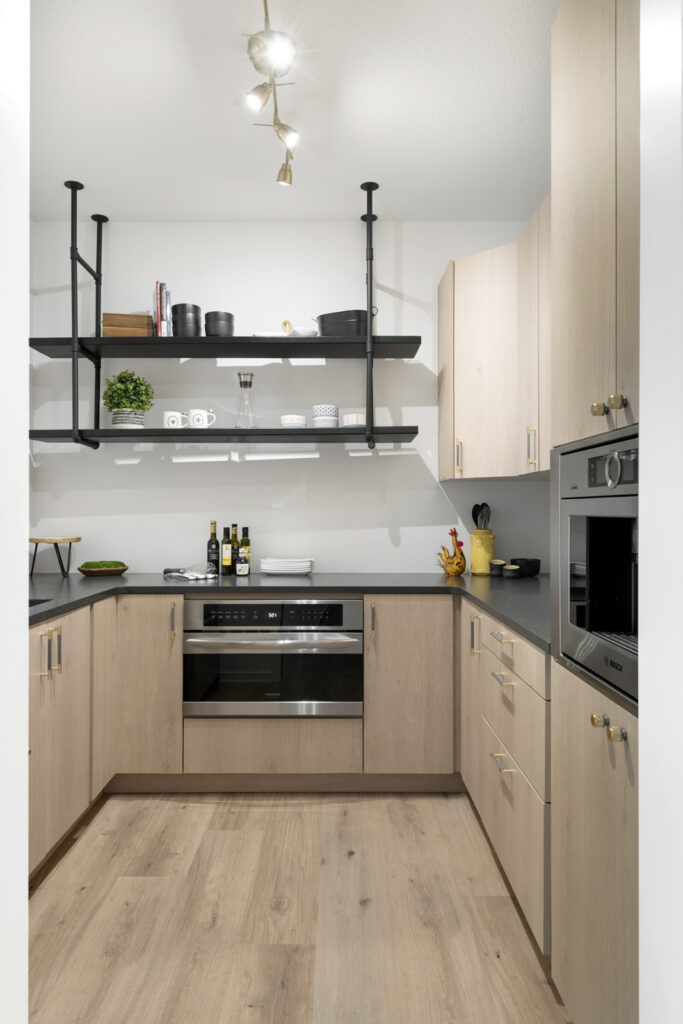
If the kitchen wasn’t already amazing, we have a big BONUS just around the corner! Hidden by a fun sliding door, lies a pantry so well-equipped and spacious that it’s almost like a second kitchen. Another full size refrigerator, an additional oven, and a built in coffee & espresso maker are all located here to create a space that food can be prepared without messing up the main kitchen. Most of the pantry food items are stored here, as there is ample cabinet space. Appliances like the toaster and smoothie maker can be left out on the countertop here and it keeps the kitchen looking clean and pretty.
the powder bathroom
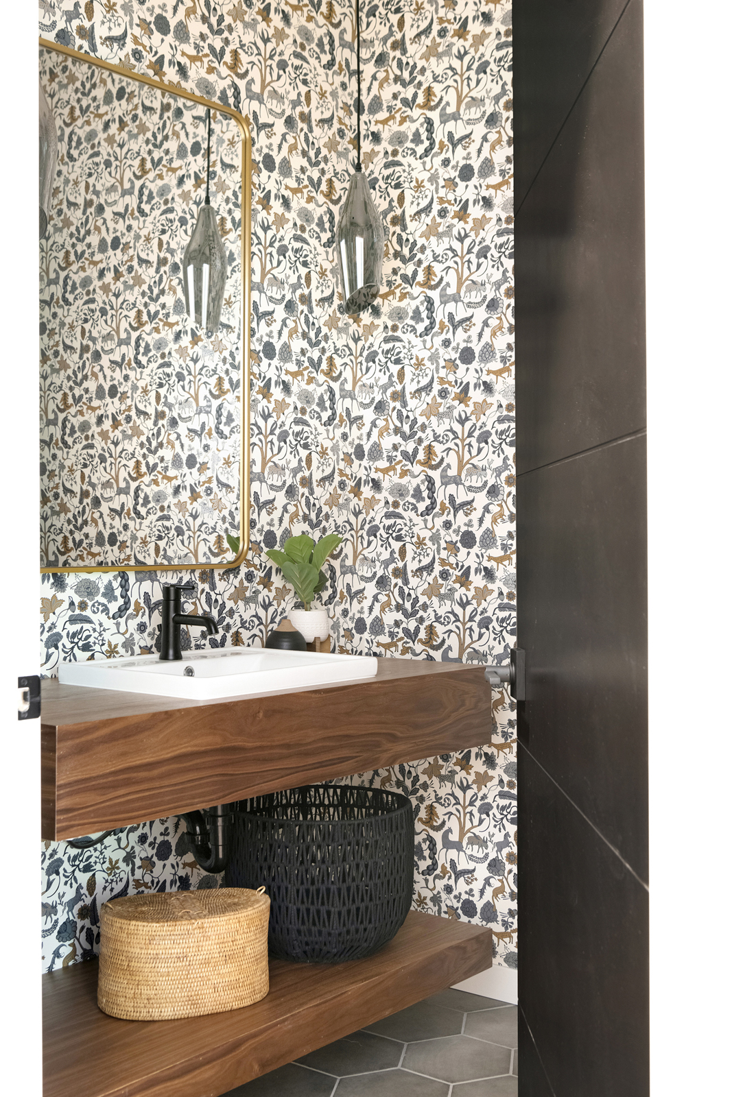
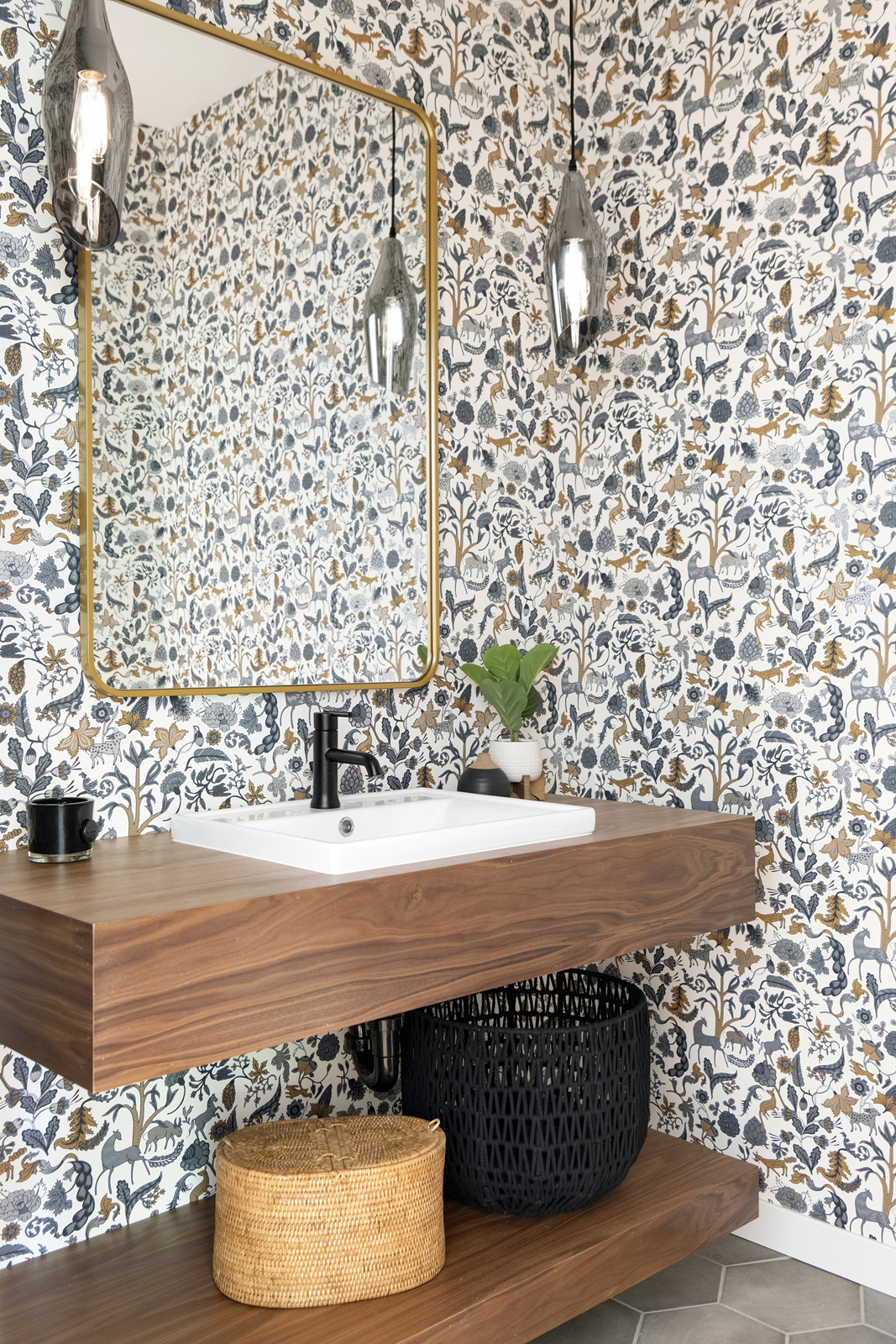
Here’s another one of my all-time favorites! I love how this powder bathroom turned out! We used this fun wallpaper from Hygge & West, a Minneapolis-based wallpaper company. It is colorful and whimsical and fits the organic, modern feel of this home. A custom-designed black walnut floating vanity adds a WOW factor to the room, along with the beautiful gray glass pendants, We used a simple hexagon on the floor that looks like concrete. I like mixing materials like gold metal, black metal, glass, wood tones, concrete, and pattern all in one space to create layers of interest that all harmonize beautifully together.
the mudroom
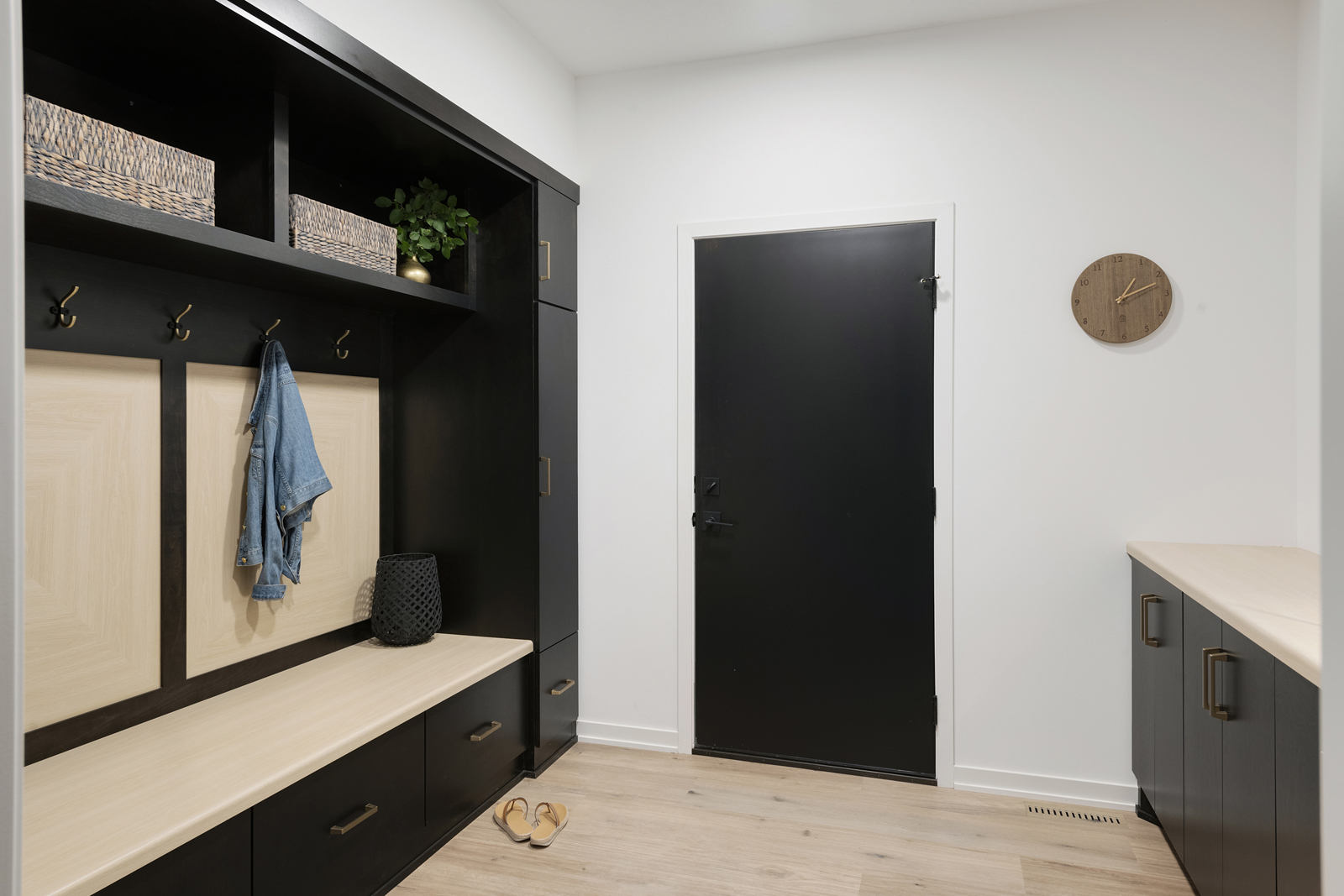
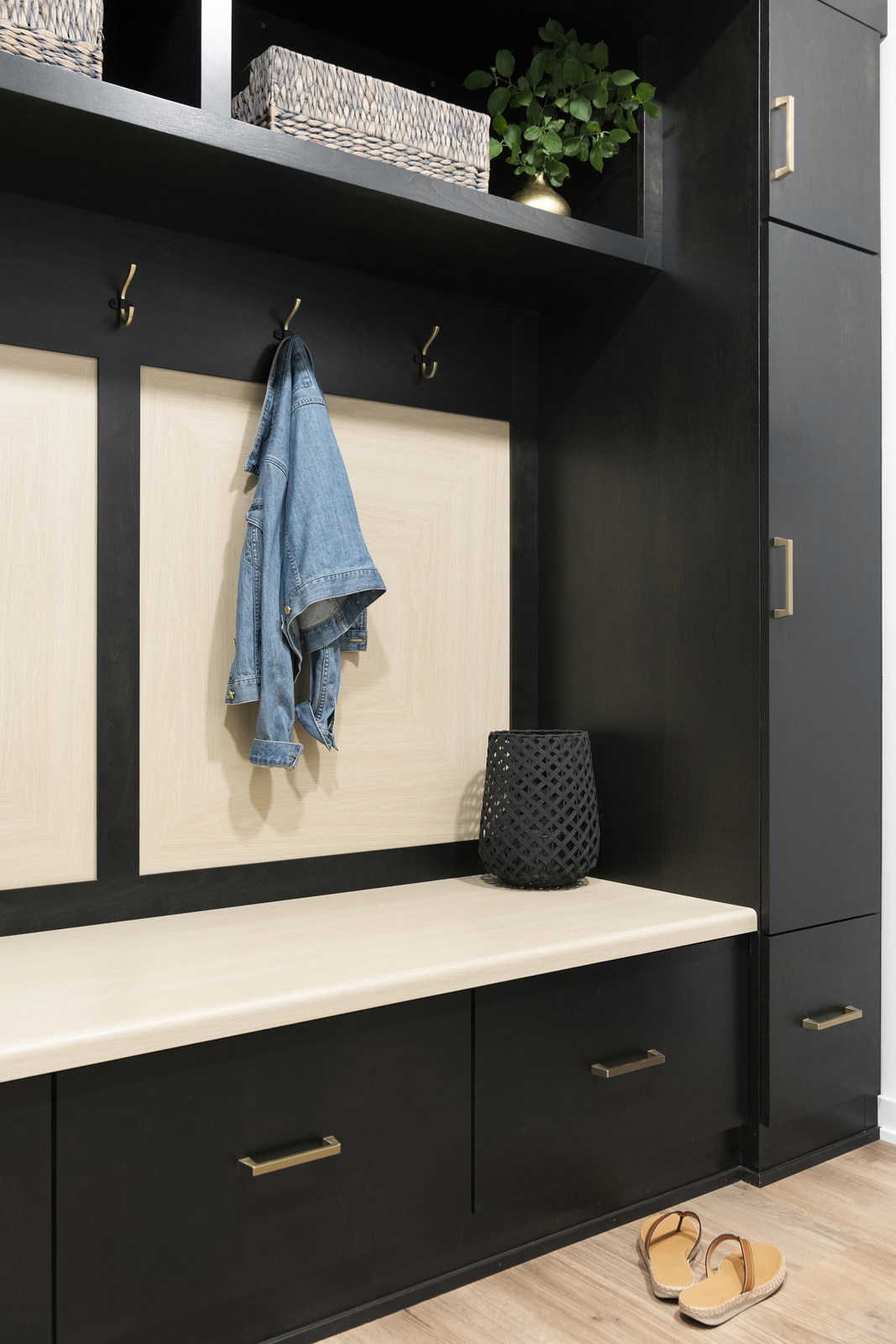
Tis mudroom is simple but packs in a lot of functionality. We didn’t capture images, but there is an open space at the bottom of the cabinets that was specially designed for the Roomba vacuum to dock itself, keeping it hidden and easily accessible. There is also a pass through opening through one of the upper cabinets that goes into the primary closet, where the laundry room is also located. We created a fun design on the back of the locker area that is made to look like a wood inlayed design but is actually made out of laminate that looks like wood. It is super durable and the seat also is made from that wood look laminate, so wet clothes or shoes will not harm it at all. It is easy to clean and virtually maintenance-free.
the primary suite
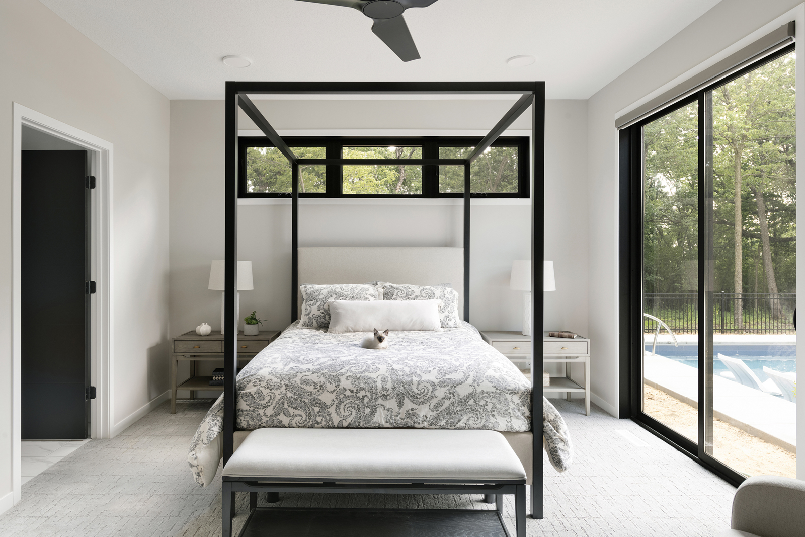
The primary suite is simple and restful. The black canopy framed bed adds a modern touch, and the patio door steps right out to the pool area. What a perfect way to start your day!
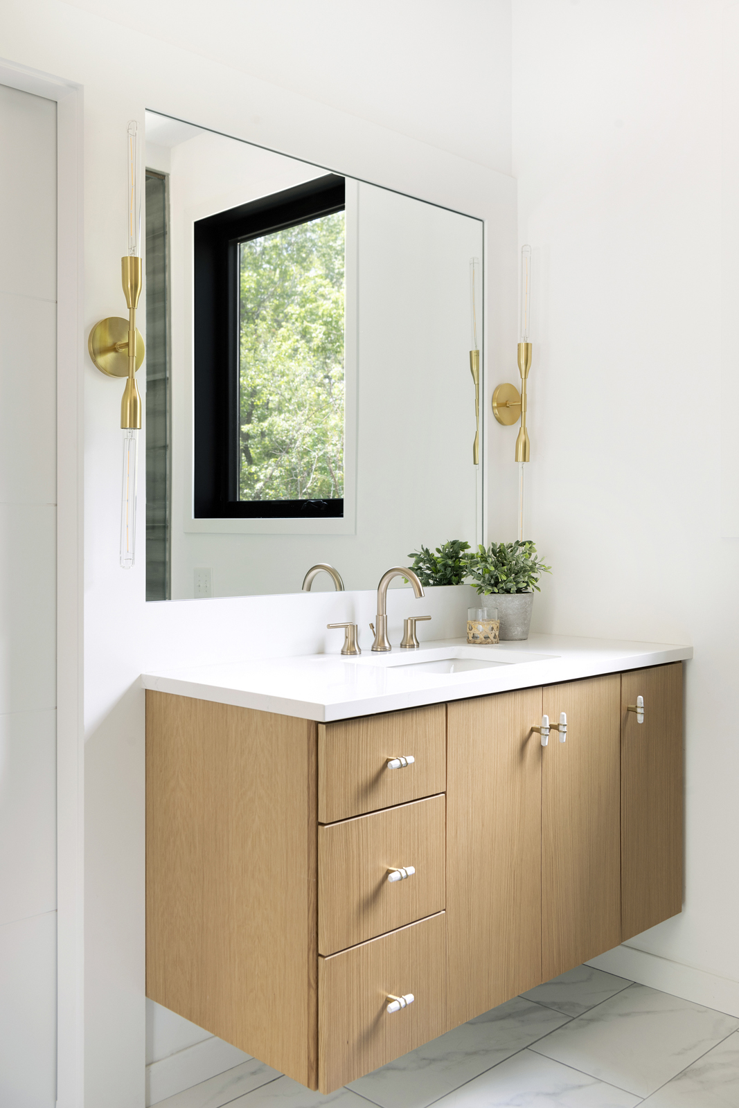
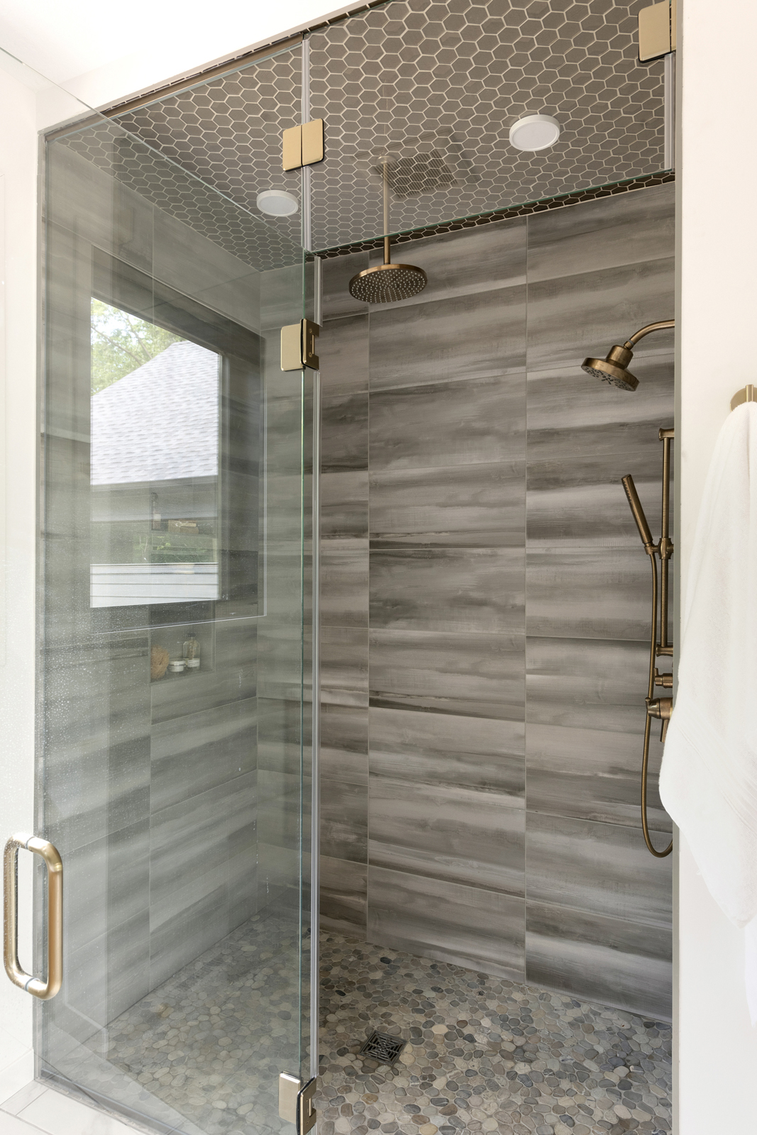
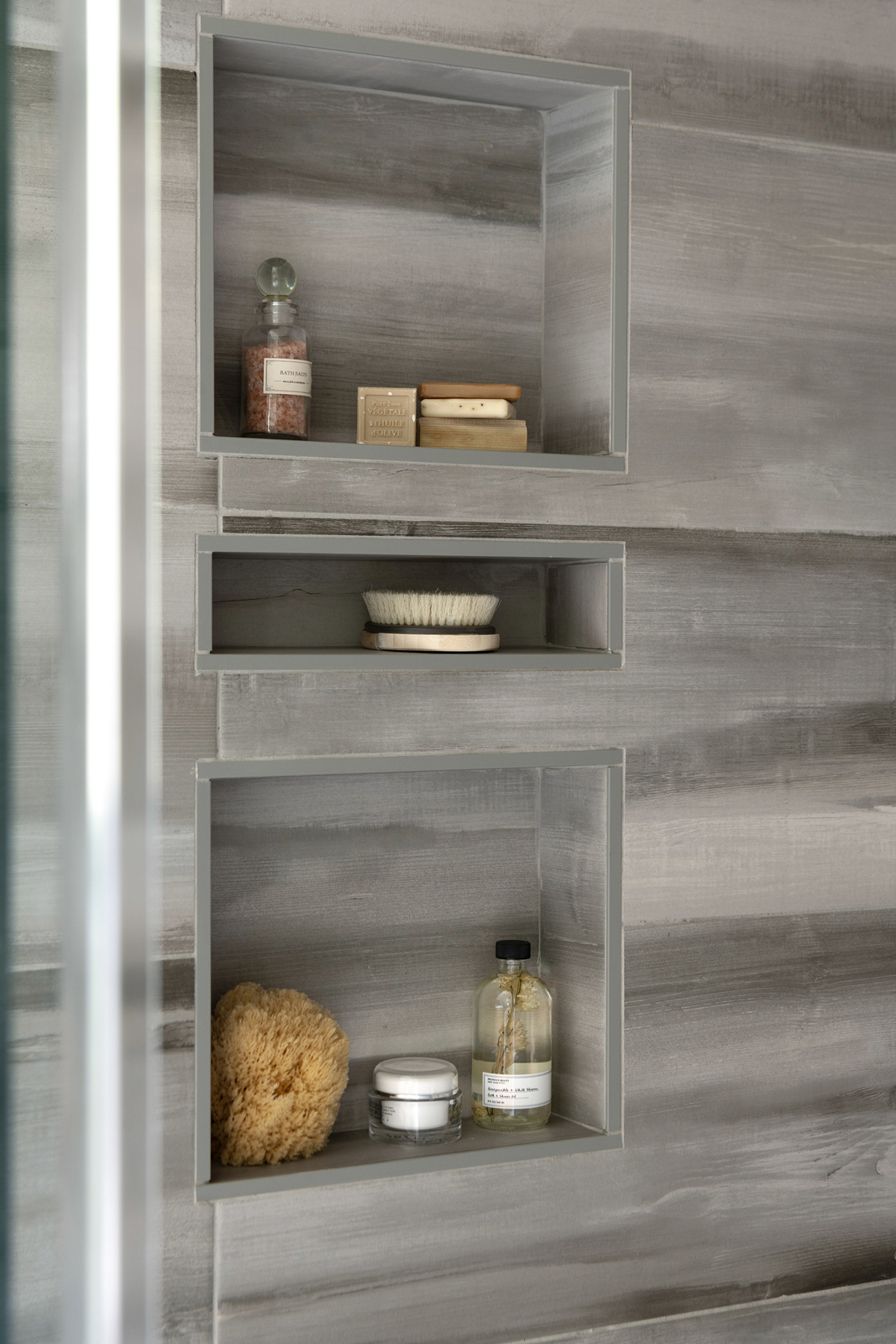
The primary bathroom has a luxurious steam shower with beautiful tile on the walls, floor and ceiling. When it comes to design, we truly care about the details. I personally went to the jobsite to layout each tile and where it would be positioned. I ended up having to do it 3 times, because there were some issues with the tile company and they kept having to reschedule installation and it kept getting picked up and stacked in between. More work than we anticipated, but well worth the effort! The vanity cabinets are rift sawn white oak, and the floating style gives a modern feel. Beautiful gold light fixtures and plumbing fixtures add a little sparkle and warmth to the room, making it feel very special.

the lower level
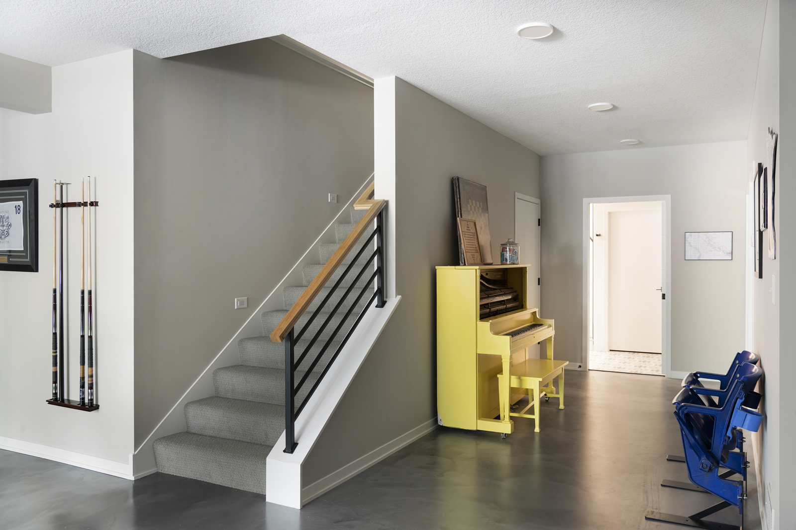
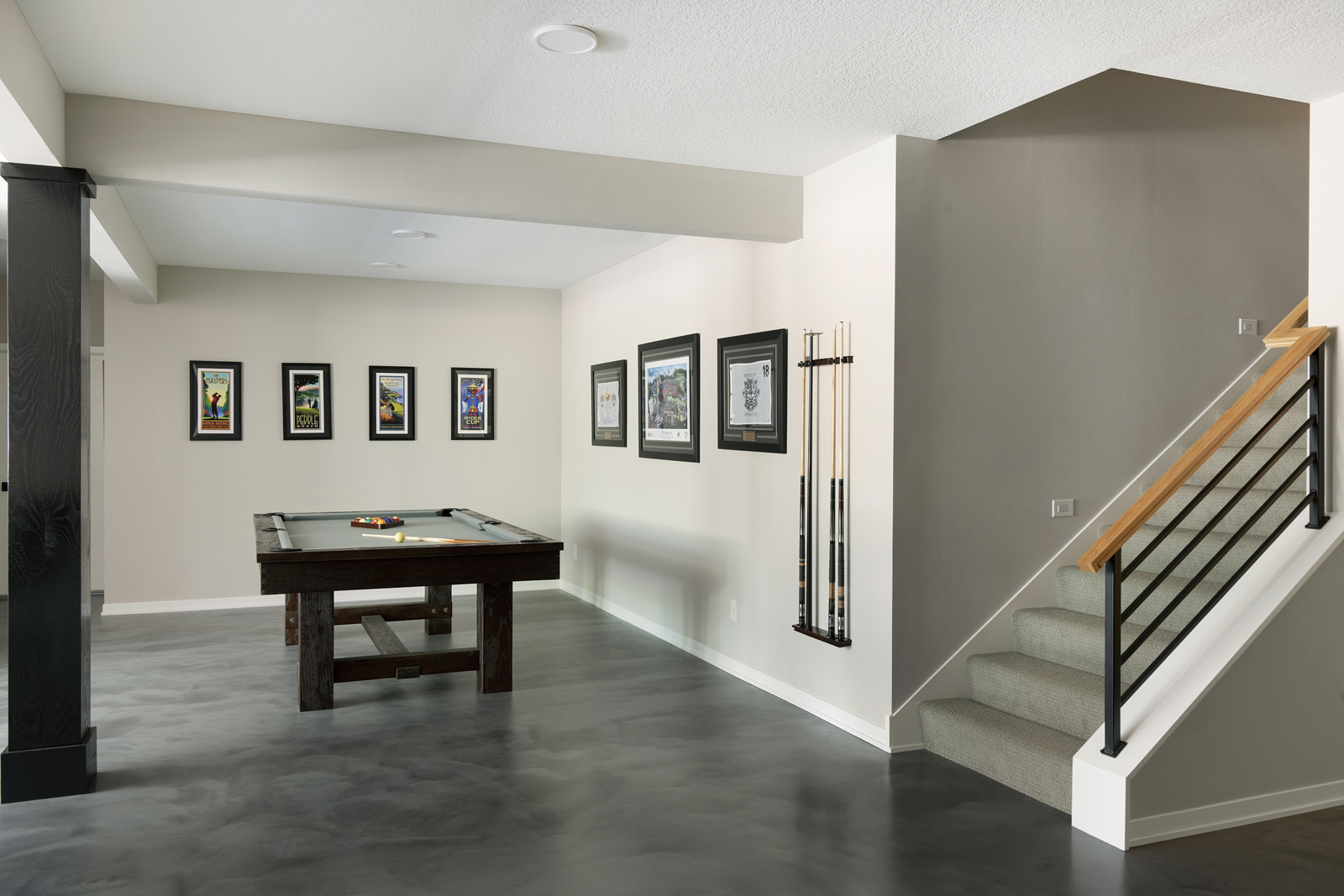
The lower level houses 3 more bedrooms, a family room, rec room and a bathroom. Shown here is the rec area, with a pool table and whimsical yellow piano.
the daughter’s bathroom
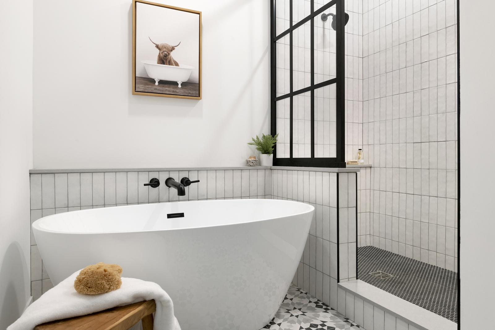
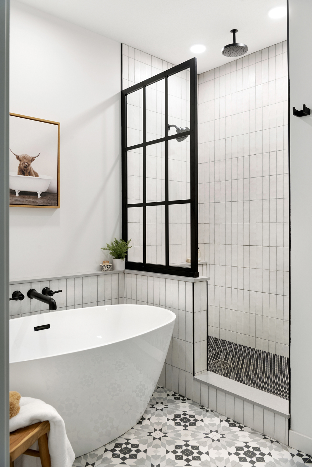
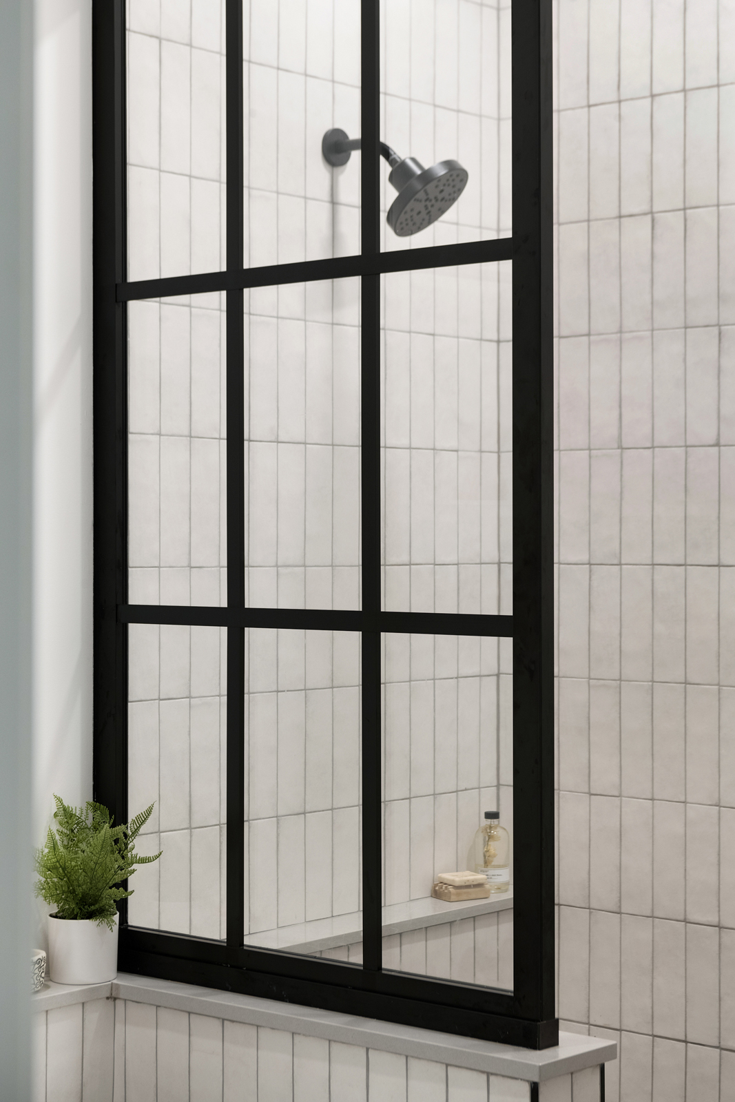
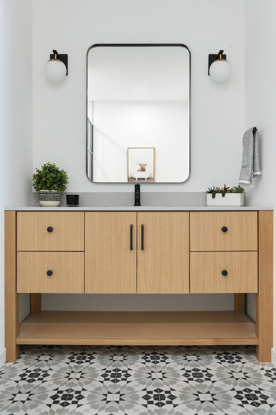
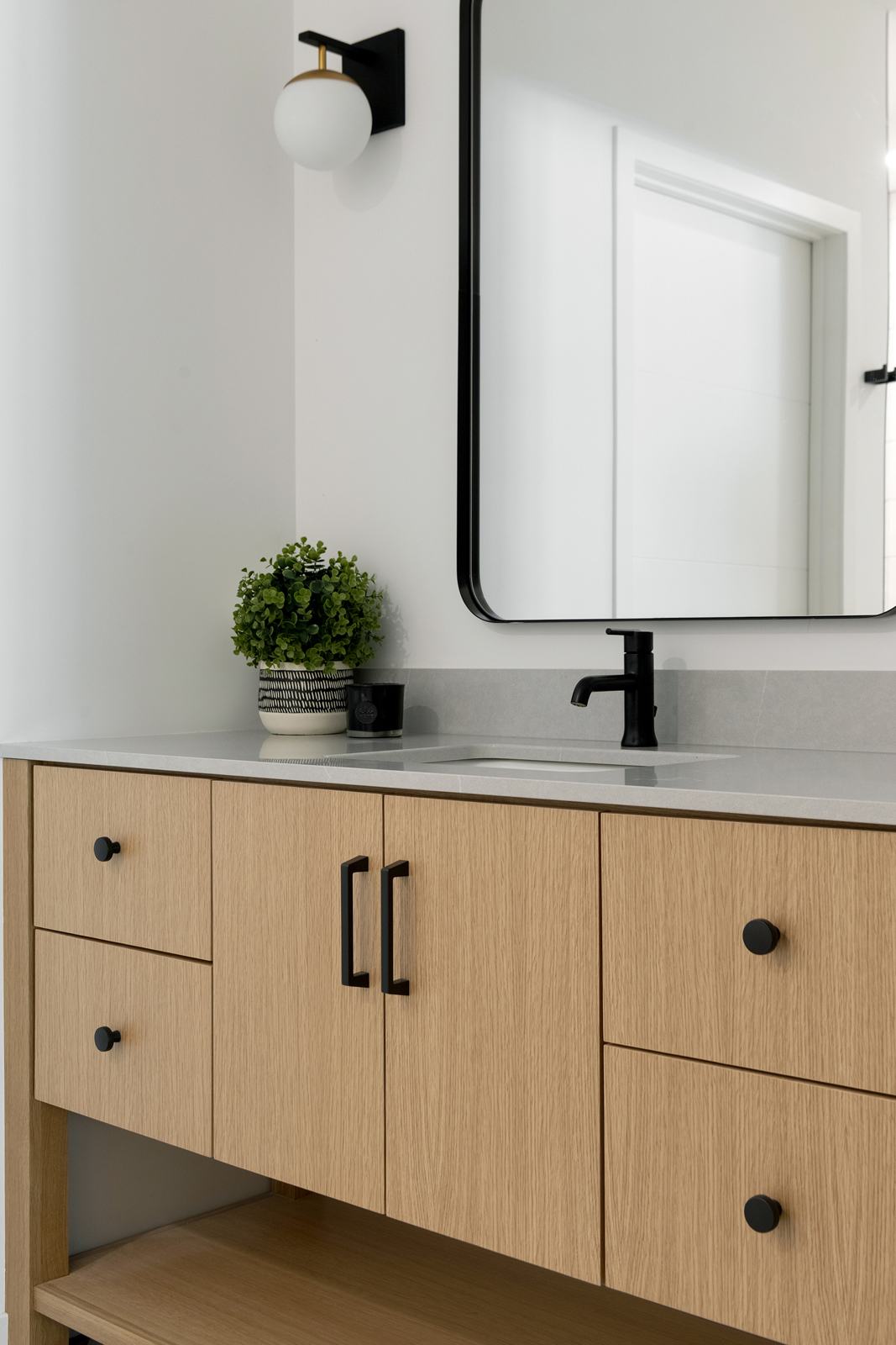
Last, but not least, is the lower level bathroom. We had fun with this one! A handcrafted linear subway shower tile was run vertically for a modern look. The dark grout really makes the pattern pop and gives an important contrast to tie in with the black accents. The shower is open, with just the paned glass divider. A luxurious soaking tub with a wall-mounted tub filler offer a very inviting spot to end a busy day. We ran a ledge along the entire wall to create a space to hold toiletries in both the shower and next to the tub. It is capped with a quartz material that looks like concreate and is also on the vanity top. The light oak cabinets bring in the warmth to balance out all of the black and white and geometric features in this room. One of my favorite things in this bathroom is the floor tile. I love the black, white and gray pattern. It just feels so fun and happy!
We hope you enjoyed seeing our friends’ beautiful new home! This past year has been such a dream as we have had the blessing of being able to work on several projects with good friends, as well as several fabulous projects that have led to the gift of wonderful NEW friends. We’d love to help you with your next big adventure! We can’t wait to meet you, and become friends too!
XO,
Amy & the Interior Impressions Team
Leave a Reply