Click here if you missed Part 1 of this Project Reveal!
the kitchen + dining area
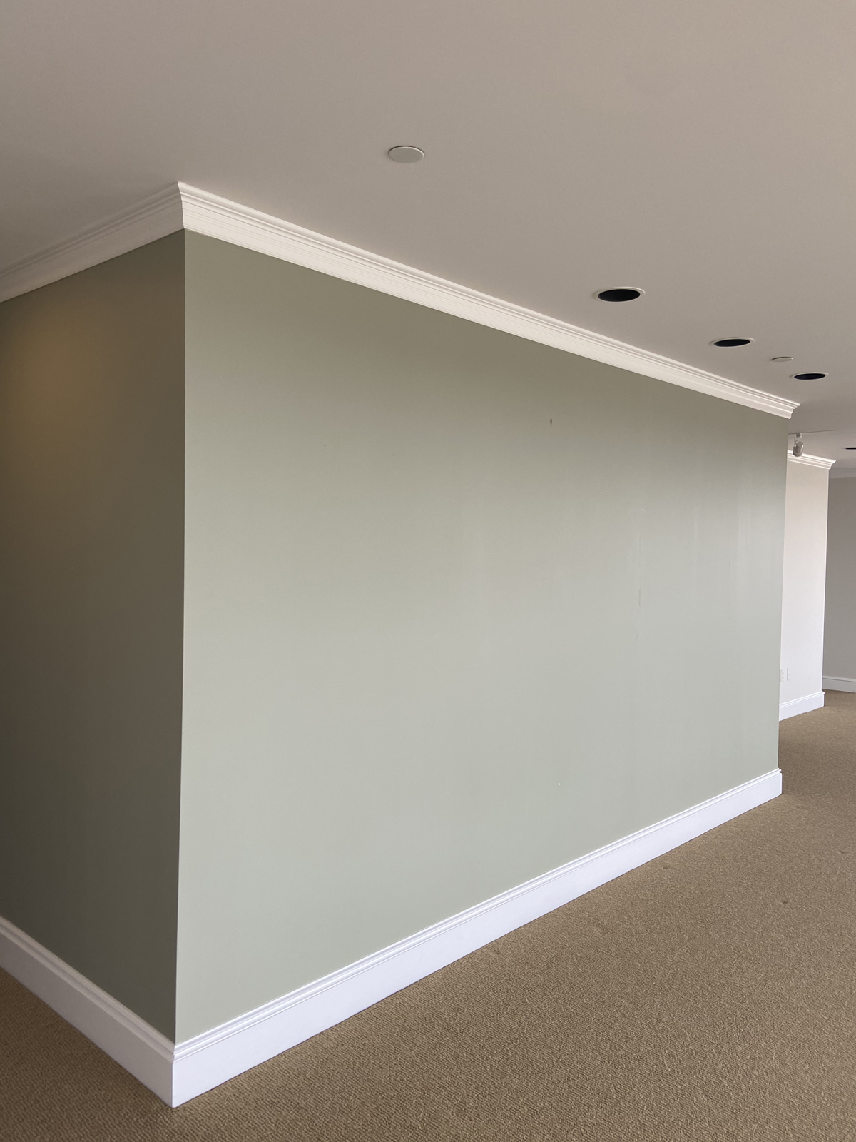
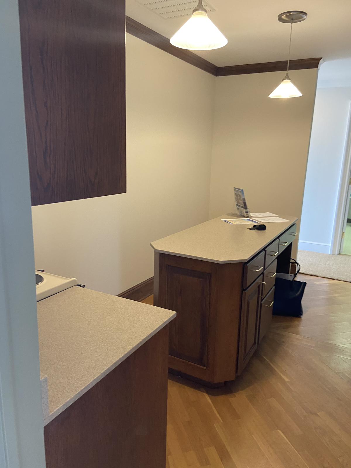
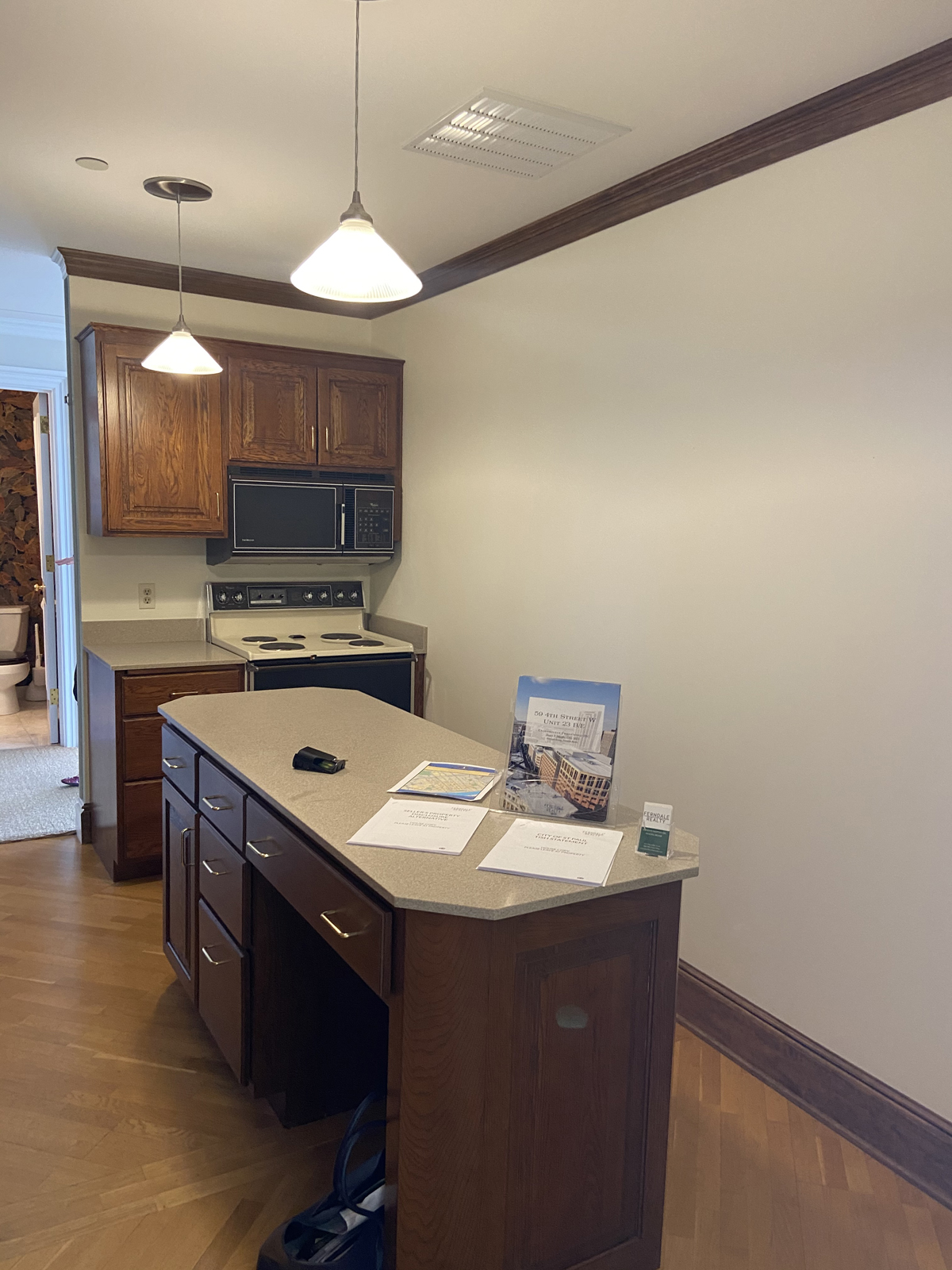
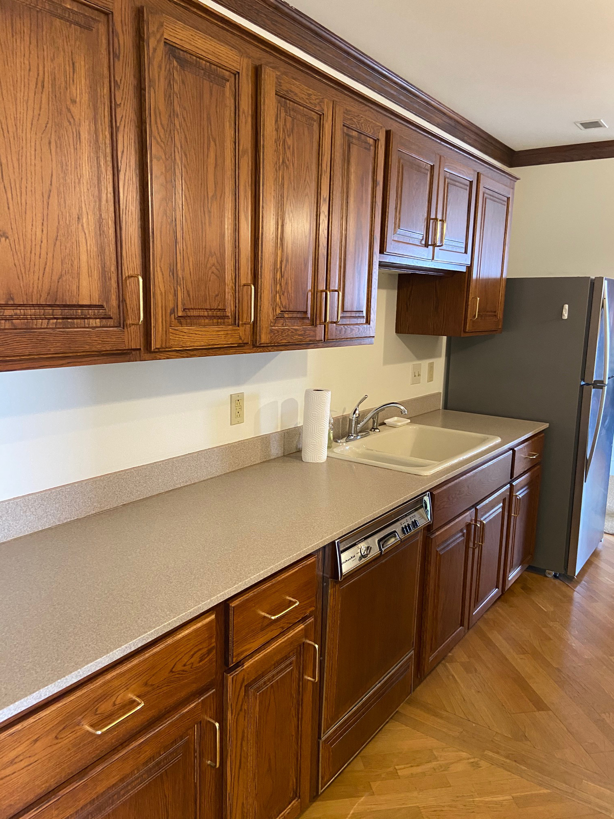
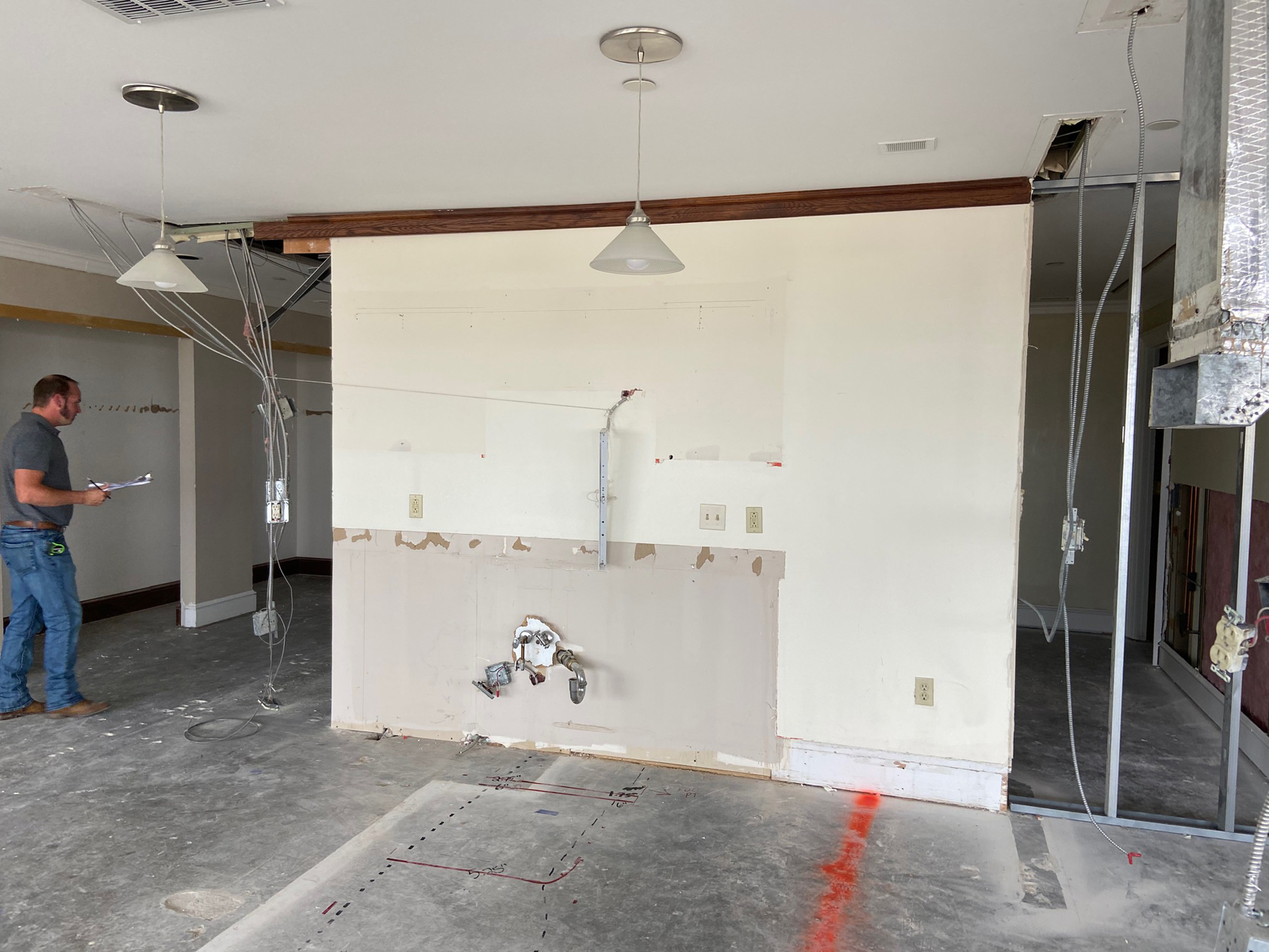
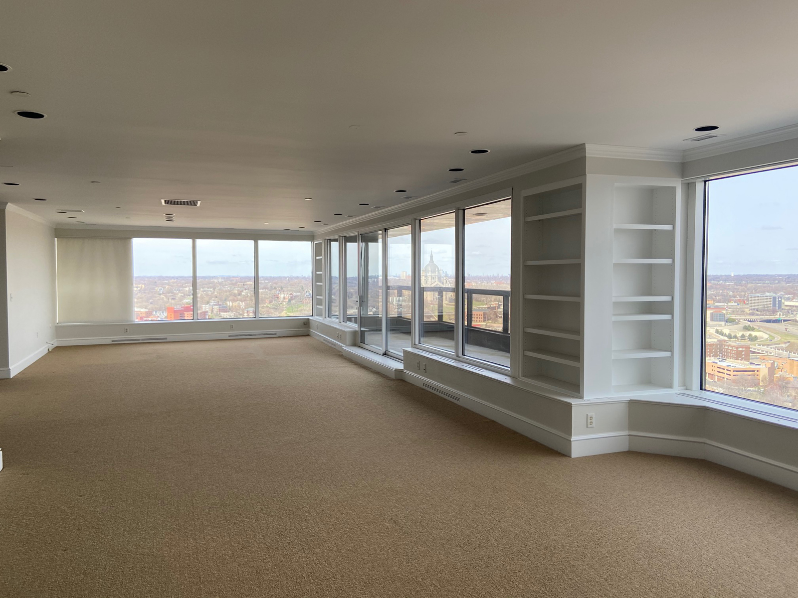
I remember going to look at this condo with our friends before they decided to buy it. Undoubtedly, the sweeping skyline views are what really made this condo attractive. What was shocking to me was that you couldn’t even see out of those windows from the kitchen! It was completely enclosed with solid walls and everything in that room was extremely dated. It was a unanimous decision that the kitchen needed to be opened up and have unobstructed views of that spectacular skyline. The green wall below is the wall we removed. Keep your eyes on the pendant lights that are hanging over the island and you’ll see where that island and kitchen was after the wall was removed.
THE BEFORE
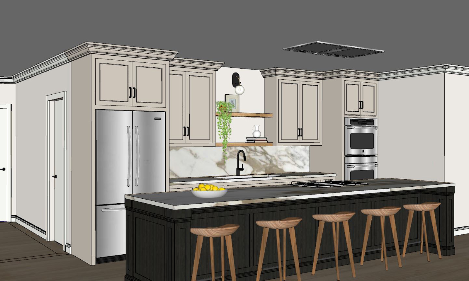
THE DESIGN PLAN
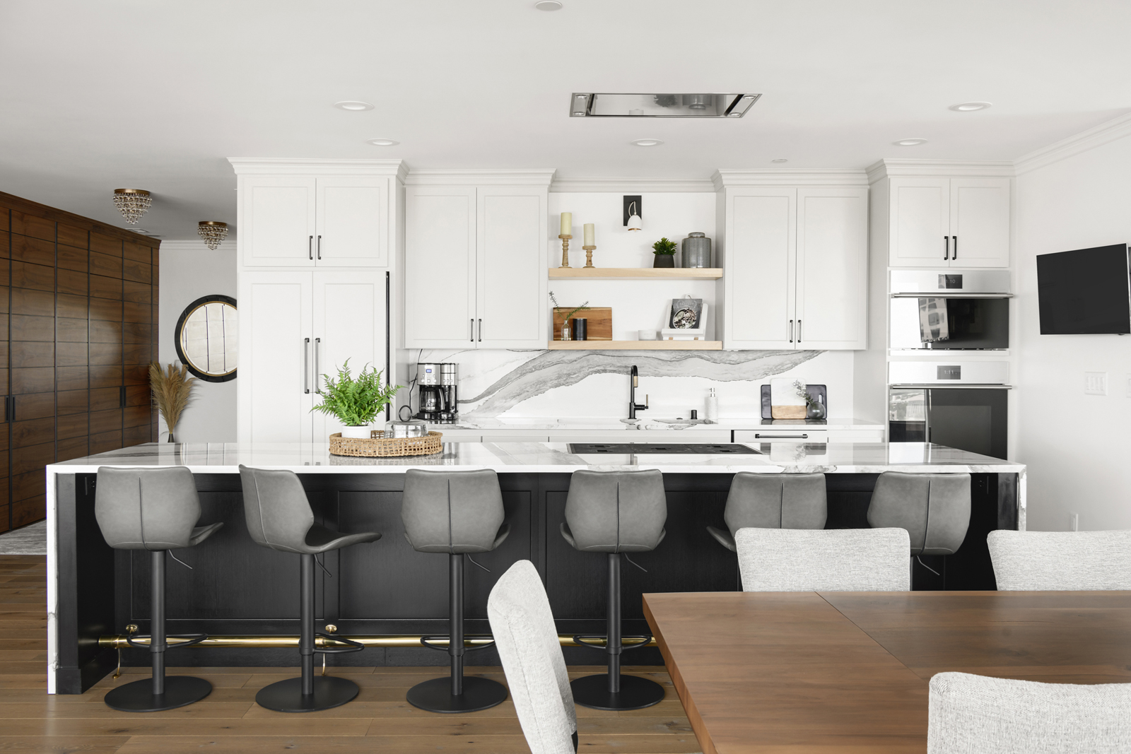
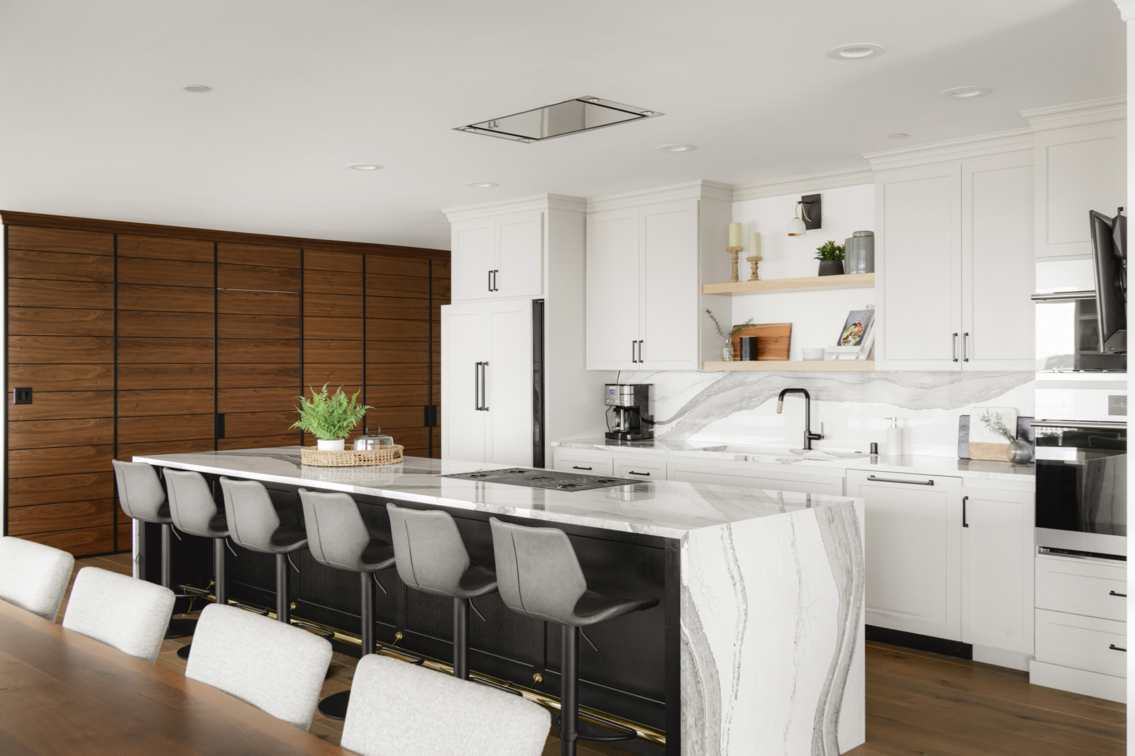
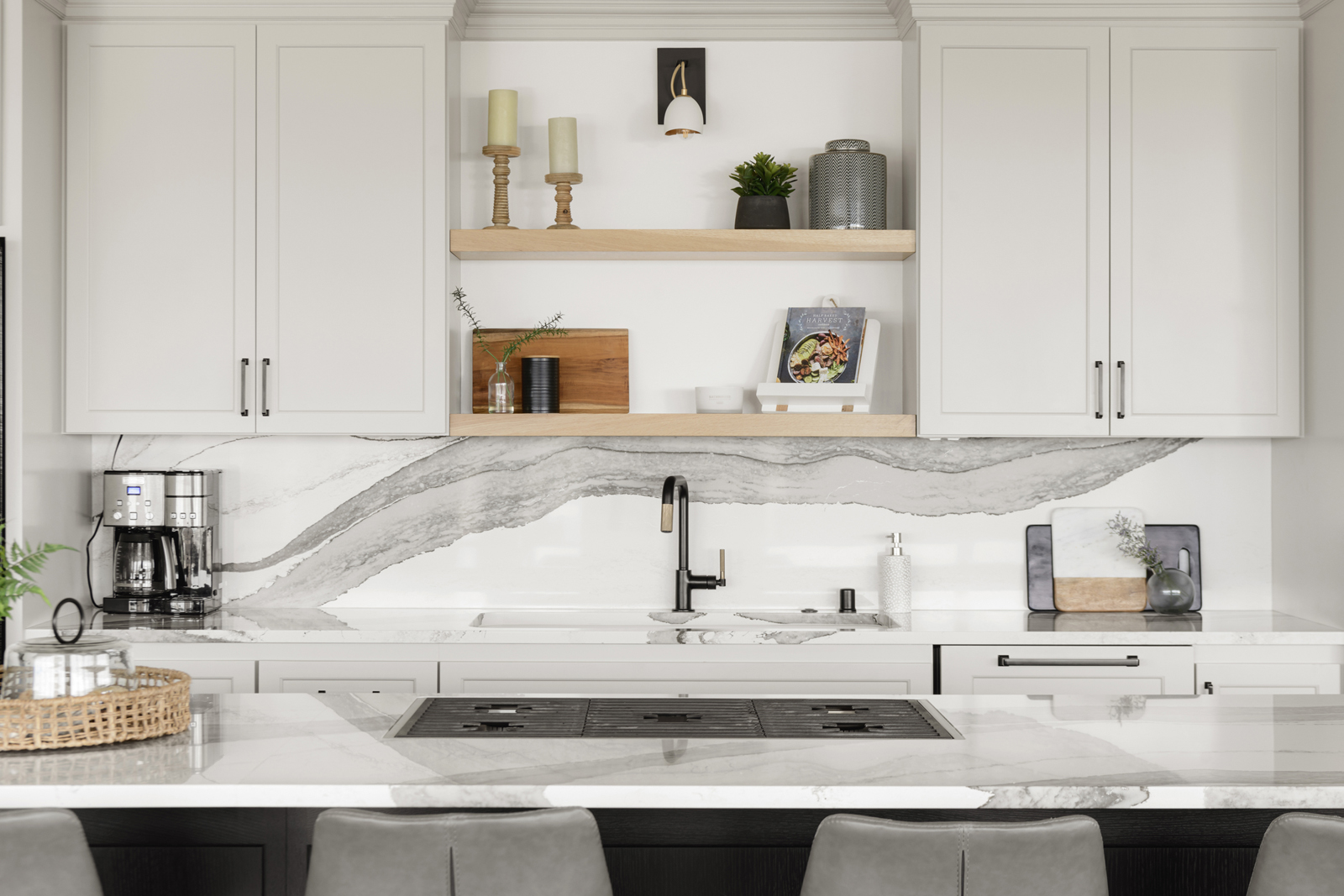
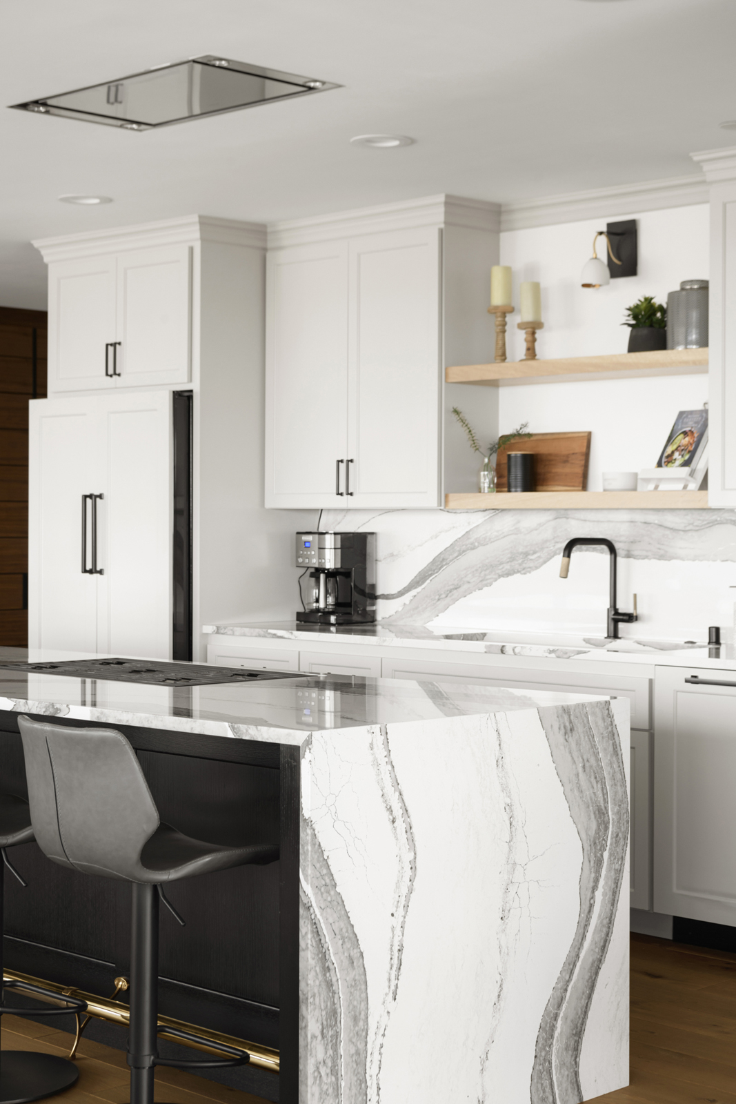
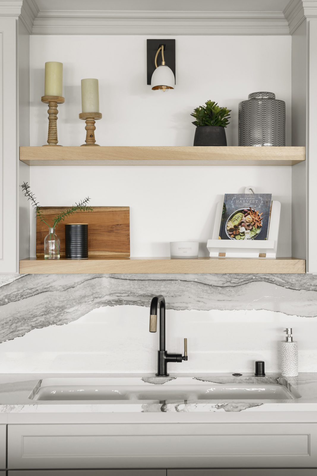
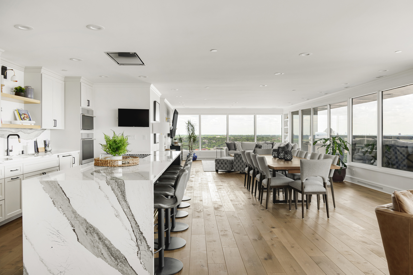
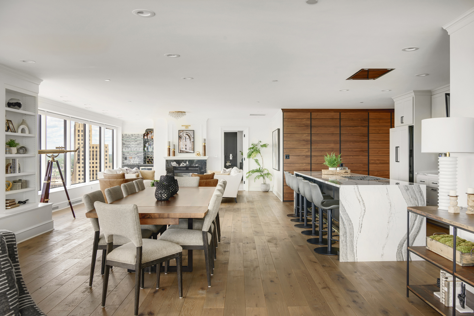
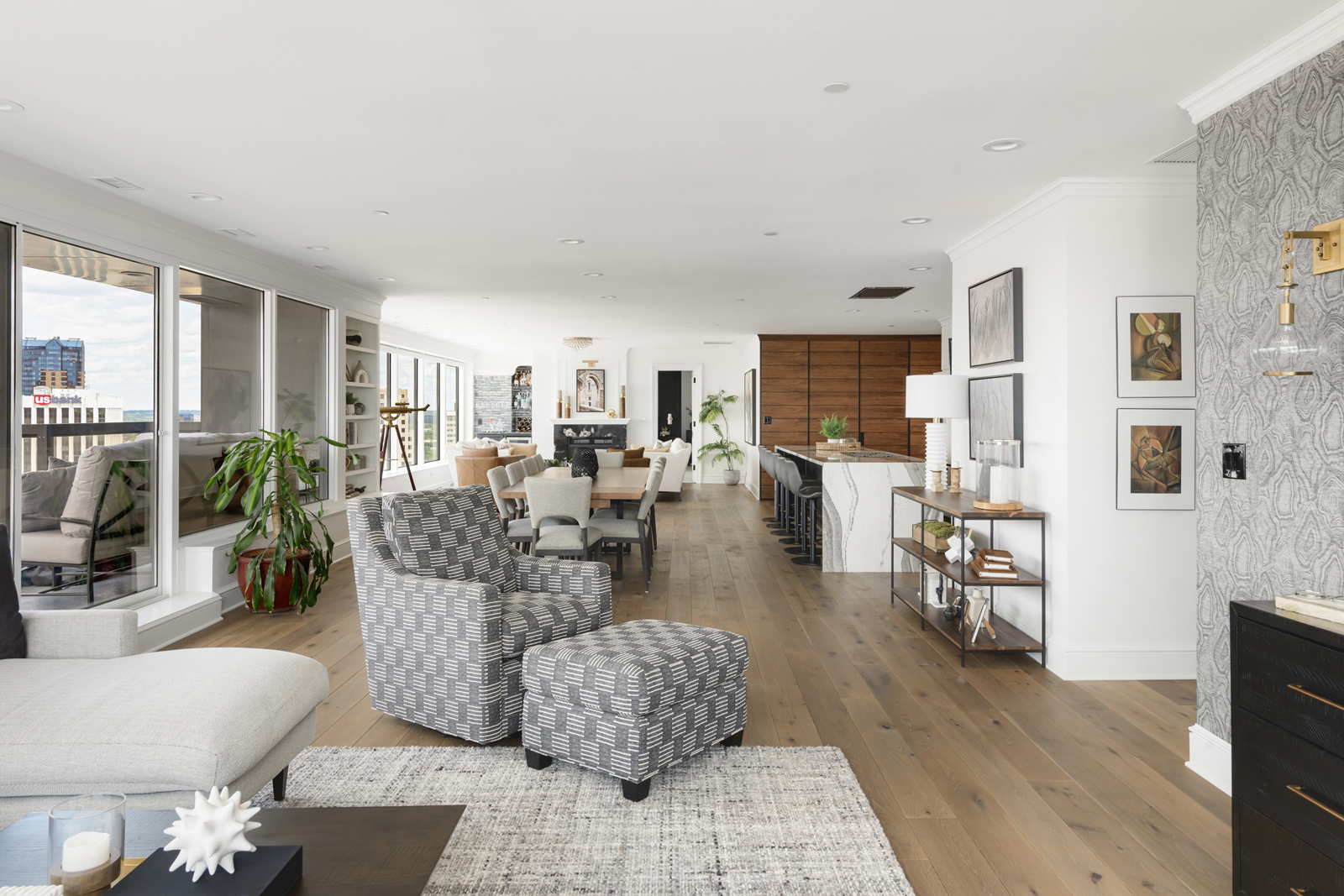
Because the kitchen, living room, dining room and family room are all one massive “open room” space, spanning over 60 feet long, it was important to have a cohesive design and color palette. Our design aesthetic keywords were elegant but inviting and comfortable, warm, organic/earthy colors, textured, and light-filled. The walls in this big space were going to be a soft white, all of the new flooring was wide-plank oak, and all of the millwork would be bright white. We felt the cabinetry in the kitchen needed to be light and bright, but not white. We chose a lovely shade of warm gray for the back cabinets (Worldly Gray), and contrasted the island with a black finish (Caviar). We originally fell in love with Borghese marble for the countertops, but the cost was astronomical. Cambria quartz countertops were a beautiful 2nd choice, and they provided the drama and wow-factor we were looking for in the kitchen. Rather than installing a tile backsplash, we opted to run the Cambria quartz all the way up the backsplash as well, for a seamless and classy look. This entire kitchen is stunning, but in my opinion, the best part of the kitchen is the oversized island. It is 13 feet long! I always say “A center island can never be too big!”. After all, that is the heart of the home and everyone wants to hang out there. You may as well make it big enough for that to happen comfortably. We ran the Cambria down the sides of the island for a modern waterfall feature. A beautiful brass footrail was the icing on the cake! We decided to locate the cooktop in the island as well. It was quite the challenge getting gas, electrical and water lines moved around in this kitchen. When you are remodeling a condo, you run into all sorts of technical challenges, such as drilling into concrete in a building that has suspension cables literally holding the building up. We had to have infared Xrays done to see what was below the concrete so we knew where it was safe to drill. If you cut into the wrong spot and break one of those cables….well, let’s just say we would never want to know what could happen! Fortunately, all went well and we were able to get the gas appliances and everything we wanted. End result – a spectacular, gorgeous kitchen that now has the most beautiful skyline views as well!
THE AFTER
the additional living room
the before
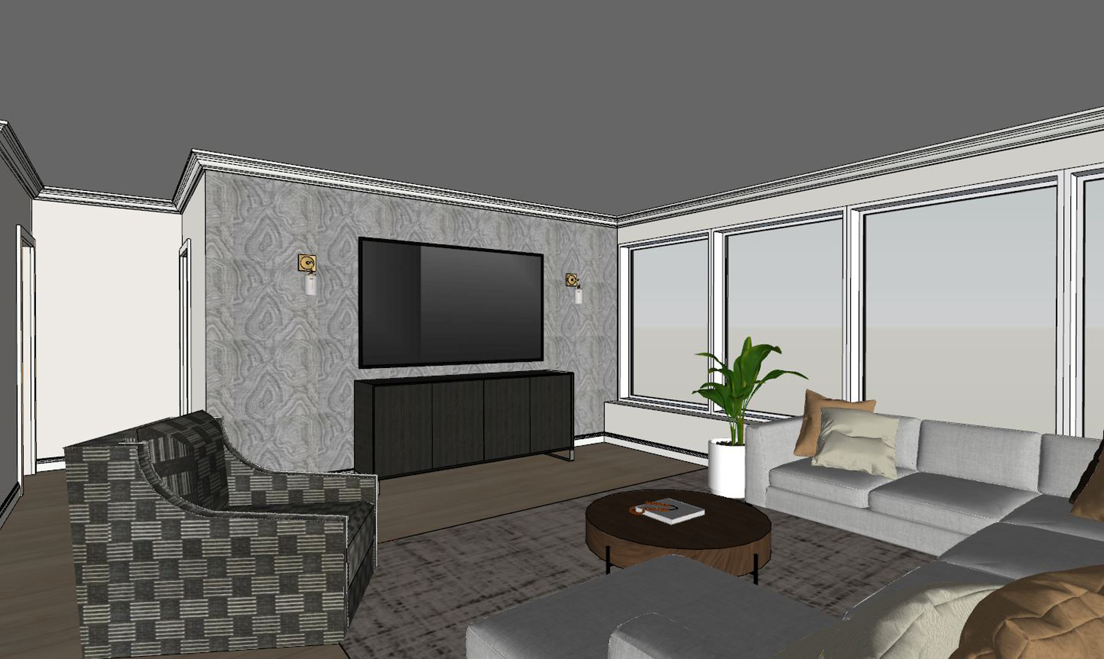
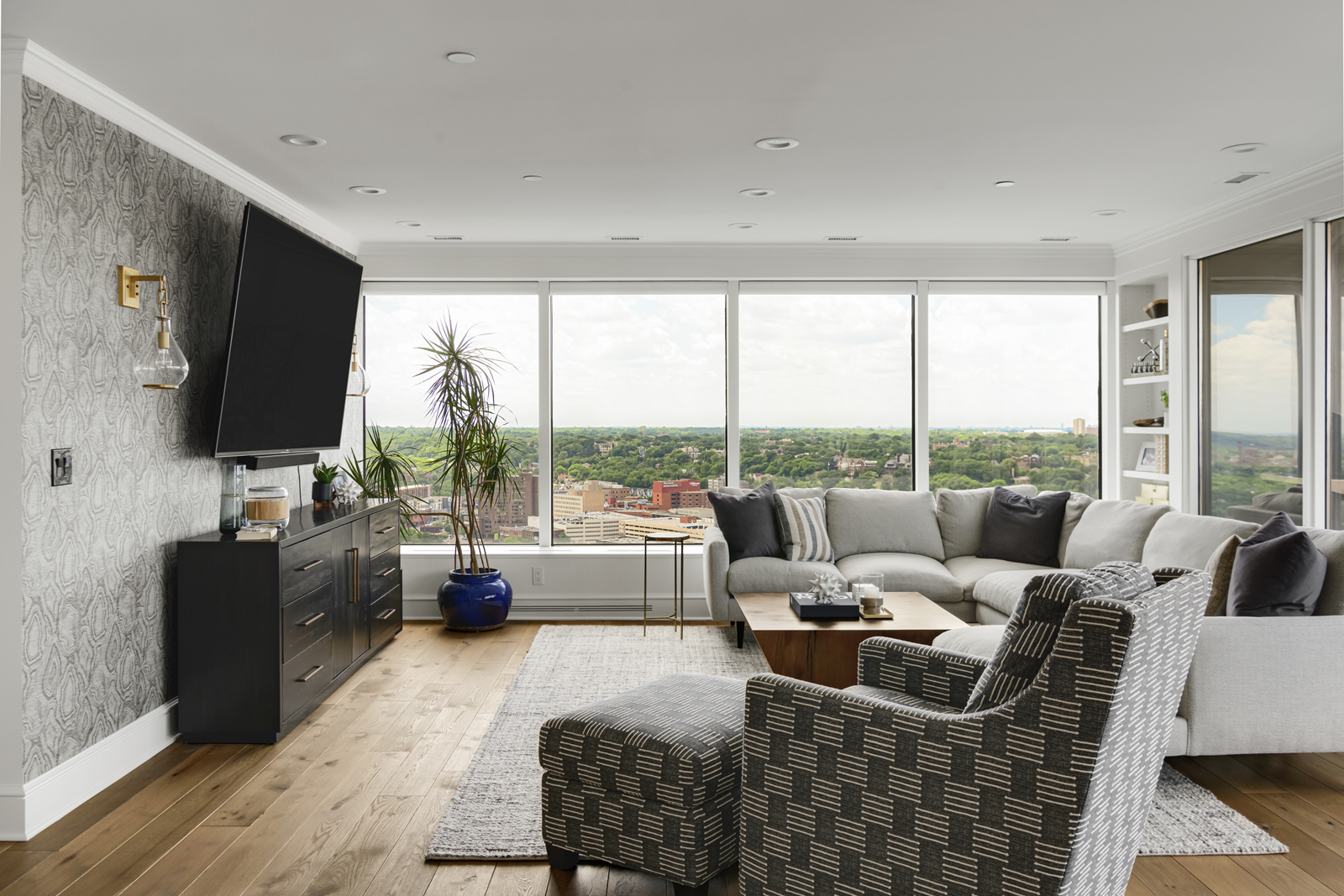
With this very long room, it was important to break it up into areas for different functions. The dining space filled the gap between the formal living room and the far end of the open space, as well as the space between the kitchen and the windows. The far end of the room had one of the few walls to work with, and it just made sense to put the tv watching area there.
the design plan
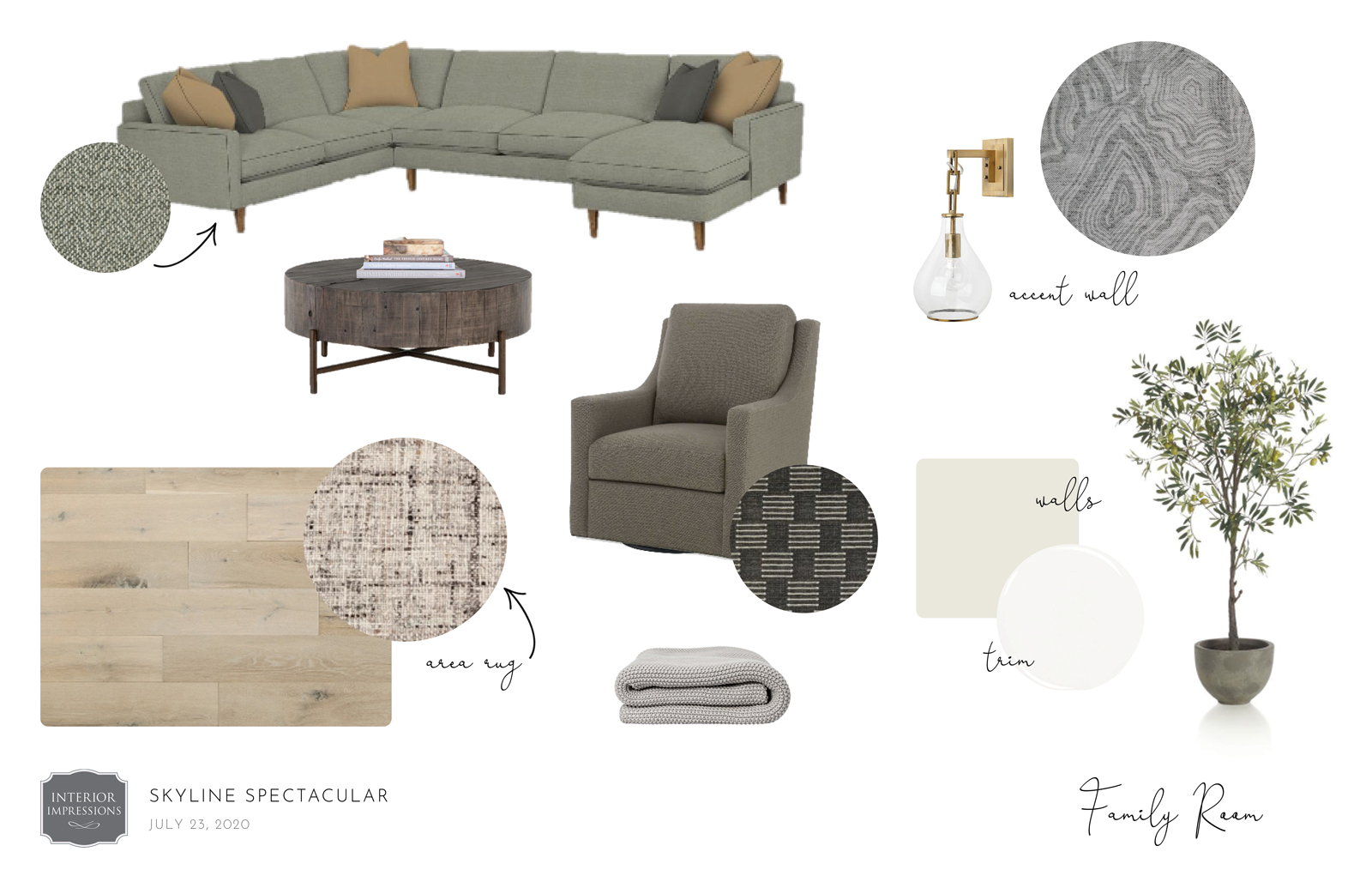
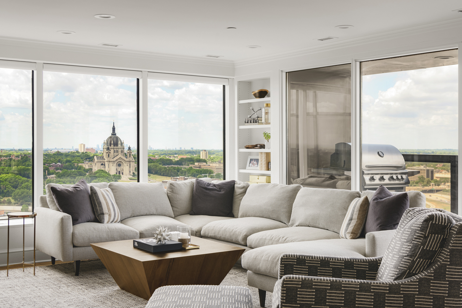
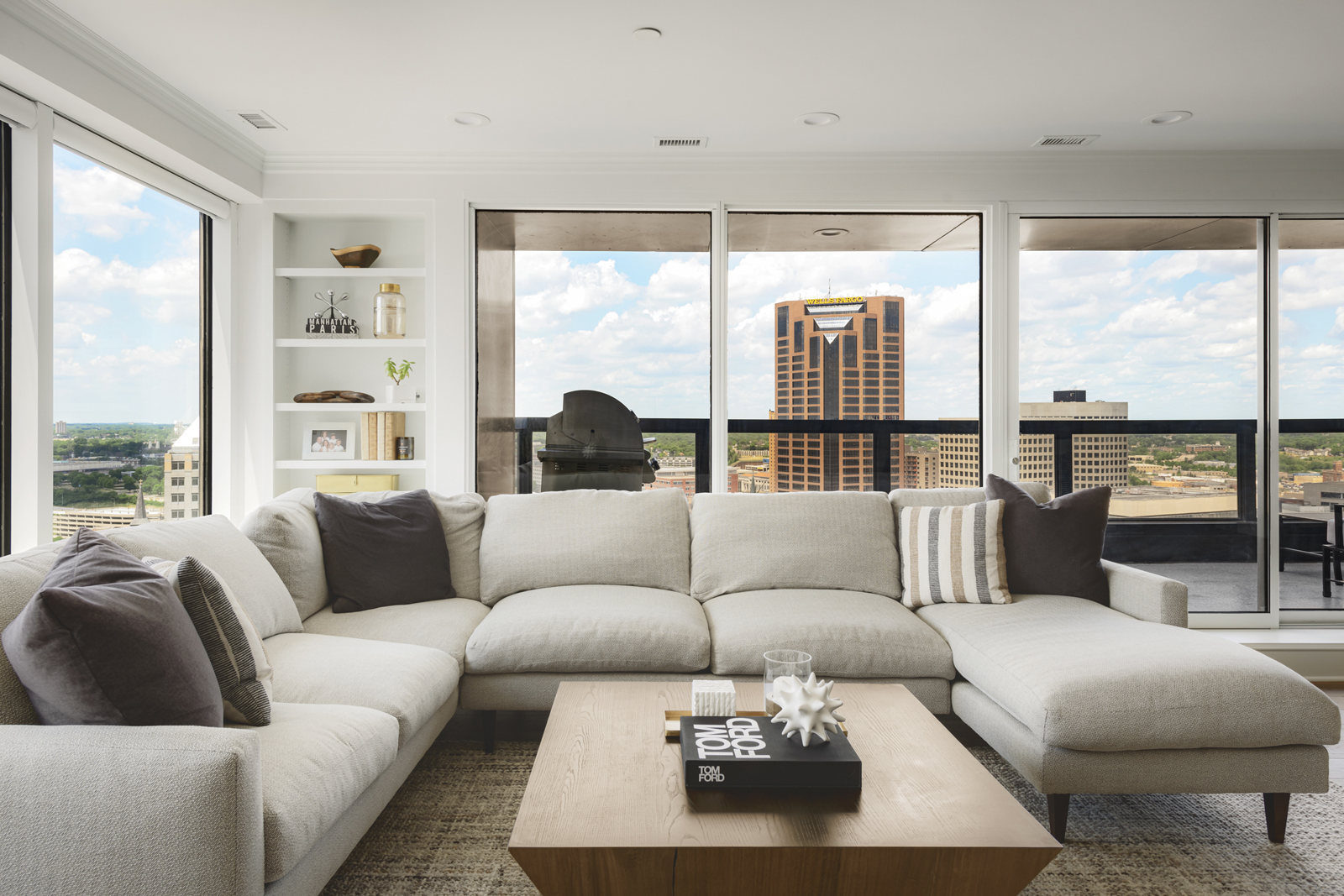
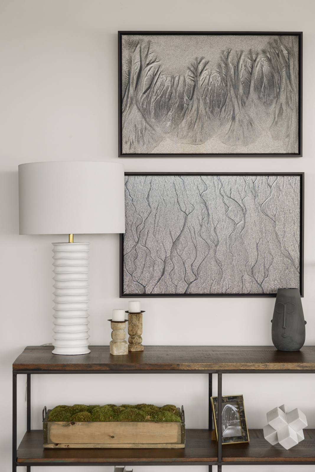
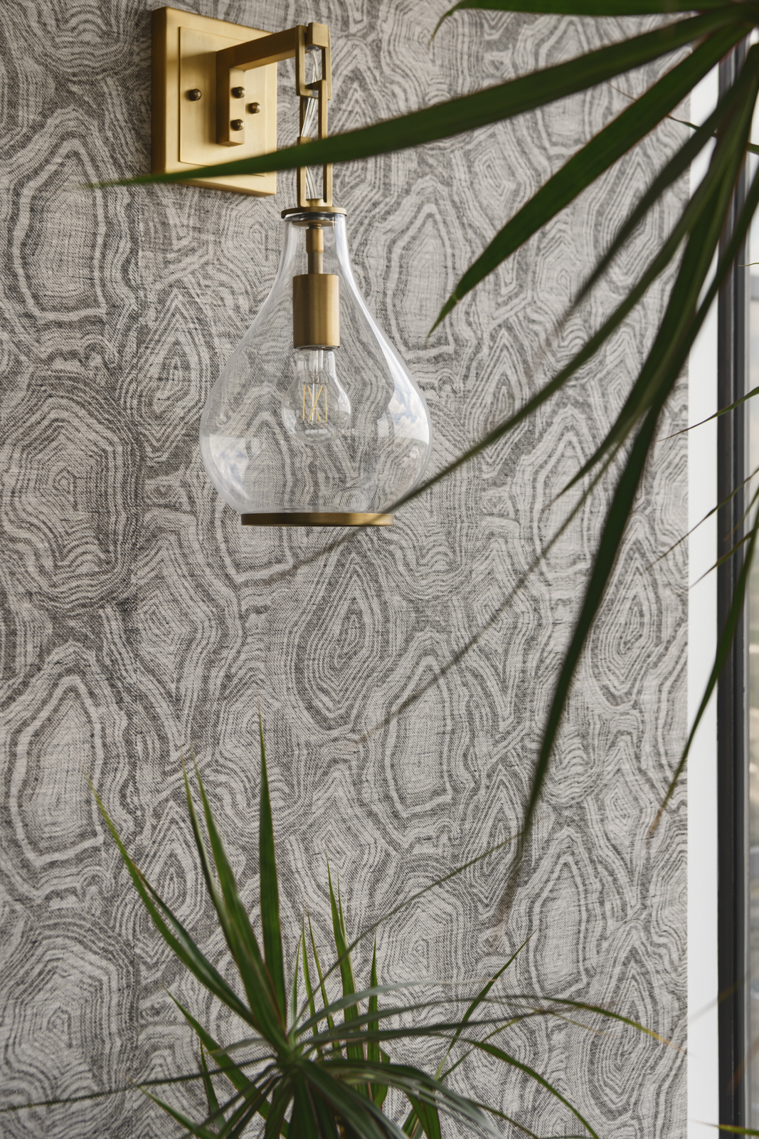
A cozy sectional sofa and swivel glider were custom designed to make the family room super comfortable and inviting. We added visual interest by layering neutral colors and textures with warm wood, a little black metal, and pops of brushed gold to carry the palette from the rest of the open space. A beautiful Phillip Jeffries woven wallpaper that mimics agate was installed on the tv wall. We love adding wallpaper or millwork behind a tv to give it a more interesting backdrop. Wall light sconces were wired to add ambient light to the room and make the feature wall extra special. I would have to say, if I could choose any place to Netflix & Chill, this would be it!
the after
the daughter’s bedroom
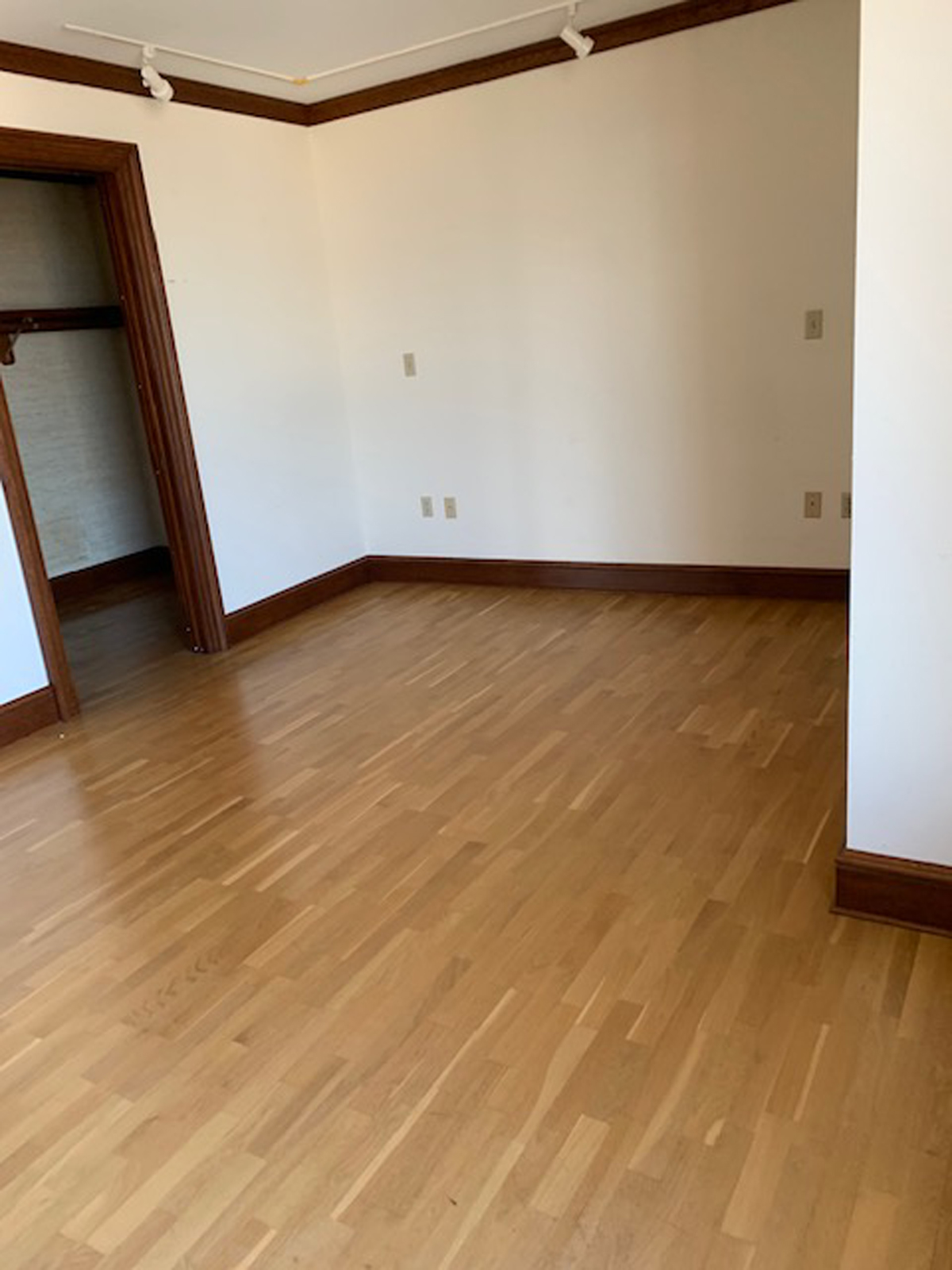
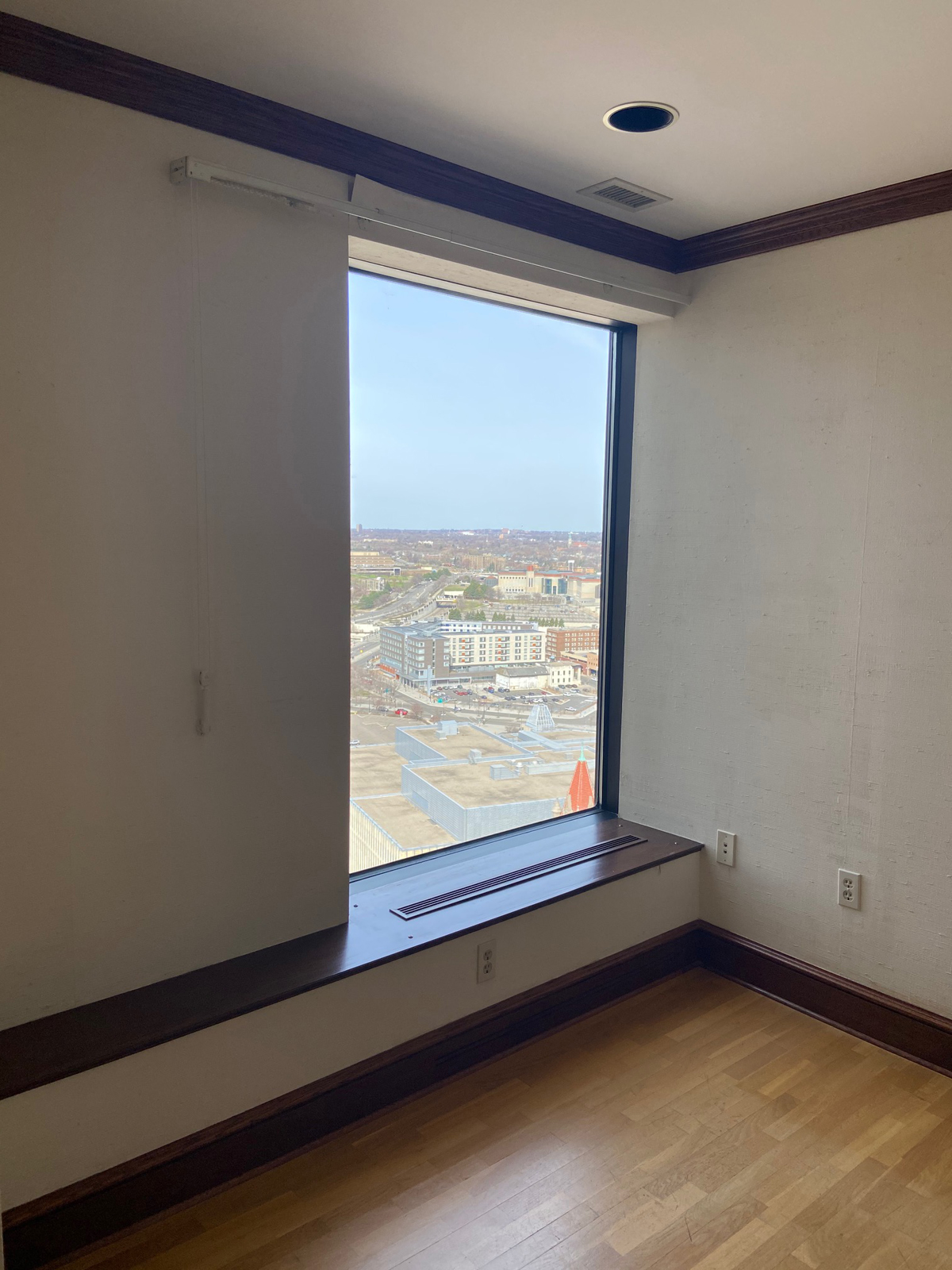
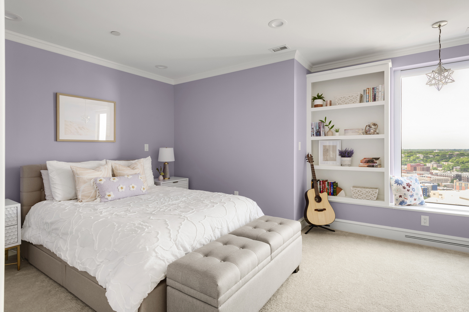
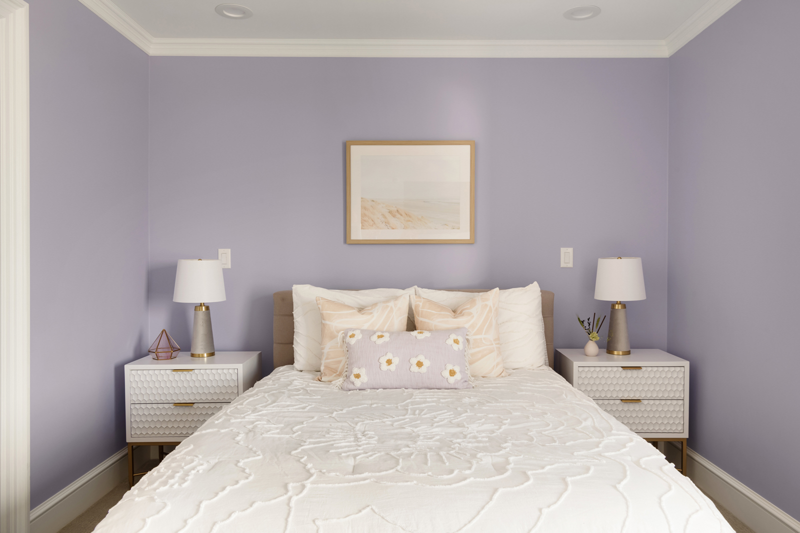
Not too much needed to be done in the 2nd bedroom, other than remove old wallpaper, skim-coat all the walls to repair lots of bumps and cracks, remove track lighting, and paint the walls and millwork. We added carpeting for warmth and comfort. The walk-in closet got all new California Closets organization and better lighting. We wanted to highlight the best feature, which is the window and window seat area. We had a bookshelf custom made to add storage and take advantage of an awkward alcove. What a perfect spot to take in the beautiful views and read a good book!
the bedroom before
the after
THE EN-SUITE BATHROOM
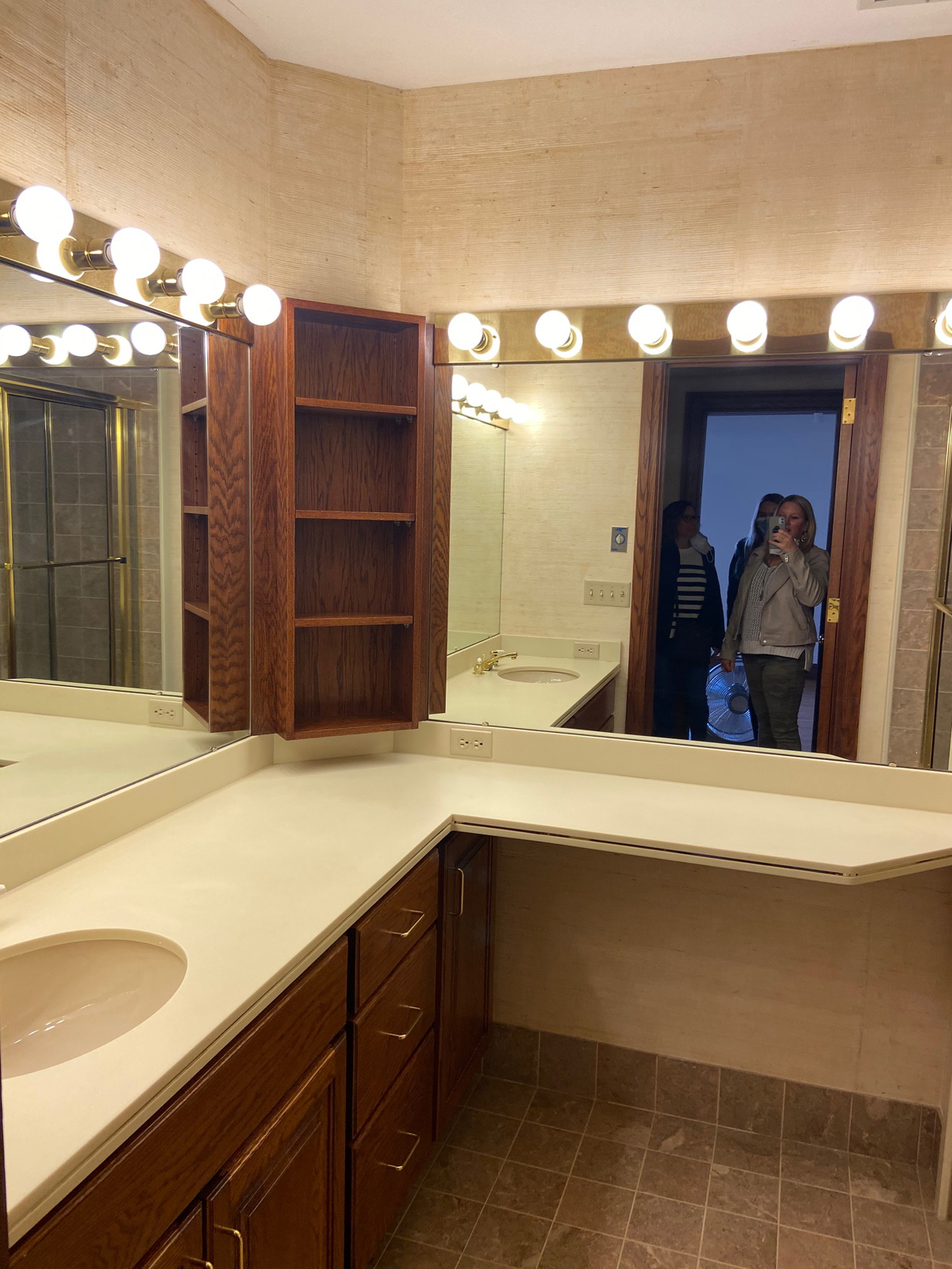
the before
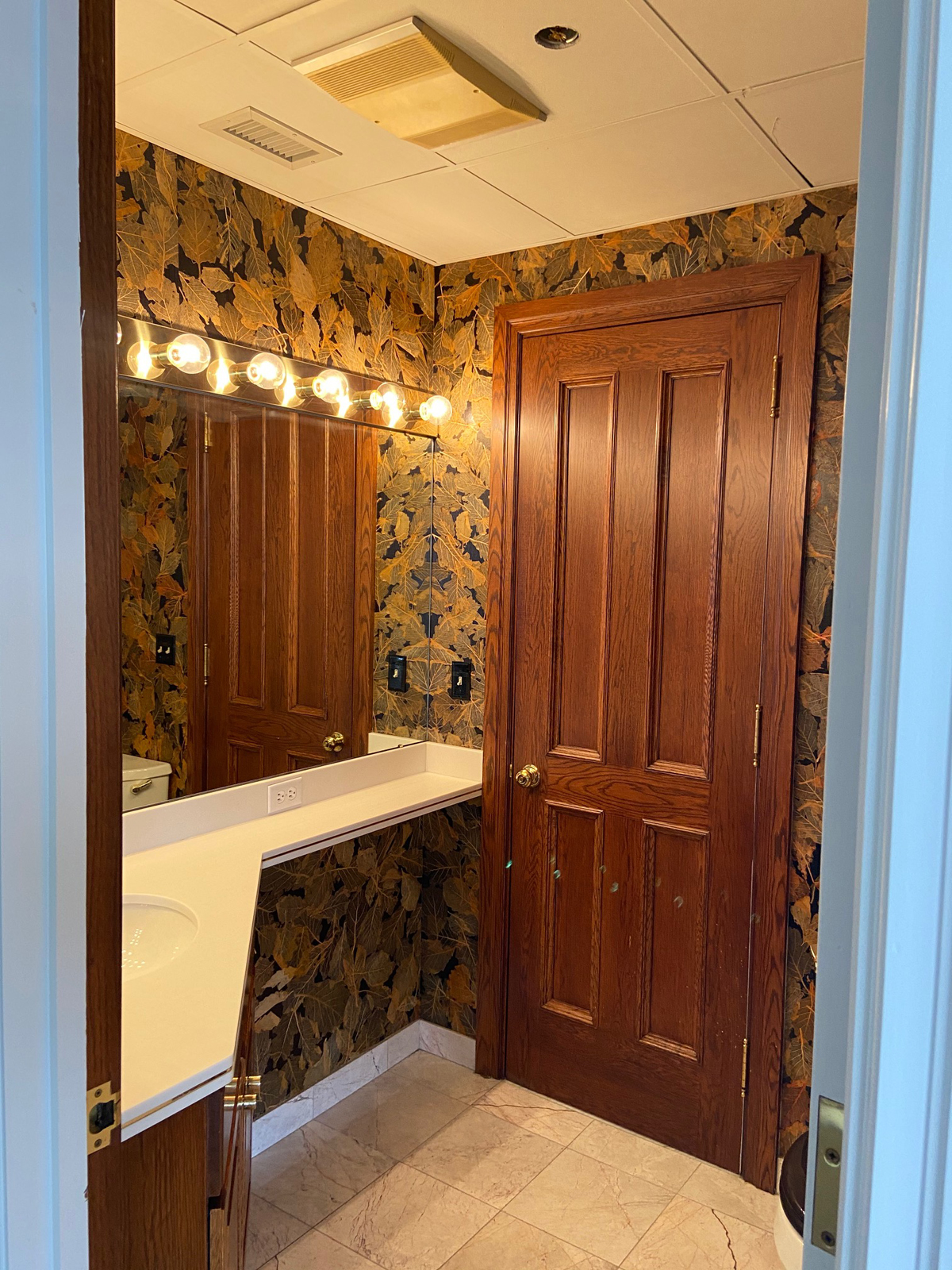
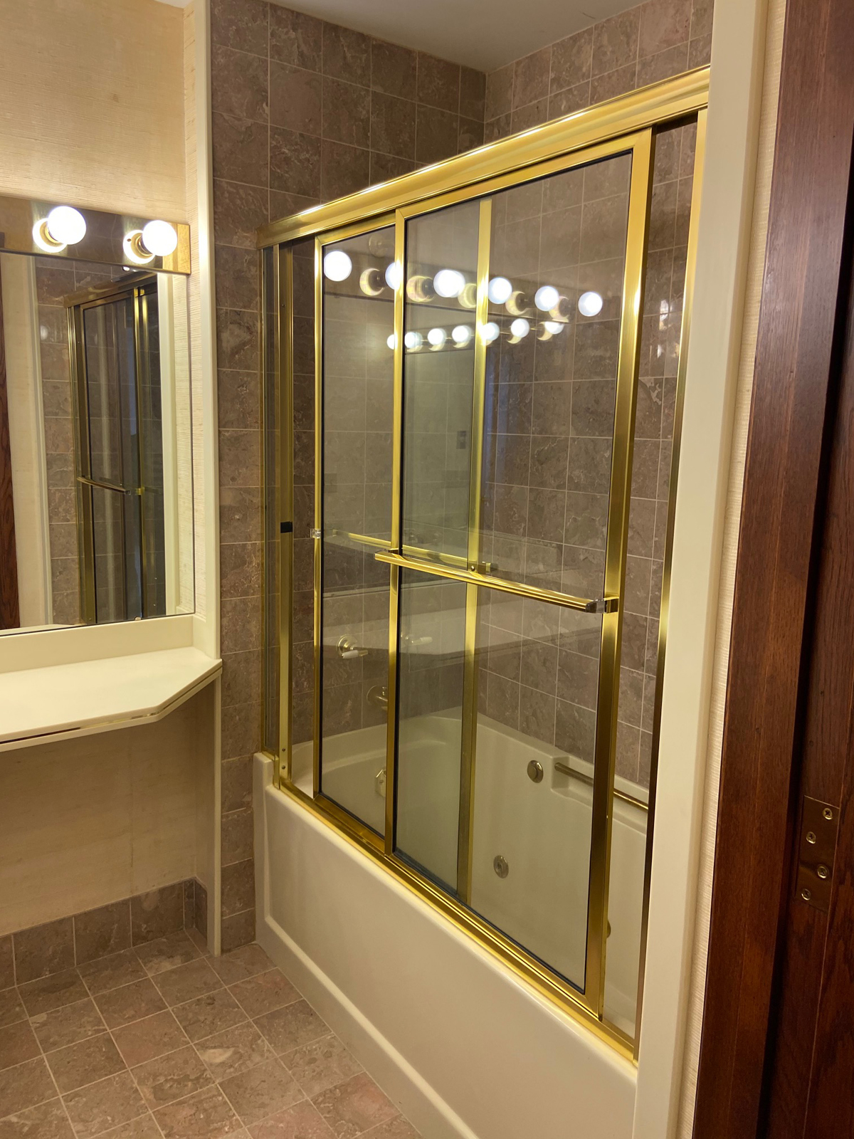
It is a little too complicated to show, but the biggest challenge of this remodel was re-configuring this section of the condo. There were 2 main entrances to the condo from the building’s hallway, and there was previously a hallway from the family room area to one of those entrance doors. Also, the powder bathroom opened up to what is now the kitchen, and we really needed to move the doorway out of that kitchen space. Lastly, there are only 2 showers in the condo, and we wanted to figure out a way for guests staying in the flex room/guest room to be able to access the bathroom and shower without having to walk through their daughter’s bedroom. However, we also wanted the bathroom and shower to be connected to their daughter’s bedroom. What a Brain-Teaser, huh?

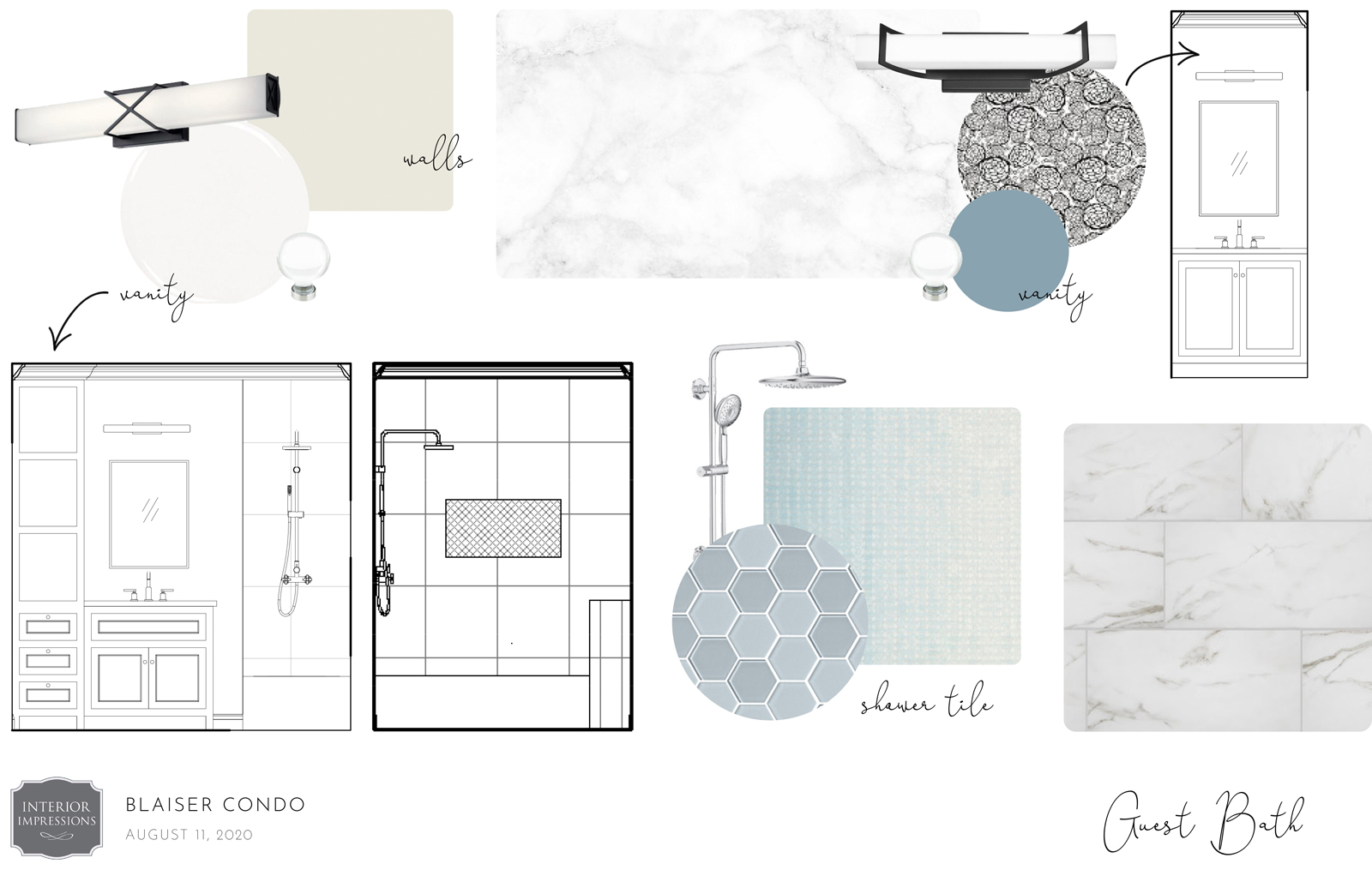
the design plan
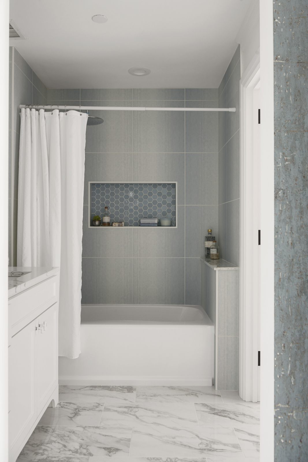
After several complicated attempts to re-configure these spaces, “WE” (meaning LOTS of people, including the homeowners, us, an architect, plumber, electrician, HVAC guy, etc) came up with a unique, but good solution. The hallway to the 2nd entrance was closed of and now is accessed through the utility and storage room behind the kitchen. Part of the hallway became the kitchen, making it longer than before, and the part that was closed off became more storage space. We opened up the powder bath to the 2nd bathroom, removed the sink from the powder bath and created a shared sink and bathtub area from the previous 2nd bathroom. There are now 2 entrances to this shared area – one from the powder bath space, and one from the daughter’s closet which adjoins to her bedroom. Ta da! Now guests can access this bathroom from the main living space without having to walk through their daughter’s room, but she can also access it through her bedroom.
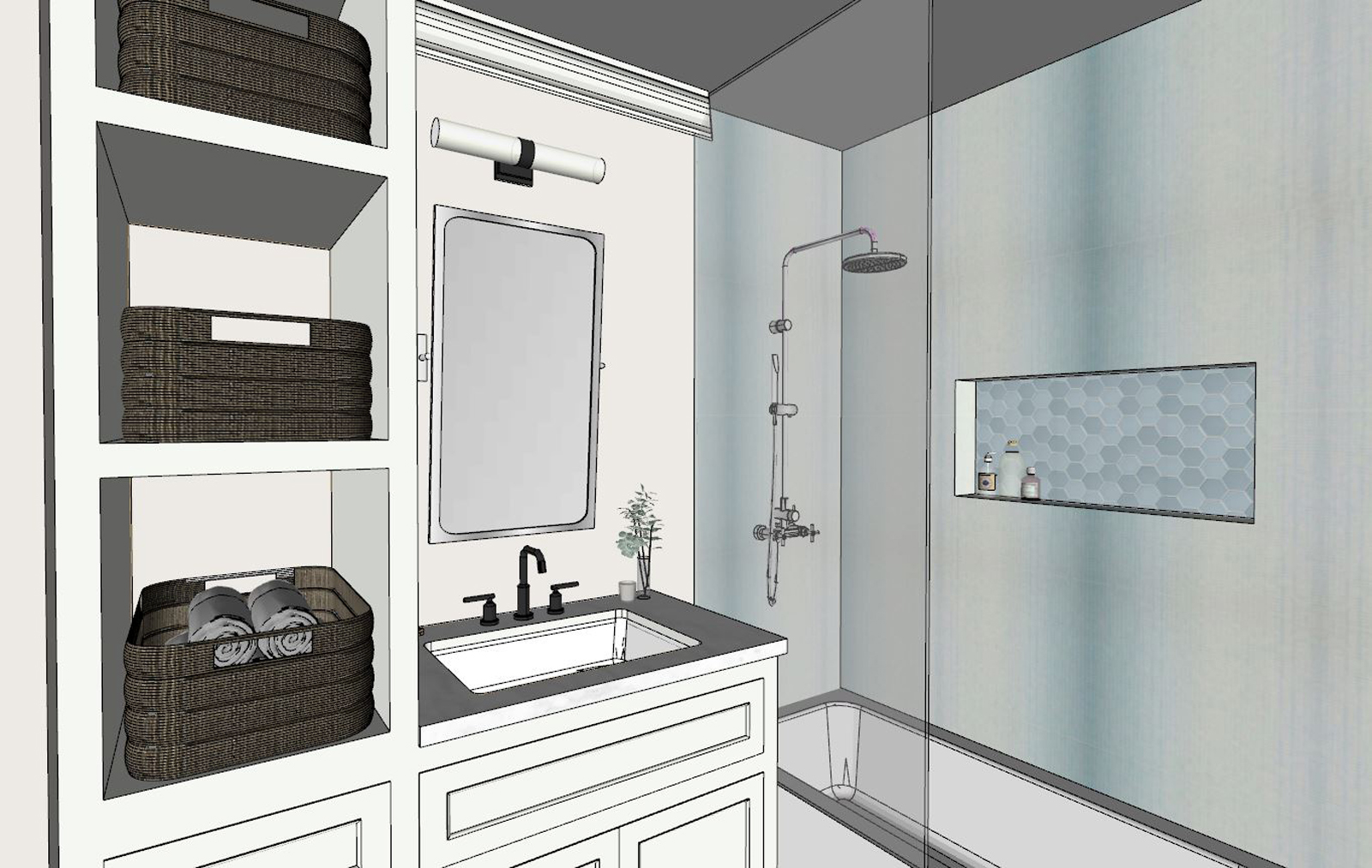
the after
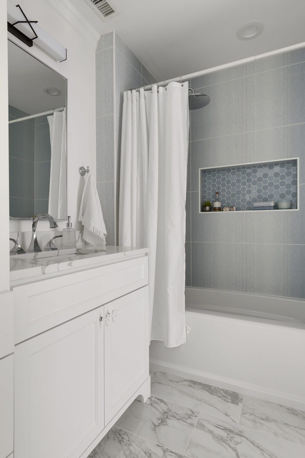
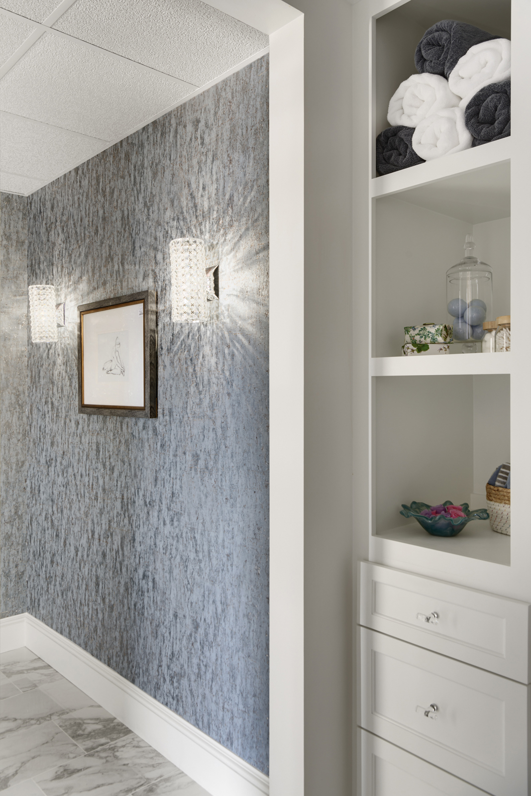
THE EN-SUITE POWDER BATHROOM
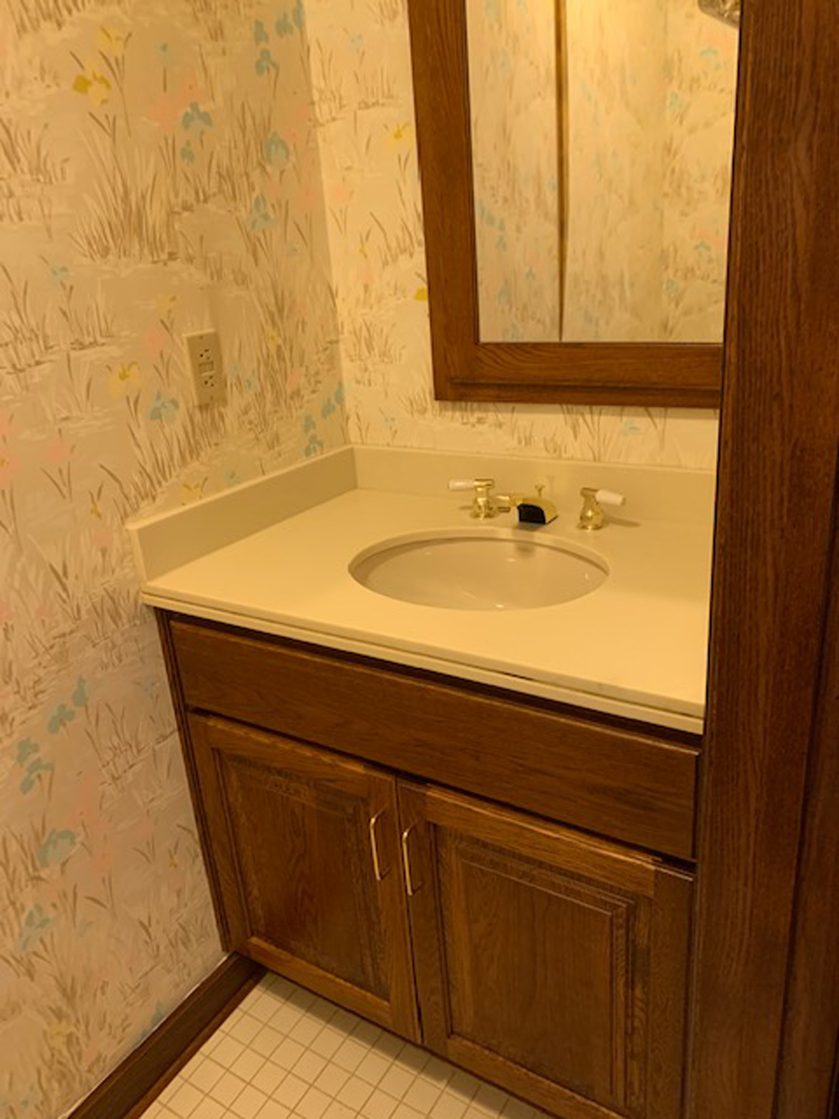
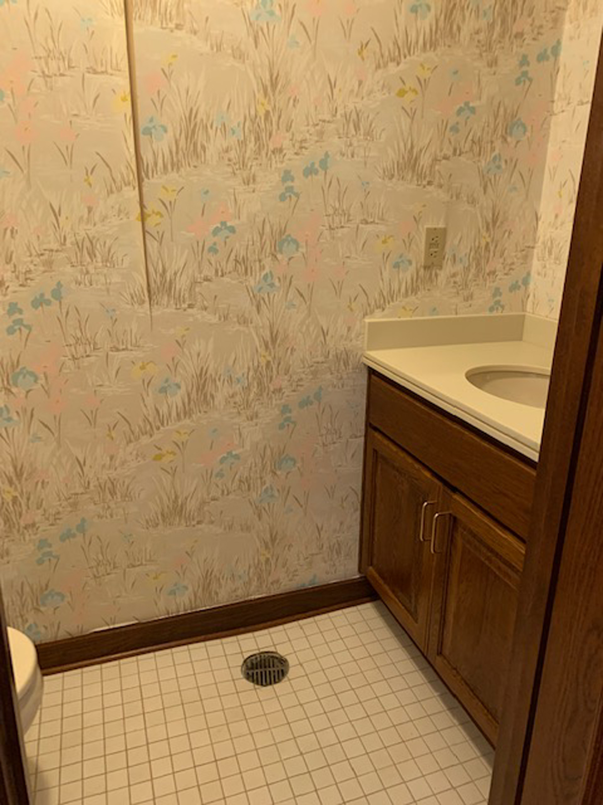
THE BEFORE
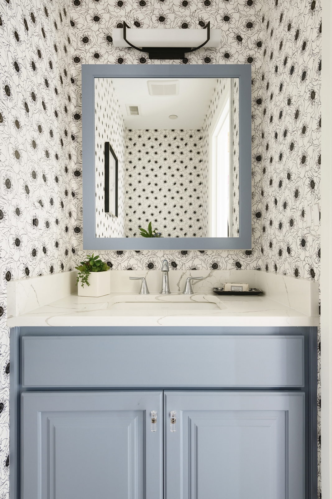
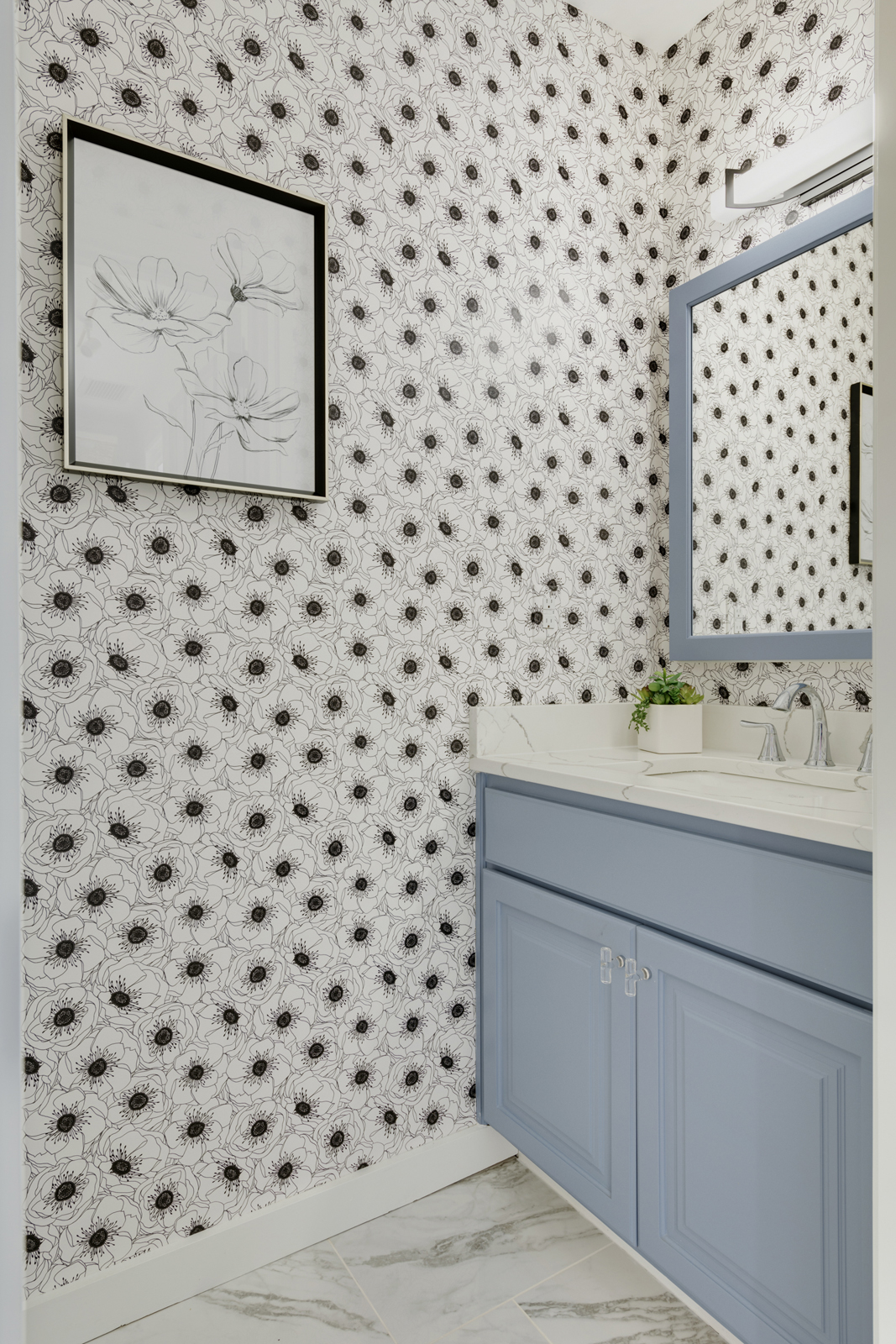
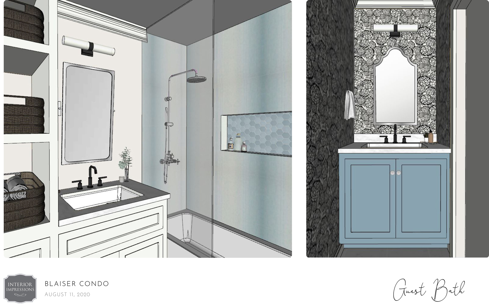
Another unique feature is that there was another powder bathroom on the other side of her walk-in closet. This gives her a private toilet space as well. We kept this room as it was, but obviously gave it a facelift with adorable black & white floral wallpaper, a lovely blue vanity, new quartz countertop, custom framed medicine cabinet mirror, new tile flooring and new plumbing fixtures. I love this little powder bathroom now! I’d say it’s probably my favorite because I love the fun wallpaper and pretty blue vanity 🙂
THE DESIGN PLAN
THE AFTER
That concludes our Skyline Spectacular project reveal! We hope you all loved seeing the dramatic Before-and-After photos of this space. I know that I personally love this condo SO much, and I feel truly blessed to have been able to help transform it into an incredibly beautiful home for our dear friends, (whom we love SO much, even more than their condo!) 🙂
In case you missed part one of this project’s reveal, head over to our previous post to see the gorgeous foyer, formal living room, primary suite and flex room!
XO,
Amy & the Interior Impressions Team
I absolutely LOVE this project. It’s probably my favorite one yet… The kitchen re-design is stunning, and it was so satisfying to see the bathroom makeover with a practical and beautiful bathtub. Really nice work.
Thank you so much, Liz!