This is a very special featured project for me to share with all of you. Our very dear friends (“Besties” to my husband and I), decided they wanted a change of pace and decided to trade in their suburban family home for a downtown condo. As they were becoming empty nesters, the appeal of living without yard work or snow removal, as well as the ability to walk to great restaurants, bars, and parks, seemed like a fabulous lifestyle change. I was given the honor and pleasure of working with them to transform their new condo into a place they are proud of and absolutely love spending time in. As you will see from the “before” photos in this project reveal, the condo was seriously dated and needed a complete renovation. I’m not going to lie – I was a little overwhelmed when I saw it for the first time! I knew it would take a ton of creativity and work to bring it up to the level we had envisioned, but one good look through the enormous span of windows overlooking the St. Paul skyline, and we couldn’t help but fall in love! It was a huge feat, but seriously, it was SO worth it! I am completely enamored with this spectacular home and couldn’t be prouder of how stunning it turned out to be. I hope you all love it as much as we do!
The Foyer
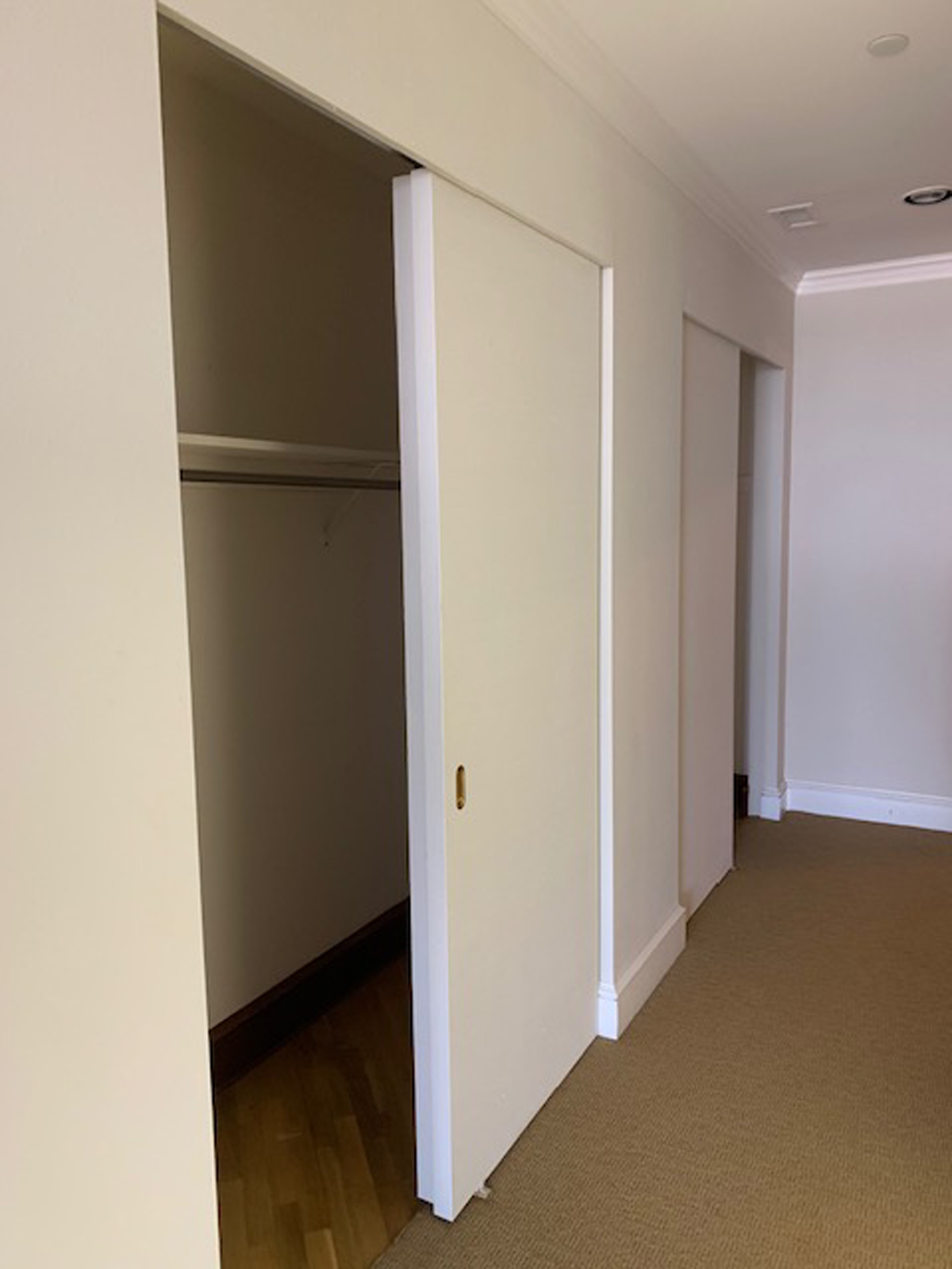
Nothing special was happening in the entryway, and there was basically a long wall of boring closet doors that didn’t even operate properly. It lacked visual interest and was poorly lit as well. It had carpeting, which wasn’t the greatest material for entering guests.
the before
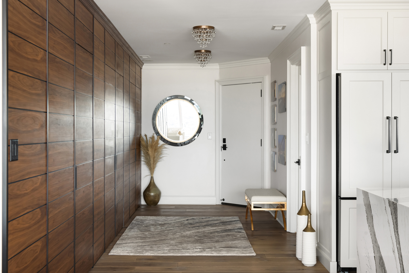
The after
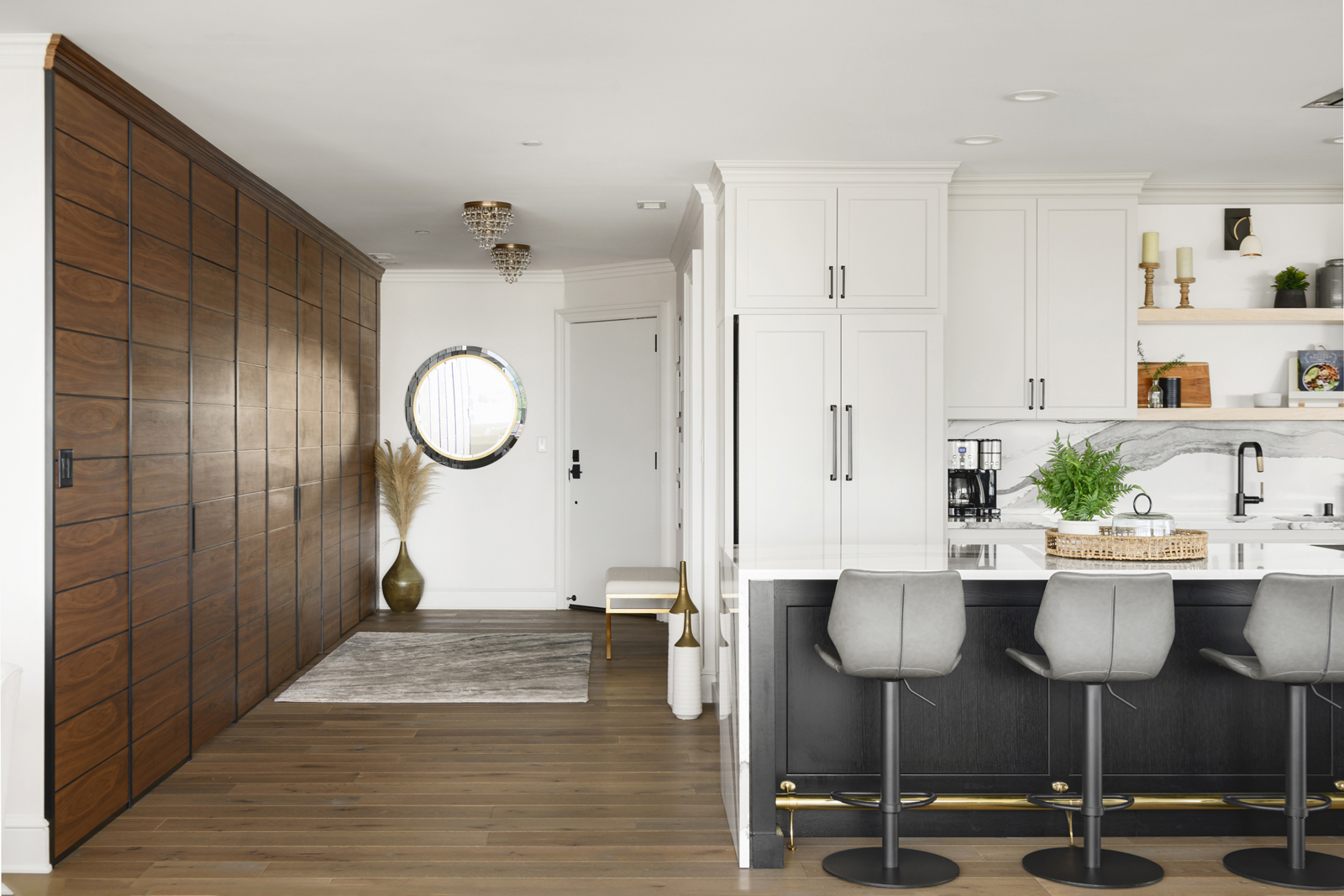
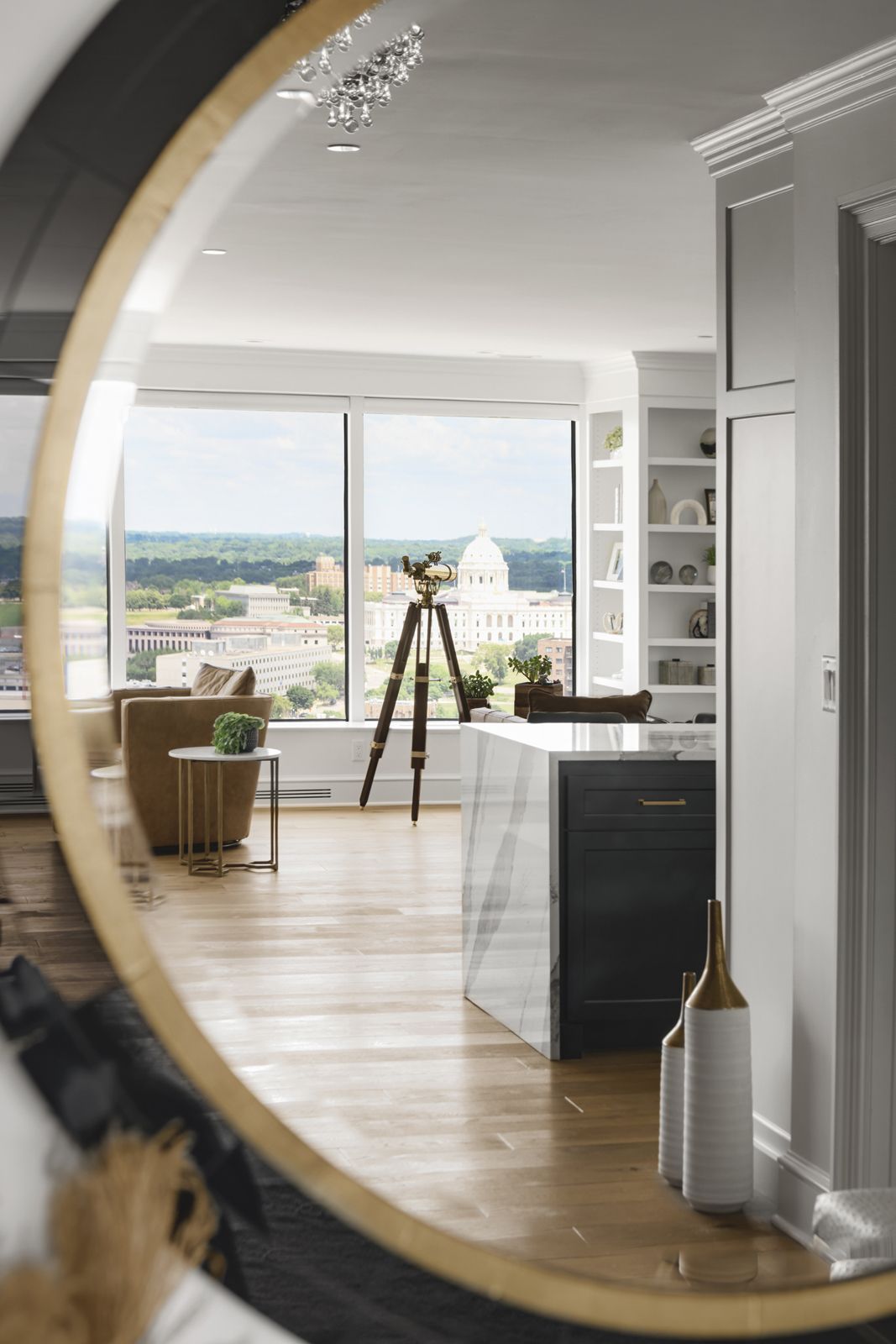
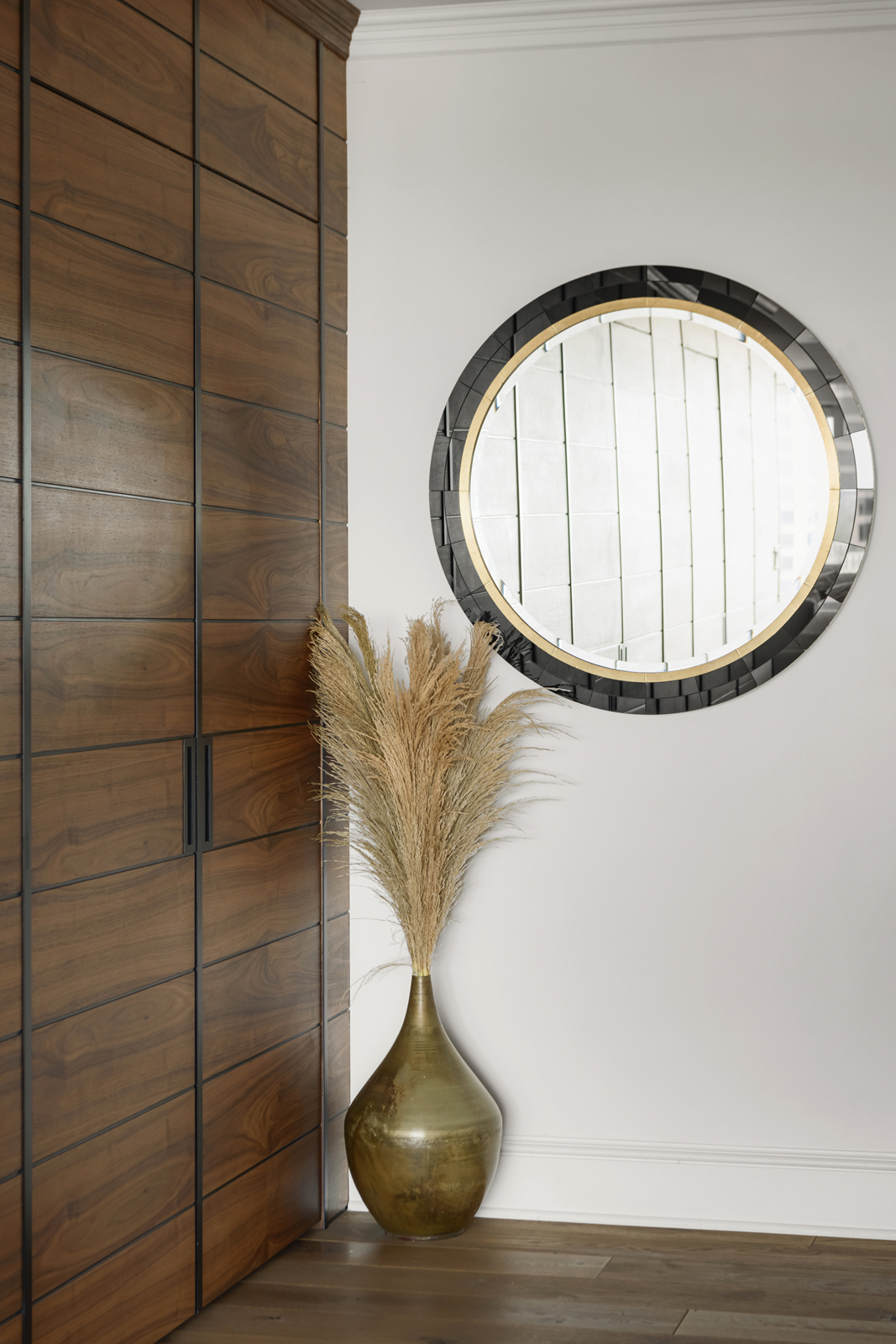
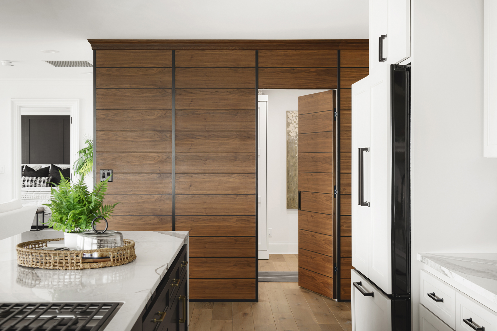
A photo discovered online was the inspiration behind the gorgeous paneled wall of black walnut. We searched for the perfect craftsman to make it happen and we were fortunate enough to collaborate with Michael Casler of Holl Studio http://www.hollstudio.com custom cabinetry and furniture. We wanted the wall to look like a beautiful paneled work of art, and to disguise the 4 closet doors and the doorway to the flex room. His craftsmanship truly exceeded our expectations! Now when you enter this home, you experience an immediate “Wow” factor! This condo already had lovely millwork, so we kept the existing baseboards, crown moldings and trim but just added a fresh coat of paint. We removed all of the carpeting and installed beautiful wide-plank white oak floors from WD Flooring. Welcome friends!
the flex room
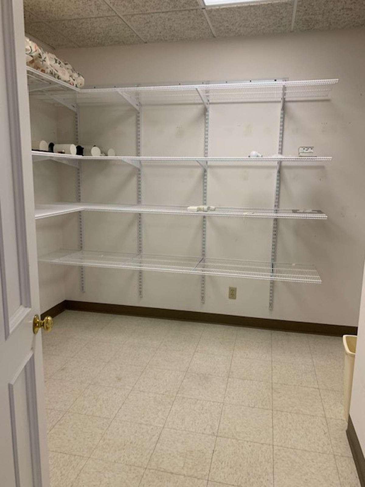
There is a room right off the foyer that was being used as a storage room. It had ceiling tiles and old linoleum square flooring. A guest room was really needed, as well as an area to exercise and a home office space. We felt that this room would be a perfect solution for all of those needs.
the after
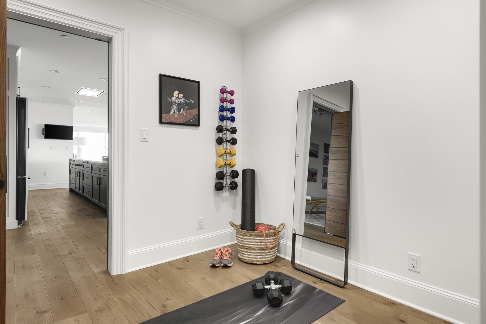
Behind the “hidden” door in the walnut paneled wall lies a multi-functional room. We brought in built in desk, a Murphy bed, and space for exercise equipment. The room may be small but it packs a punch!

the living room + built-in bar
The Before
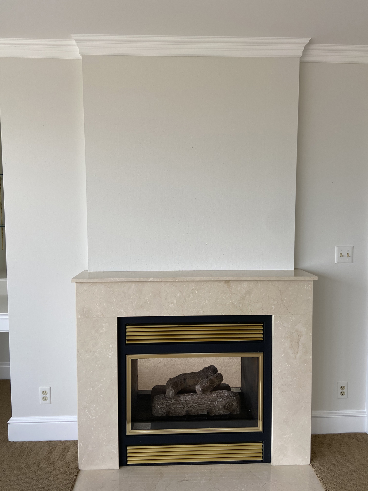
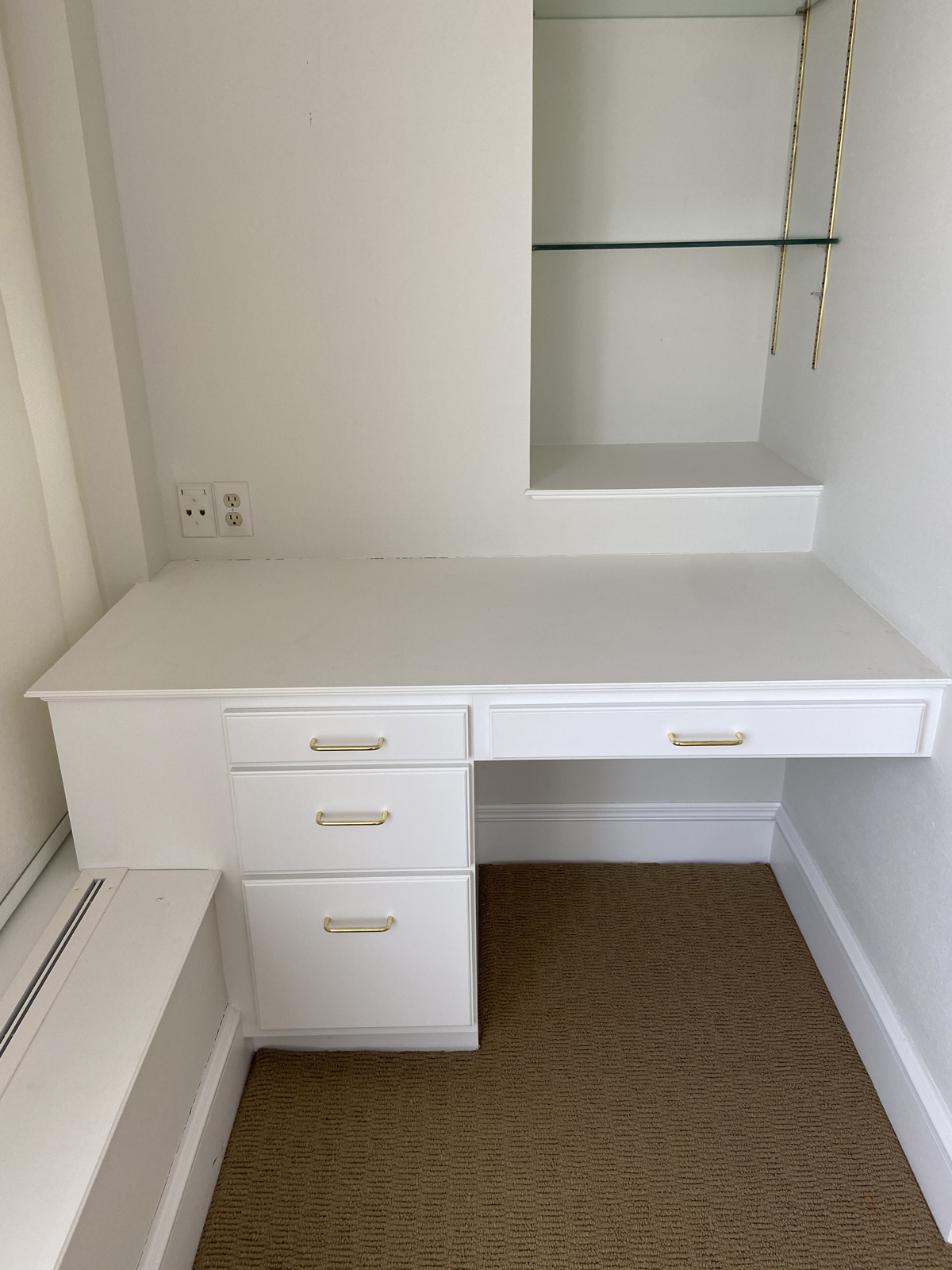
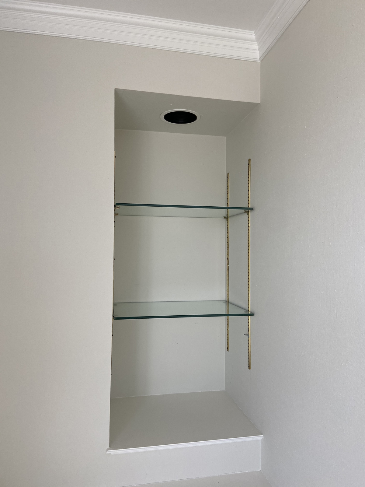
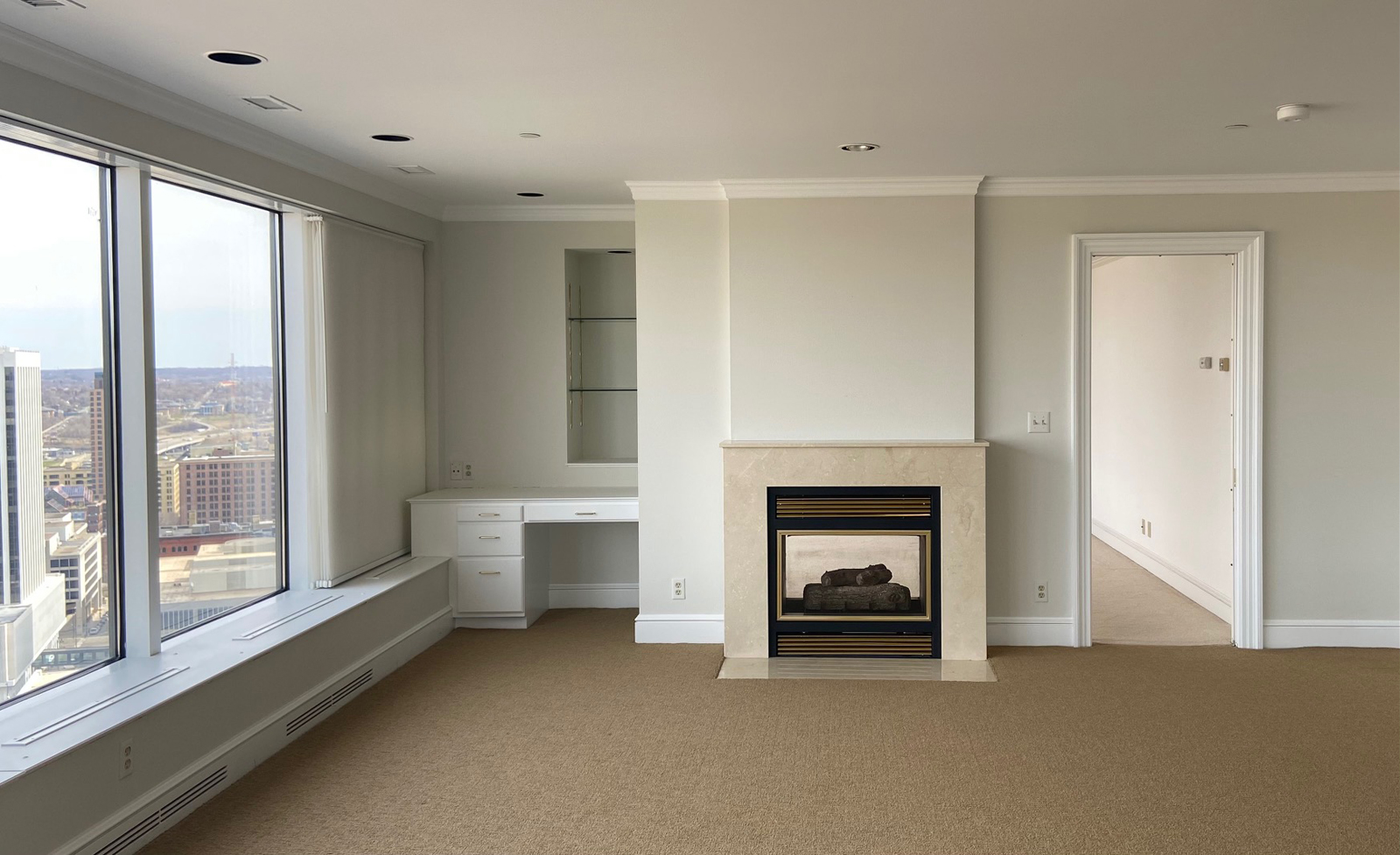
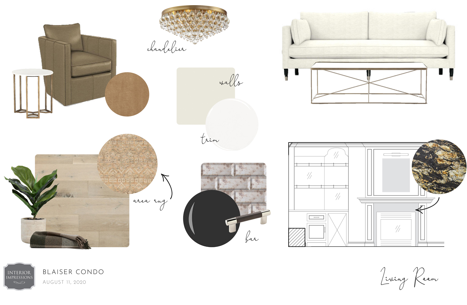
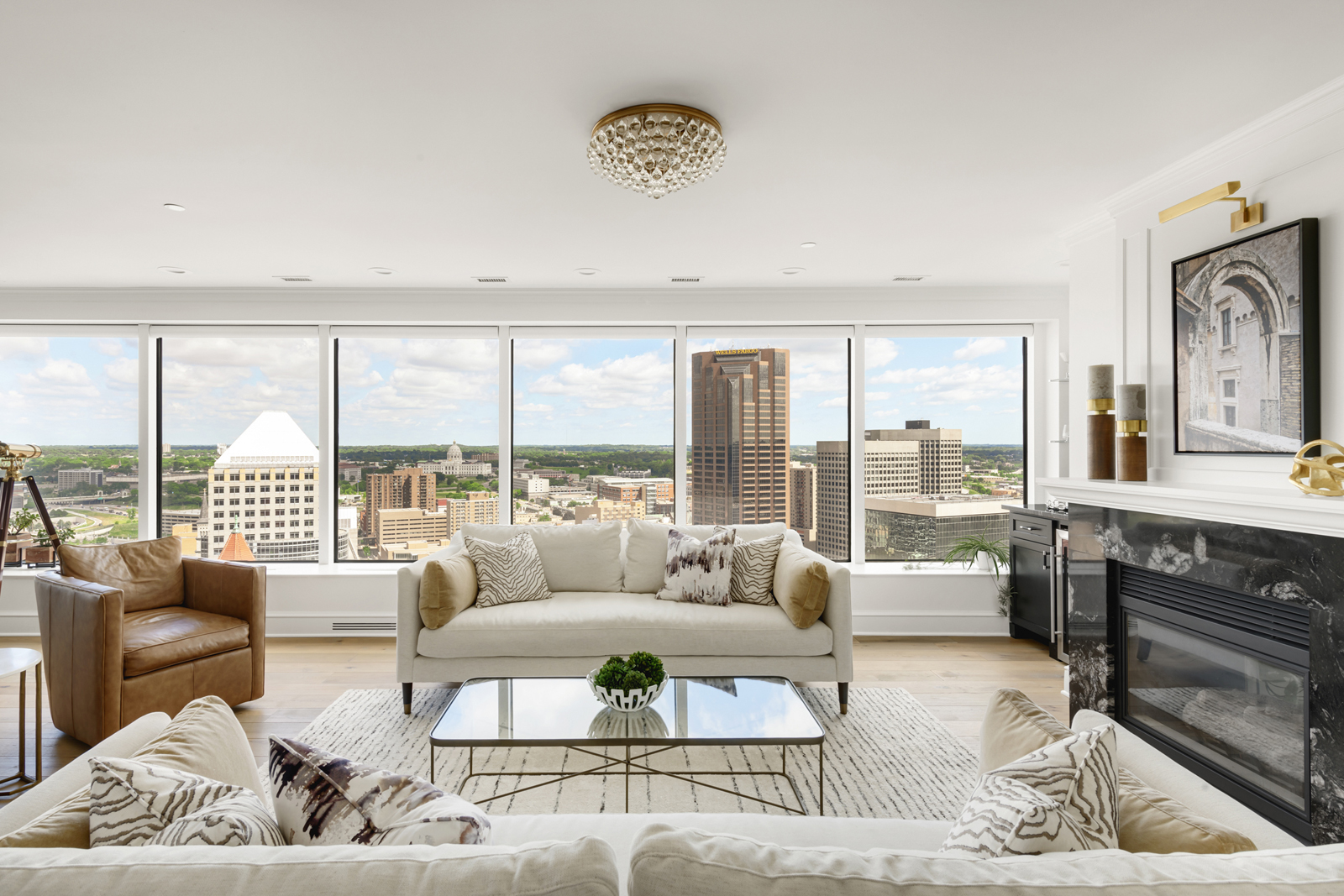
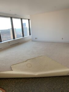
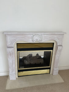
The biggest challenge we had with this room was figuring out what to do with the awkward desk area to the left of the fireplace. It had a deep niche in the wall and the cabinetry extended over the window platform, making it difficult to work with. Since a desk wasn’t really helpful in that space, and we thought it wuld be a shame to just close up the niche in the wall, we thought it was a perfect spot for a little bar area. Our design team put our heads together and collaborated with our cabinet maker to come up with a way to make it feel intentional. Check out our design board with cabinetry drawings to see what we came up with! The fireplace stone surround wasn’t really our first choice, but we were going to leave it alone in order to save money. A “fortunate” mistake by the demo crew caused it to be torn off. Oh darn! Guess that gave us the opportunity to pick out a stunning black, cream and caramel colored granite. It ended up taking that whole fireplace/bar wall to another level! The last 2 issues we had to fix was the heat vents that came up from the window ledge wall. It was metal and stuck up quite a bit and was just an eyesore in general. We had a finish carpenter remake all of the ledges with recessed vent openings. A small detail, but one that makes a big difference in the overall finish.

THE DESIGN PLAN
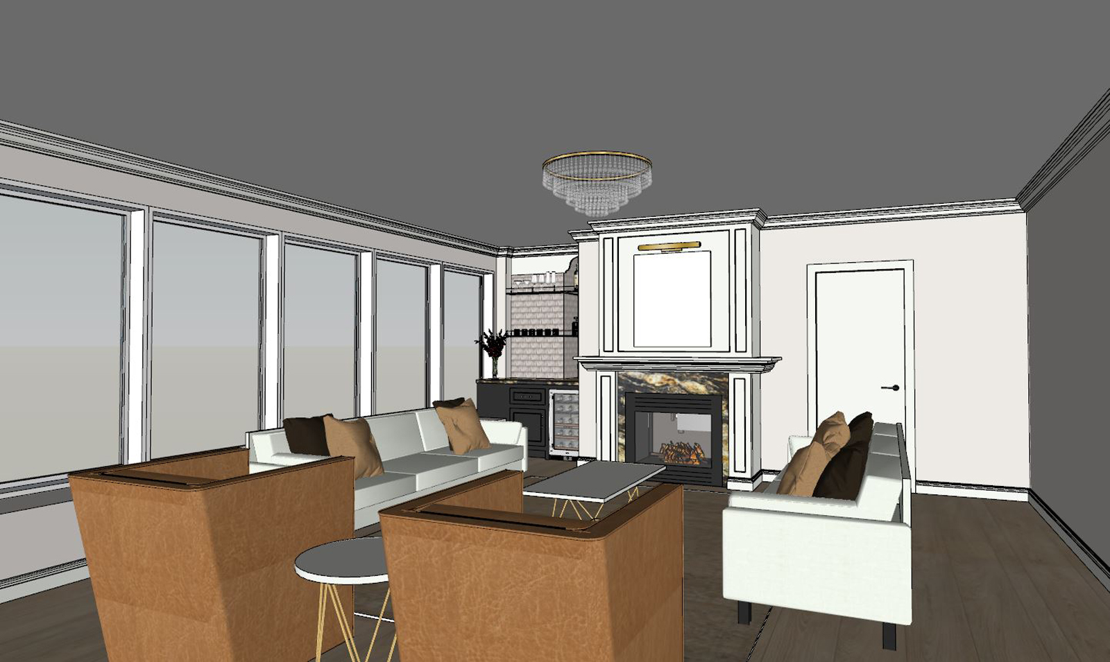
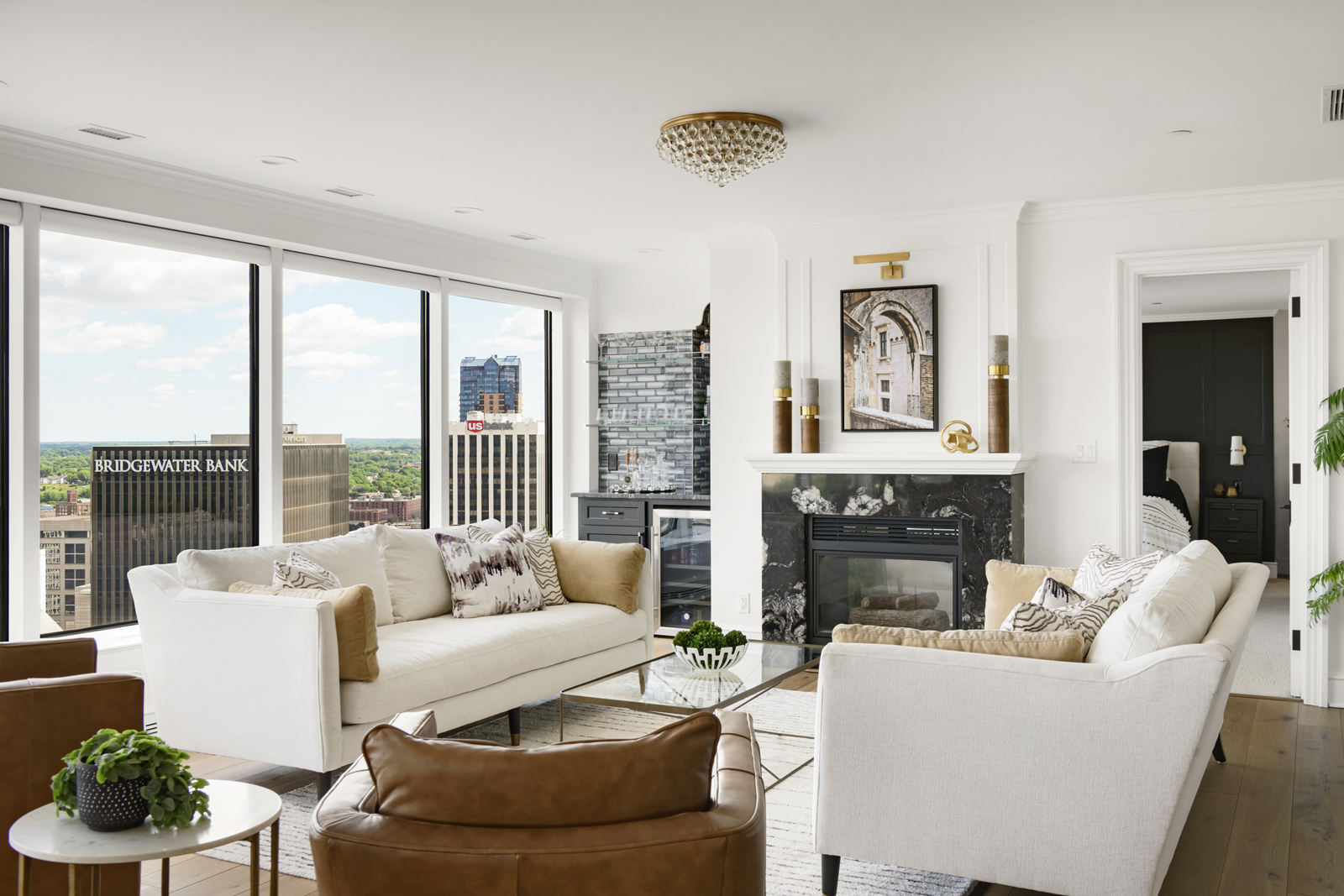
Our color palette consisted of warm caramel, cream, black, brown leather accents, and gold metal details. We wanted it to feel modern, elegant and sophisticated, but also inviting and comfortable. By adding layers of textures and lots of organic-feeling materials, it evokes a feeling of coziness, warmth, and calm. The goal was to have guests walk in and be completely blown away at how beautiful it is, but also feel completely at ease and comfortable hanging out and enjoying a nice glass of wine and great conversation. Our original design presentation board with inspiration photos is shown here, followed by a rendering that we created after the actual materials and furniture pieces were selected.

the after
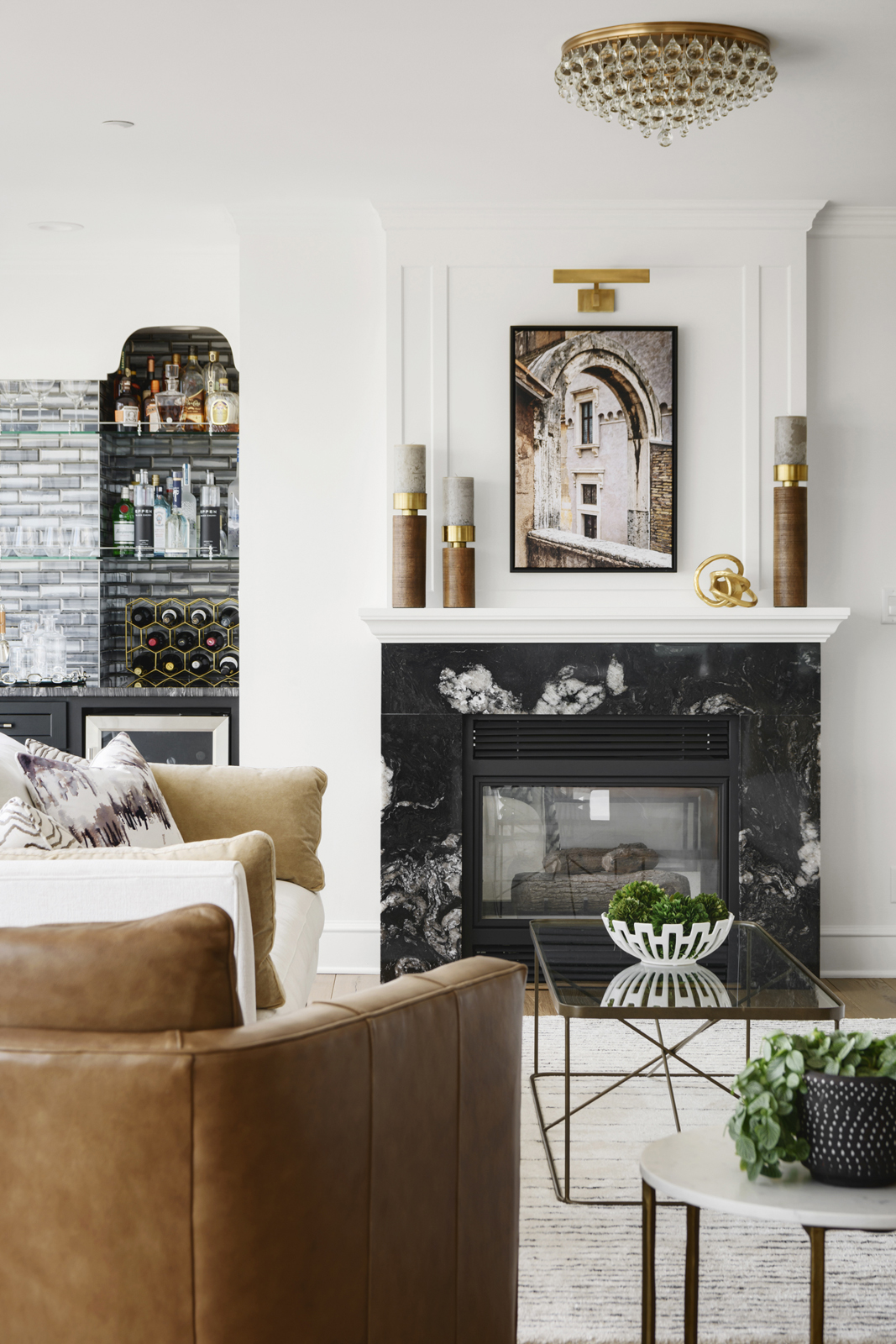
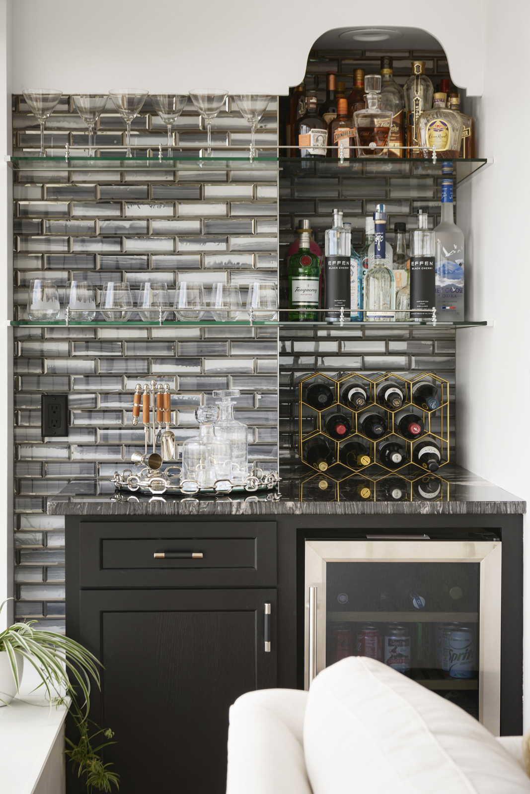
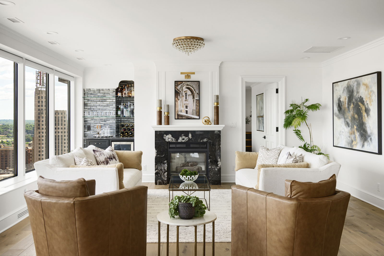
This room still takes my breath away every time I see it! A new granite fireplace surround, a custom-designed mantle and wall panel millwork, and a beautiful brass picture light now make this fireplace a lovely focal point. We know it’s hard to compete with the gorgeous skyline view, but this room now gives it a run for it’s money! Remember that awkward niche? Now it’s a pretty cool bar area! We custom-designed glass shelving to wrap from the niche across the front to hold glasses. We added a pretty chrome railing and posts, and had a custom arched piece designed to top it off and tie into the crown molding. We added a beverage refrigerator, black cabinets, mirrored glass tiles and a countertop in the same granite as the fireplace. Now this room is ready for a party! The beautiful photography above the fireplace is a photo from a trip to Italy and it was taken by a close friend who happens to be an amazing photographer too! You can check out her beautiful work here – http://www.stillmomentsbynancy.com Custom sofas, leather swivel chairs, custom-made pillows and framed artwork all come together to create a beautiful blend of warm colors.
the primary bedroom
THE BEFORE
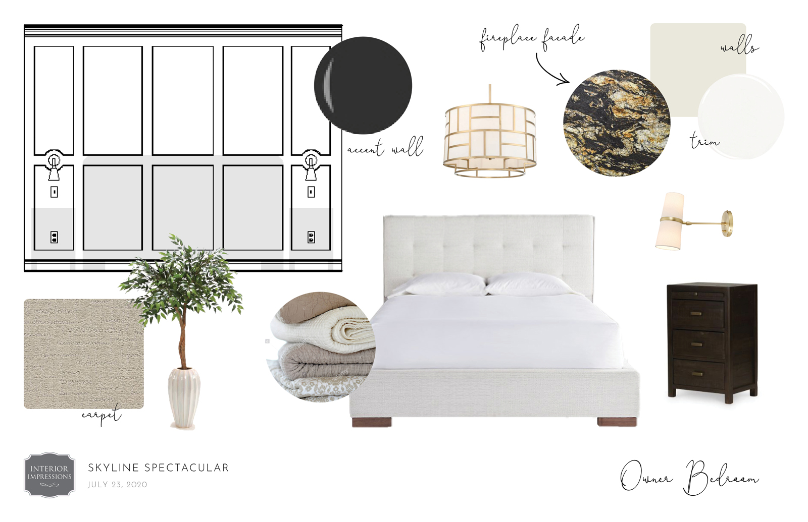
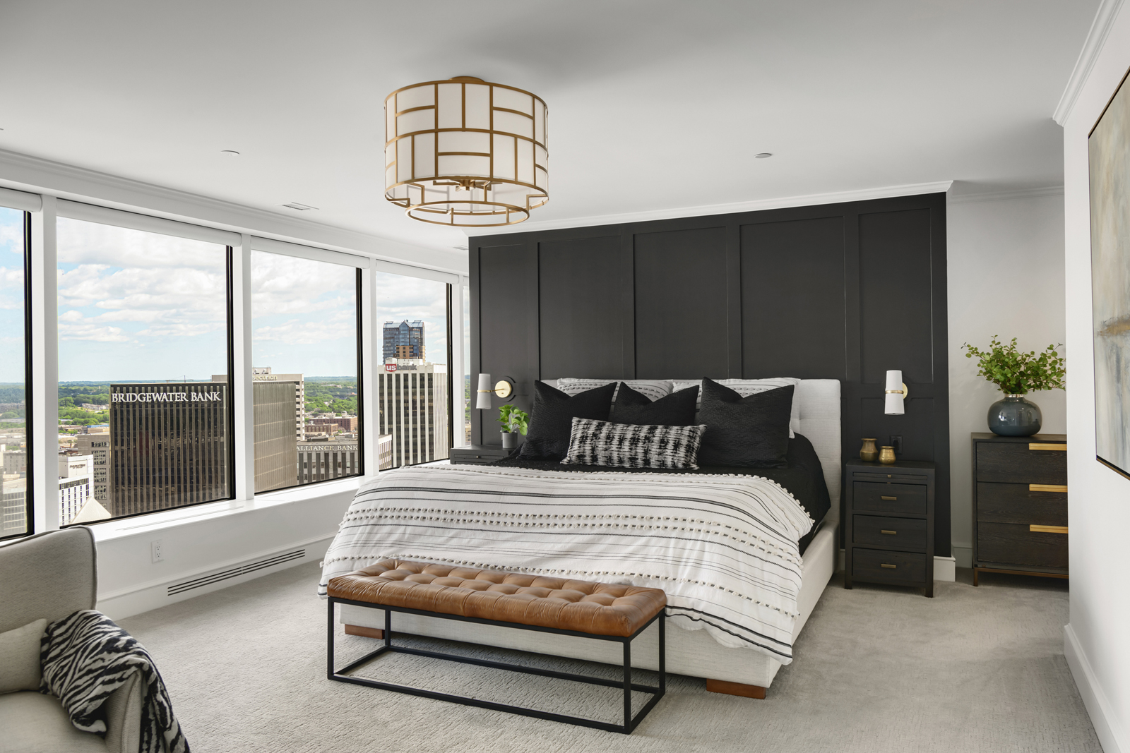
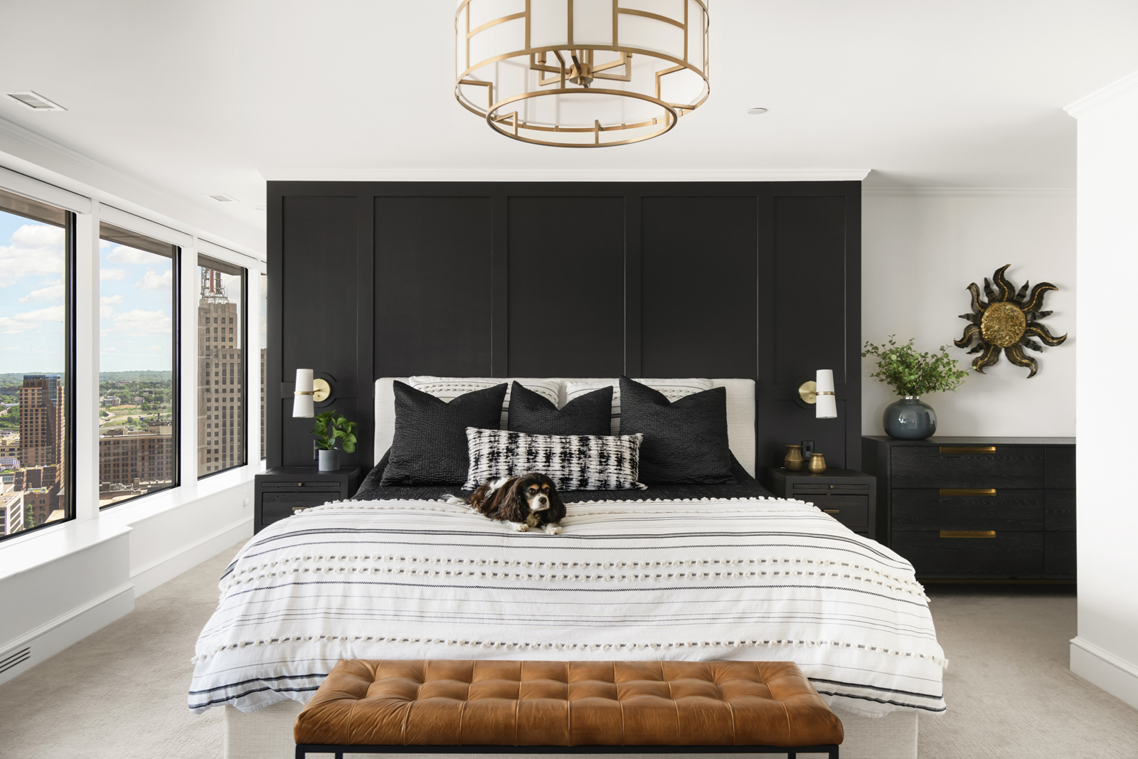
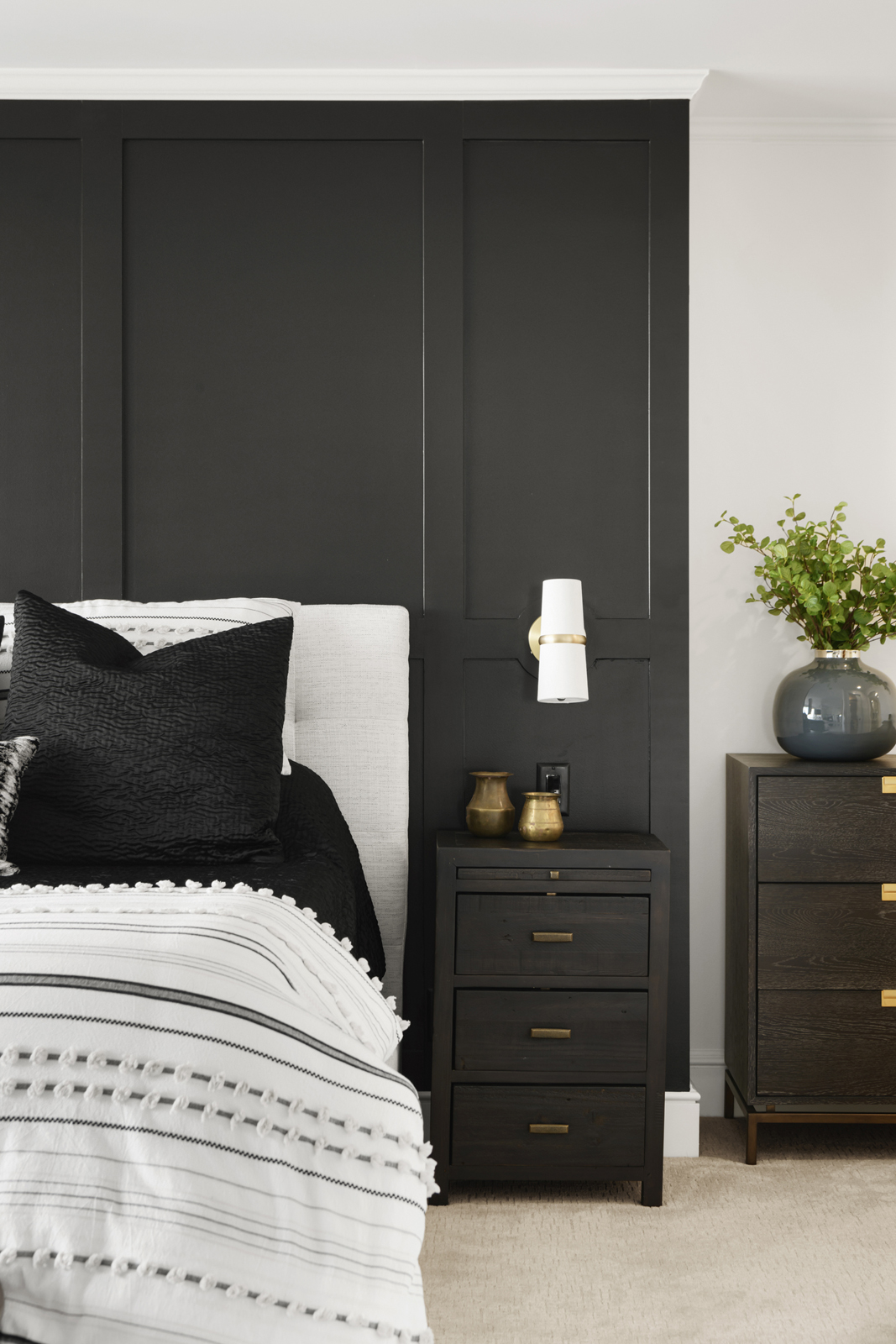
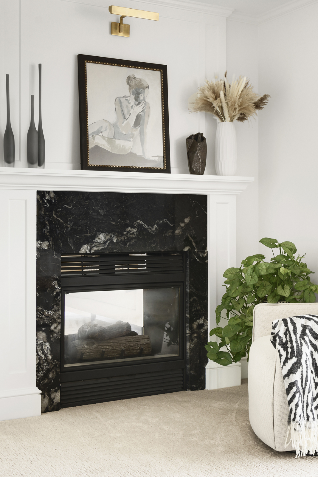
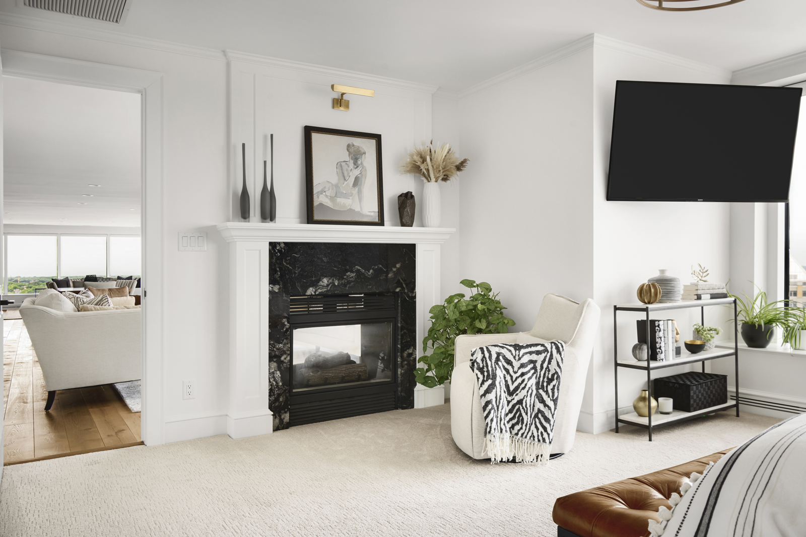
The main bedroom didn’t need a lot of work as it was basically a blank slate. The double sided fireplace needed a big update though, so we tore off the dated surround and had a new surround made with the same granite as the other side, but with a mantle, legs, and a little different paneled design above the mantle to give it its own look. We also added interest to the room by creating a millwork wall in a grid pattern. We added wall sconce lights to free up space on the nightstands since there wasn’t a lot of wall space to hold a king bed and 2 nightstands. We also added beautiful motorized shades from Hunter Douglas. Adding a little plug for Woodbury Blinds here. 🙂
THE DESIGN PLAN
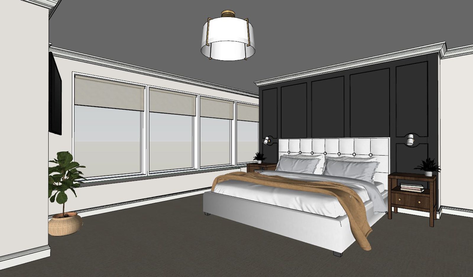
the after
the en-suite bathroom
the before
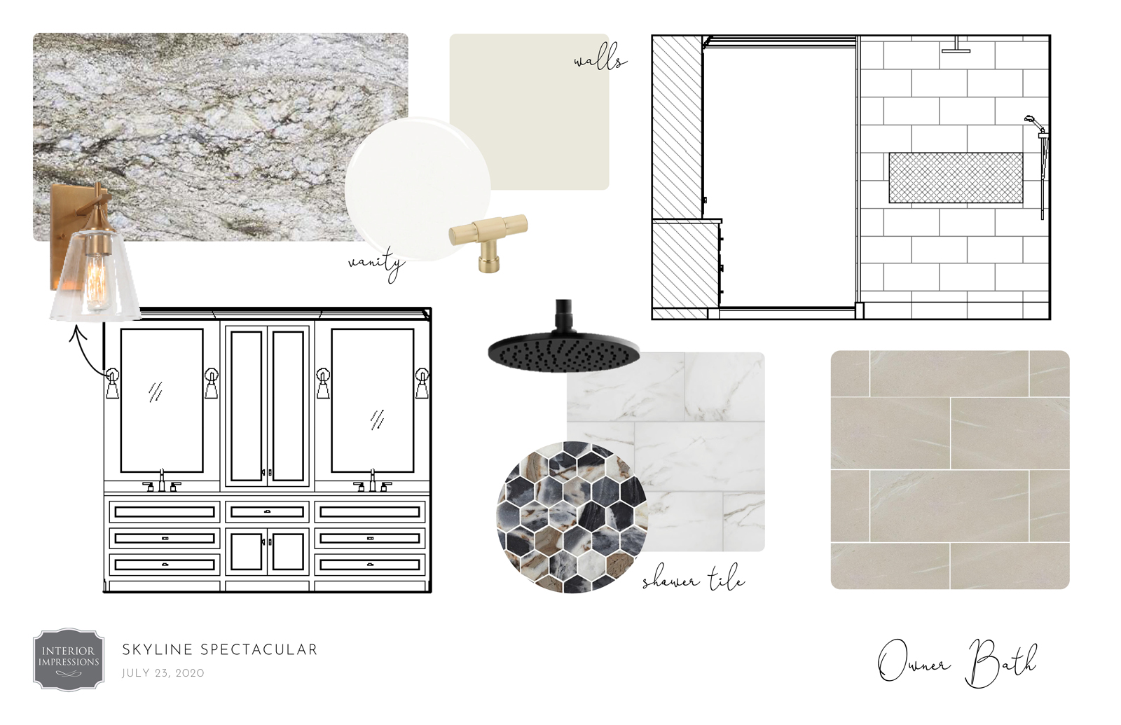
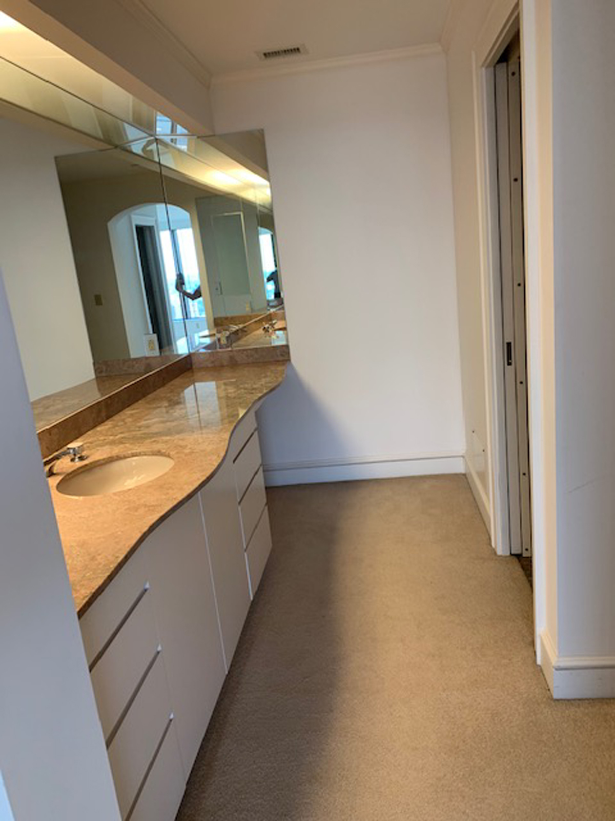
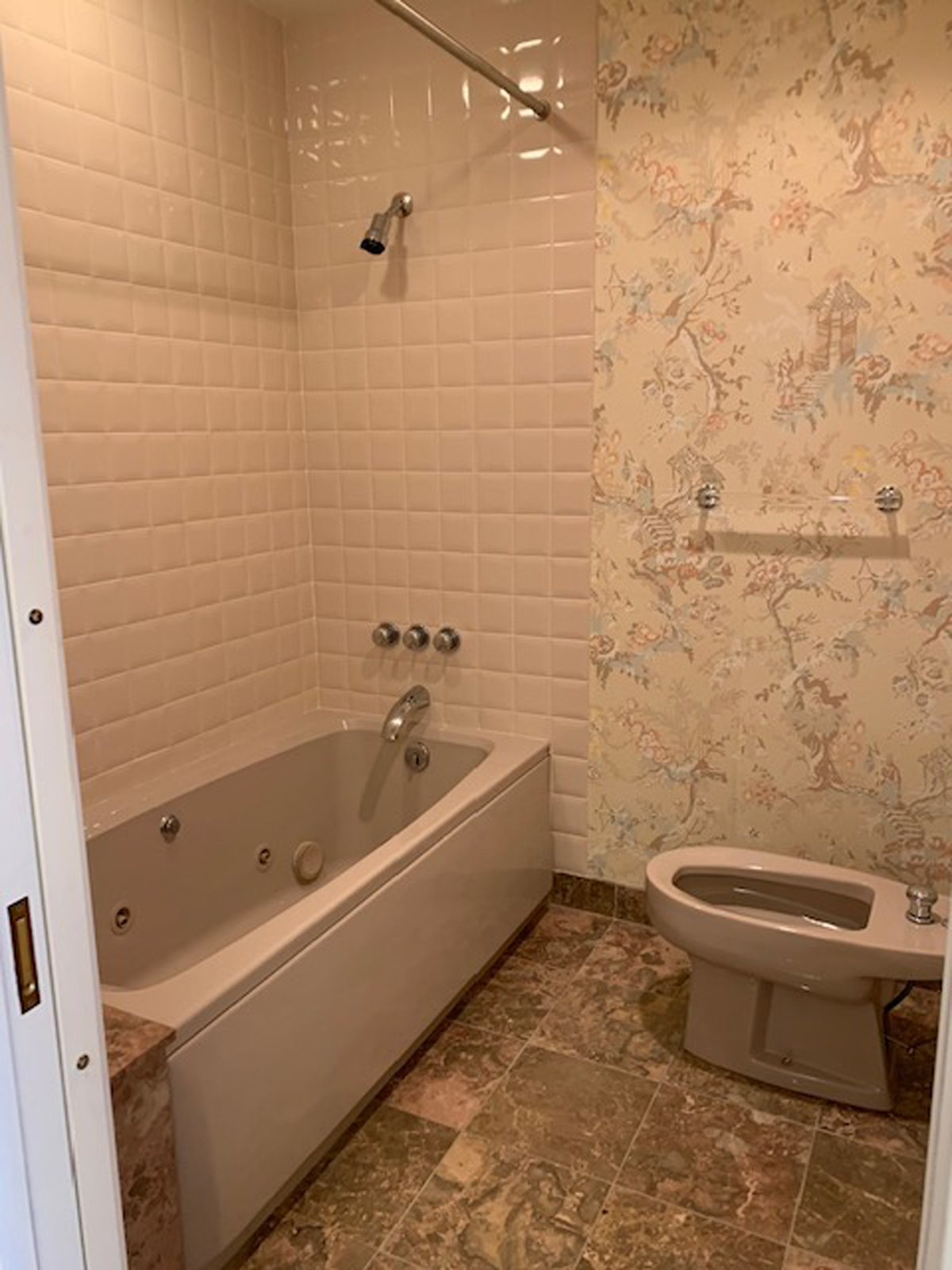
I feel like no words are needed here (LOL)! I mean…can we say 1970’s??!!! Yikes! It was truly the strangest layout I have seen. There was a long skinny section for the vanity, but it only had 1 sink. Literally a separate room was housing the toilet and bath/shower. A completely separate 1/2 bath is between the primary bedroom and the primary bathroom. And the wallpaper, pink toilet and sink, and carpet in the bathroom….need I say more?
The design plan
the after
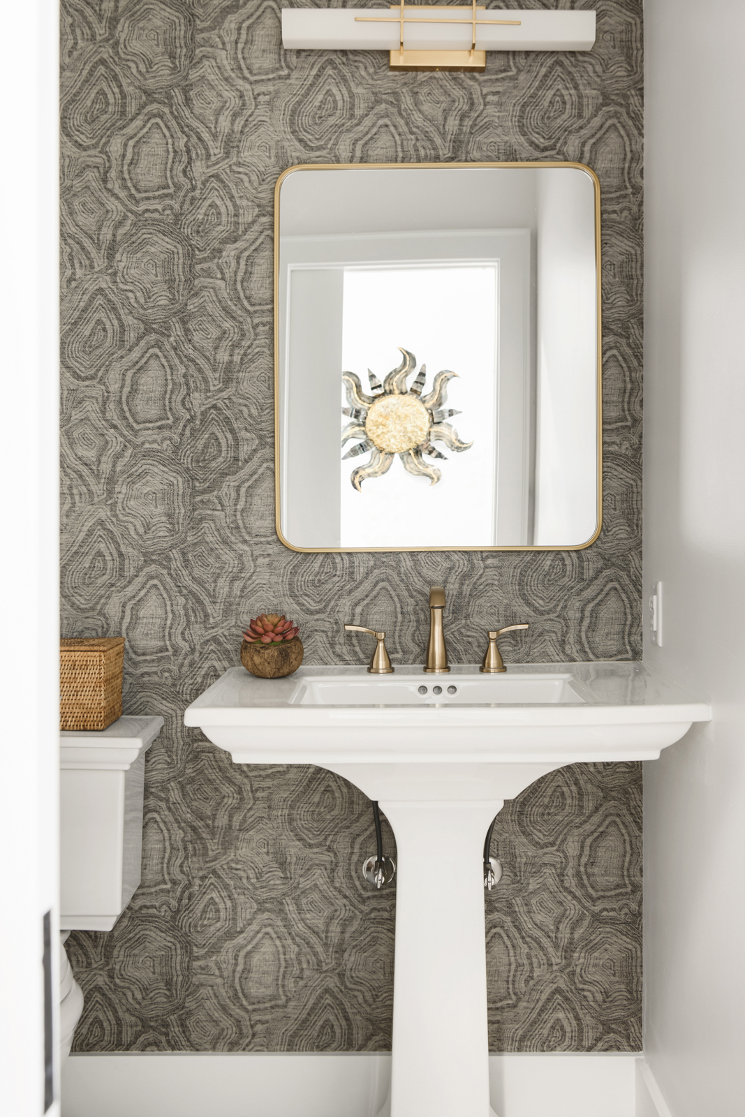
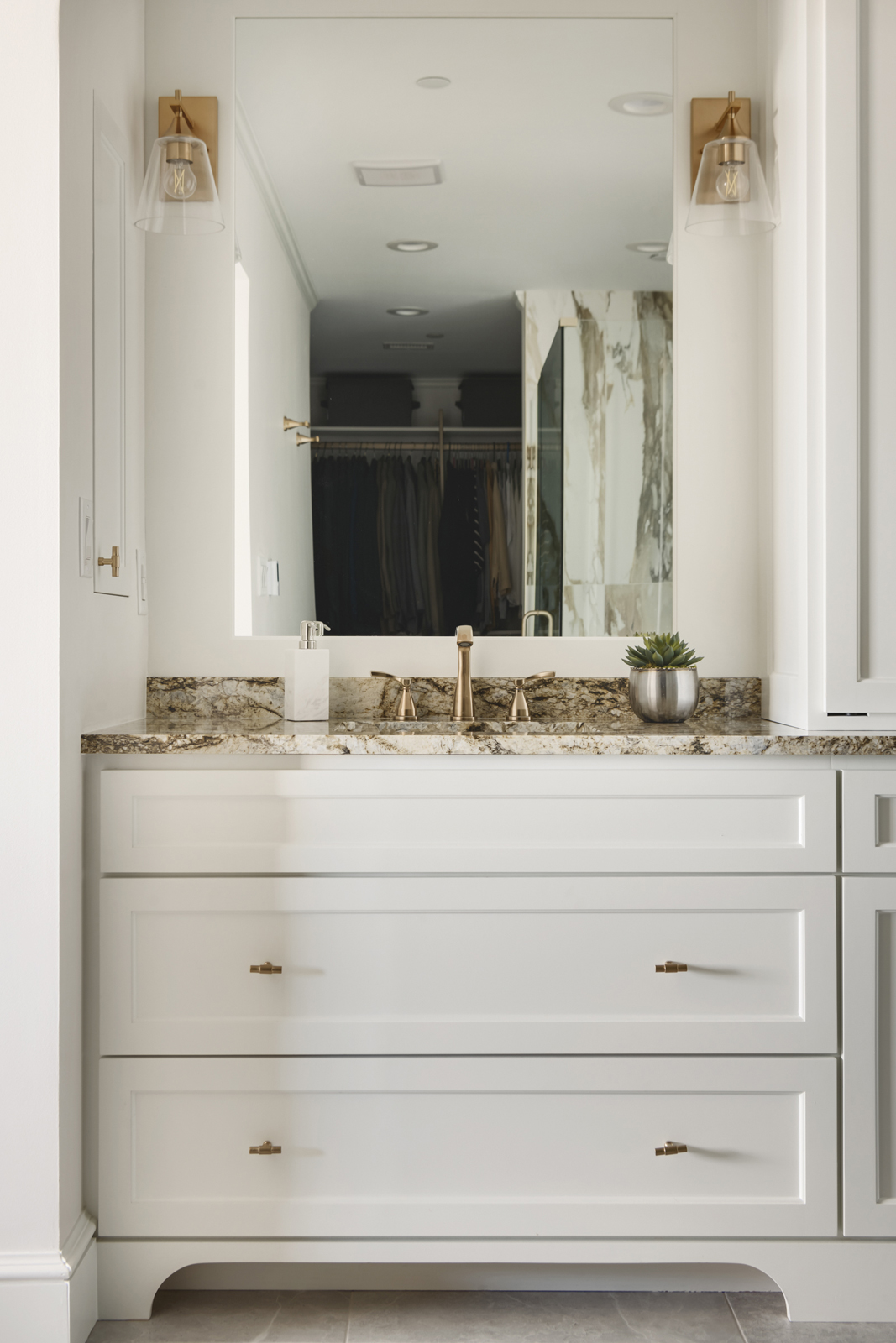
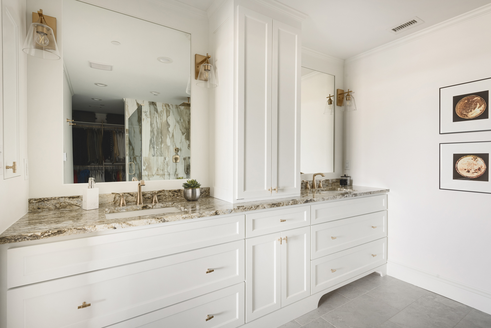
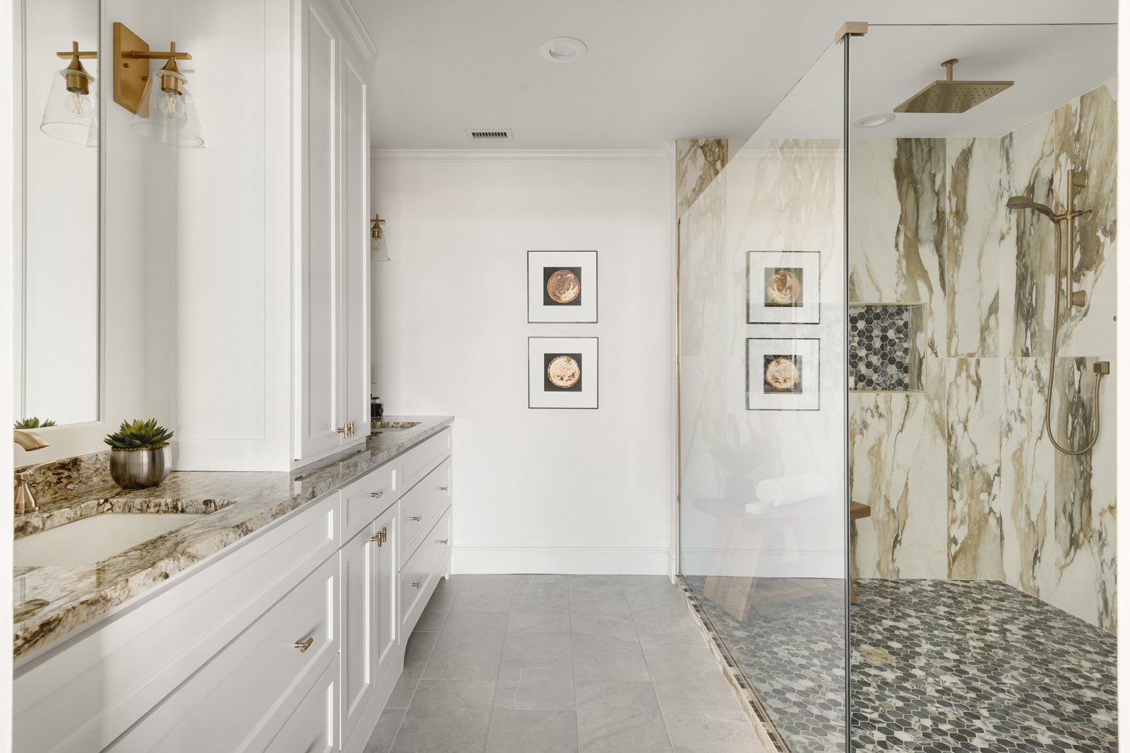
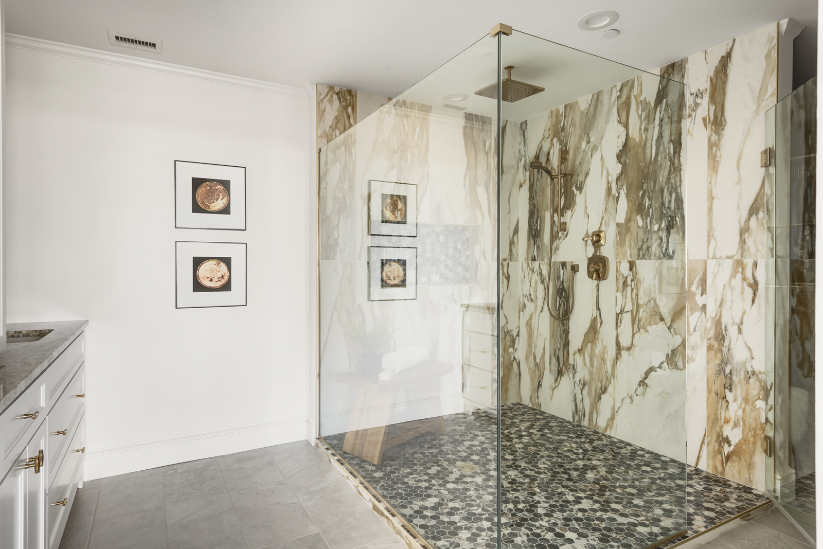
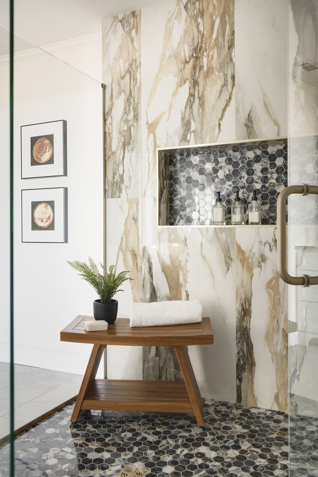
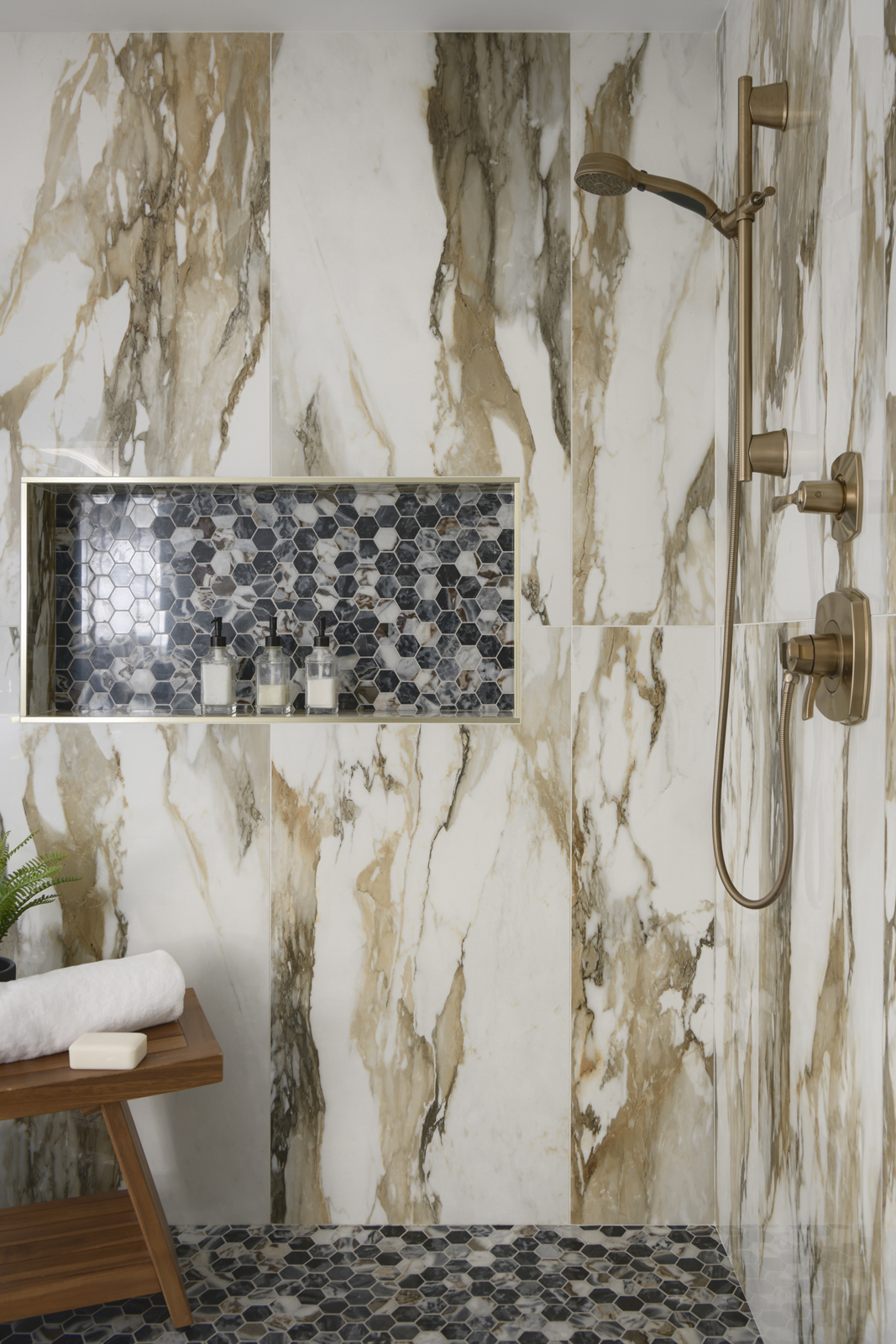
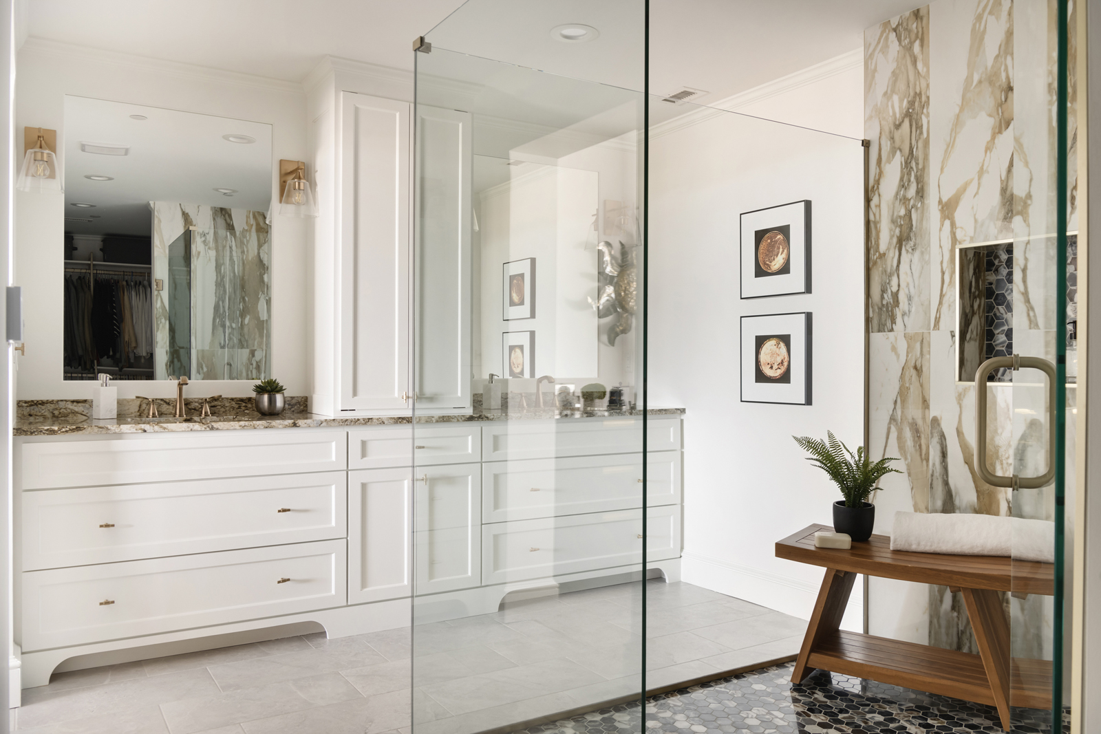
We gutted the main bathroom space, removed the soffit that made the ceiling feel so low over the vanity. We designed a new vanity with lots of storage, 2 sinks, wall mounted light fixtures, and beautiful granite countertops that carried through the warm color palette from the main spaces. Soft brushed gold hardware adds sophistication and elegance. We added a fun agate wallpaper to accent the 1/2 bath, and ditched the blush pink fixtures. All carpet was removed and a pretty gray porcelain tile brought in a nice contrast to all of the warm colors. The creme-de-la-creme in this bathroom is the incredible shower! We decided to forgo the bathtub and just go all-in on an impressive shower. The previous room that held the tub and toilet was converted to a full glass shower with multiple shower heads, gorgeous marble mosaic floor tile and shampoo niche, and dramatic large scale porcelain wall panels. The porcelain tile mimics a natural Borghese marble tile that we had fallen in love with at a stone showroom, but it is virtually maintenance-free and was a fraction of the cost of the real marble.
I hope you enjoyed seeing part 1 of this impressive condo! Click here for Part 2 of this Project Reveal! Hoping this inspires you and gets you dreaming about living in a beautiful space with skyline views! 🙂
XO,
Amy & the Interior Impressions Team


Hey, I really like your comforter set! Do you mind if I ask where you got it from?
Thank you! Its from Wildcat Territory.