This Stonemill Farms home has good structure and many lovely qualities, but needed better functionality and an updated look in a few key areas. The rooms that our clients wanted to remodel were the laundry room, mudroom, guest bathroom, kid’s bathroom, primary bedroom, primary closet and primary bathroom. We teamed up with Custom One Renovation to recreate these spaces and add tons of storage and organization and to make these rooms feel fresh and new.
The laundry & mudroom
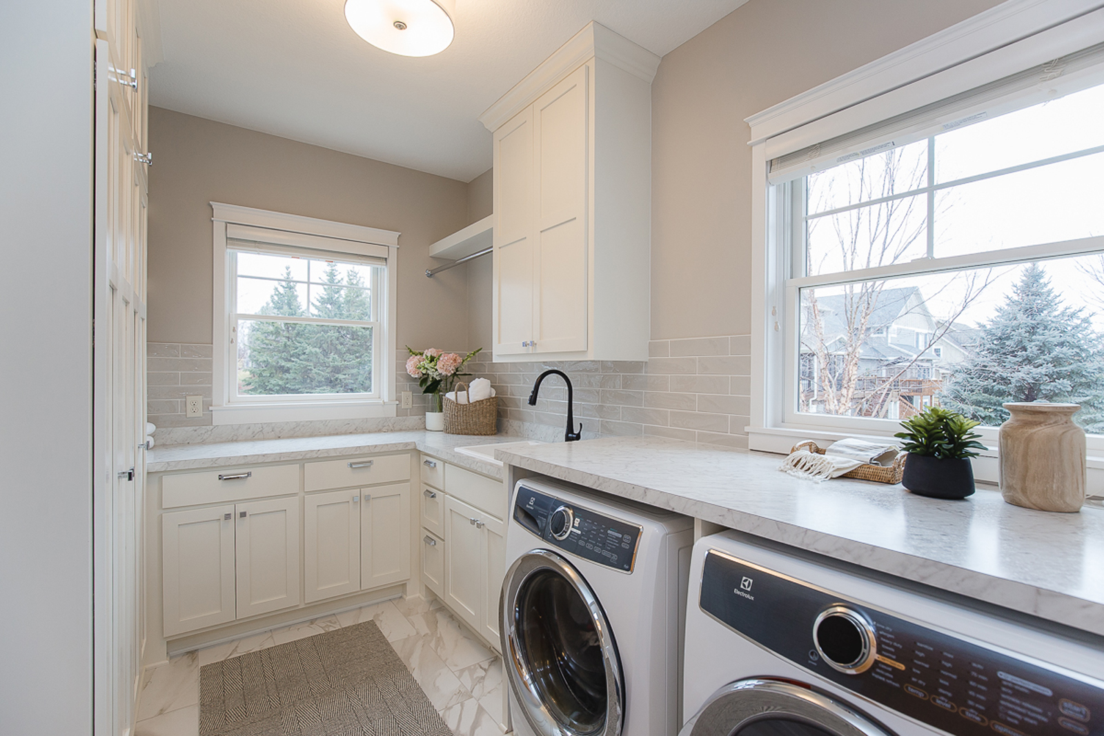
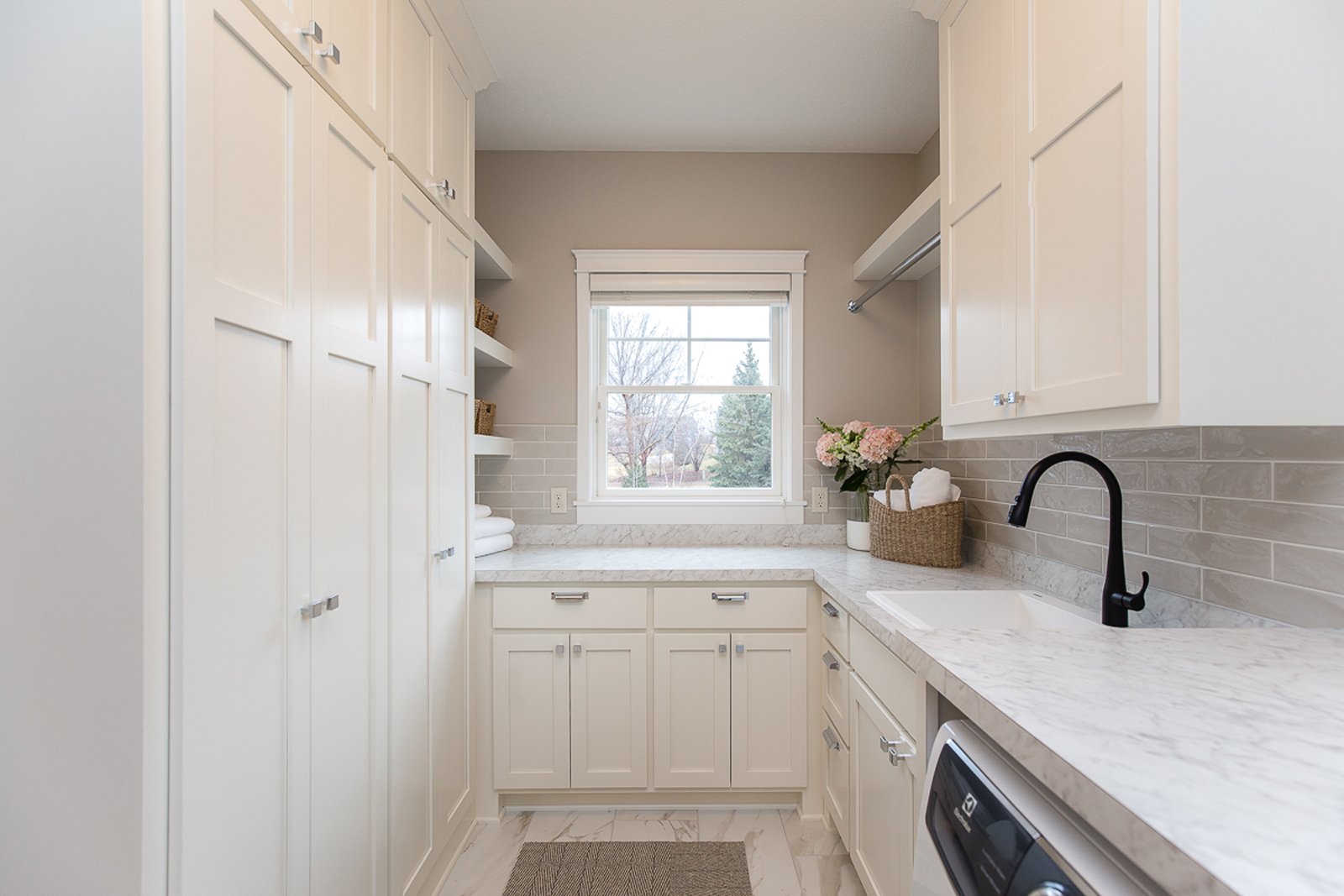
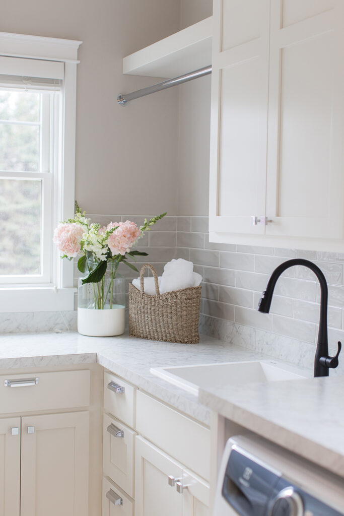
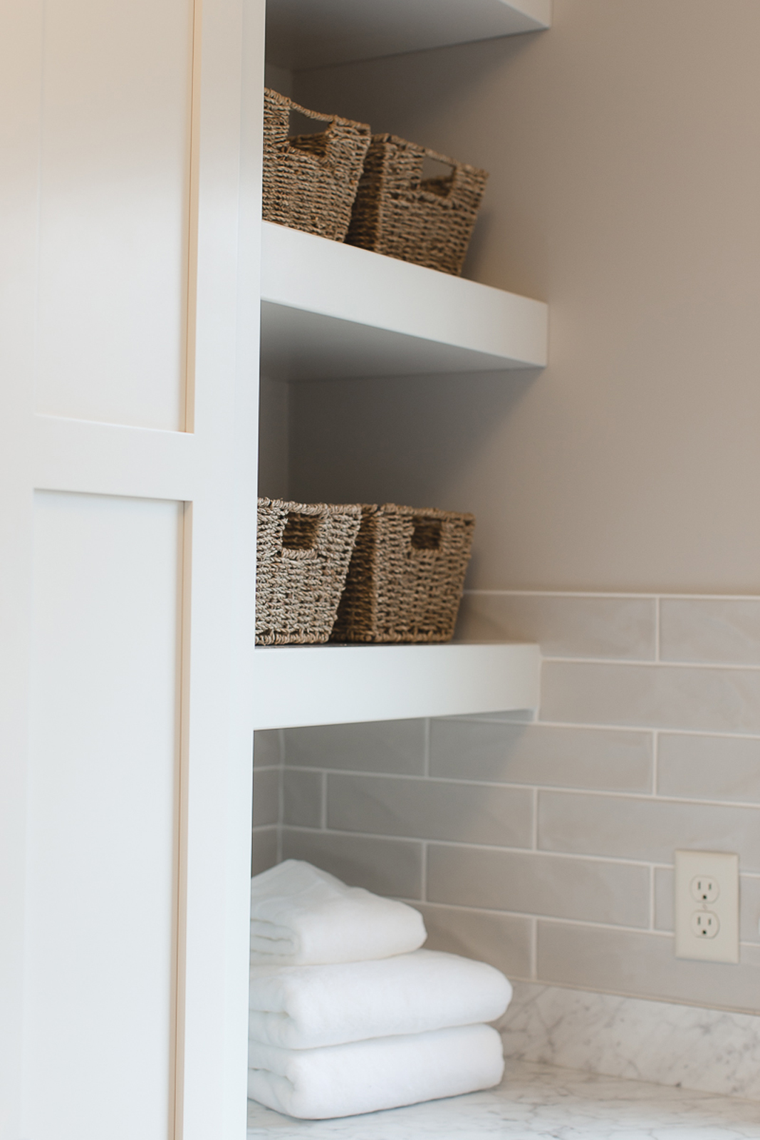
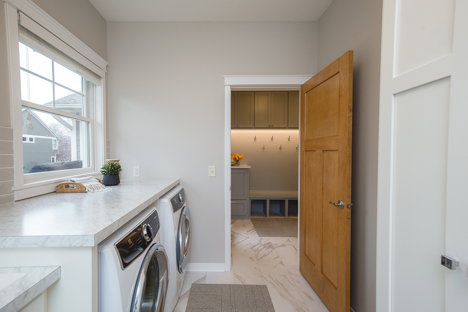
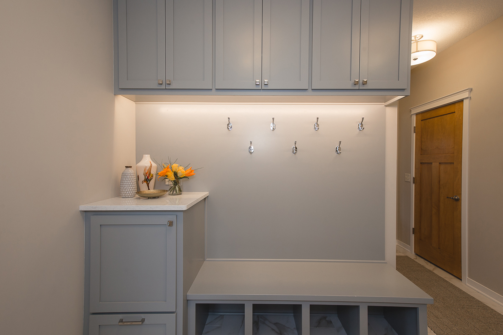
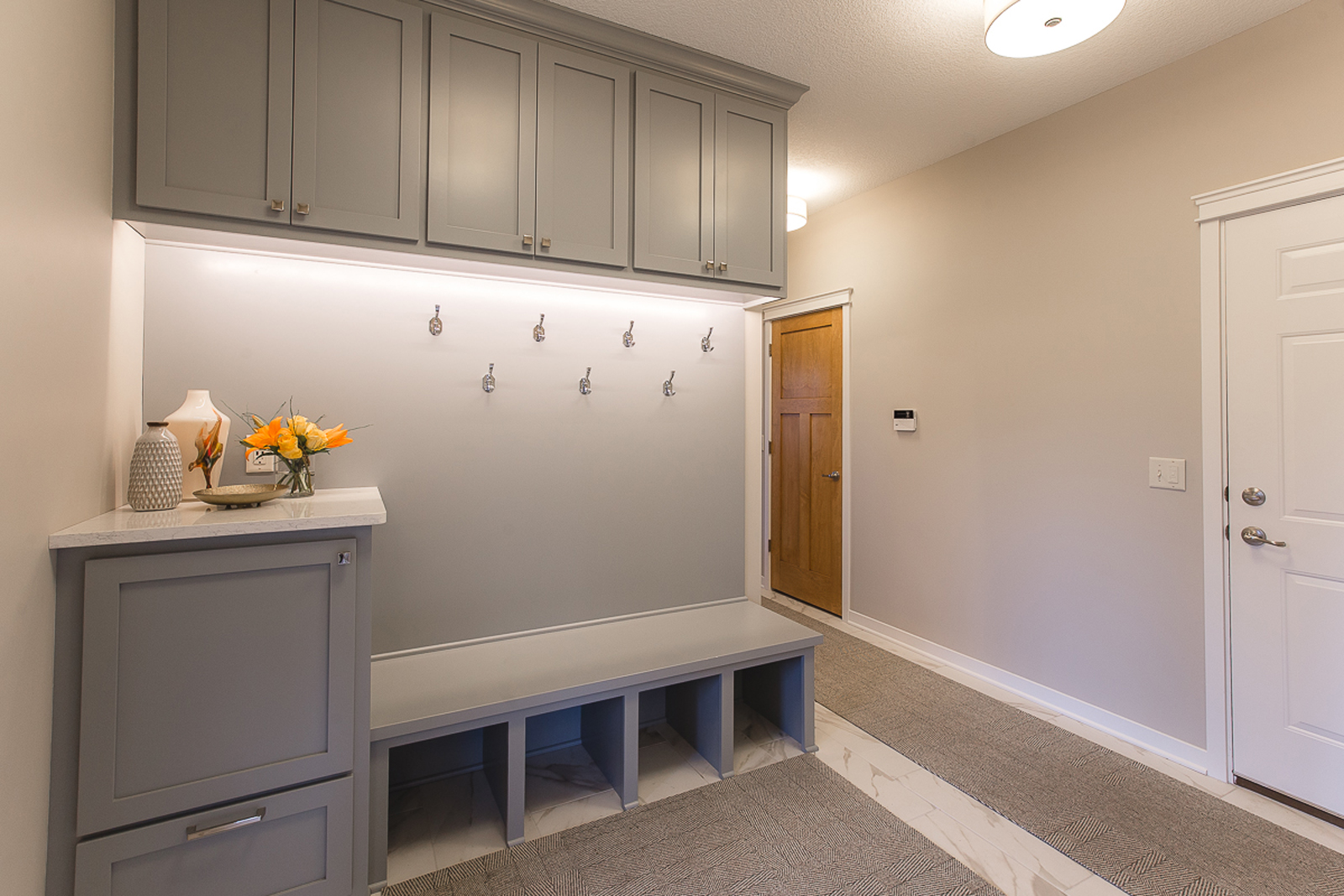
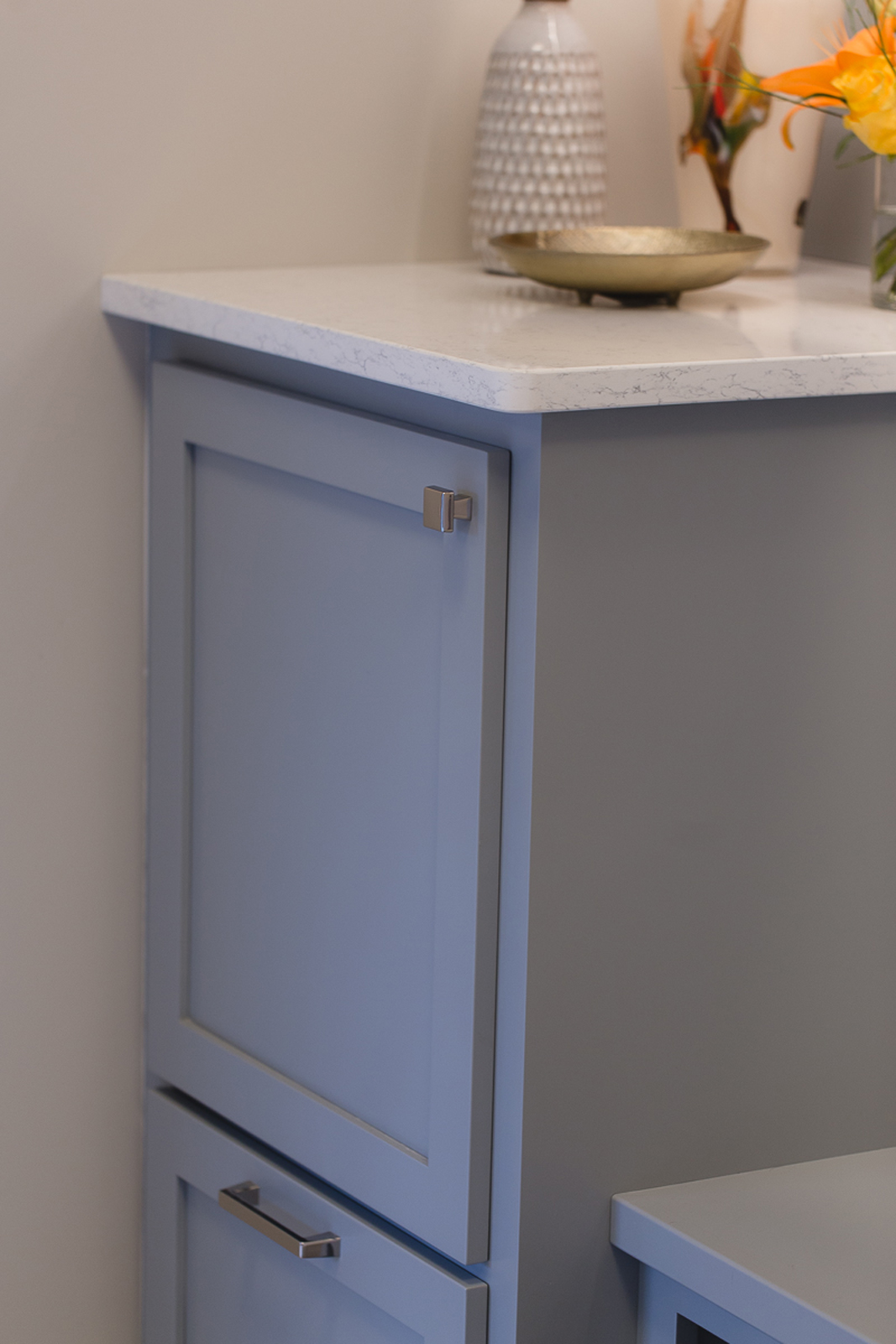
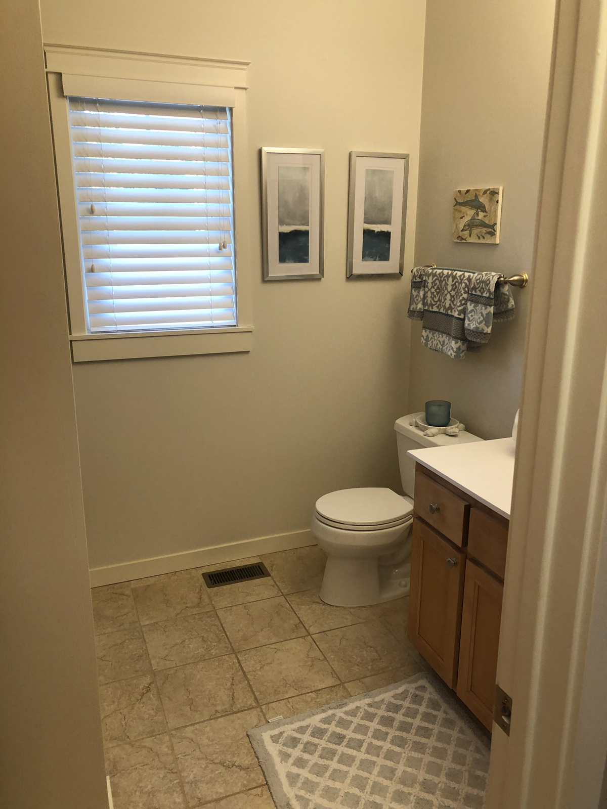
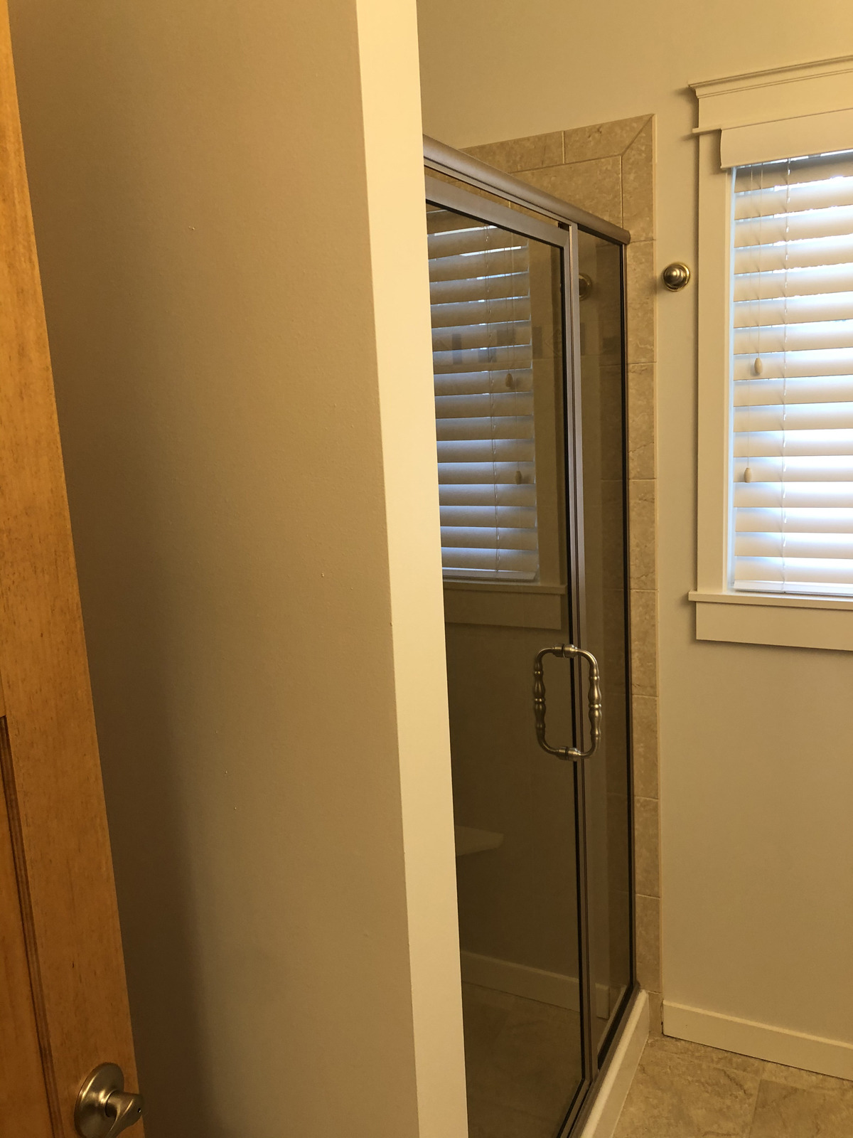
Our clients felt that their mudroom and laundry room lacked good storage and had a lot of wasted space. The mudroom was very small and had hardly any storage at all. Conversely, the guest bathroom that is adjacent to the mudroom was much larger than necessary. It had a shower that was never used and didn’t make sense for a main floor bathroom without any bedrooms. . The bathroom shower was removed, at that space was then converted to enlarge the mudroom. This allowed for a mudroom bench with hooks and cabinets to be custom made to fit that area perfectly. All new flooring was added to the mudroom, laundry room and bathroom. We brought in a little color with the mudroom cabinetry and used a pretty shade of blue/gray to brighten up this area. The laundry room received all new full height cabinets, new countertops, sink, faucet, open shelving, a hanging rod, and a pretty tile backsplash. This room is now light and bright and makes doing laundry a lot more enjoyable!
the before
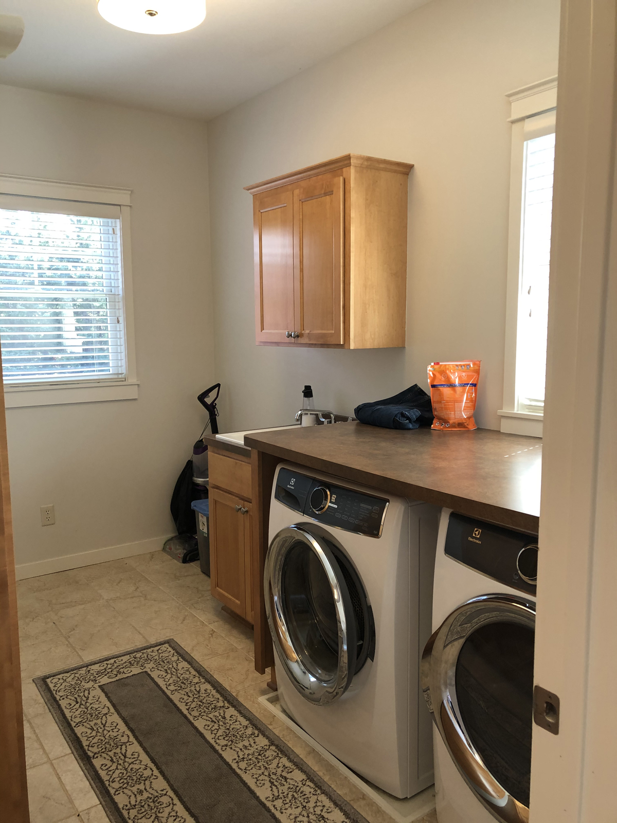
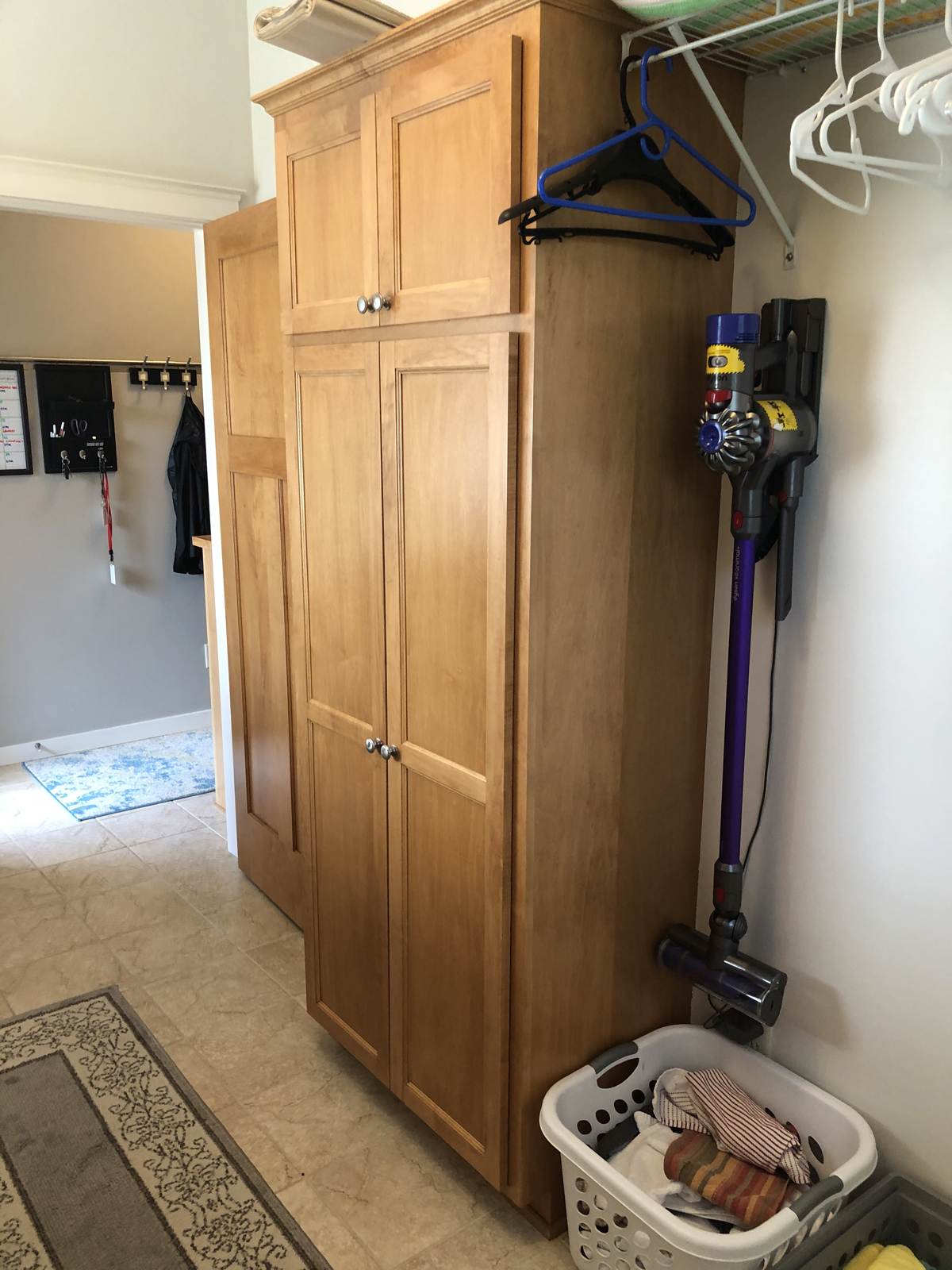
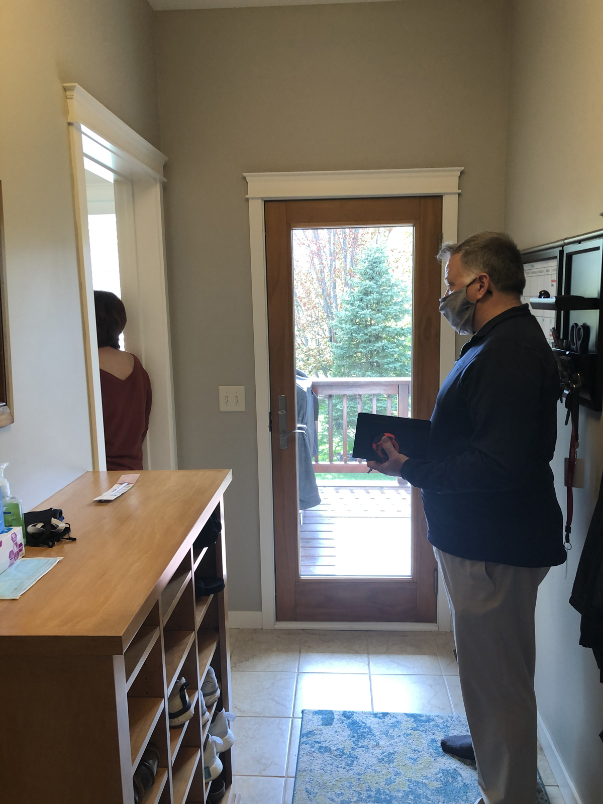
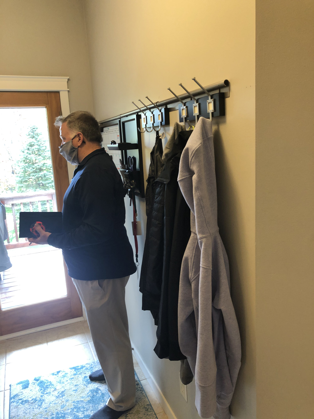
the after
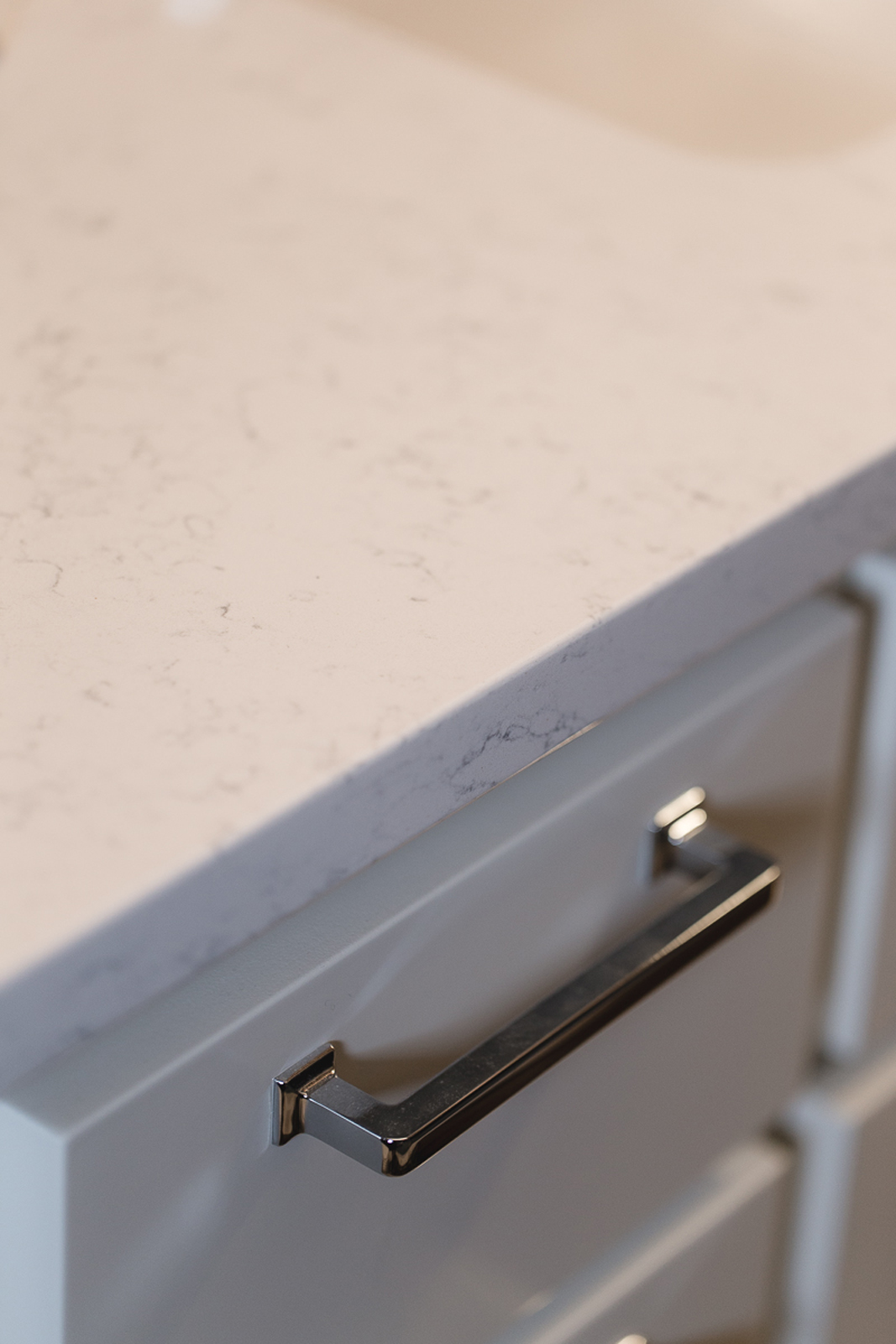
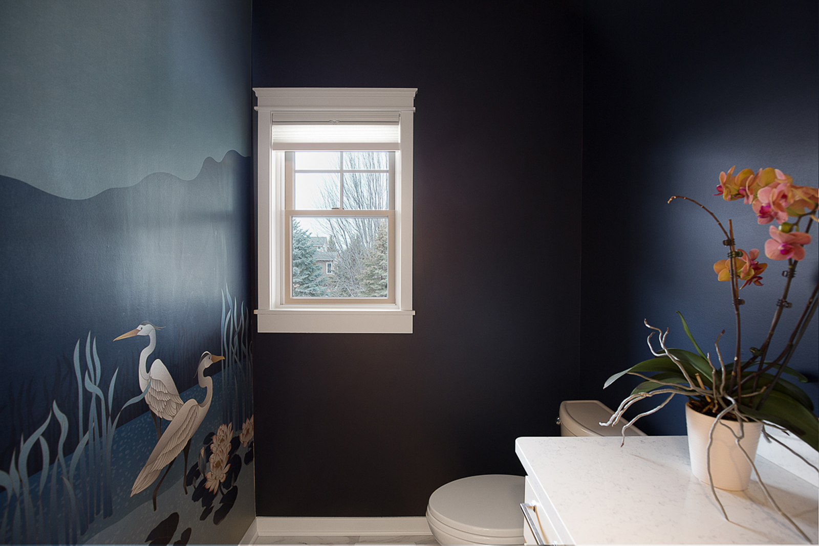
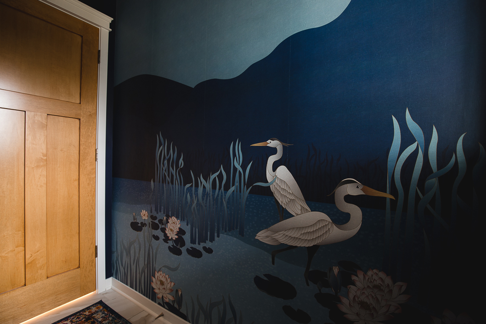
the powder bathroom
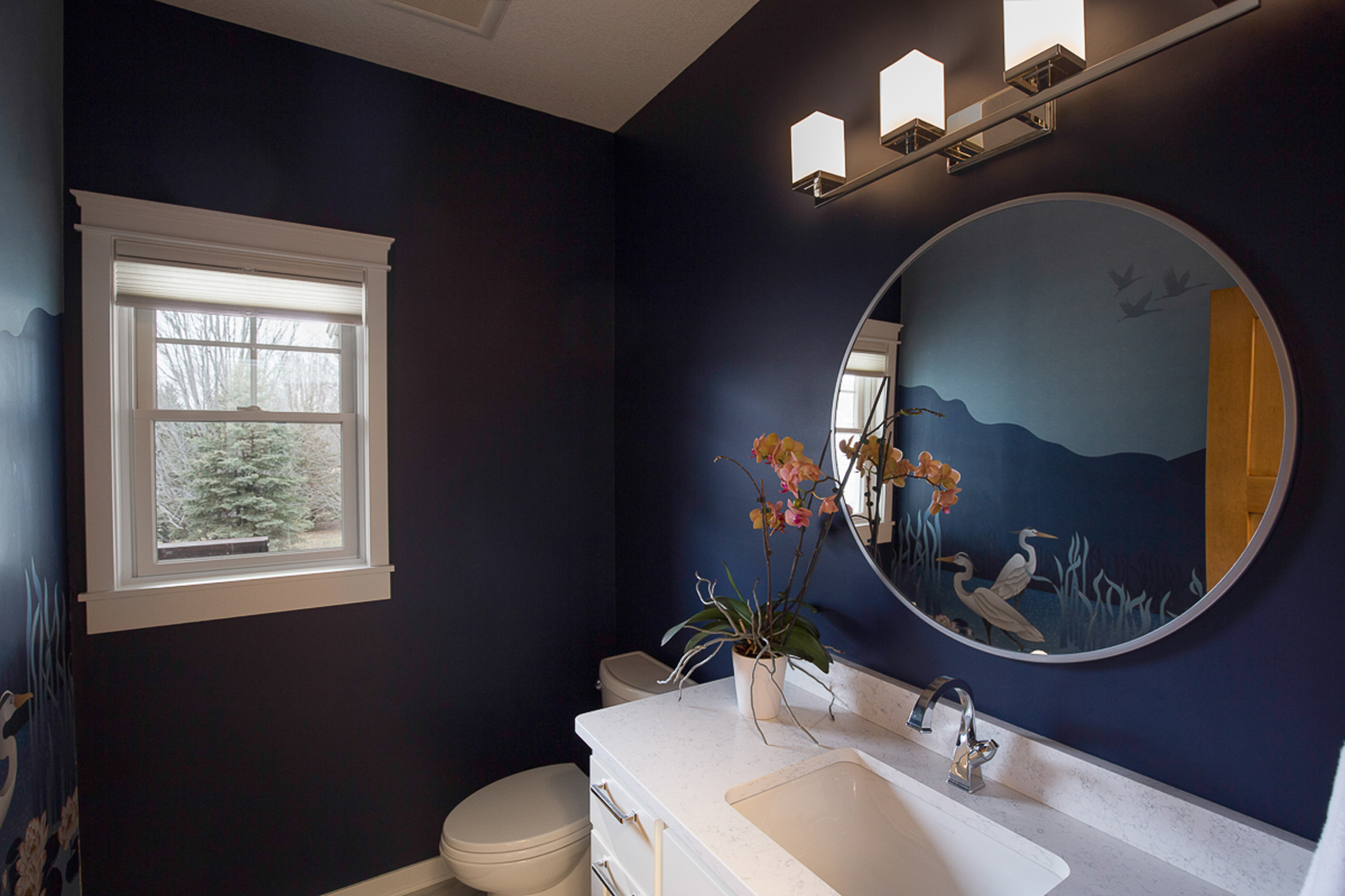
This guest bath really did not need a shower, so as mentioned, that space was much more beneficial as a mudroom bench and cabinetry space. We replaced the flooring, painted the existing vanity cabinet white, added a new quartz countertop with an undermount sink and new faucet. A new window treatment, mirror, light fixture and cabinet hardware were also added. Our clients found a stunning mural with blue mountains and herons as a statement piece for the room. We thought is was a fun way to make their bathroom memorable for visiting guests. We rounded out the dramatic punch by painting the remaining walls a deep blue to match the wallpaper and to keep the mural from feeling overpowering.
the before
the after
The PRIMARY bedroom
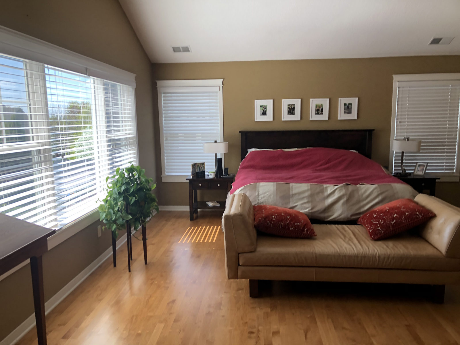
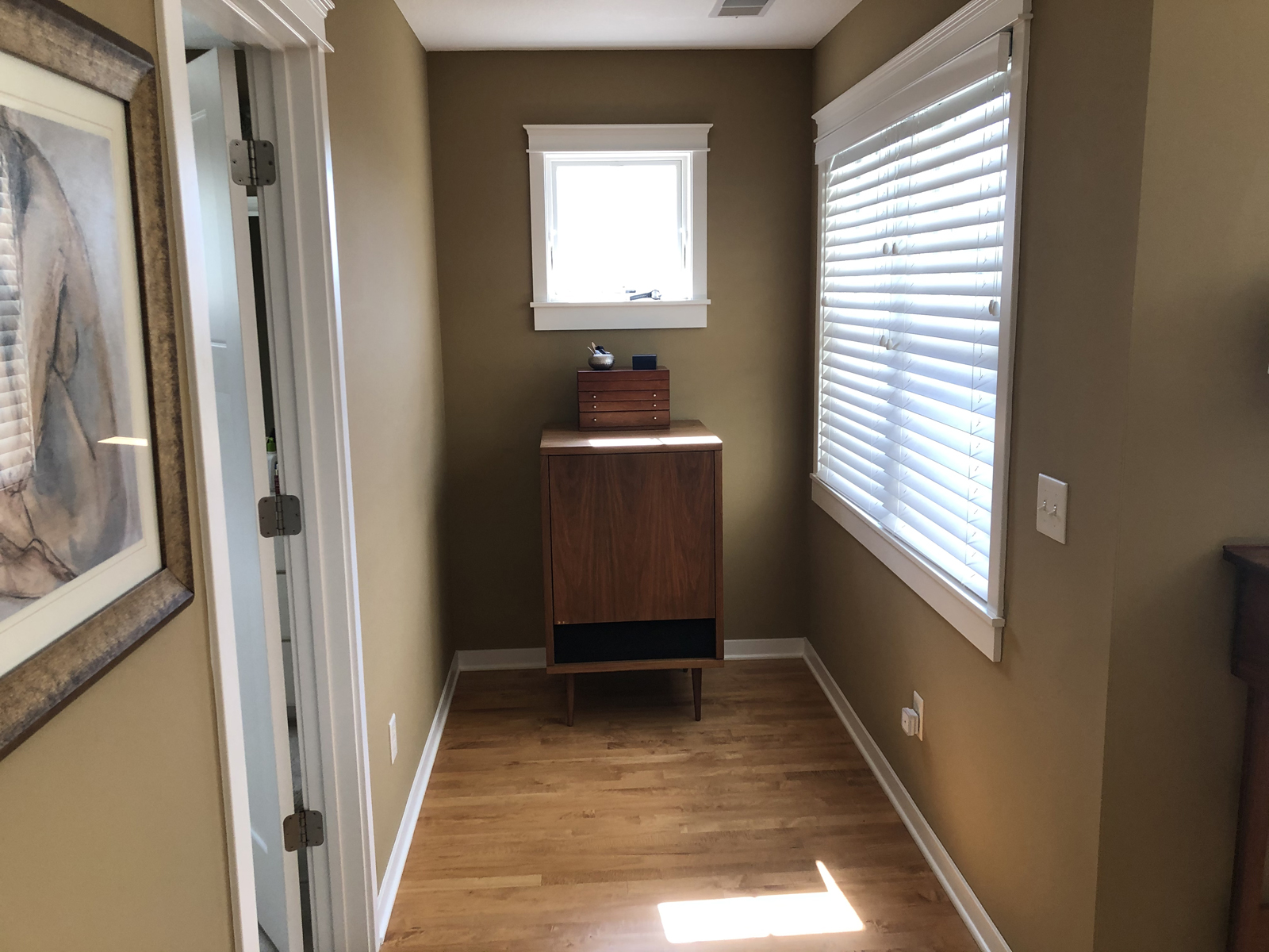
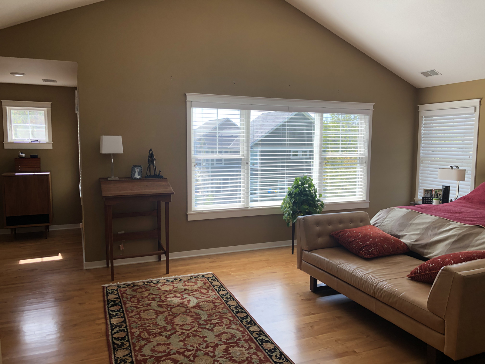
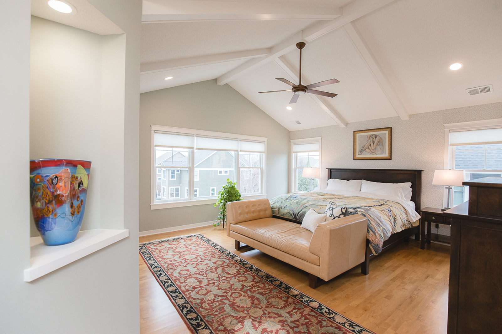
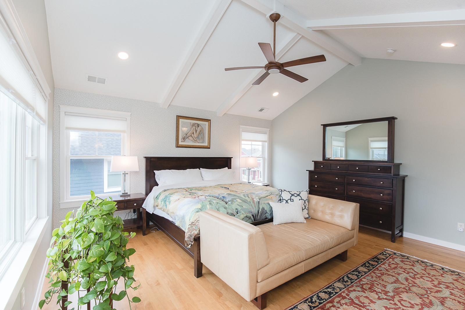
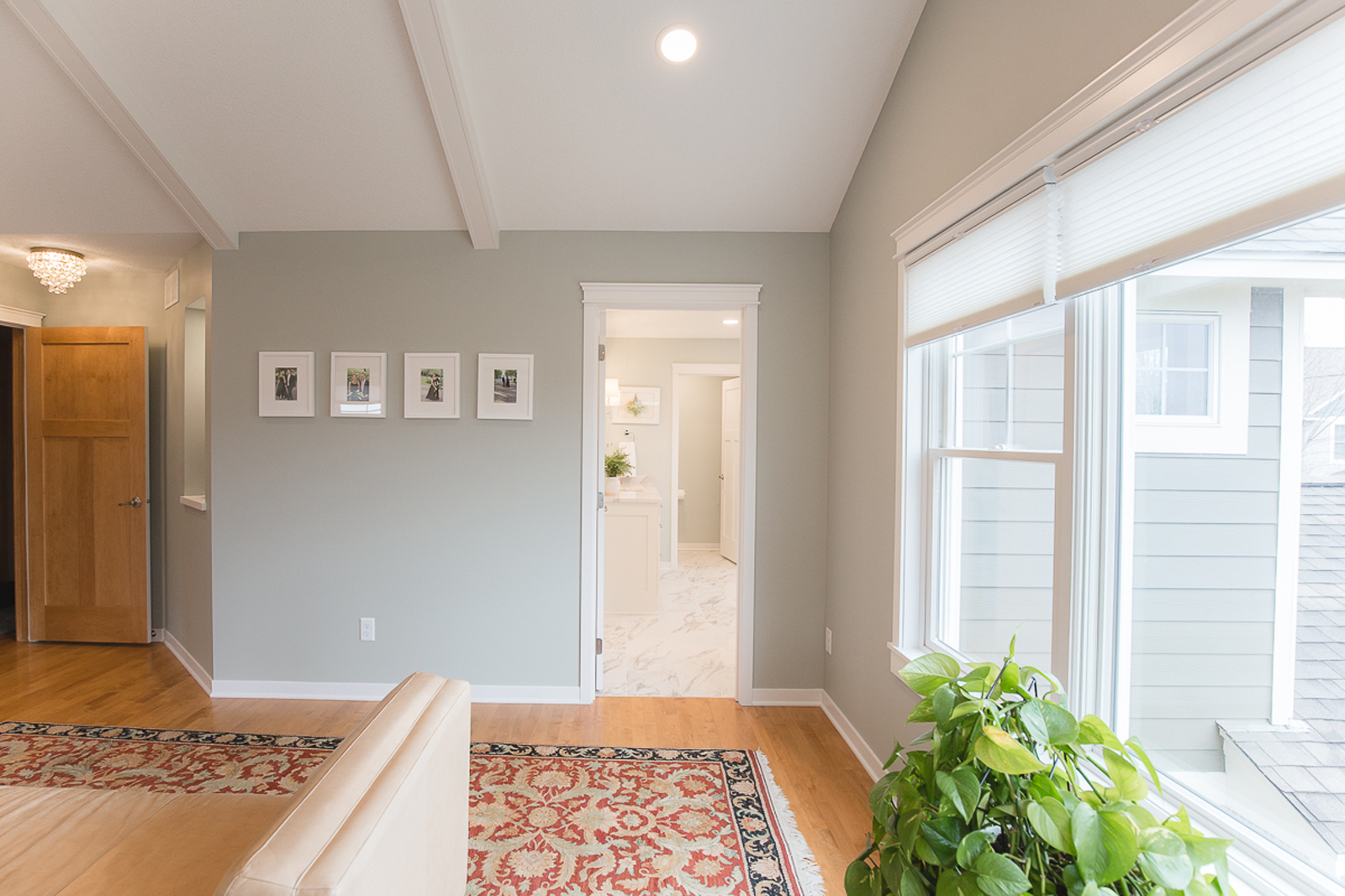
The primary bedroom has a beautiful vaulted ceiling, but it didn’t feel like there was much to draw your eye to the vault. adding custom beams to the ceiling really added drama and makes them stand out. There was also an unusual alcove/hallway between the bedroom and the bathroom that didn’t serve any purpose and felt awkward. This space was closed off to the bedroom and opened up to the bathroom instead, which allowed for the bathroom to gain valuable space. The bedroom didn’t miss this space at all. The primary closet was also shifted a little bit to allow for a new entrance to the bathroom. The bedroom got a lovely new fresh coat of a soft greenish blue color, New artwork, bedding, lamps, and window treatments added softness to the room and now it feels light, bright and relaxing.
the before
the after
The owner’s bathroom
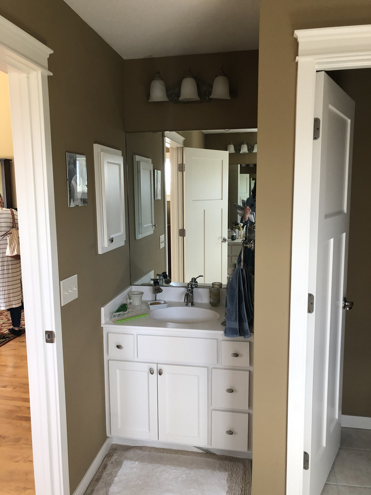
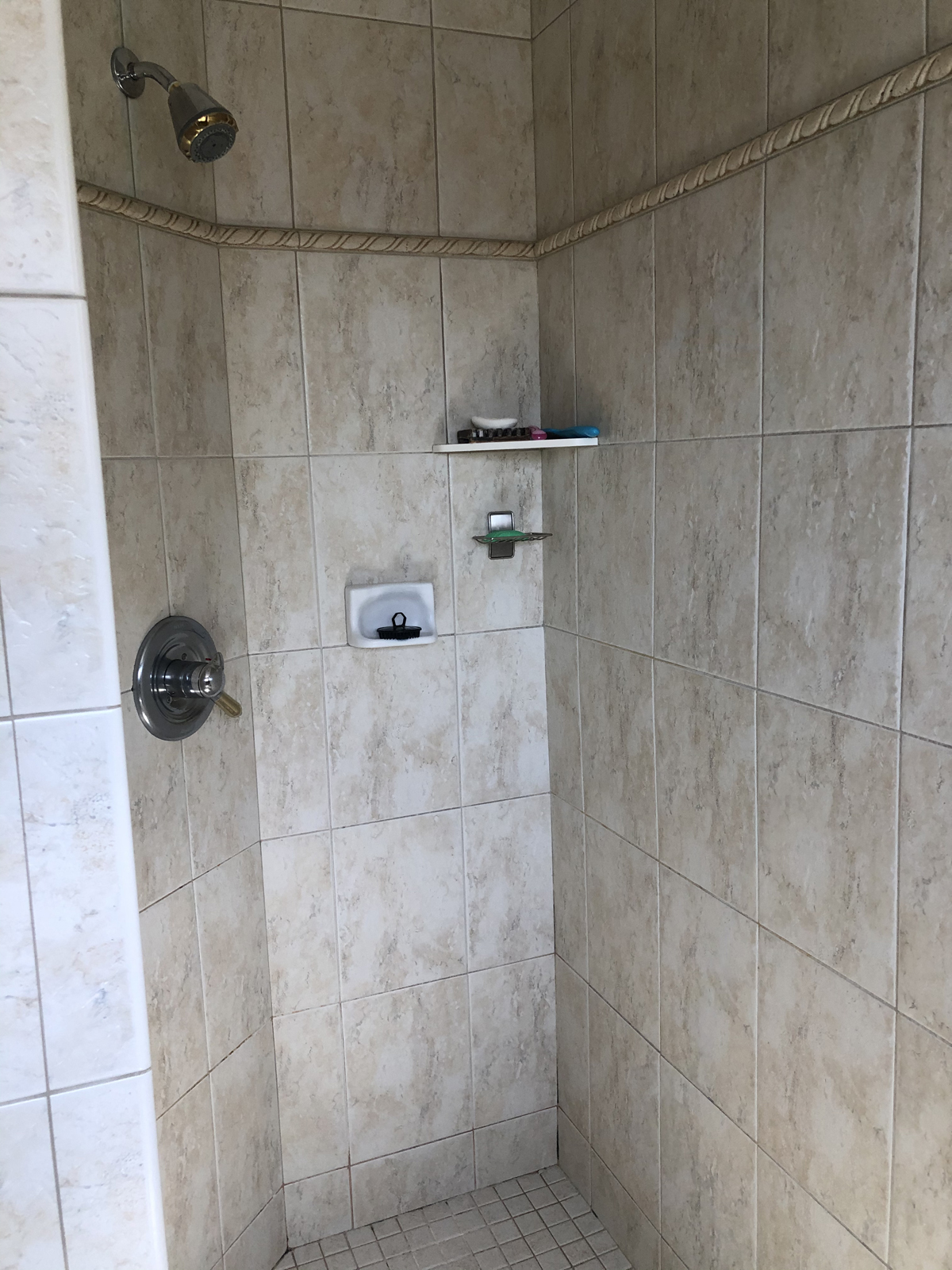
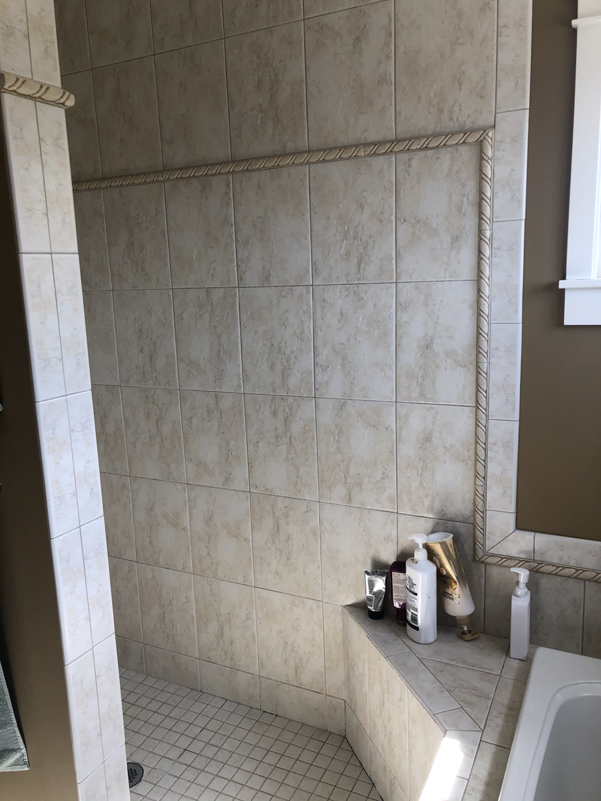
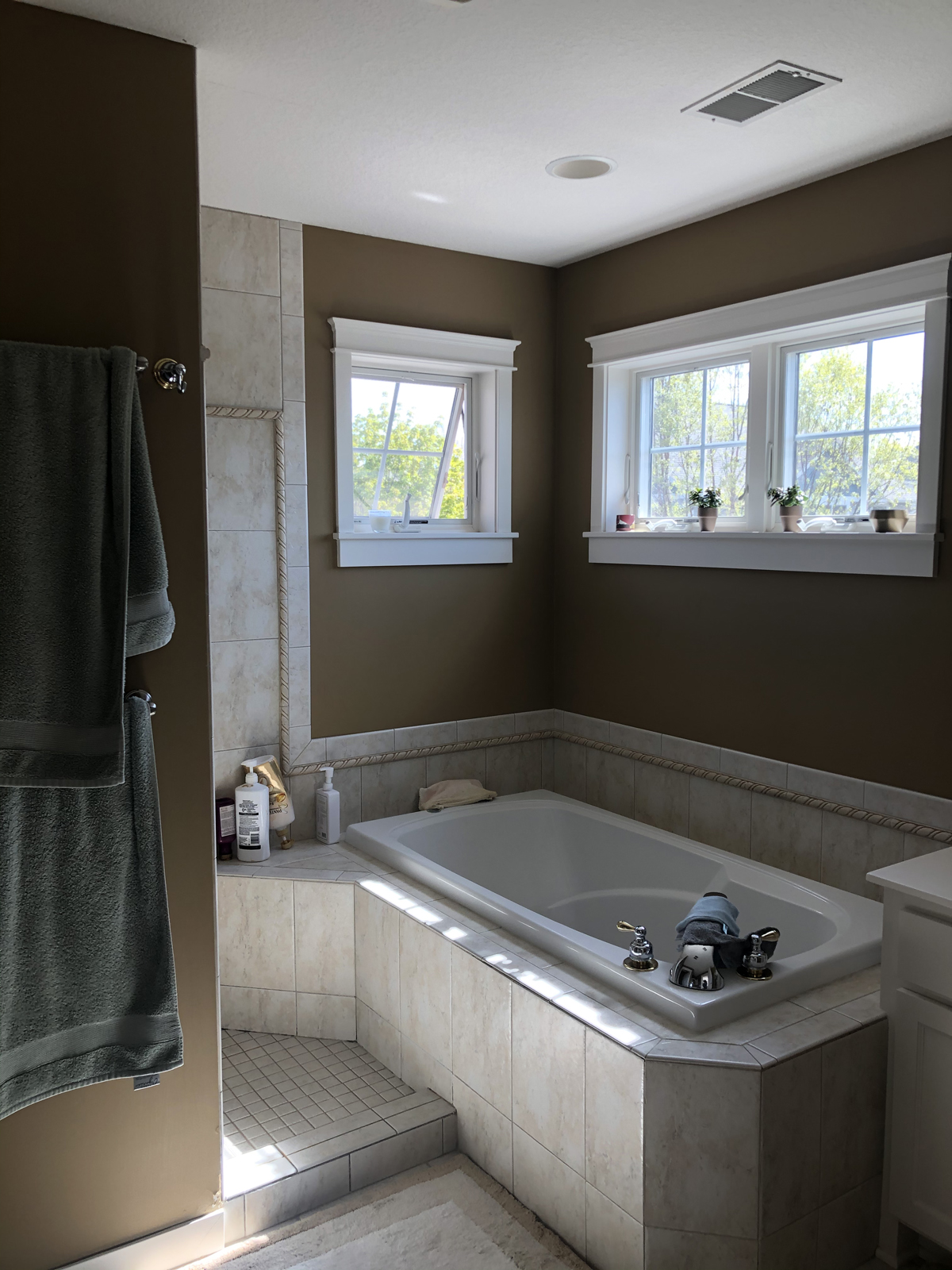
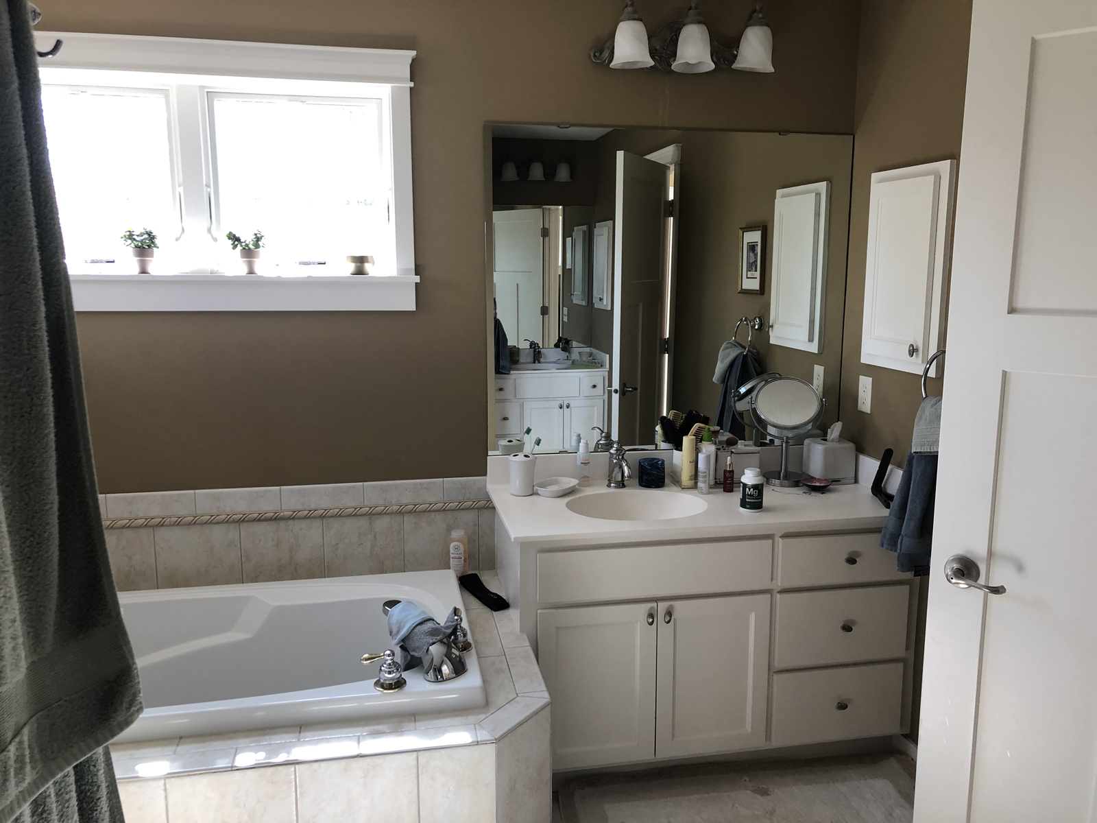
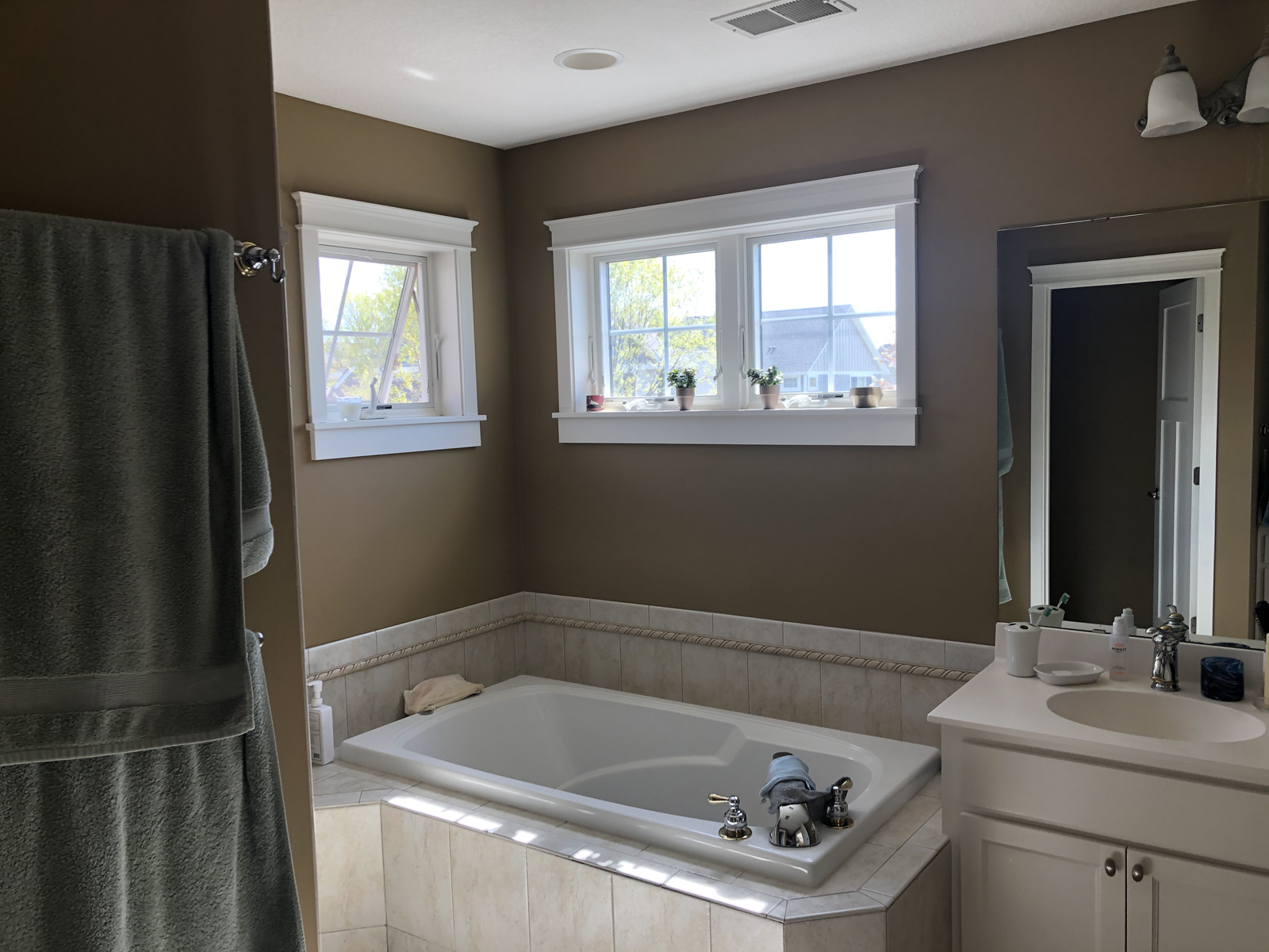
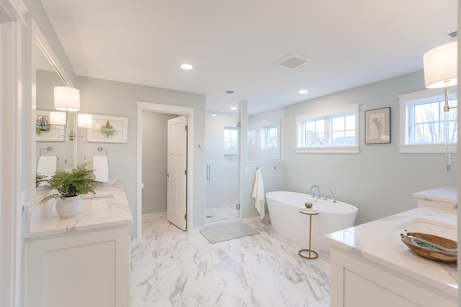
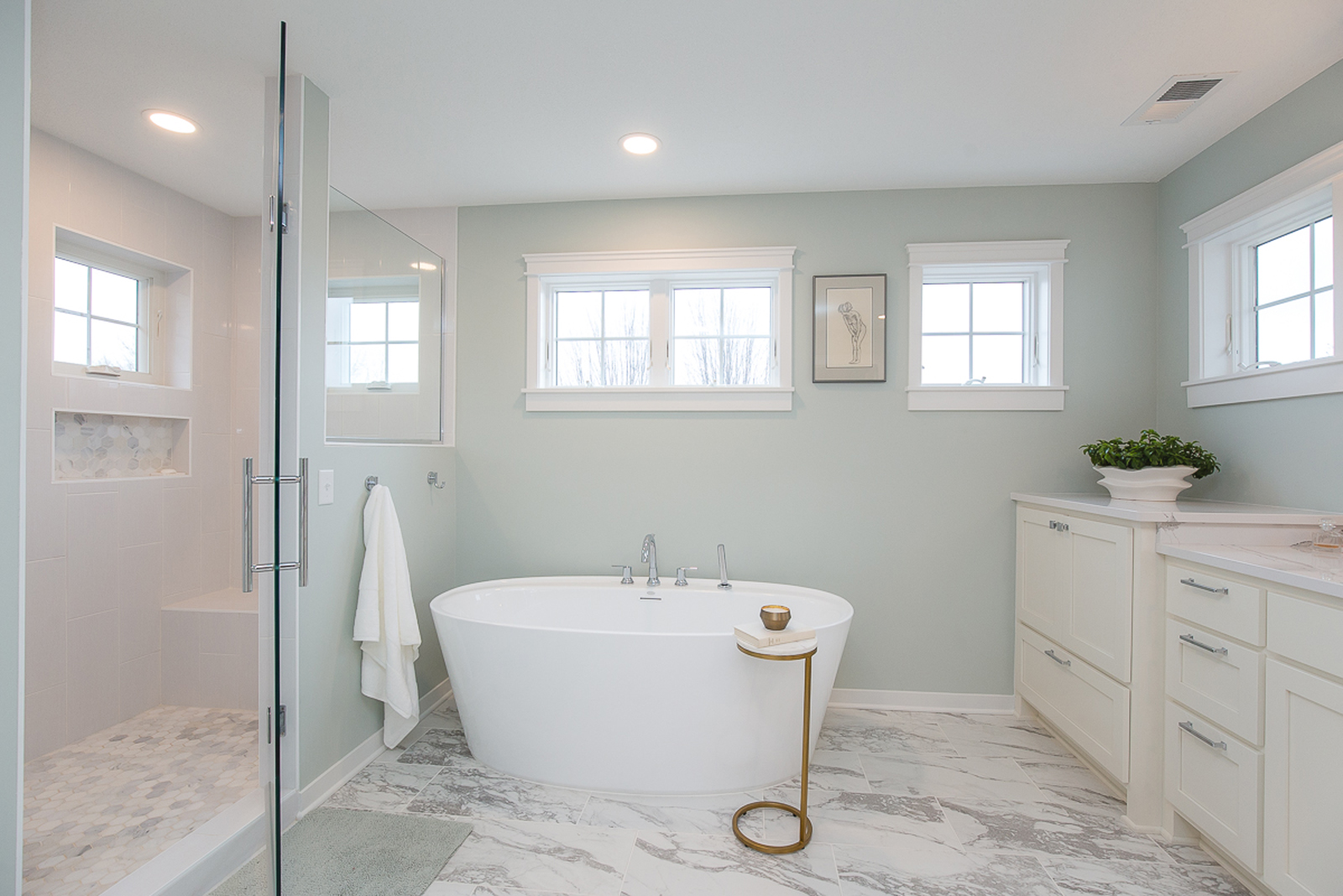
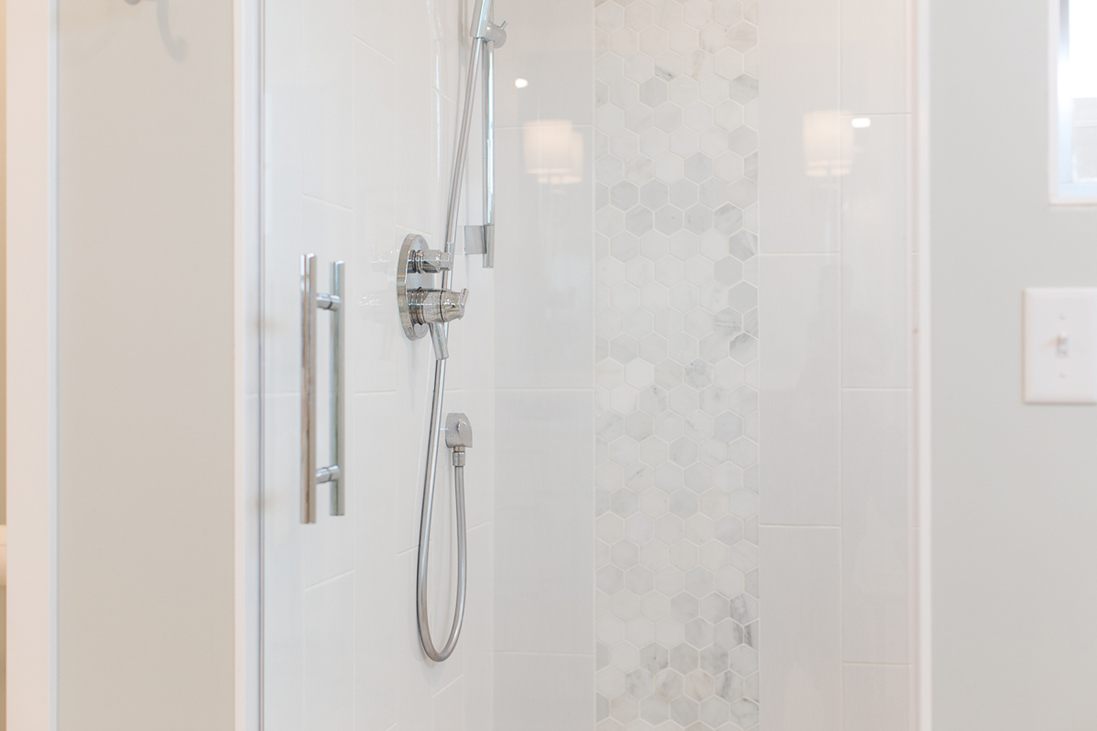
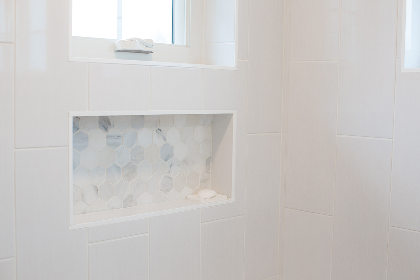
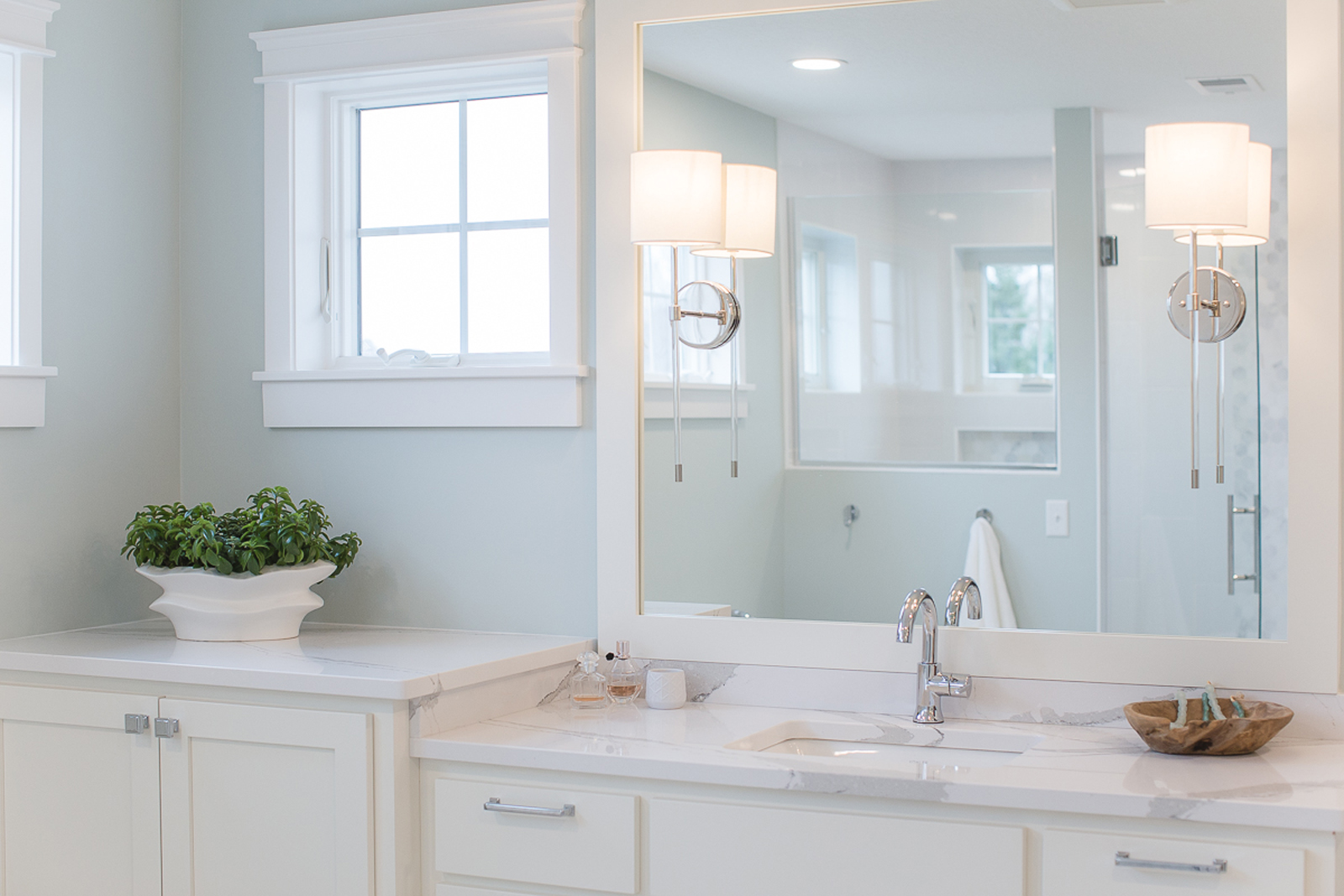
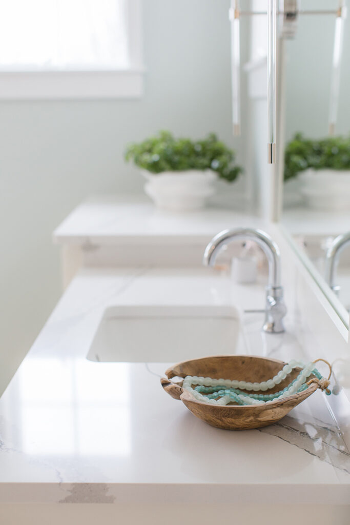
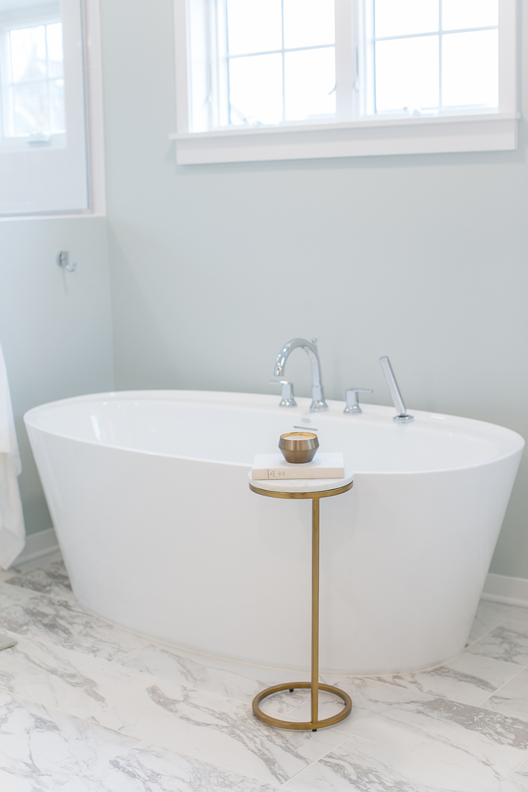
This room underwent the most drastic transformation. It was dark, cramped, and had several awkward turns that made the room feel very tight and difficult to navigate. Our clients wanted to feel relaxed and enjoy a spa-like feel in their bathroom. The gained space from the bedroom allowed for one vanity to fill in the old hallway space, which opened up space for a beautiful free-standing tub. The shower was enlarged and kept bright and fresh with large-scale white tile and a clear glass door and window. More windows were added to bring in as much natural light as possible. Custom cabinets, quartz countertops, all new plumbing fixtures, cabinet hardware, a pretty spa green paint on the walls, and custom framed mirrors with beautiful wall light fixtures now make this bathroom so gorgeous that you’ll never want to leave!
the before
the after
The owner’s closet
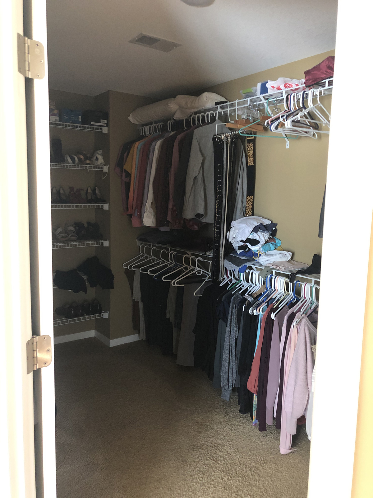
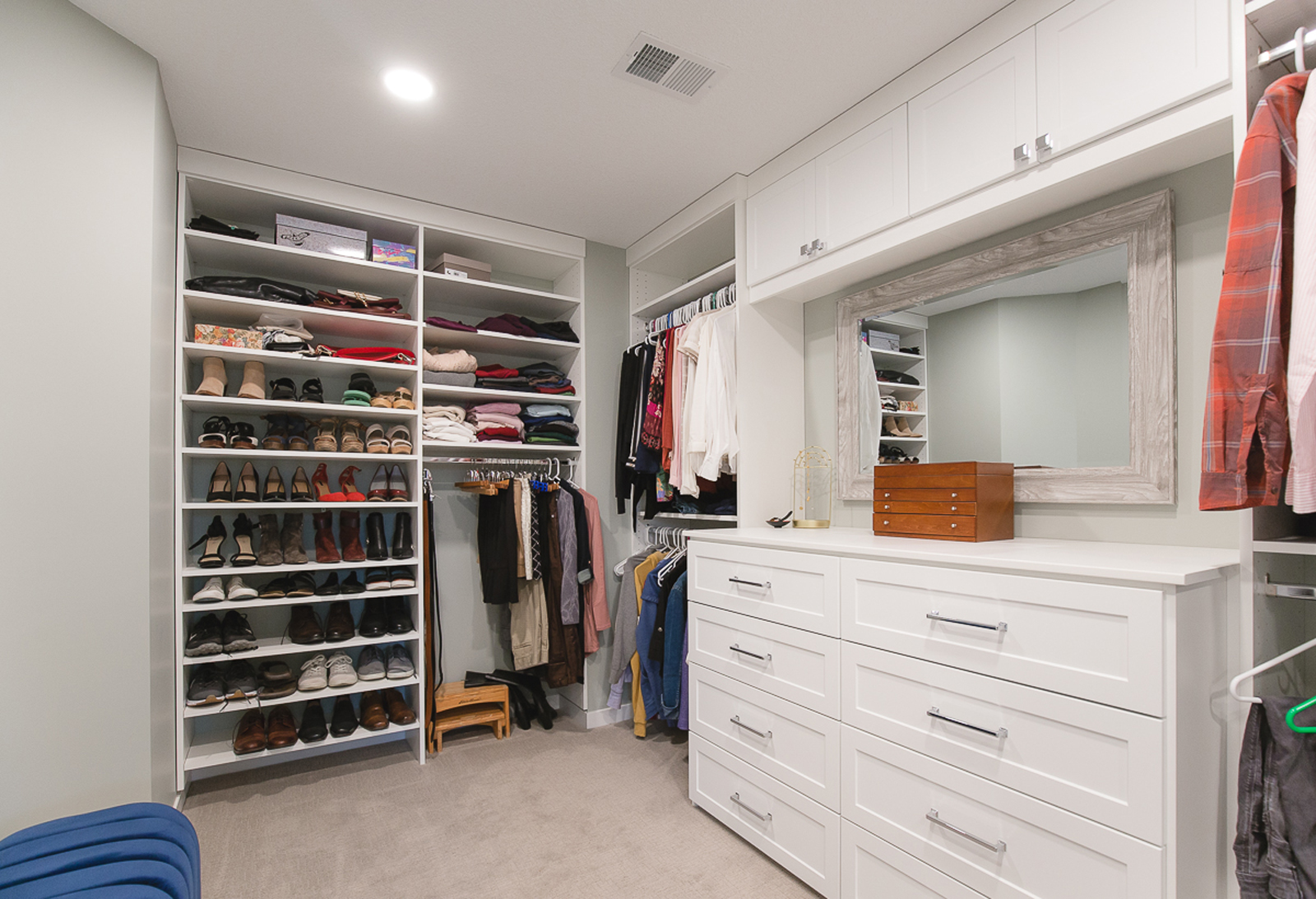
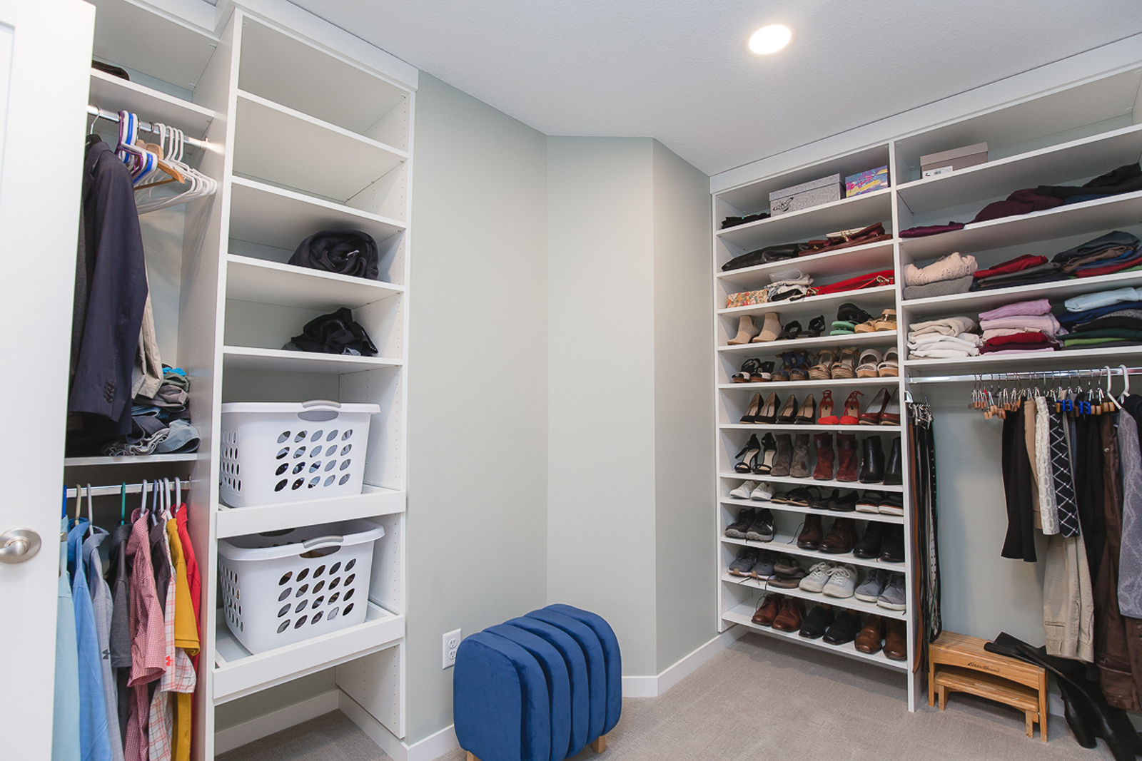
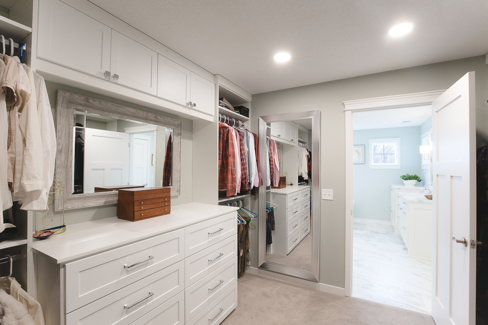
It’s amazing how impactful good storage can be! This closet really just needed better lighting, fresh paint, and carpet, and a really great closet system.
The before
The after
tHE GUEST/KID’s BATHROOM
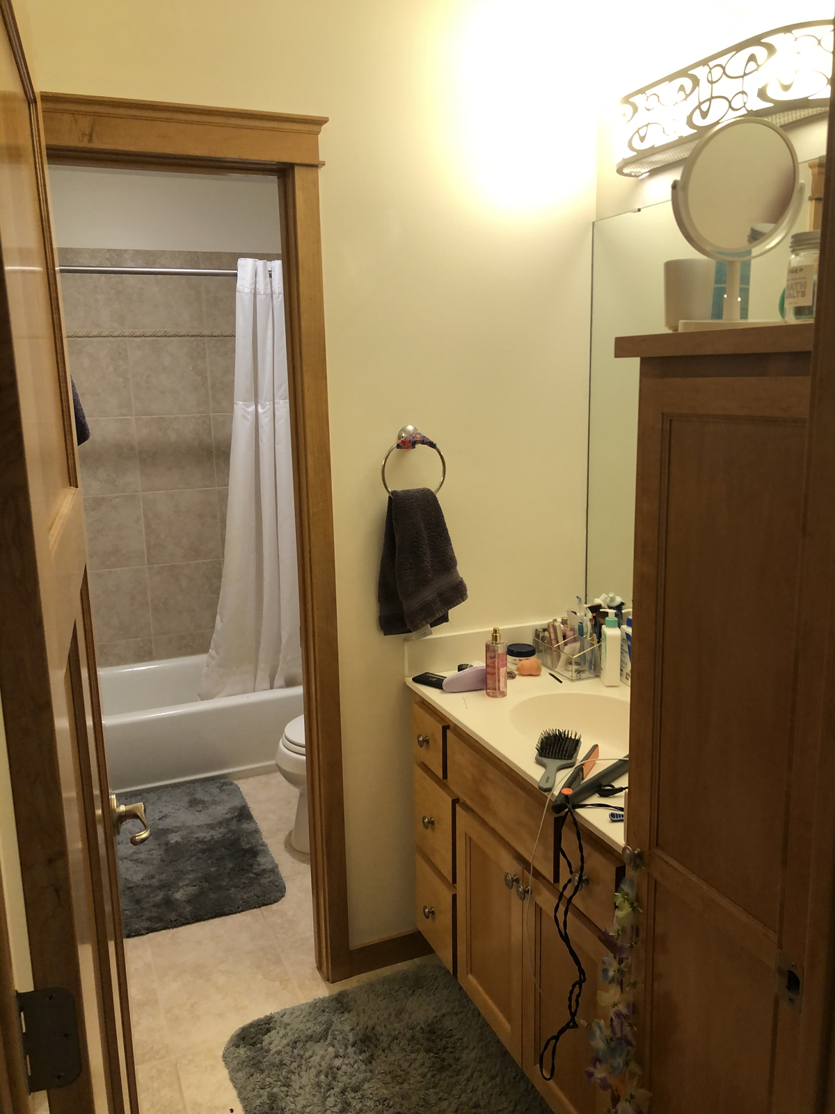
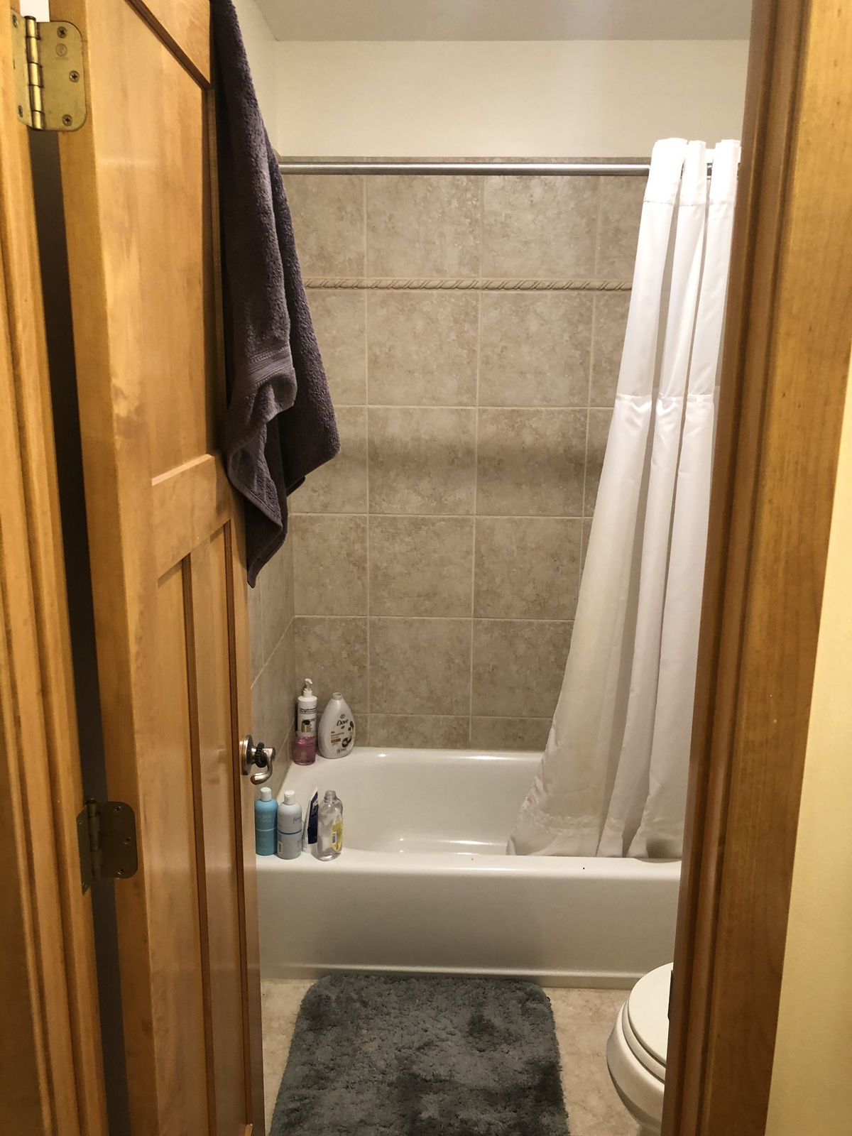
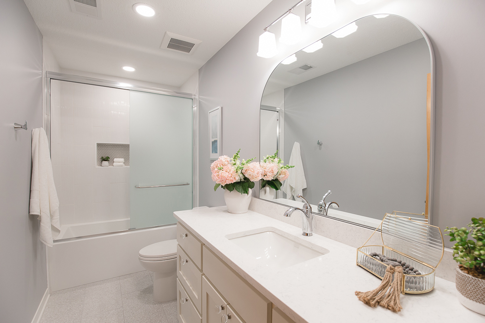
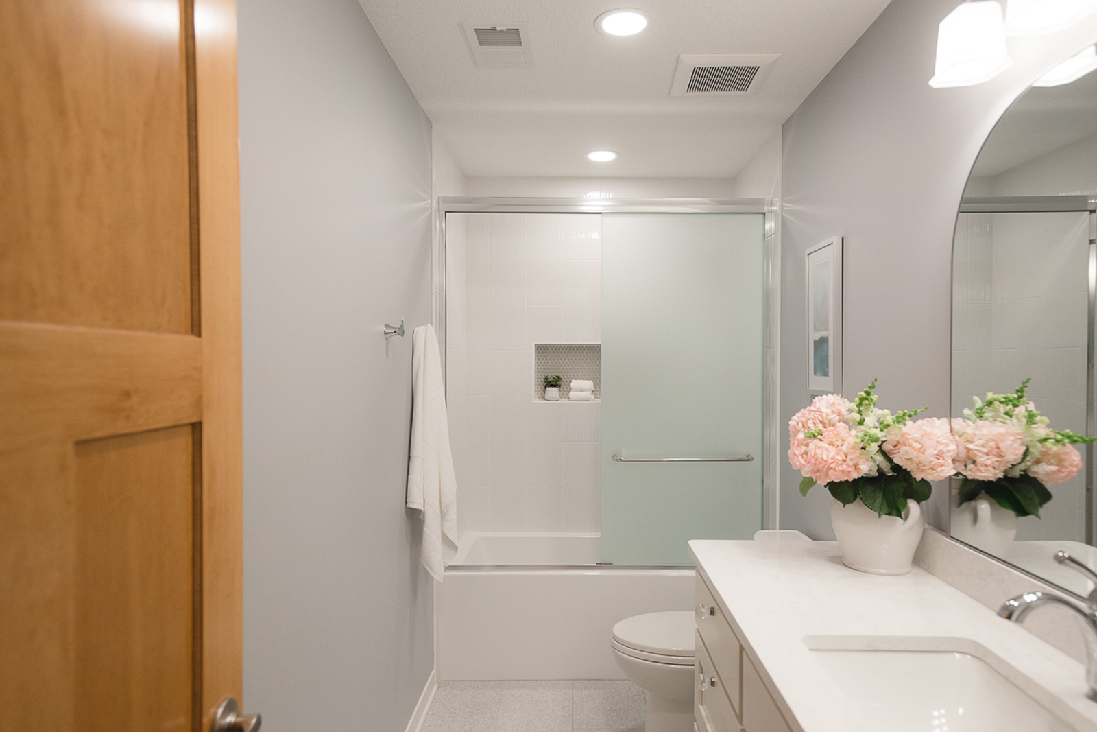
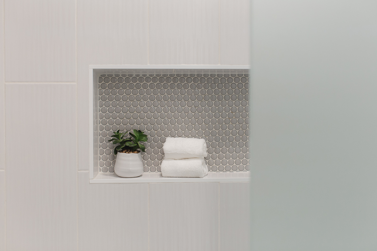
This bathroom felt so small, especially because of the unnecessary door that divided the bathroom. The tile and tub felt drab and dated and the overall aesthetic wasn’t very inspiring for their daughter to get ready in every morning. By removing the division between the tub 7 toilet area from the sink area, the space opened up quite a bit and immediately felt bigger. A new vanity with more thoughtful storage makes storing toiletries much easier. New tile flooring that has a modern, yet retro terrazzo look was one of my favorite selections. The tub was updated, brand new tile with fun penny round accents in the niche, and a new shower system now feels much more grown-up and luxurious. A new custom cabinet with quartz countertops, a lovely arched mirror and much brighter lighting all brought this bathroom up to an entirely new level!
the before
the after
This project is proof that focusing on the smaller rooms of your home can make all of the difference. We hope you enjoyed this latest project reveal and wish you a wonderful weekend!
Stay in the know by subscribing to our blog for upcoming project reveals, design tips and so much more!
XO,
Amy & the Interior Impressions Team
I am wanting ao e help decorating our loft. Thanks!
Hi Cami! We’d love to help design your loft. Please give us a call at 651-337-2184 Monday – Friday, 10:00 – 2:00. We’d love to hear more about your vision for your loft space!