We are excited to share our Hidden Lake Haven project with you. We were introduced to Lisa & Tony from a mutual realtor friend. They were looking to update their home and make it feel a little less heavy and formal. This seems to be a common issue with many of our clients. In the early 2000’s, the look that everyone wanted was very traditional, formal, heavy on fabrics and darker colors. After having lived with that look for 15 – 20 years, many of our clients are asking us to help them to make their homes feel lighter, brighter and more current in style. This home was in that situation exactly. Some rooms just needed a cosmetic “Refresh”, while others needed a full remodel to satisfy to Lisa & Tony’s current wish list.
the bathroom
The primary bathroom needed the most work. It felt dark, dated and the shower and bathtub did not entice anyone to use them. The vanity countertop was cultured marble, the toilet was bisque colored, the bathtub had boring beige square tiles around it, and the shower had a metal track sliding door with a fiberglass shower wrap. The plumbing fixtures and tile floor also needed updating.
BEFORE photos

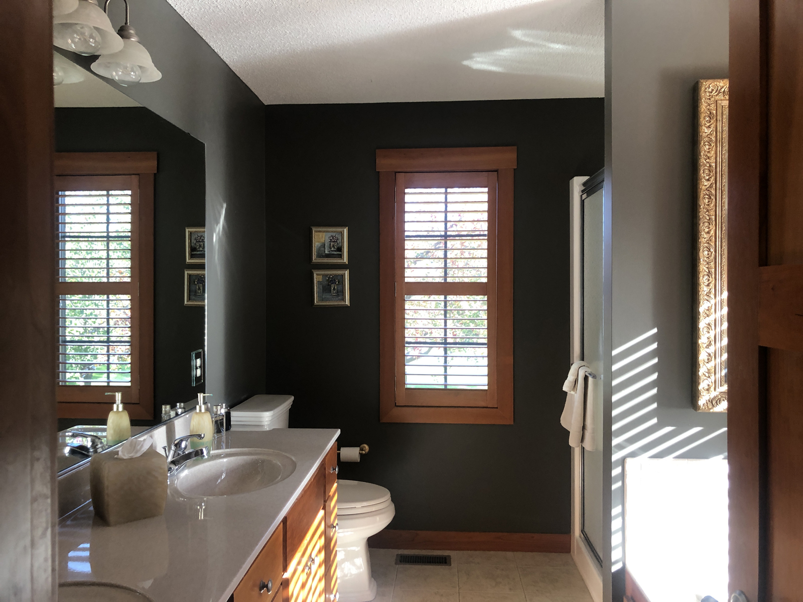
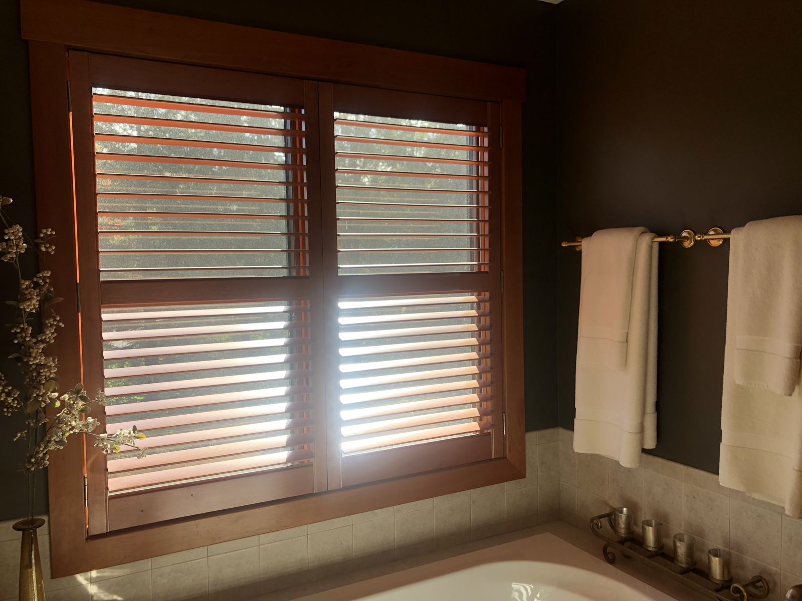
AFTER photos
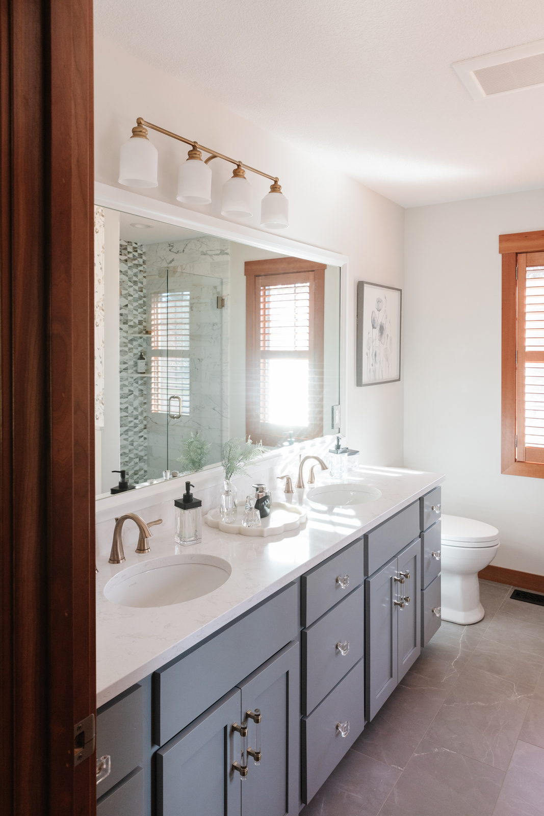
Let the sun shine in! We brought in a very happy, light and bright color palette to give this bathroom an entirely new feel. Here’s the list of everything we changed:
New floor tile that is porcelain but looks like gray marble with white veining
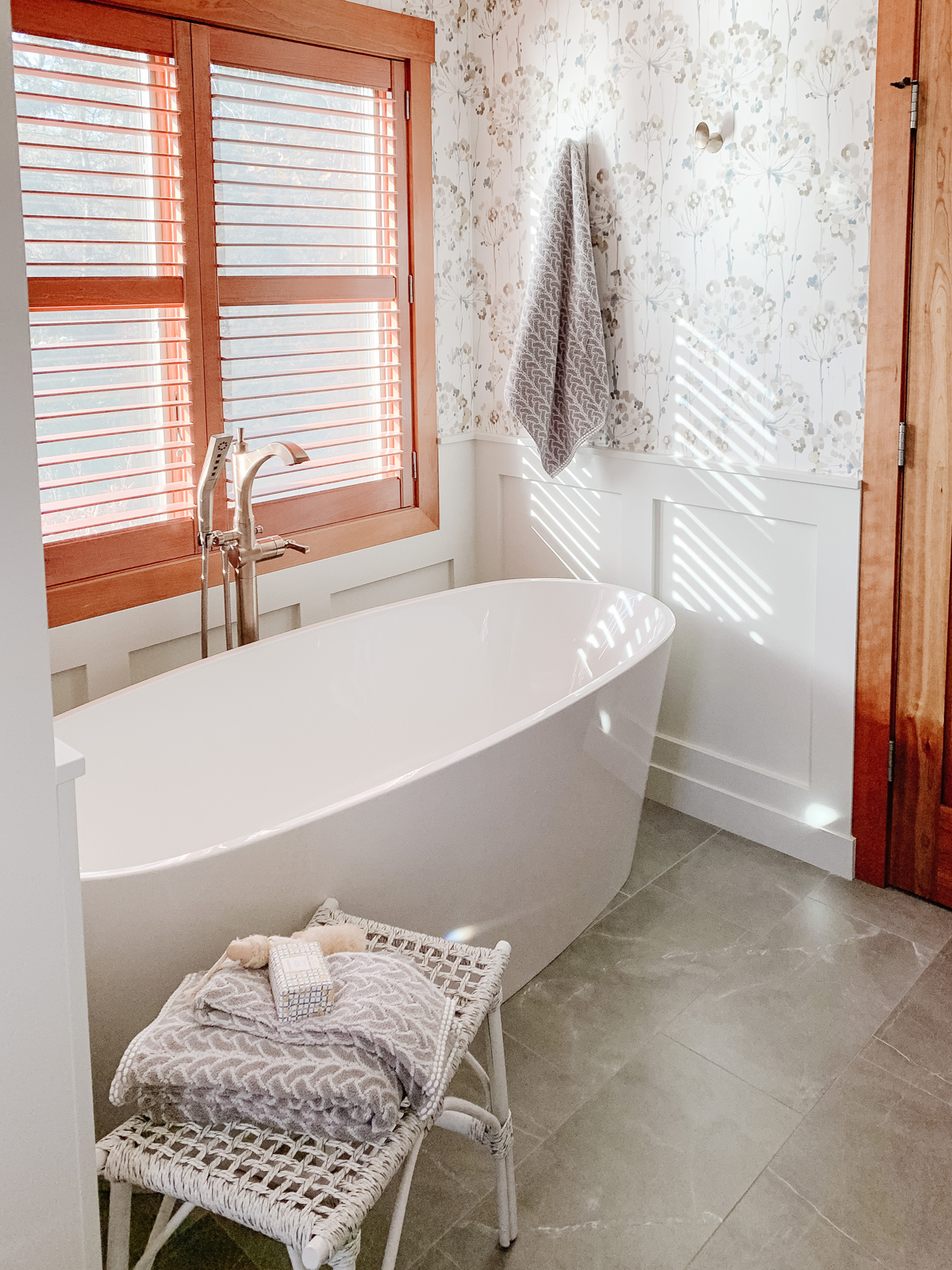
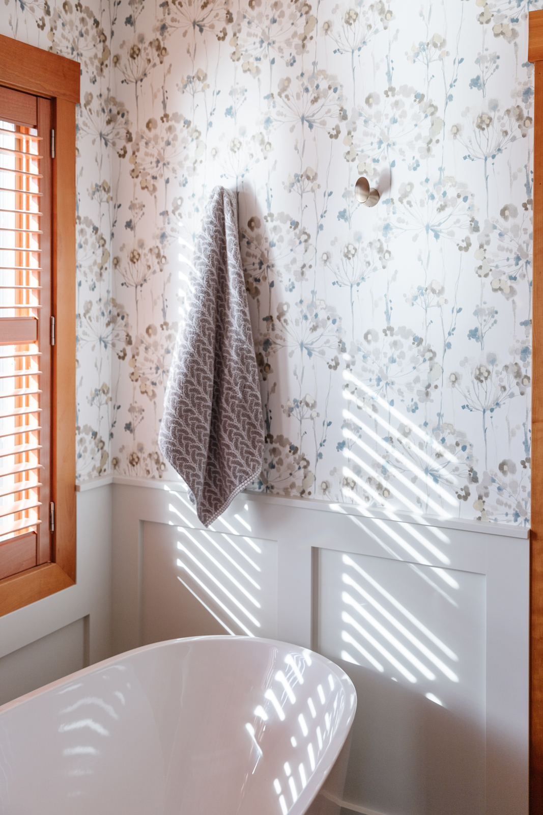
We removed the built-in bathtub and brought in a luxurious free-standing tub with a gorgeous brushed gold floor-mounted tub filler
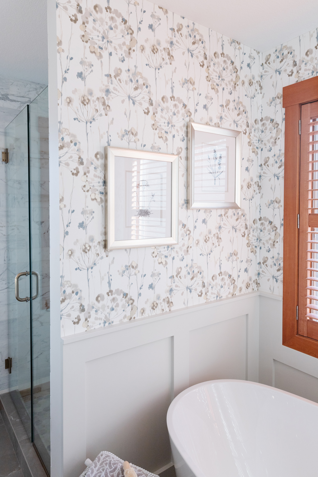
We added custom millwork/wainscoting to add character to the alcove surrounding the bathtub.
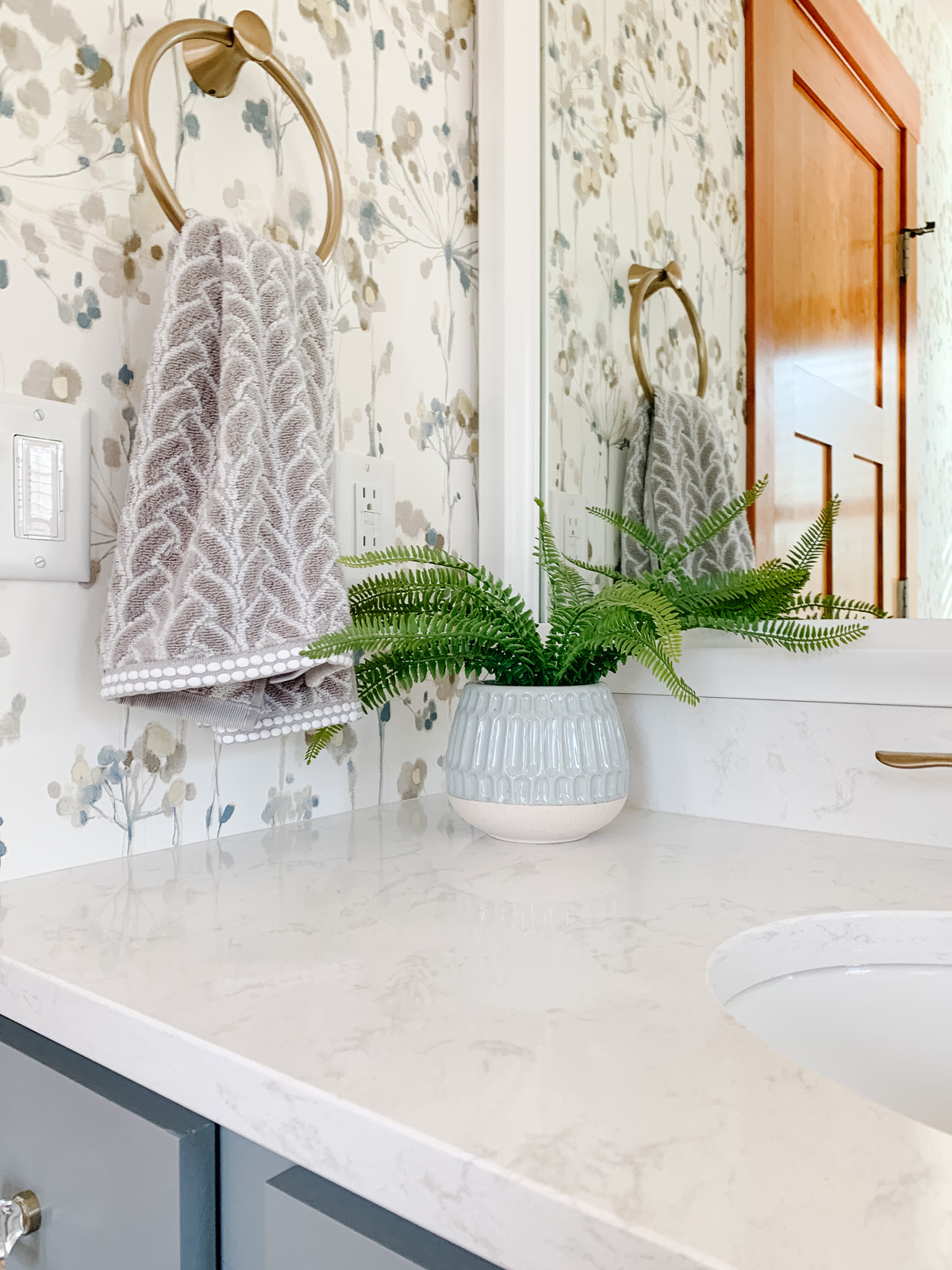
A beautiful floral wallpaper was added above the wainscoting to make the tub alcove feel extra special.
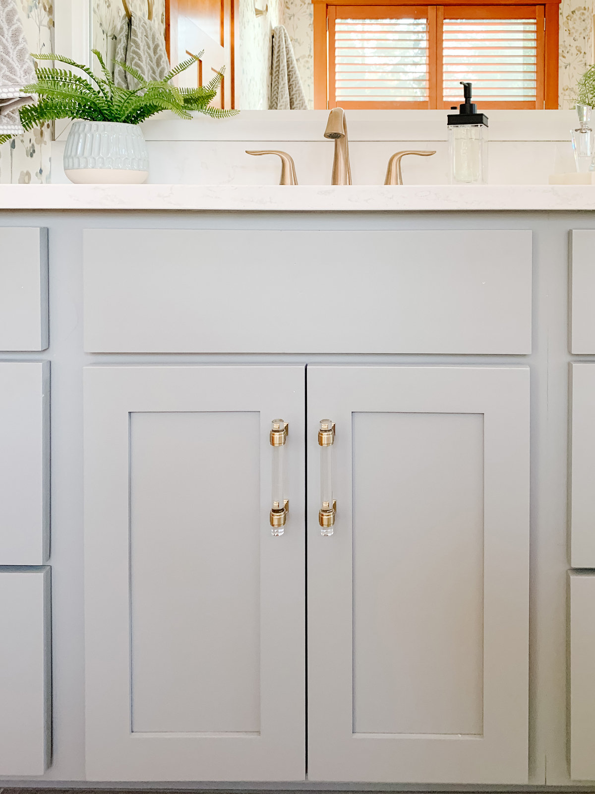
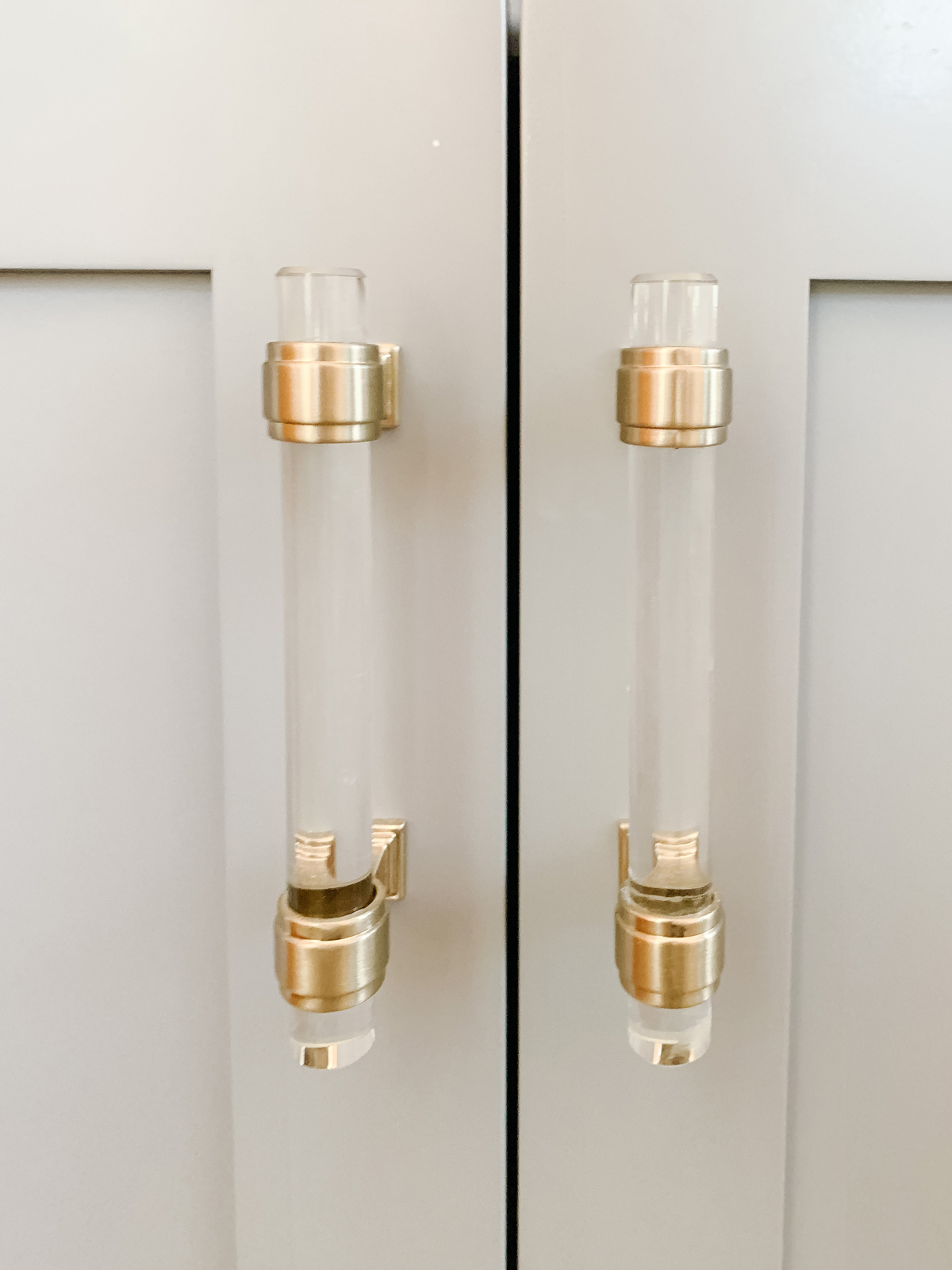
We kept the current vanity but gave it a fresh look by painting it a beautiful sky blue color and adding acrylic and brass cabinet hardware.
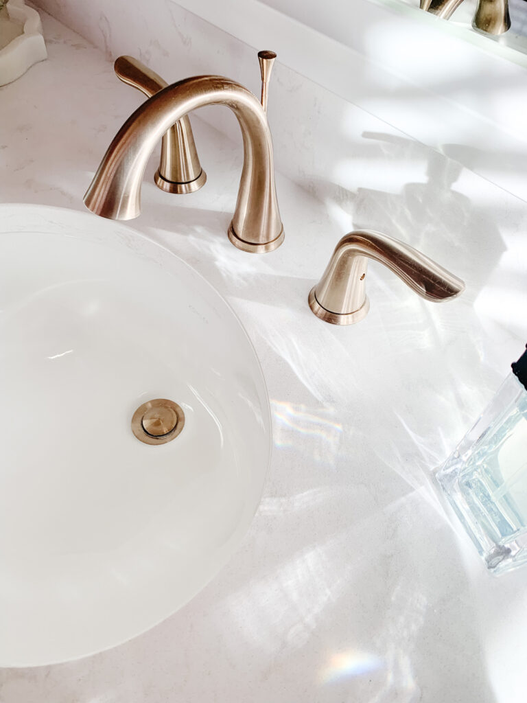
Beautiful Cambria quartz countertops, undermount porcelain sinks and brushed gold faucets add glamor and functionality.
The plate glass mirror was framed out with a custom white frame.
A new light fixture in brushed gold adds more lighting to the room.
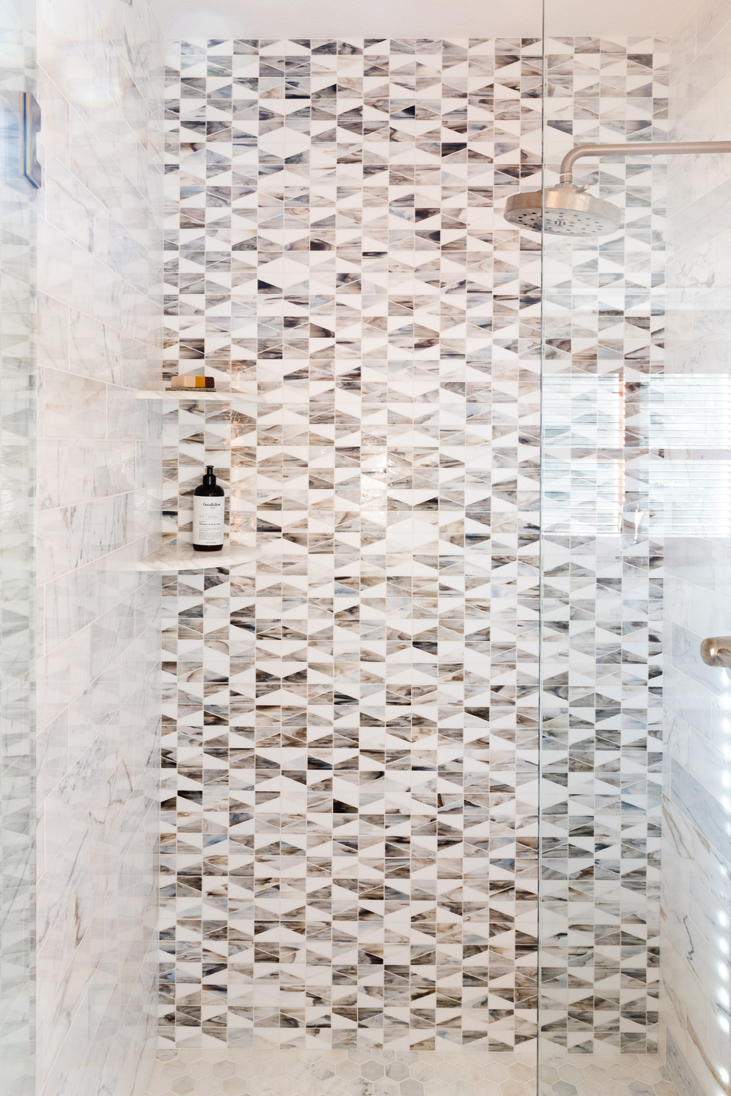
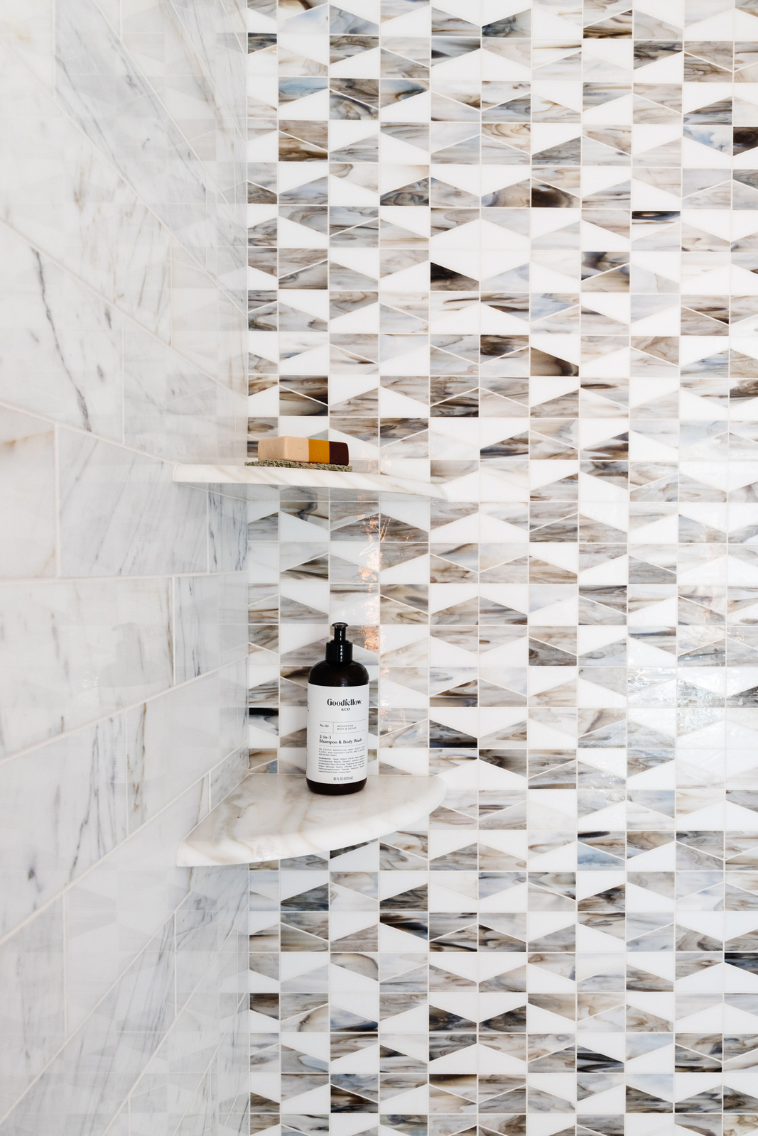
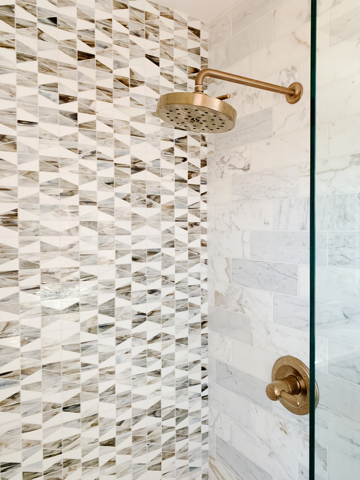
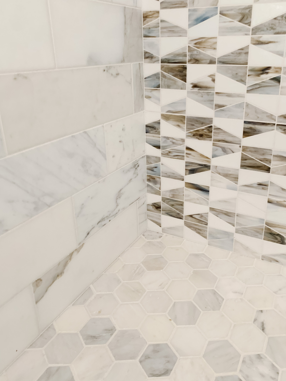
The shower got a huge upgrade with cararra marble subway tile on the walls, and in a hexagon pattern on the shower floor. We added an accent wall with a milk glass mosaic pattern to bring in more color and contrast. A frameless glass shower door and new plumbing fixtures brought this shower up to a spa-worthy level!
the lIVING ROOM
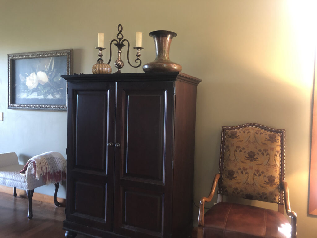
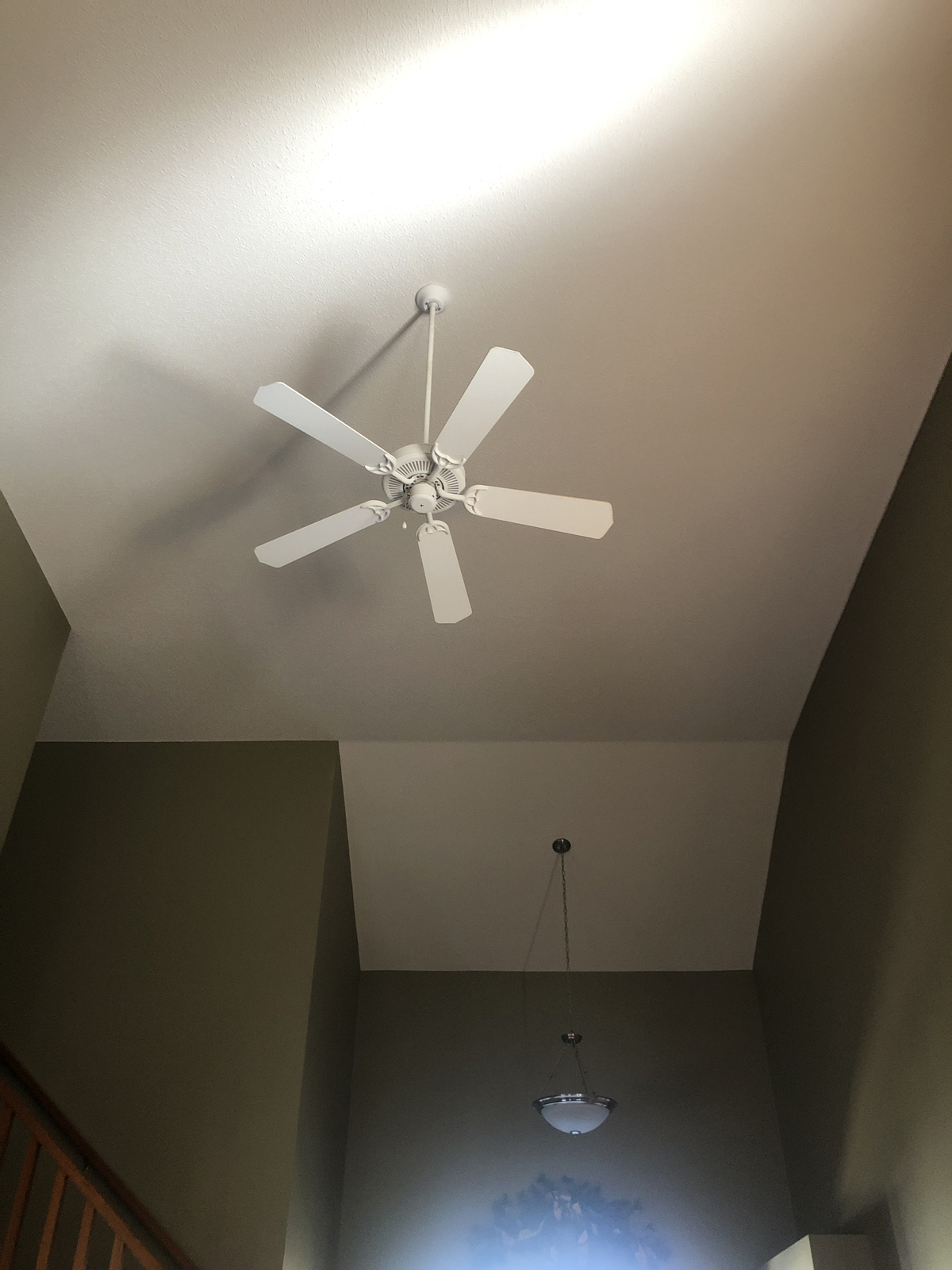
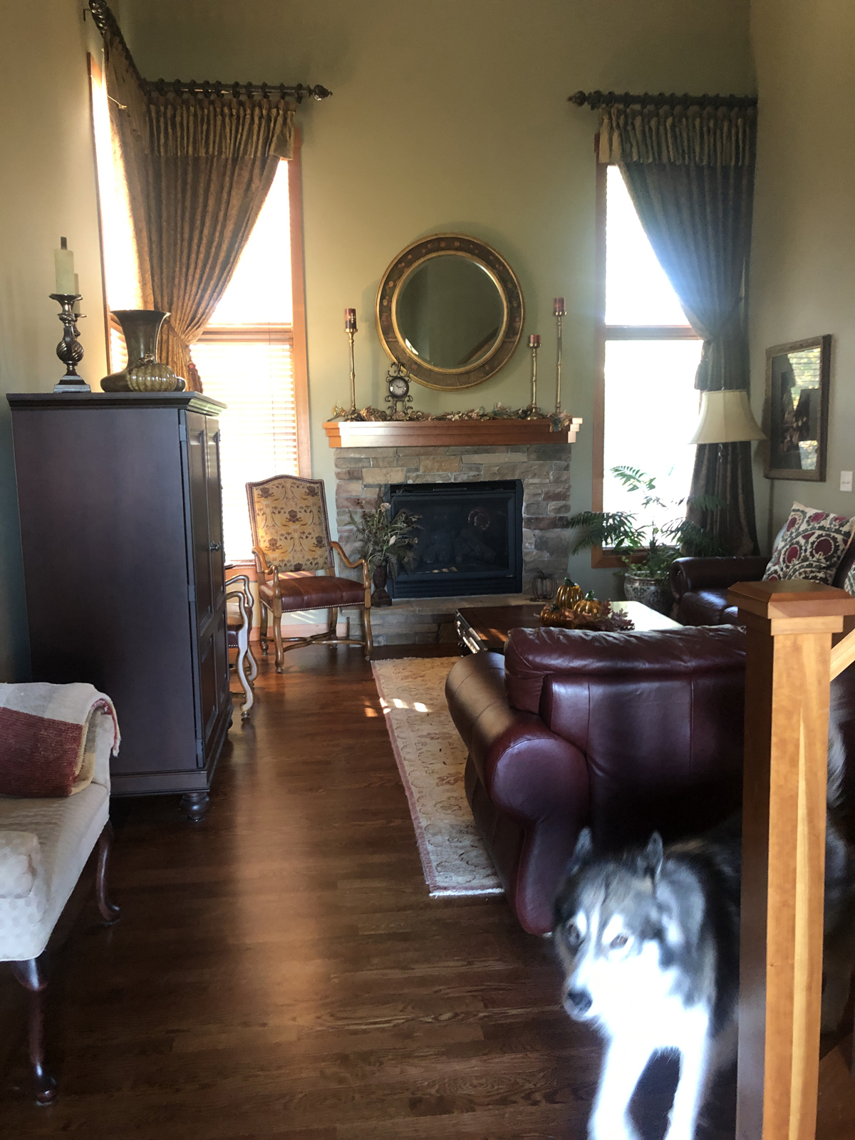
The living room had very heavy draperies, dark wall paint, and uncomfortable furniture. Everything was very formal and didn’t feel very inviting. The armoire only allowed for a small tv to be held inside. We did love their current area rug and decided to keep it, so we used that as the jumping off point for the color palette.
BEFORE PHOTOS

AFTER PHOTOS
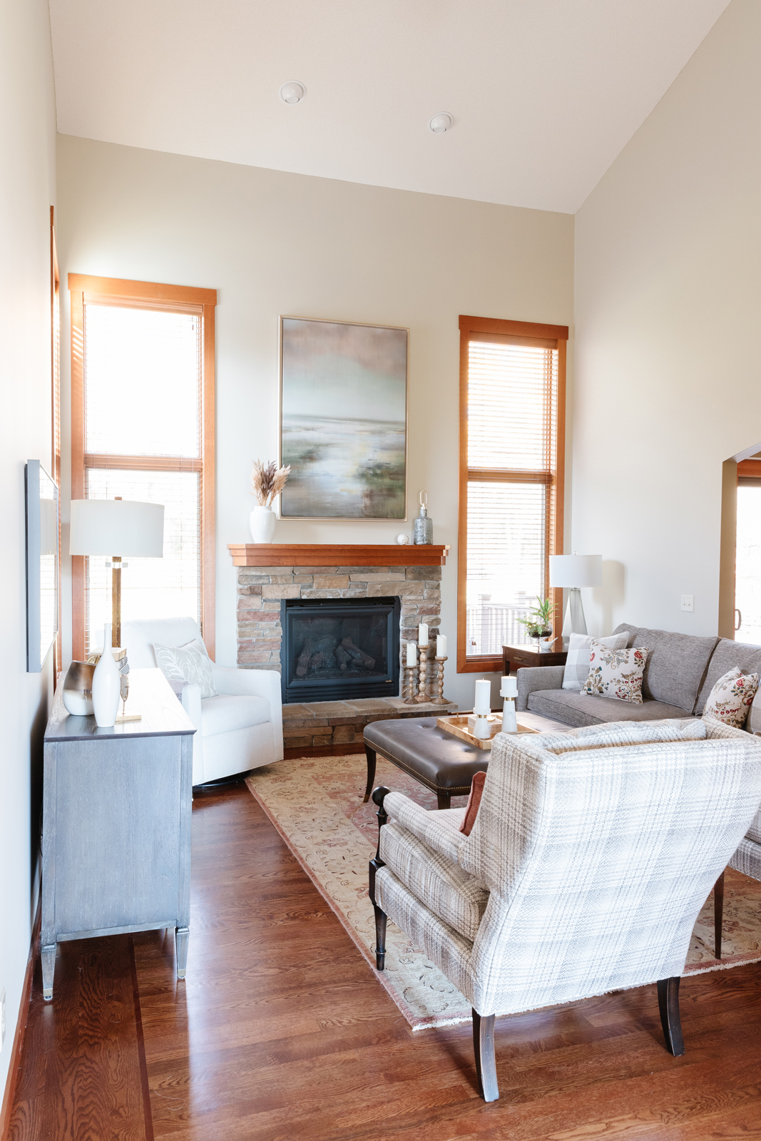
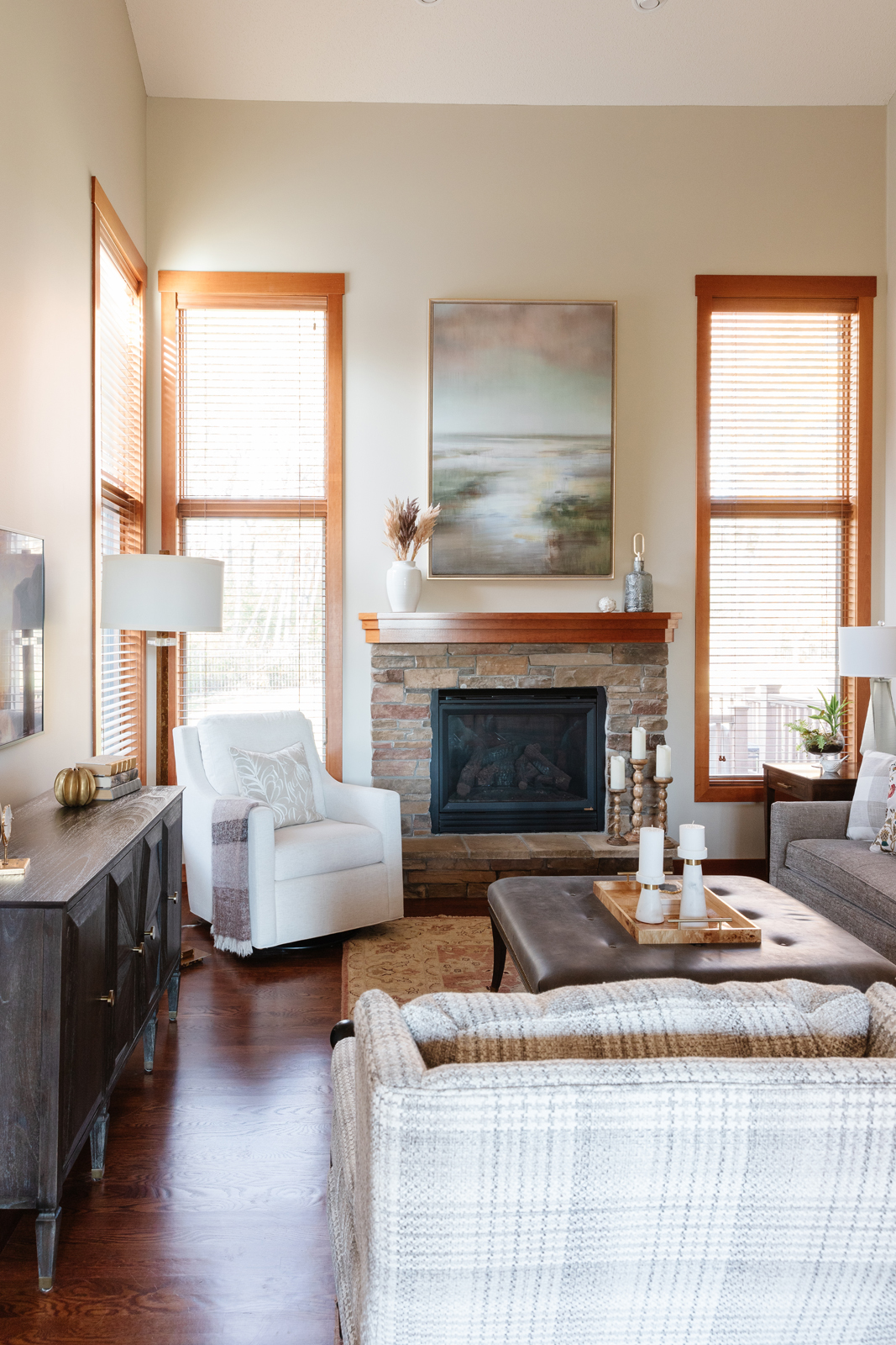
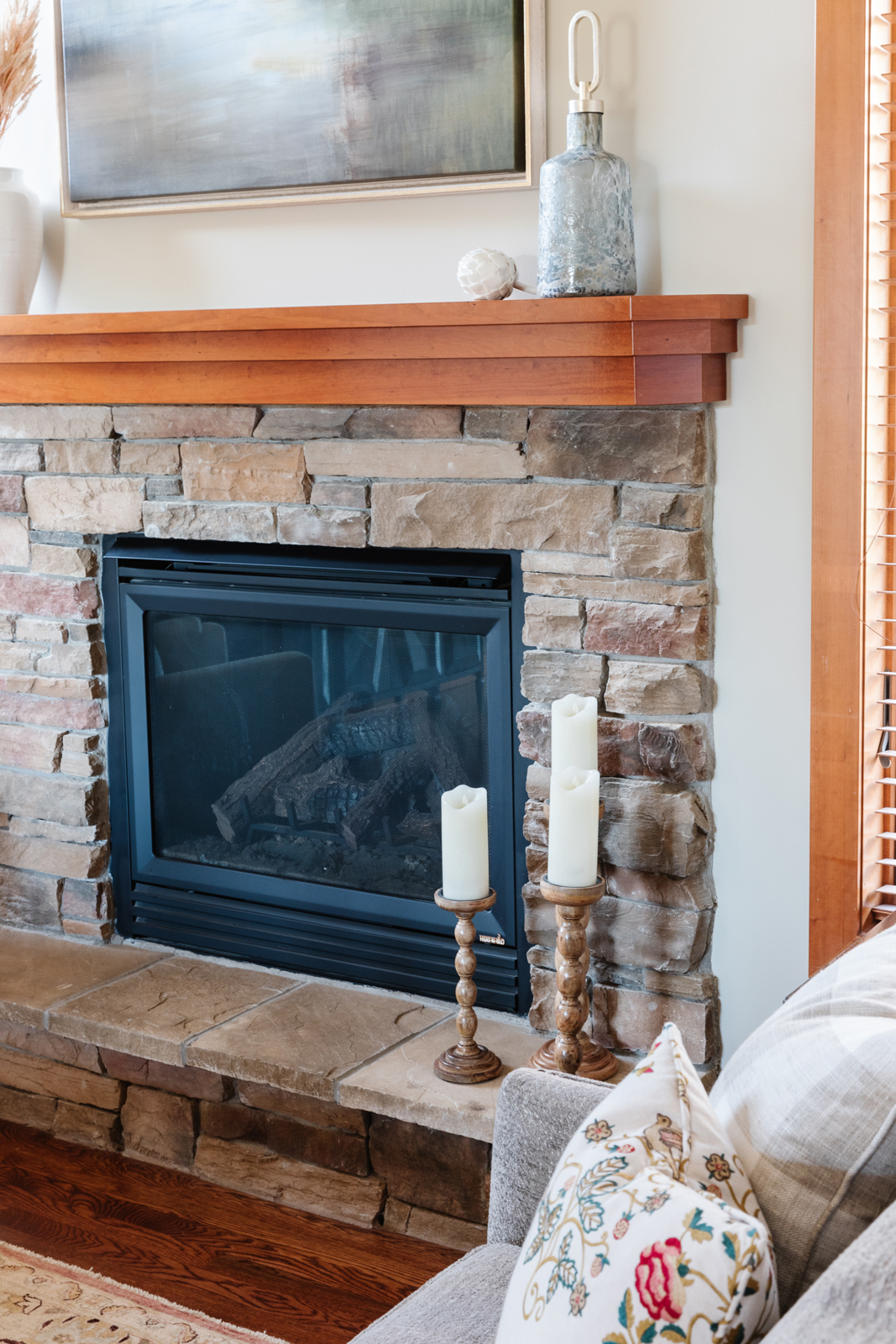
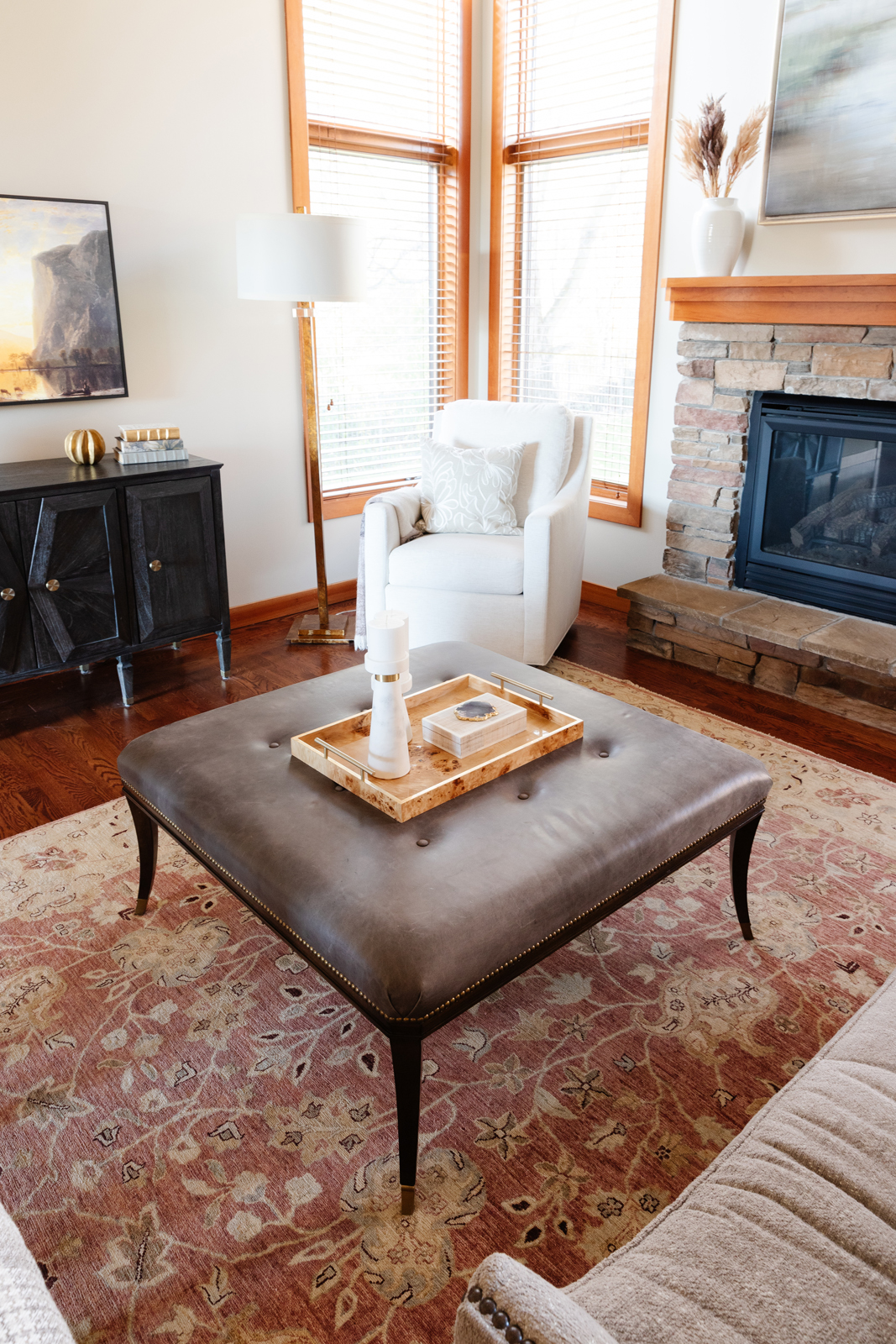
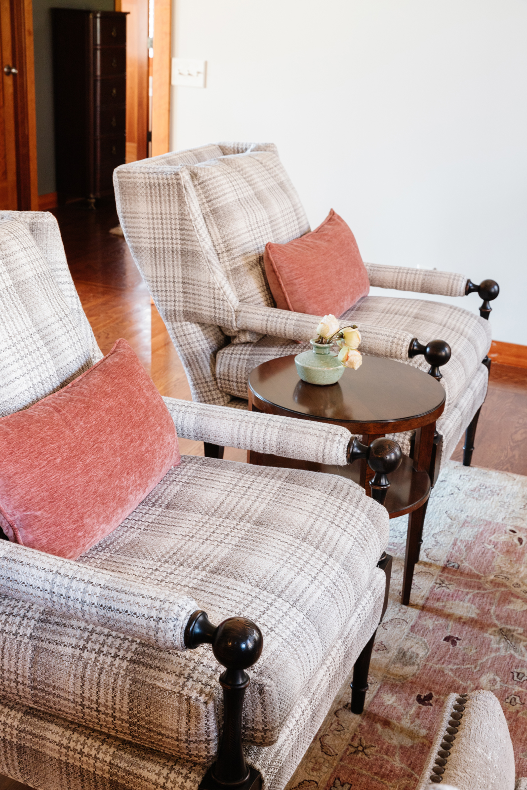
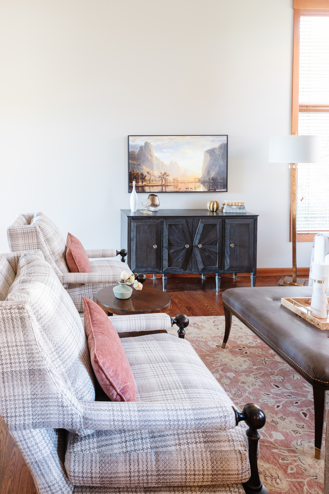
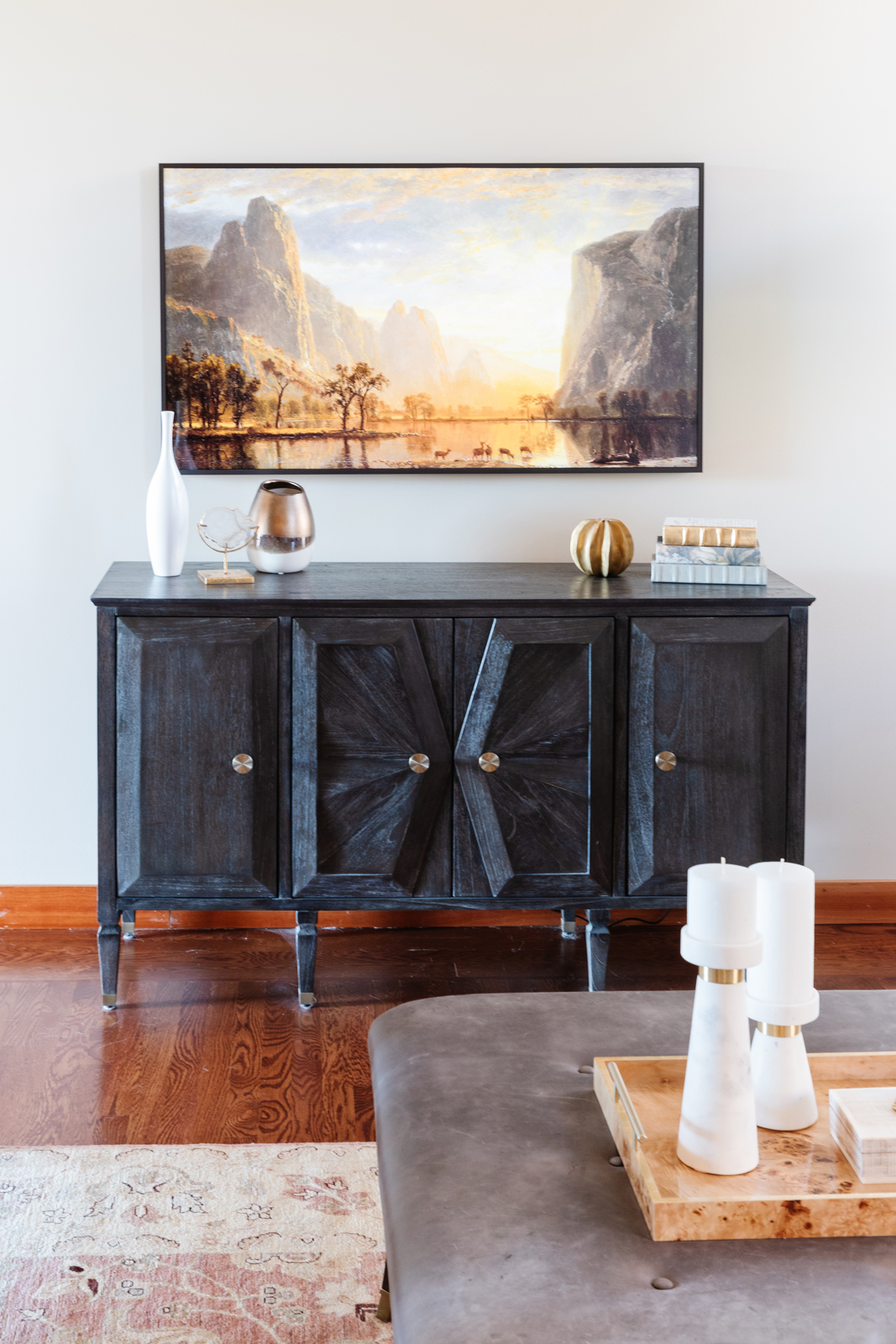
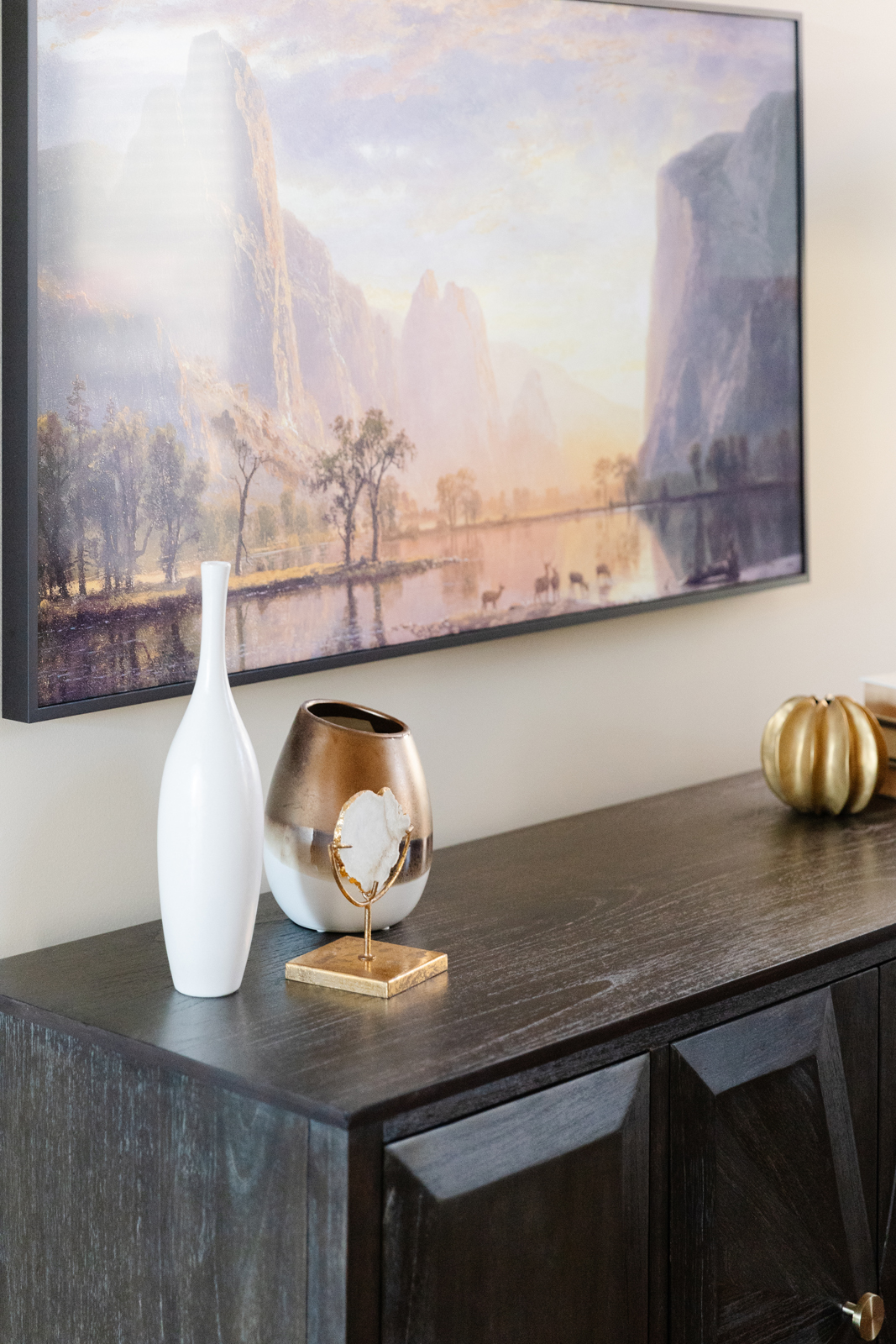
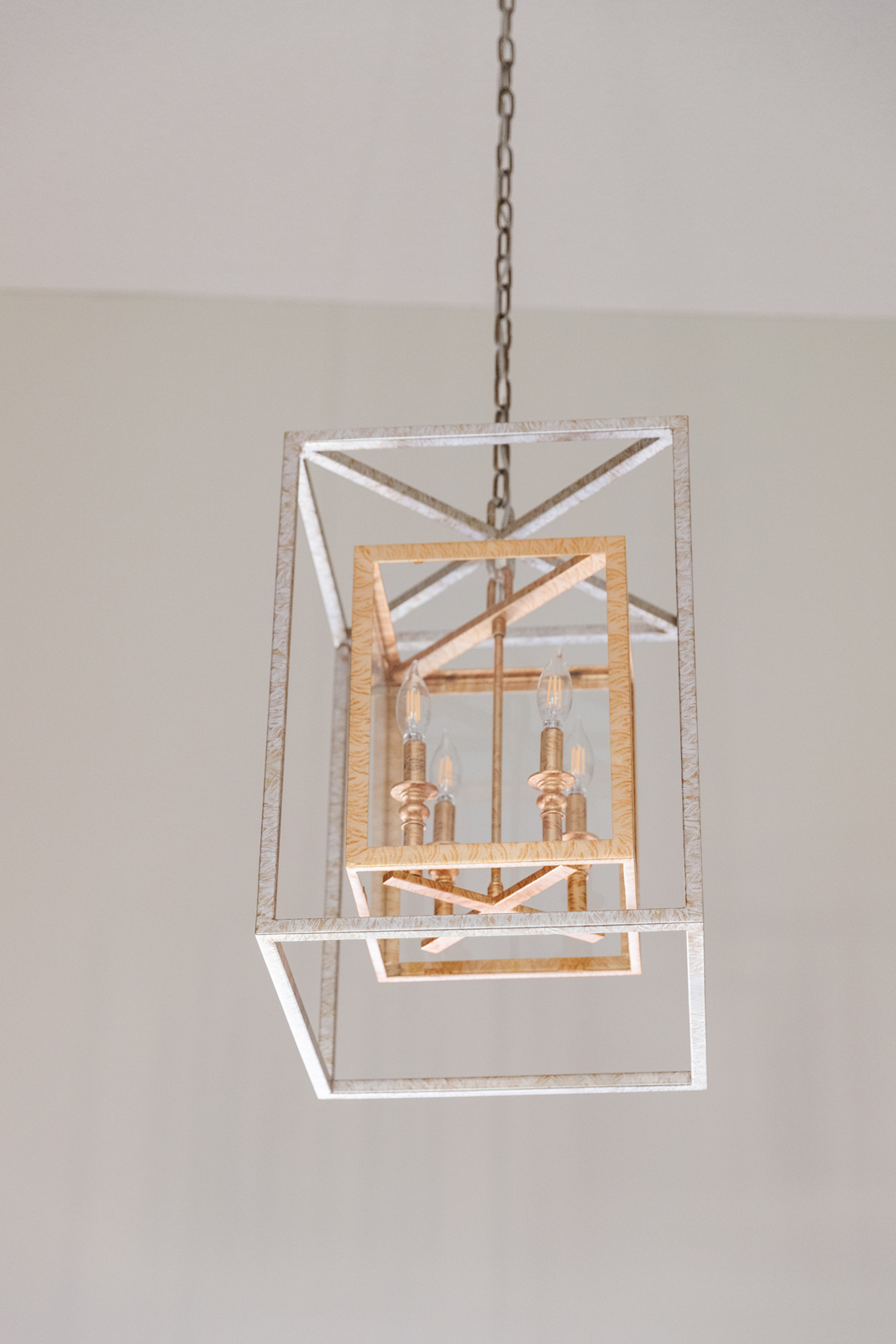
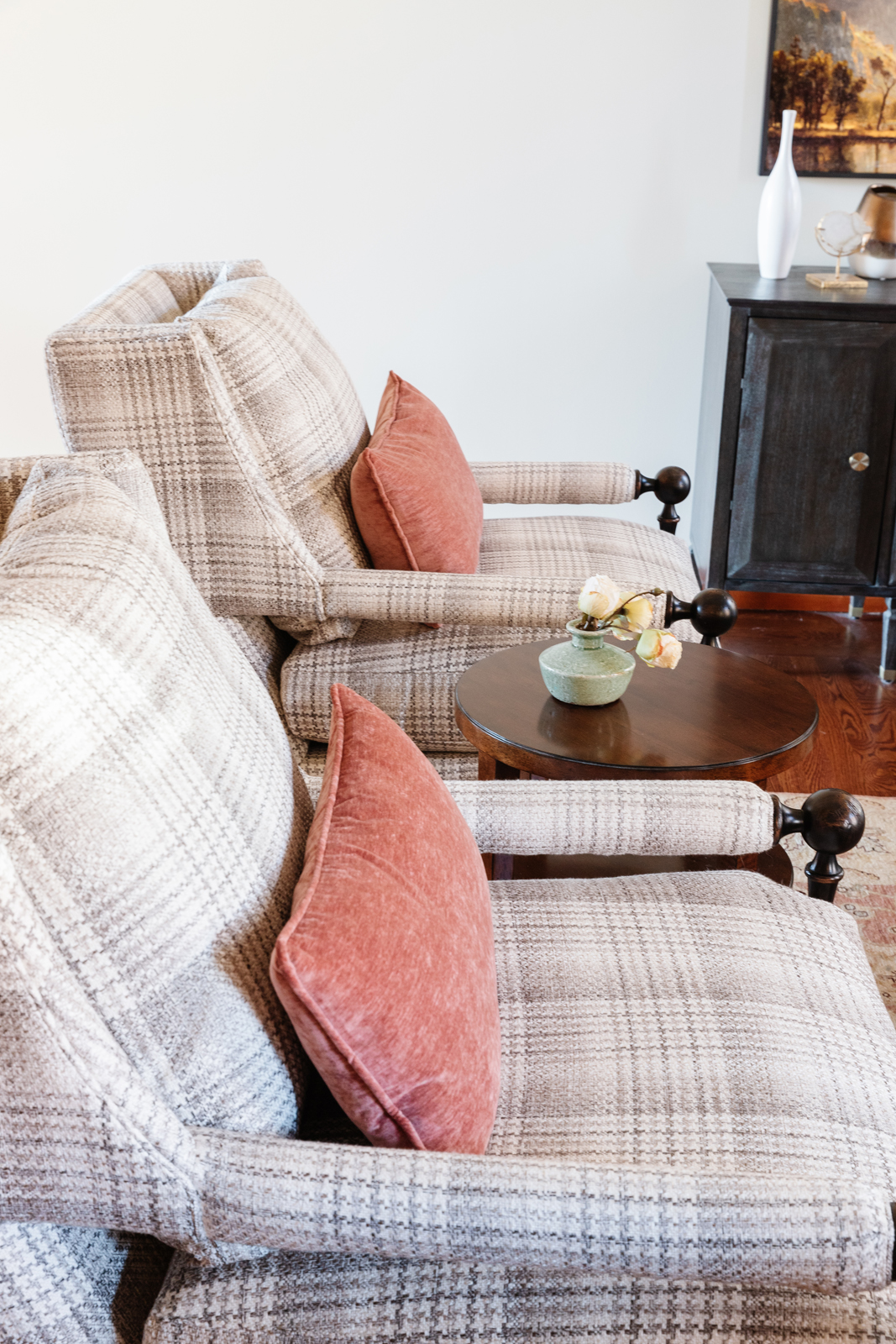
Removing the draperies made an instant difference! We lightened up the walls and made the entire main living space and foyer feel light and bright. All new furniture was custom made to curate the perfect colors and patterns. and all of the furniture pieces are very comfortable – bonus!! New artwork, all new end tables and accent tables with beautiful wood finishes pull together the new transitional look. A new wall-mounted Samsung frame tv allows for a larger scale tv that is so pretty, you don’t have to hide it. The final touches of new lamps and accessories make sure that every detail is thoughtfully curated to make the room oh-so-perfect!
the sitting room
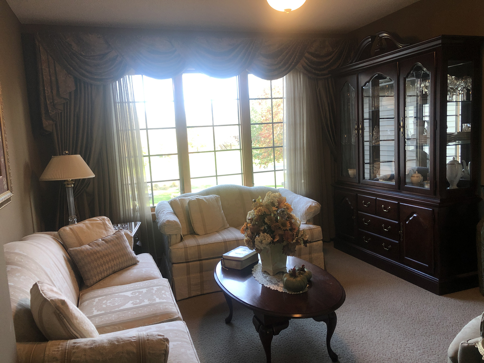
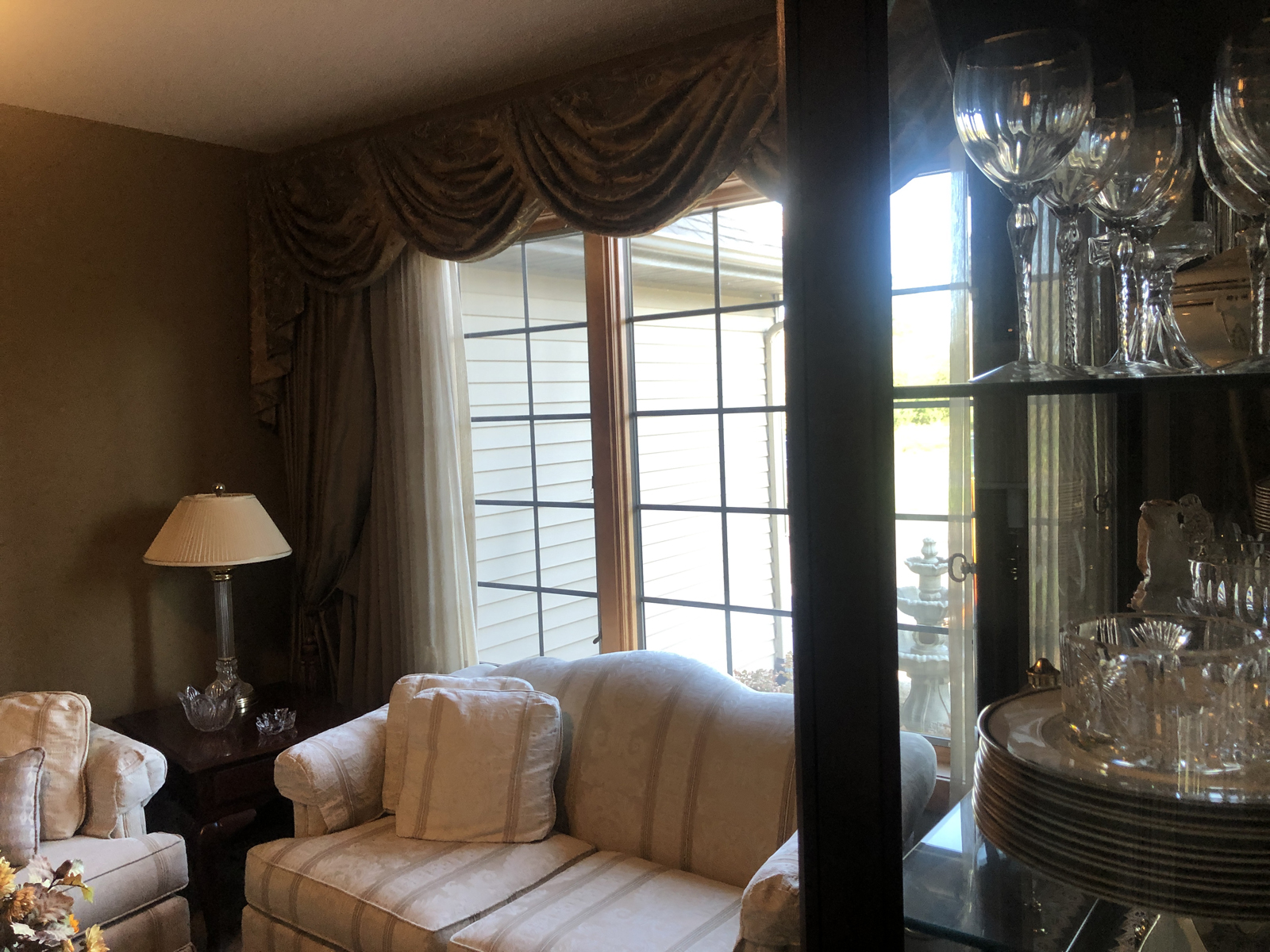
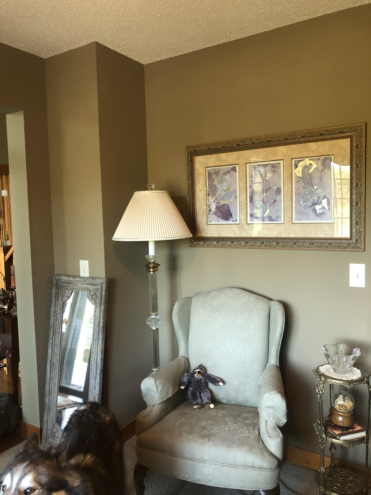
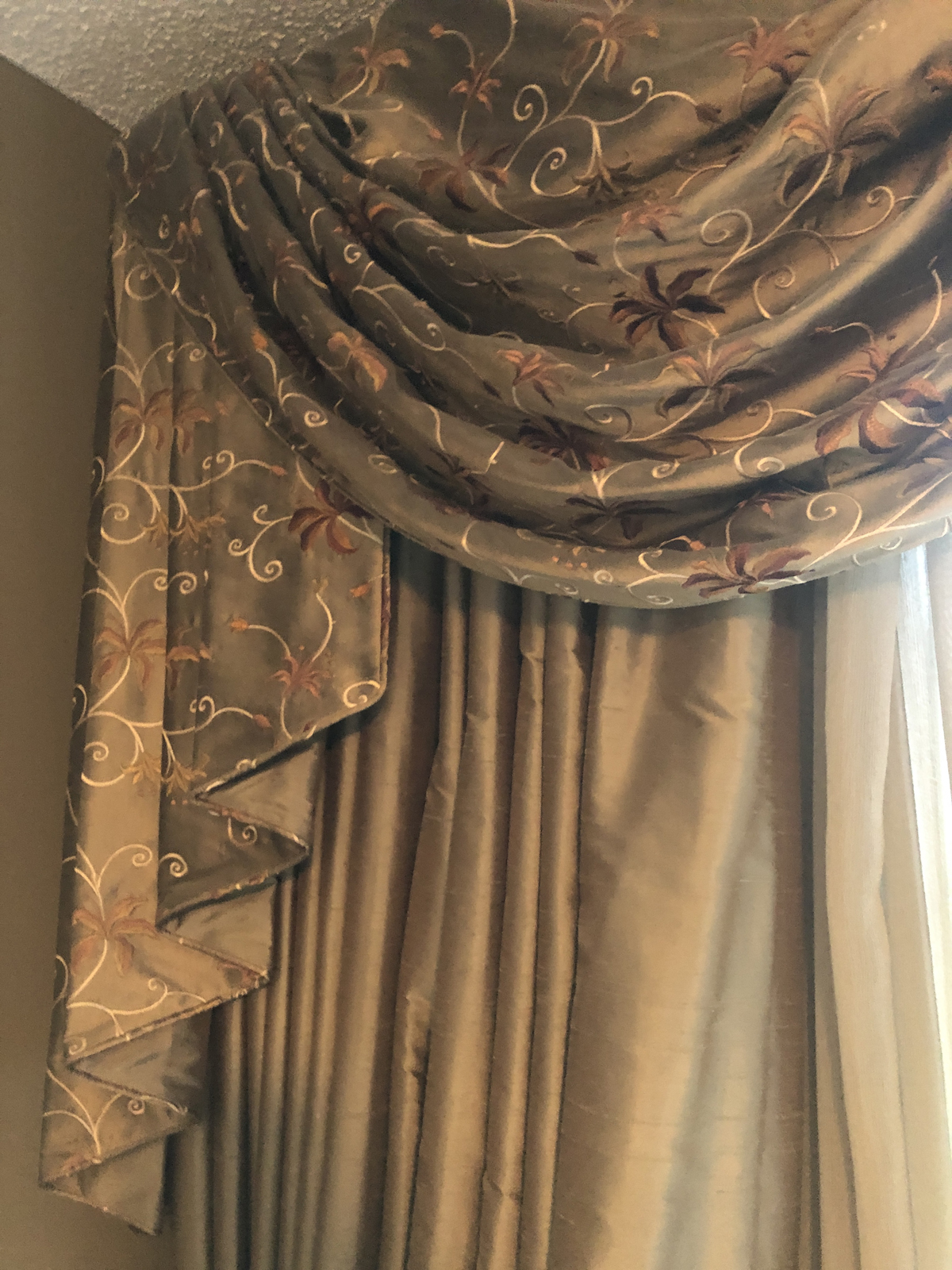
The front room was a formal dining room at one point, but had become a sitting room to serve as a retreat for Lisa to read, relax, or socialize with friends. Once again, the heavy draperies, swags and jabots made the room feel overpowered. The furniture was very formal and not super comfortable. The room felt cramped and dark.
BEFORE PHOTOS

AFTER PHOTOS
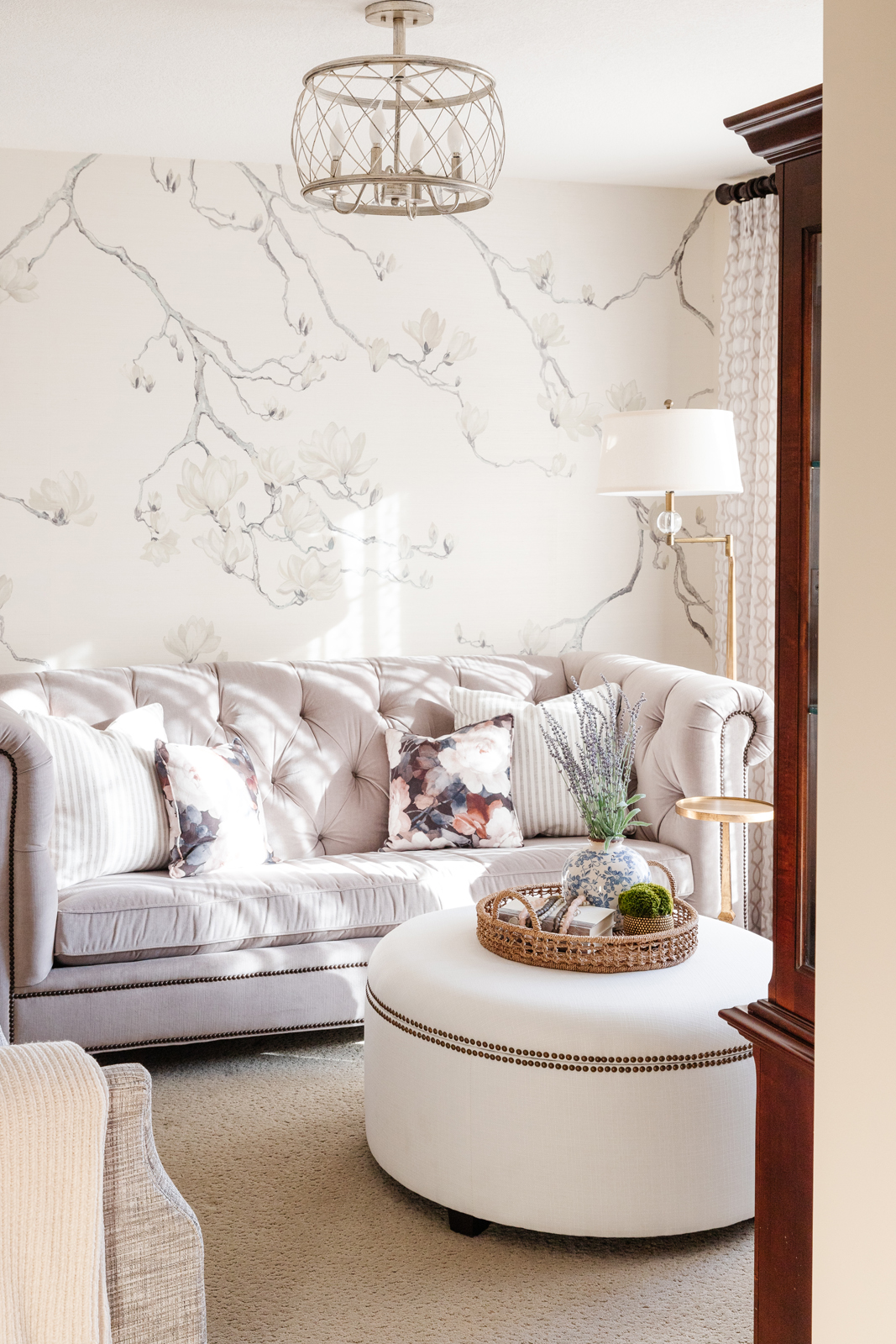
The inspiration and starting point for designing this room was the gorgeous wallpaper that we fell in love with. The textural linen makes the lovely dogwood tree pattern extra special. New semi-sheer draperies, new drapery hardware and a lighter paint color allow the room to feel so much brighter and spacious. A new light fixture, floor lamp and table lamp bring in much more functional lighting as well. All new furniture, custom pillows, new artwork and accessories, make this room a favorite place to hang out!
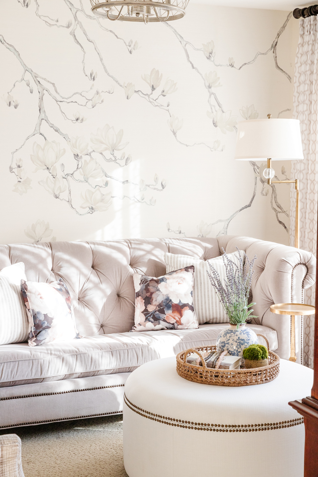
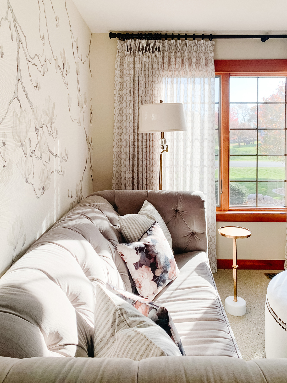
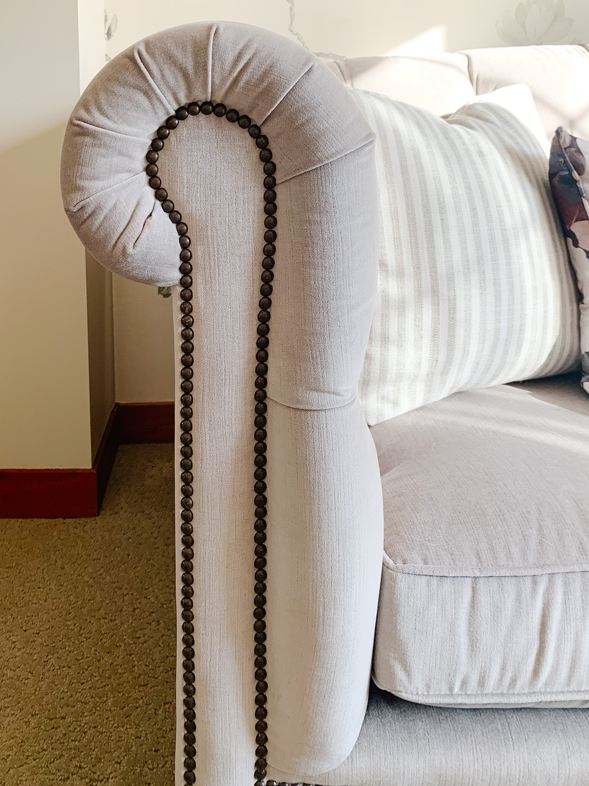
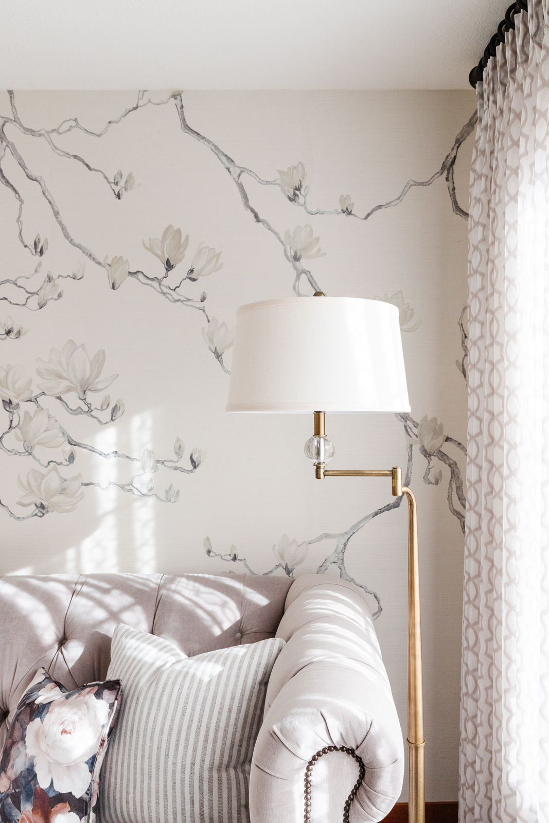
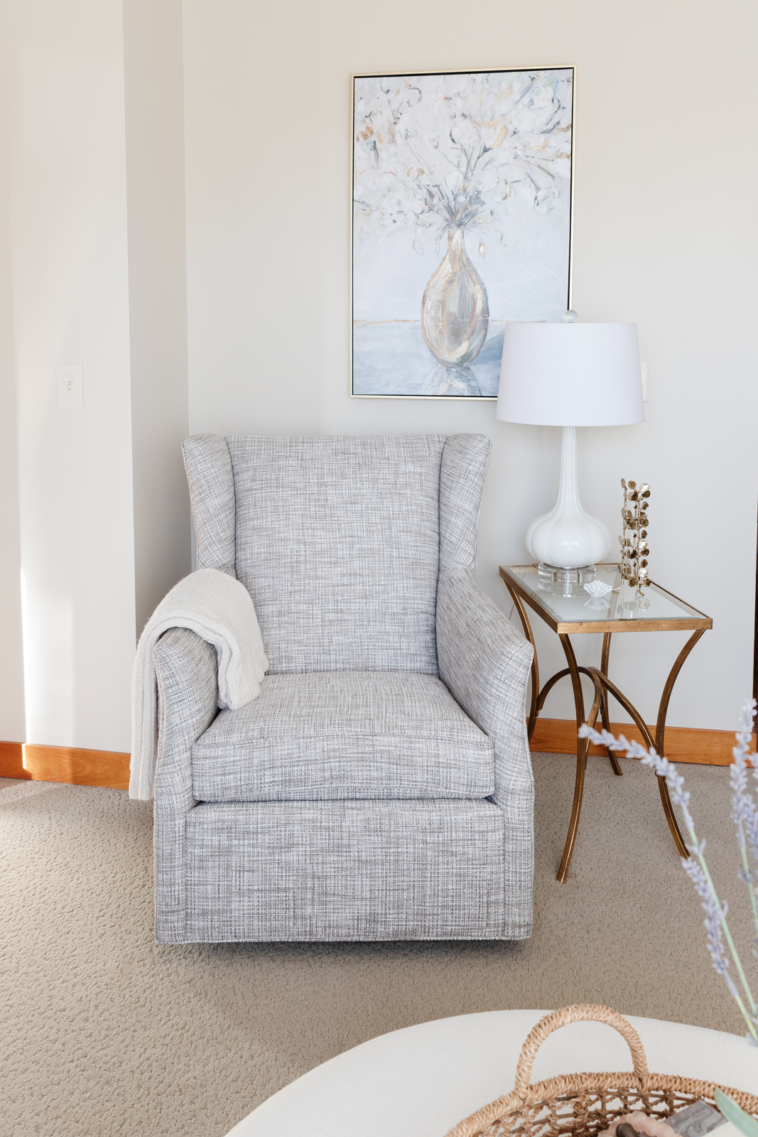
We hope you enjoyed seeing the transformation of these rooms. We absolutely loved working with Lisa and Tony and are now working on Phase 3 remodeling plans for other rooms! Do you have a special place in your home that you like to escape to for a little quiet time? If not, we’d be happy to create a haven for you in your home too!
XO,
Amy & the Interior Impressions Team
What paint colors did you use in the bathroom?
Hi Eric, We used the following colors: Cabinet paint color – African Gray SW 9162. Wall paint color – Aesthetic White SW 7035