Welcome to part 2 of the Classic Elegance project. We had the pleasure of making over several rooms in this beautiful home. One of my favorite spaces, and the homeowner’s favorite place to hang out, is the sun room.
THE SUN ROOM
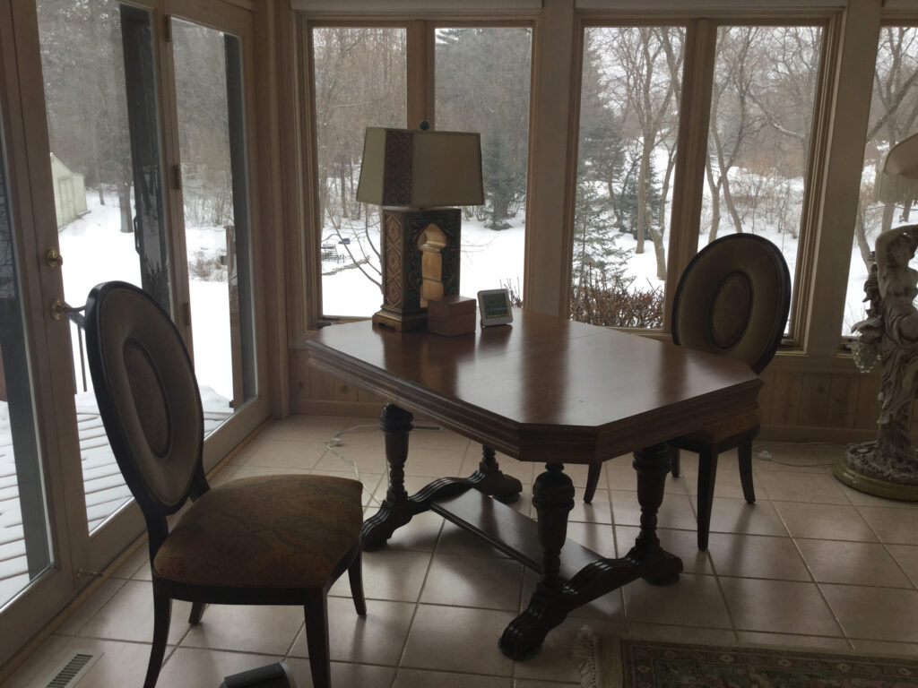
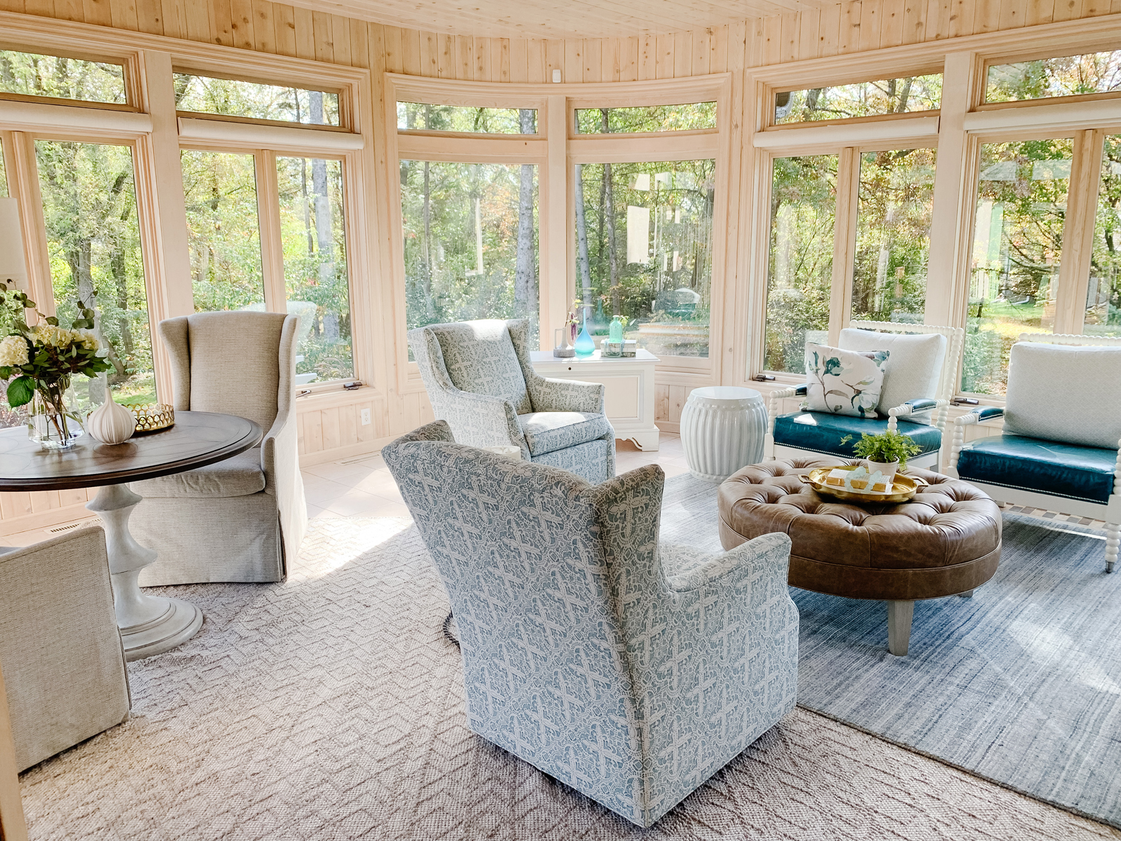
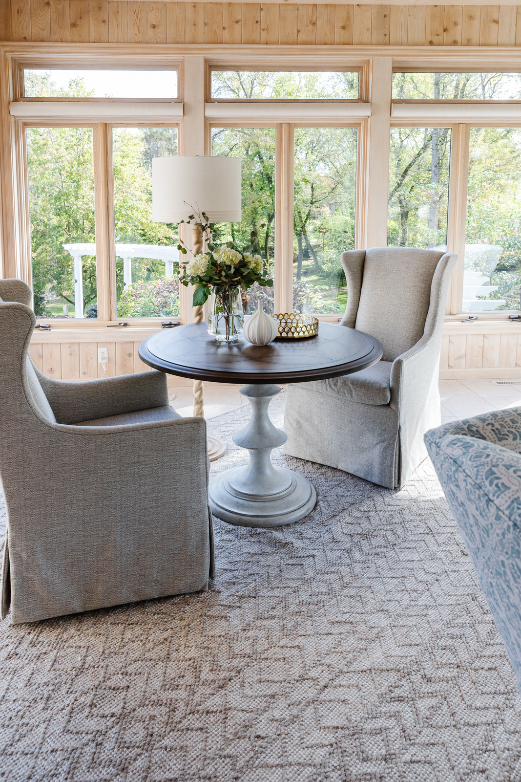
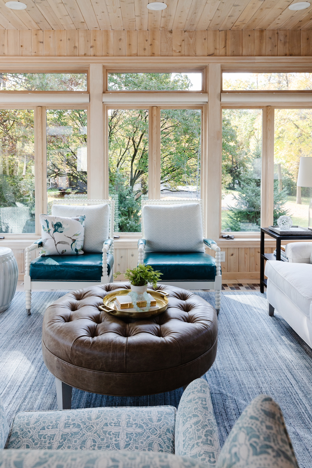
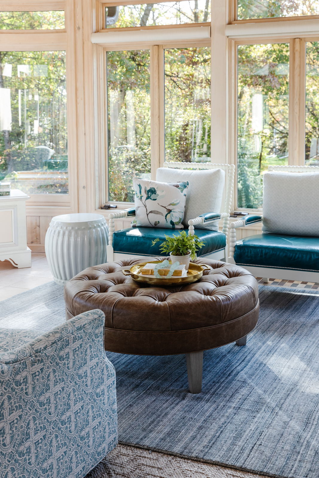
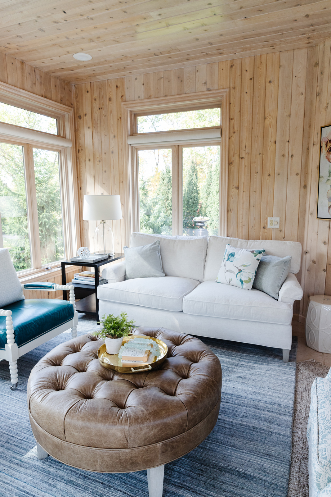
This room is filled with windows and has fabulous views of the wooded back yard. We decided to keep the walls the washed pine finish rather than paint it. This room only needed updated furniture, as their current furniture was heavy and a little too formal for the space. We brought in lighter fabrics and cozy furnishings that make spending time in this room more comfortable and functional. We created a zone with a table and chairs for casual dining, or doing crossword puzzles. The seating area provides plenty of room for guests to enjoy conversation and a glass of wine.
the before



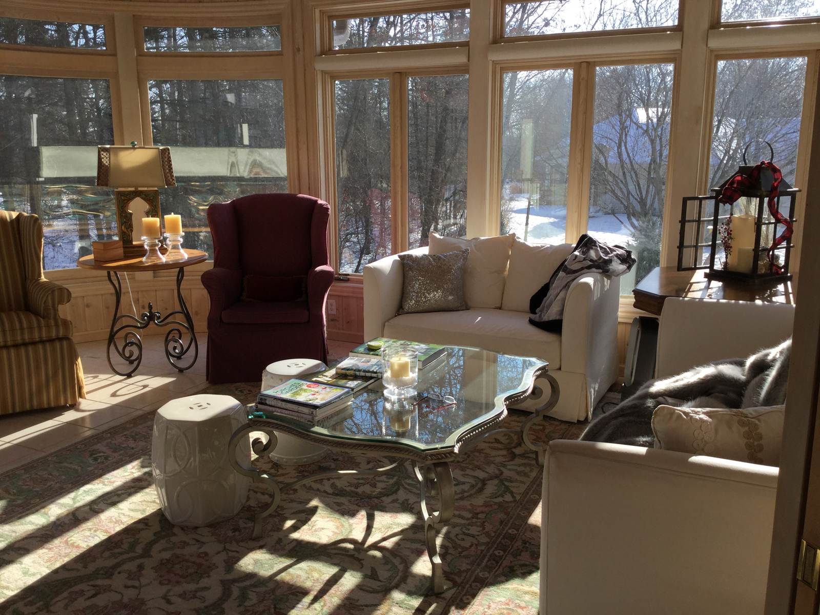
the after
The LOWER LEVEL bathroom
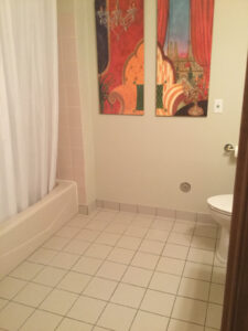
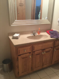
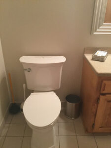
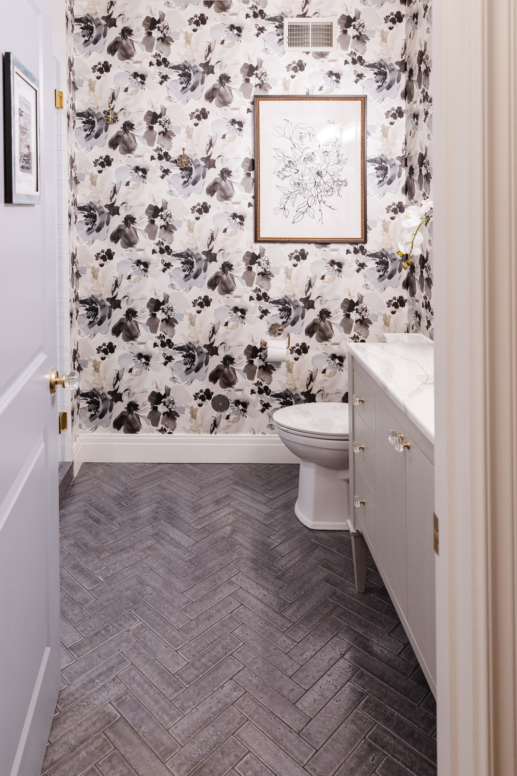
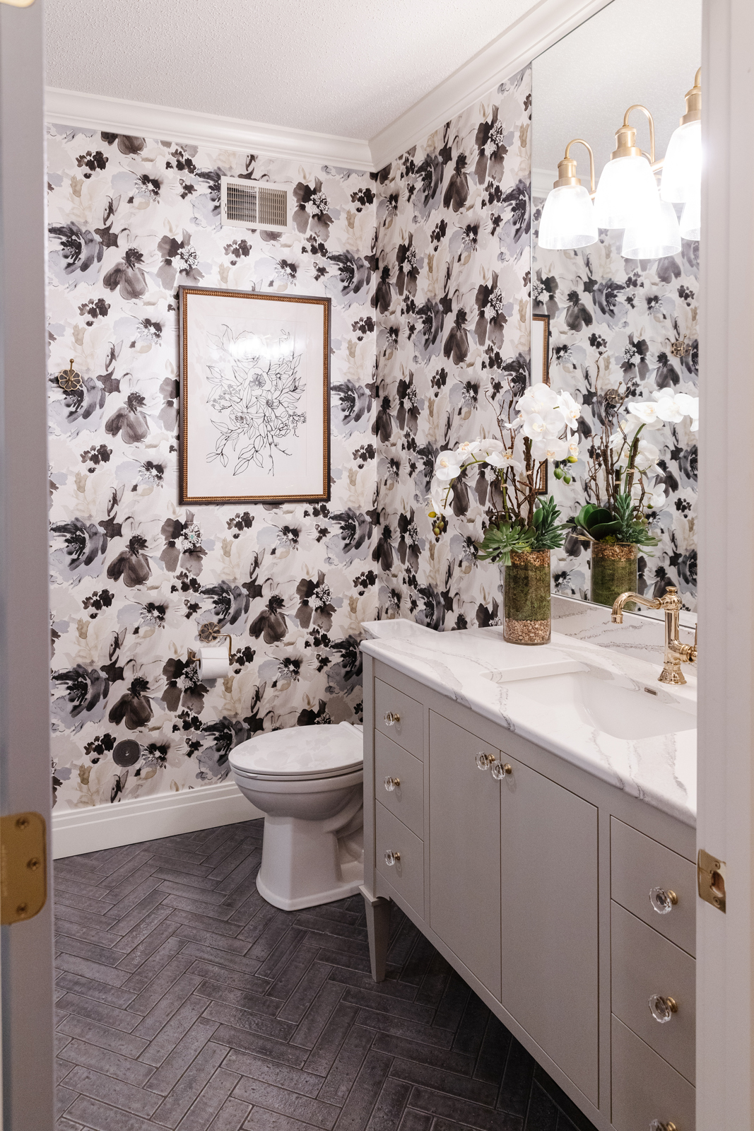
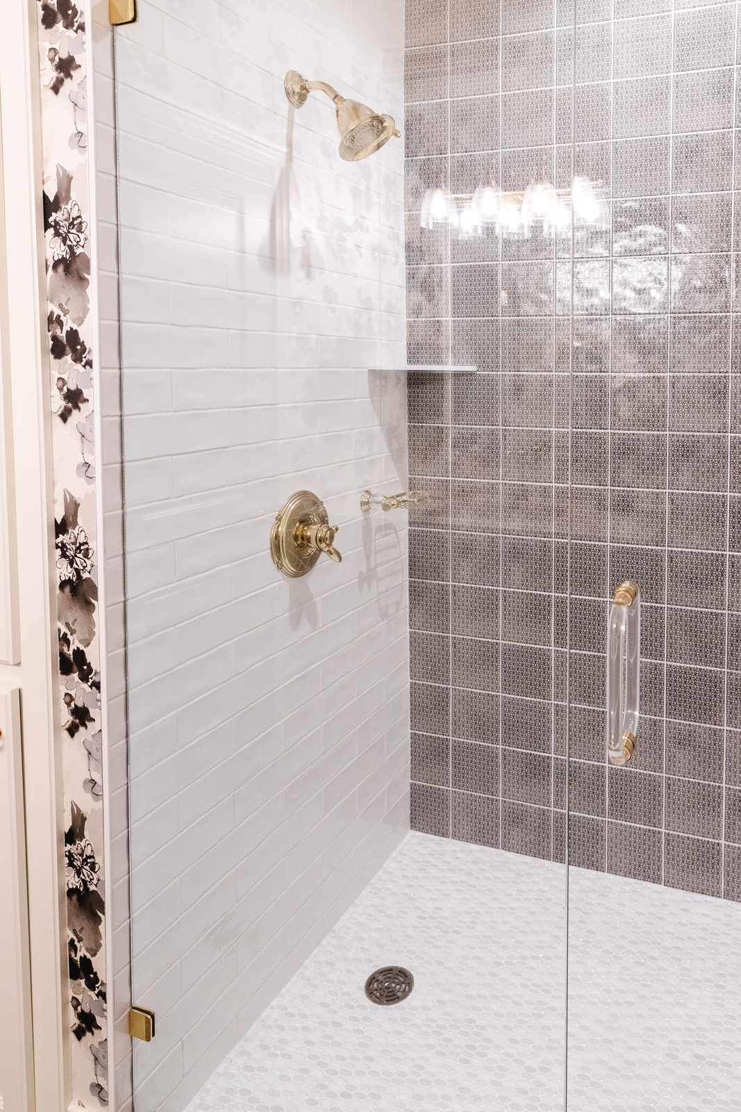
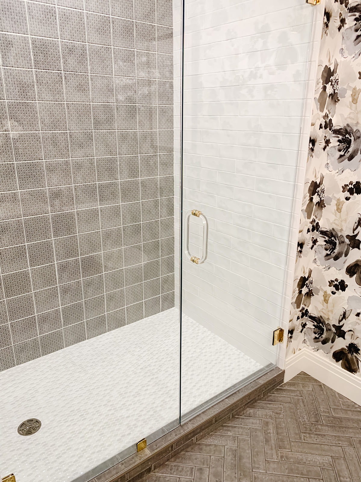
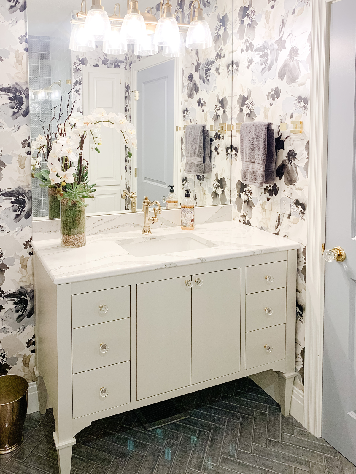
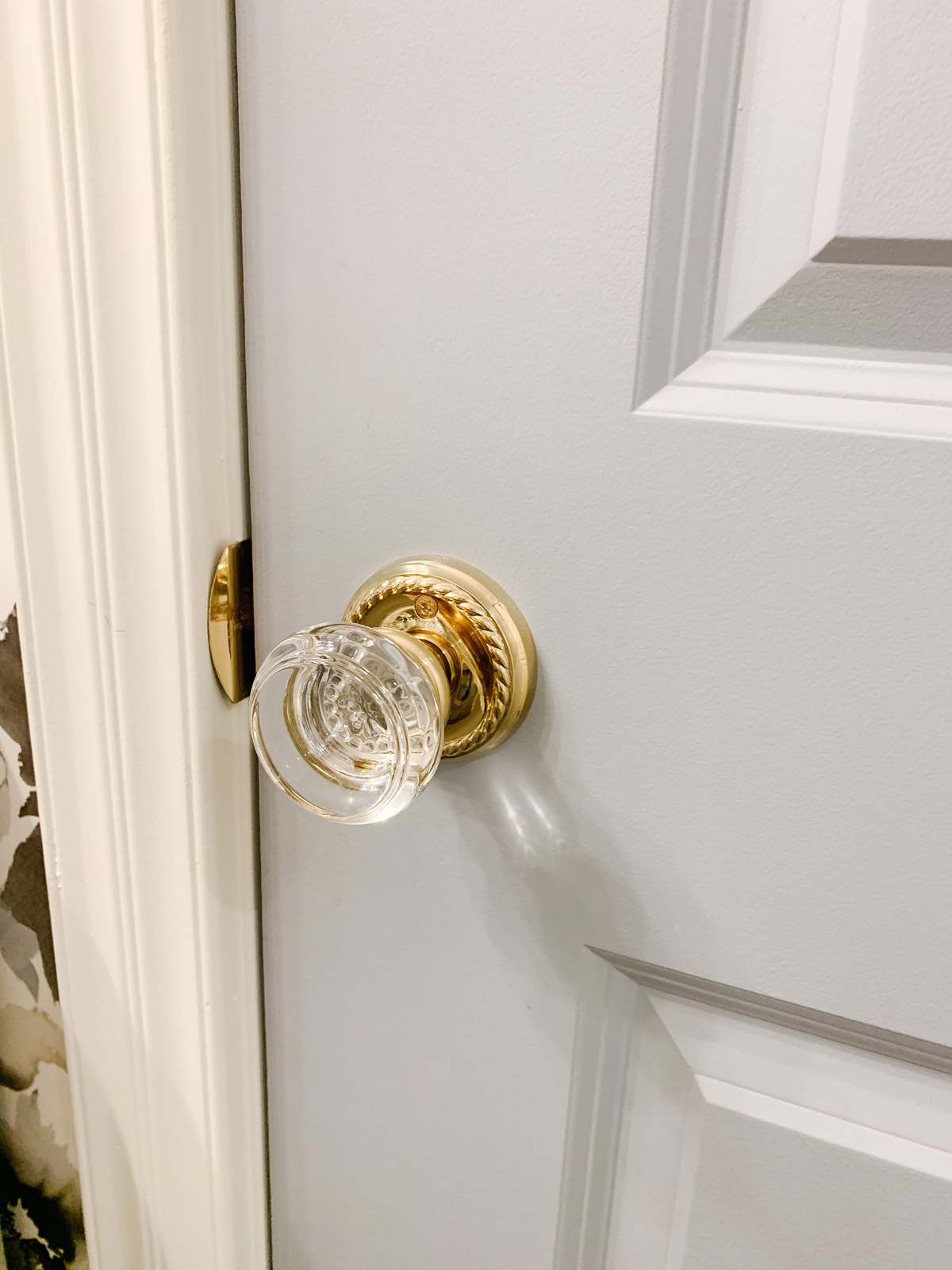
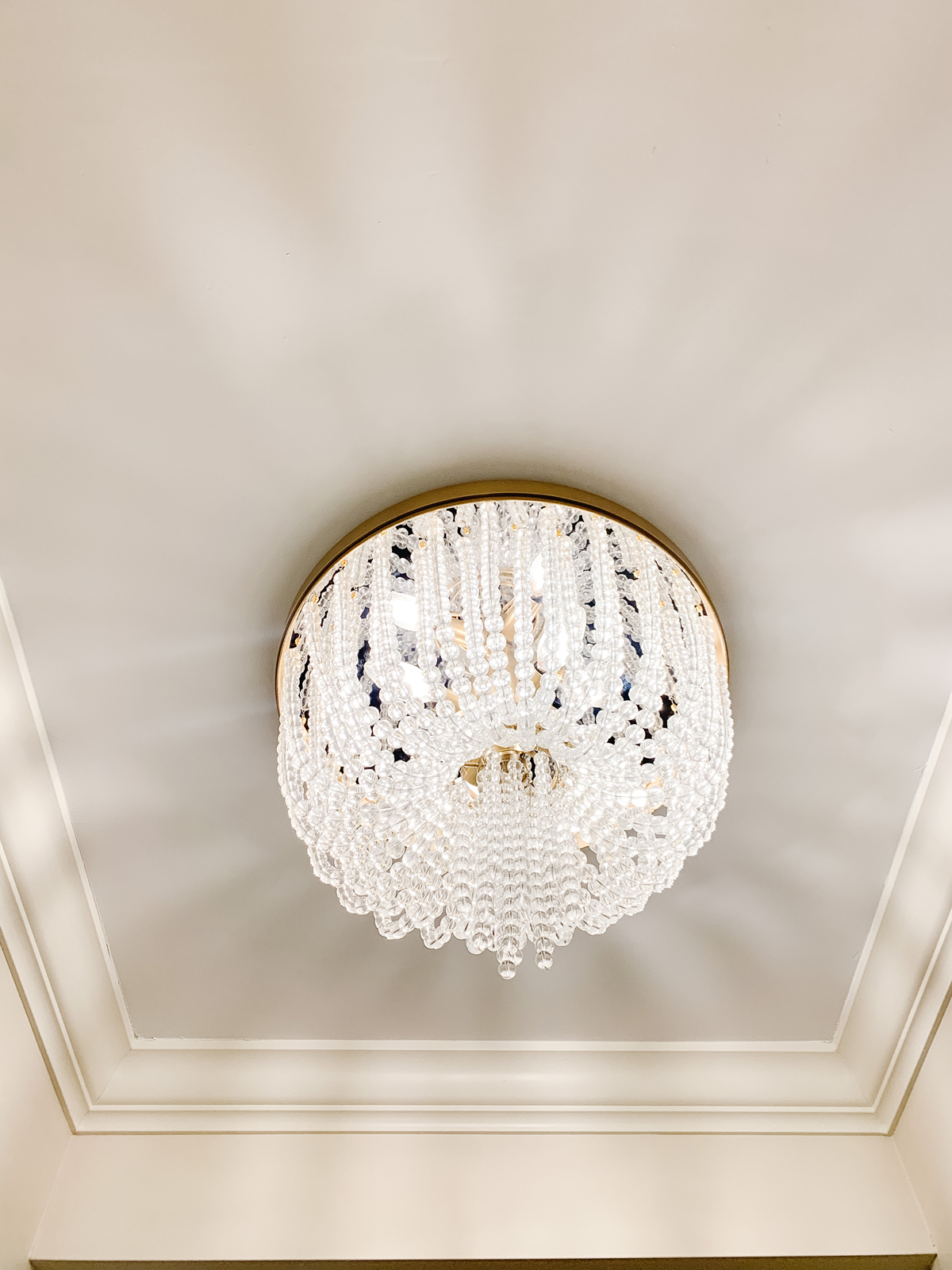
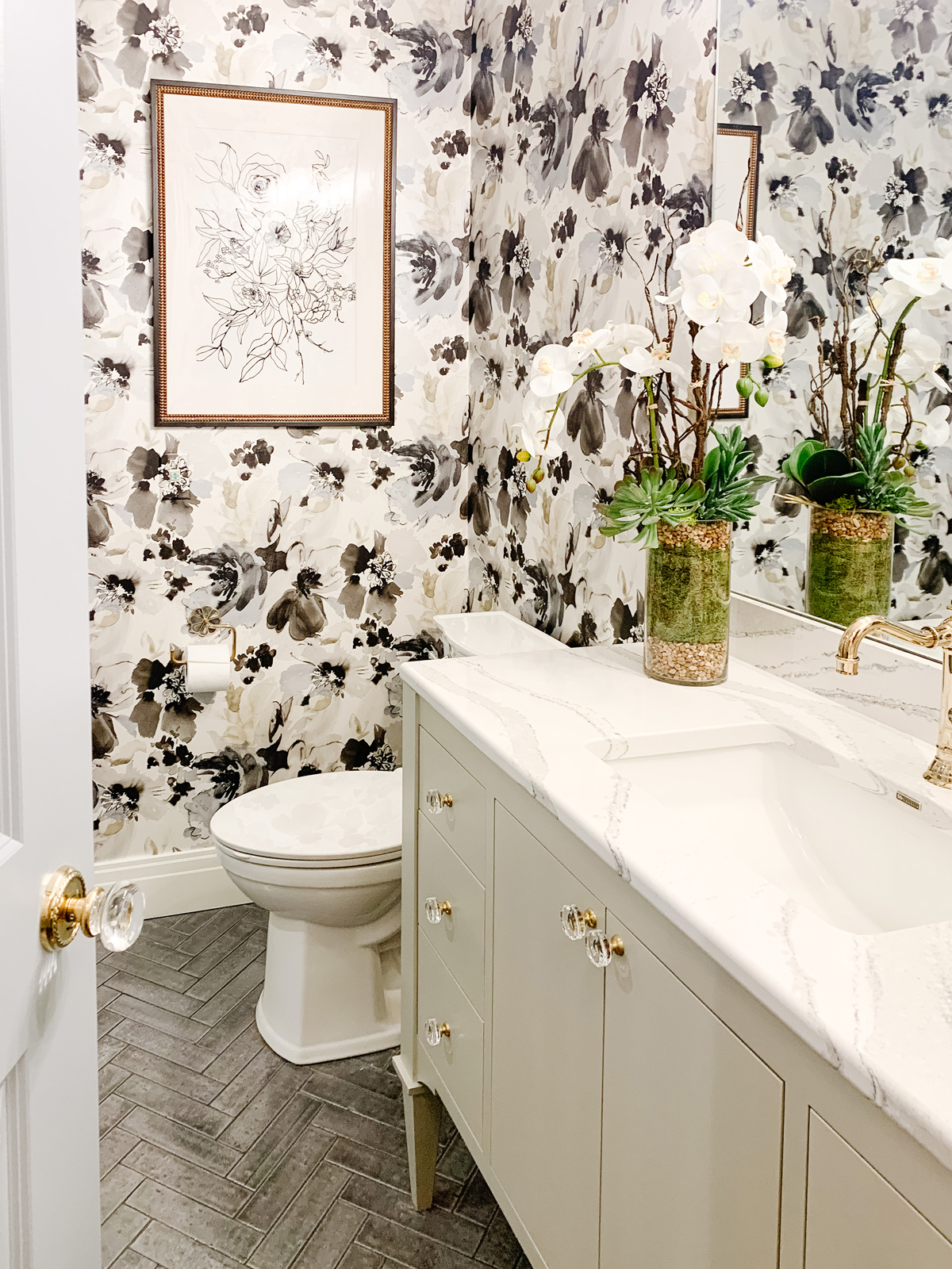
The lower level bathroom was very dated and because it is the main bathroom used by guests and the only bathroom in the lower level, our clients wanted to make it more appealing. The floor had a very plain square tile and the bathtub was so low and small that it wasn’t very functional. We decided a shower would be better used and also allowed for a glass enclosure that opened up the room and made it feel bigger. We used a beautiful patterned tile as an accent on the back wall, and an oval marble mosaic tile on the shower floor. The main floor of the bathroom got an update with a brick look tile set in a herringbone pattern. We custom-designed the beautiful furniture style vanity and had it painted a lovely shade of blue-gray. The countertop is Cambria quartz, and we added all new plumbing, millwork, new lighting and a new sink. We painted the door a pretty shade of blue to give the bathroom a notable entrance. We used pretty gold finishes for all of the metals in the room. The icing on the cake was the fabulous wallpaper. It really took this bathroom to another level! We love how the bold floral pattern really makes the room feel special and adds a whimsical feel.
the before
the after
The den
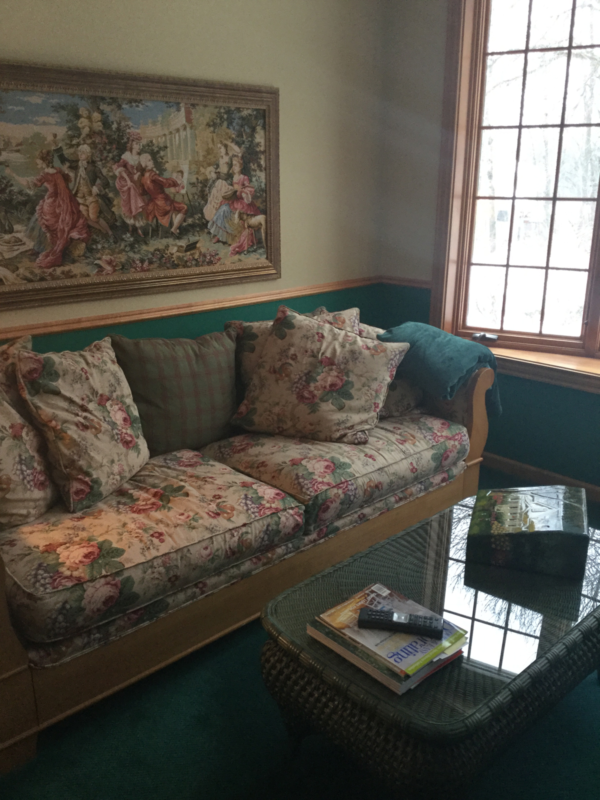
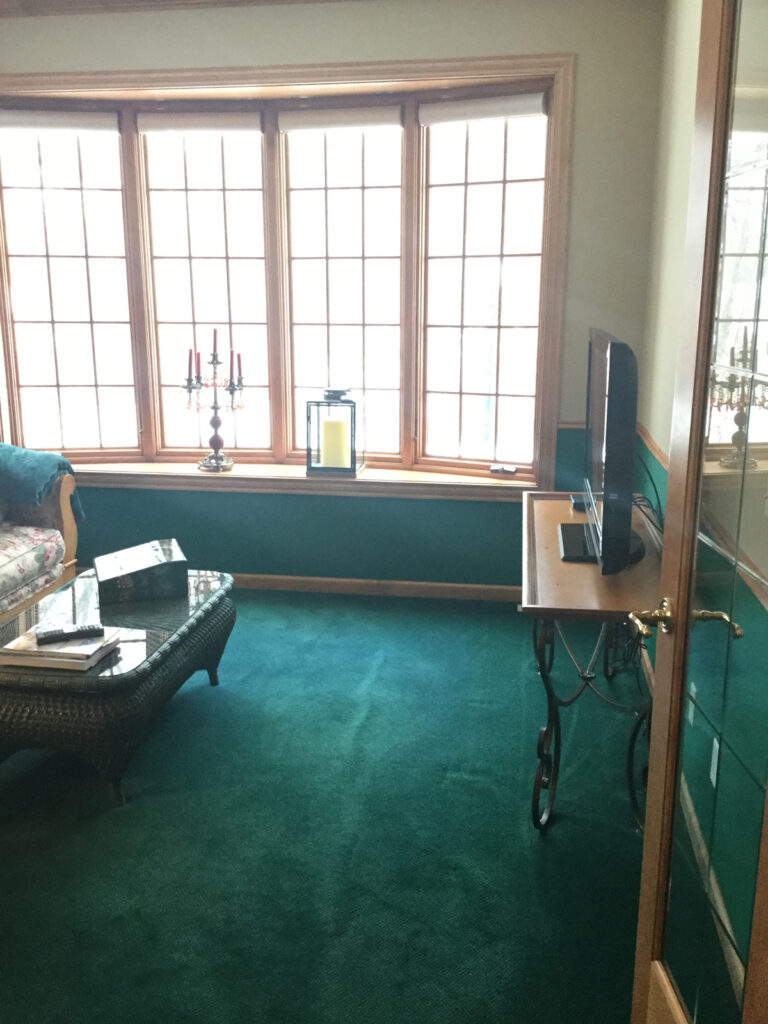
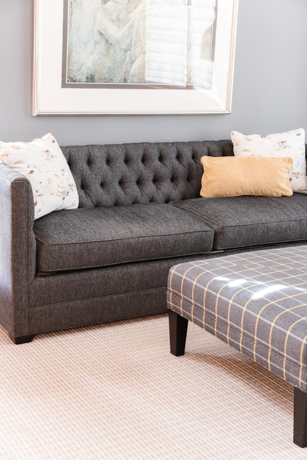
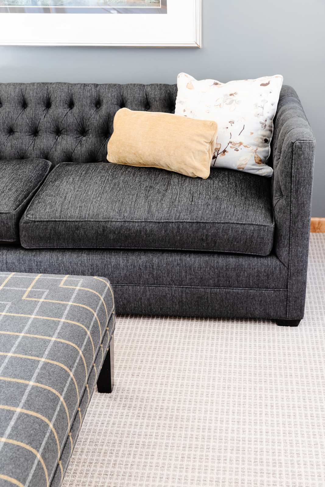
The main floor den is right off the front foyer. It was important to update it since it is one of the first rooms you see when you enter the home. The before and after difference is pretty significant! The room was filled with dark green – on the walls and on the floor. We got rid of the chair rail millwork and painted the room a pretty shade of gray. A gorgeous new wool carpeting really adds interest to the room as well. New furniture rounds out the updated look and provides a cozy spot to read a good book or watch a movie.
the before
the after
the lower level FAMILY ROOM
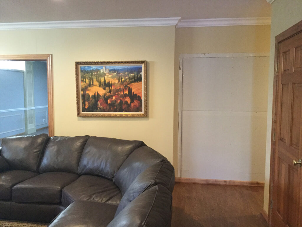
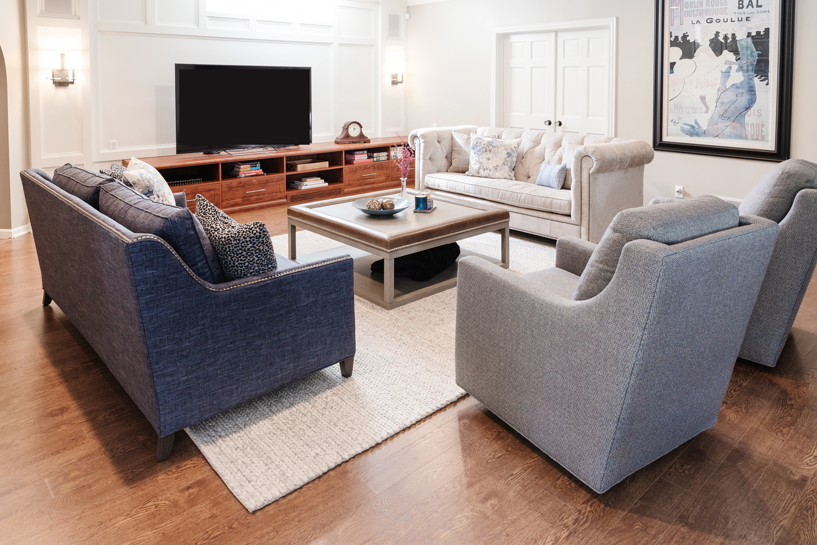
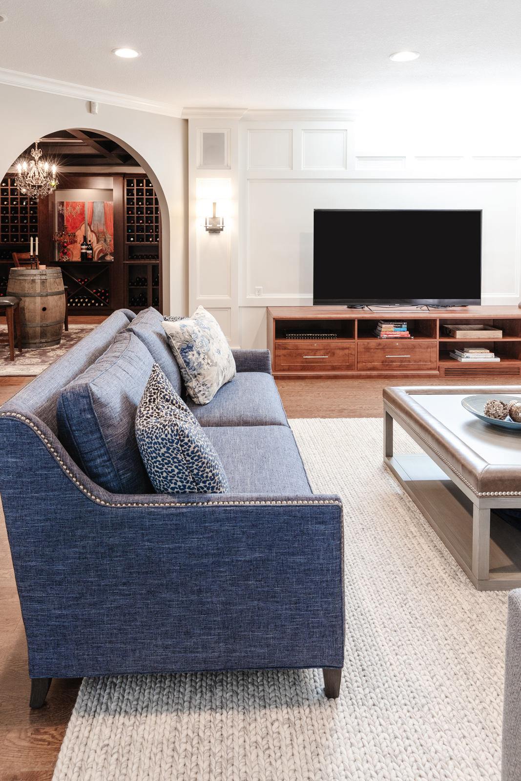
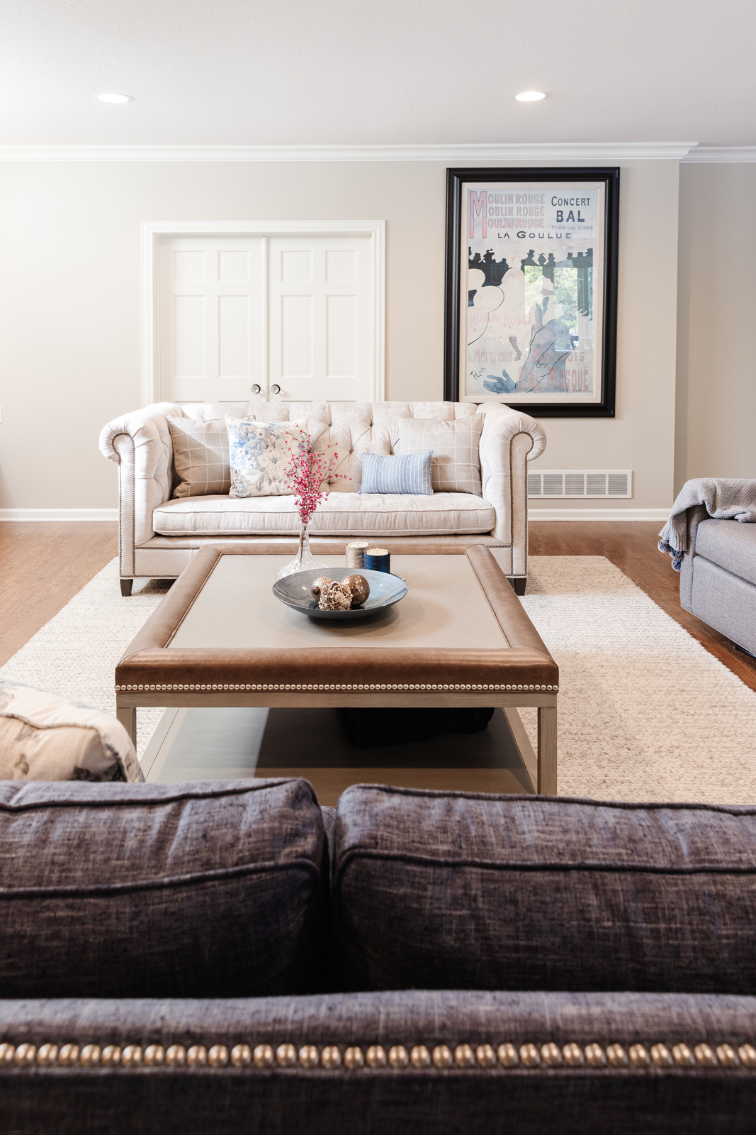
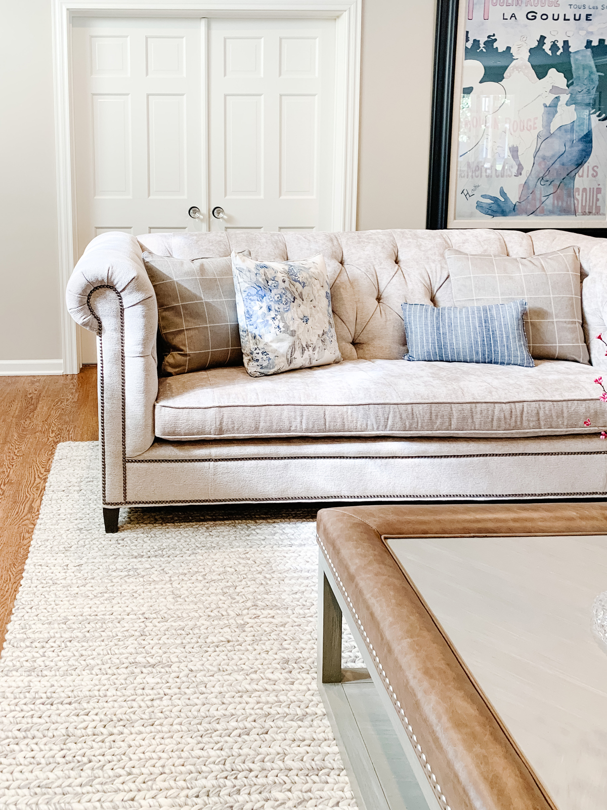
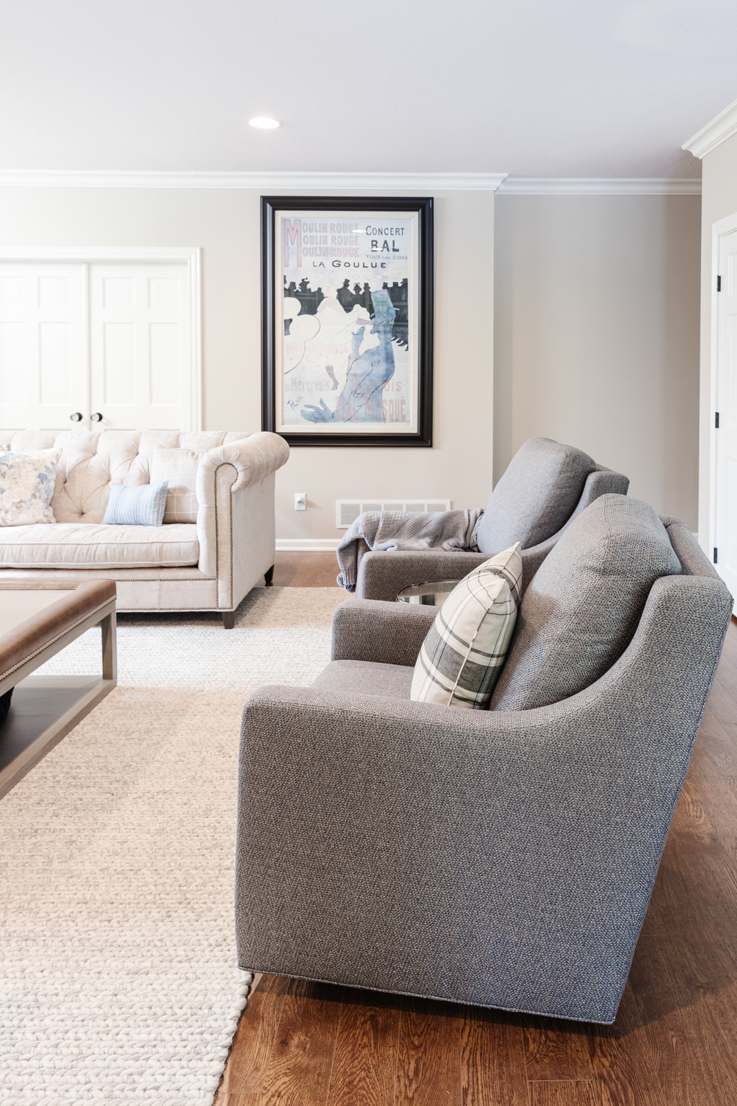
The lower level update involved closing up an opening to the theatre and moving it down closer to the movie screen. We had beautiful millwork added to the wall behind the tv cabinetry to add interest to the wall, and we also added it to the exercise room which is adjoined to the family room. The baseboards, trim and doors got a fresh coat of white paint to brighten up the lower level. We added pretty wall sconces to the tv wall as well. All new furniture and a cozy area rug give this room a fresh look and all of the pieces are super comfortable – perfect for watching your favorite Netflix show.
the before

the after
We hope you enjoyed seeing this home’s transformation. It shows how much a home can get an entirely new look without having to do a complete remodel!
Leave a Reply