We love working with different styles. It keeps things interesting when we get a mixture of modern, traditional, casual, formal, and everything in-between! One of our core values at Interior Impressions is a Client-Centered approach to design. That means we design for our client’s style, needs and things they love, rather than our own personal style. In this project, we had the pleasure of working with an absolutely beautiful home that has a very elegant, classic structure. Our clients have a love of travel and really enjoy entertaining in their lovely home. The house they bought has a great layout, but was in need of updated finishes. We were able to make it feel fresh and new, but with choices of very classic, traditional and timeless materials. We hope they will love this home for many years to come!
the foyer
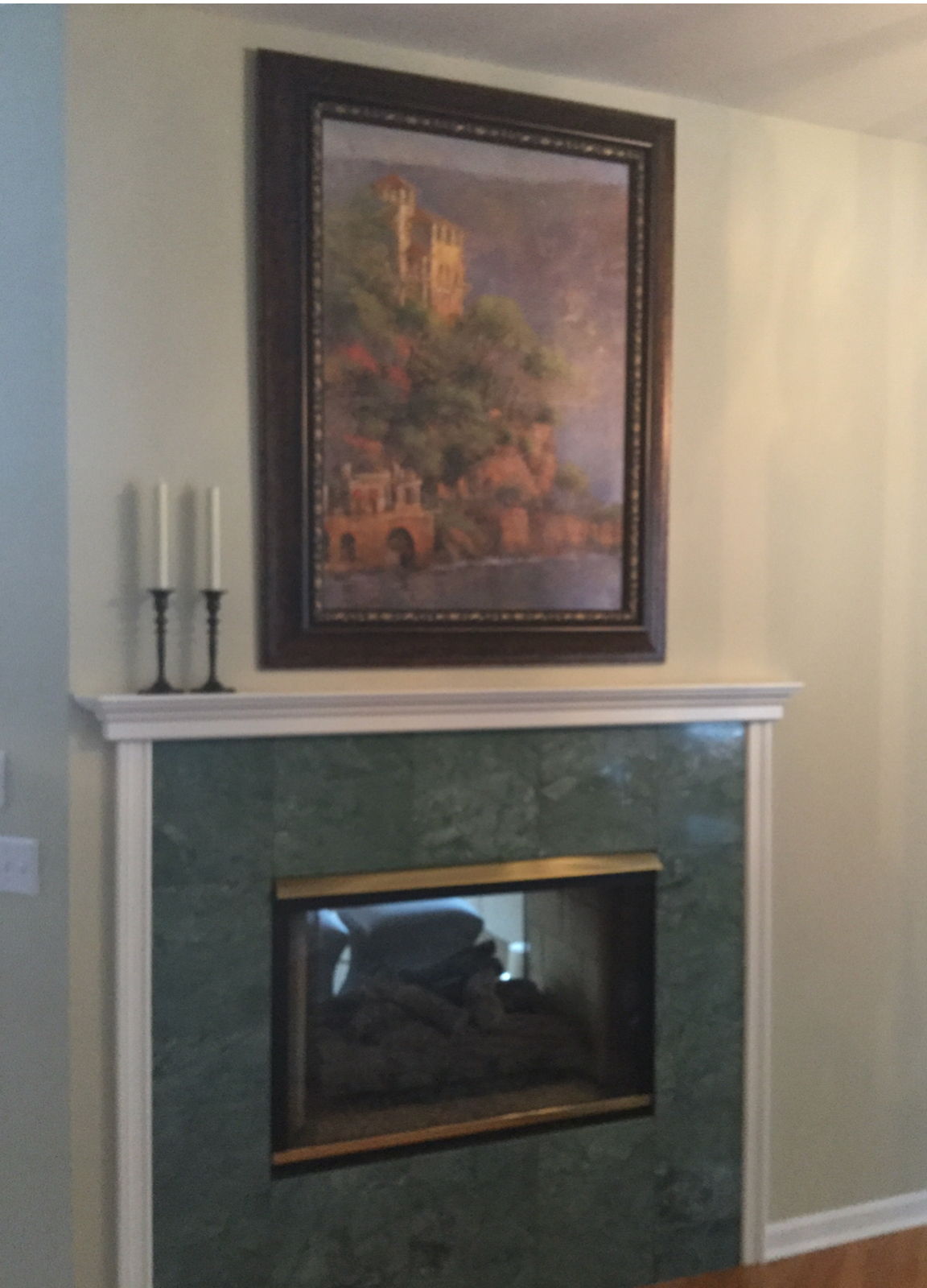
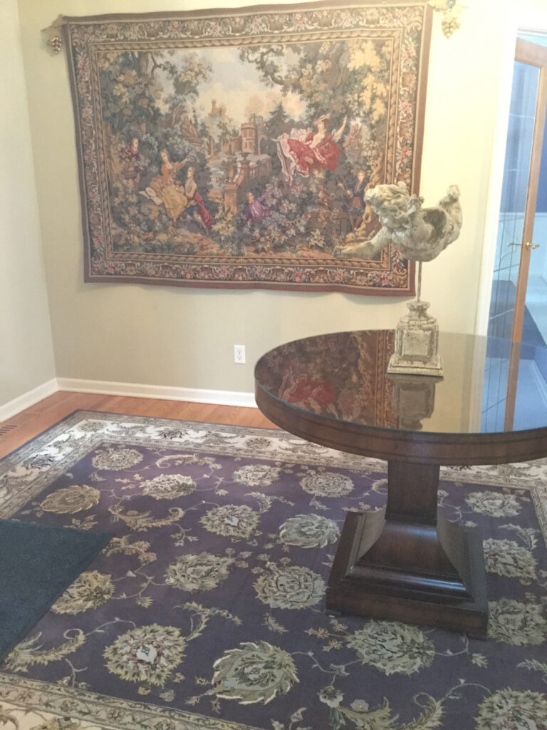
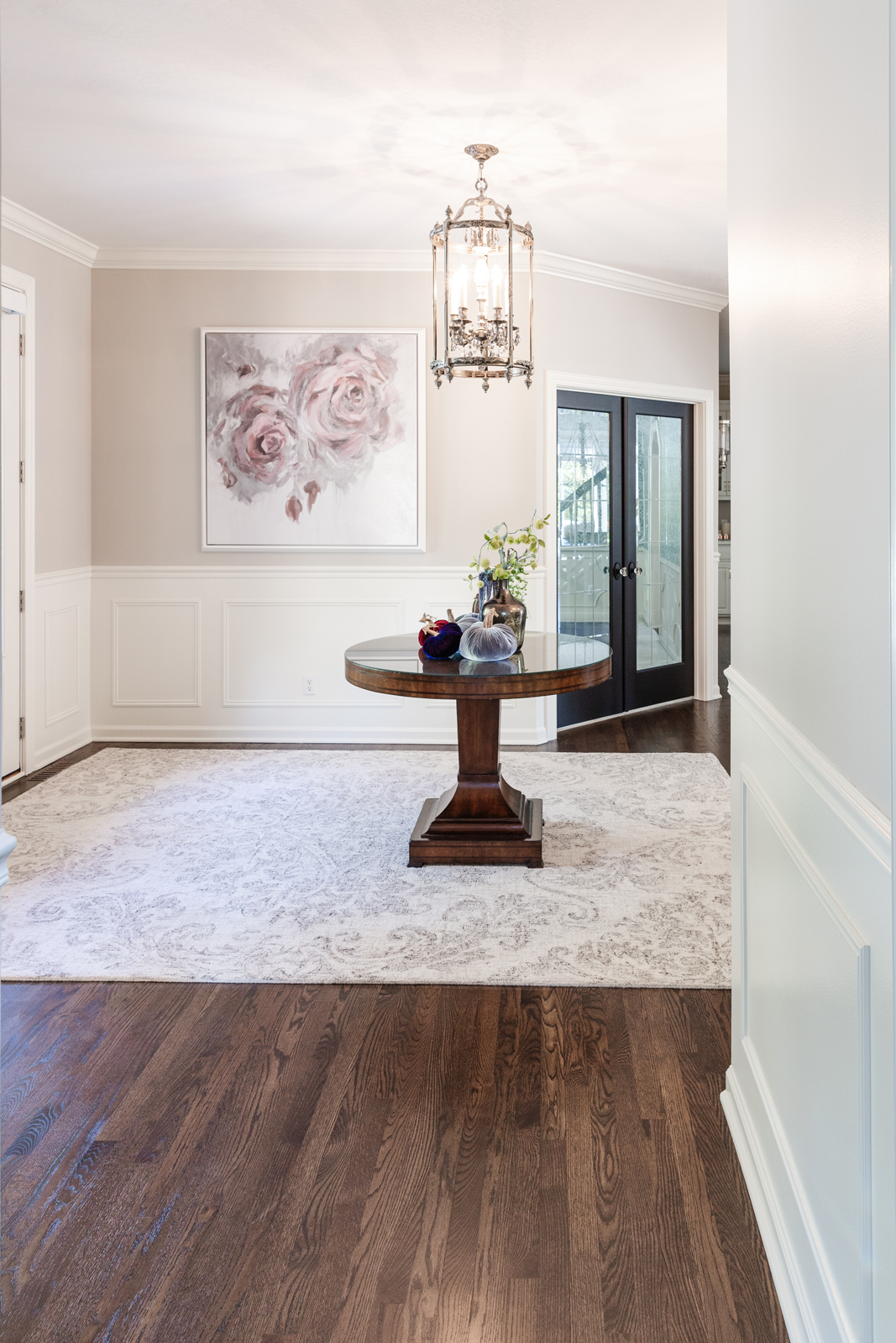
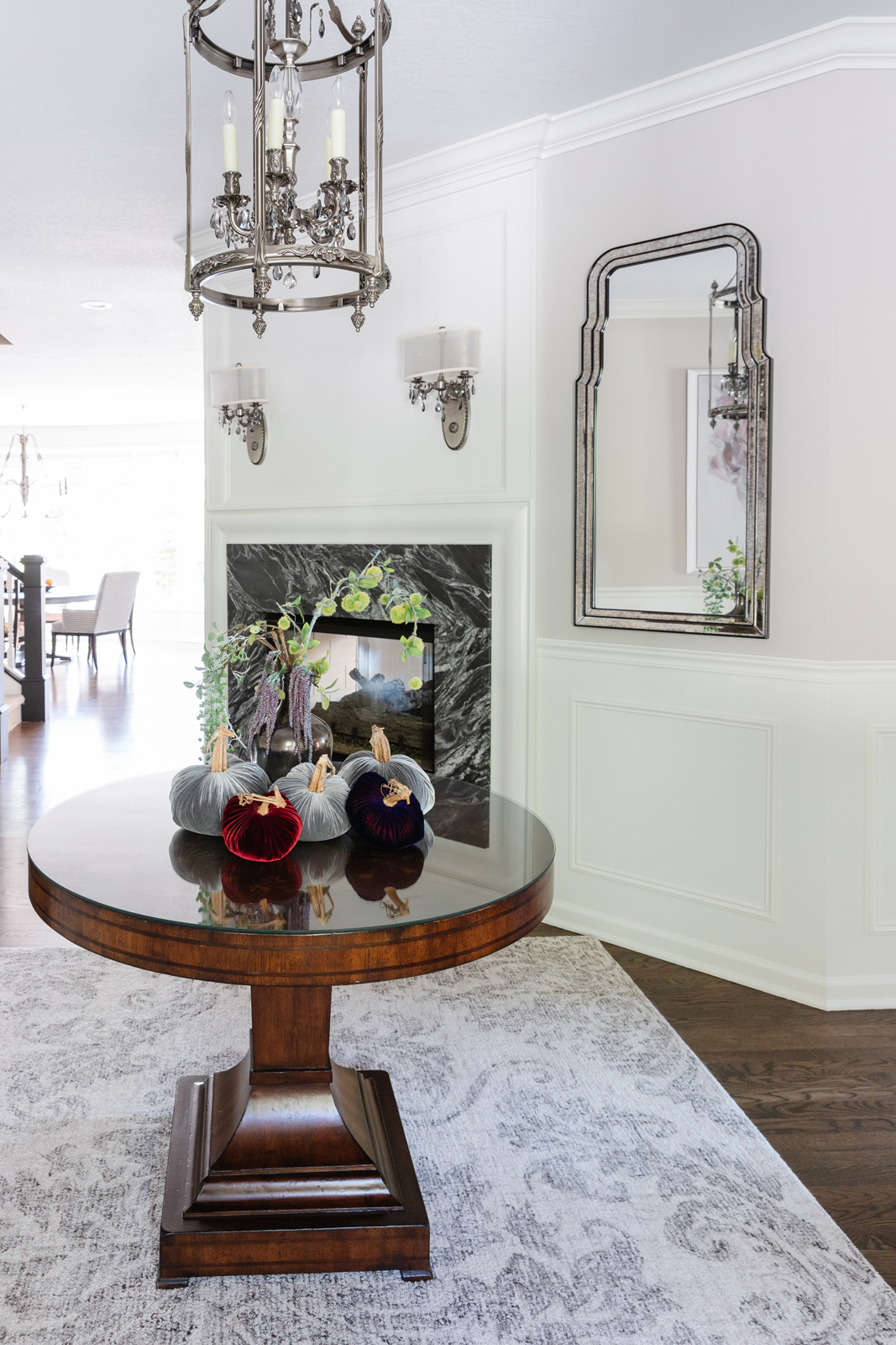
The foyer had a fireplace, which is unusual to see in an entryway. It is double-sided and shared with the living room on the opposite side. The problem with the fireplace was that is was plain and had dated green tile and did not make a very impressive statement when you entered this home. The walls lacked pizzaz as well. This large foyer needed more detail to bring that WOW factor in.
the before
the after
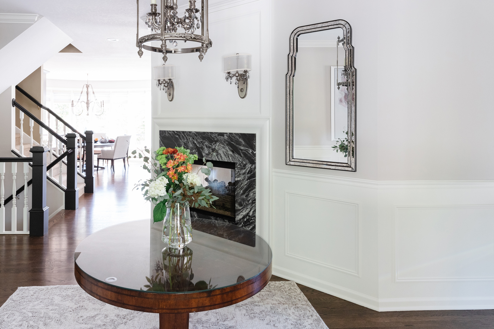
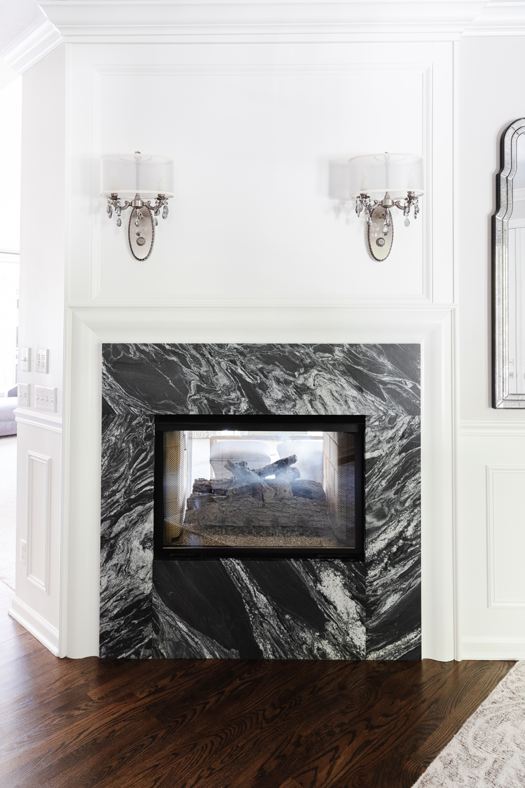
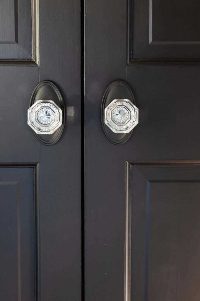
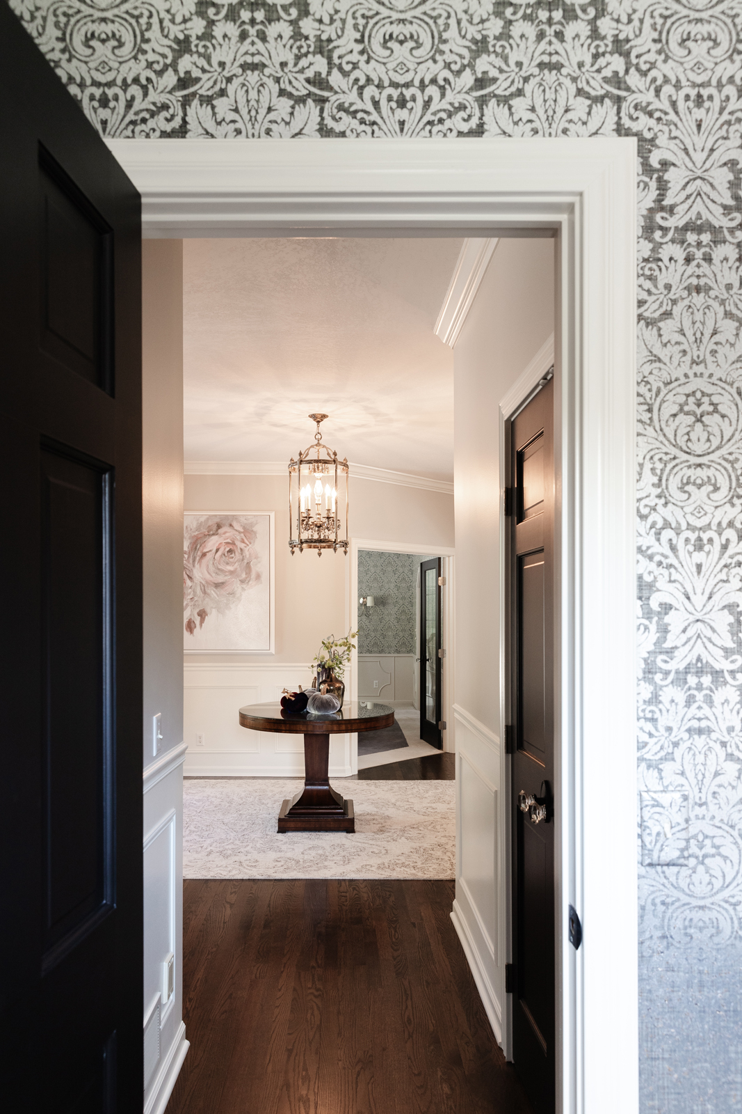
The fireplace was stripped down to the firebox. A gorgeous new granite surround was added, as well as custom millwork to frame the face of the fireplace. Wainscoting and custom designed millwork was added to wrap the entire foyer and make the walls feel special. A lighter paint color was added. All of the hardwood floors were refinished and stained a richer chocolate color. The stairway railings, posts and handrails got a big update. New light fixtures were added and we had wall sconce lights wired to add even more interest to the fireplace wall. We painted the doors black and added beautiful crystal door knobs. I love how the black and white details really add drama to this space! A new mirror, artwork and rug were finishing touches to make this one of the most elegant foyers were have ever worked with.
the powder bathroom
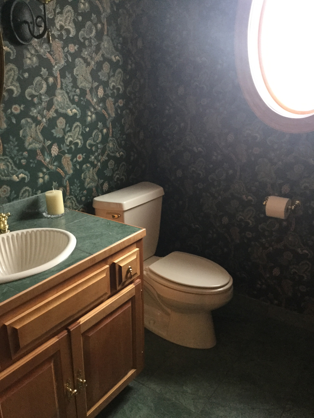
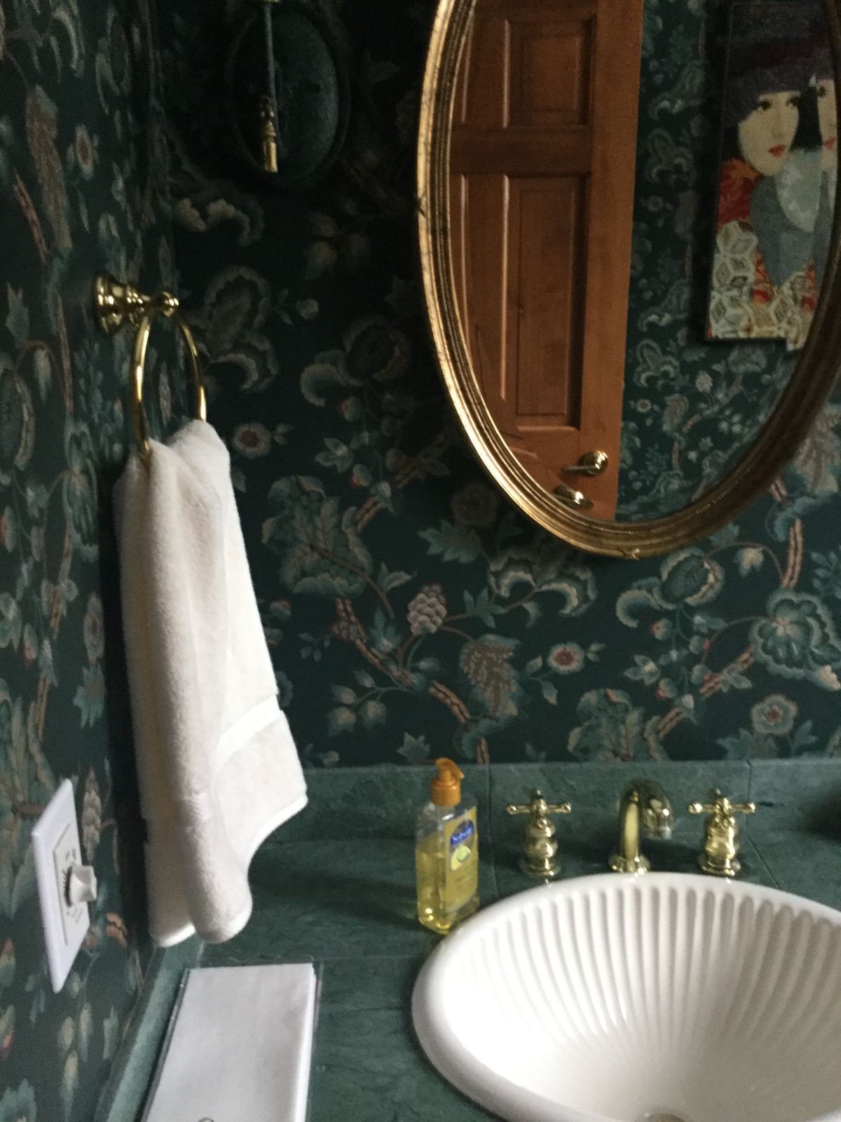
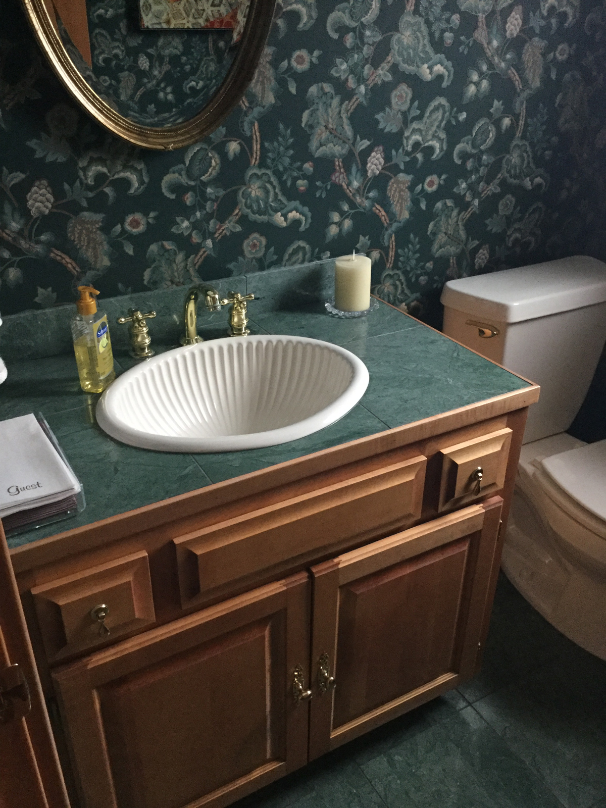
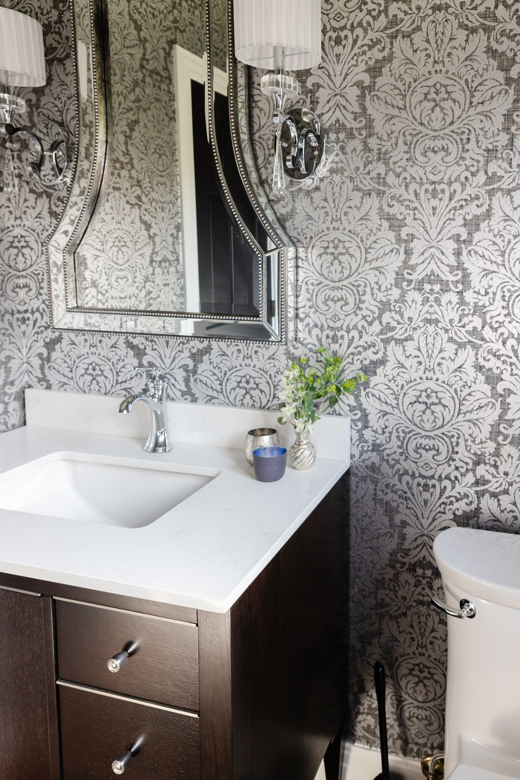
Wow – was this room ever dated! The green tiled countertop, “shell” basin sink and polished gold hardware were probably lovely back in the day, but it was time for them to go away. This room was green EVERYWHERE – even the flooring tile was green. I do like green, but not that much!
the before
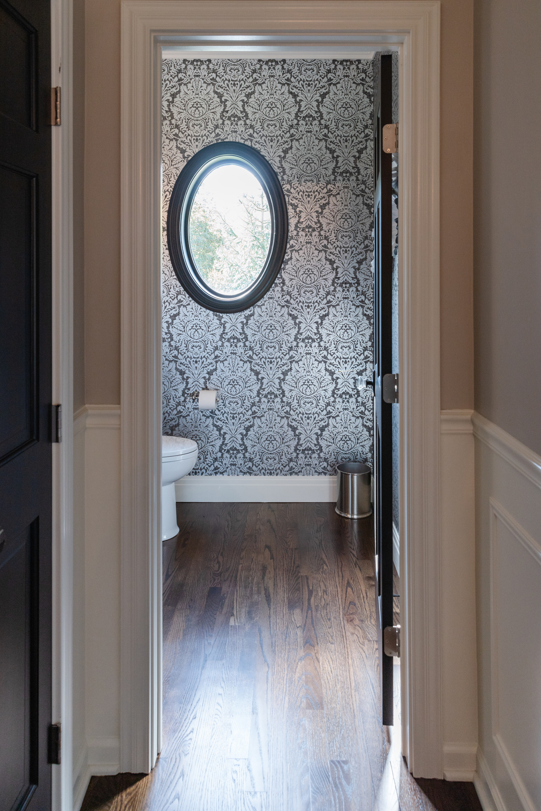
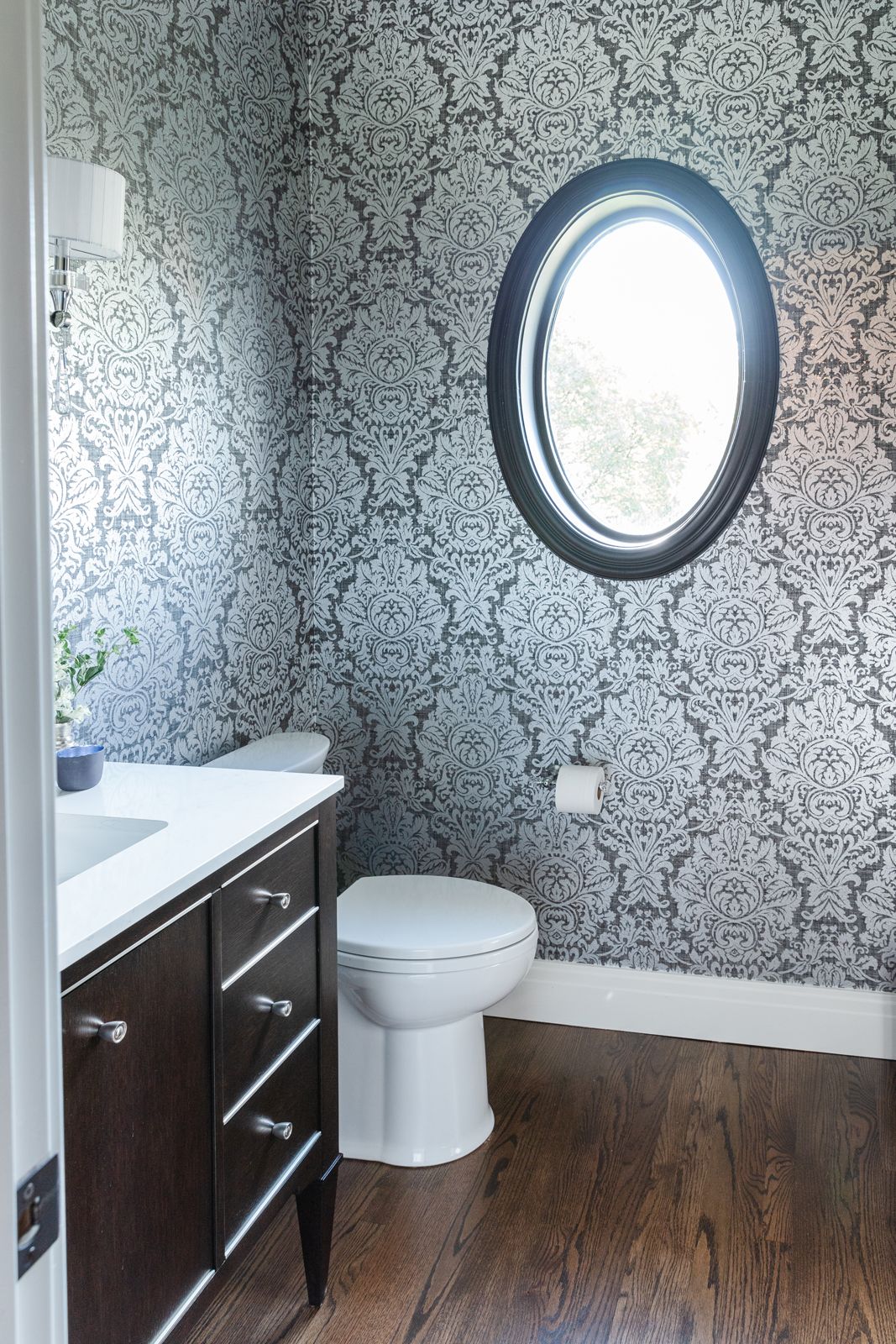
the after
This wallpaper is the star of the show and packs quite the punch in this powder bath. It has a shimmery metallic overlay that makes it extra special. We brought in a beautiful free-standing furniture style vanity with a clean white countertop and undermount sink. The new faucet, mirror and cabinet hardware mimic the shiny silver in the wallpaper. We removed the tile flooring and extended the hardwood into the bathroom to unite it with the foyer. We painted the door and window trim black to make it stand out against the silver and black walls. Beautiful crystal wall sconces softly light this room and are the jewelry that finishes off this room perfectly.
The morning room
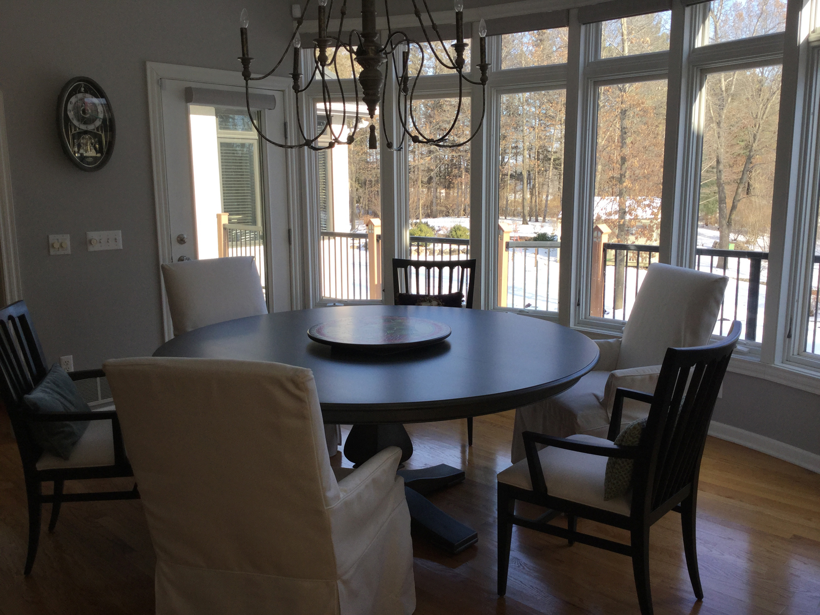
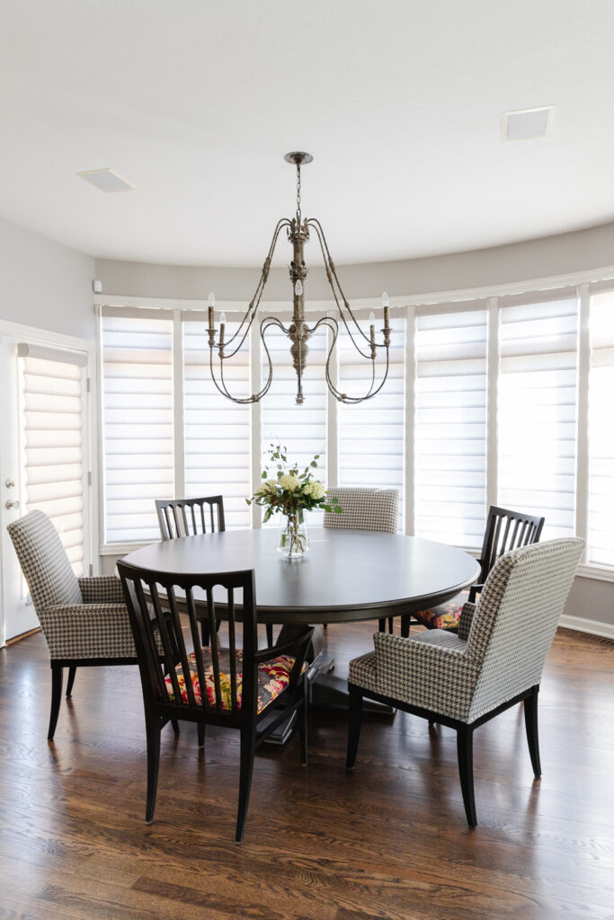
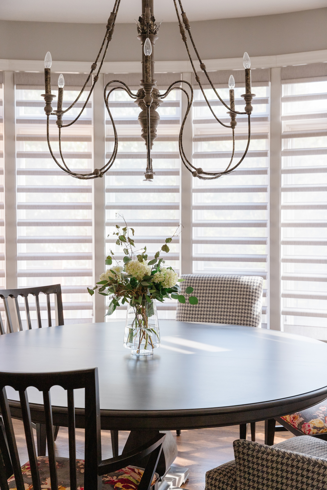
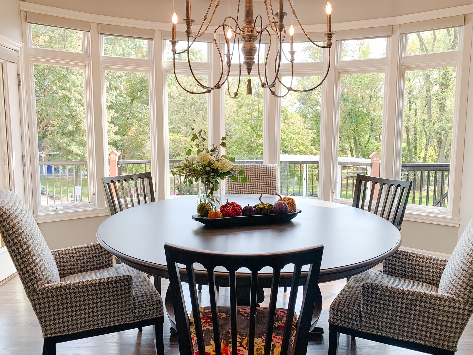
This sun-filled room already had great furniture but it lacked warmth and interest. Not much needed to be done here except to add some pretty fabrics to the chairs. We ditched the slipcovers and had the chairs underneath reupholstered with a classic, but not-so-serious houndstooth. We painted the legs black to match the other chairs. The companion chairs got a facelift with a colorful, fun floral fabric on the seats. Now this room feels a little less stark and beckons you to sit down with a cup of coffee in the morning and enjoy the beautiful back yard views.
the before
THE AFTER
The kitchen
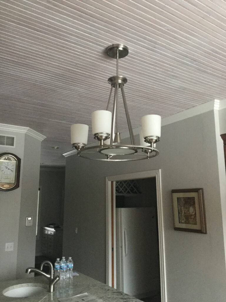
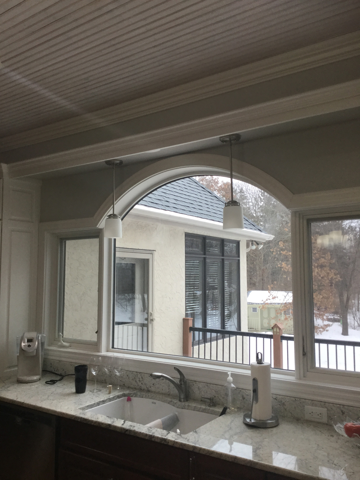
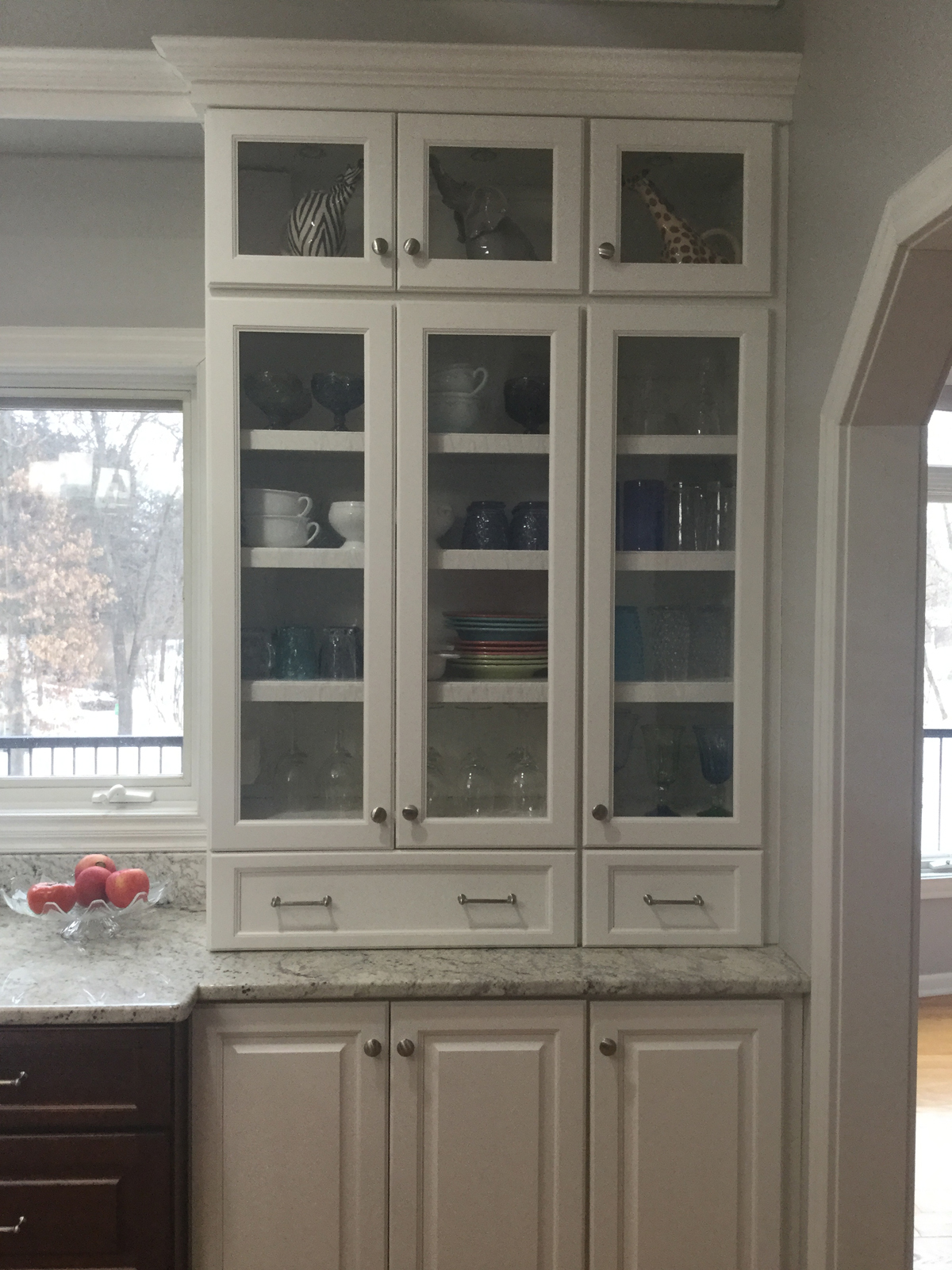
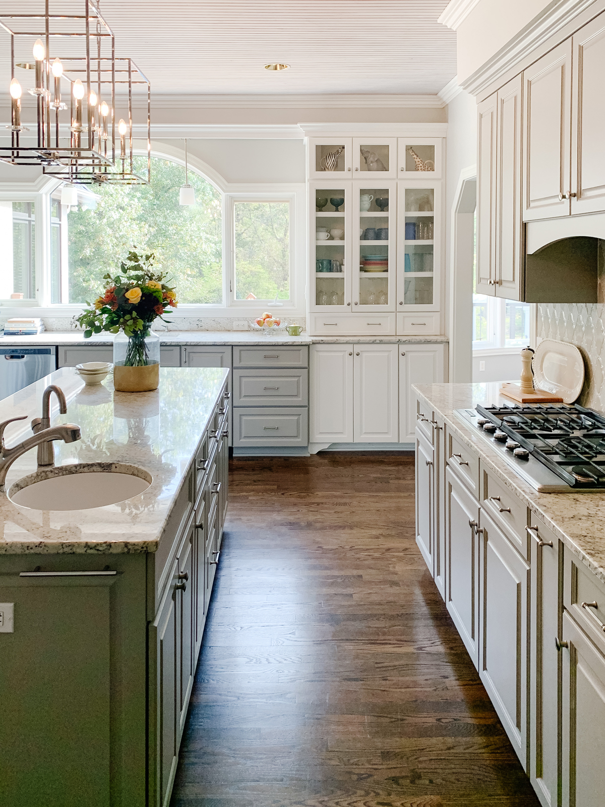
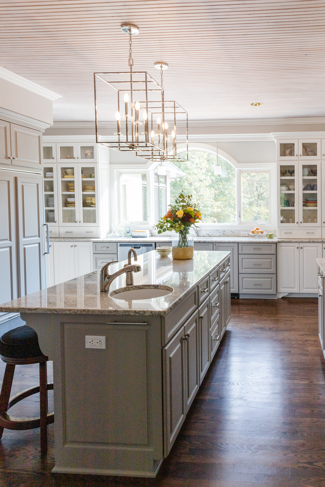
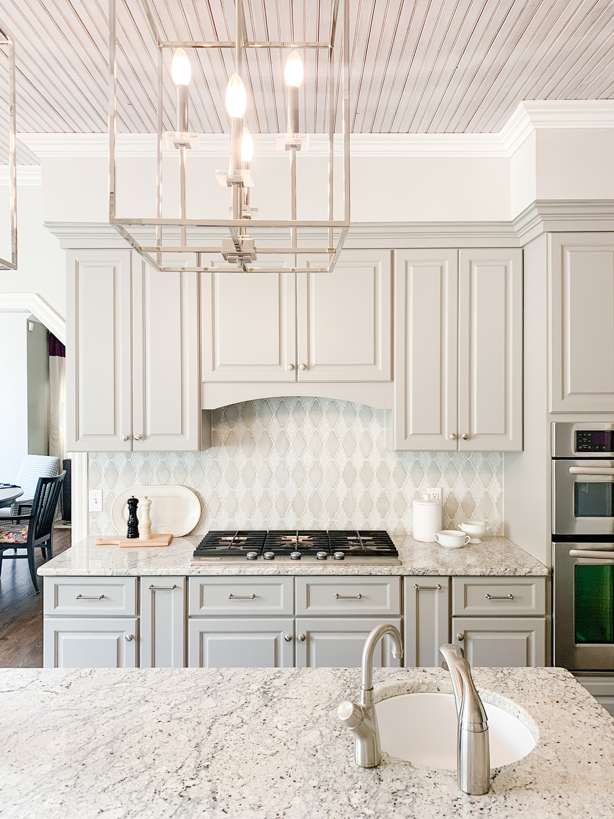
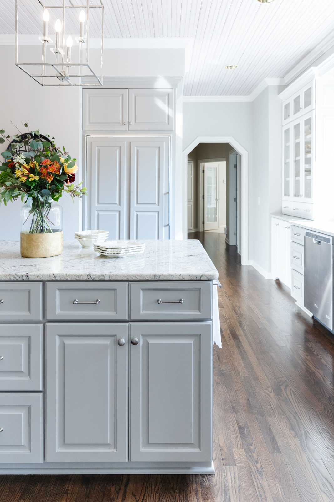
The kitchen didn’t need much more than a fresh coat of paint! We painted the dark brown stained wood cabinets a lovely gray with soft blue undertones. We freshened up the white painted cabinets, added a gorgeous porcelain tile backsplash behind the cooktop, and brightened up the room with new light fixtures. Ta da! Now there is a sunny, bright space with fabulous backyard views.
the before
the after
The dining room
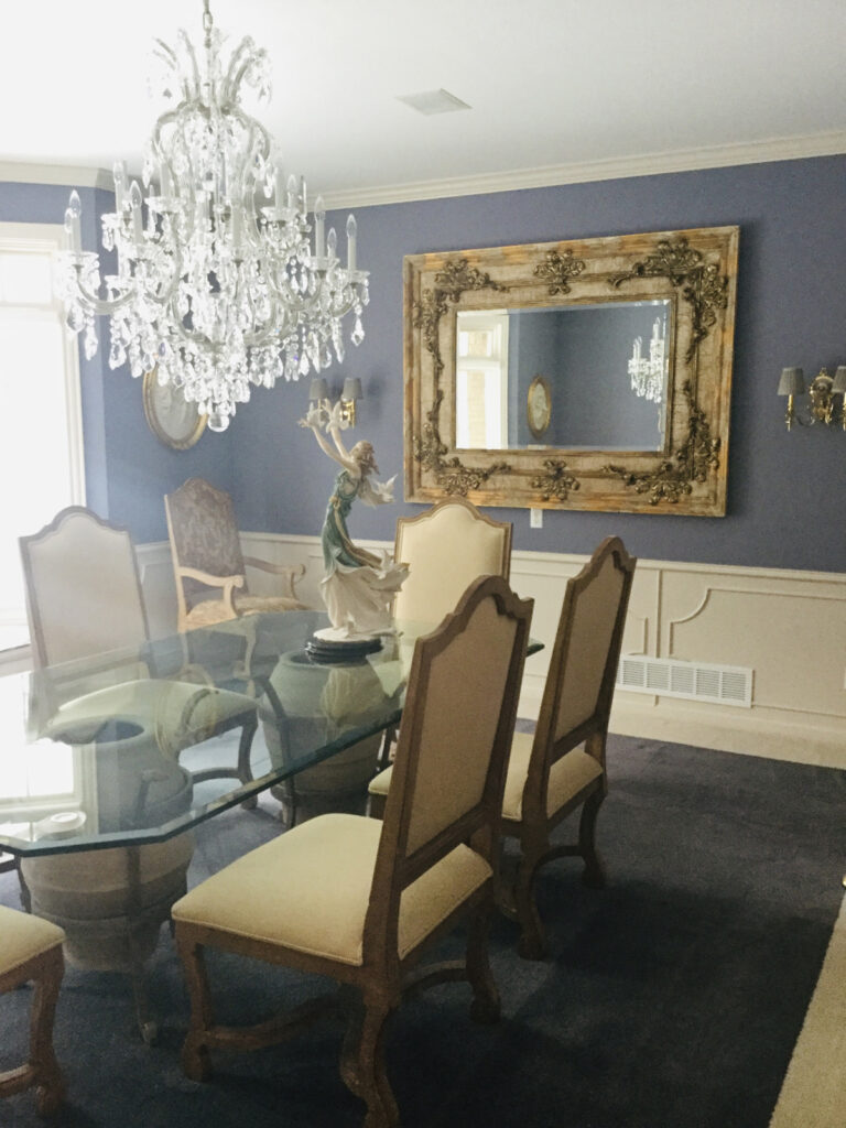
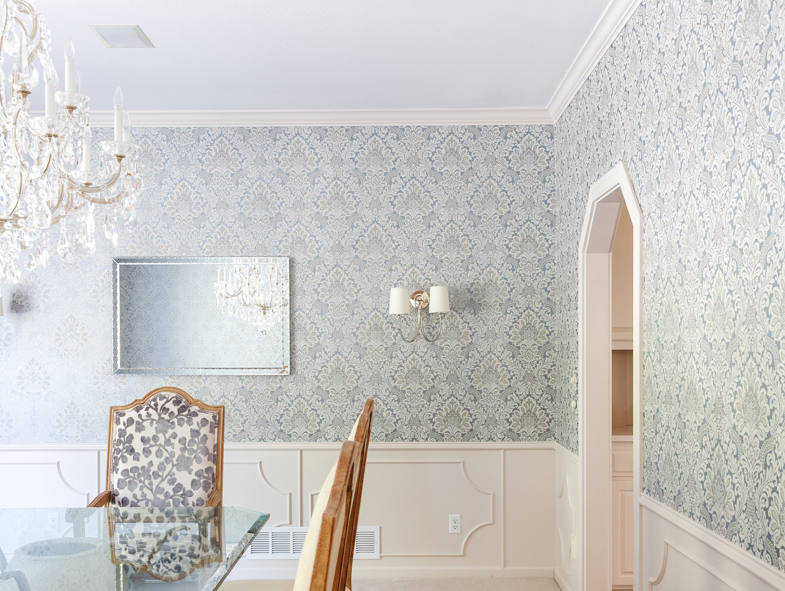
The formal dining room already had a beautiful chandelier as a jumping off point. The room had a lot of purple on the walls and the wainscoting was more of a cream color than white. The mirror and light fixtures were heavy and a little too ornate. The captains chairs were upholstered with a heavyweight tapestry fabric. This room just needed a little lightening and brightening. We reupholstered the chairs with a lovely cut velvet botanical pattern, replaced the mirror and wall lighting with streamlined but beautiful silver toned pieces. The icing on the cake was the fabulous wallpaper! This formal dining room is now ready for some amazing dinner parties!
the before
the after
We hope you enjoyed Part 1 of this beautiful, elegant home. Next time we will show you the sun-room, the den, lower level bathroom and family room. Cheers!
In the meantime, be sure to subscribe to our newsletter to have more project reveals and design tips sent to your inbox weekly!
XO,
Amy & the Interior Impressions Team
I love the colors used in the kitchen. Do you remember the paint color names?