We always love getting referrals from our clients. It’s the best compliment we can receive and we are always so humbled and grateful when our clients work with us on multiple projects and recommend us to friends and family. In this case, our wonderful clients Holly & Greg, were referred to us by their good friends who worked with us on their home (Light & Bright remodel). Holly & Greg actually moved into the same neighborhood as their friends and share the same lovely view of Powers Lake. It was so much fun working with them to bring a fresh look to their newly purchased home. It didn’t take a major remodel to make their home feel brighter and fresher! We also helped make their kitchen much more functional and created an environment in their sunroom that makes the entire family want to hang out in there all the time. We are excited to share the transformation with you all!
Living Room
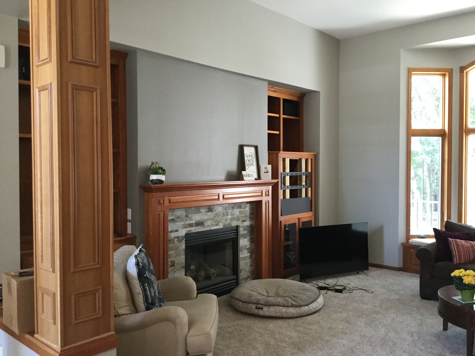
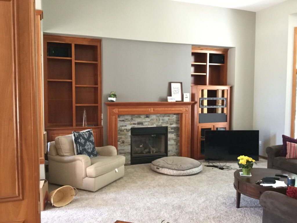
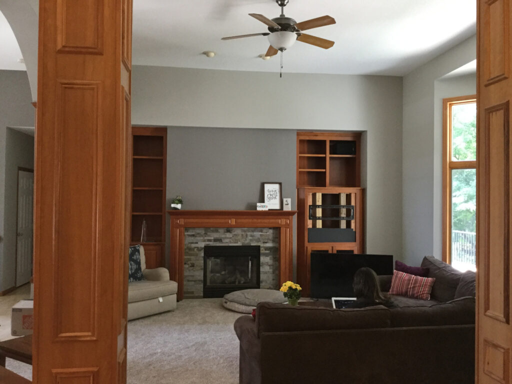
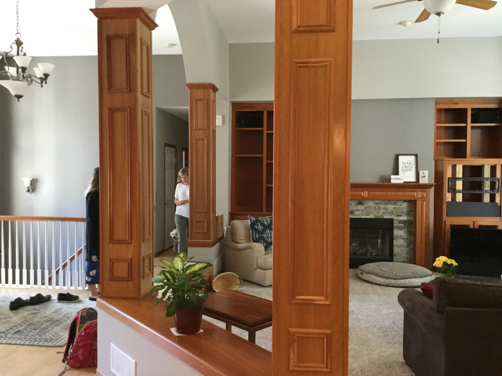
The living room, dining room, kitchen and foyer all very open. I love how this makes the space feel like one big room, however, it can be challenging from a seating and design perspective because everything flows together and changes affect all of the spaces around it. The things that Holly & Greg didn’t love were the bulky columns that also looked liked a previous DIY project. The craftsmanship and products used were not up to par with the quality of this beautiful home.
The other problems were:
*Awkward and small cabinet space for the tv. Our clients wanted a bigger tv
*A lot of dark wood everywhere
*The fireplace surround and mantle was a little dated and lacked interest
*Their furniture was getting old and needed a refresh and more seating
BEFORE PHOTOS
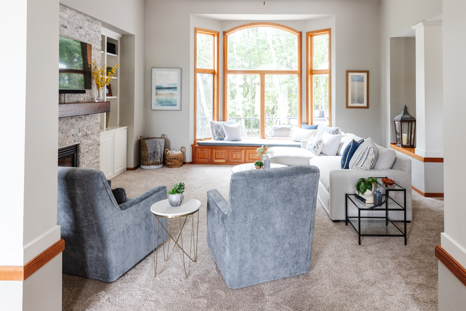
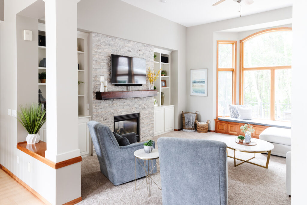
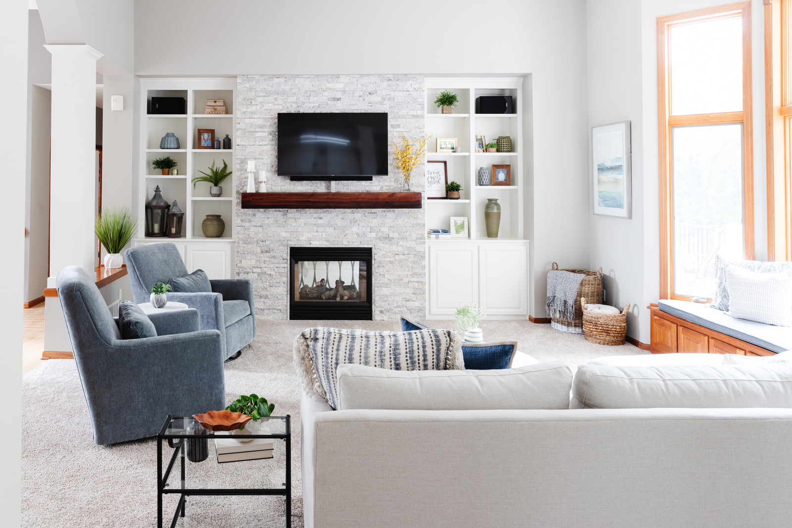
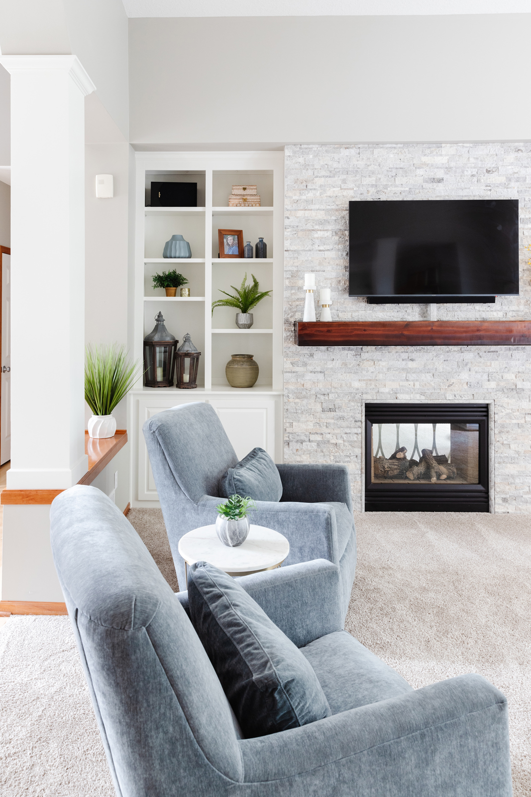
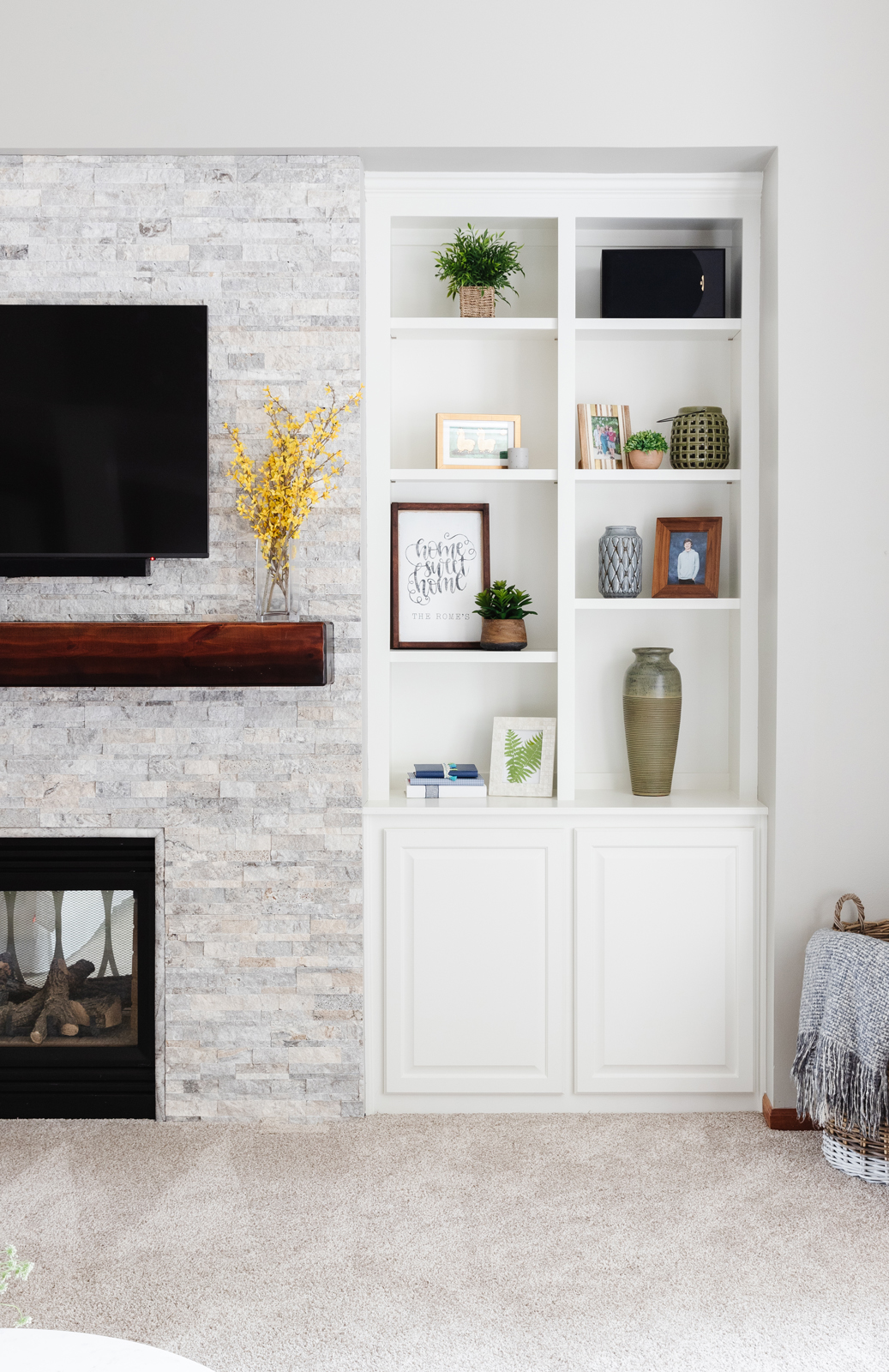
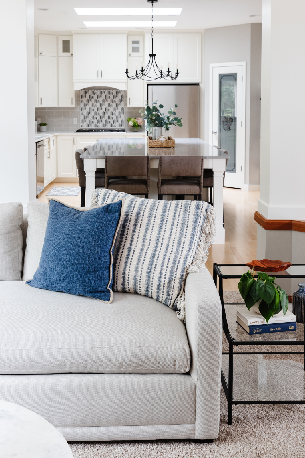
aFTER PHOTOS
What we changed:
*New paint on all walls
*Custom cabinetry modifications and moved the new larger tv above the fireplace
*New fireplace surround and mantle with floor to ceiling ledgestone and a rustic wood mantle
*Removed column woodworking and made new custom wrapped columns, painted all columns and cabinetry white to brighten up the space.
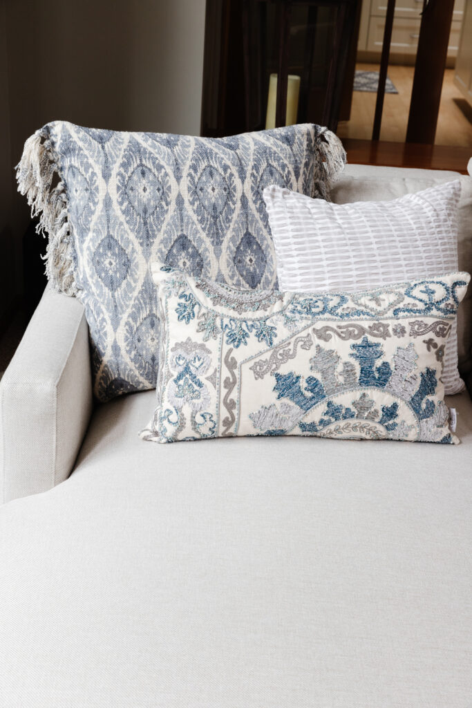
*All new furniture, custom made bench cushion, new pillows, artwork and accessories
*We did not paint all of the millwork white. The intent was to keep the main floor millwork stained for now to tie in with the other rooms. We suggested that we could paint all of the millwork white in the future if they decided they want to change it up.
.
THE KITCHEN
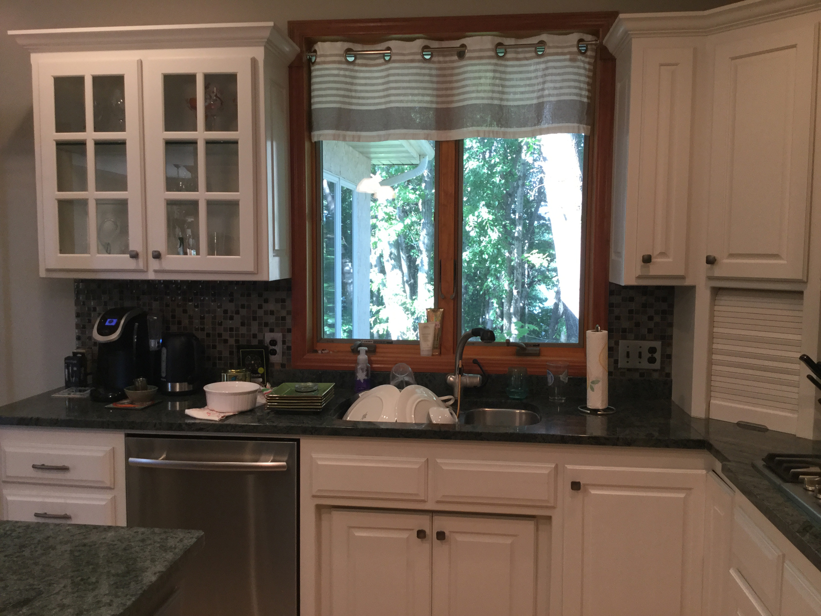
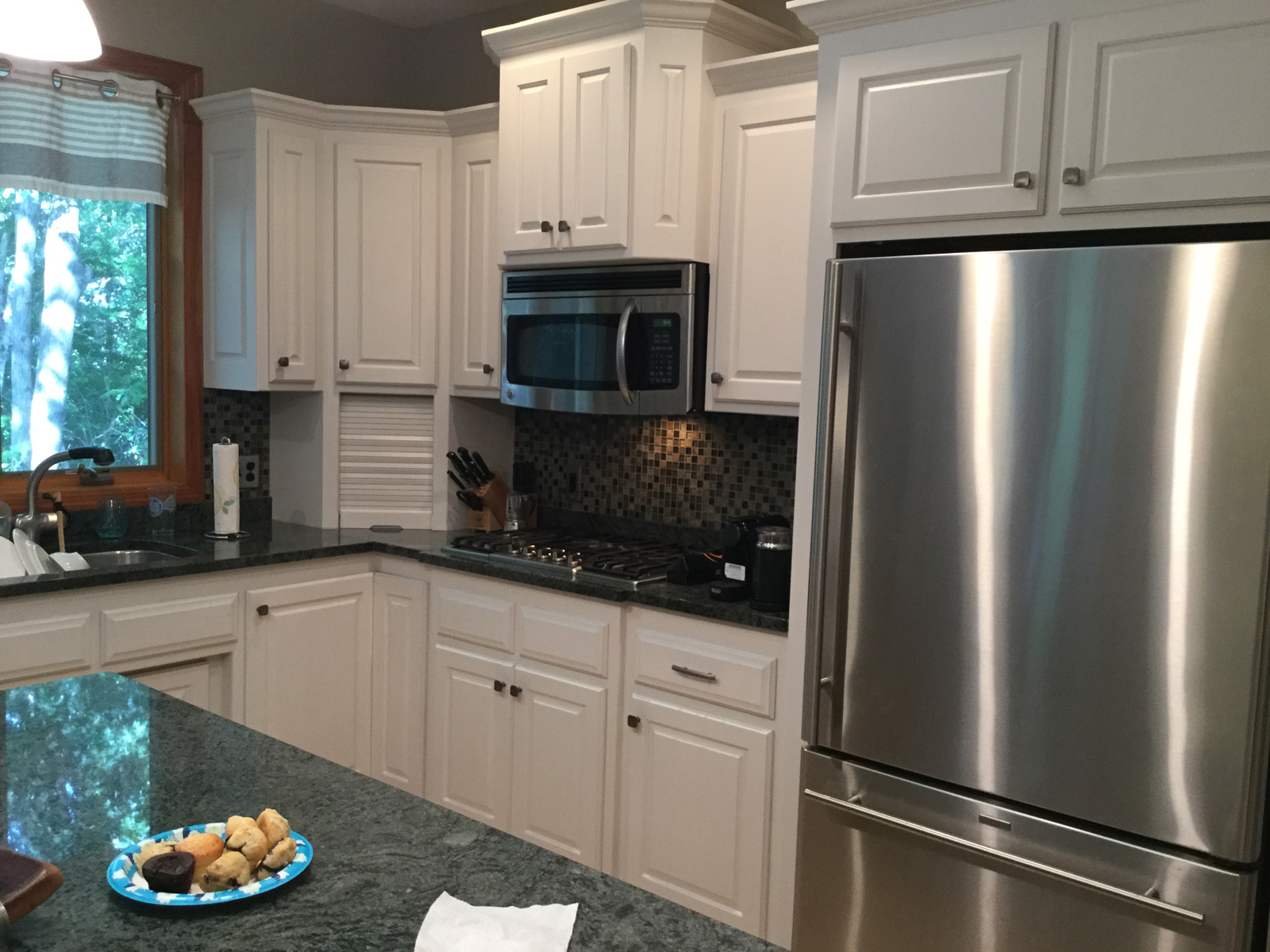
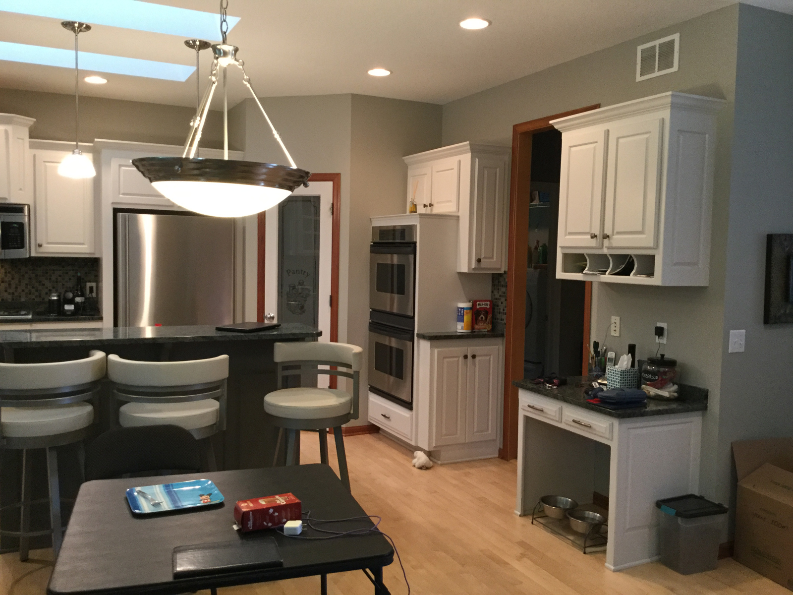
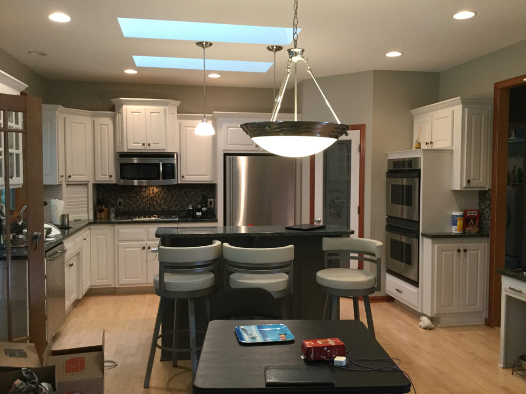
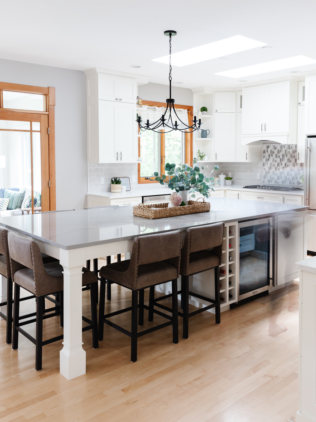
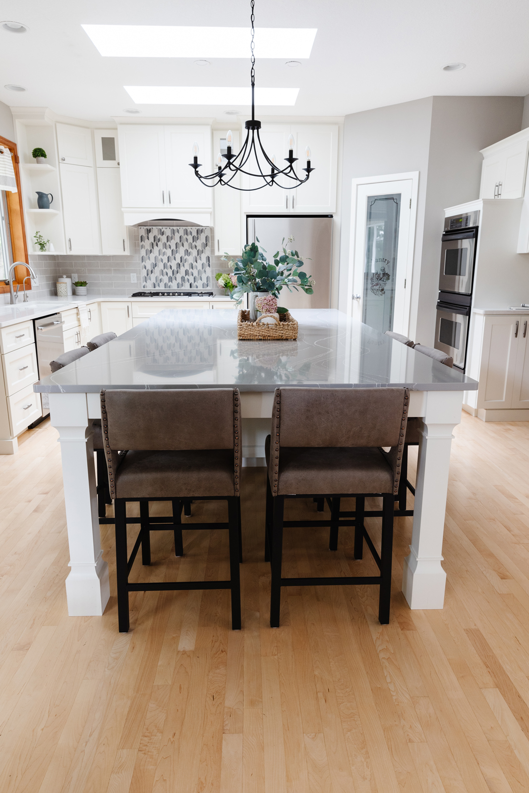
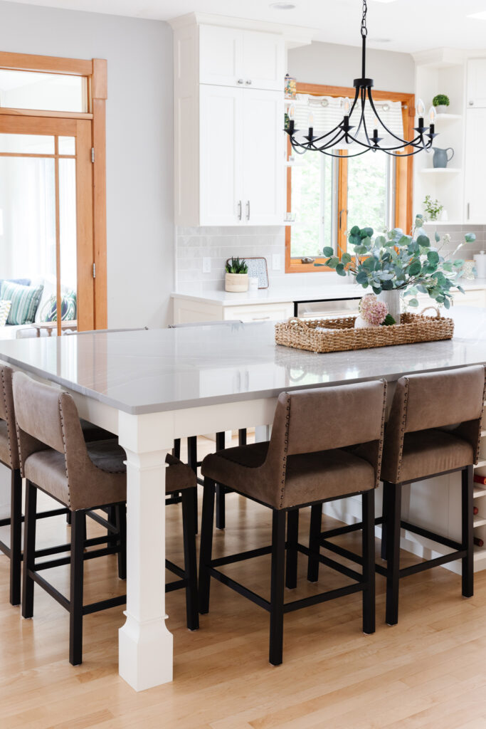
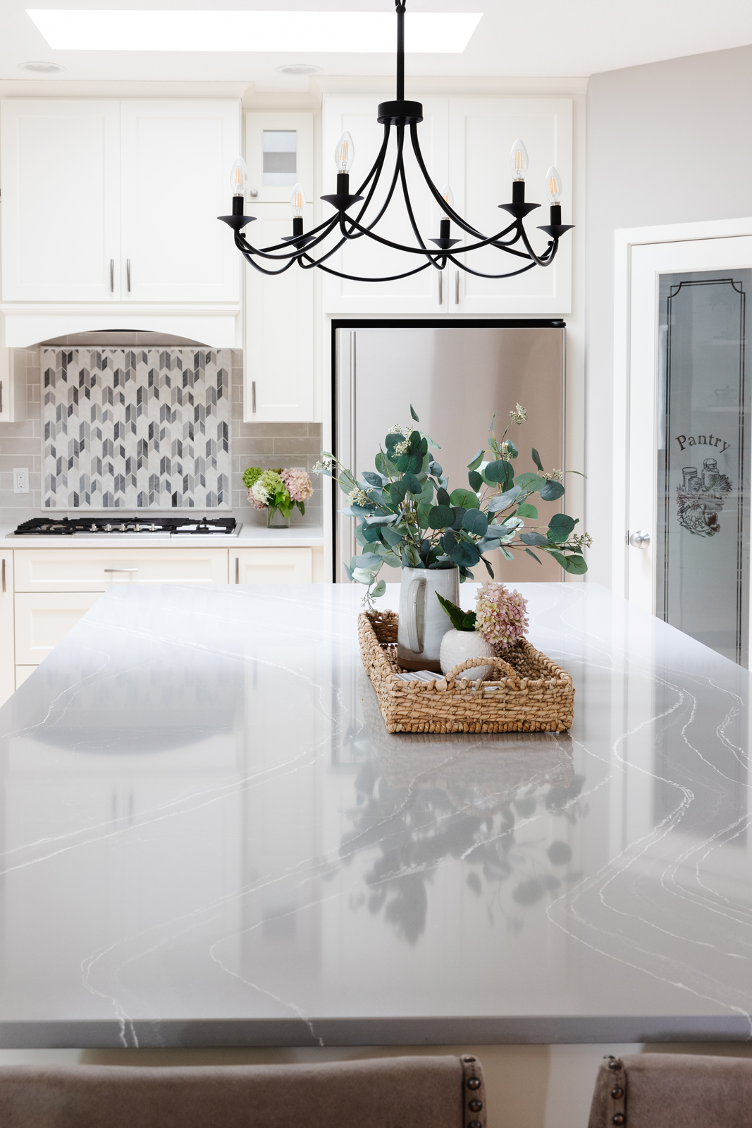
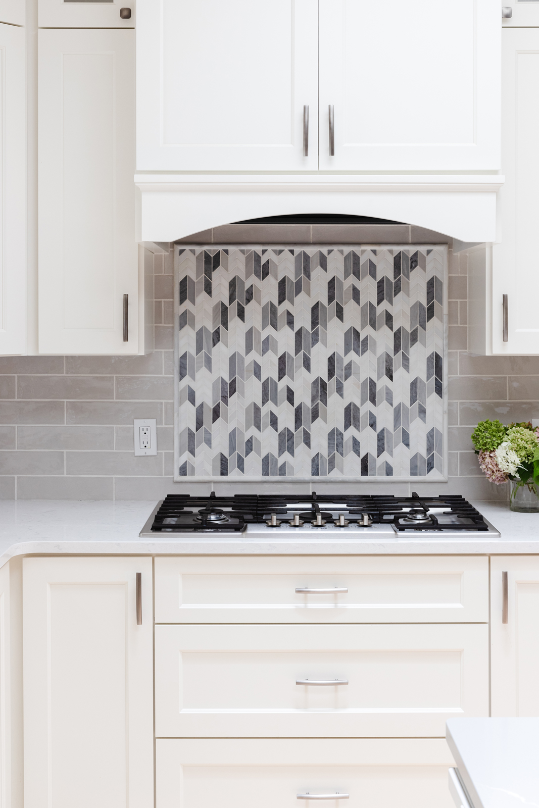
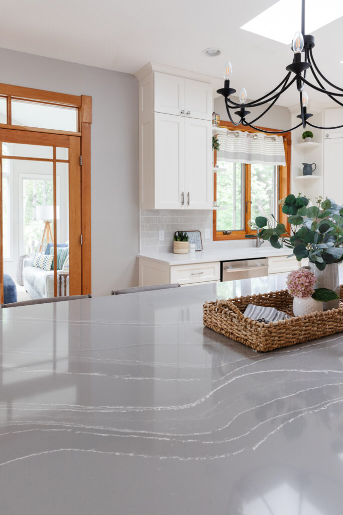
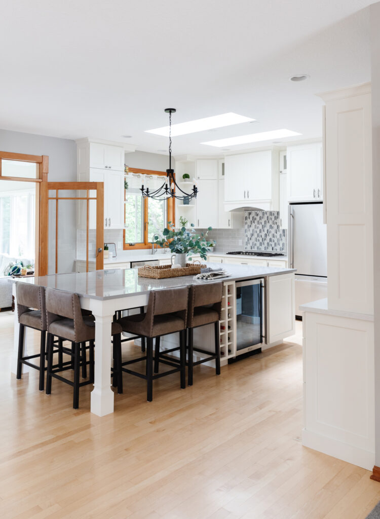
The biggest problem in the kitchen was the tiny center island and lack of space to work. The island was 2 levels, which gave them very little counter space, and only held 3 stools. For a family with growing boys, the kitchen is a busy place and it really craved better functionality. The countertops and backsplash were both very dark, and the lighting was dim. This kitchen looks so much different than it did, but the best part is the dramatic improvement in functionality. The center island is huge! Now 6 people can sit comfortably and there’s still plenty of space to prep food or set out a buffet at the other end. Here’s what we changed:
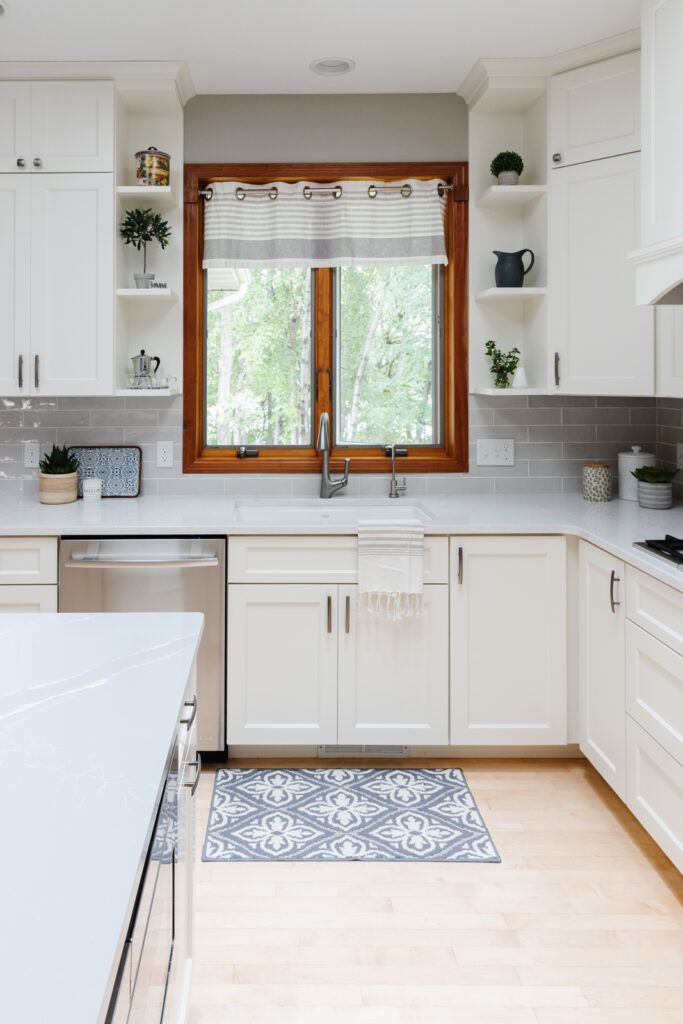
*We removed the appliance garage in the corner and replaced most of the upper cabinets. We went all the way to the ceiling with the upper cabinets to maximize storage and replaced the doors and drawer fronts on the lower cabinets.
*The 2 tier center island was replaced with an oversized island with plenty of seating and storage
*A new stylish hood vent was made and the microwave moved to the center island
*A beverage refrigerator and wine storage was added to the center island
*All of the cabinets got a fresh coat of white paint
* Beautiful new backsplash tile was added with a decorative tile featured behind the cooktop
* All new gorgeous Cambria quartz countertops
* New light fixtures
* New gas cooktop
* New counter stools
Before photos
After photos
the sunroom
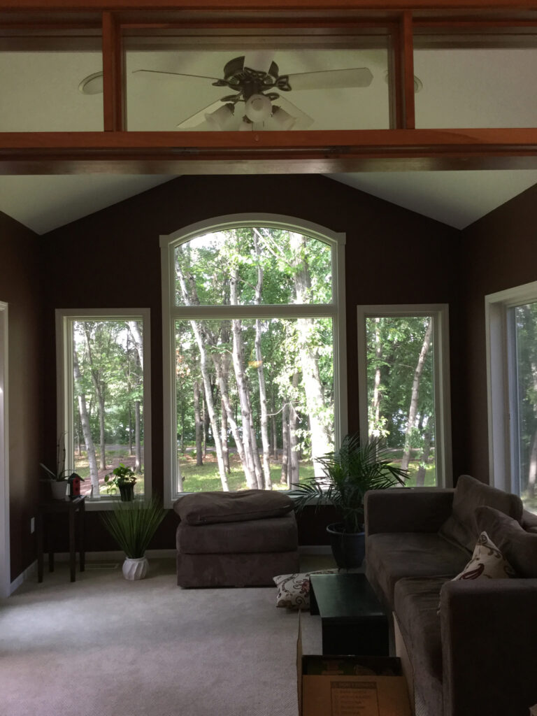
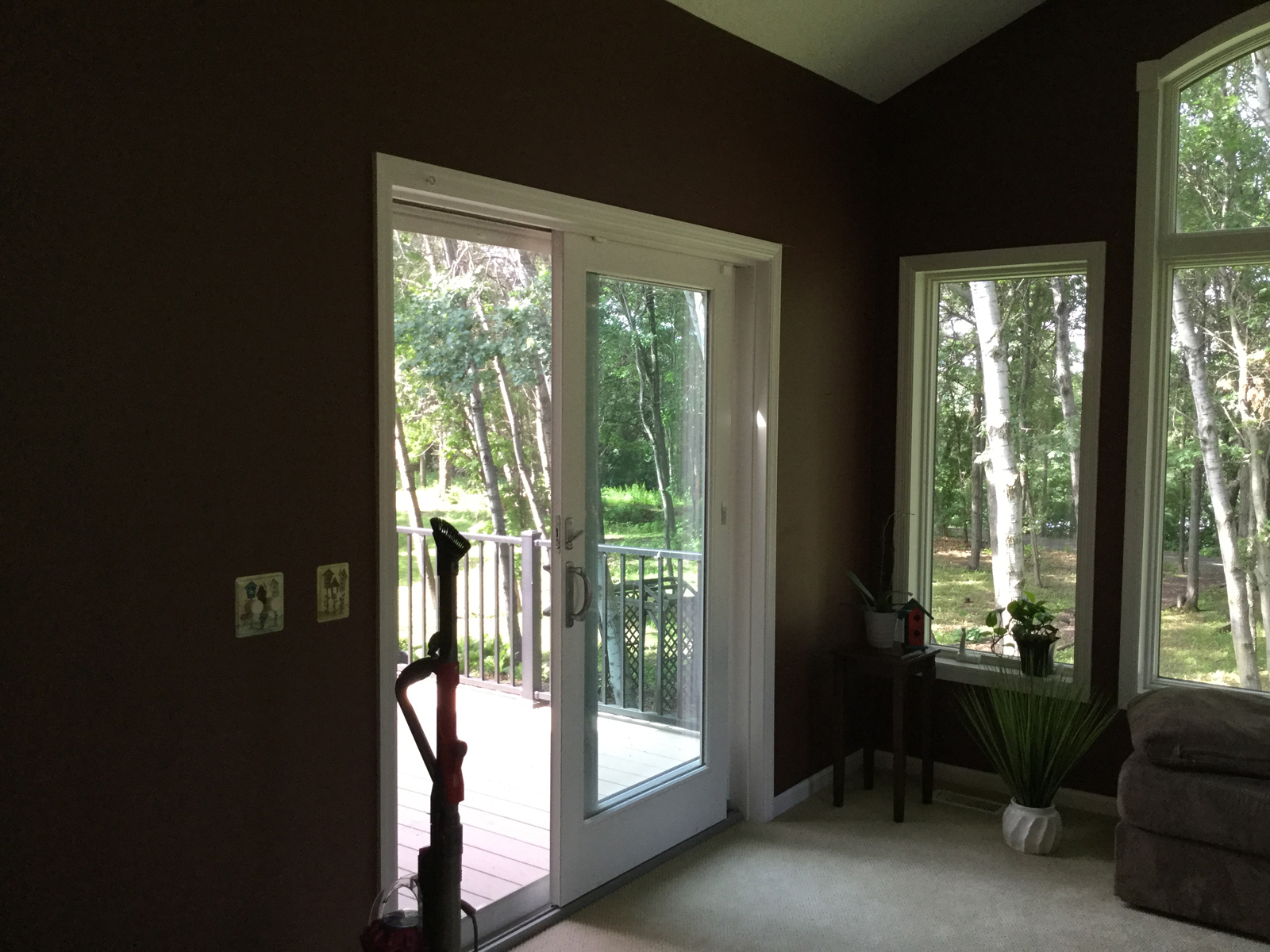
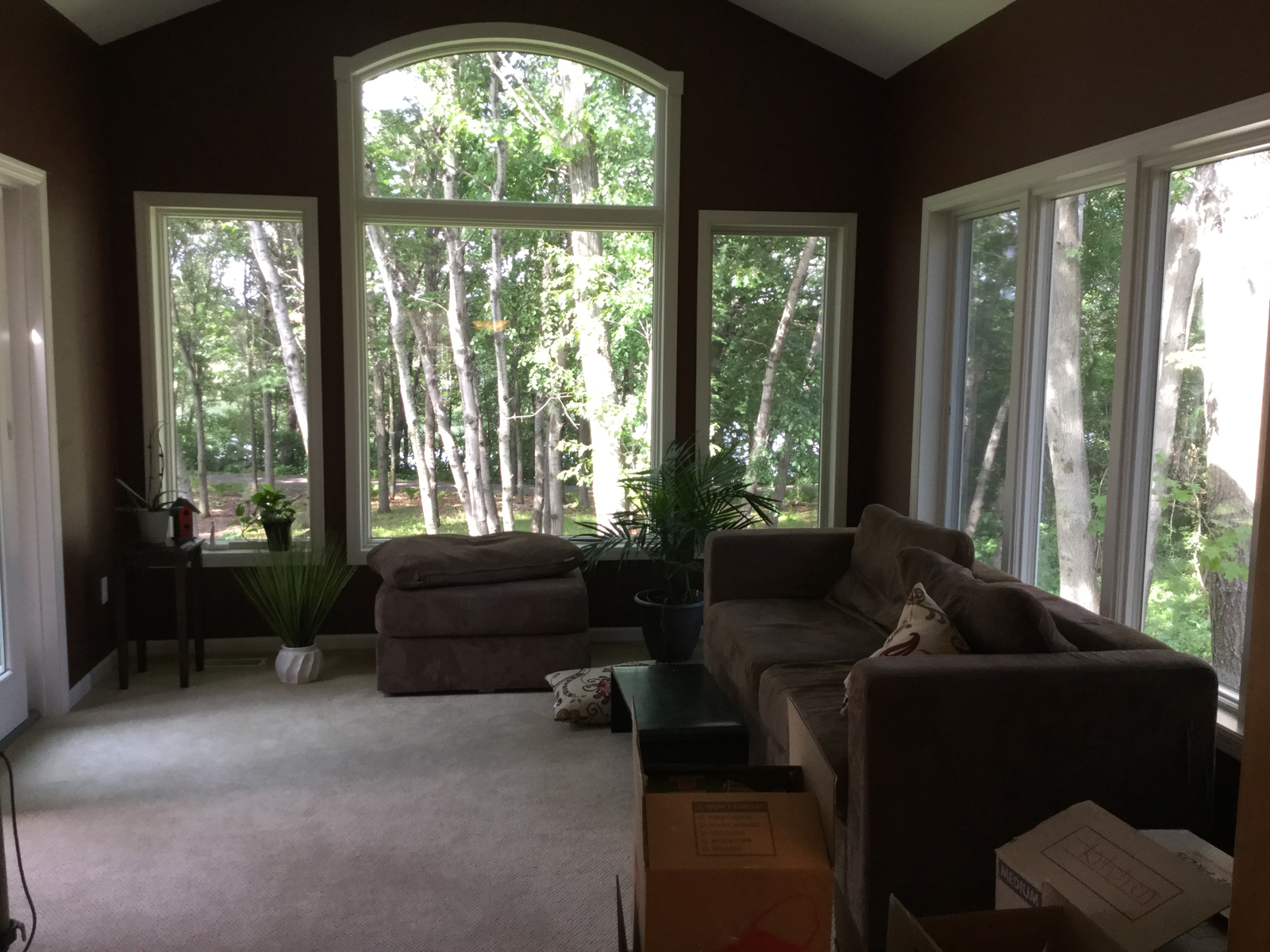
Before photos
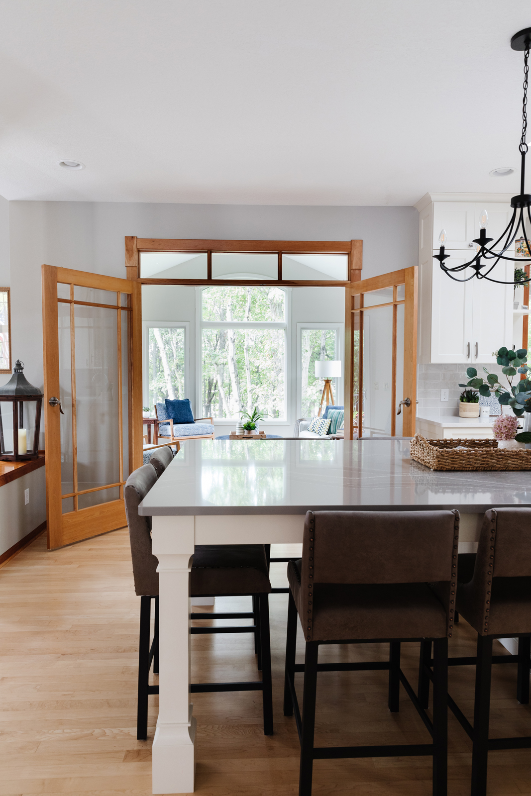
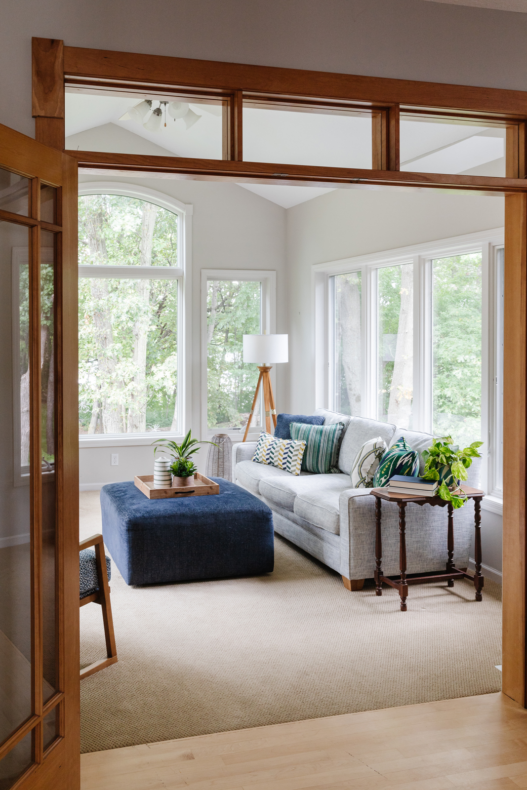
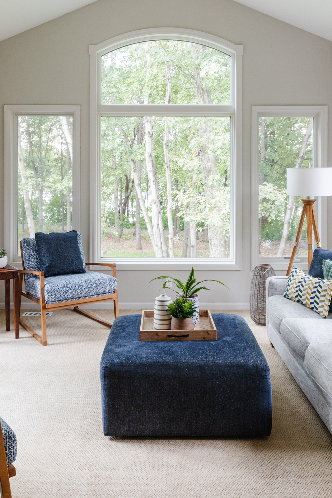
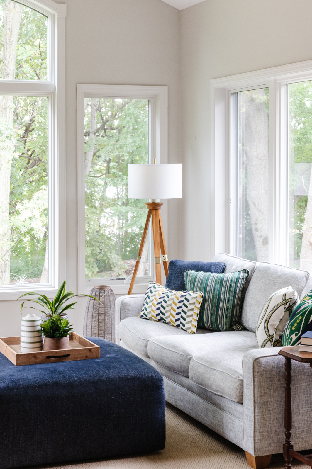
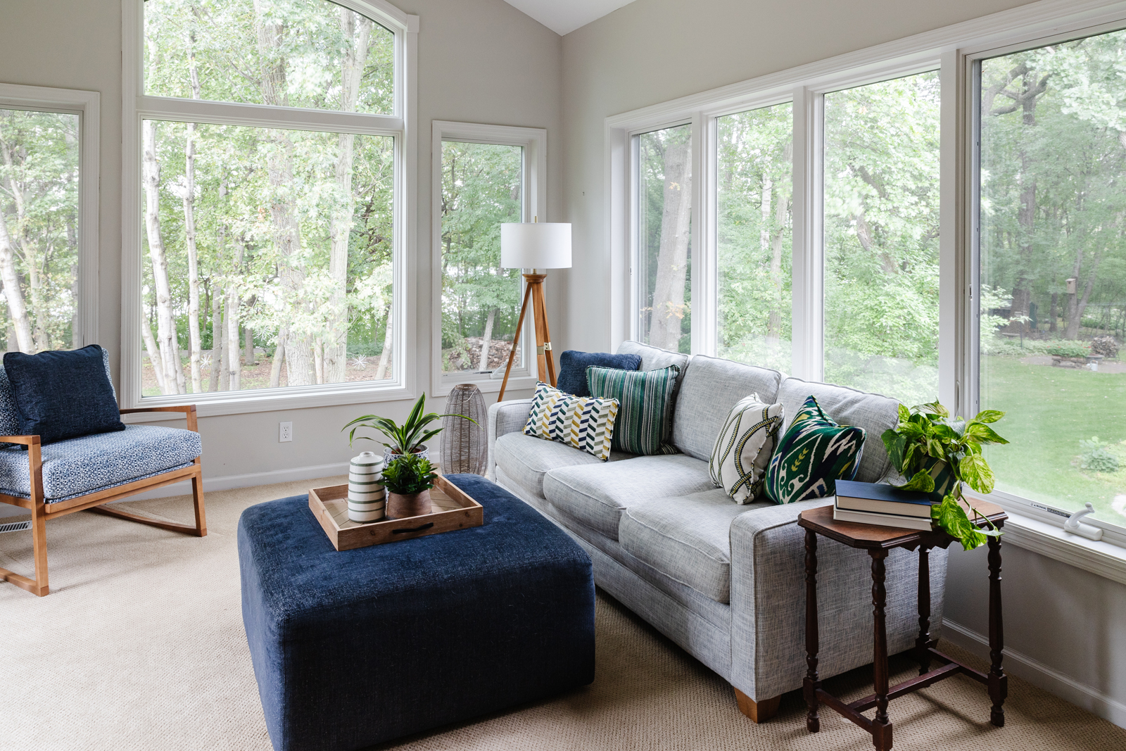
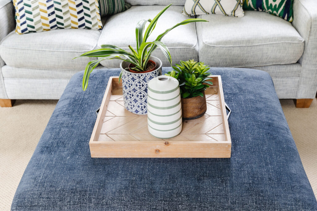
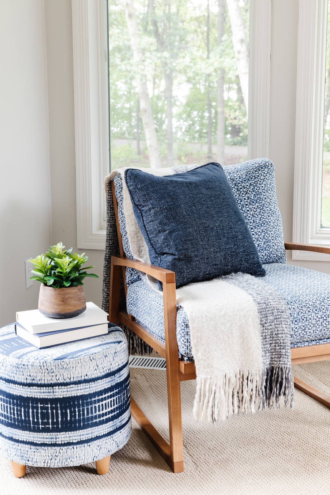
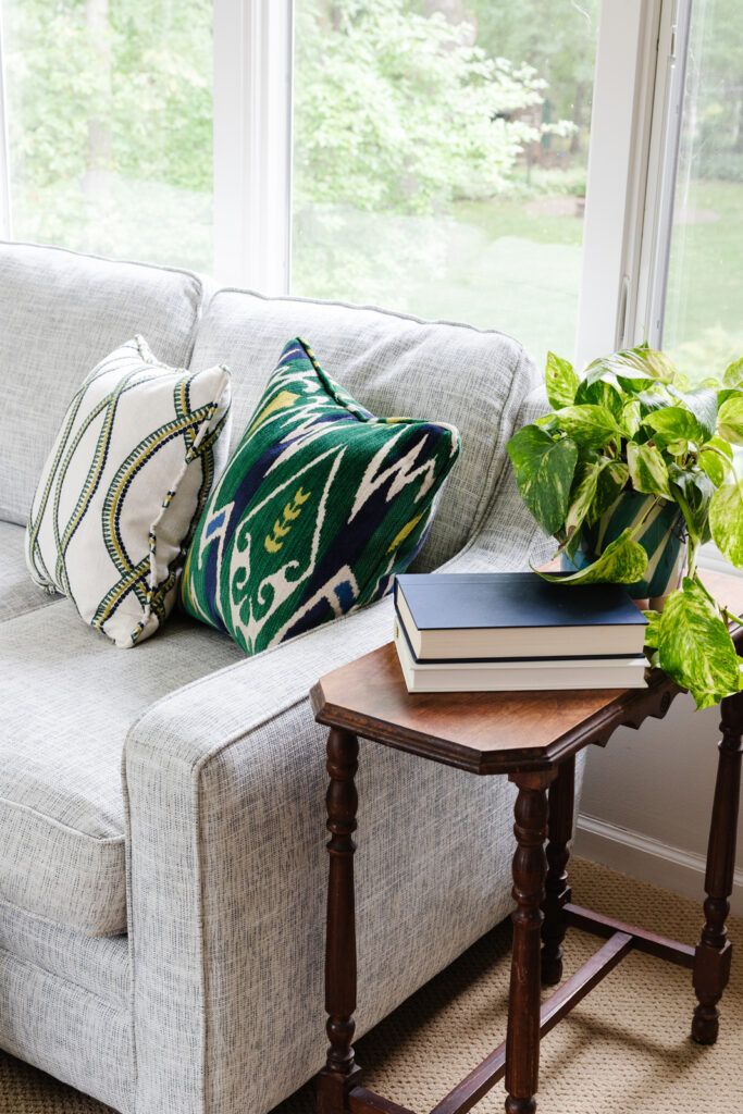
The sunroom was dark and drab but had so much possibility! It needed to be brightened up with a lighter paint color – first and foremost. The millwork was already white so that helped to keep the windows feeling bright as well. All new furniture was added to bring in some color and several cozy spots to sit and enjoy the beautiful view of the lake. This room is now a family favorite and we can understand why!
After photos
We hope you enjoyed seeing this lovely home and how a few simple changes can make it feel brand new!
In the meantime, be sure to subscribe to our newsletter to have more press features, project reveals and design tips sent to your inbox weekly.
XO,
Amy & the Interior Impressions Team
Leave a Reply