Hello friends! This time I’m sharing my primary bedroom and bathroom, laundry room, exercise room, guest bedroom and the outdoor spaces.
As I had mentioned previously, when we bought this house, I knew that I wanted to change pretty much every square inch, but it had good bones and a good layout, so we really didn’t need to remove or add many walls. Because we were doing so much, and as expected, the budget can get out of control quickly. We did a lot of the work ourselves and we’ve had to stretch the projects out over the past 5 years. I honestly don’t think we will ever be “finished”, but that’s the life of a designer! I’ll always want to continually update and change things.
THE OWNERS bedroom
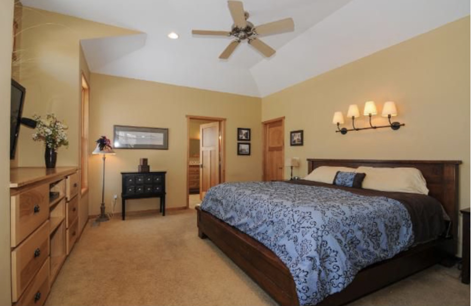
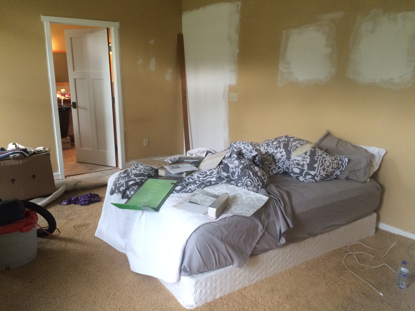
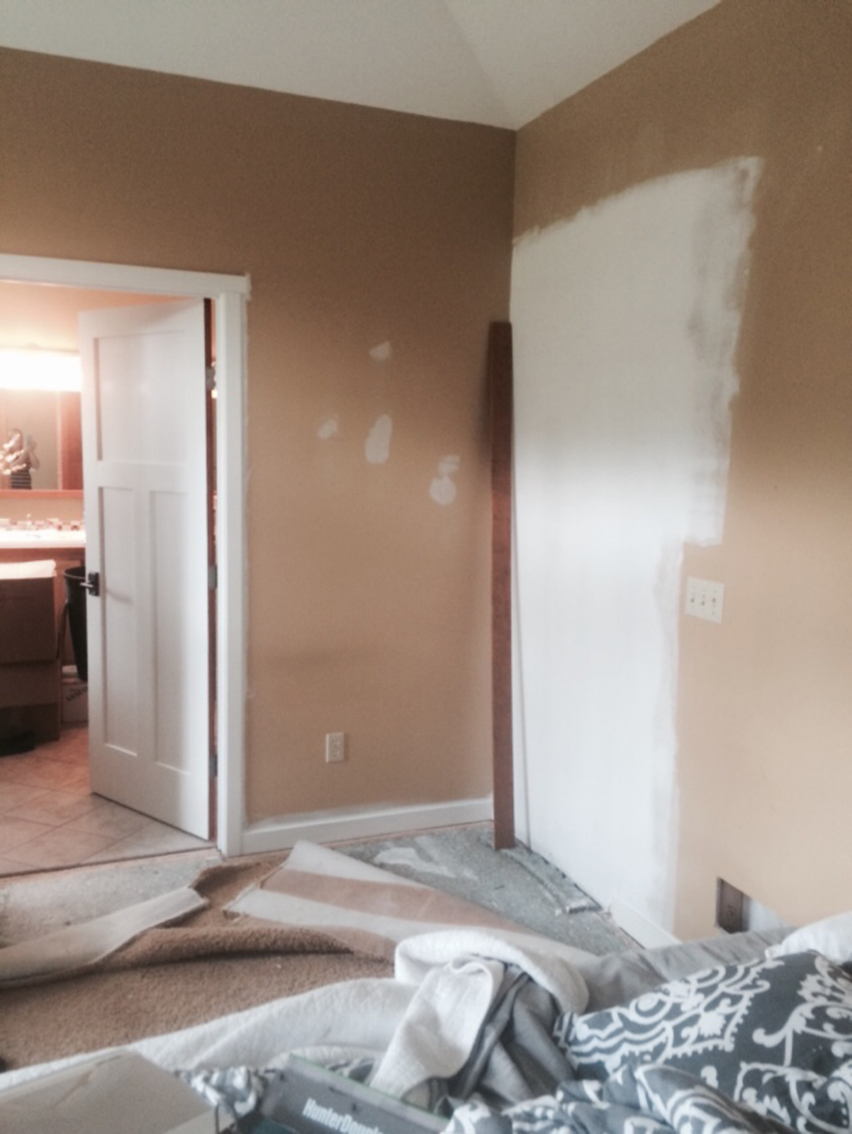
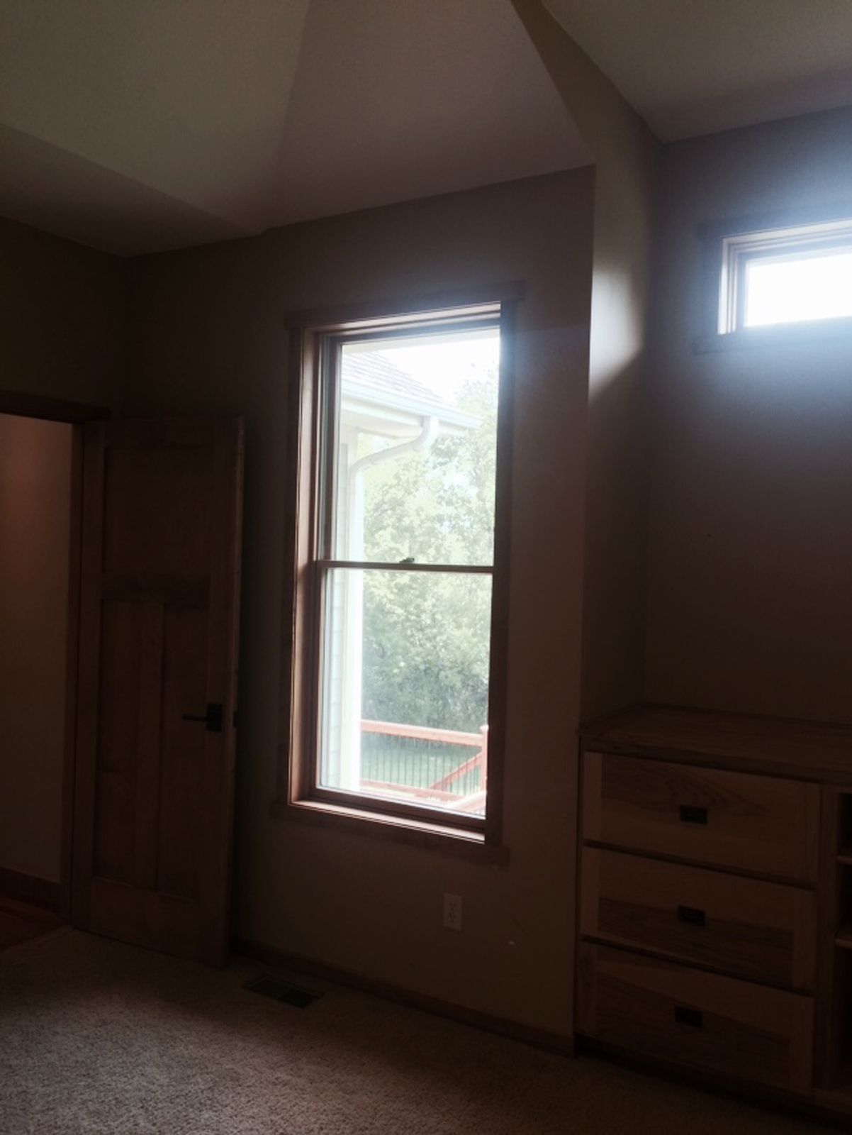
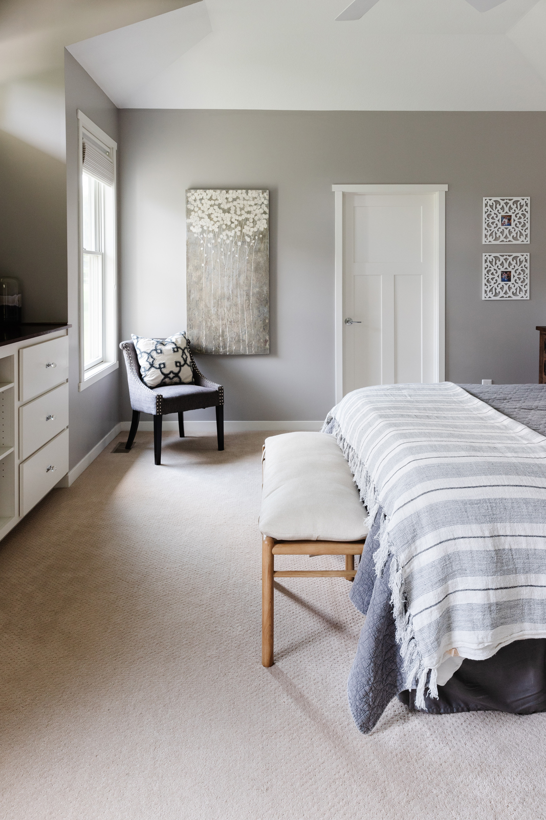
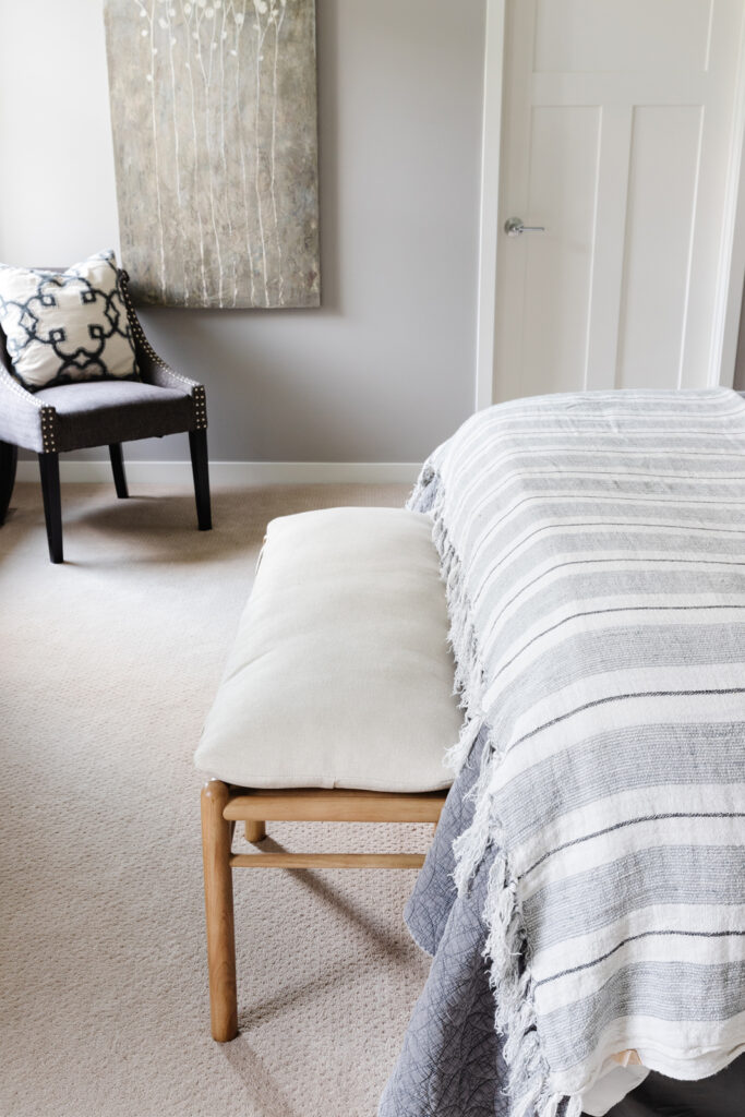
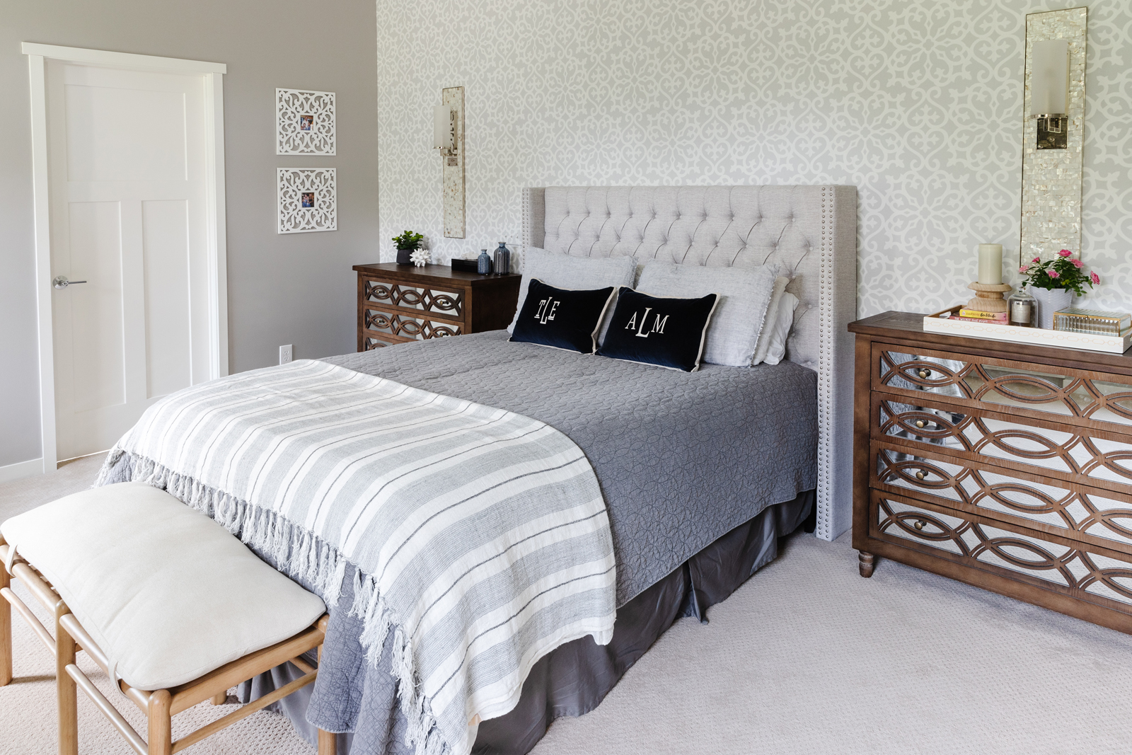
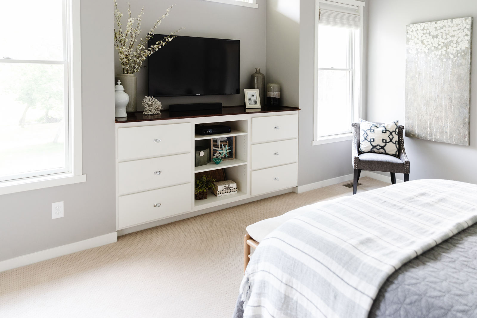
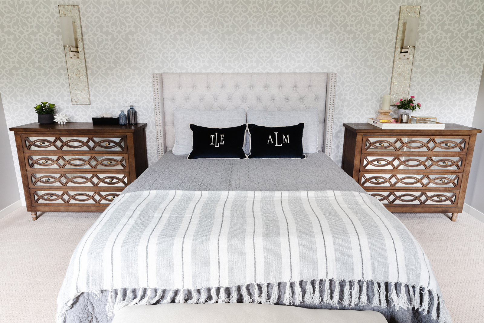
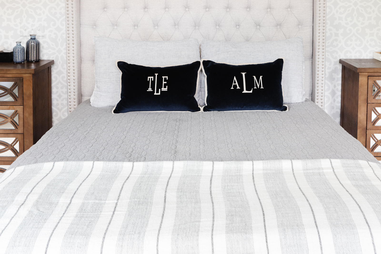
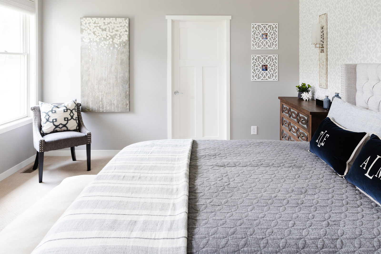
In our bedroom, there was a door into the closet that caused the bed to be off center and didn’t allow room for two nightstands. Since we had another entrance to the closet from the bathroom, it really wasn’t necessary to have two doors. We closed up the wall in our bedroom and then removed the wall sconce light that was over the bed. We centered the bed on the wall and added two wall sconce lights over each nightstand. We replaced the carpeting, added wallpaper to the headboard wall, painted all of the windows and trim white, painted the built in dresser white and stained the top a darker brown. We added a wall mounted tv over the dresser, painted the walls a light gray and added room darkening Vignette Roman shades. The room is now complete and cozy!
BEFORE & progress PHOTOS

AFTER PHOTOS
The owners bathroom
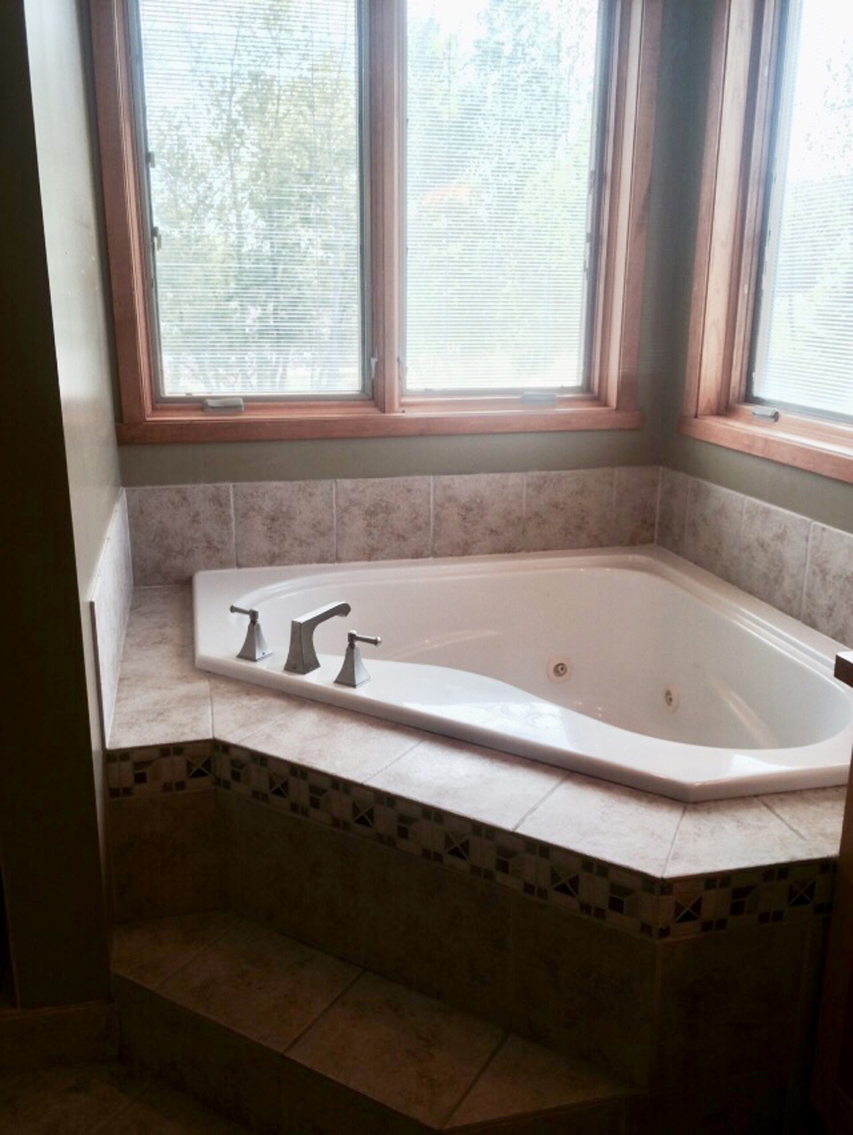
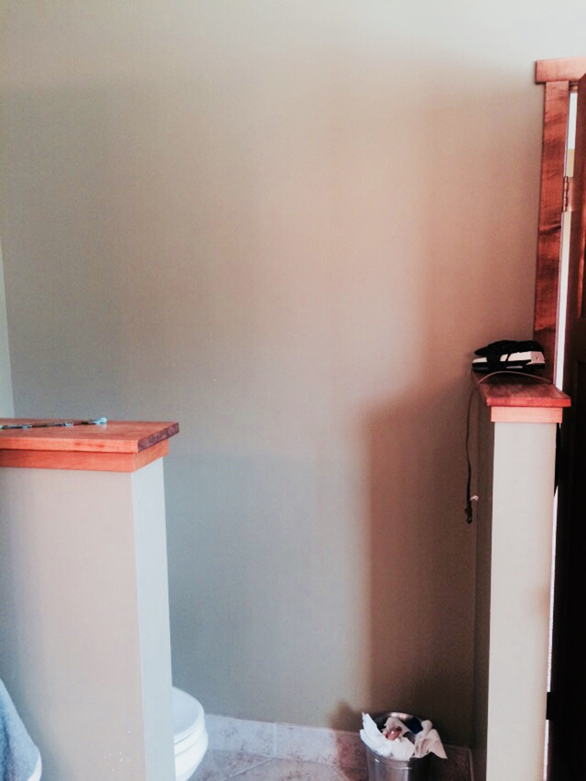
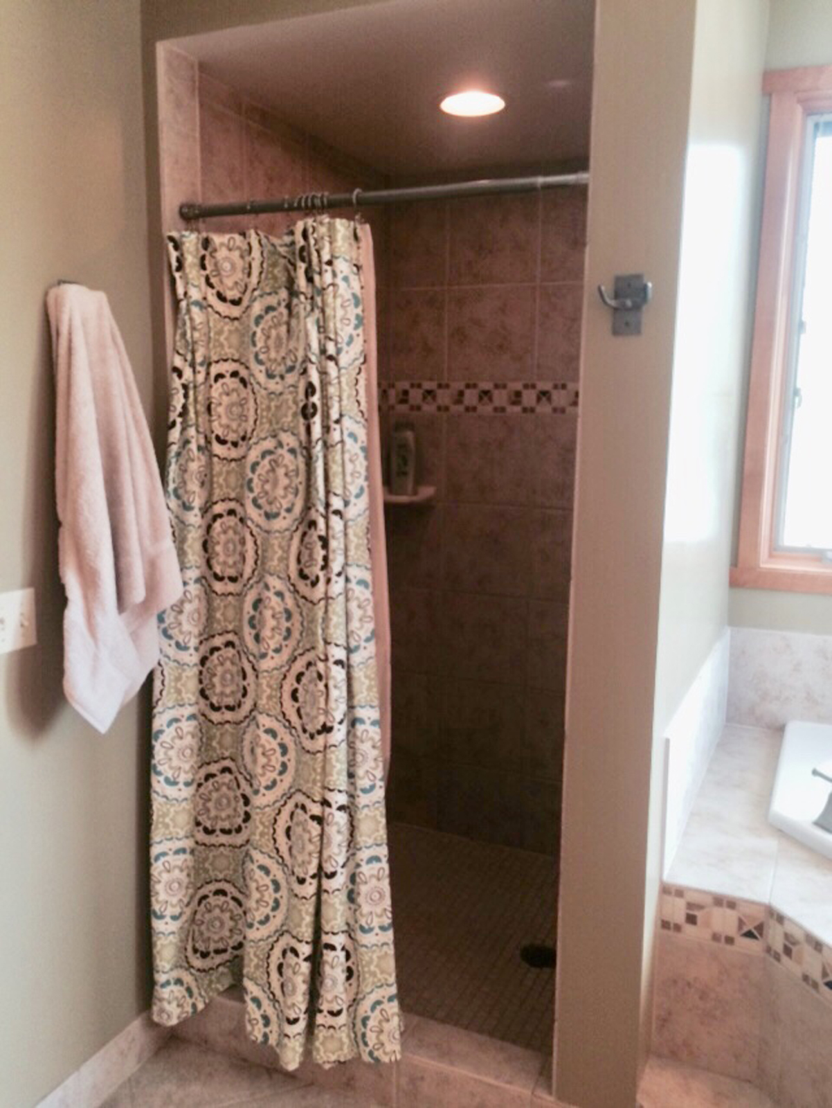
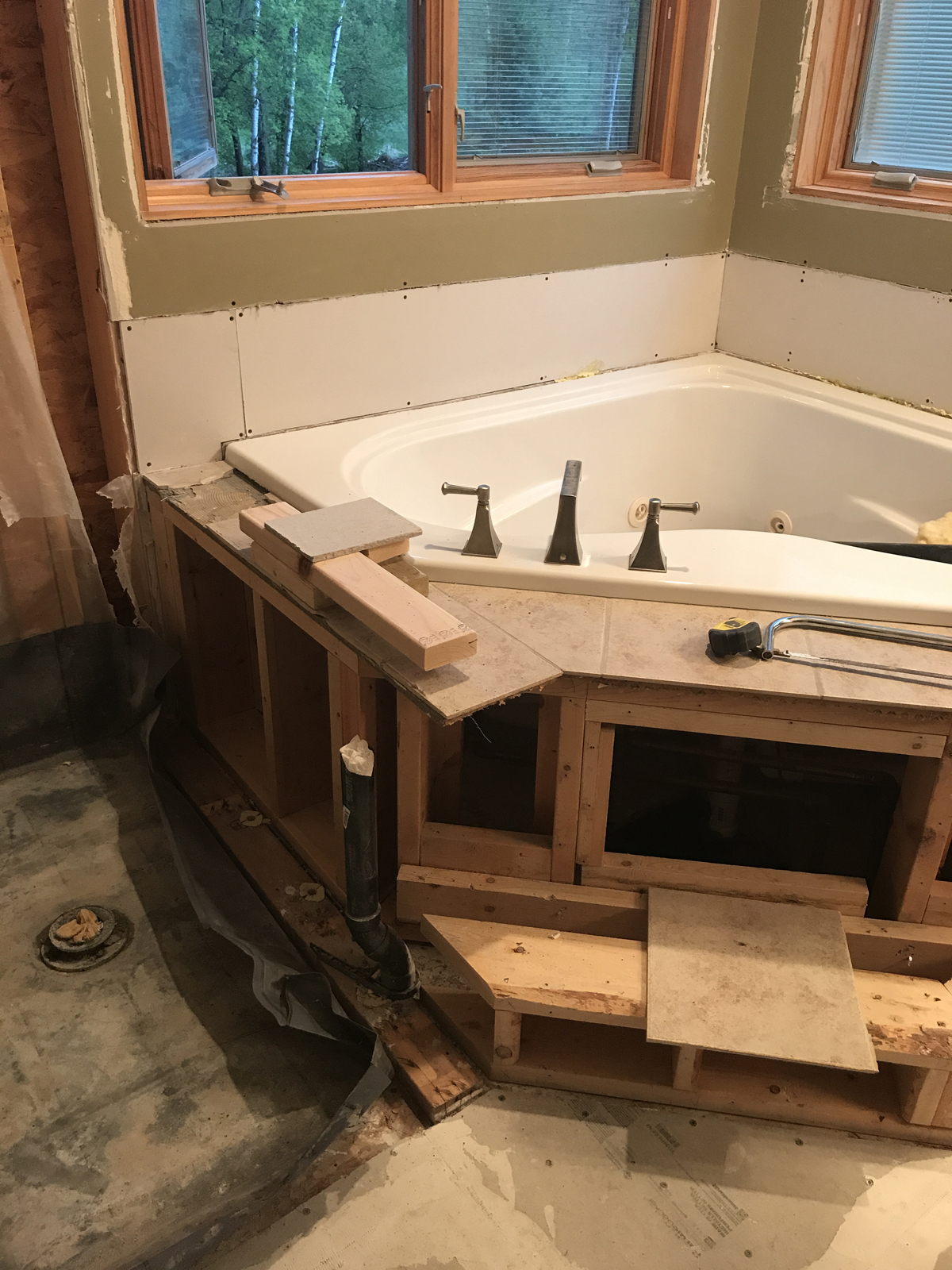
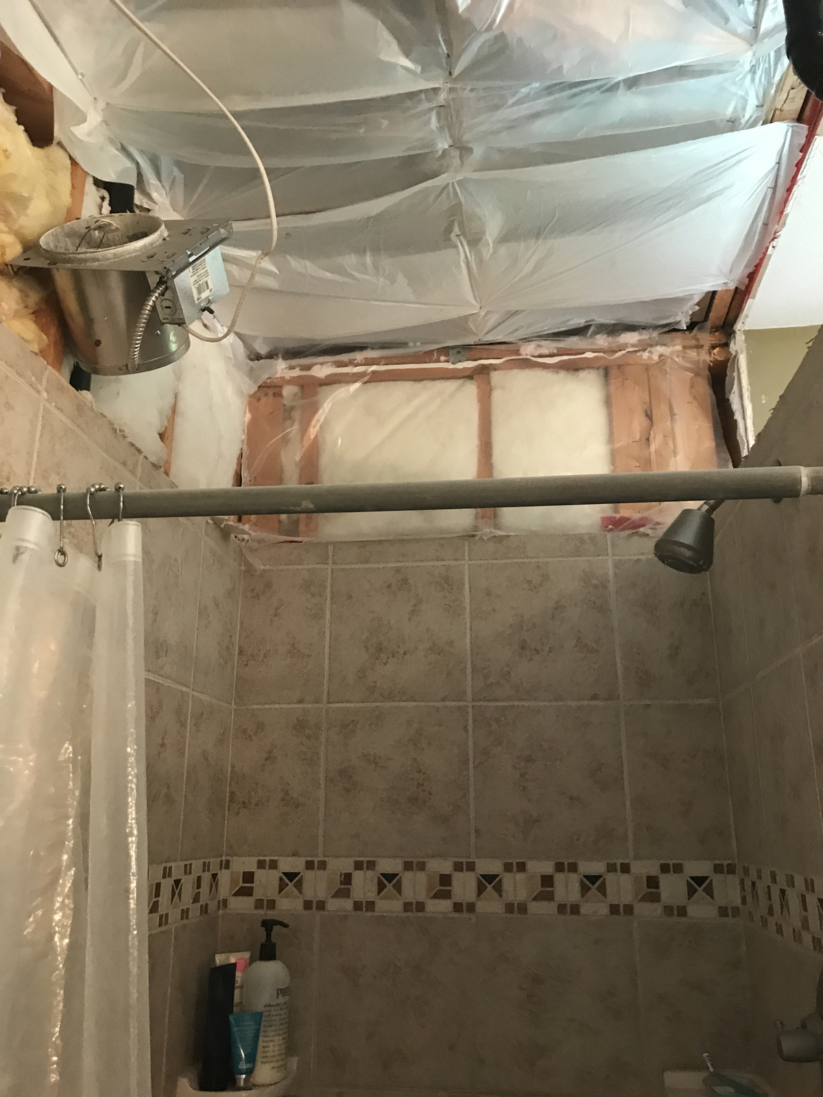
The primary bathroom was probably our biggest remodeling project in the house, besides the kitchen. It was dark and dated and had the ugliest tile I’d ever seen (almost)! The shower was tiny and felt like you were showering in a dark closet. The vanity countertop was made out of square ceramic tile and the grout was coming loose and cracking everywhere. The toilet was not enclosed but had two, half walls that supposedly offered some privacy – complete fail, if you ask me! The hardest decision for me was whether to keep the corner jetted tub or not. I really wanted to put in a free standing tub instead, but the cost of removing our corner tub and adding a new tub was astronomical. There was a lot of plumbing and sub floor work that came along with that. After much deliberation, I decided to keep what we had and just do new tile around it. The tub is in excellent condition and it works. I also never take baths, so spending upwards of $6000 to change out the tub just didn’t make sense. I literally only climb into it to clean it when it gets dusty. I’ve only used it 5 times since we moved in.
BEFORE & PROGRESS PHOTOS




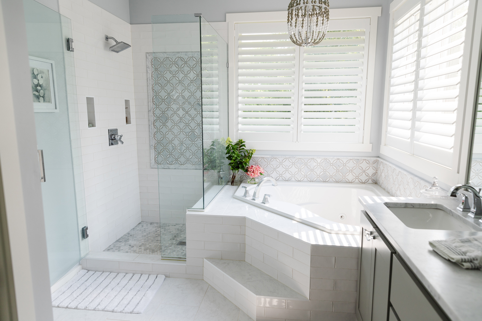
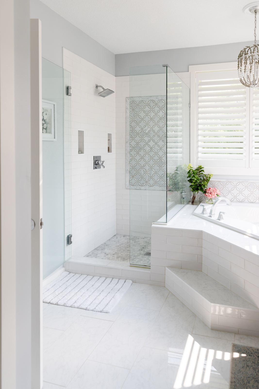
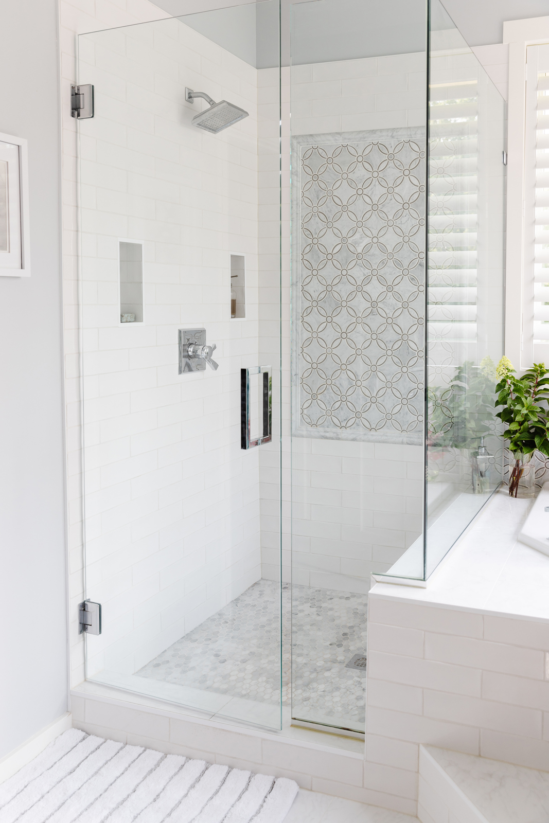
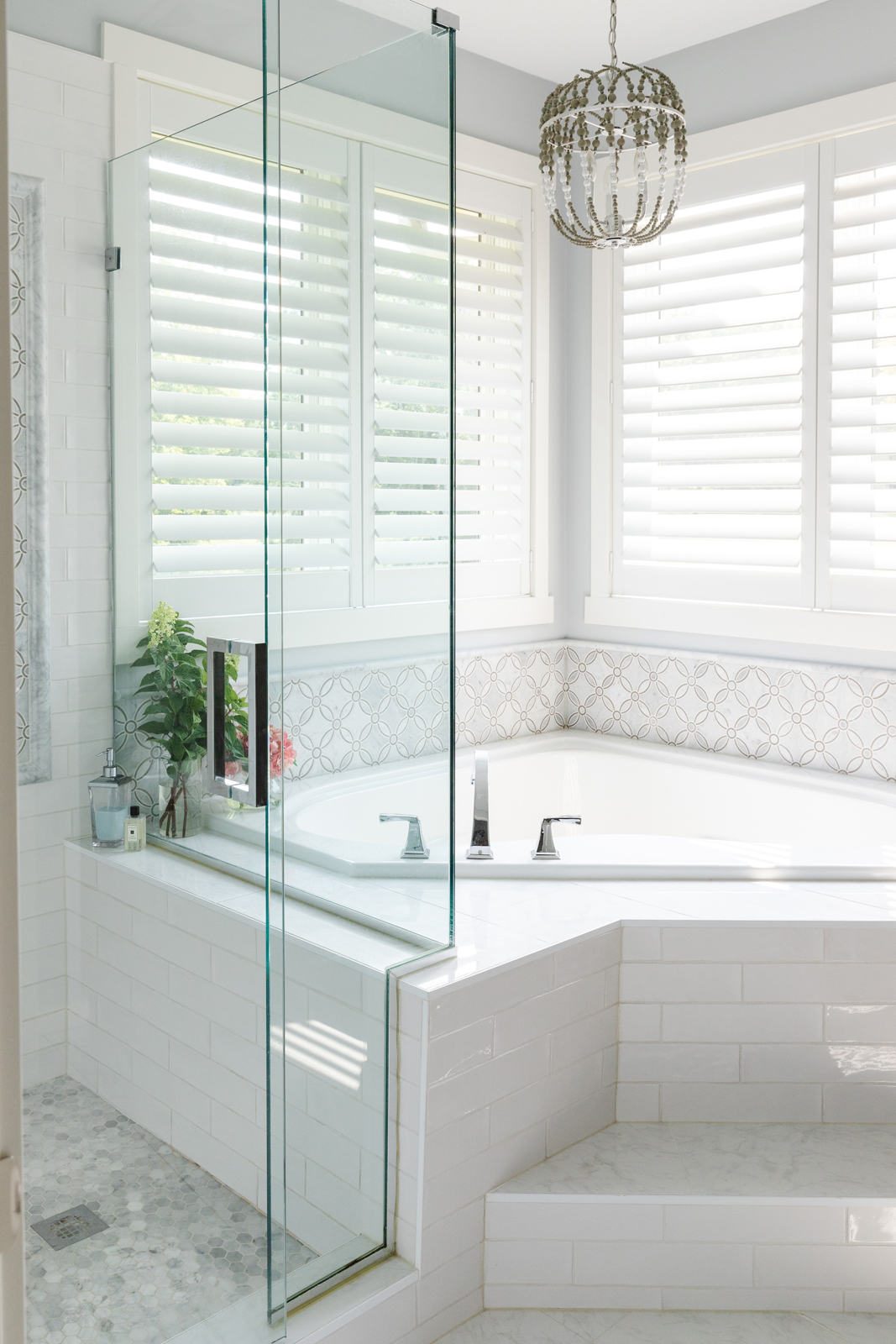
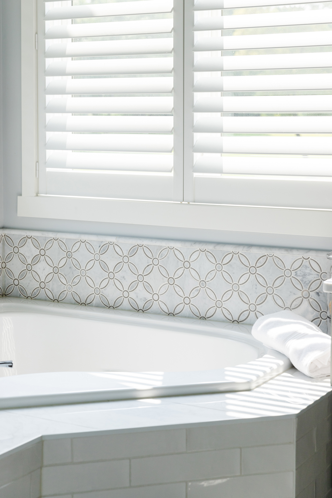
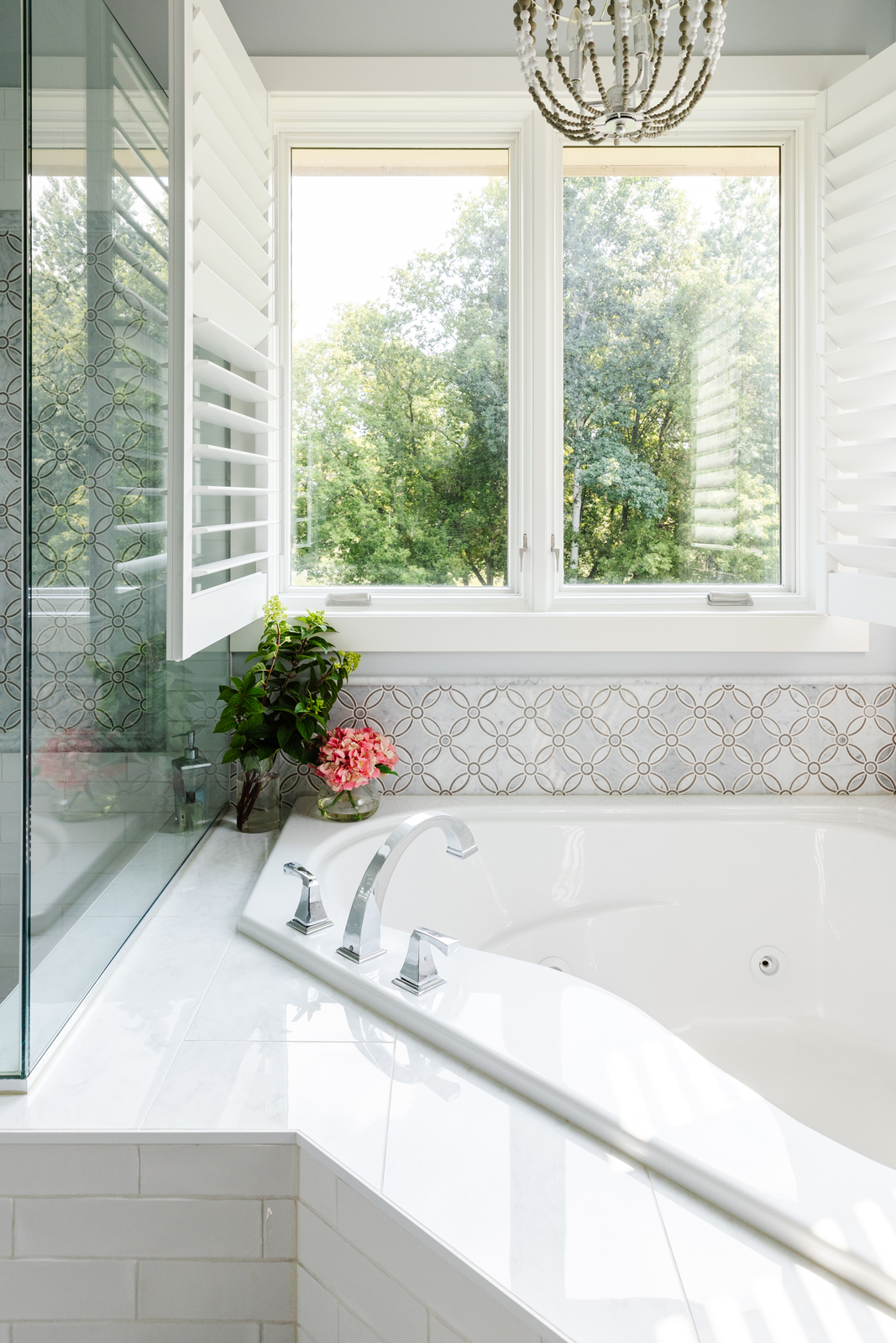
AFTER PHOTOS
So here’s what we changed:
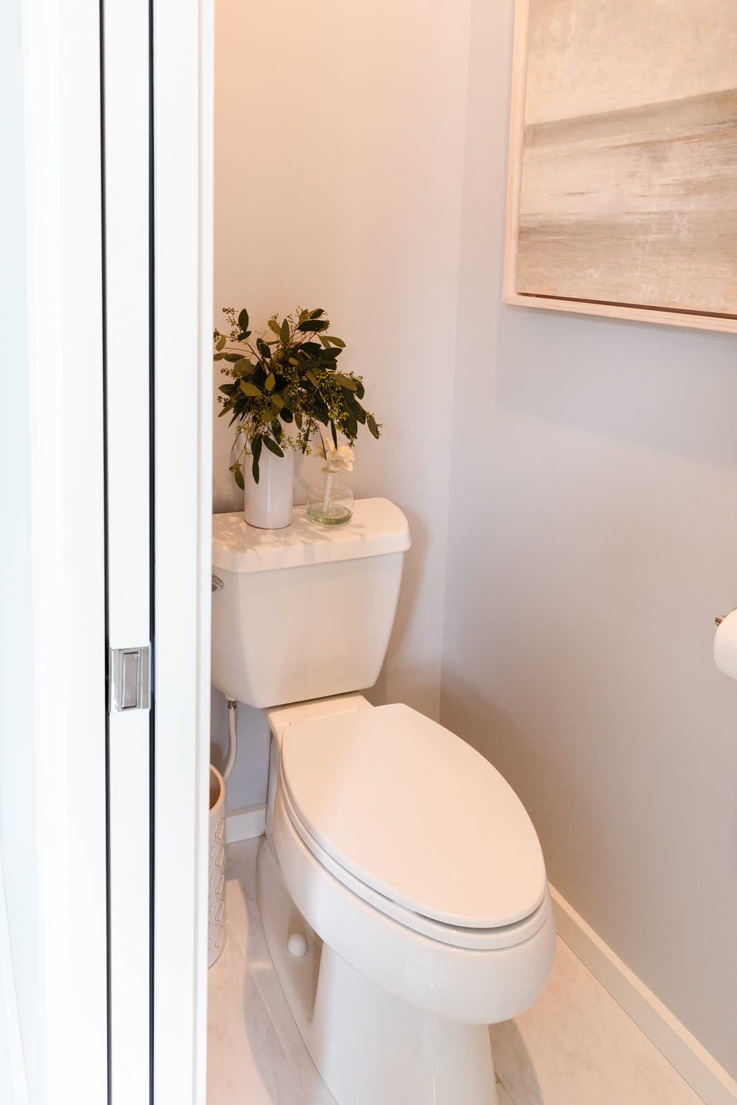
Structurally, we added walls and a pocket door to create a private toilet room.
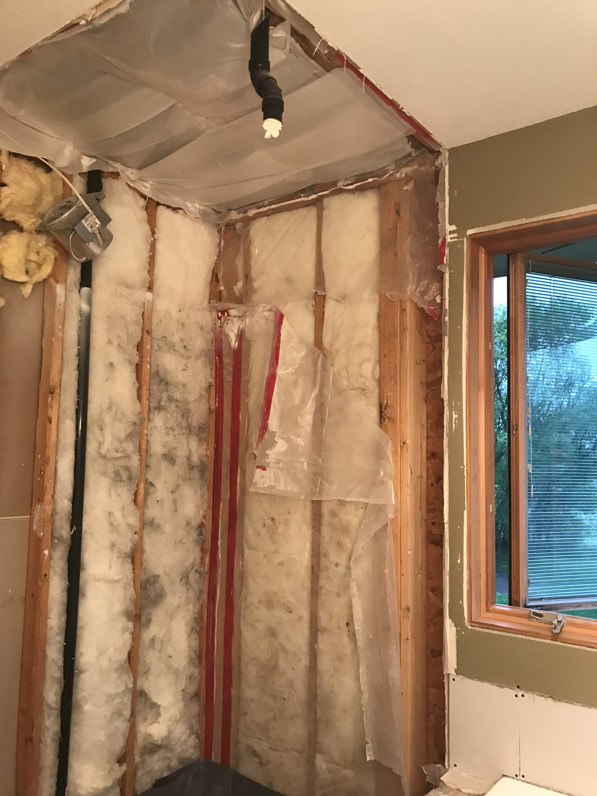
We removed the shower walls and soffit that made the ceiling really short.
We rerouted the shower head to the opposite wall and added a frameless glass enclosure and door.
We changed up the step to the tub by removing a weird angle it had.
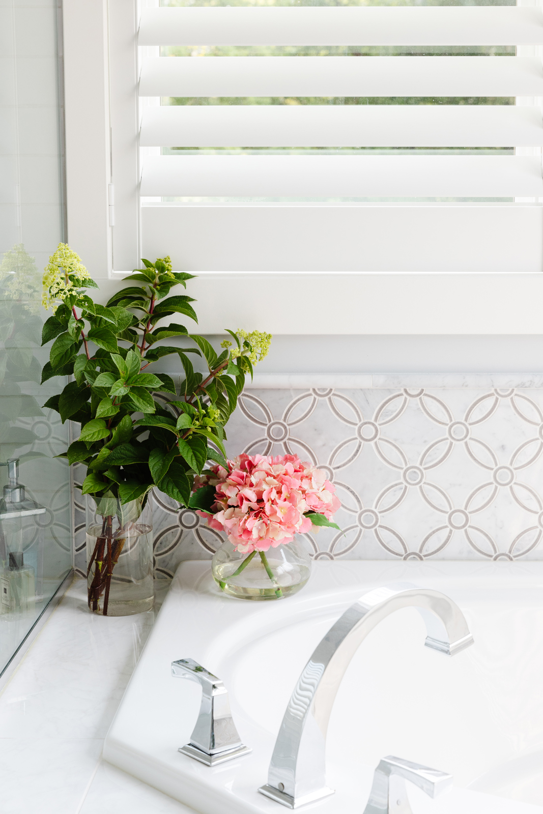
We added all new tile to the bathroom floor, tub deck and surround, shower floor and shower walls. I tiled the bathroom floor myself but then decided to hire a professional for the shower and tub. It got to be too much for me to do on my own.
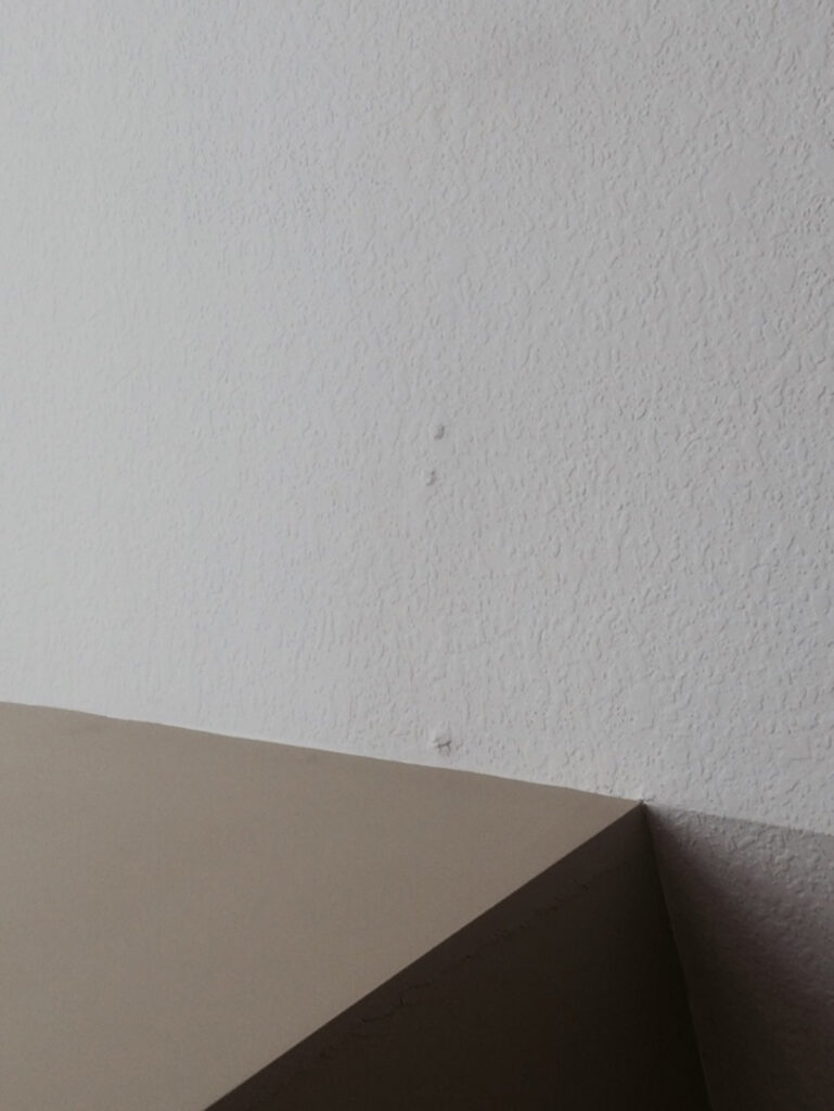
We scraped down the popcorn ceiling, added sheetrock over the shower ceiling that we had opened up, and had the ceilings professionally textured with knock down finish and painted.
We painted all of the windows and trim white and added new baseboards.
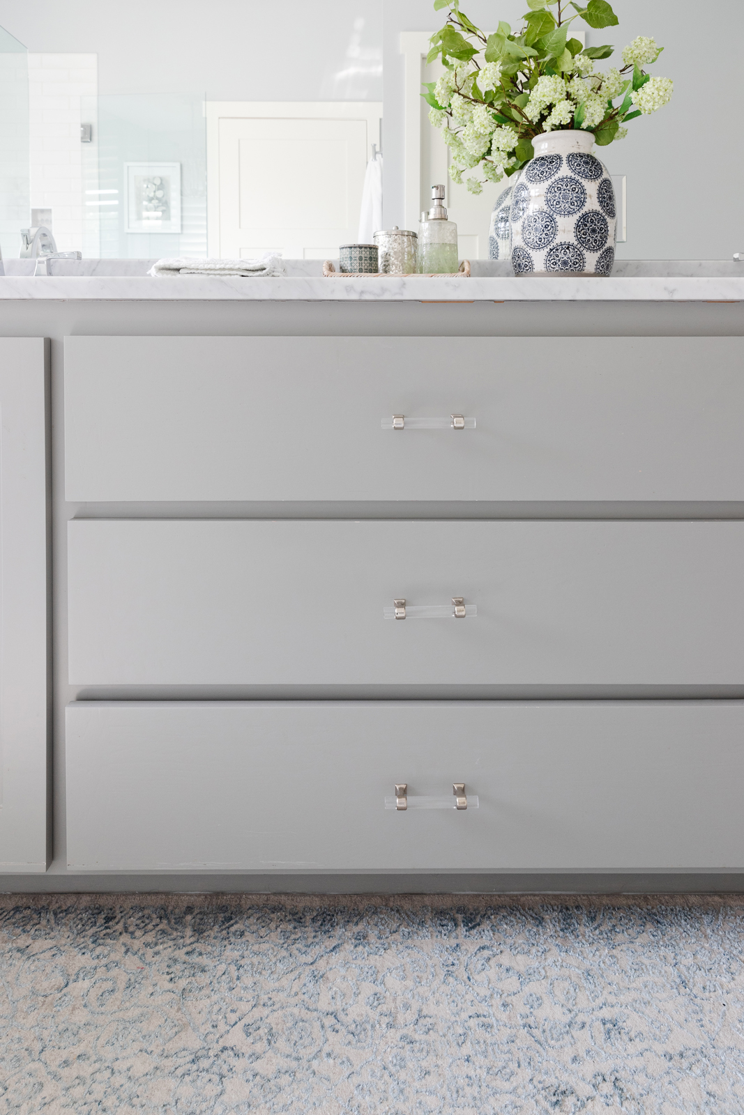
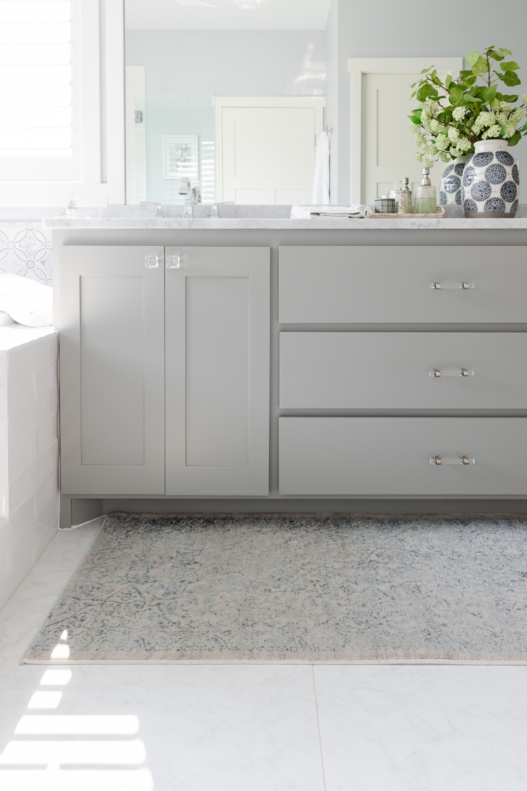
We painted the walls a silvery blue and had the vanity cabinets professionally painted a medium toned gray.
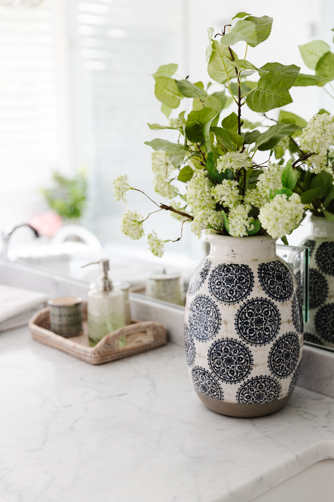
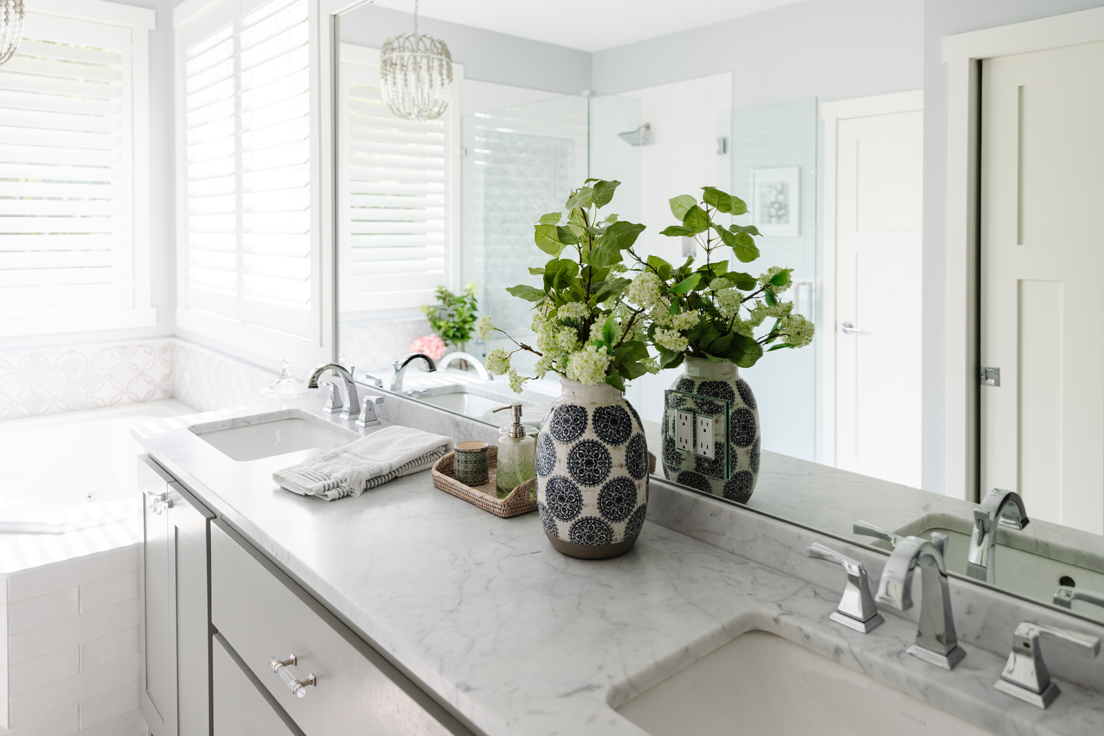
We added a new honed Carrara marble countertop, new sinks, new faucets, a new framed in mirror, all new plumbing fixtures, and lighting. I love the beaded chandelier over the tub! Lastly, we added shutters to the windows that allow us to tilt the top and bottom separately so we leave the bottom part closed for privacy but open the top half to let the sun shine in. Not pictured, we added all new closet organizers to our walk in closet, as well as a new light fixture, carpet and paint.
LAUNDRY ROOM
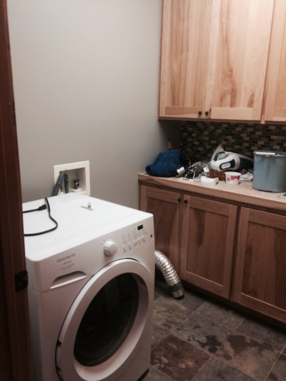
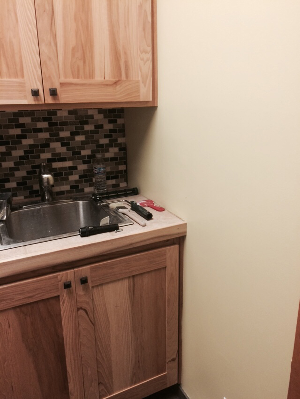
In the laundry and mud room, the walls were sponge painted a lovely shade of barf. Lol, can you tell how much I loved them? This part of the house is still the most challenging because it is very small and our previous house had a huge mud room with custom lockers and a desk, an extra refrigerator, a huge walk in closet with a custom designed system for all of the coats and shoes that a seven-person family could possibly have. In this house, there’s barely enough room to hold one person’s belongings. But, we did downsize after all, so it is what it is. There’s really no way to make it bigger.
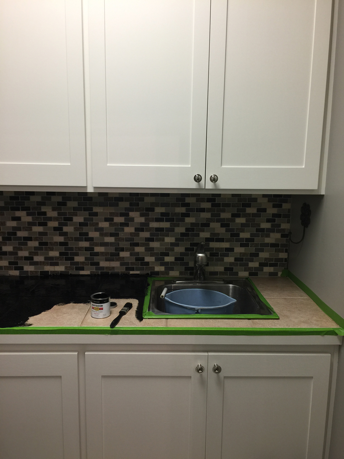
BEFORE PHOTOS

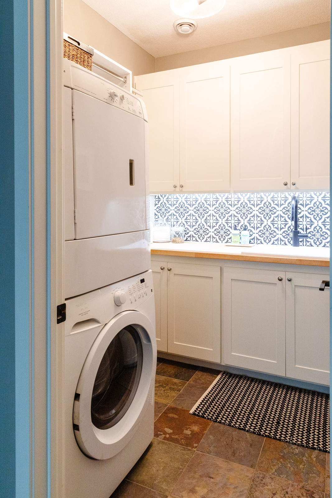
After photos
We added a stackable washer and dryer to conserve on space in the laundry room. The countertops were again tiled. Why was that ever popular in the early 2000’s? What were they thinking?! Yuck! The tile backsplash was a peel and stick and was never grouted and didn’t even cover the entire backsplash. We attacked the laundry room in stages. At first, I just painted the countertop black to disguise the tile temporarily. Eventually, we tore out the tile countertop and added a butcher block counter, a new really deep sink, and a new faucet. I tiled the backsplash myself, and we had the cabinetry professionally painted white, added new hardware, painted the walls a light gray, and added a new light fixture. It’s still really small, but at least it looks prettier now! In the mud room, we just painted the walls, trim and doors and added a slim cabinet for extra storage. The only thing we have not done yet in the mud room and laundry room is replace the tile on the floor. It’s a multicolored slate and I hate it. That will happen… eventually!

THE GUEST BEDROOM
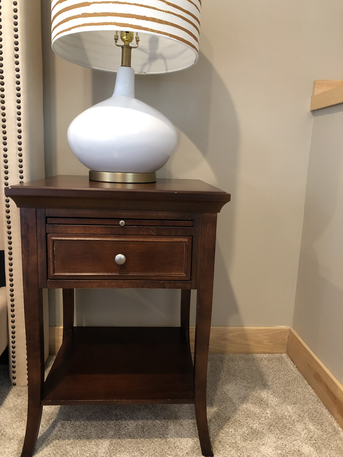
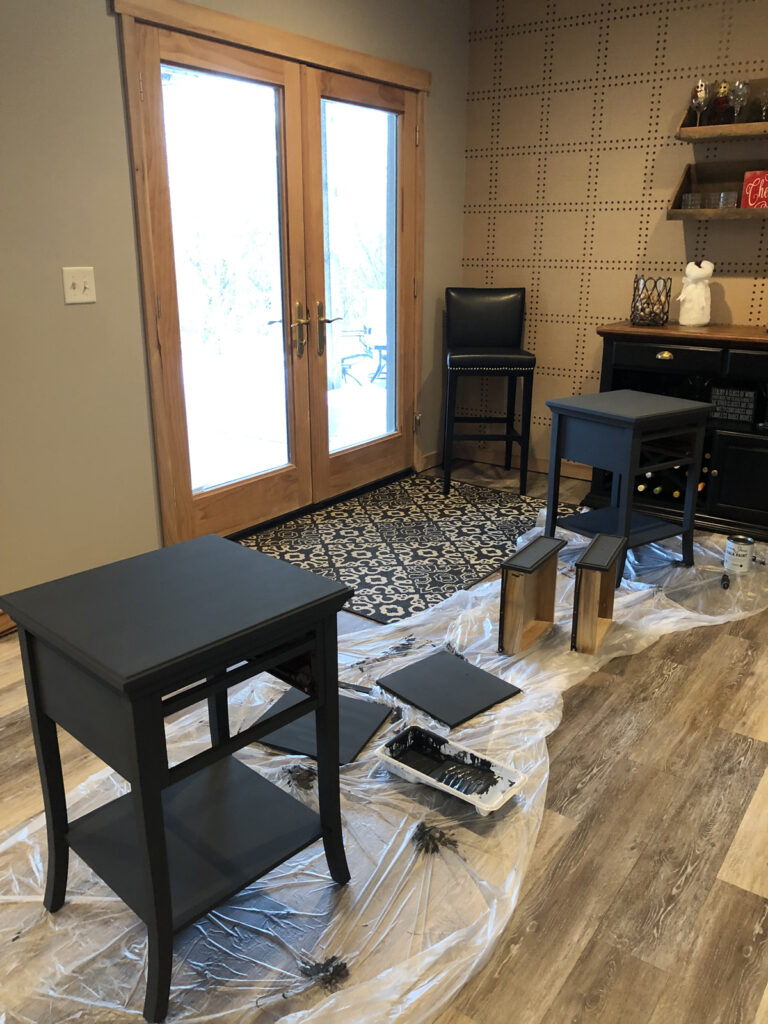
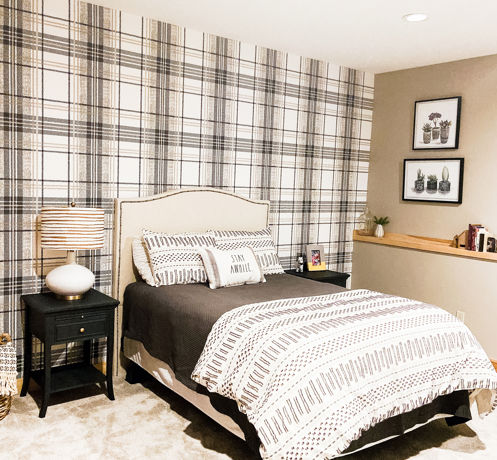
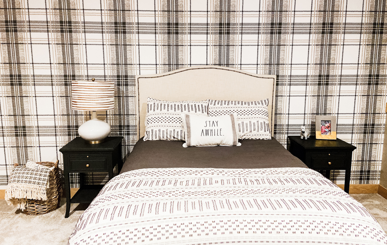
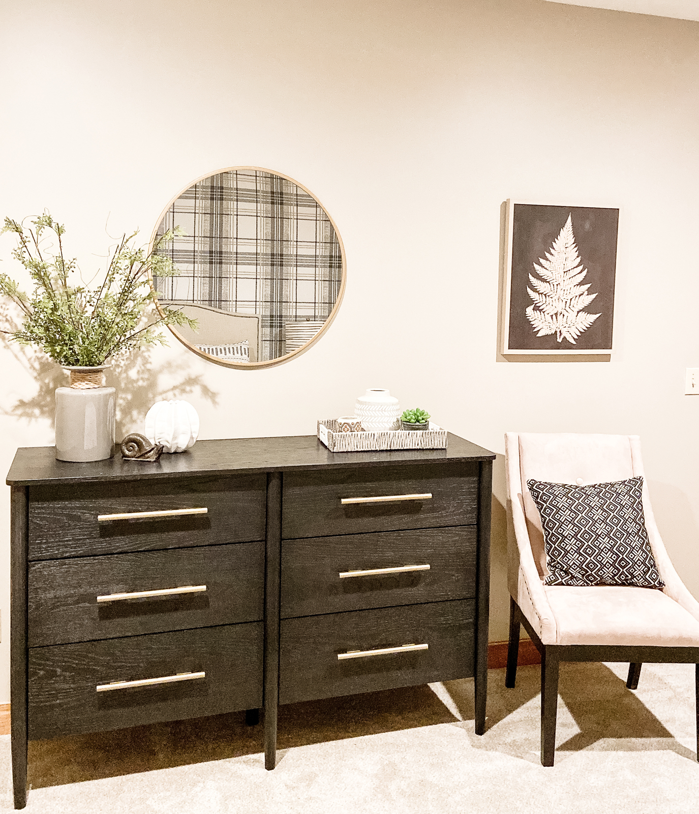
The guest bedroom – not a lot needed to happen here other than new carpeting and paint on the walls. I left the wood trim and doors in this room. I wallpapered the headboard wall with a cute plaid pattern and brought in some cozy bedding and new furniture. The nightstands were gifted from one of our clients, as they were going to donate them. I used charcoal gray Annie Slone chalk paint and gave them a whole new look!
BEFORE & PROGRESS PHOTOS

AFTER PHOTOS
the “MIRACLE MORNING” ROOM
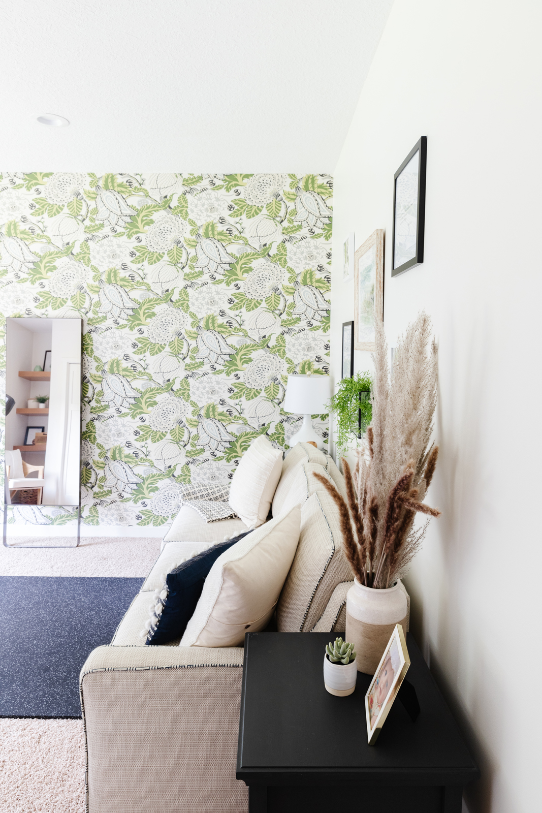
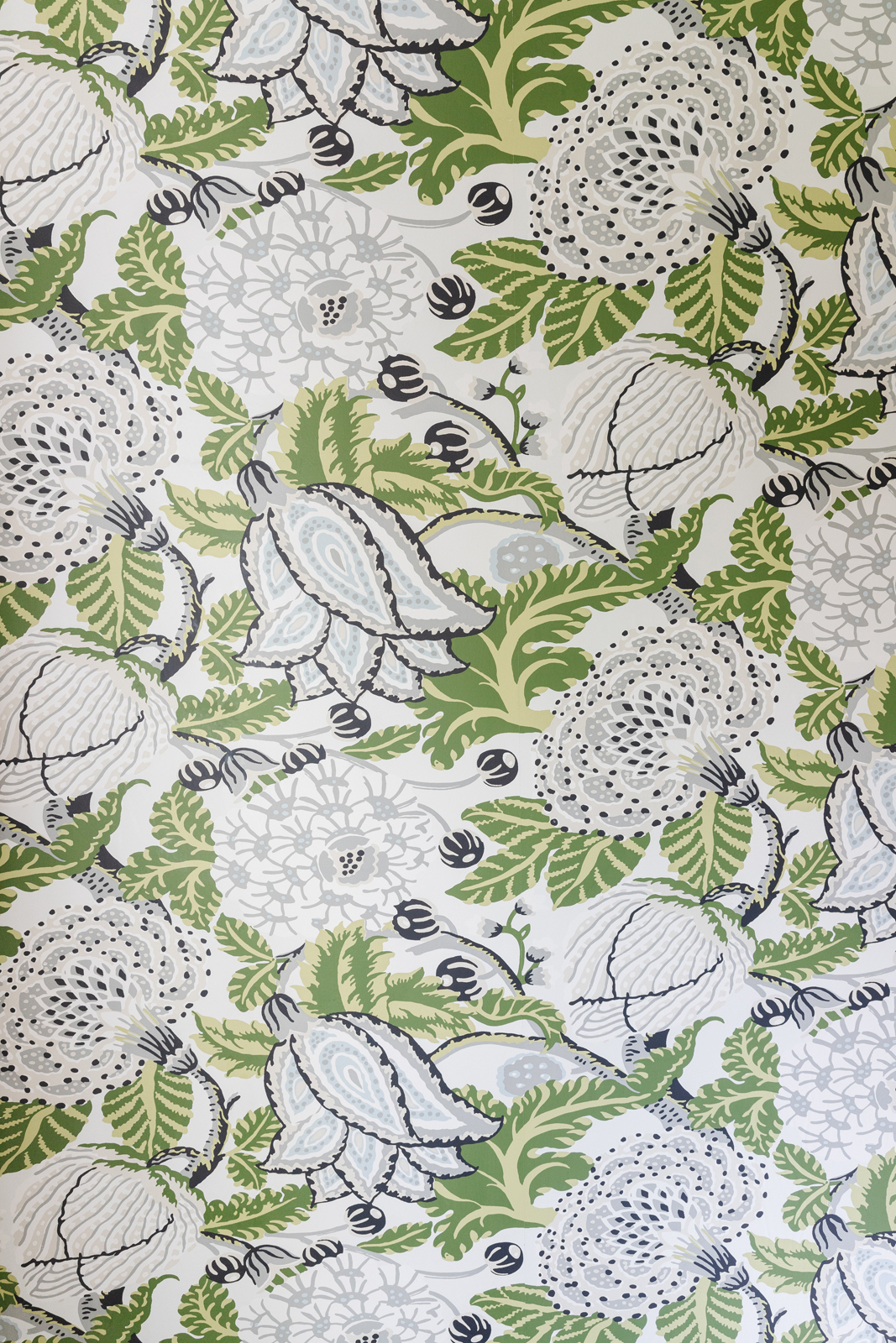
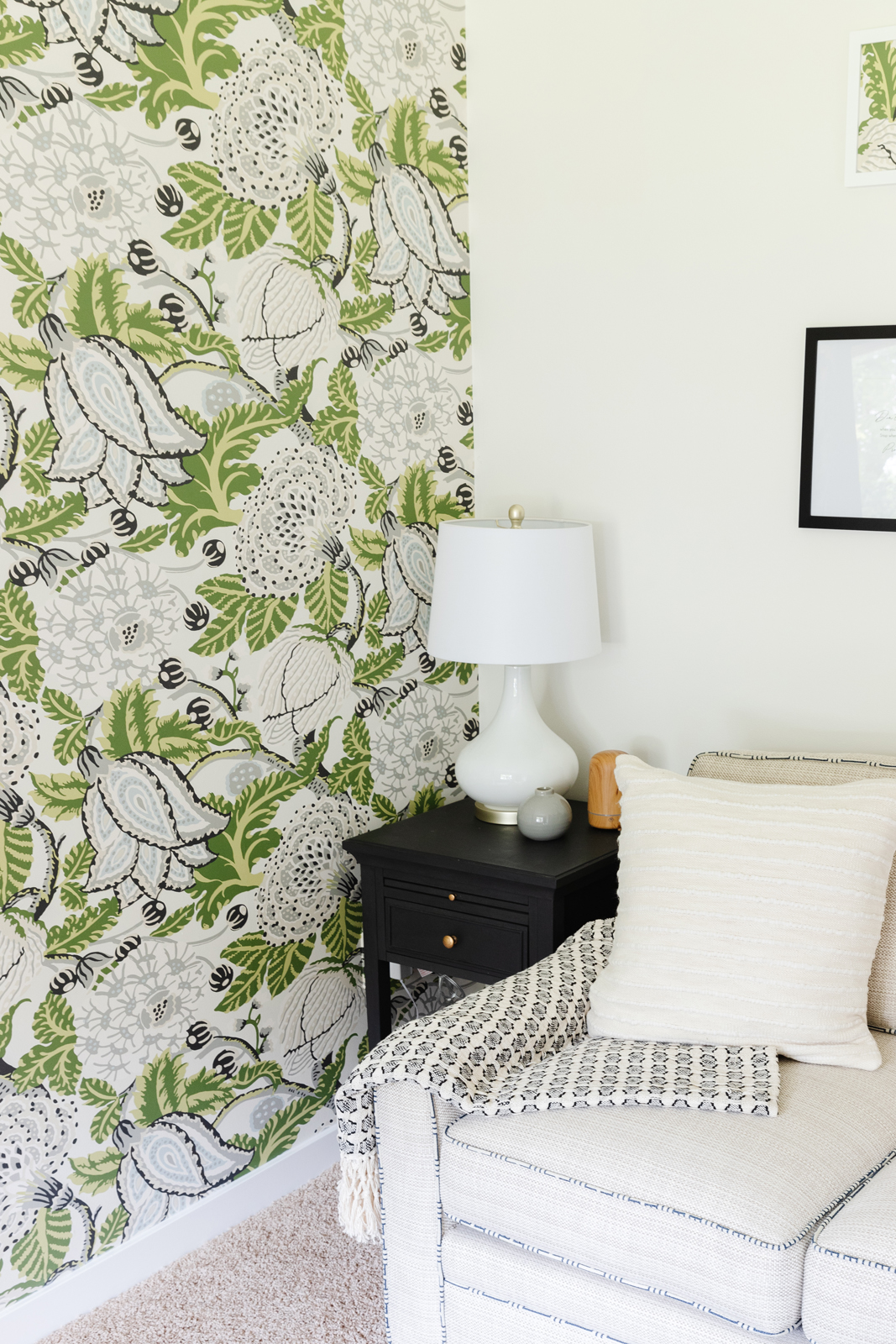
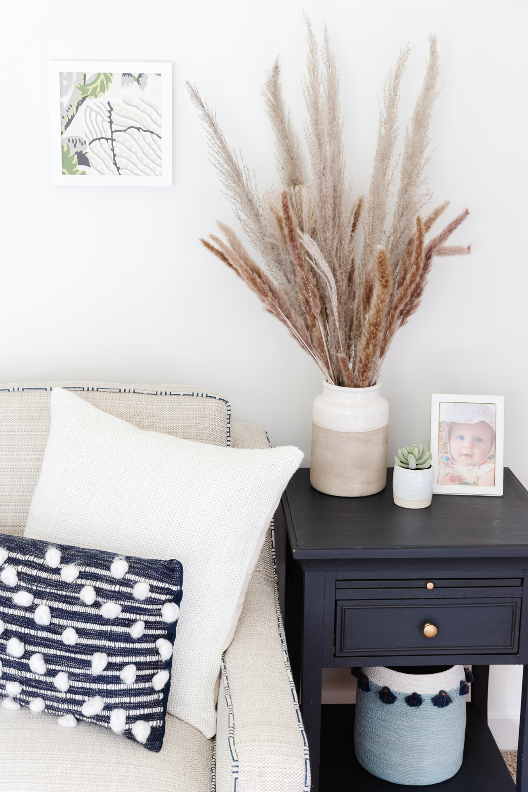
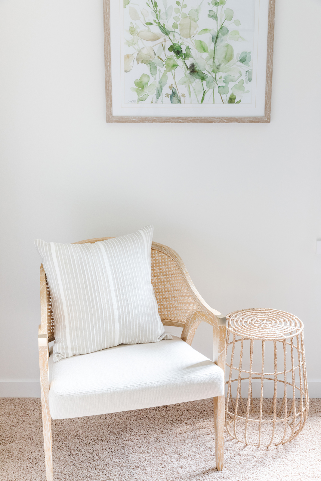
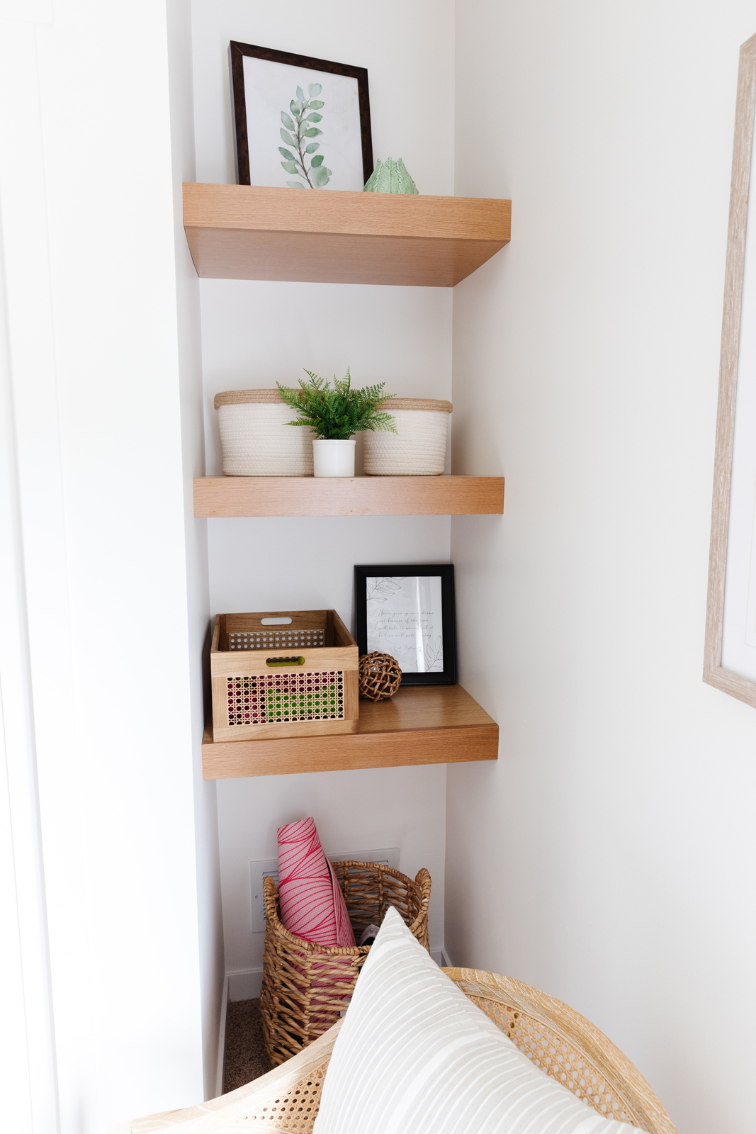
The second guest bedroom in our lower level (previously the rainbow room when we bought the house) has also gone through a few phases. It was just painted a neutral color at first and was my youngest son’s bedroom for a few years when he still lived at home. After he left it became a guest bedroom, and then during the COVID lockdown I decided I really wanted a home exercise room. I removed the bed and brought in a sleeper sofa in case we do need to use it as a guest bedroom. I still had room for a treadmill and I bought the Mirror which takes up no space at all, but allows me to do all sorts of workouts. I absolutely love my Mirror! I added a thick gorilla exercise mat and just put it on top of the carpet. I had custom shelves made to fill in an otherwise useless alcove on the side of the closet. It holds my hand weights, exercise bands, and other equipment. I added a beautiful woven wood shade that has a separate room darkening shade that you can pull down behind it for guests to use if they are sleeping in the room. I painted the walls, windows, doors and trim a fresh white and added a vibrant, fun wallpaper that makes me happy every morning when I use the room for meditation and exercise. I am a big advocate for the Miracle Morning routine, and it has literally changed my life. Therefore, this room is the one that is the most special to me.

THE EXTERIOR & OUTDOOR SPACES
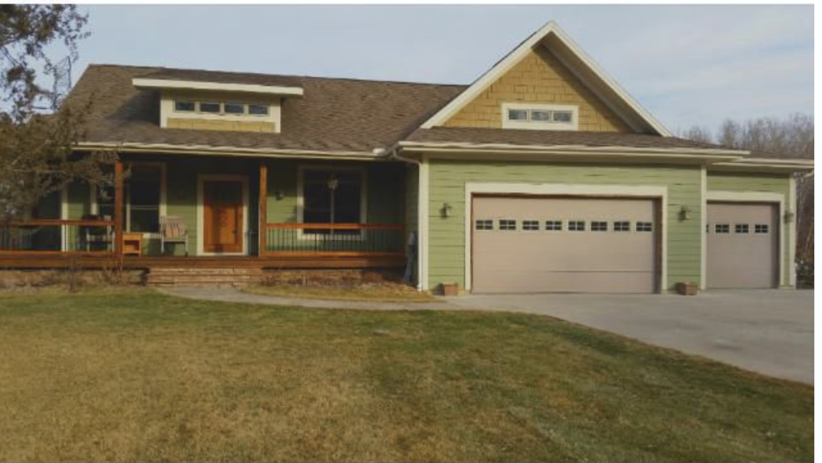
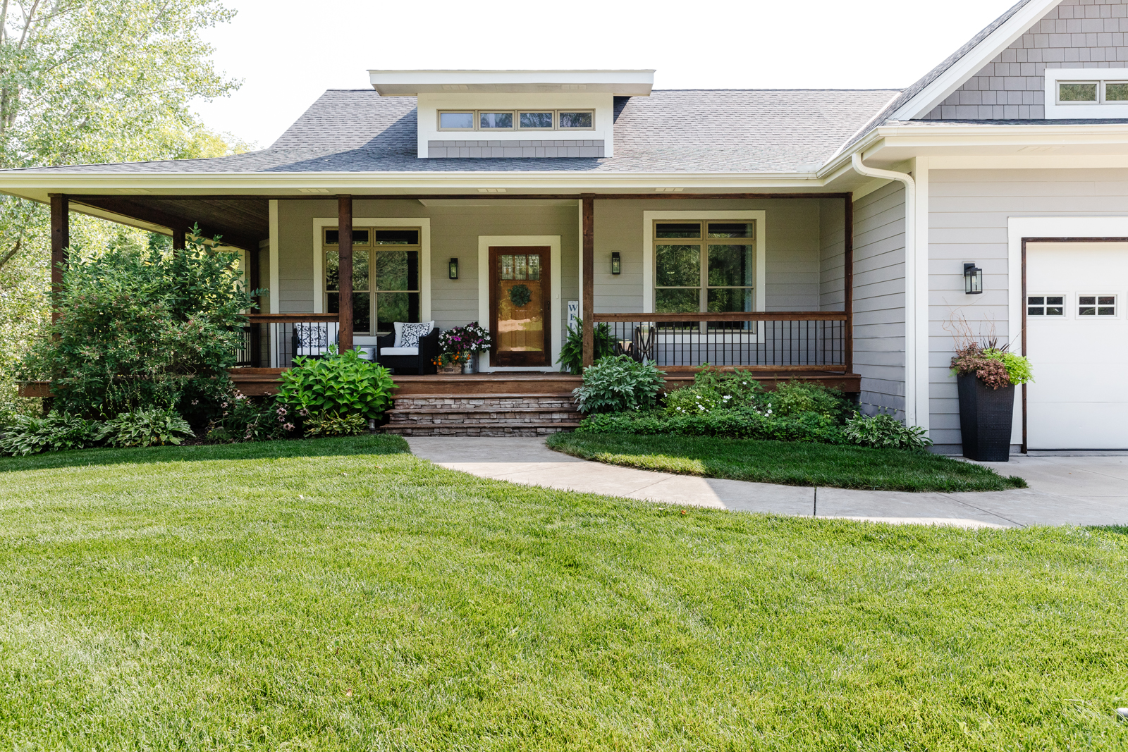
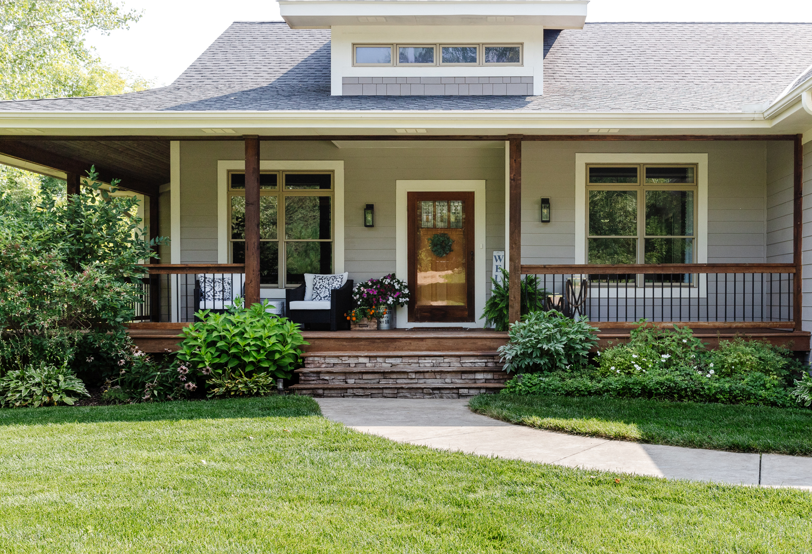
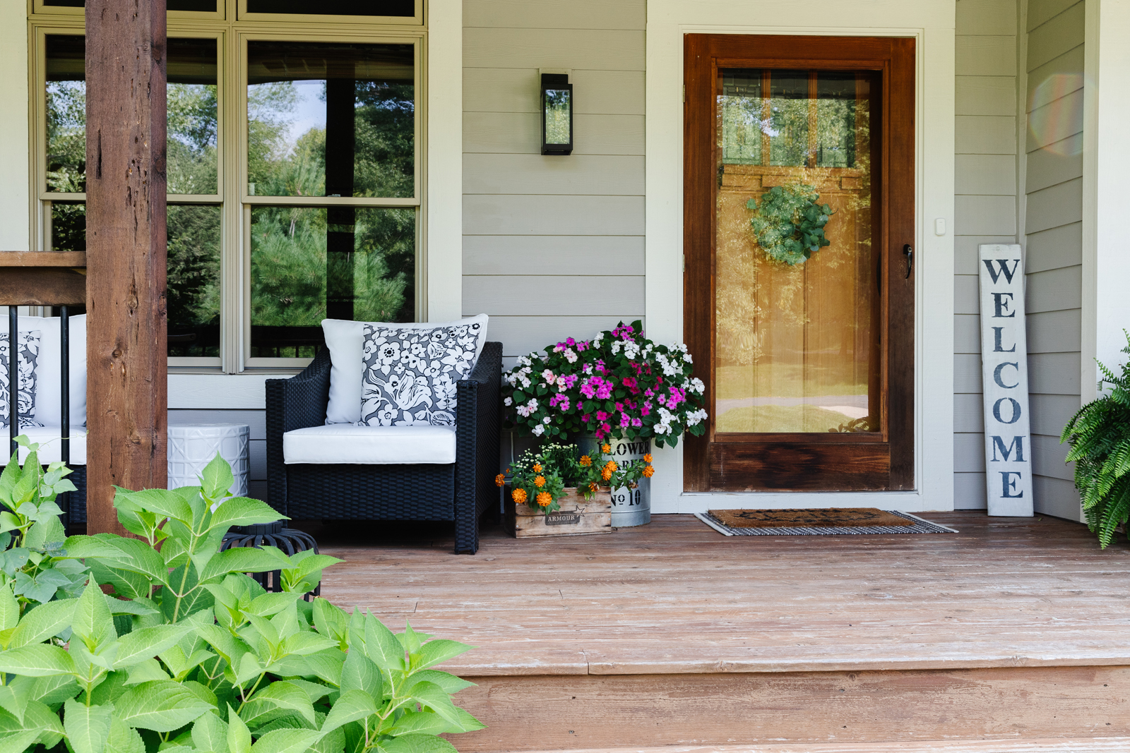
The outside of the house was a sage green with a yellowish accent color. It was fading and looked pretty worn. I never liked the color but knew we would eventually change it. The challenge was that the house also had a dark green roof – ewww! We had the roof replaced with black singles and painted the exterior siding a warm gray and the accented areas a darker gray. The trim was painted a warm white. The challenge was that our windows are a sandstone color, so unless we wanted to buy all new windows, we had to work around that. It was hard to go gray without looking bad with the sandstone color. I tried several shades and finally settled on an Elephant color that is kind of a blend of gray and tan, so it has enough brown tones in it to work with the sandstone windows. Paint colors can be very tricky to get just right!
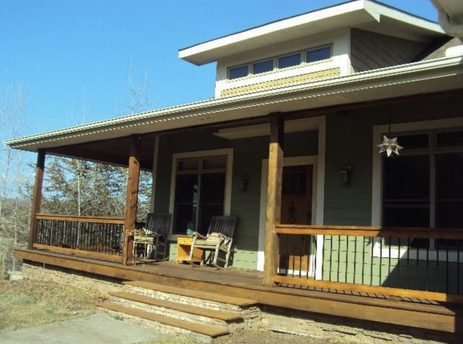
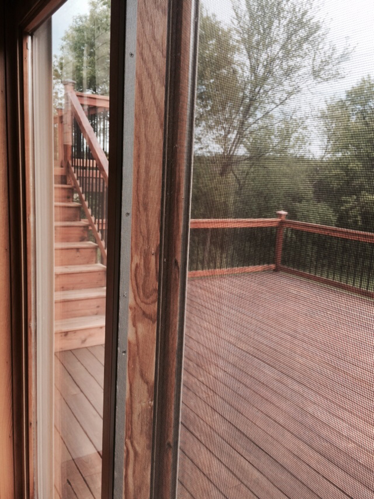
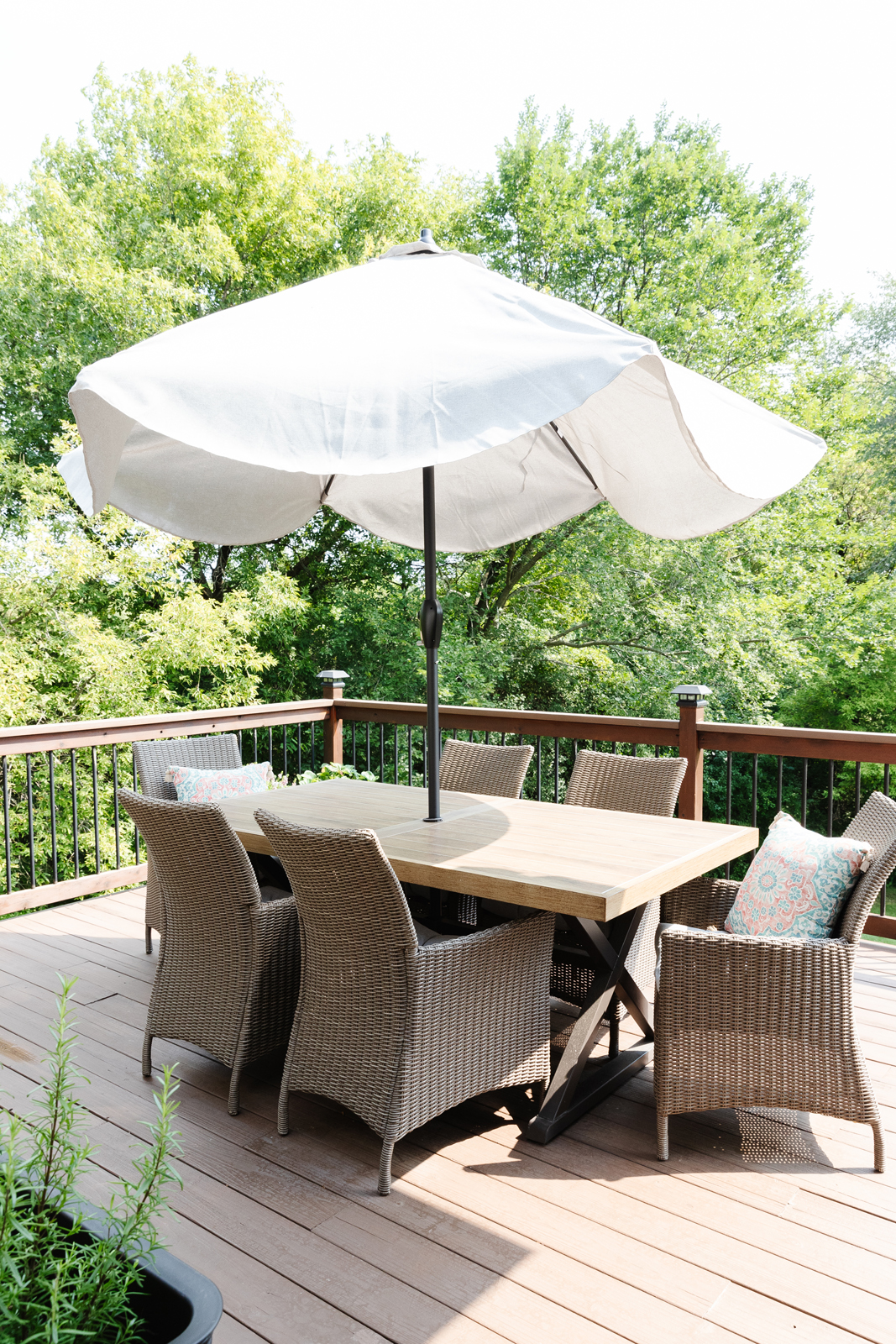
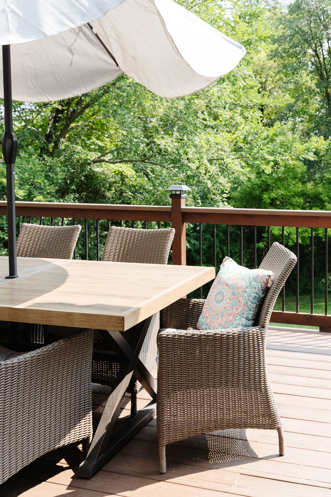
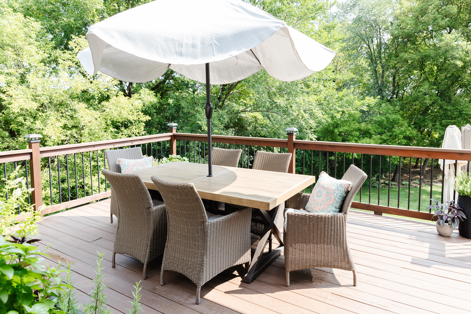
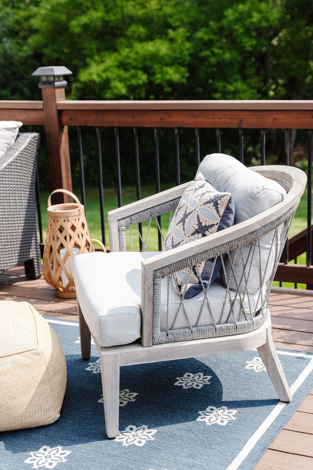
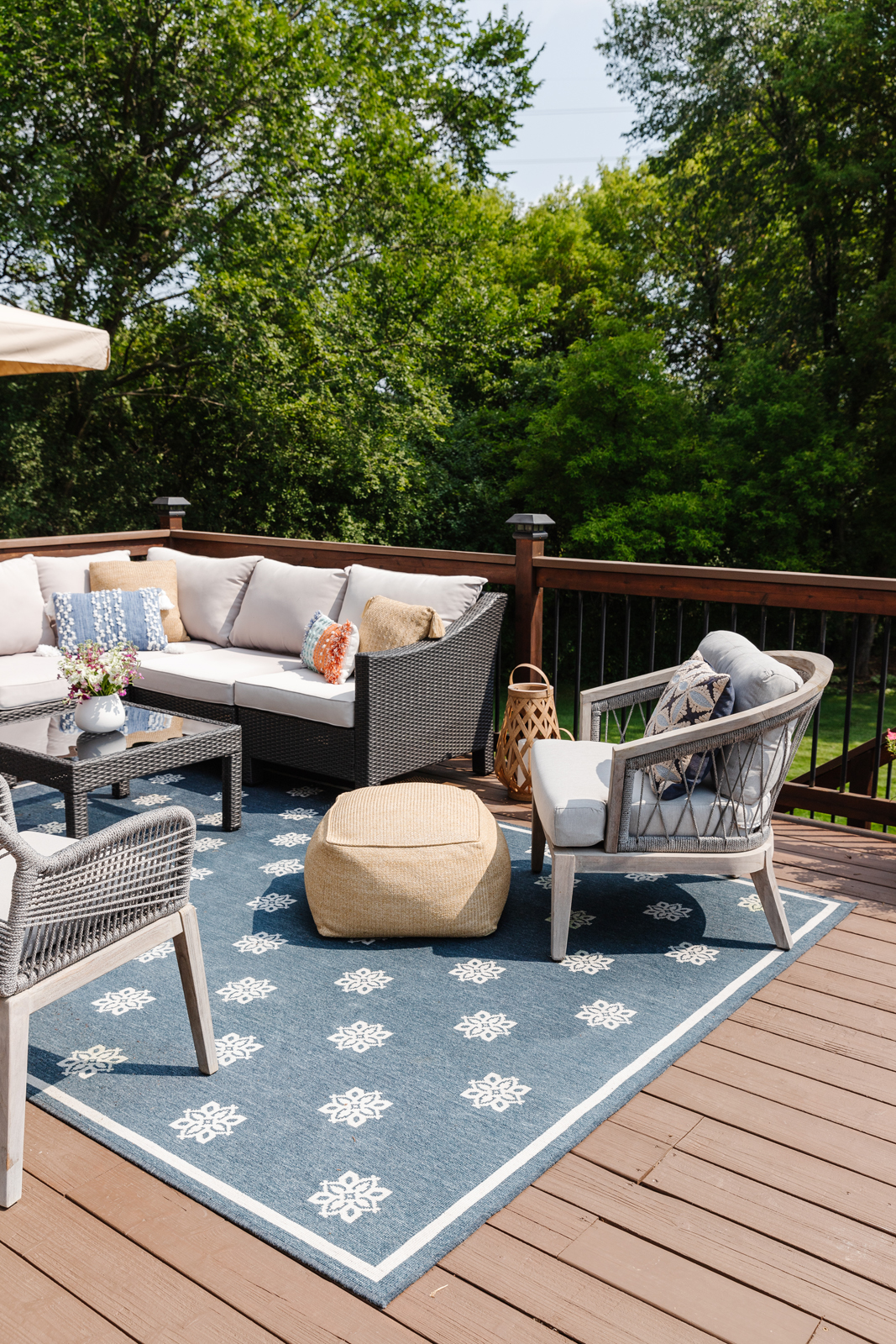
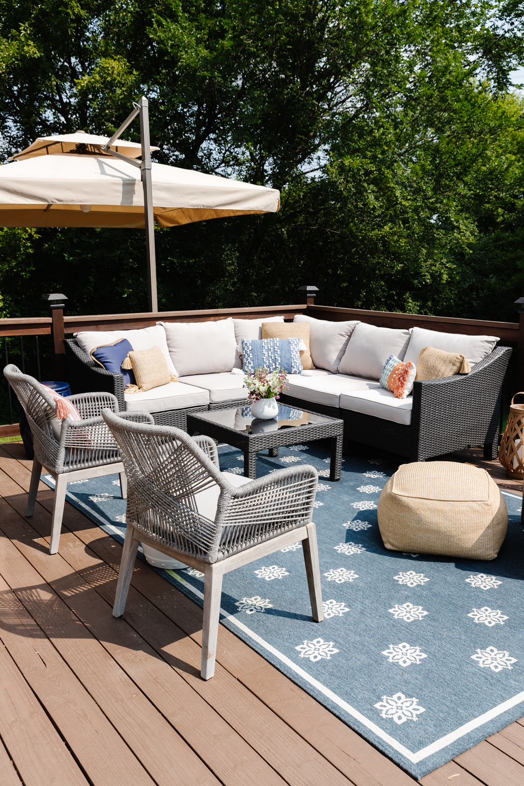
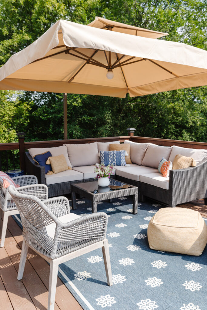
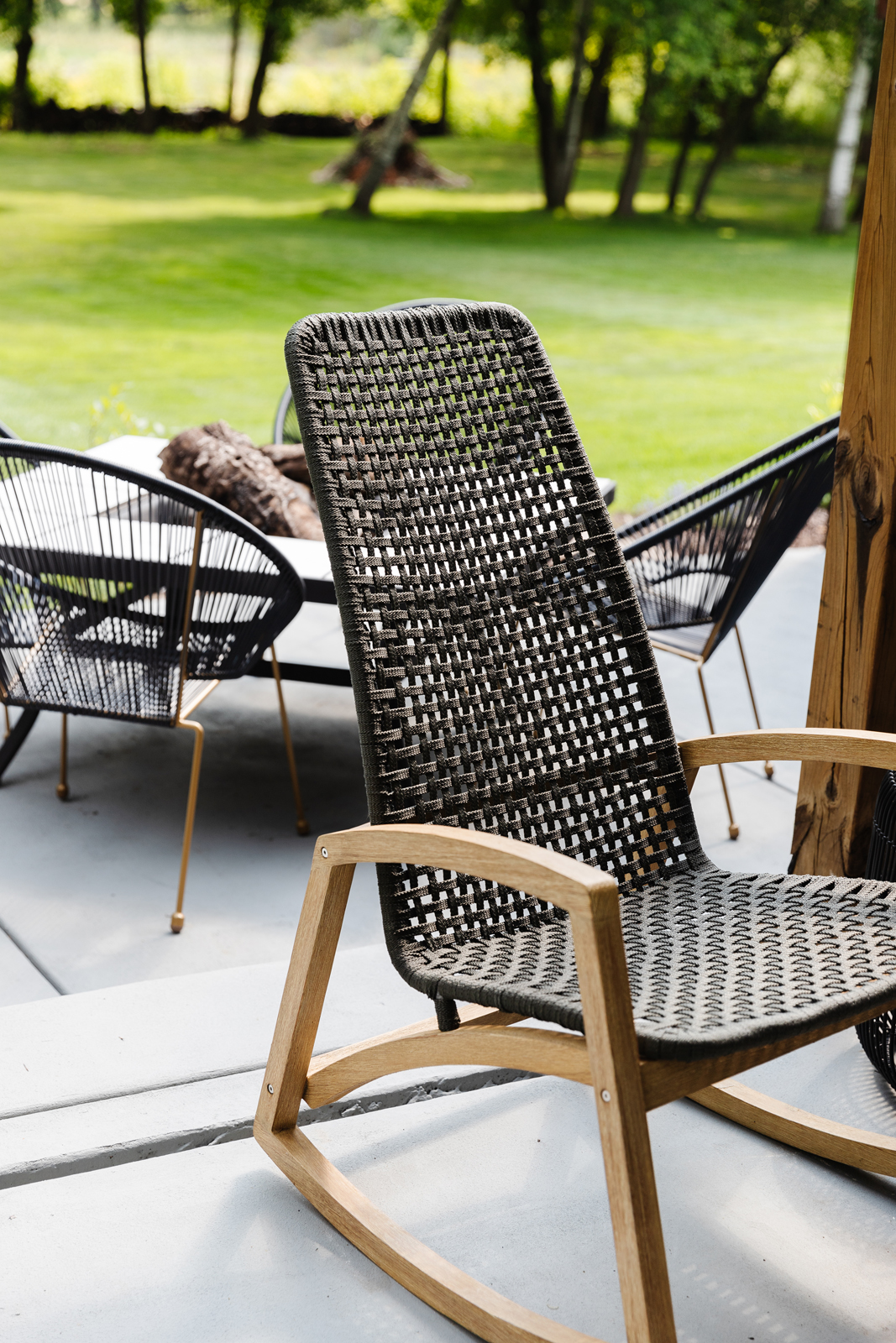
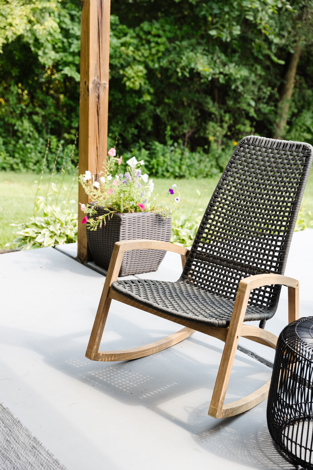
Lastly, we added new stain to all of our decks (my husband’s worst nightmare because it is so much work), and painted our concrete patios gray in the back of the house. All new exterior furniture was needed because we have 2 decks, 2 concrete patios, and a big wrap around front porch. We had to rework 100% of the landscaping too because it was in pretty rough shape when we bought the house. There are so many outdoor spaces with this house, and that is one of the things we love most about it. We live on a large pond with tons of trees, a huge yard, and lots of privacy, peace and quiet. It truly is like a retreat for us!
BEFORE PHOTOS
AFTER PHOTOS
PATIO & FIREPIT AREA
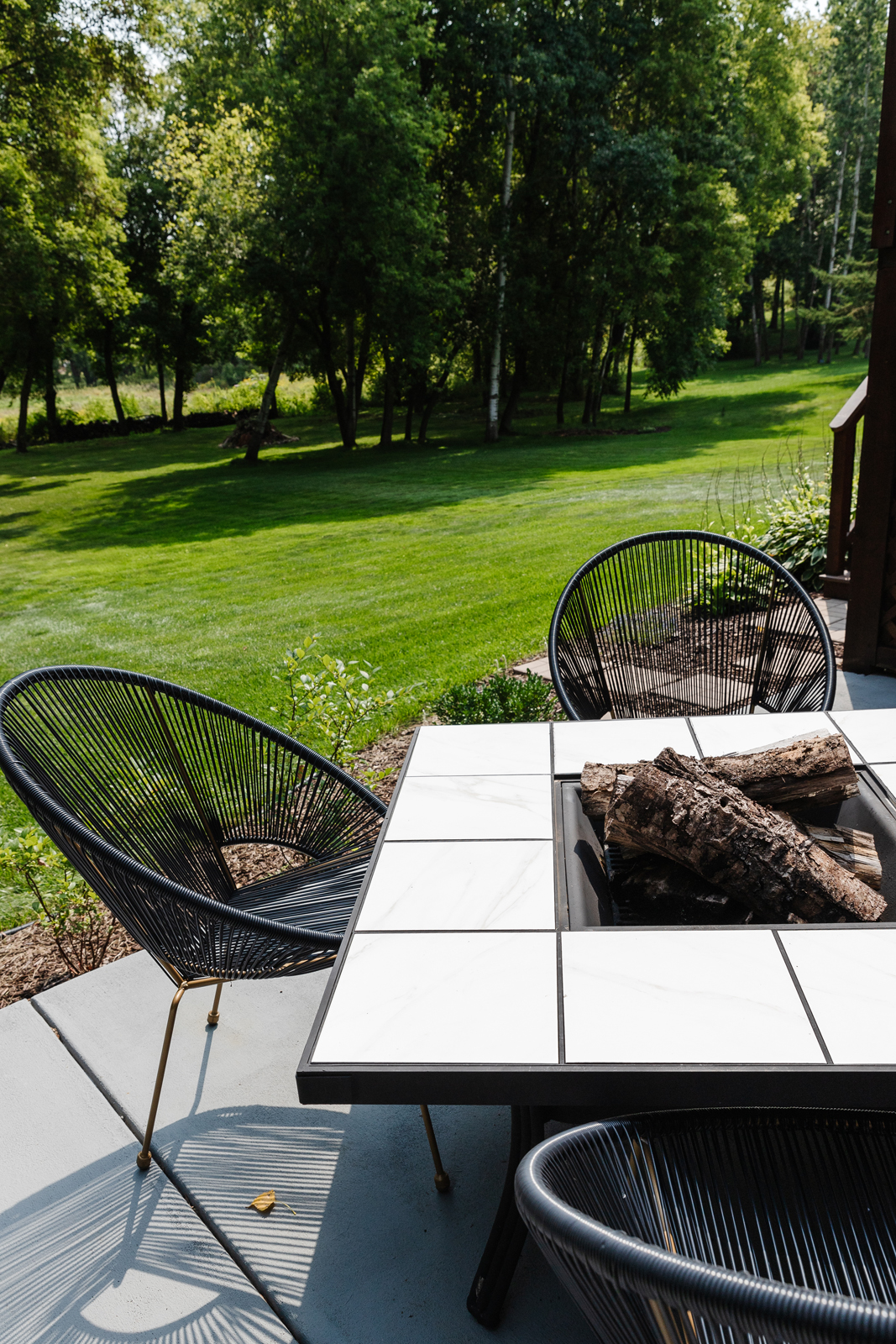
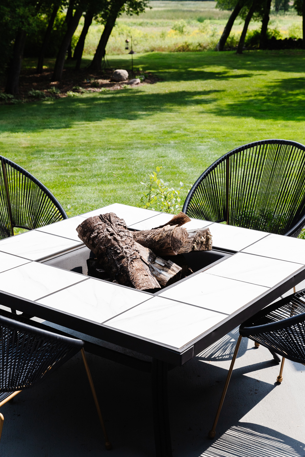
There are still several areas that are works in progress that I hope to share someday soon. Next up…I’m working on the main floor powder bathroom, the lower level family room, rec room, wet bar and wine room. We did add a full bathroom to the lower level when we moved in also, but I haven’t had that photographed yet. So, more to come! By the time I finish those areas I may be ready to re-do some of the main floor rooms again. Shhhh, don’t tell my husband! LOL
In the meantime, be sure to subscribe to our newsletter to have more press features, project reveal and design tips sent to your inbox weekly!
XO,
Amy & the Interior Impressions Team
Yes, I know this place! Lovely home! The best part is how I feel when I come in. So pretty & comfortable & inviting! This is what we all are hoping for when we design, right? You always nail it, & I always look to your style for inspiration!
Love you, Linda
Thank you Linda! We love having you in it 🙂
So comfortable and peaceful – love it! Thanks, Amy, for sharing.
“Thank you so much!”, says Amy!
Thank you for sharing, this is beautiful, would you mind sharing the wallpaper from guest room please? Thank you
It was a York Wall covering and it looks like it has since been discontinued, but here is a link for something similar!