Hello friends, it’s Amy here. I’ll be honest, this is the most difficult blog and project reveal I’ve ever had to write! As a designer, I love helping everyone else with their homes and it is so much easier for me to feel proud of my work on my client’s homes. But when it comes to my own home, I never feel like it’s 100% exactly the way I’d like it to be. I am super critical of every detail, and it is much more difficult for me to feel comfortable putting it out there for everyone to see. I know I am over-analyzing and being silly! At any rate, I did feel like it was important to share some of my story because this house has been a huge project since the day we bought it. I have always built brand-new homes in the past and this was the first time my husband and I bought a Fixer-Upper. I had romantic notions that it would be so much fun to remodel this home and make it our own. Truth is, parts have been fun, but it has also been so much more challenging than I had ever imagined. It never seems to end! I am proud of our hard work (we did most of the work ourselves) and the incredible transformation that we have made with this home. I do absolutely love our home now, and I want to share a little bit of our journey with you all. This process has been so good for me to truly understand what our clients go through when they have their homes remodeled. I can honestly say “I know what you’re going through” and I can actually help prepare them and make the process a little less painful! So..let’s begin the adventure!
WELCOME
The home we bought was built in 2003. The structure is very different than most homes I’ve ever seen, which intrigued me. My husband looked at it first and didn’t even tell me about it because he assumed I wouldn’t want to have anything to do with it! When I finally went to see it, I loved the unique open floor plan and absolutely fell in love with the location and the back yard. We are only 15 minutes from my design office in Woodbury, but we are located in a very quiet neighborhood, on a cul-de-sac, with a huge pond/small lake in the back yard with over an acre of wooded surroundings. It is so serene and restful. It is truly a retreat at the end of a busy day. We will be revealing the outdoor spaces in Part II of the Project Reveal, so check back for that!
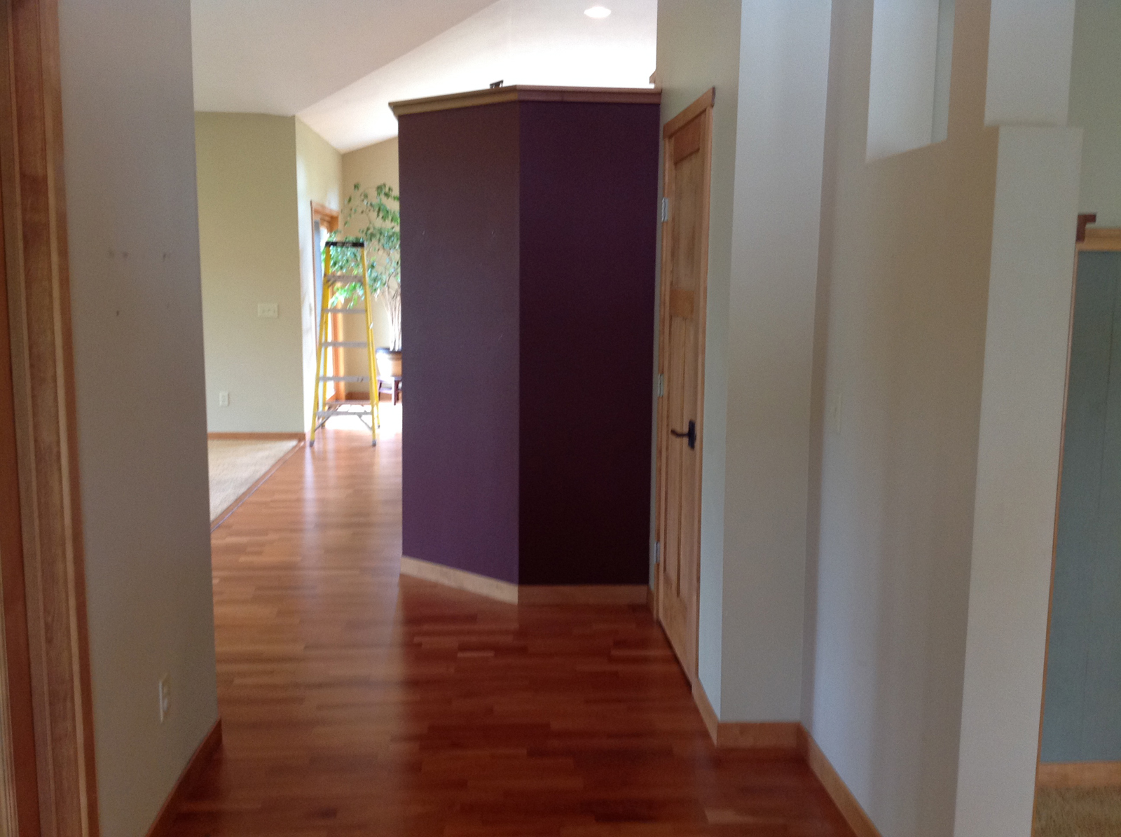
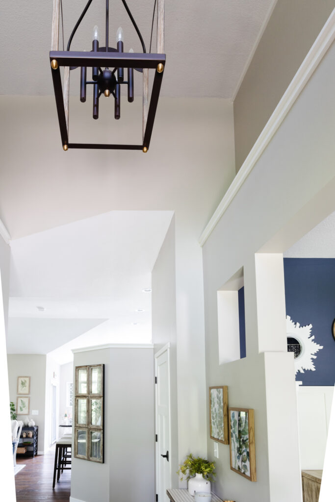
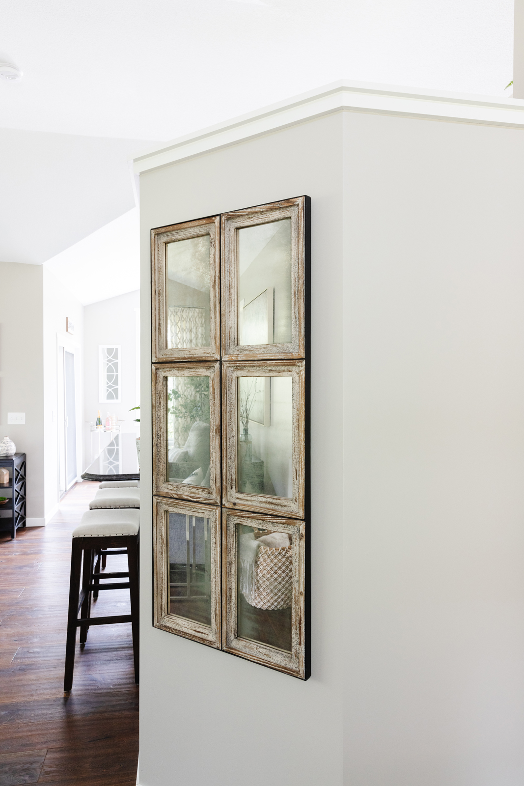
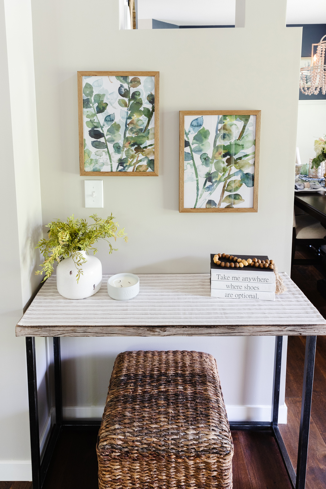
Let’s start with the foyer. When you enter our home, there is an office on the left and a formal dining room on the right. The previous owners had built and designed the home during a period that Craftman style was very popular, so there were a lot of dark colors, hickory and maple woodwork, and tons of stained glass light fixtures. That was not so much my look, so my goal was to update, lighten and brighten the entire house. We painted all of the millwork white on the main floor, and replaced all of the hardwood flooring with a wide plank European white oak floor that I still love so much. I added a lantern style light fixture and brightened up the walls with lighter paint. There was a very dark burgundy wall on the backside of the kitchen that you saw right as you entered the foyer, and you can see in the before photos that the dining room on the right had teal blue wallpaper on the lower walls also. My next project is to add some neutral colored grasscloth wallpaper to the foyer walls. One thing about being a designer is that I always want to change things. It never ends! My poor husband 🙂
BEFORE PHOTOS


AFTER PHOTOS
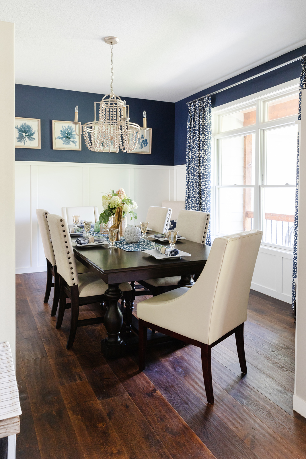
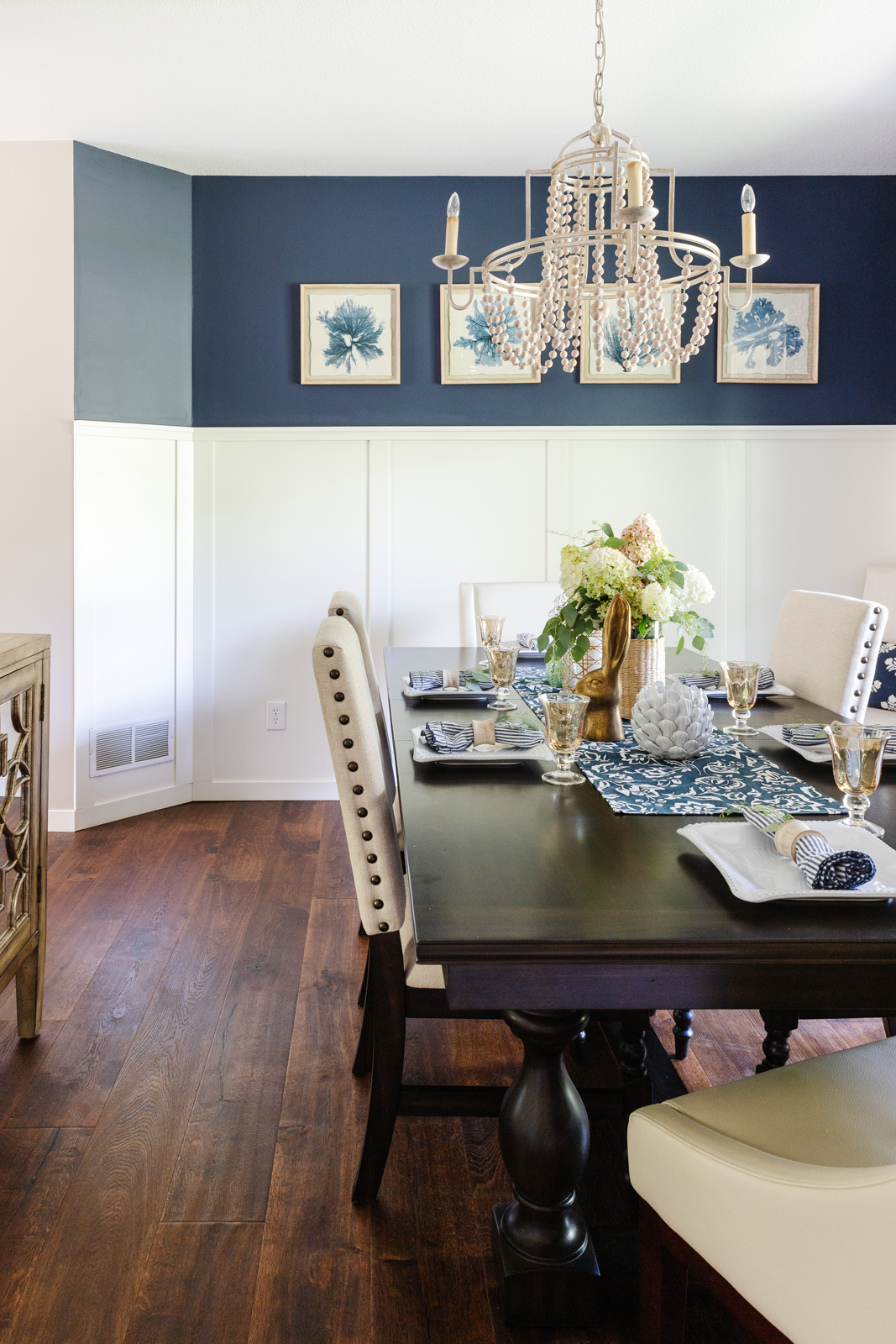
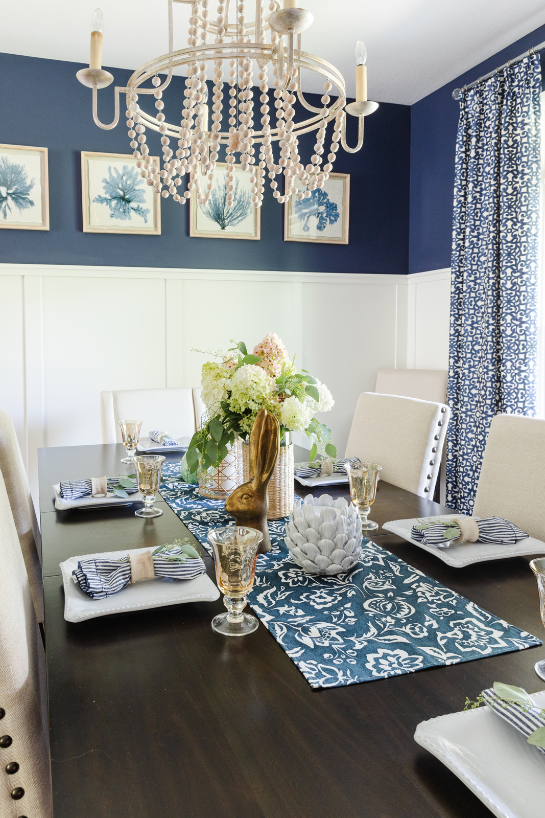
The dining room
This room was probably the worst part of our entire remodeling experience! When we went to remove the teal blue wallpaper, we discovered that it had been glued to bare sheetrock. It was not properly installed with primer and wallpaper sizing. Removal was a nightmare! There was no way of getting it off without tearing up the sheetrock in several places. In hindsight, we should have just ripped it all out and replaced all of the sheetrock. The entire family took turns working on removing wallpaper and we had to get it professionally skim coated to smooth out the walls and make them perfect. We kept the existing chair rail and then added more moldings to create wainscoting paneled walls on the lower part. The second part of our nightmare came when we hired a guy to paint our walls “professionally” by spray coating oil based paint for the wainscoting areas so it would look very smooth and polished. We should have known better when he said “Yea, I think I could do that. I spray cabinet doors all the time”. Let’s just say, he definitely DID NOT know how to do it. The paint dripped and ran, and then he ended up making a horrible mess of our beautifully perfect skim-coated walls! We had to start over and get them fixed again and then re-painted. Lesson learned the hard way.
I wanted this small room to feel bigger, so the white paneling really helps with that. I added a fun pop of color by painting the upper walls navy blue and then just added draperies and decor to make the room feel welcoming when we use it a few times a year for holidays. And of course, the craftsman style light fixture was replaced with a pretty wood-beaded chandelier that I love.
Before photos
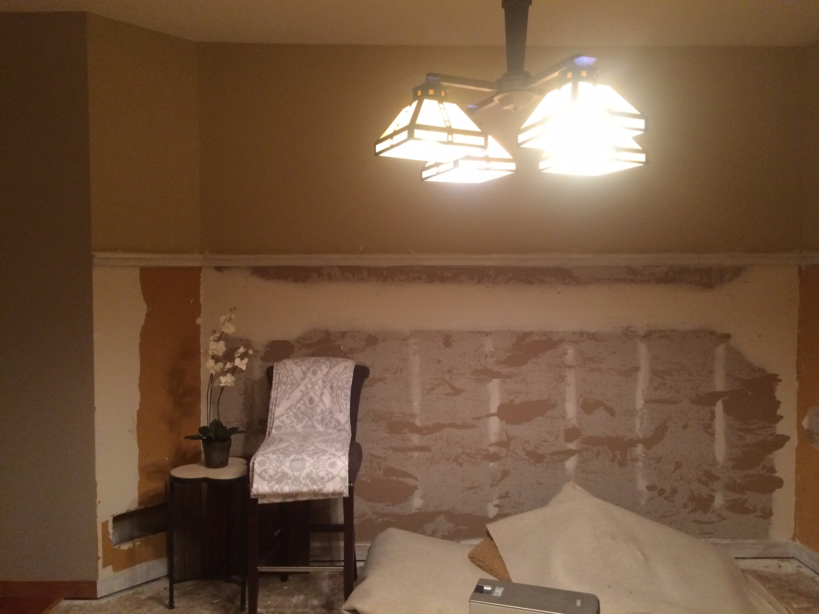


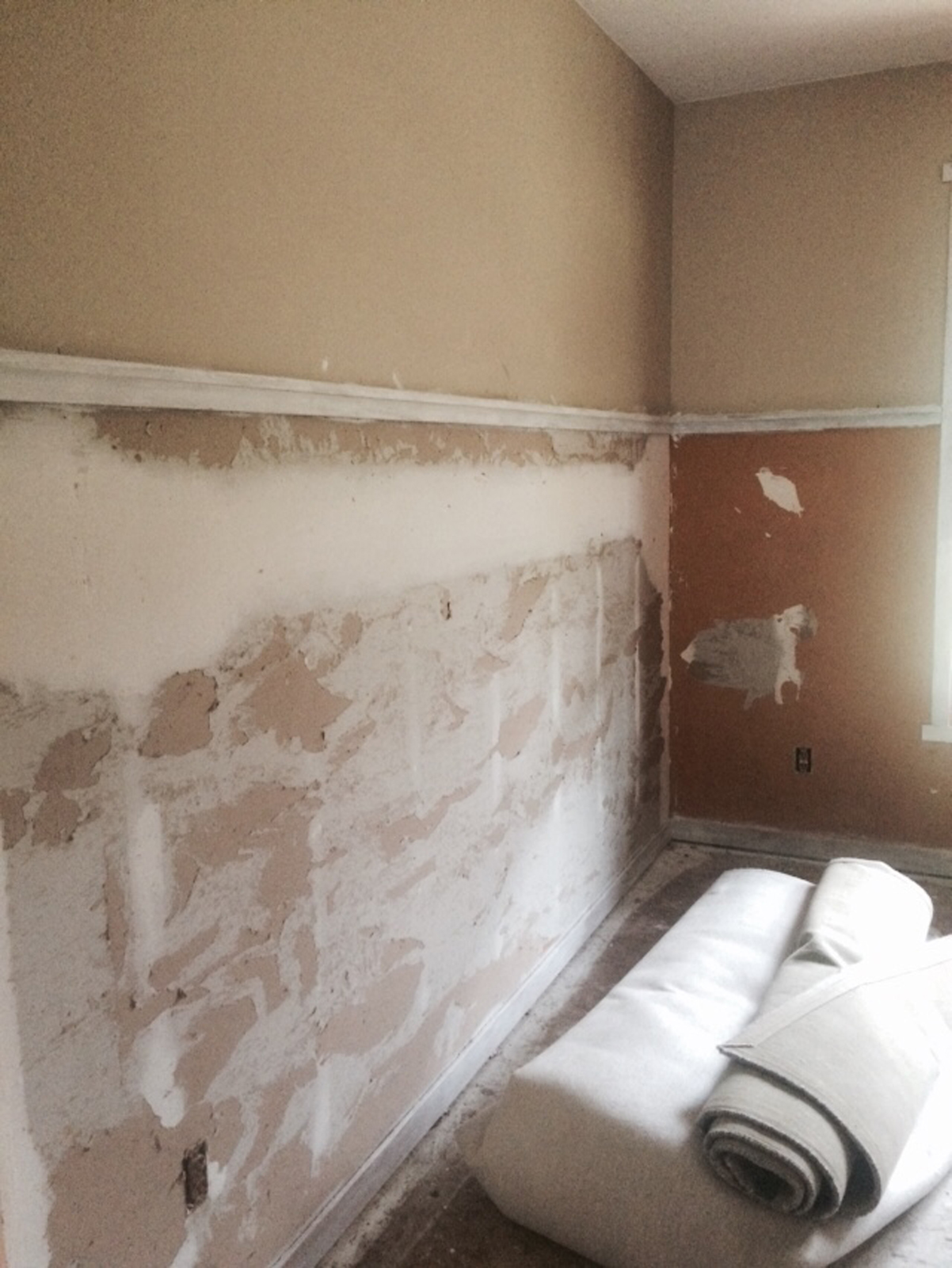
after photos
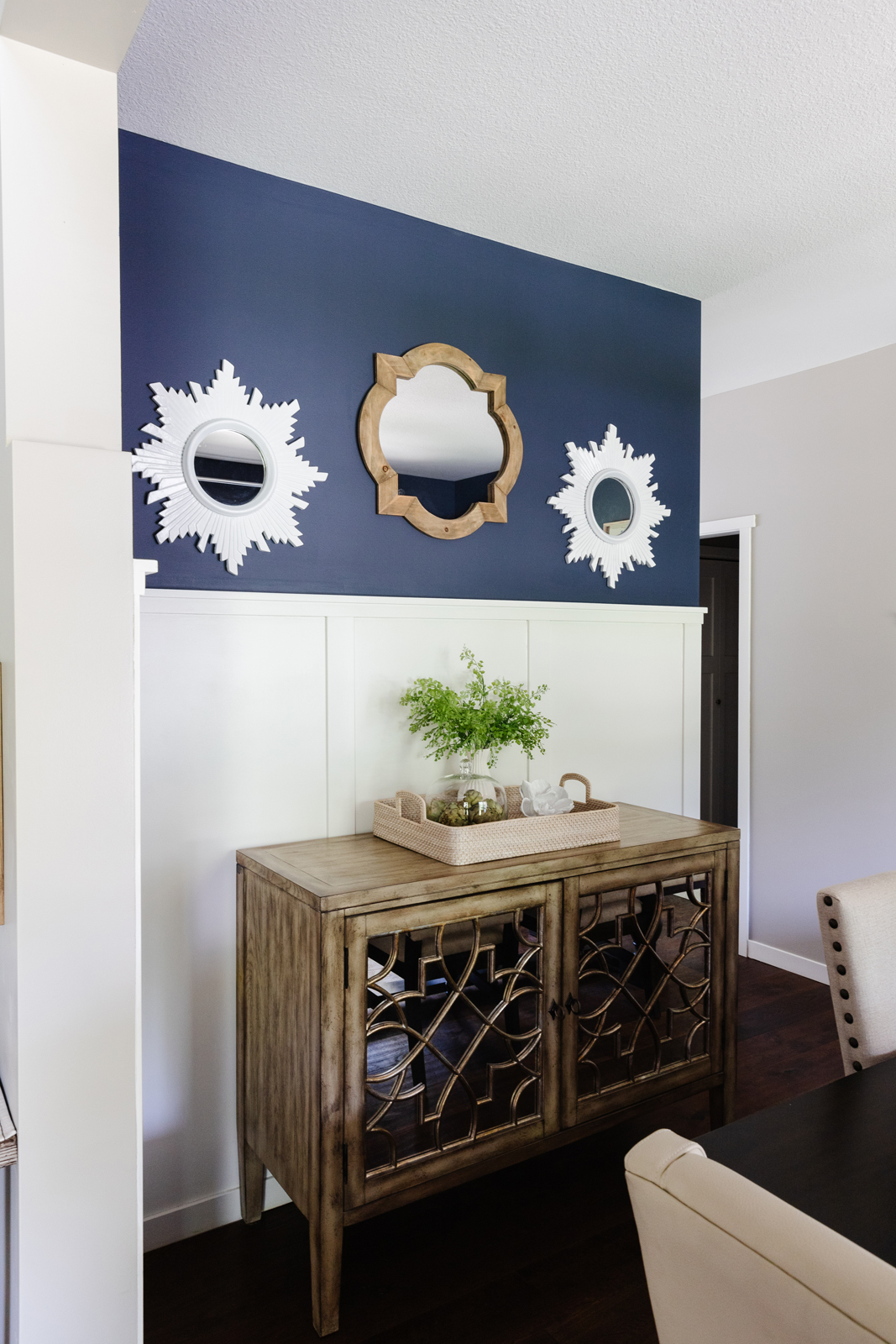
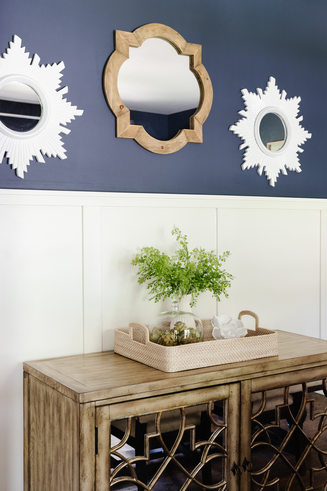

the living room
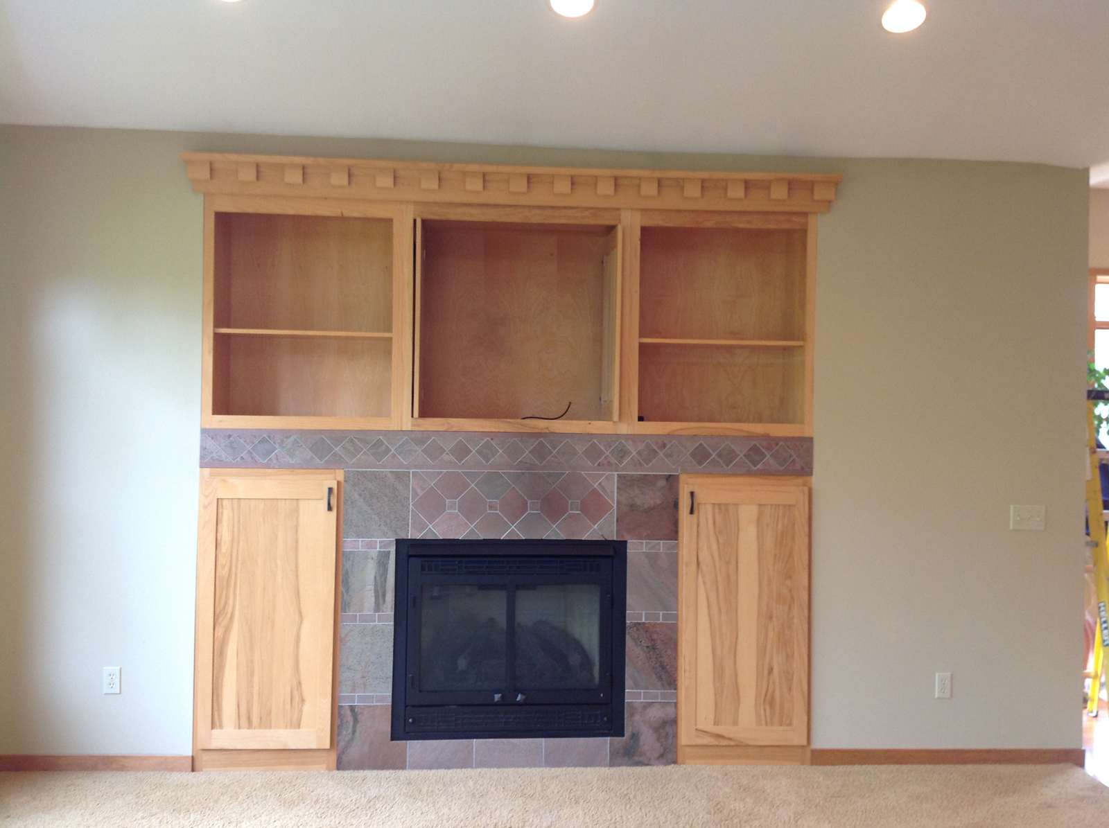
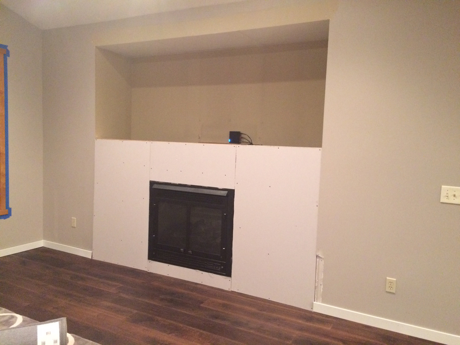
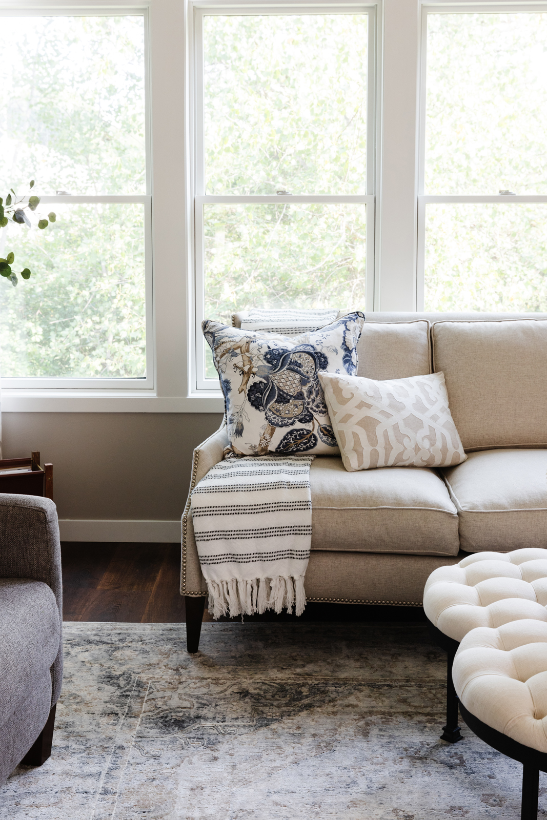
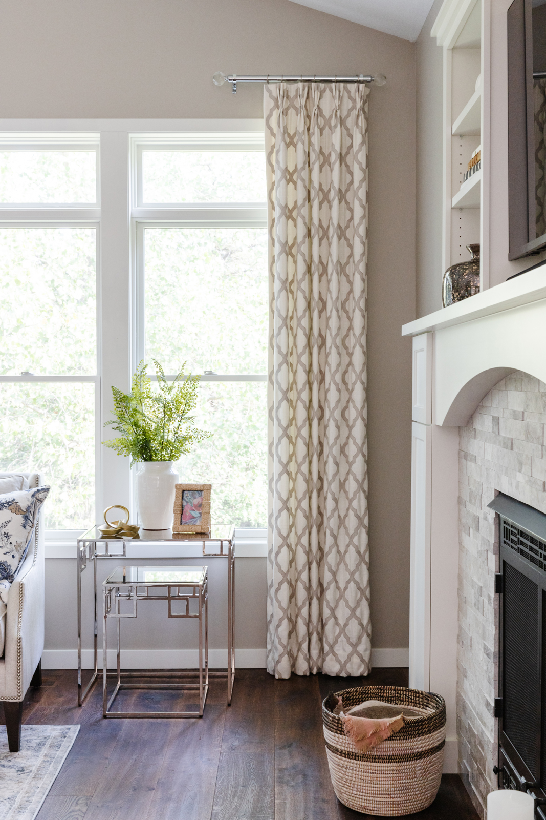
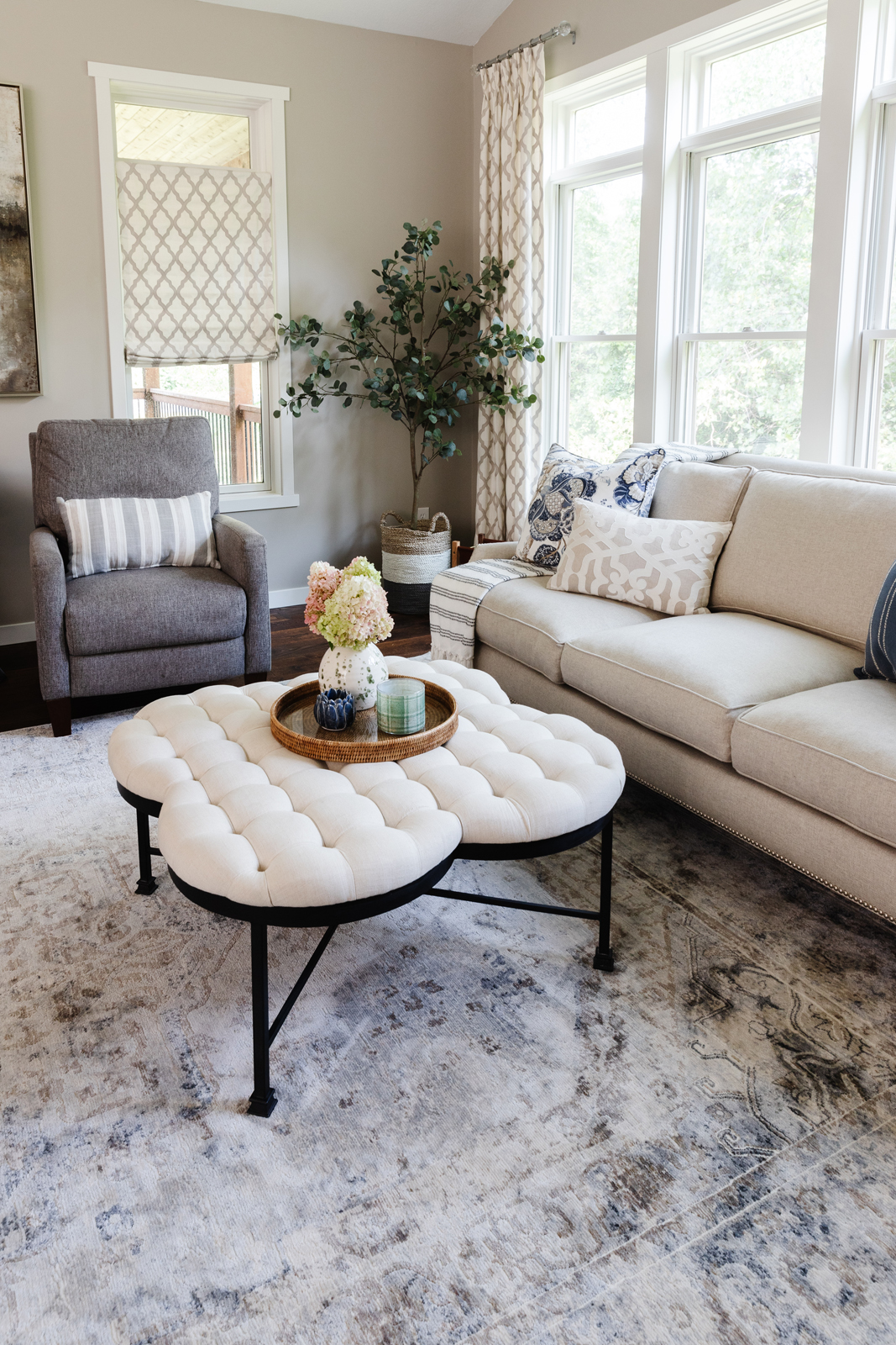
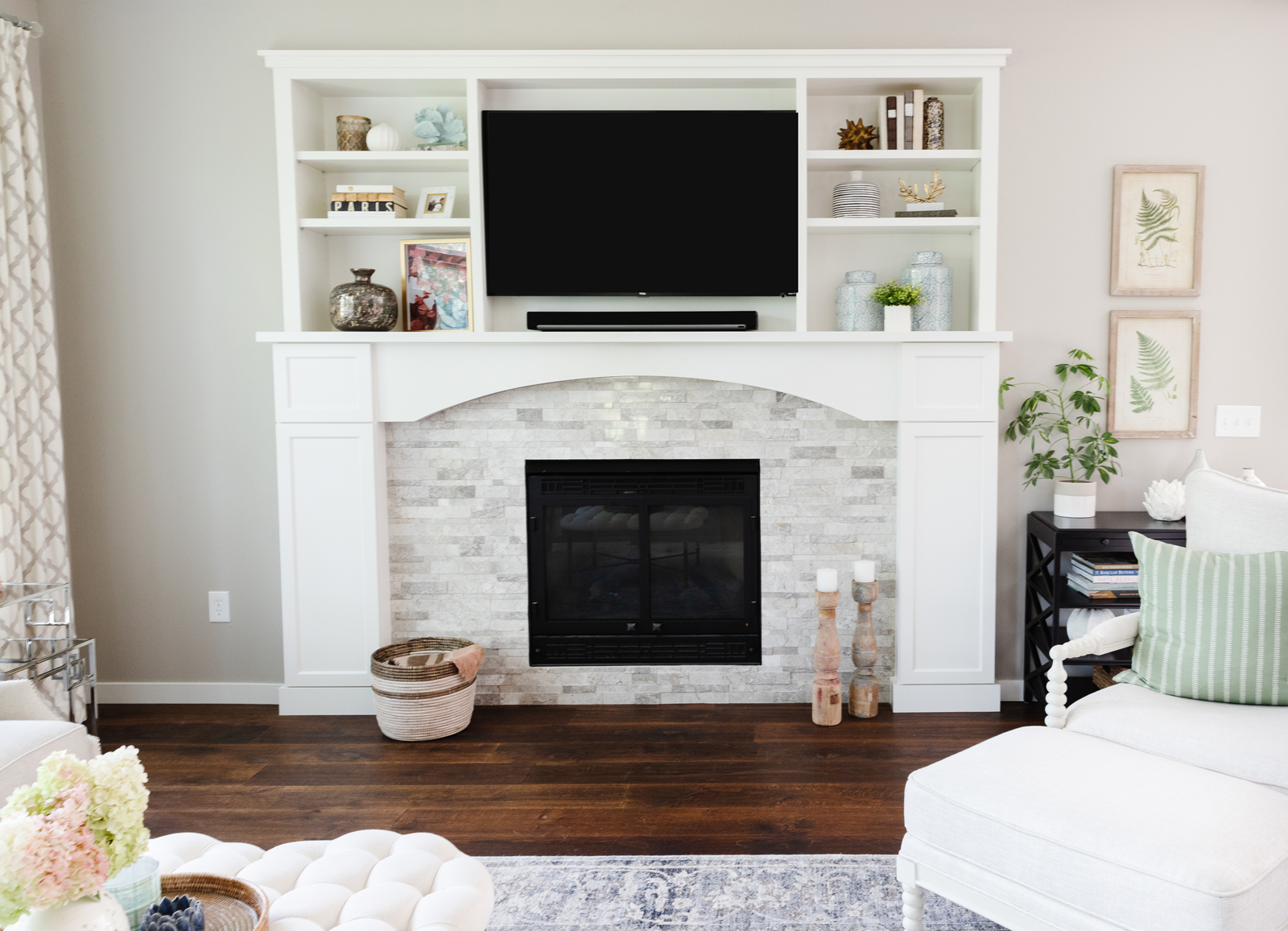
The worst part of the living room was the fireplace and built-ins. It was very dated and extremely ugly! The opening for the tv was way too small to accommodate a tv that my husband would be happy with. We again painted all of the millwork and windows white, tore out the old carpeting and extended the new hardwood floors into this room. That made it feel even bigger by connecting it with the foyer and kitchen and dinette areas. We also had to repair and refinish and repaint all of the ceilings in the main spaces, which was a big undertaking with all of the vaulted lines and angles. We of course called in the professionals for that job too. We tore out the fireplace down to the studs and then reframed and sheetrocked it ourselves. I drew up a design for the fireplace wall and we had our fabulous cabinetmaker Nathan build it. We had it all professionally enameled this time – not making that mistake again! We added a beautiful architectural marble surround and got a much bigger tv. The fireplace is now my favorite part of the room.
before photos
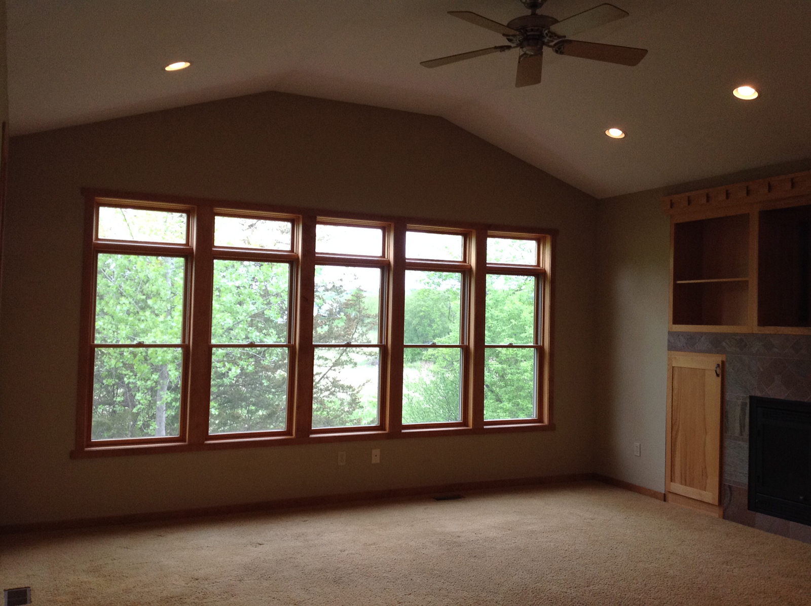
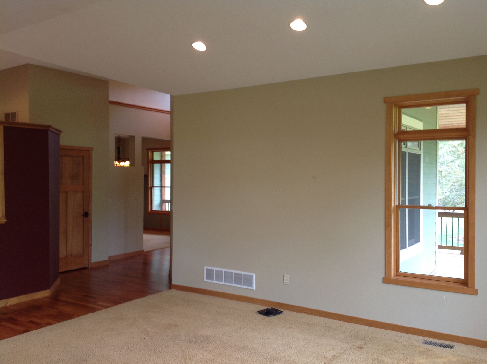
PROGRESS PHOTOS

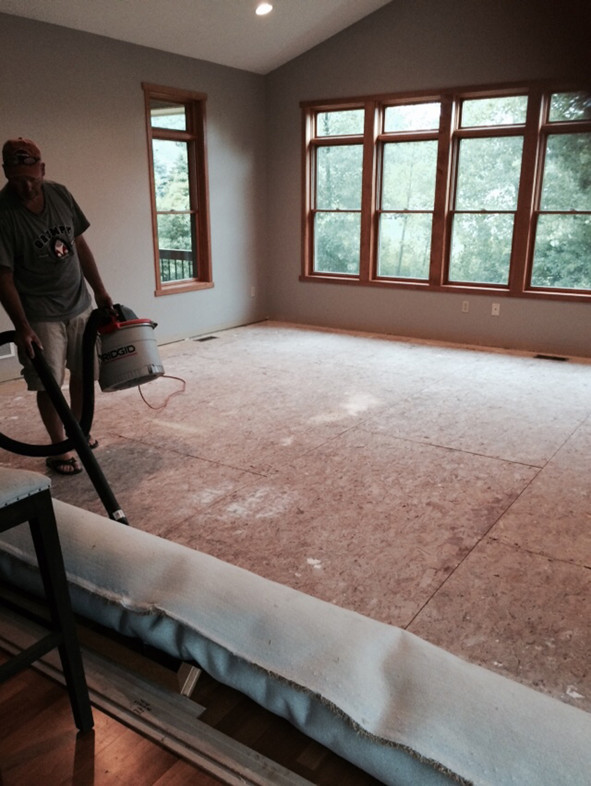
AFTER PHOTOS
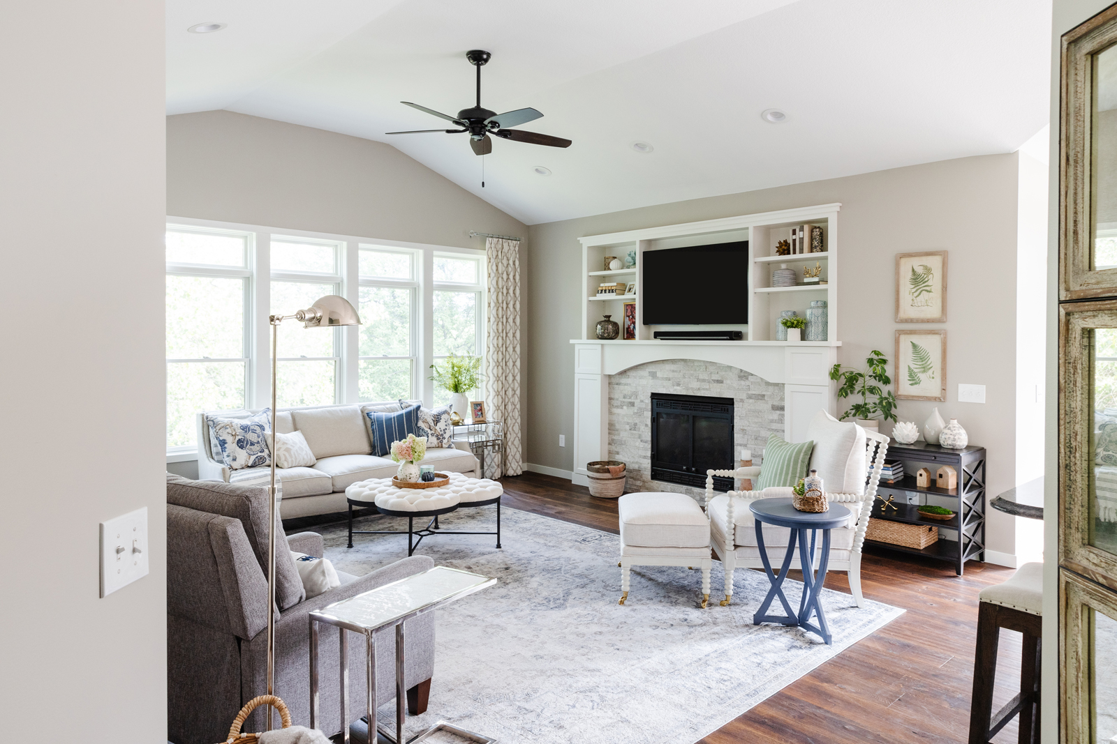
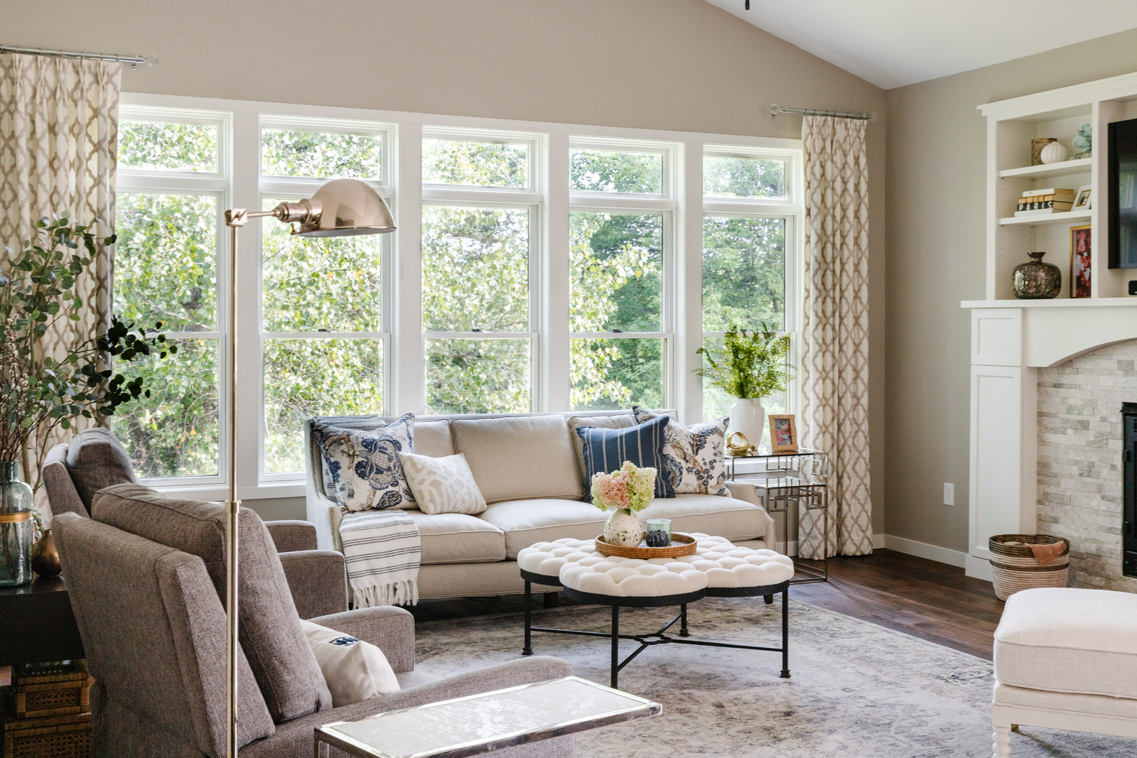
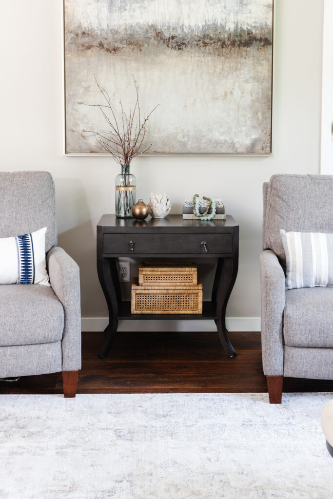
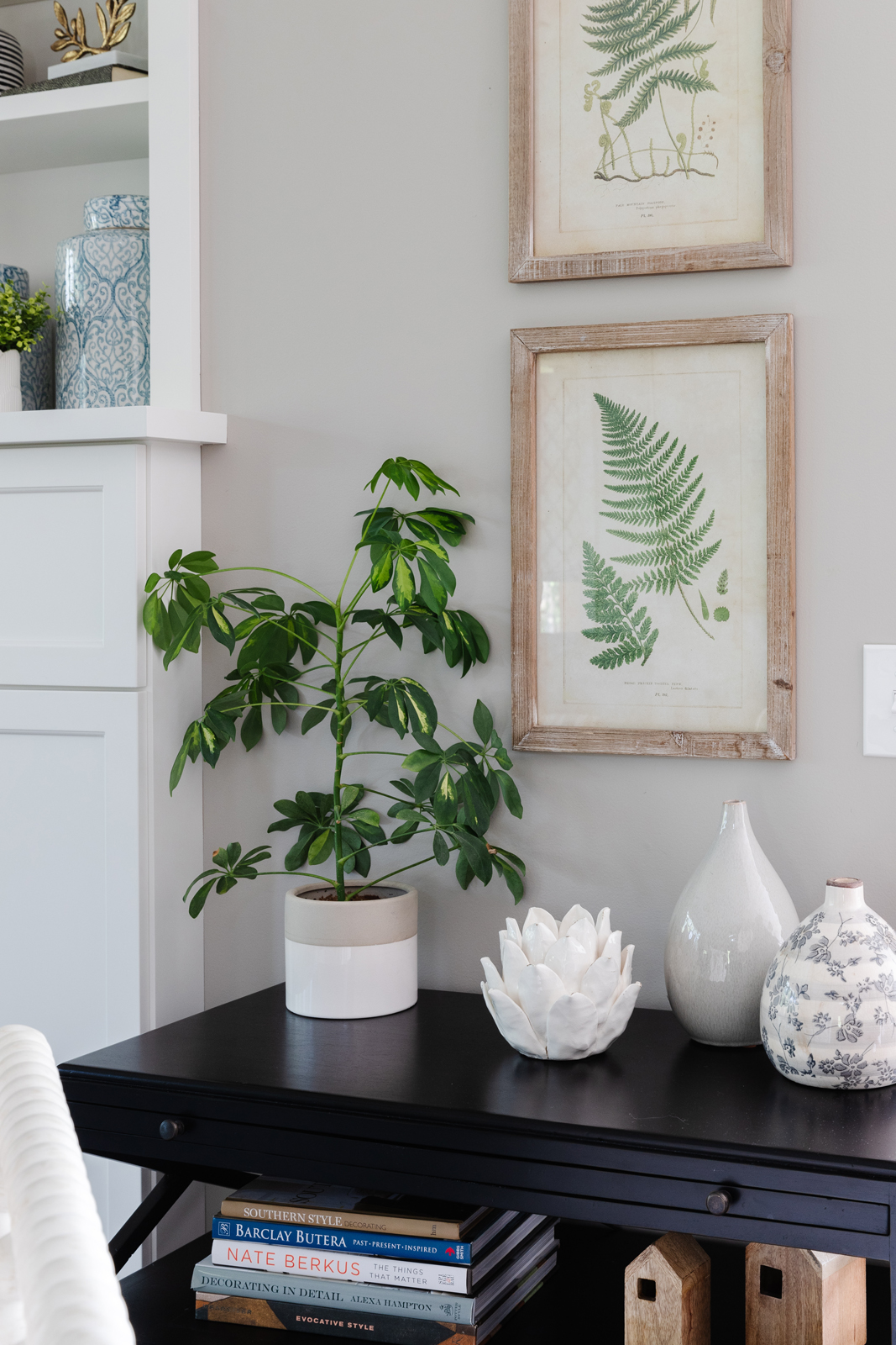
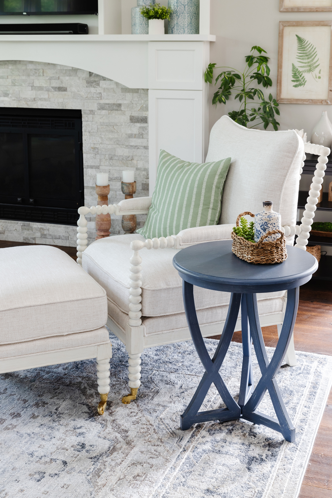
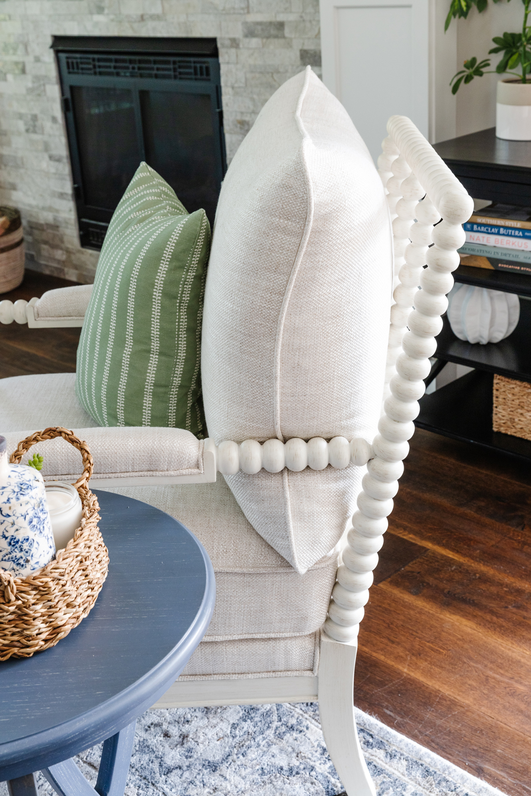

THE KITCHEN
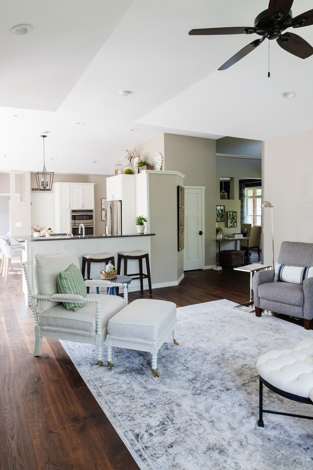
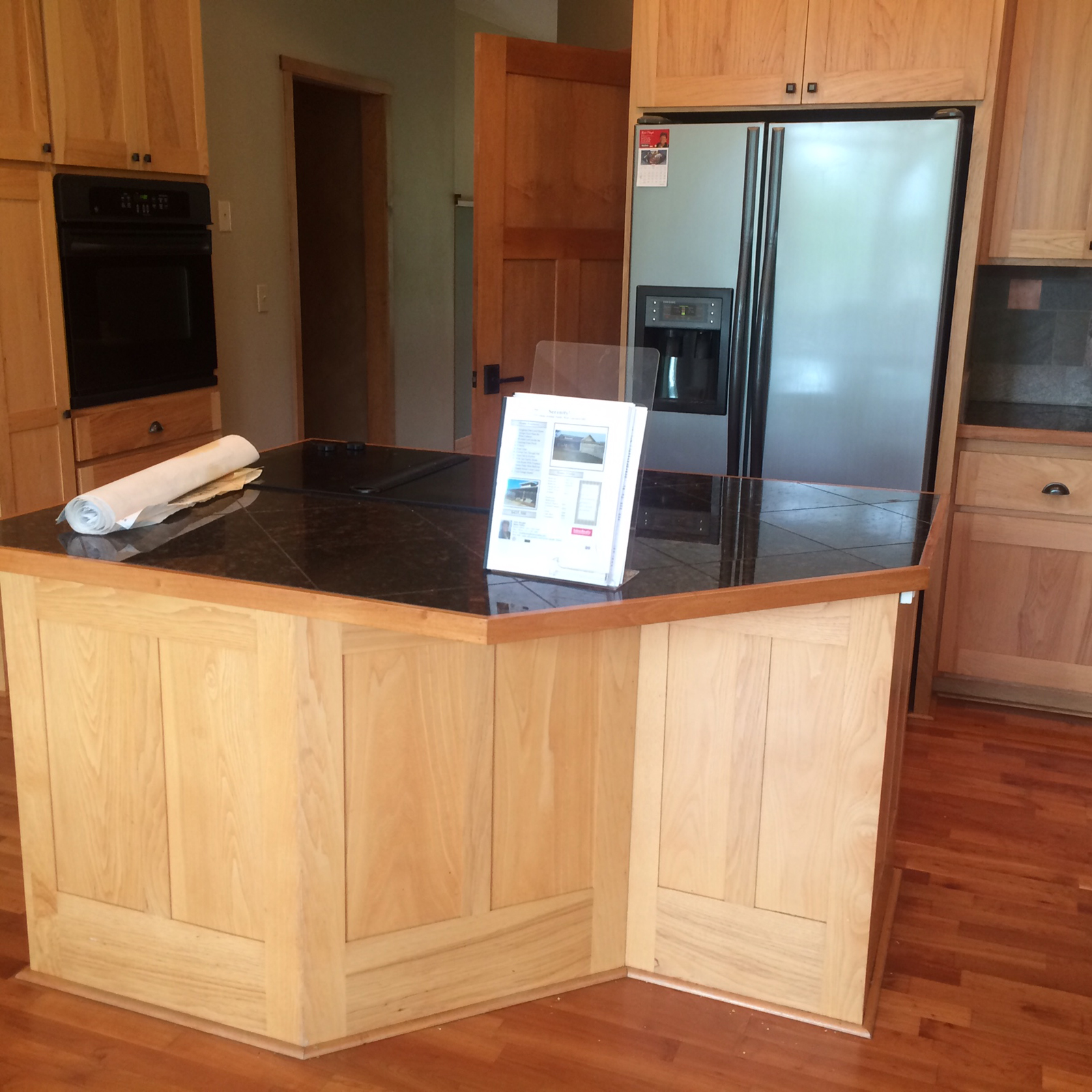
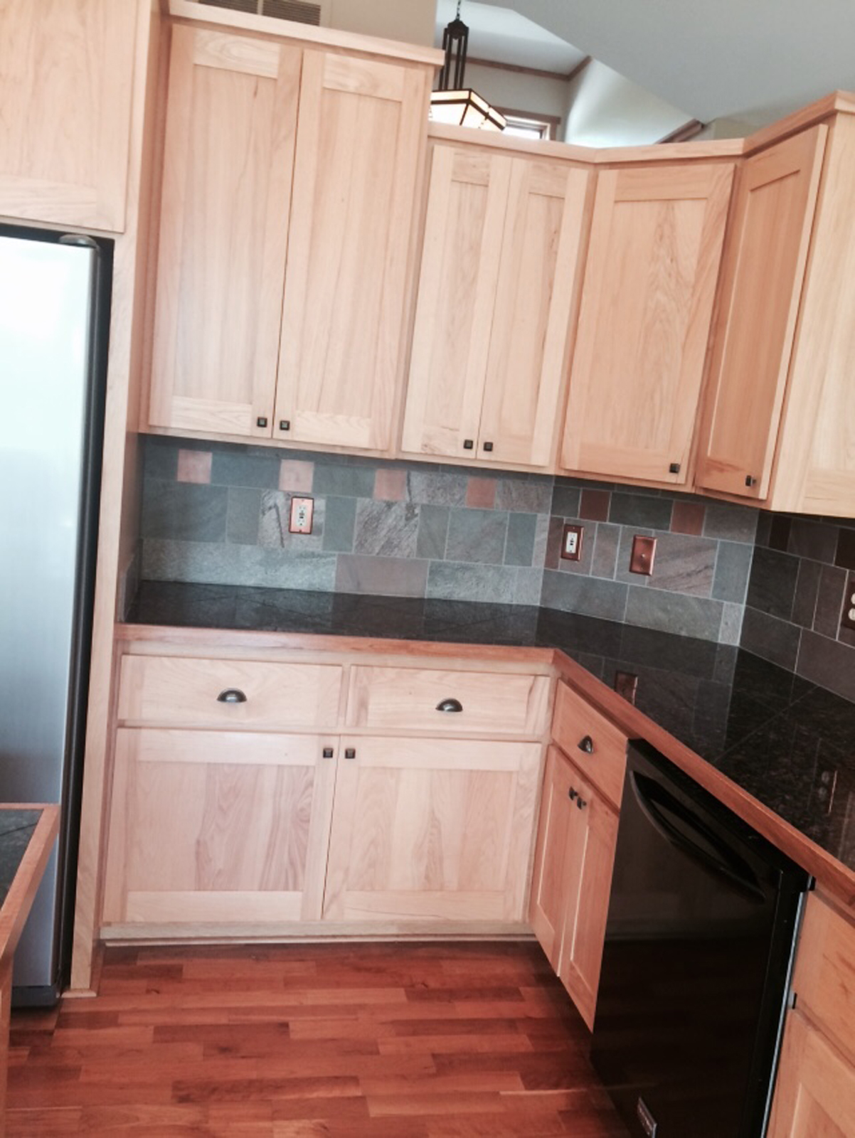
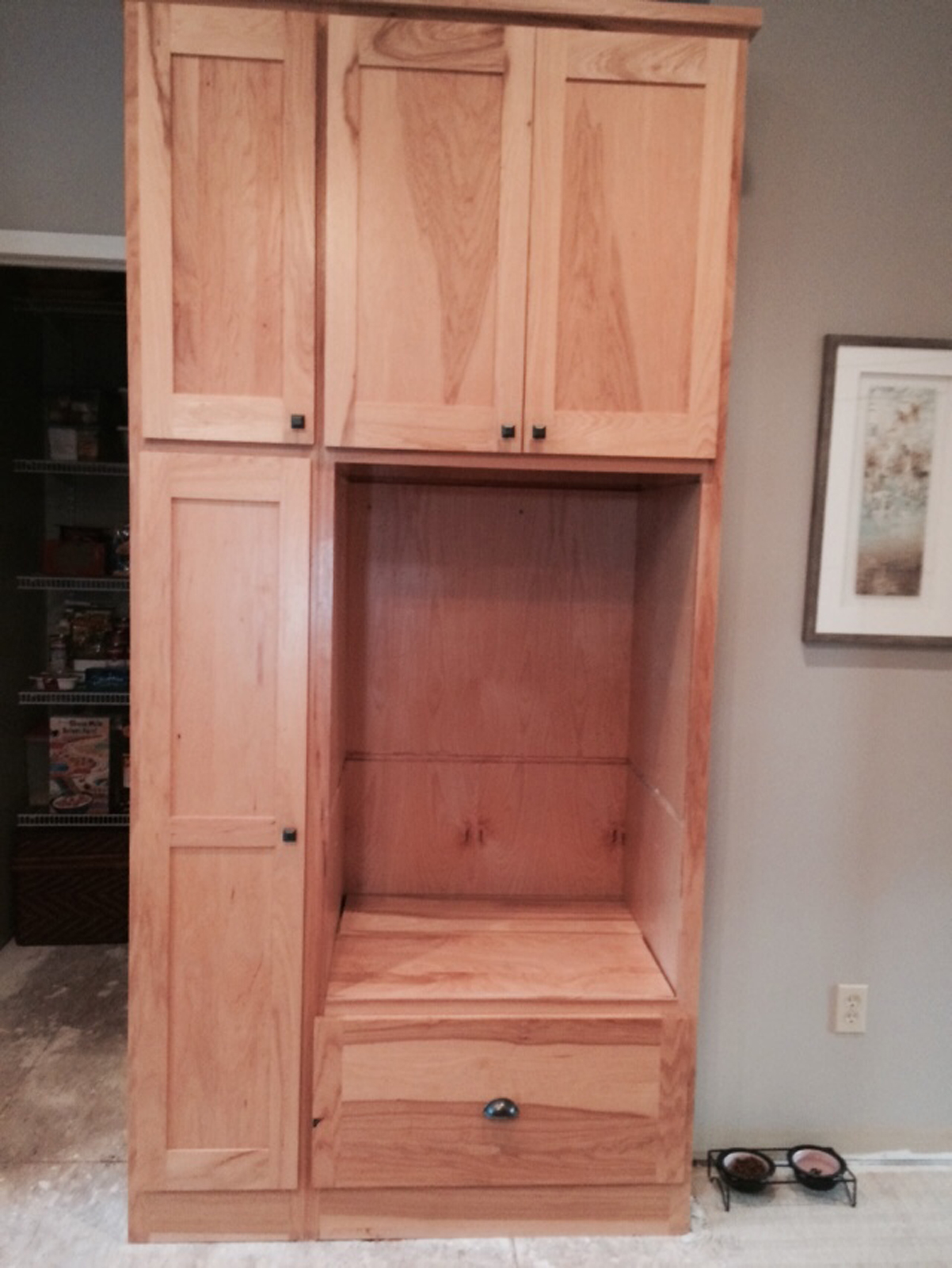
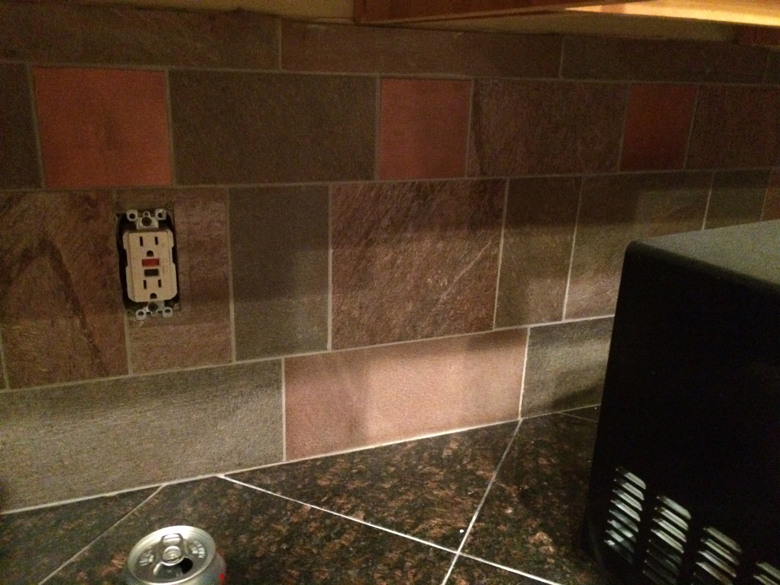
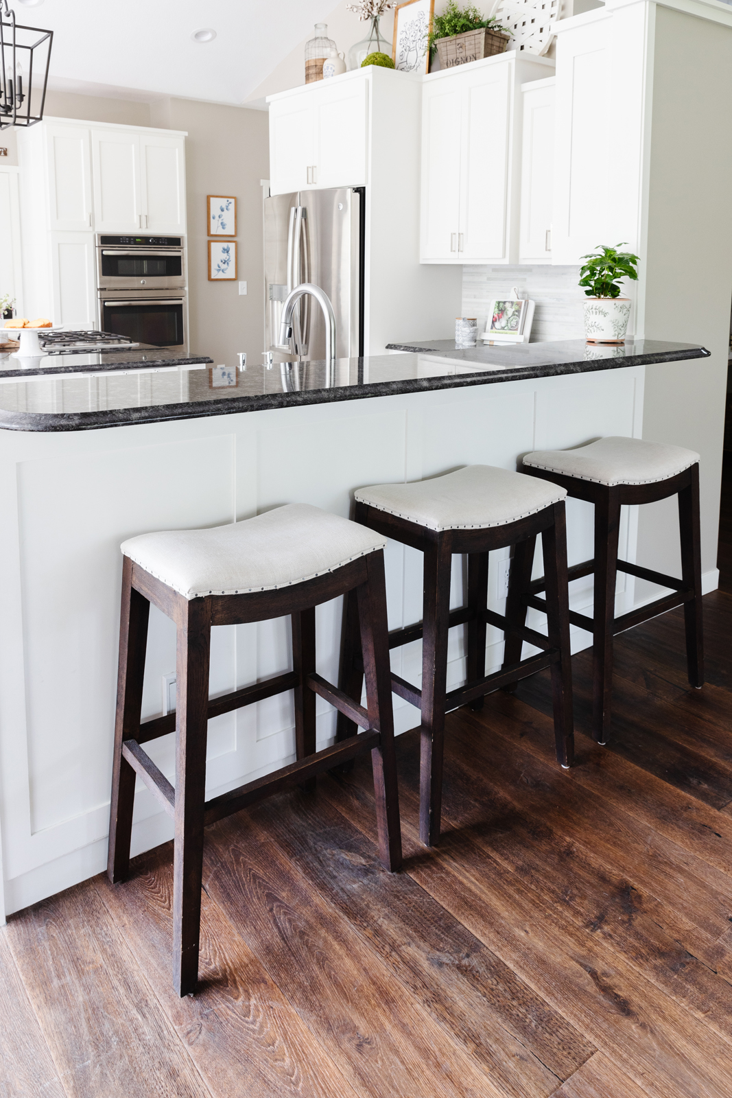
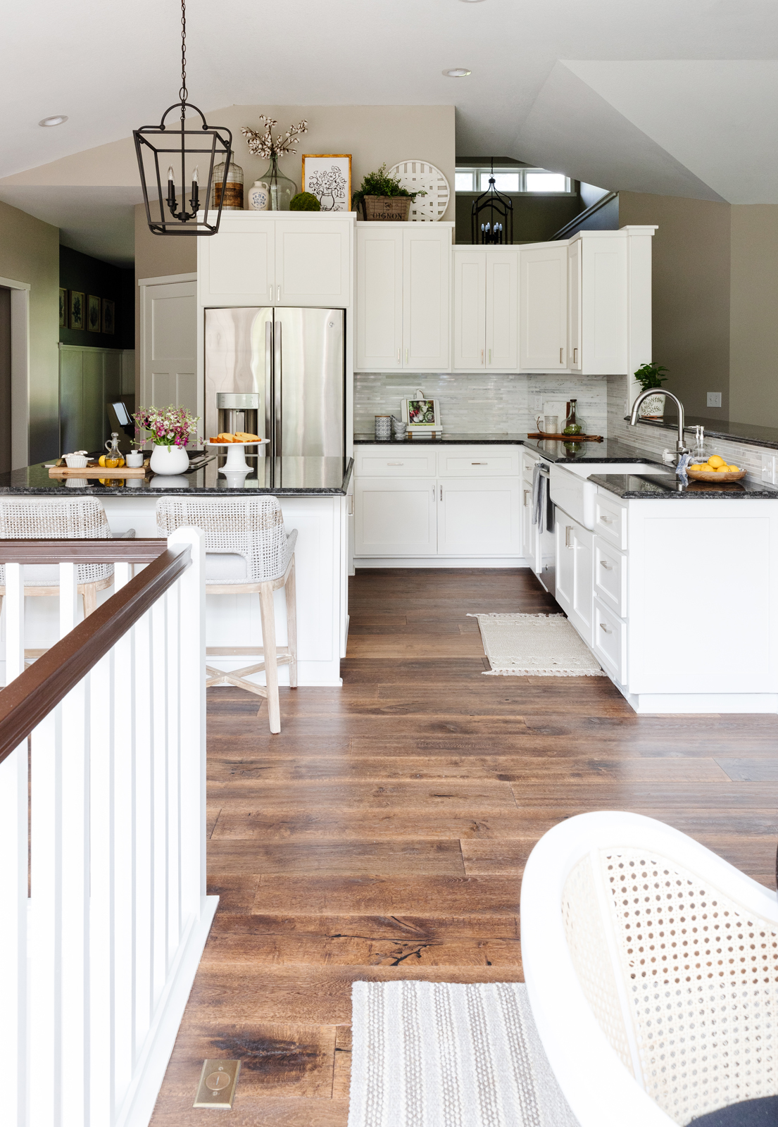
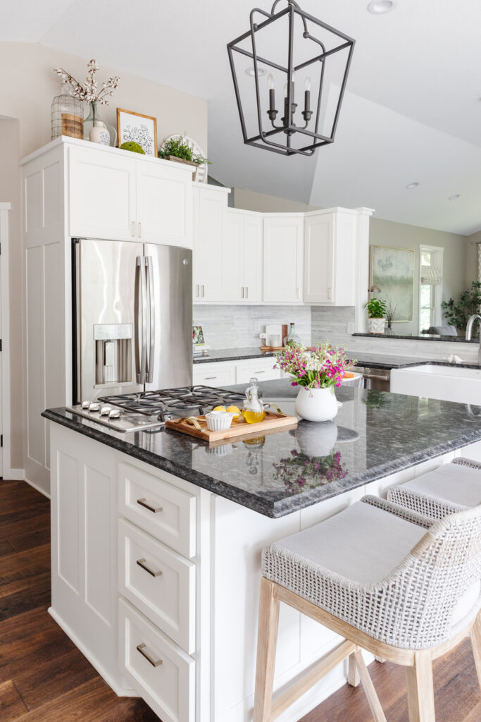
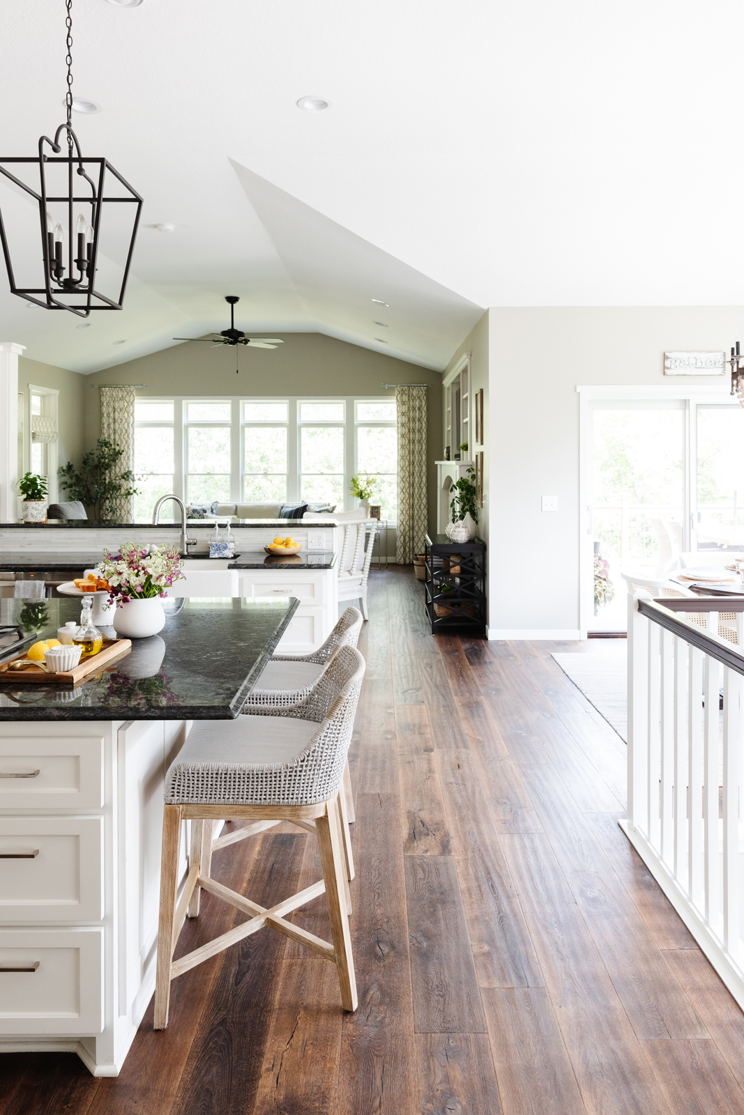
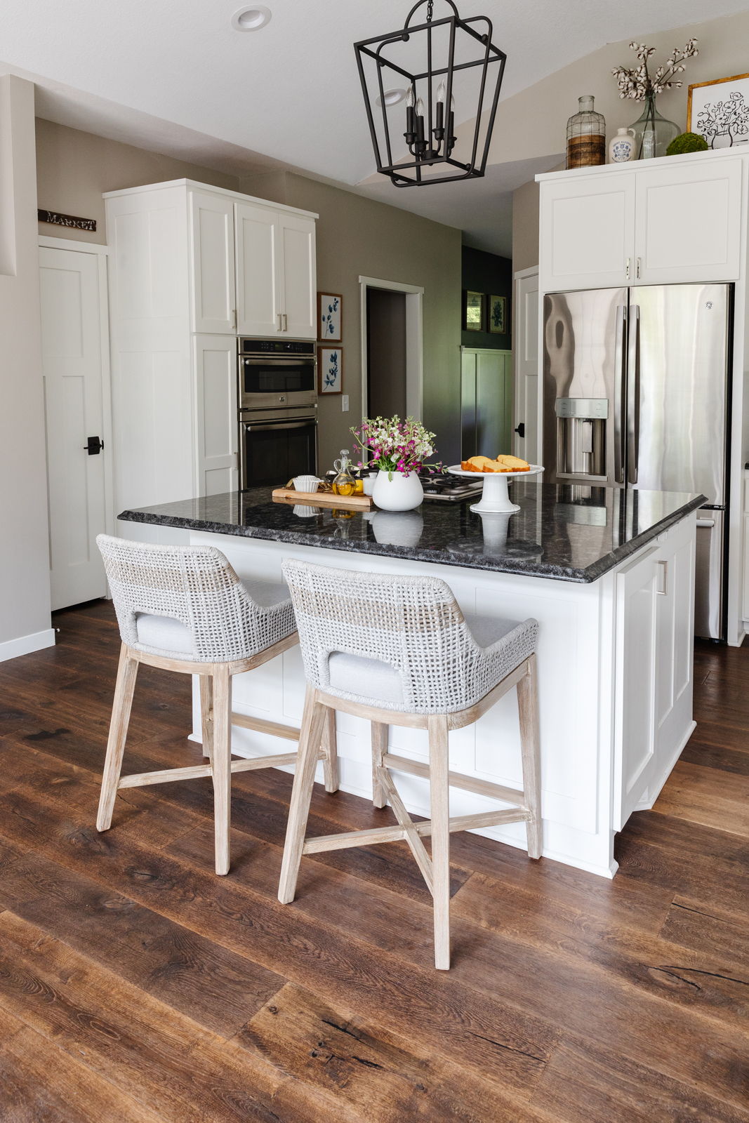
As we all know, the kitchen is the most important part of the house, and this one definitely needed a big makeover! Once again, the hickory woods and dark colors, and craftsman style lighting was not my thing. The center island was small and awkward and only allowed for 1 stool to sit at the island. The wall that backed the cabinets adjacent to the living room just had a wood ledge and was useless. The angled cabinetry of that wall was also awkward and cut into the movement and flow in the kitchen.
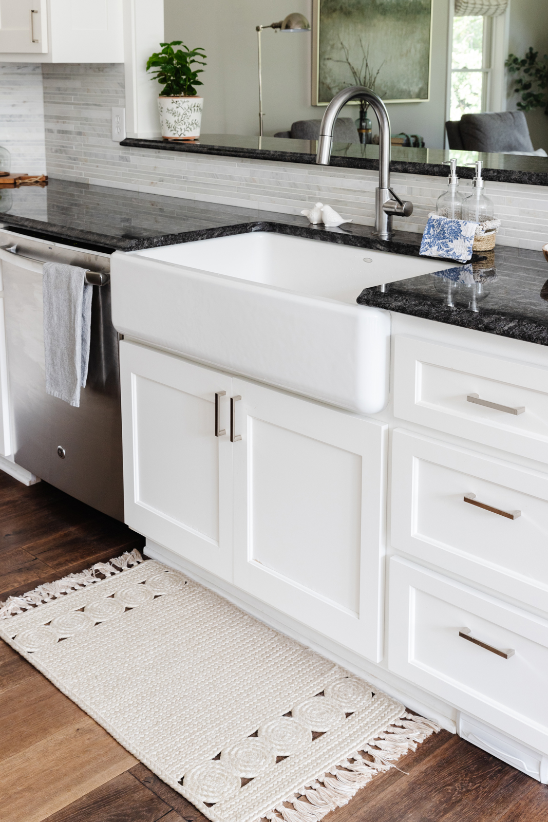
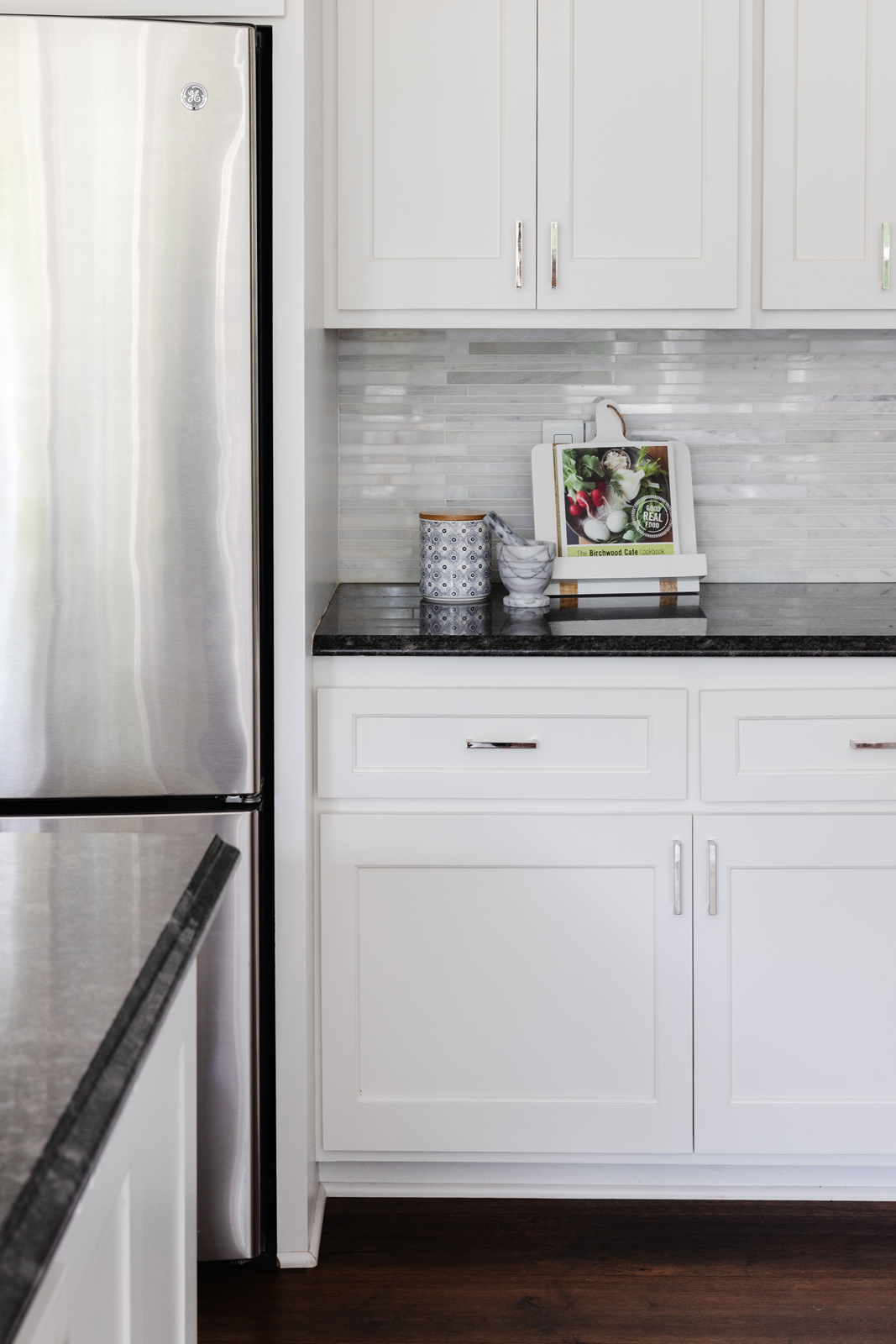
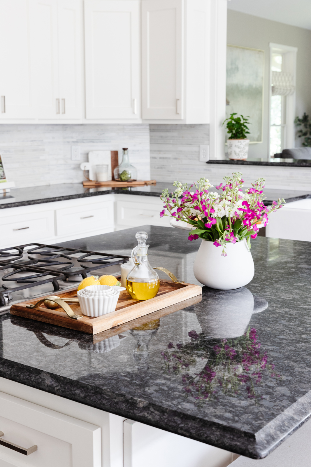
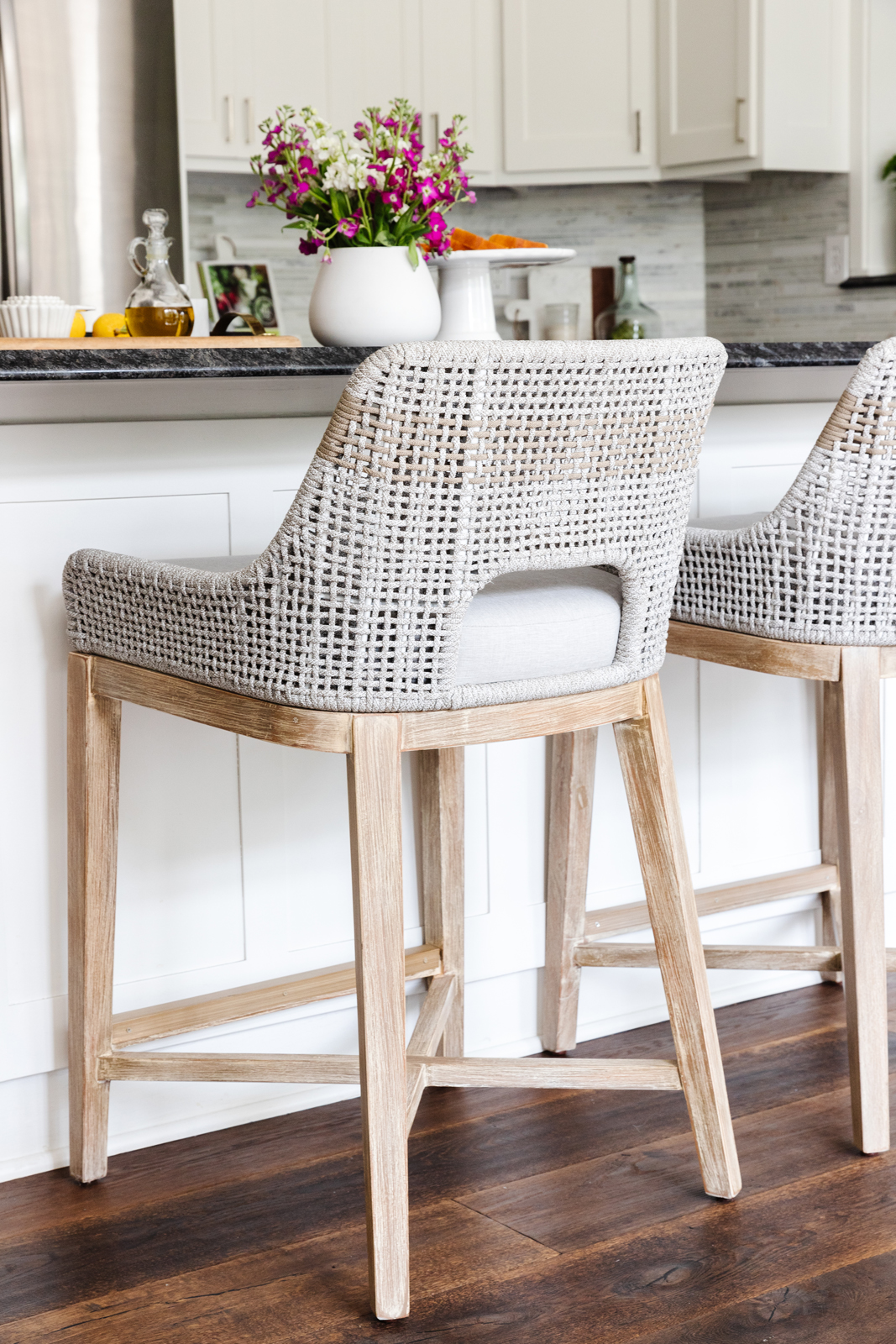
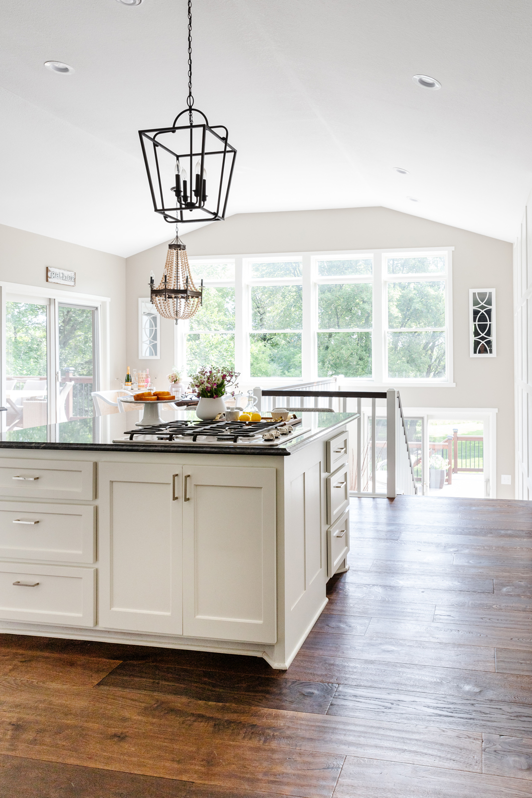
What we changed: We modified the cabinetry to create a squared off center island with an overhang of the countertop to allow for 2 people to sit there. We straightened out the angles cabinetry on the sink section. We added a countertop where the wood cap was on the wall next to the living room and added 3 more spots for people to sit. We had all new doors and drawer fronts made, and converted the wall oven cabinet to fit a new wall oven and convection microwave. We added all new appliances, sink, plumbing, tore out the backsplash and put in new countertops and backsplash tile, and we painted all of the cabinets white. We painted all of the walls, of course, and added new light fixtures. Our kitchen is now much more functional and light and bright.
BEFORE PHOTOS



aFTER PHOTOS
THE DINETTE
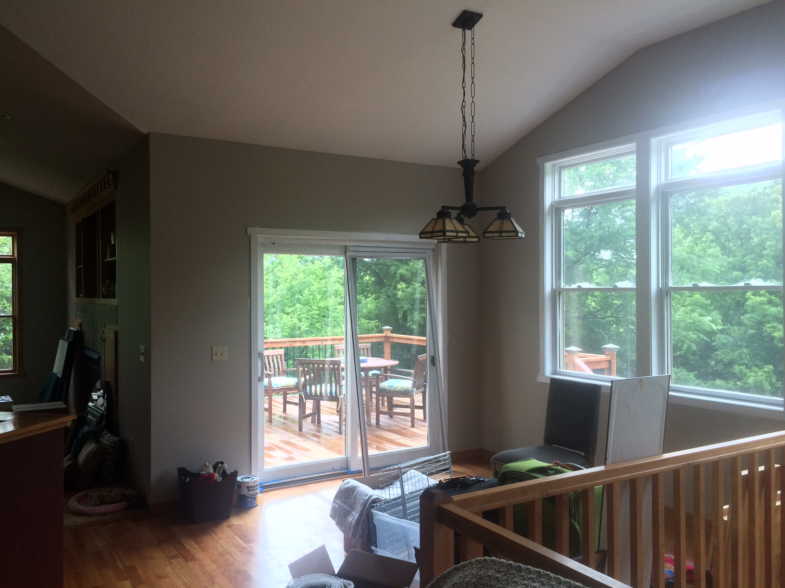
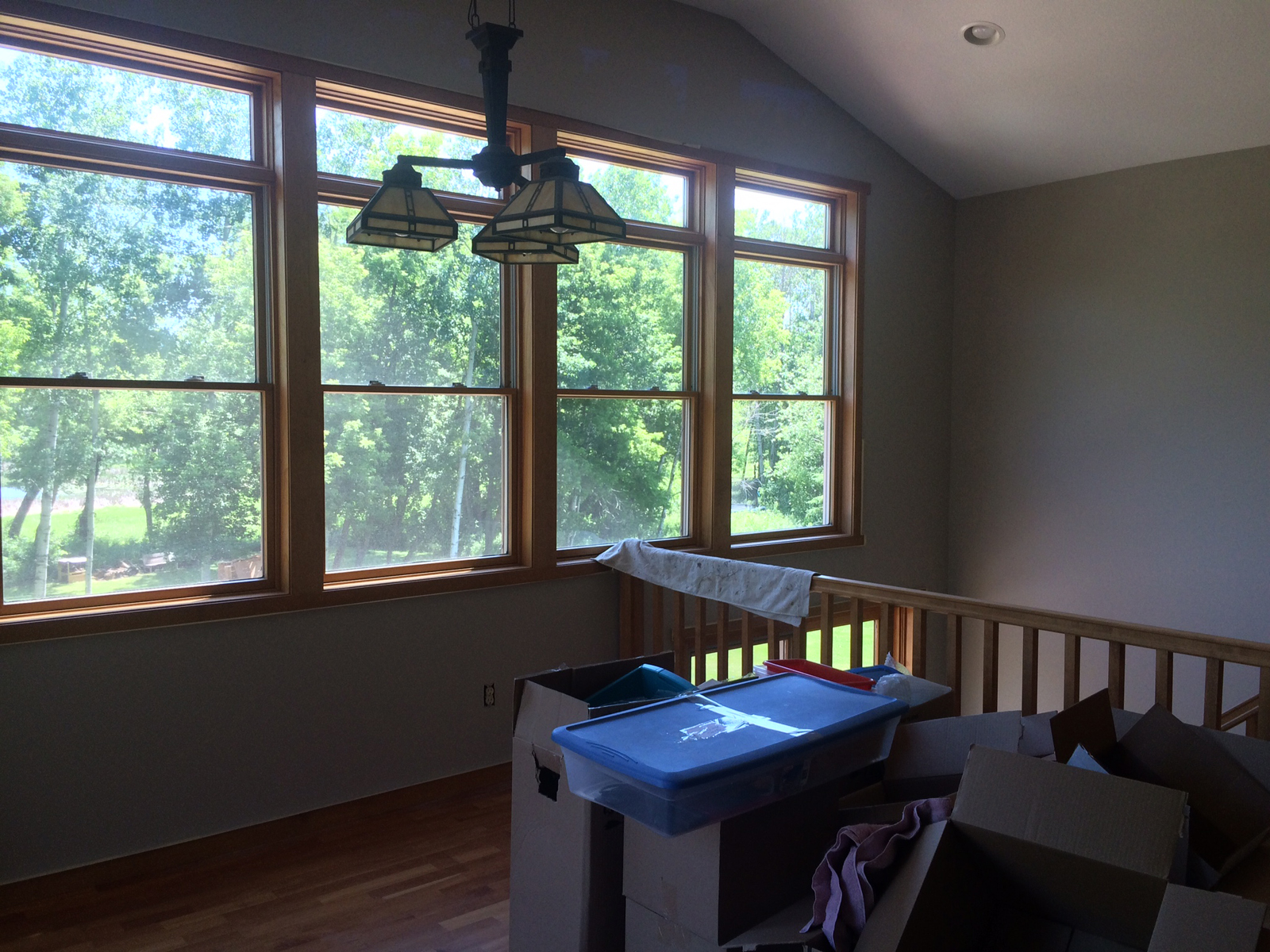
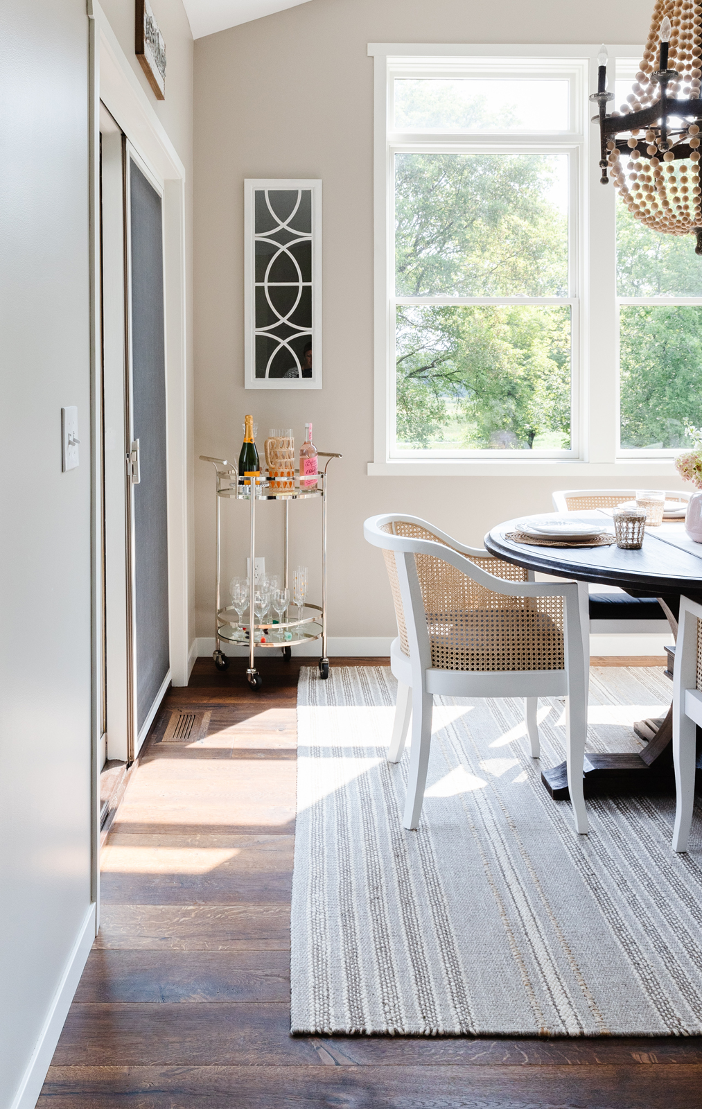
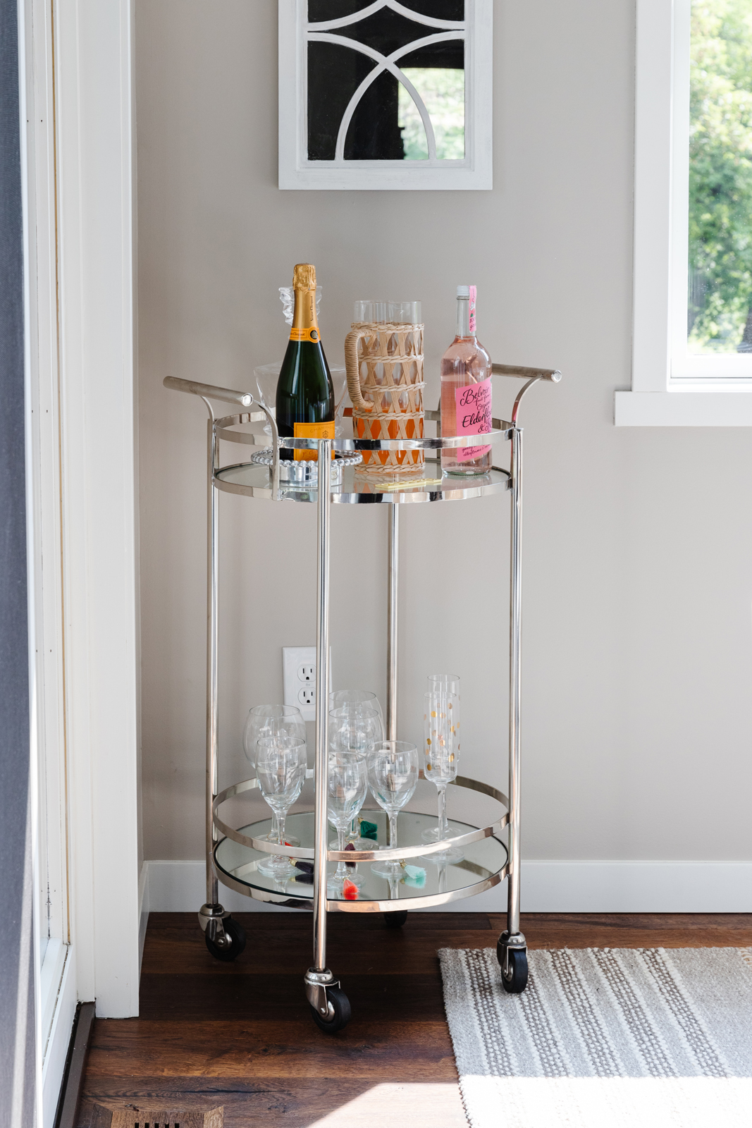
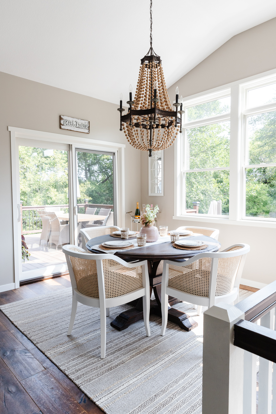
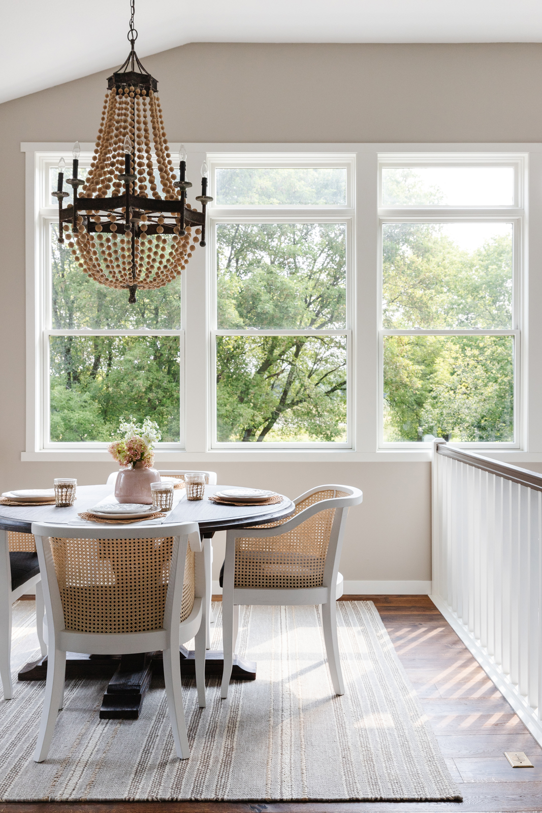
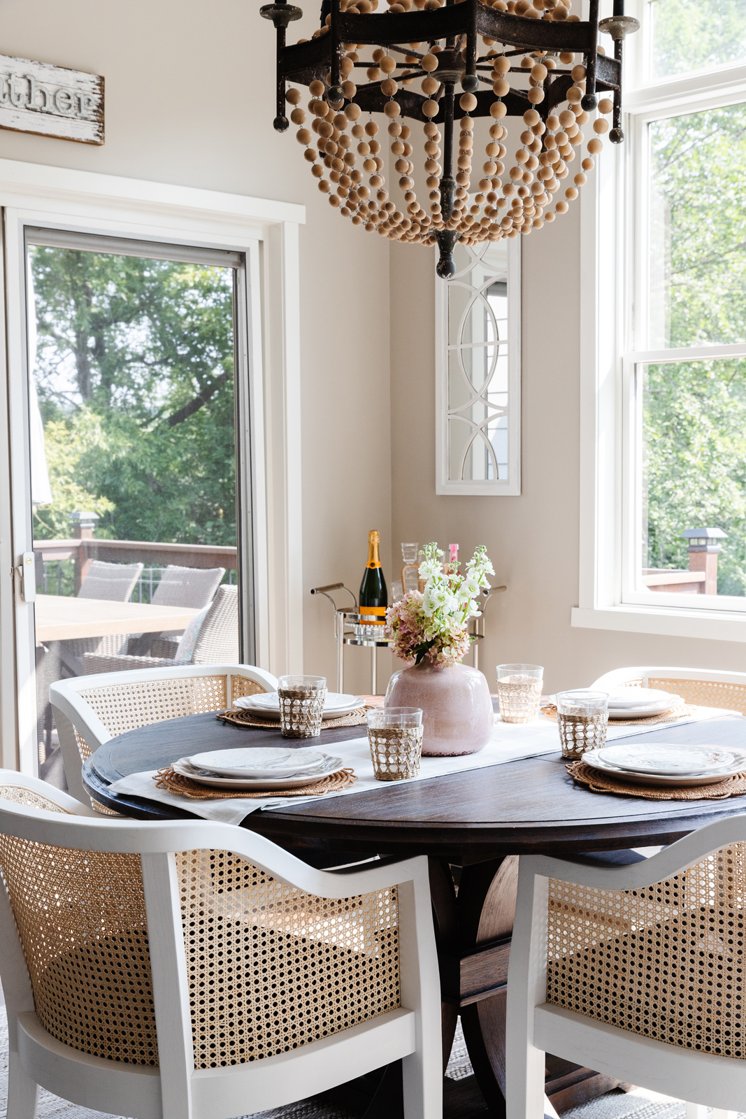
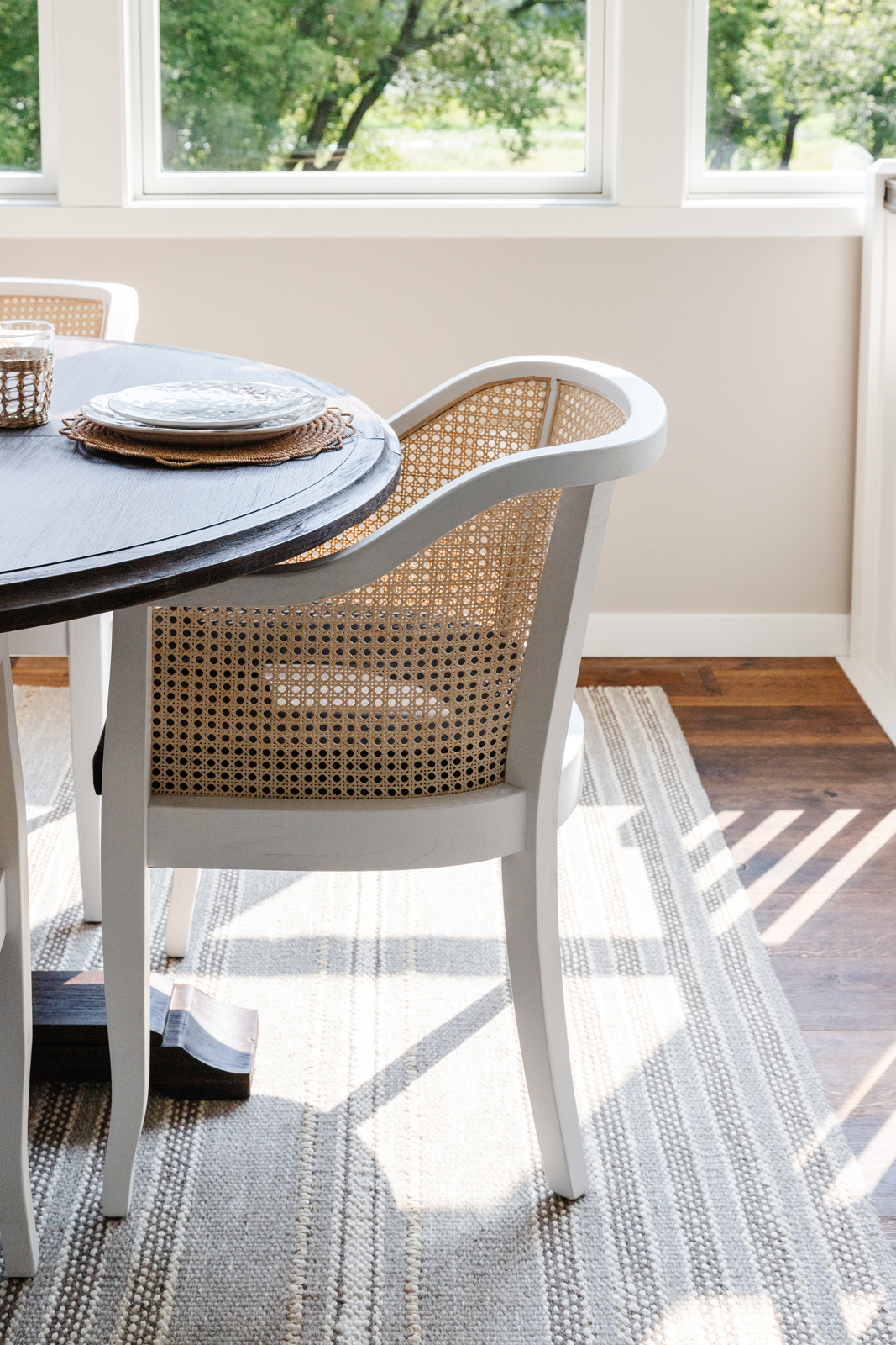
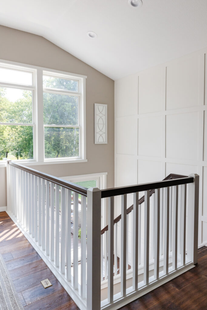
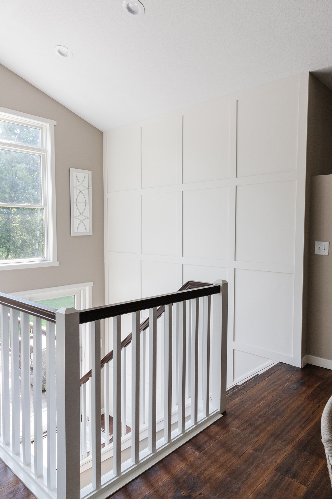
The dinette is open to the kitchen and the stairs to our lower level are located off the back of the house. We have 2 decks and there is a patio door to the upper deck off the dinette and a patio door to the lower deck off the stairway landing. It is an unusual design, but I love how all of the windows and doors open up the entire back of the house to the outdoors. Because we don’t have any neighbors that can see us out the back, we left the windows uncovered and let the light shine in! Cosmetic changes were all that were needed here. Fresh paint on the walls and millwork, new hardwood floors, new light fixture, and painting all of the stairway parts. We removed the carpet from the back stairs and put in hardwood on the stairway. We created a white millwork paneled wall to create interest to the large stairway wall.
BEFORE PHOTOS


So that wraps up Part 1 of my house reveal! We will explore several other rooms of our home and the exterior on Part II of my home reveal. For more project reveals, recipes, and design tips sent right to your inbox, be sure to sign-up for our newsletter on our blog page here.
XO,
Amy & the Interior Impressions Team
Can you please tell me where you got the curtains you put in your dining room here? I absolutely love the whole thing, and think those curtains would be perfect for MY navy and white dining room! Thank you!!
I absolutely LOVE the dining room – Could you please tell me where you purchased the draperies?
Hi Amanda! All window treatments went through our sister company @WoodburyBlinds! Thank you so the compliments!