Welcome to the second phase of remodeling on this beautiful Lake Elmo home! We had the pleasure of working with our clients to refresh the look of their main floor a while ago. This project brought us to their lower level family hangout space and to their main floor primary bathroom. We also spruced up the exercise room and movie theatre (still in progress and not photographed yet). The lower level had great structure and functionality, but just needed to be lightened up and needed new furnishings to help it match the fresh, new look of the main floor. Our clients decided their primary suite needed an update also and hired a remodeler to re-do that space. We helped them with finish selections there. They now have a fun, bright and happy lower level for their family to enjoy, as well as a beautiful bathroom that feels like a spa retreat. We’re guessing they are enjoying it a lot this summer, especially since the lower level opens to a beautiful backyard oasis, complete with a pool, pergola lounge area, and outdoor kitchen.
Check out the transformation and let us know what you think!
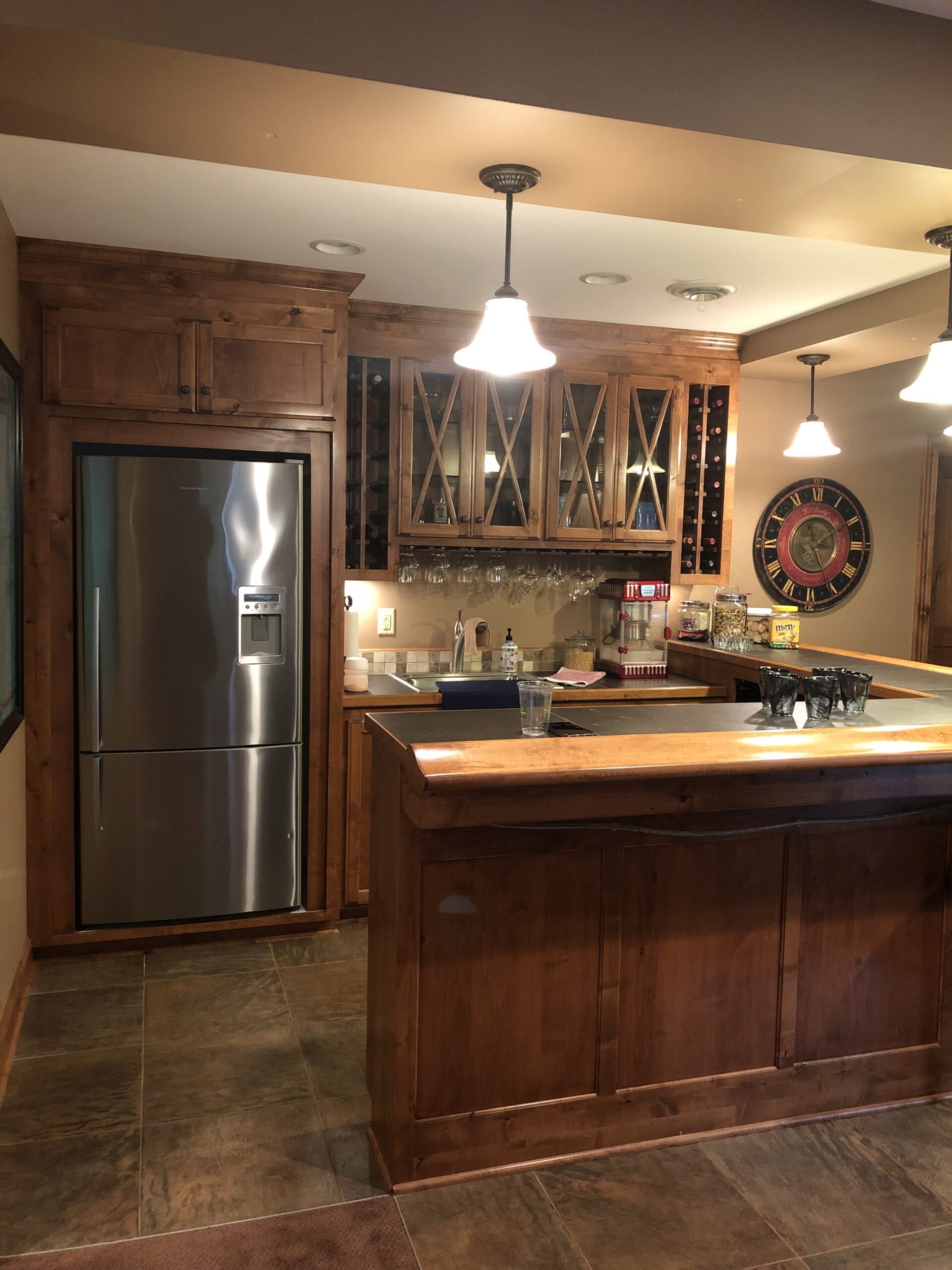
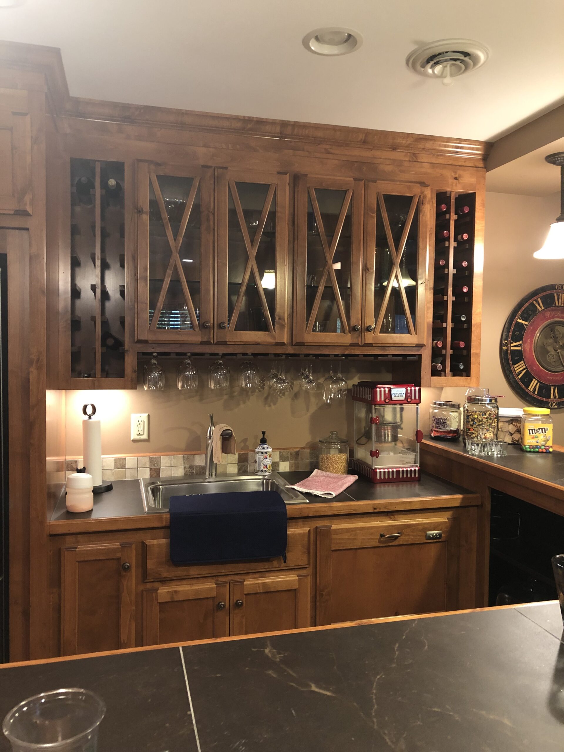
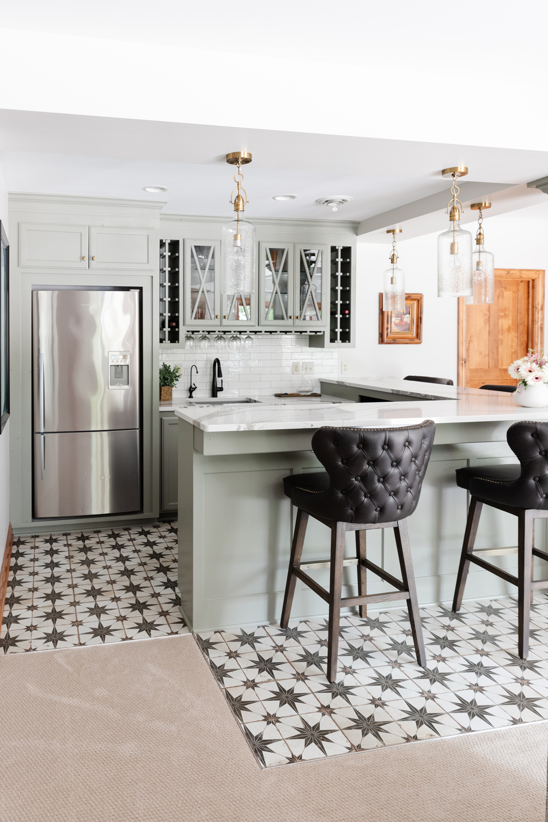
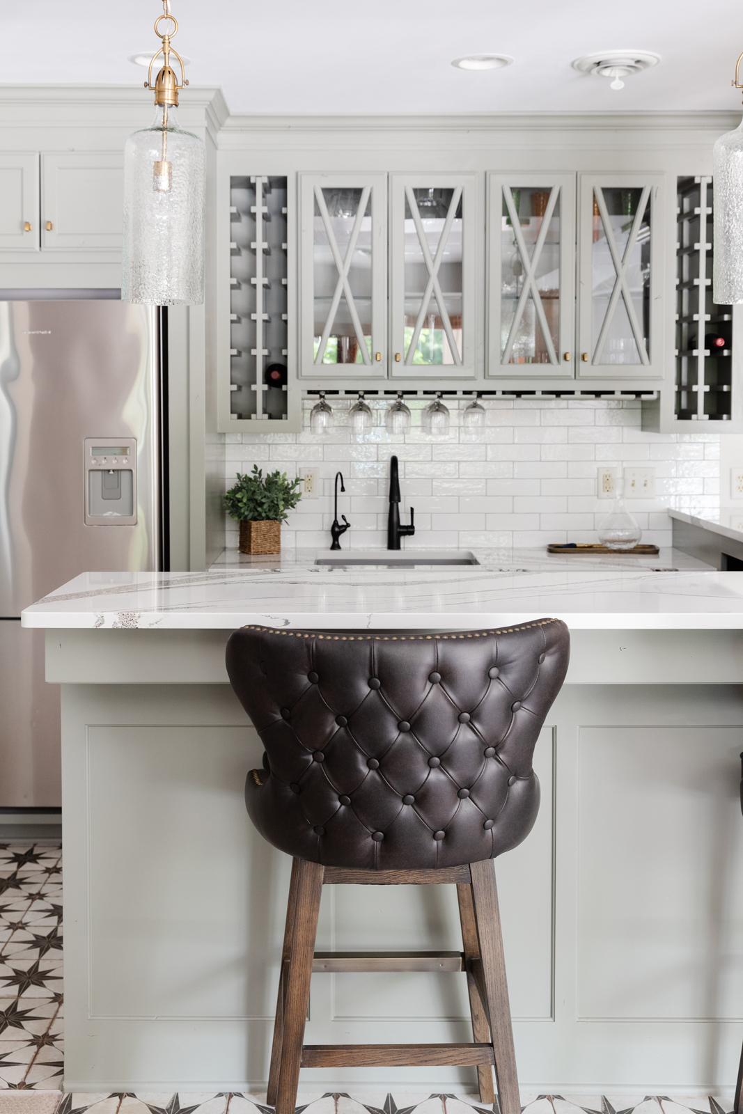
THE BASEMENT BAR AREA
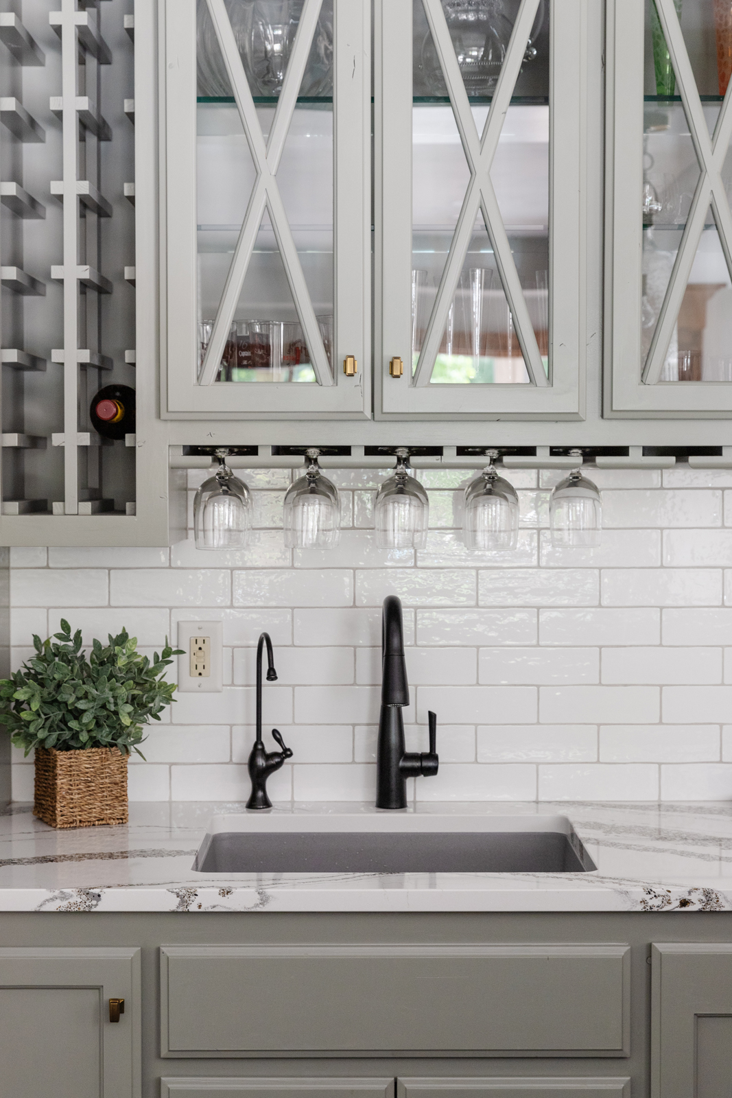
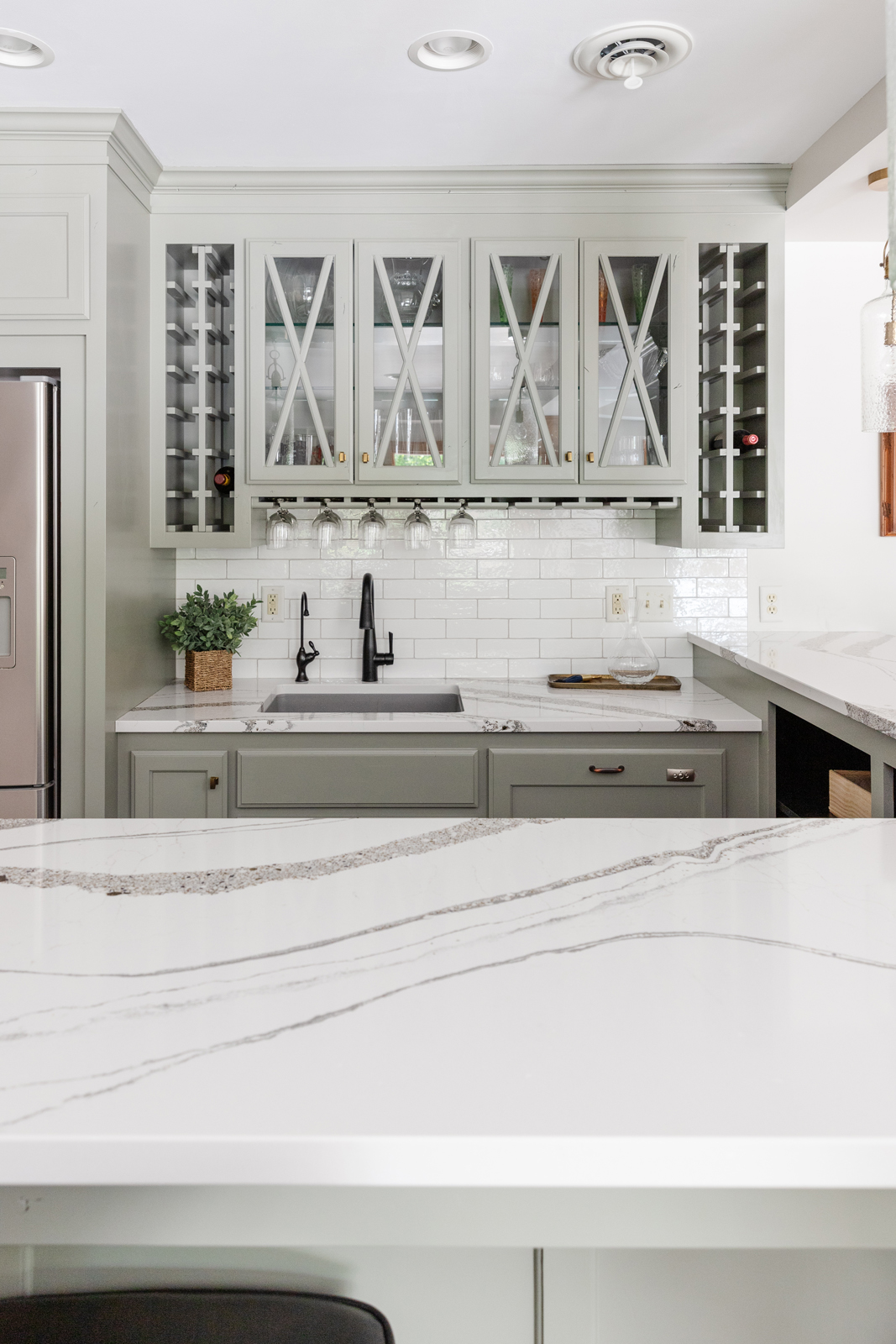
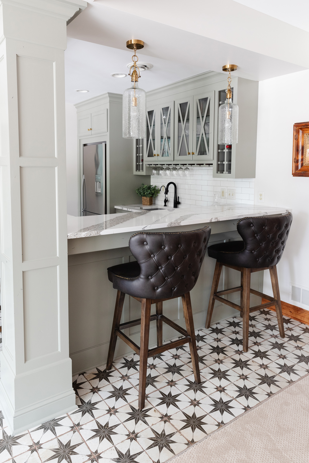
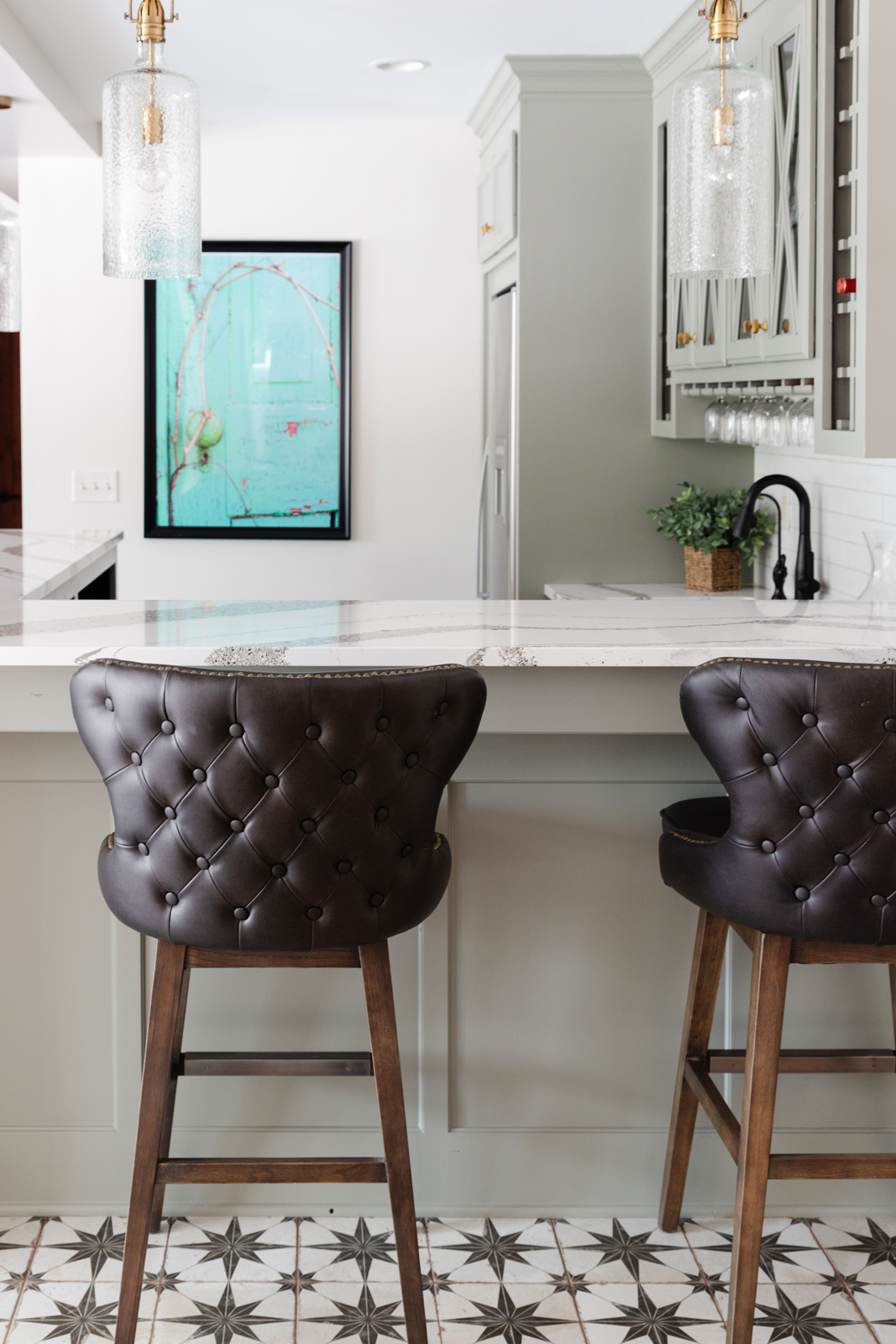
The bar area didn’t need new cabinetry or functional changes. It was just dark. Very dark. We gave it a facelift by painting the cabinets a lovely shade of gray that has undertones of green & blue. It immediately makes it feel more playful and less serious. We added new countertops and pendant lights, new backsplash tile, sink, faucet, and floor tile. We love the fun patterned floor tile. We also added comfortable and durable new bar stools. It is fun to see what a completely different look and feel it has now!
THE BEFORE
THE AFTER
THE Basement GAME AREA
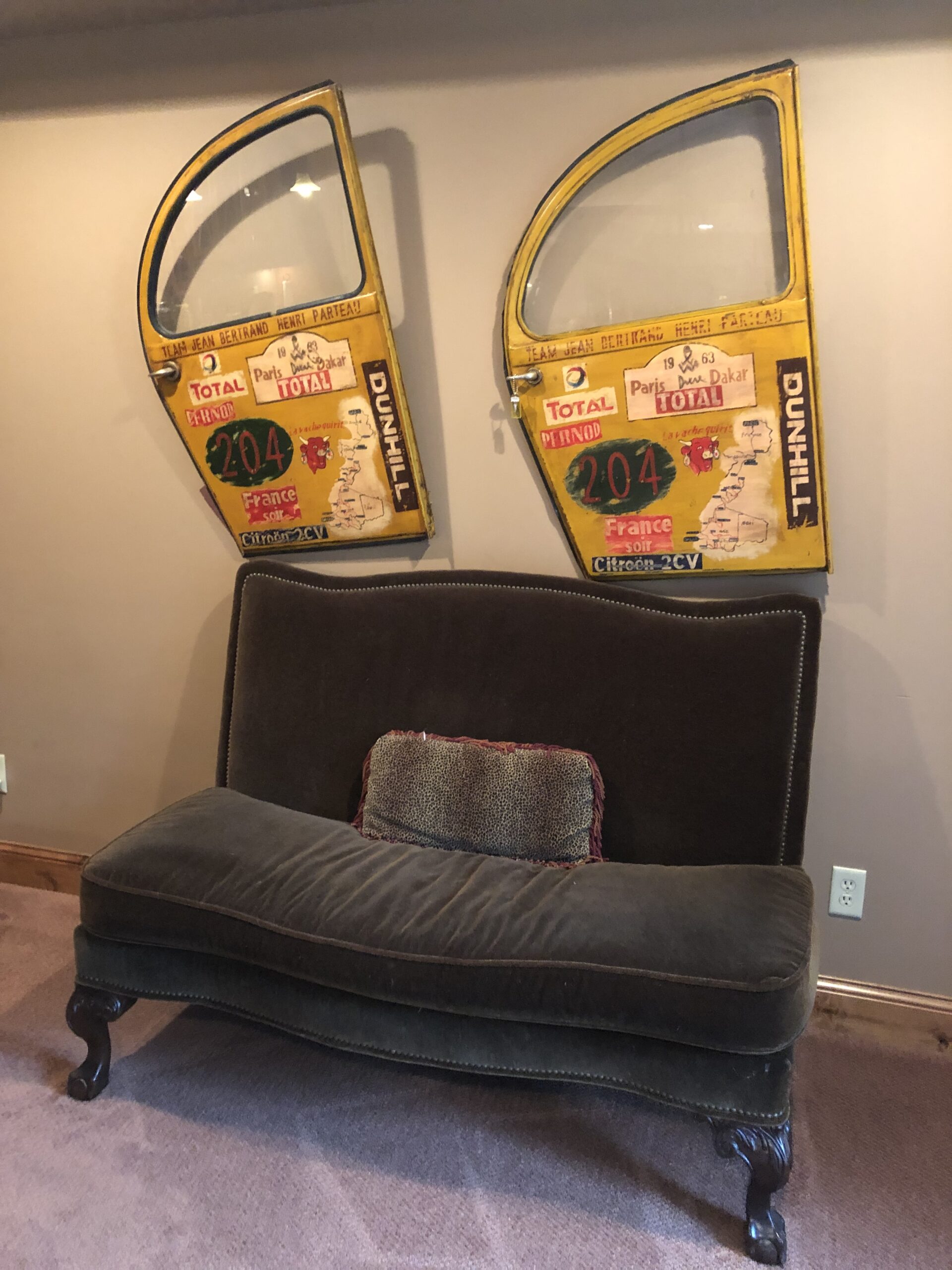
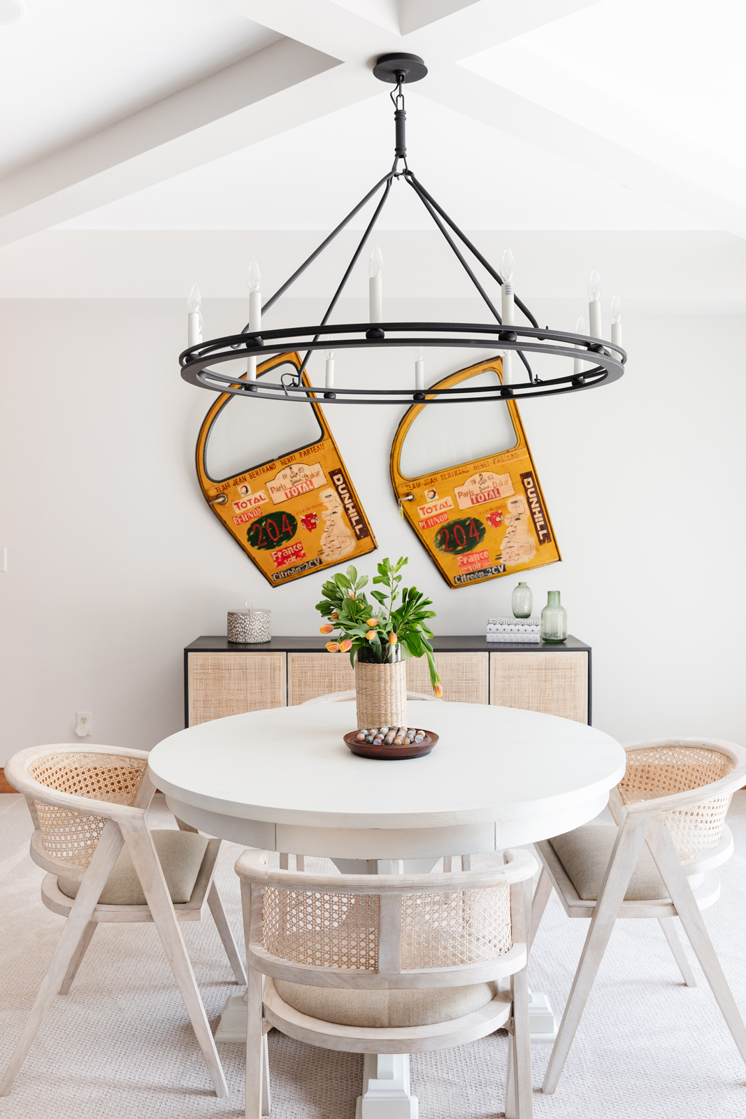
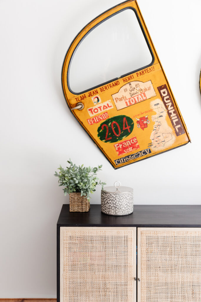
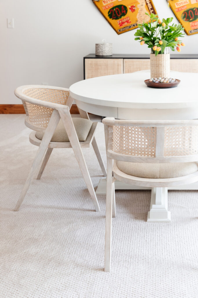
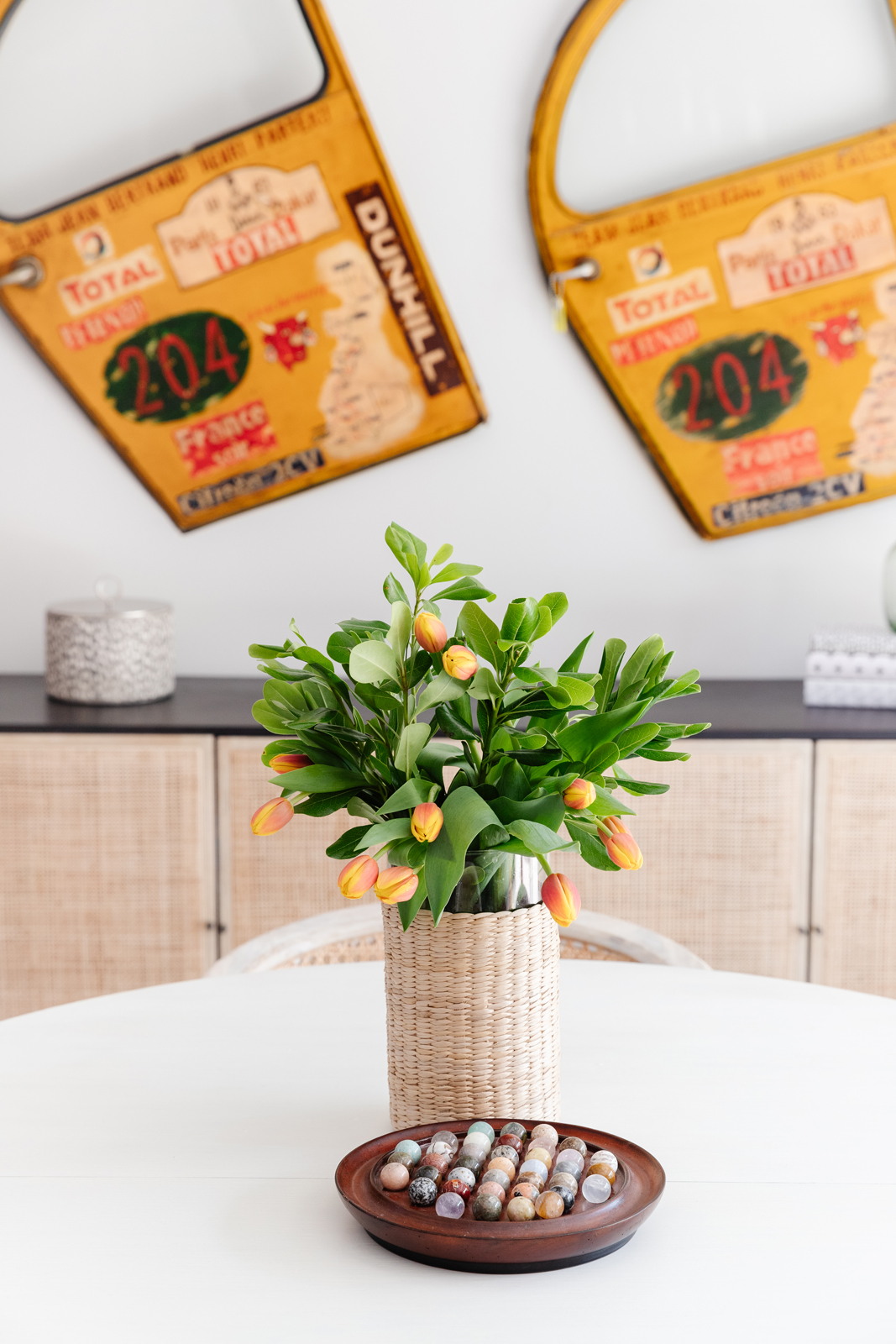
Every basement needs a good place to play cards and games, or to serve as a place to sit and eat when the party ends up inside. Our clients had these whimsical and unique cab doors from a trip to Paris and I immediately knew they had to stay! I think that was a jumping off point for the design – it had to be less serious and dark and I wanted the entire space to feel bright and evoke a sense of playfulness and casual comfort. This area of the basement is directly in front of the patio door to the back yard. It held a mobile ping pong table and a bench, and felt unfinished. The game table and credenza now give it a nice finished touch and holds lots of games too. The table and chairs are light and can be moved easily. The portable ping pong table can always be brought in when their boys want to play.
THE BEFORE
THE AFTER
THE BASEMENT LIVING AREA
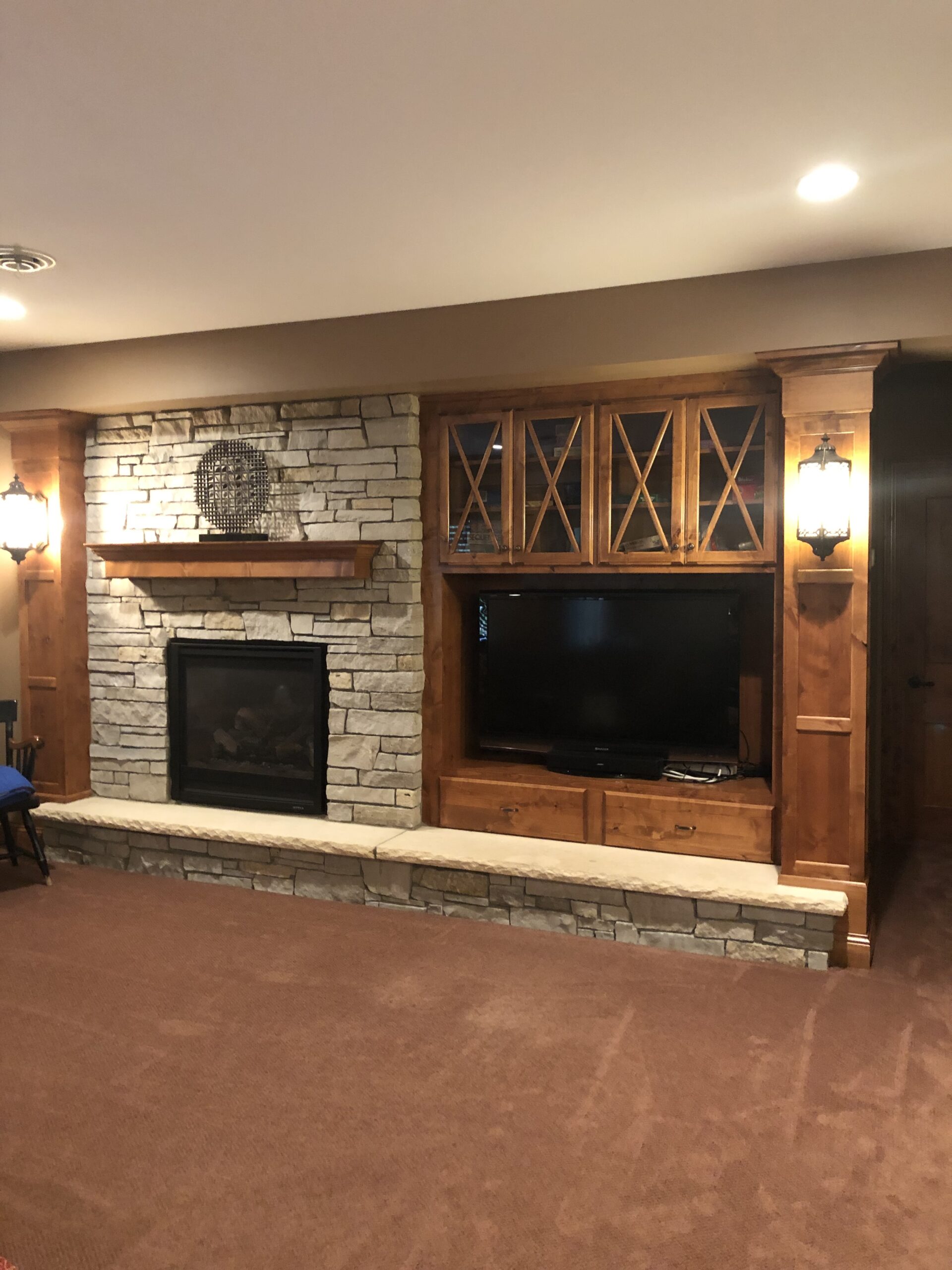
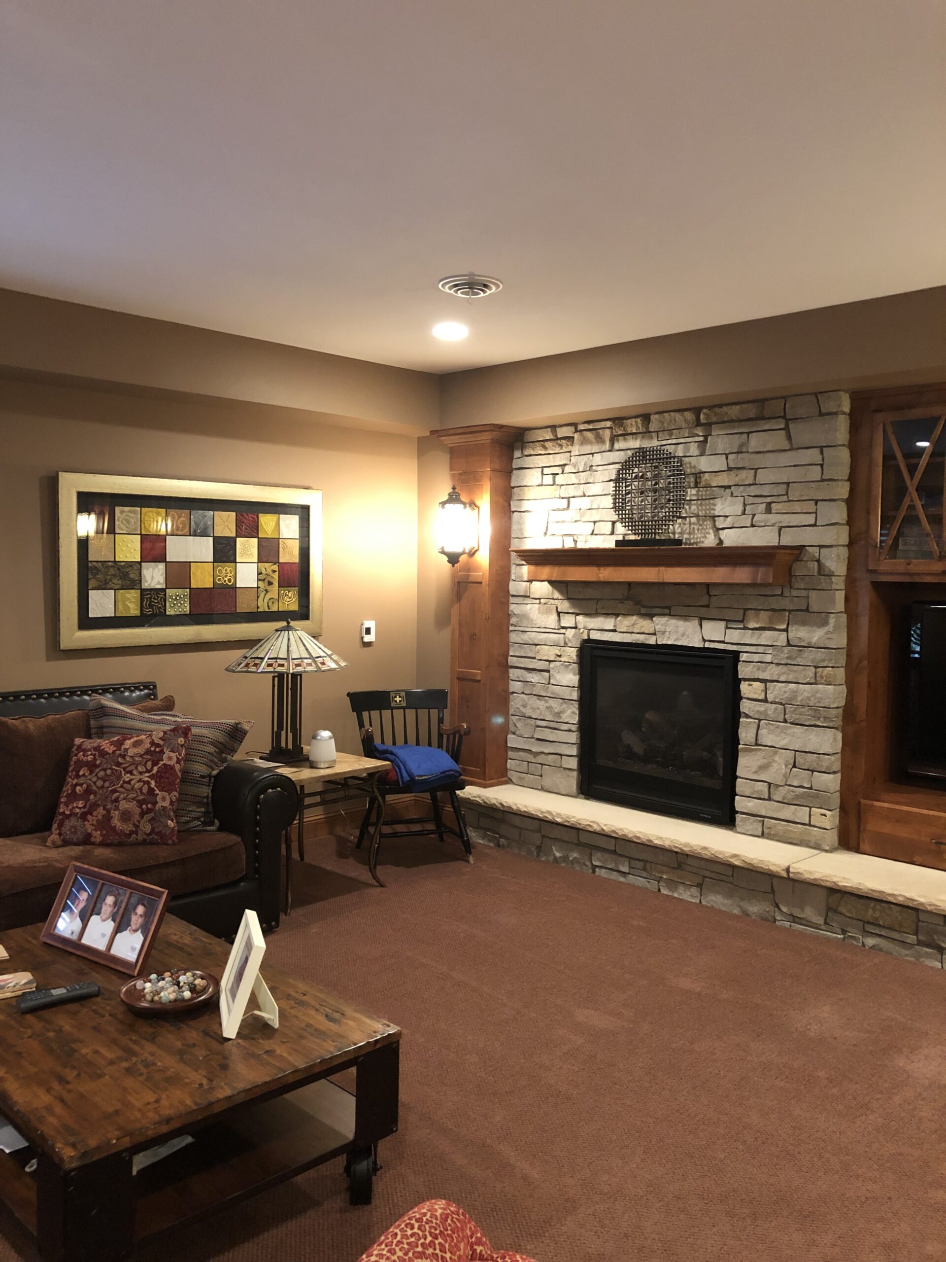
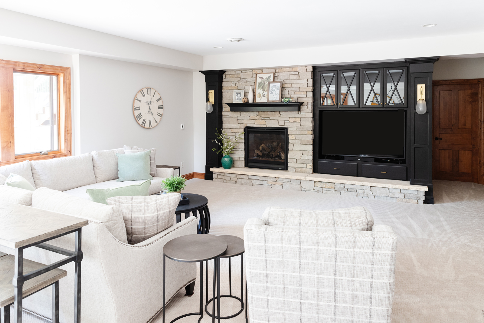
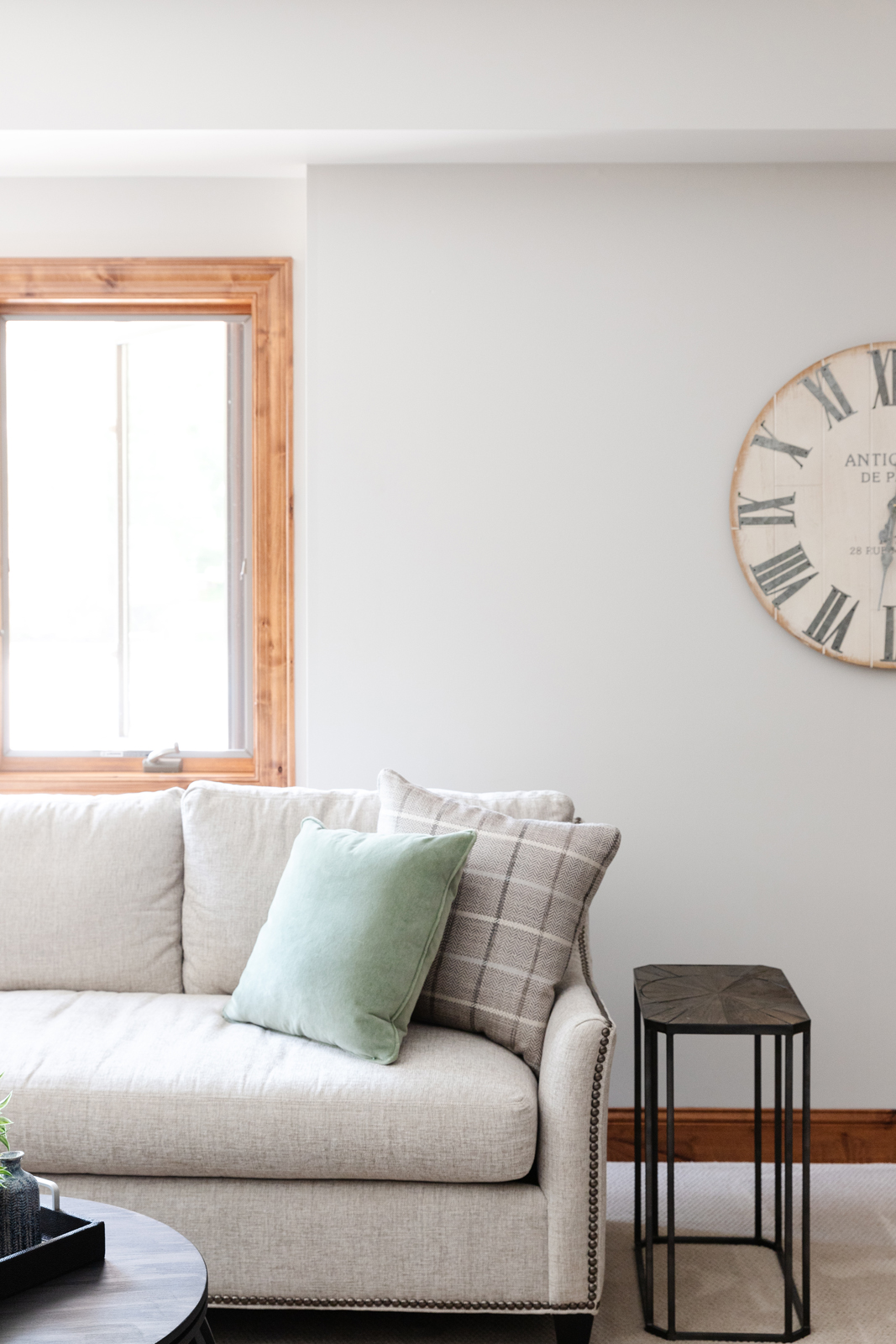
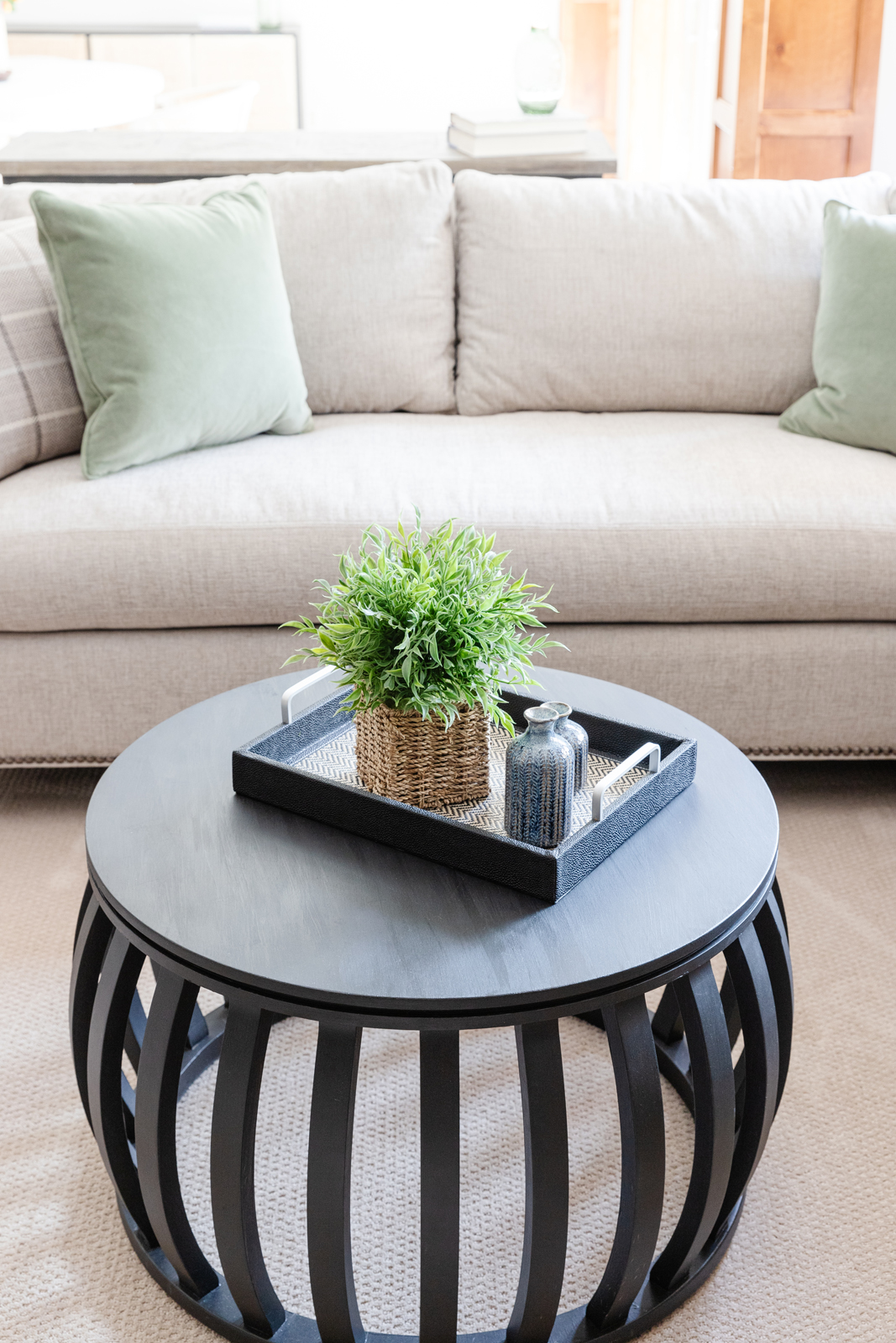
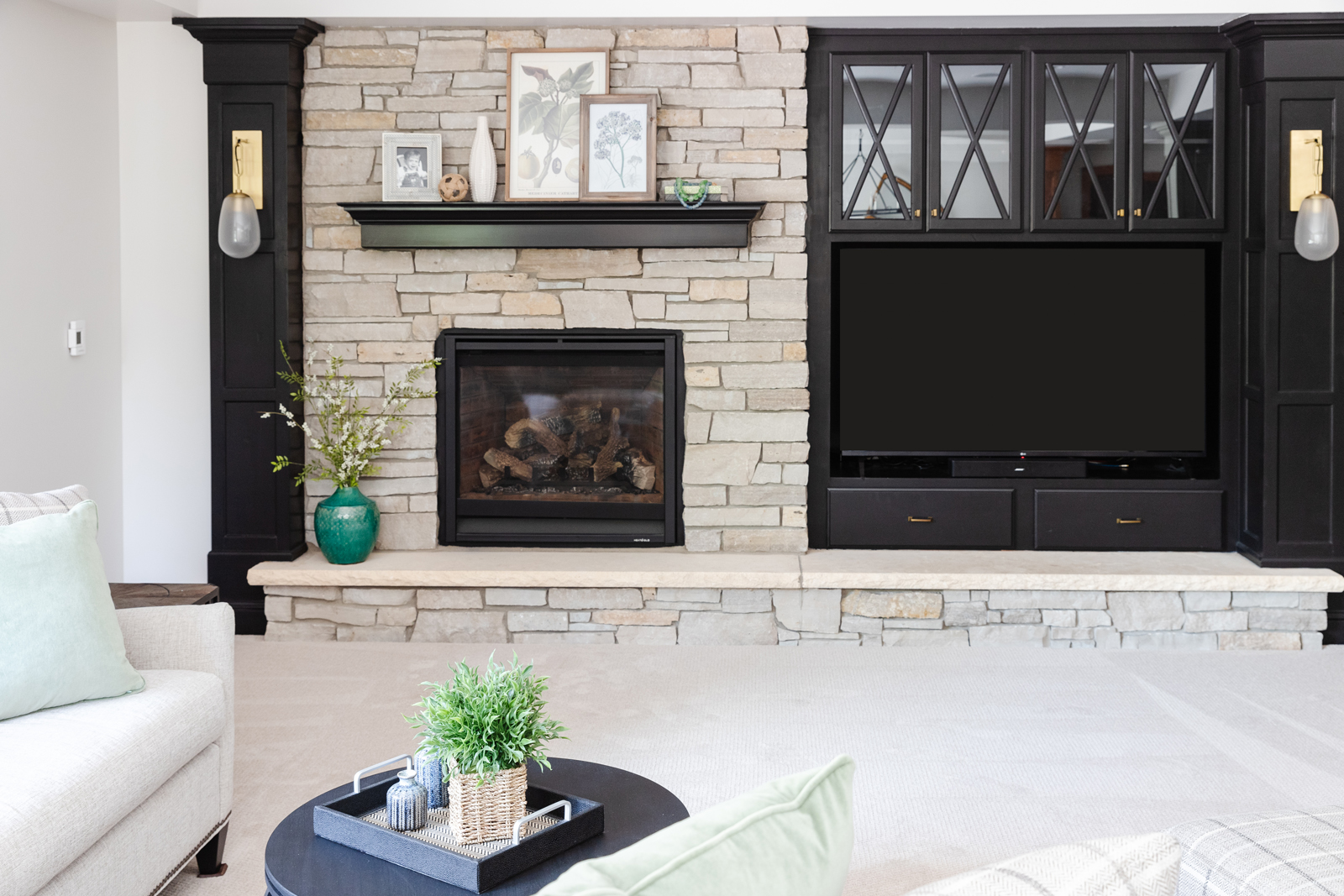
This space also felt dark and heavy. We didn’t want the same gray/blue color on these cabinets that we used in the bar, so we went with black because it is classic and timeless and also works well with the warm wood tones of the wood that we didn’t paint. Just like the main level, we didn’t want to paint all of their woodwork. It is really beautiful wood and we decided to leave specific elements to provide a balance and flow of that painted/wood mixture throughout their home. All of the walls were lightened up and beautiful, comfy furniture was brought in to give this space a complete update. New carpeting and light fixtures also helped to lighten up the entire basement.
THE BEFORE
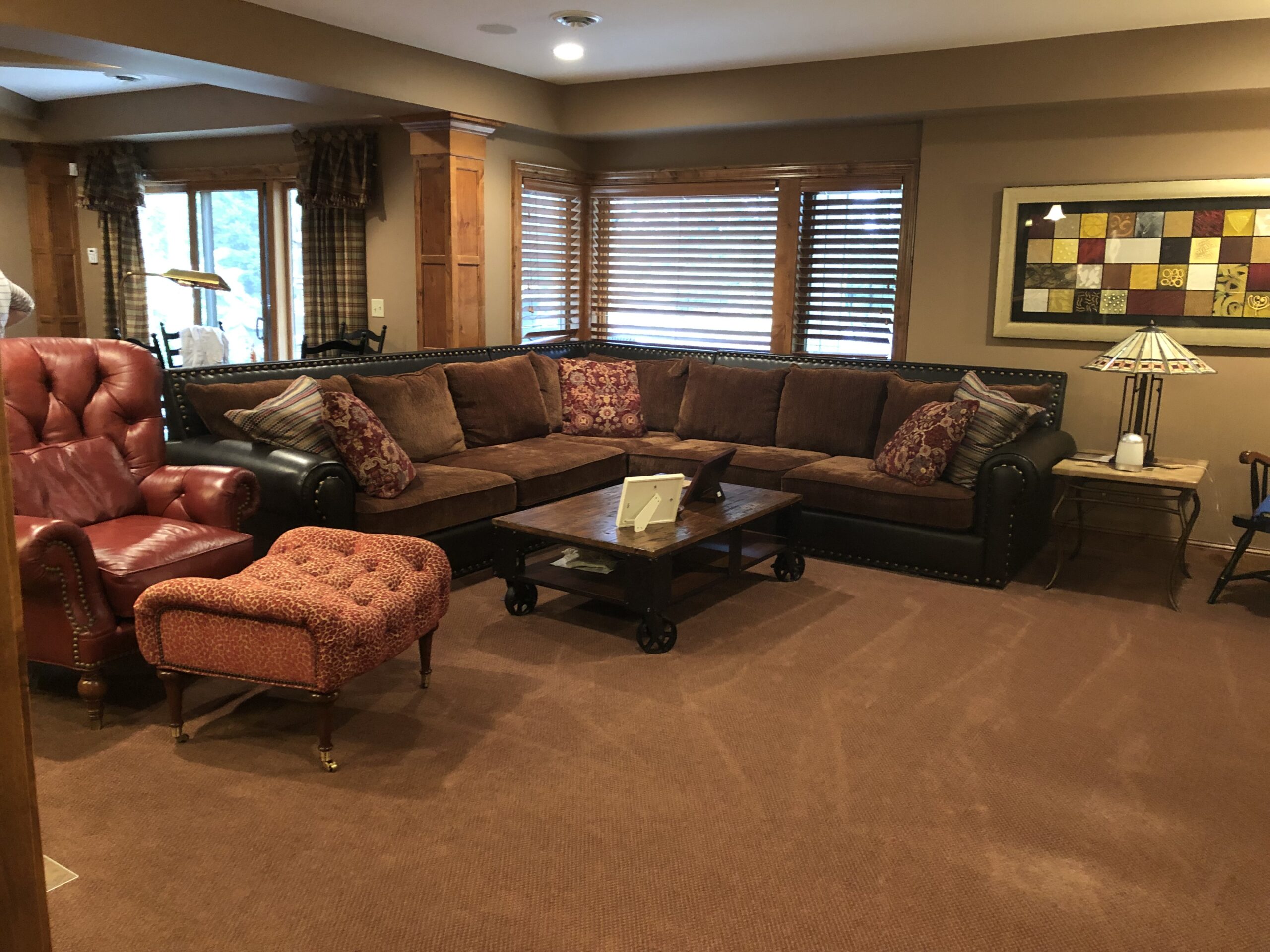
THE AFTER
THE lower level bathroom
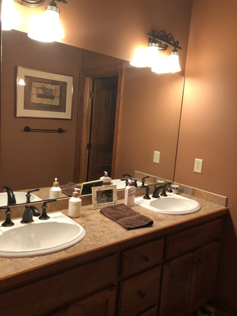
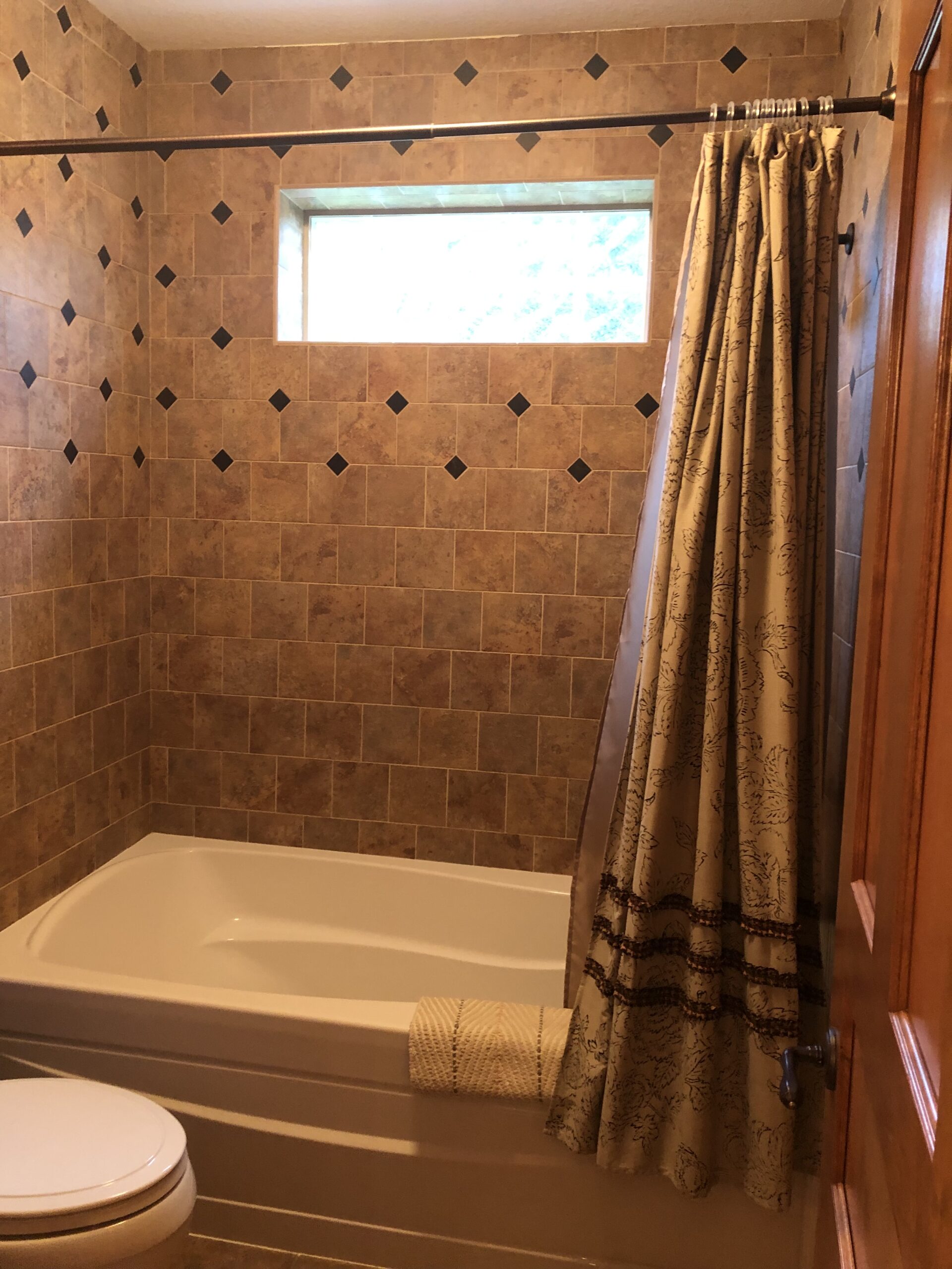
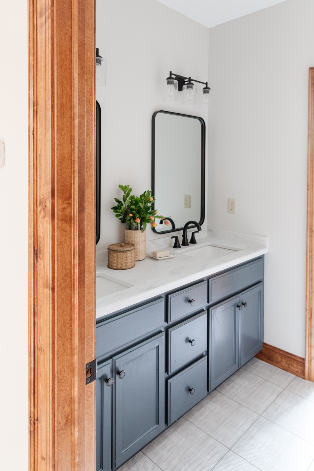
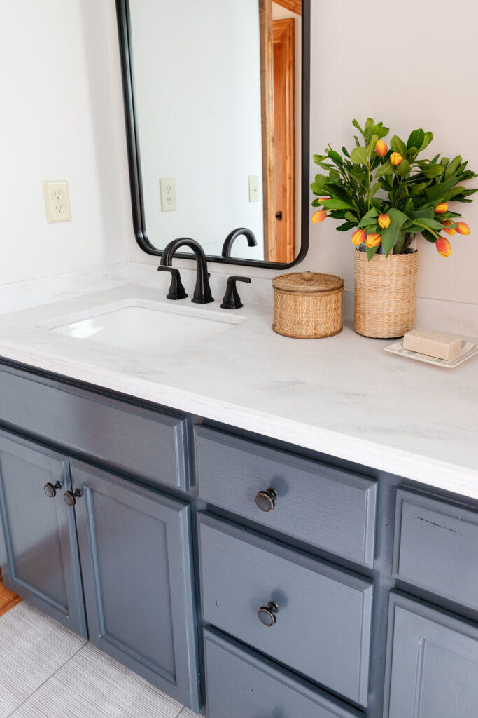
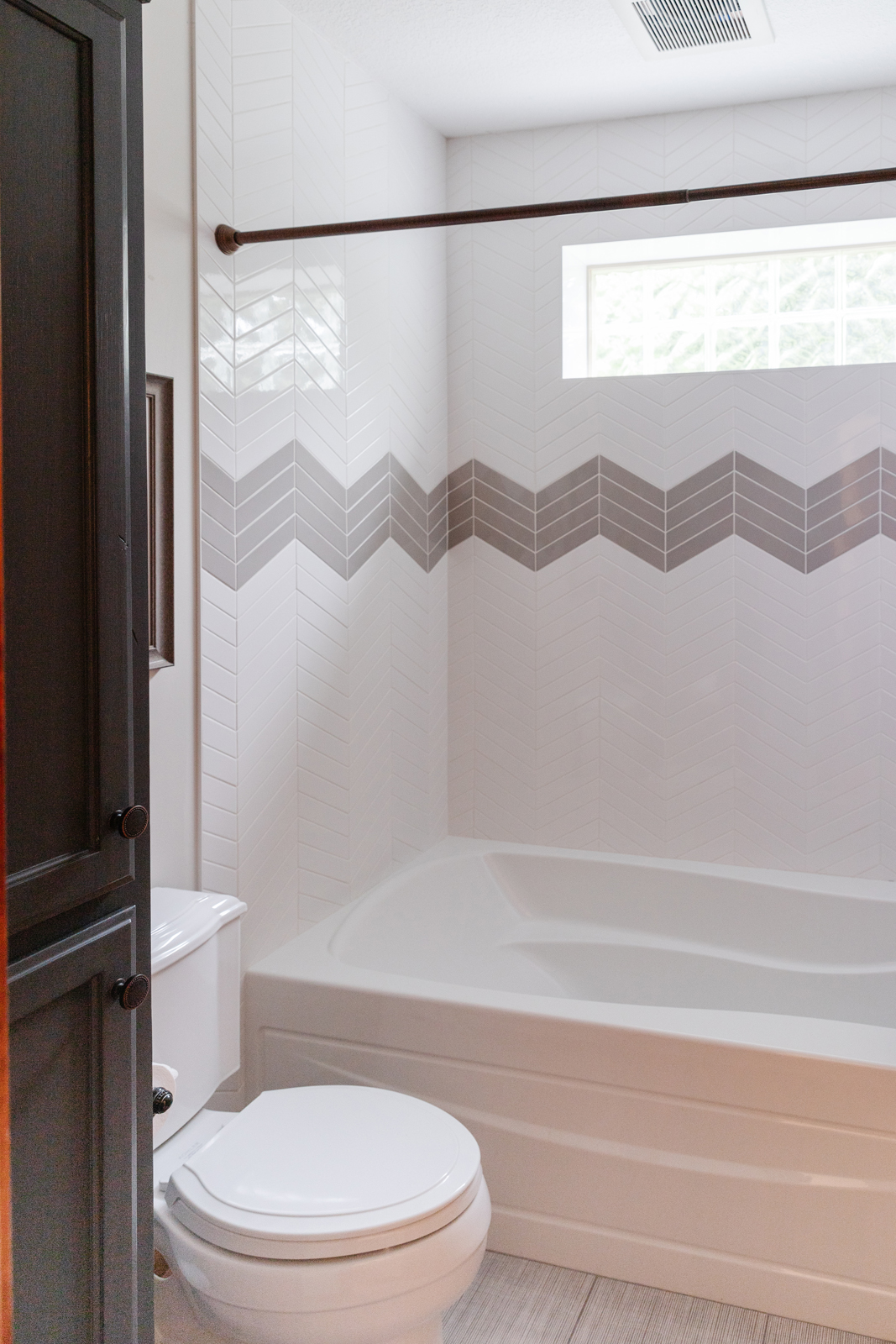
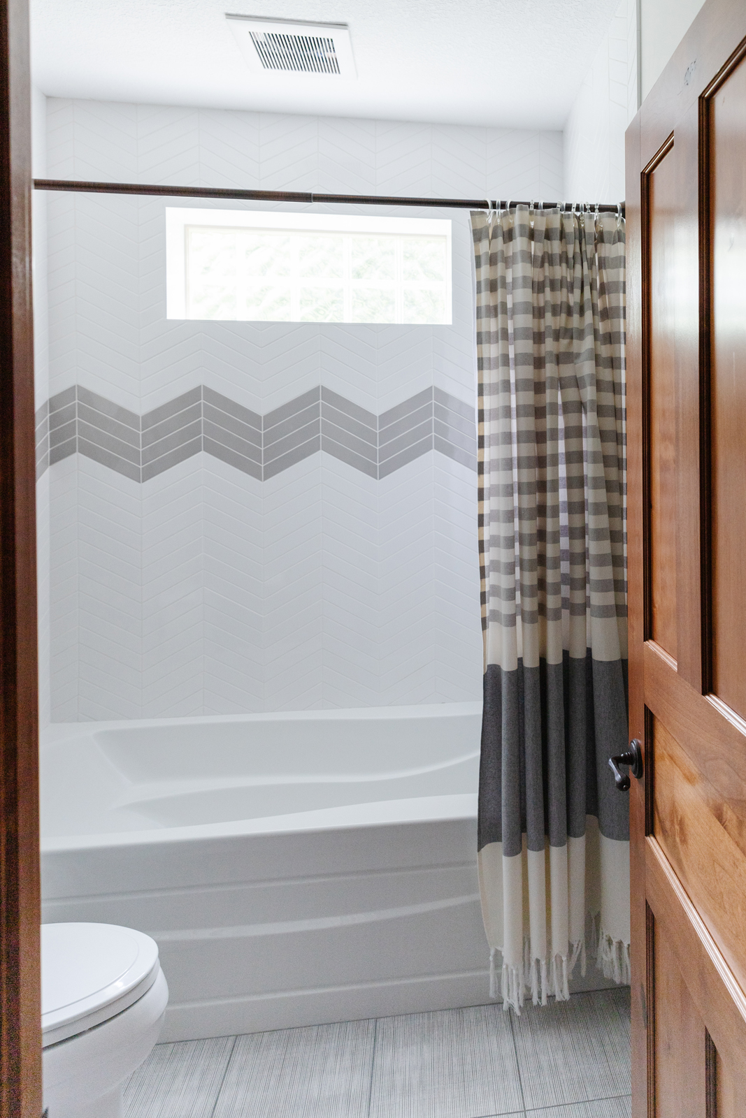
Once again, everything was dark in this room. The walls, the shower tile, the flooring, the cabinets, the countertops. The transformation immediately lifted the look of this room and changed it so much that it hardly looks like the same house! We brought in a new tile surround in the bathtub/shower and created a playful chevron pattern with gray tile pieces. The flooring is a blue/gray and white striped tile from Annie Selke (Tile Shop). The walls were painted a fresh white, and the vanity and linen cabinets were painted a fun, nautical blue. We removed the plate glass mirror and brought in black metal free-hanging mirrors, new light fixtures, quartz countertops, undermount porcelain sinks, and new matte black faucets. This space is much more inviting now and is a fun place to shower after a day of swimming in the pool.
The beforE
The after
THE PRIMARY bathroom
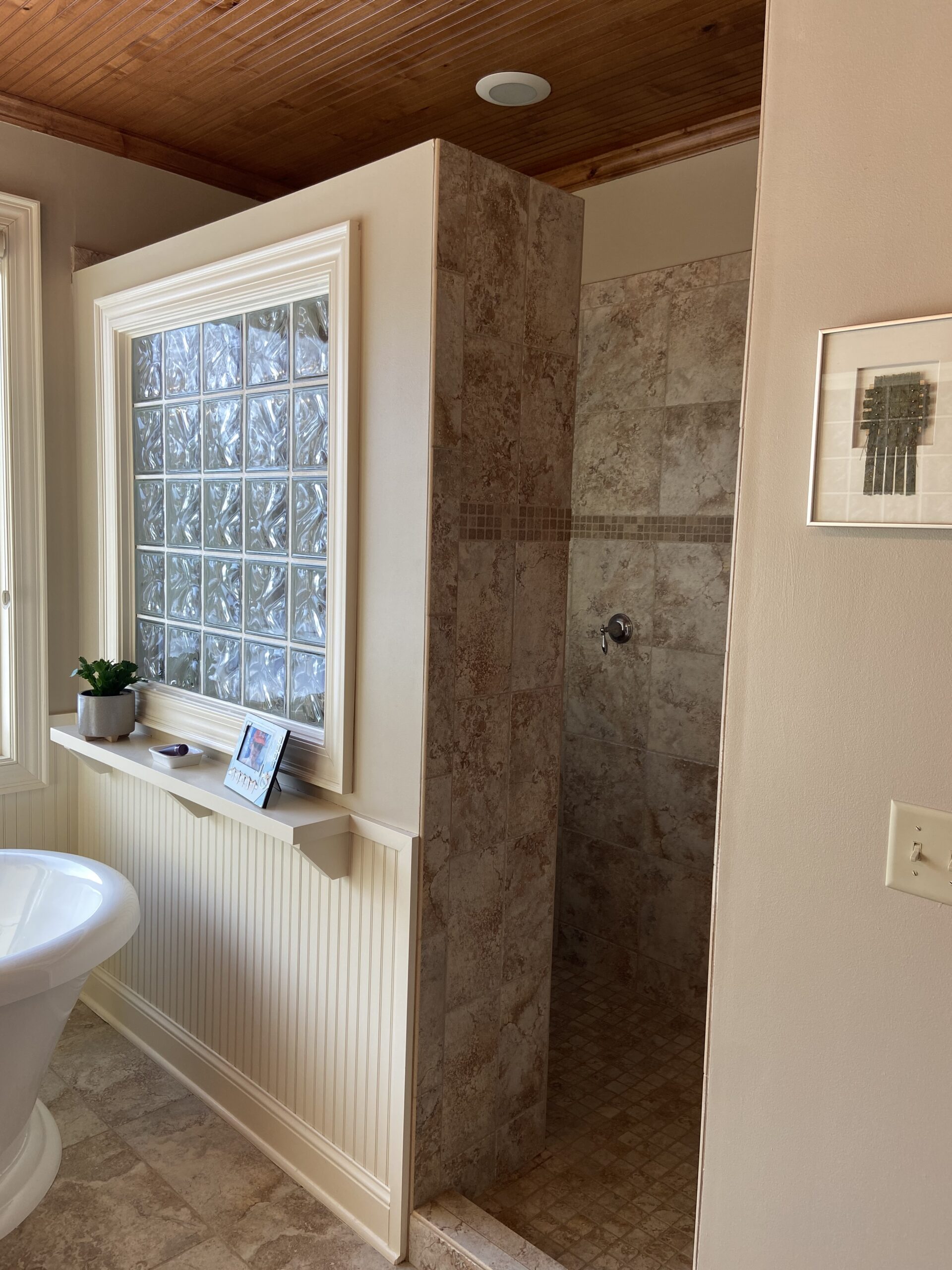
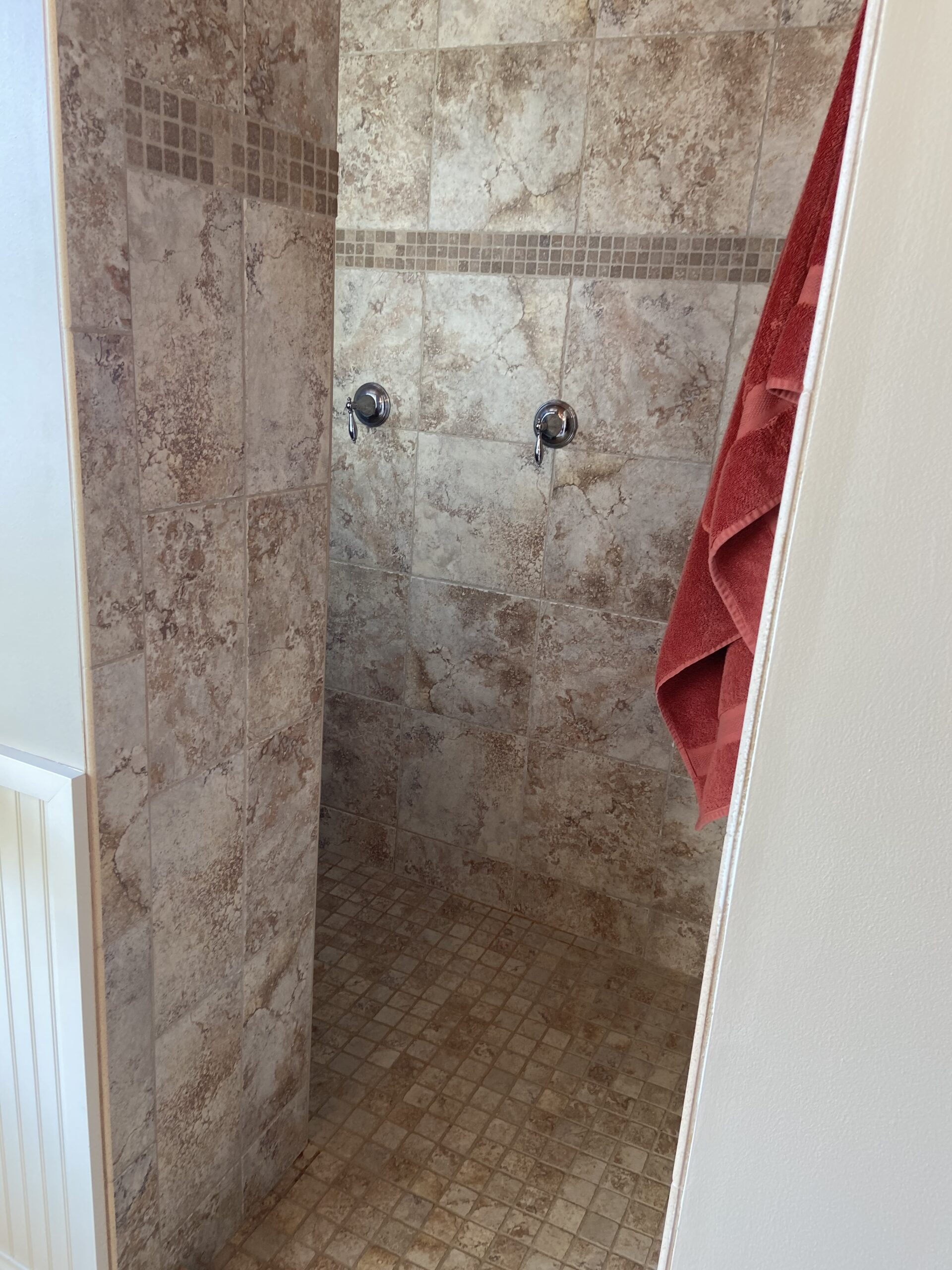
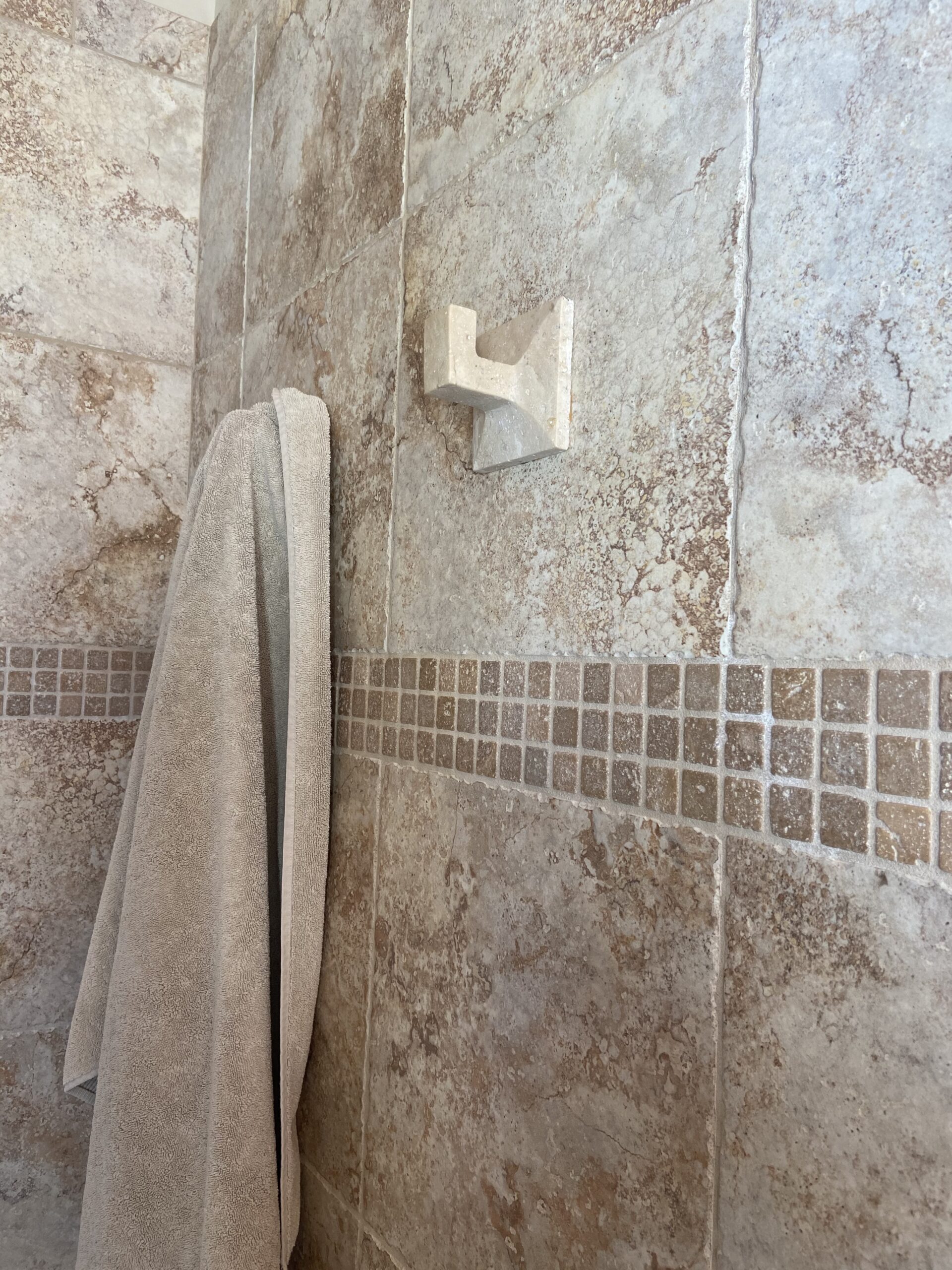
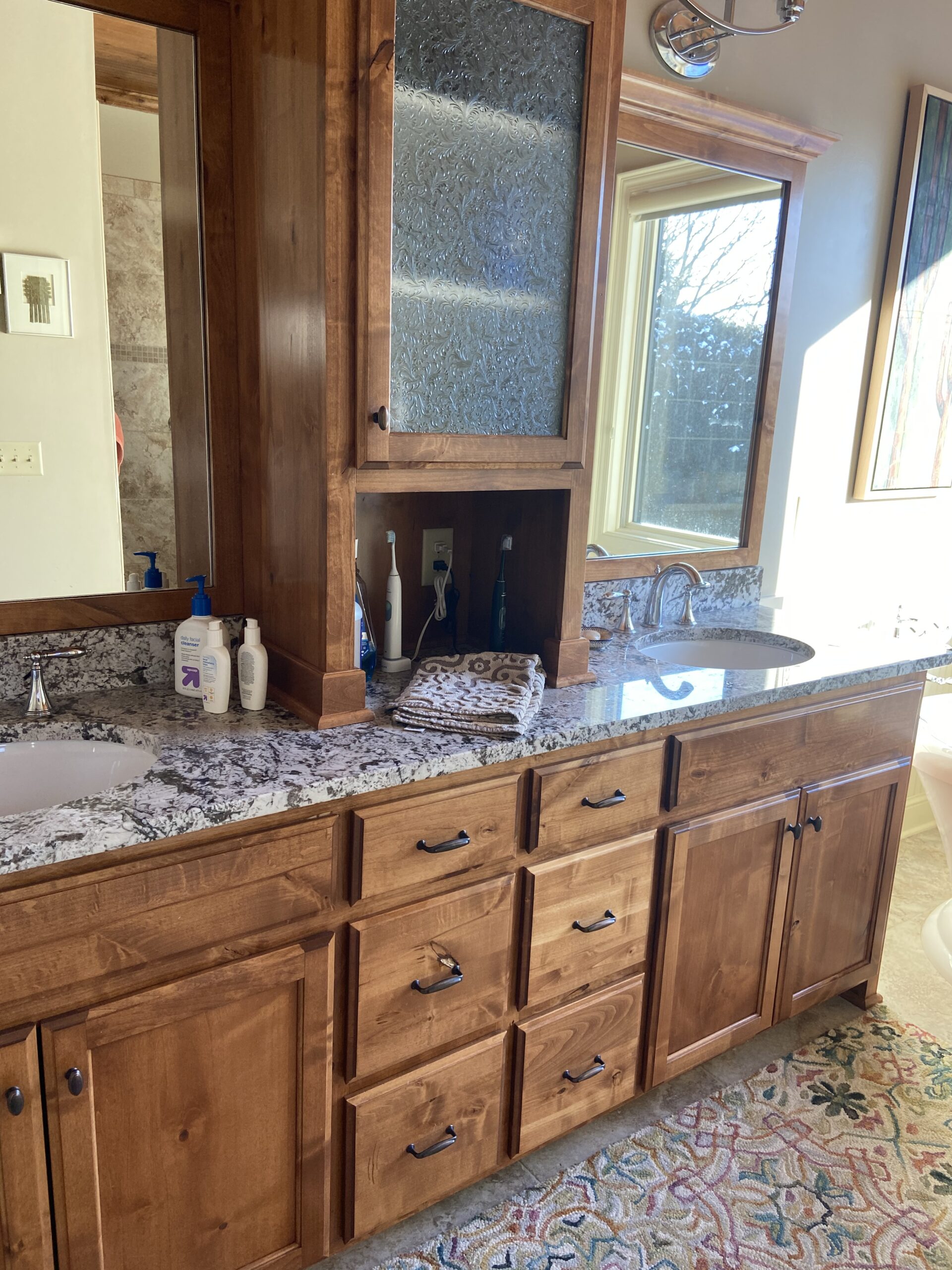
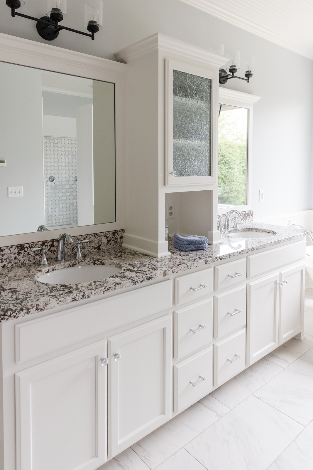
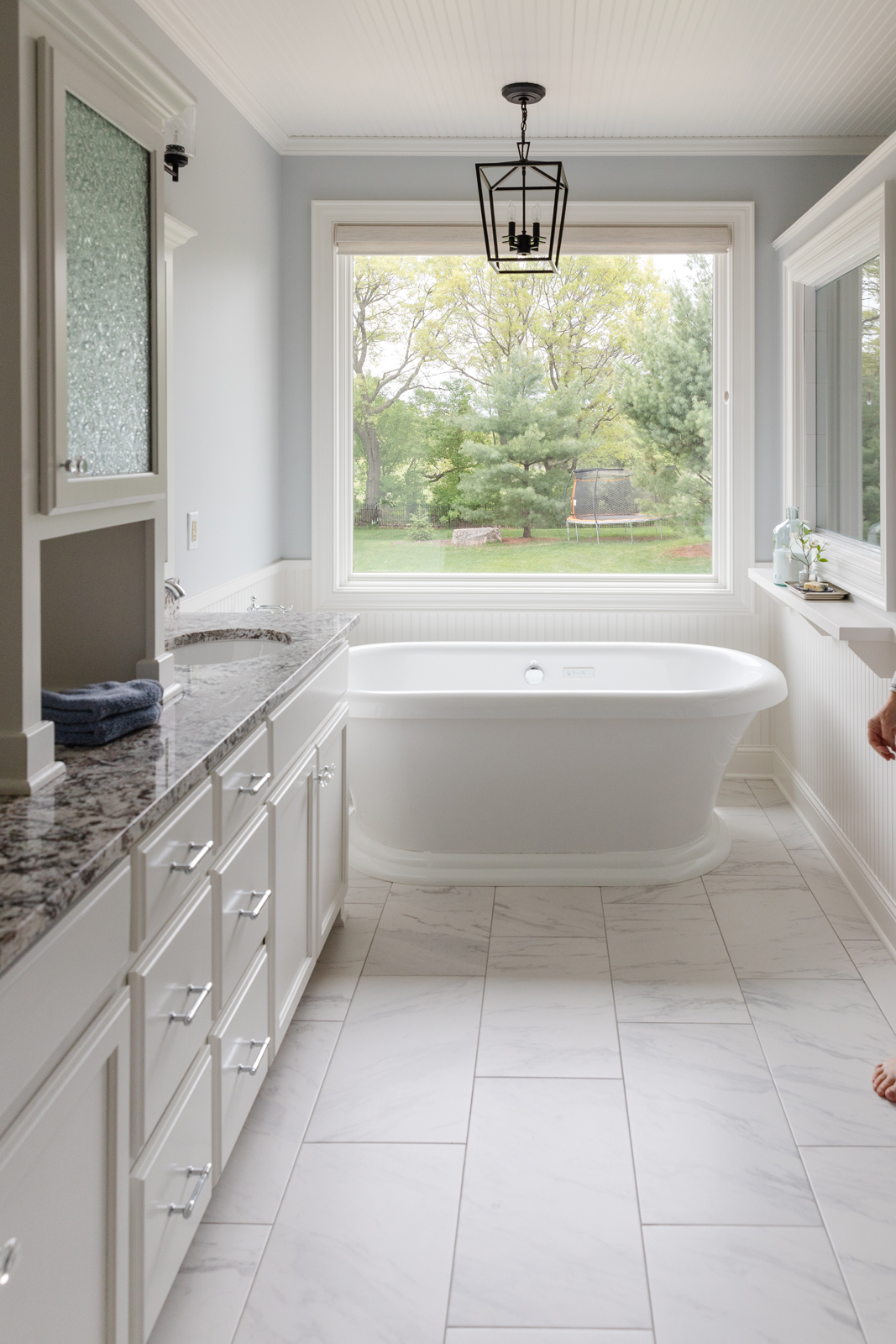
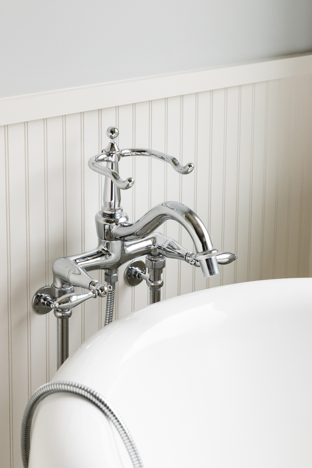
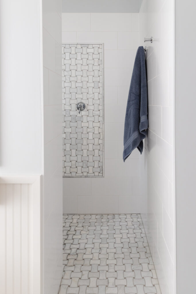
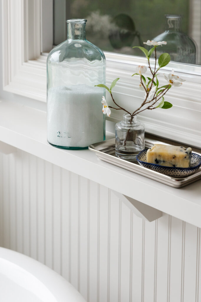
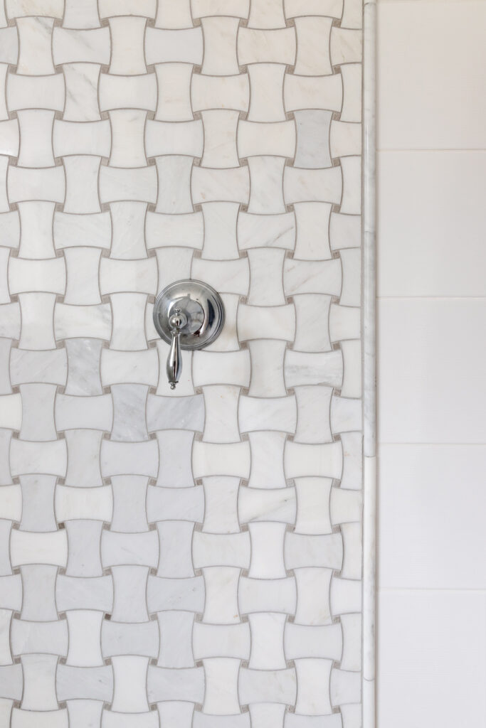
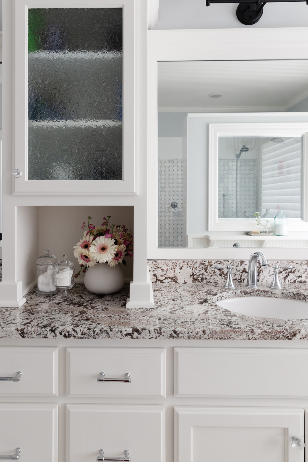
Our client’s bathroom didn’t need a new layout, but needed an update. The glass block window in the shower and the dark brown tile was popular when their home was built, but was now dating the look of their home. We did want to save the granite countertops and bathtub though, so those items were left in place. A fresh white coat of paint makes the vanity and linen cabinet and wainscoting look brand-new. Beautiful new porcelain tile that has the look of marble brings a bright & fresh, yet classic look to this bathroom. We also painted the tongue & groove wood ceiling white to make the room feel taller and brighter. The shower walls are a simple, clean white porcelain tile. We accented with natural cararra marble mosaic tile on the shower floor and as a framed in feature on one shower wall. We said “goodbye” to the glass block and now the sunshine can come steaming in to the shower! We added new cabinet hardware and lighting, and mixed matte black finishes with chrome in the fixtures. The plumbing was updated in the shower for a better spa-like experience too. A pretty lantern style chandelier over the tub draws your eye to the window and beautiful backyard. We used a soft blueish gray color on the walls to give a relaxing feel to the room. I know I wouldn’t mind starting my morning here!
THE BEFORE
![]()
THE AFTER
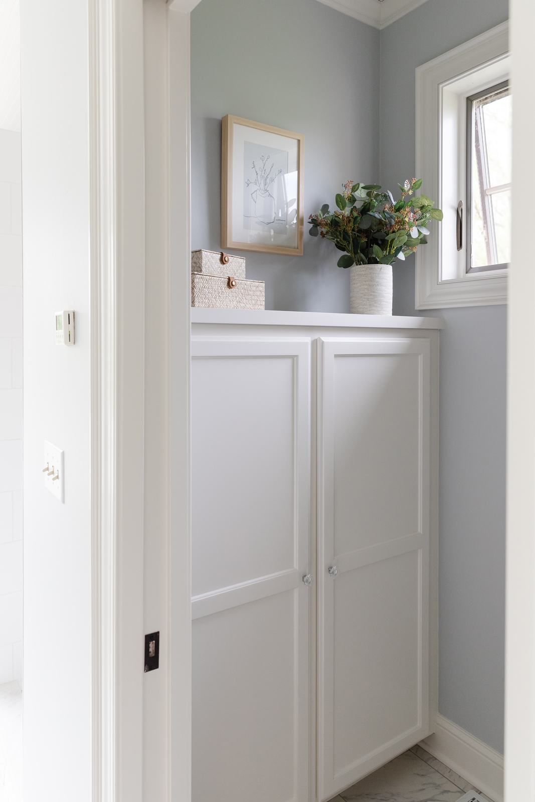
We hope you enjoyed seeing what a new design plan and some minor remodeling can do to completely transform the look of a home. We love helping our clients fall in love with their home again! Please contact us if you are in need of a new look and more functional space. We’d love to help you!
If you’d like to have more project reveals and our weekly blogs sent to your inbox, be sure to subscribe to our newsletter here.
XO,
Amy and the Interior Impressions Team
Amy, we love what you did with this lake home! Your choices mirror a lot of what we’ve done with our new home! Same countertops with the pretty swirl, white/gray walls with touches of blue. Light, bright, restful, that make you want to stay & relax. You & your staff are awesome! Your blog confirms our likes & ideas are on track with what you think is good design! Linda & Dennis
Aw, thank you so much! Such a pretty and timeless look. Enjoy your new home!