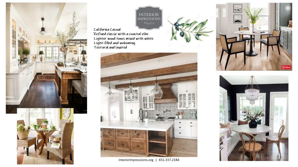
Typically you hear about people down-sizing after their children grow up and move out. In this situation, Anne & Dave tried that route by moving from their family home to a condo in downtown St. Paul. However, after a short time they decided they didn’t really like it! They missed having space and a yard and a more relaxing environment. Thus began a hunt for a “Right-Sized” home. They ended up finding a waterfront home on Forest Lake. It was close enough to the cities, but far enough away that it feels like a retreat. It had a lot to offer but also had some very challenging and awkward spaces that they didn’t really know what to do with. They also wanted to update the home and give it a very calming and welcoming feel. Anne said she wanted their guests to feel like they were on vacation when they visited their home. She loved the idea of a refined coastal vibe, but didn’t want anything too “theme-y”. It took many hours of working out different plans and options, and creating beautiful mood boards (see photo above for the kitchen mood board), and thoughtfully curating all of the selections and details. We feel like the end result turned out even better than we ever imagined when we first walked into this Forest Lake home. We are thrilled to share this beautiful home with all of you! Welcome to the Forest Lake Right-size Remodel.
THE INVITING ENTRY
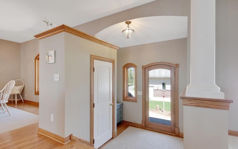
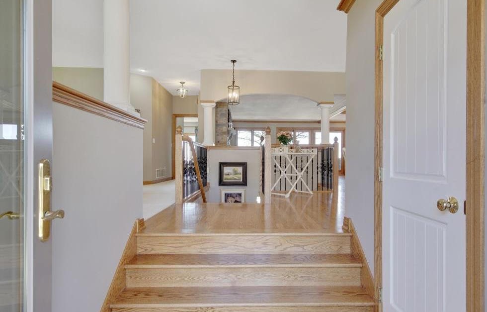
The foyer is such an important space because it is the first thing guests see when they enter your home. We didn’t like the first impression this foyer made with an awkward closet that blocked off the view of the dining room and took away from the symmetry of the entrance. It was very challenging figuring out how to remove this closet because it had a foundational support block on the floor of the closet that could not be removed. We made lemonade out of lemons by making that foundational block into a beautiful bench! We also created a half-wall on the other side of the foyer to mirror the other side, and we widened the stairway with beautiful wood stairs.
THE BEFORE
THE AFTER
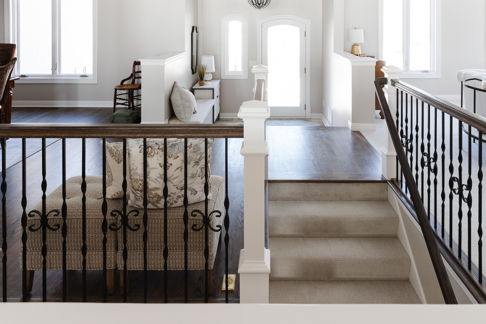
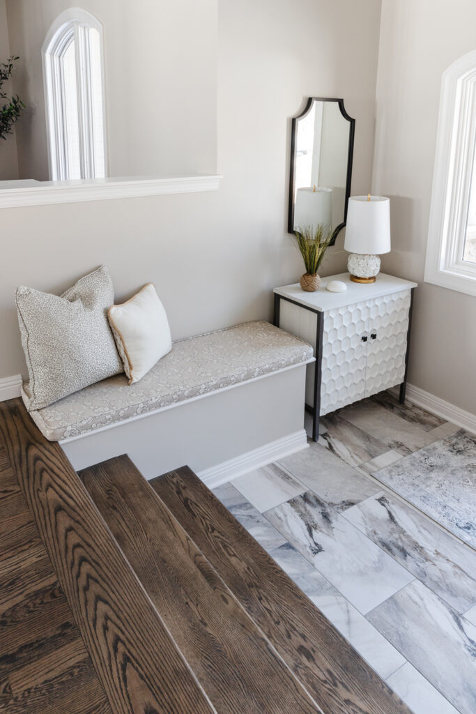
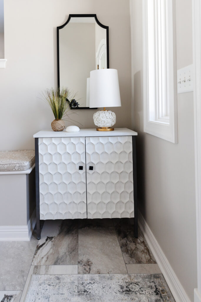
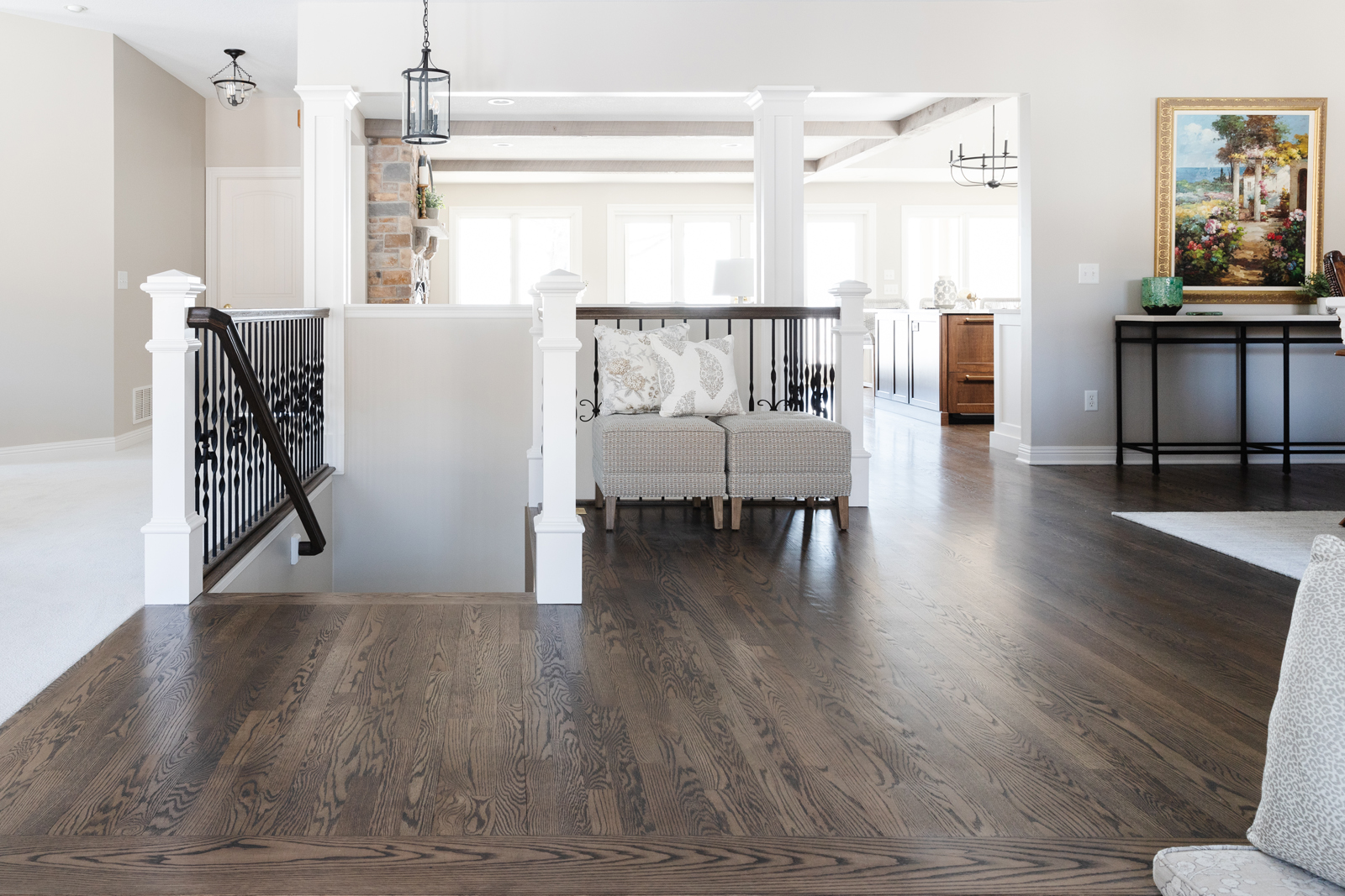
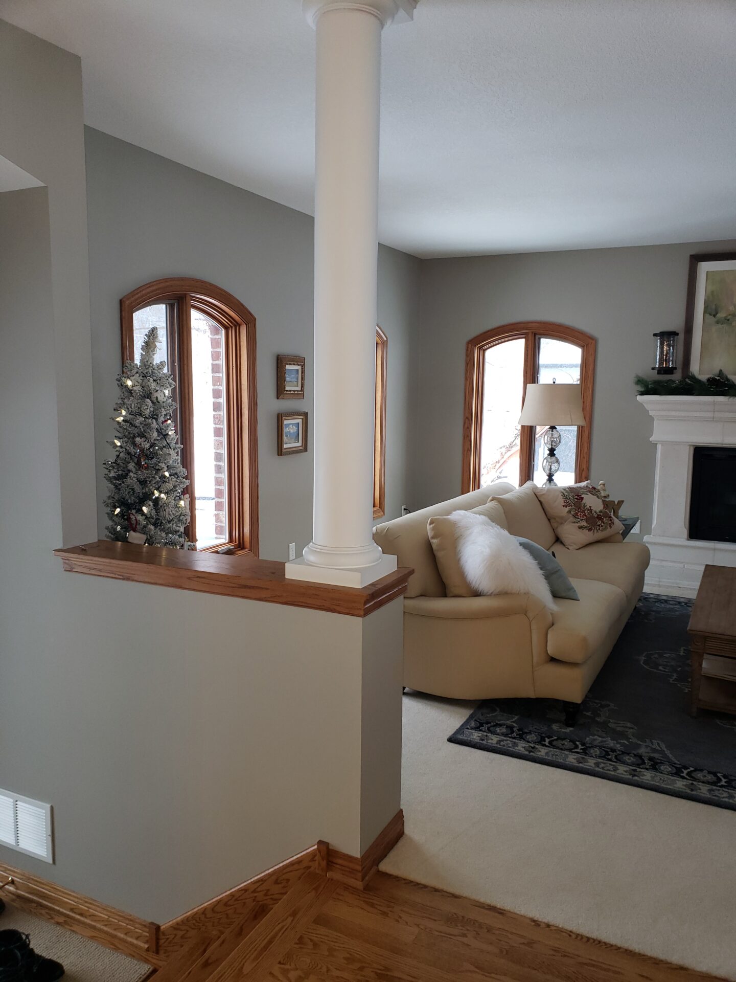
The roman columns were removed from the ledges and gorgeous new tile flooring creates a special moment when you walk in. We also updated all of the the stairway components by replacing the colonial oak newel posts with a squared white modern style and staining the handrails a walnut color to match the hardwood floors. The roman columns and arched opening to the hearth room was widened to create more openness. The columns were needed for support, but we updated them by squaring them off with white paneled millwork. We love how you can see all the way through the main living spaces when you enter now. It feels so spacious, light and airy!
CONVERSATION ROOM
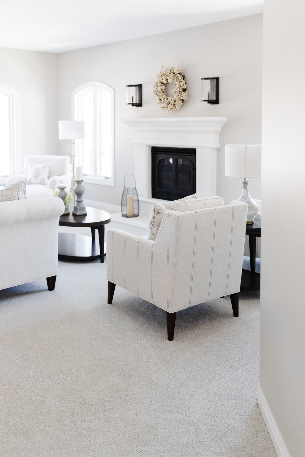
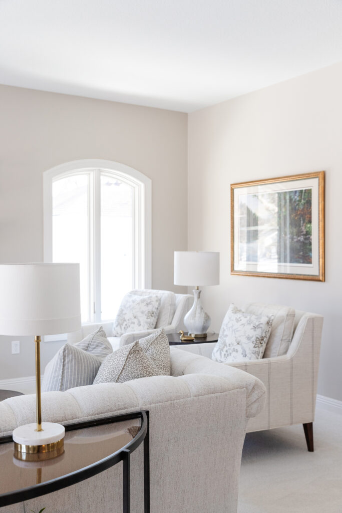
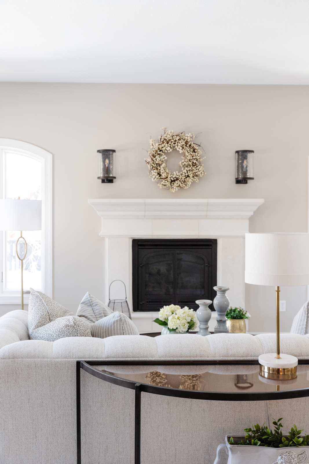
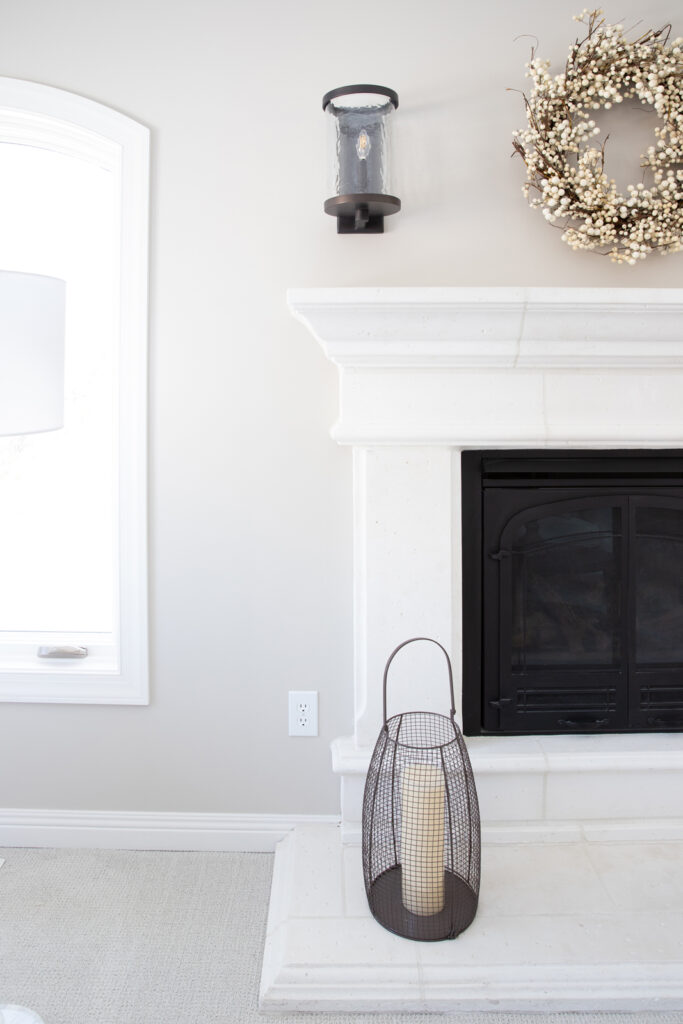
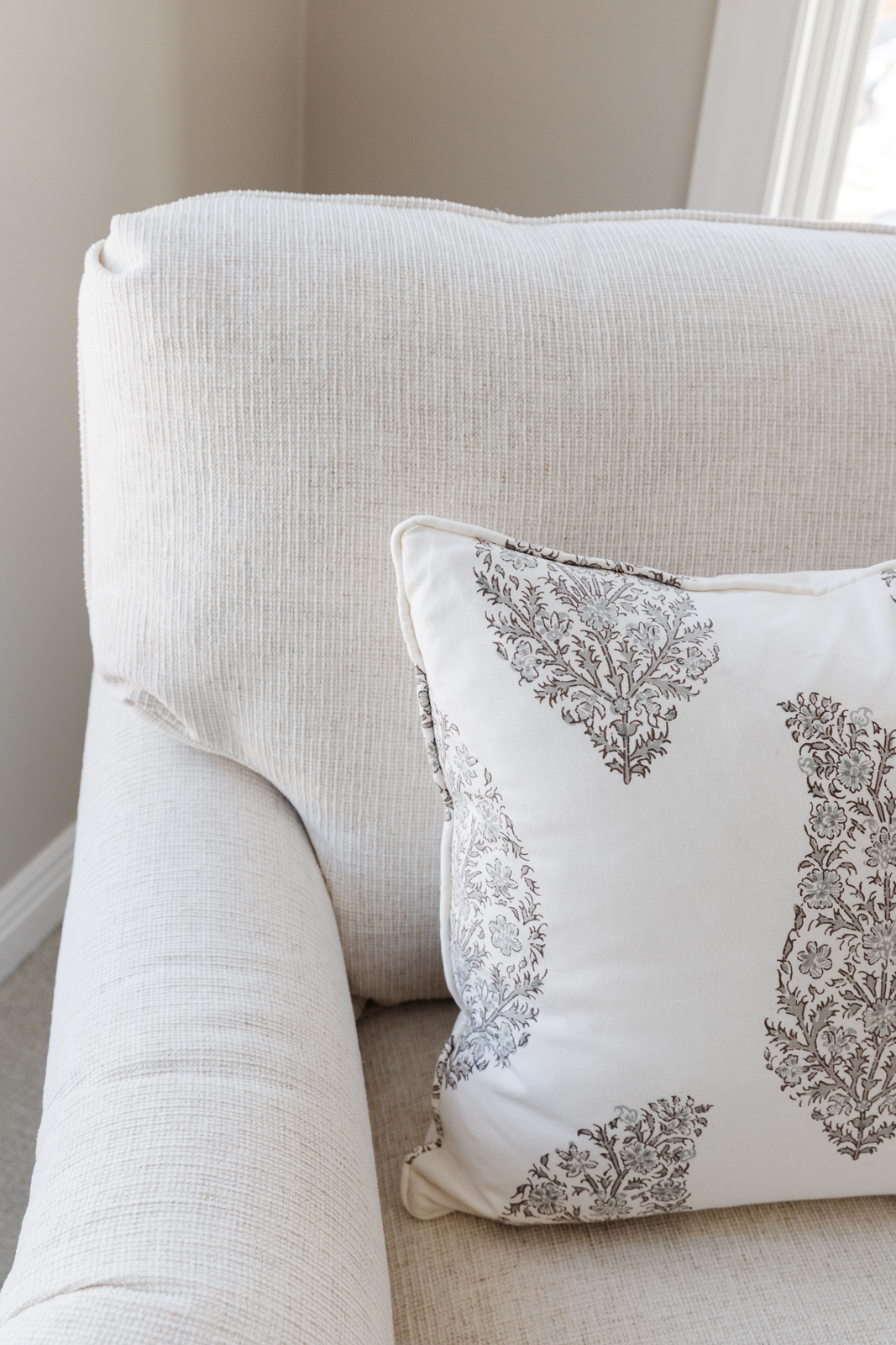
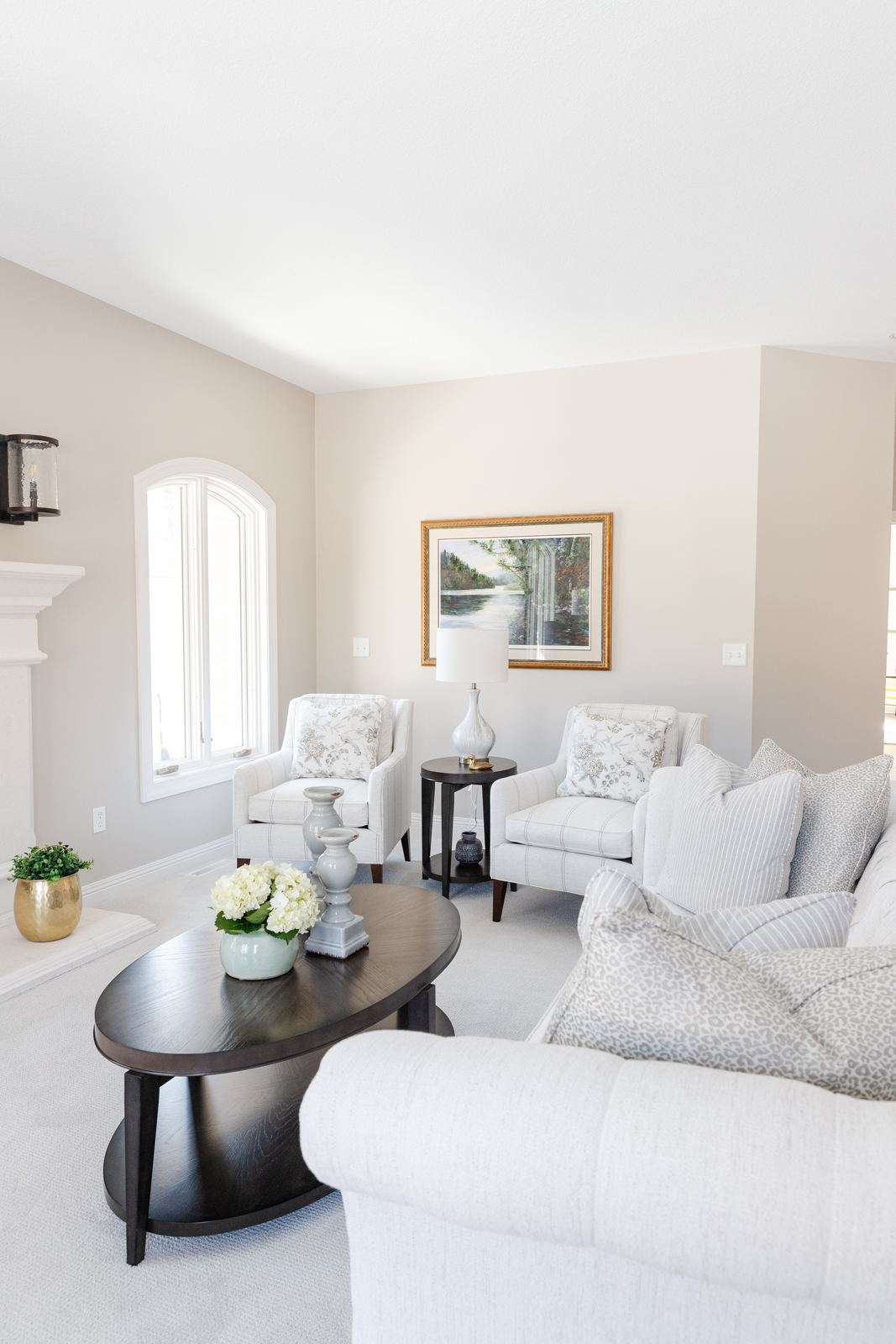
The formal living room was already lovely, but felt a little uninviting. A lighter paint color on the walls, white painted trim, new carpeting and all new furniture gave this room a whole new look. This room has an abundance of seating for times when they are entertaining friends or hosting family gatherings. The chaise lounge chair has become a favorite spot for Anne to sit and enjoy the sunshine or curl up with a good book and glass of wine!
THE BEFORE
THE AFTER
THE FORMAL DINING ROOM
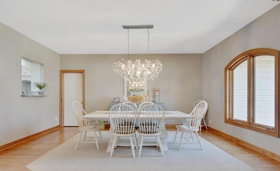
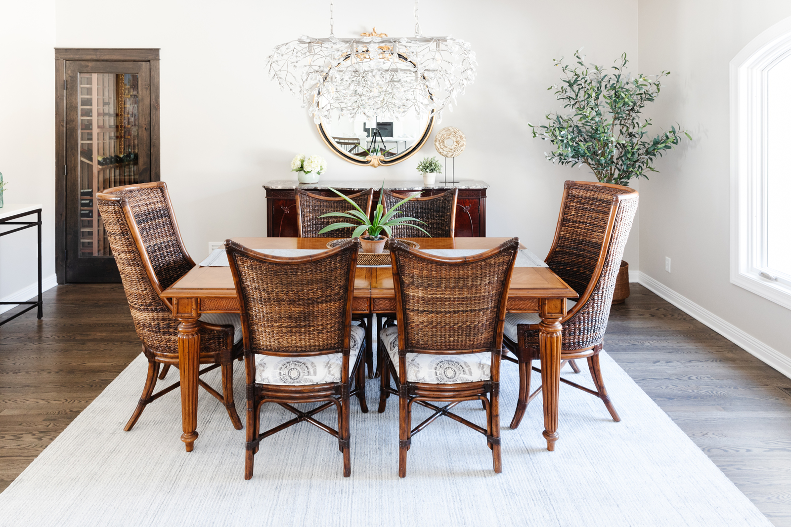
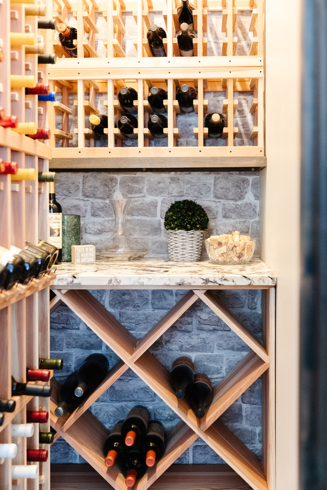
The formal dining room had the pass-thru window, an oddly located storage closet, and an inset carpeted area cut into the hardwood floors. We closed off the pass-thru window, filled in the hardwood floors when we refinished them, and Dave used his handy skills to convert the closet into a wine cellar! Anne and Dave had a dining set from Tommy Bahama from their last home and wanted to reuse it. We refreshed the chairs by having all of the cushions reupholstered with pretty fabrics – a houndstooth on the captains chairs and a fun floral on the side chairs. A beautiful woven blue rug anchors the dining space and lightens the color story. The crystal and wire light fixture was one of the few we decided not to replace. A fresh paint color and painted millwork rounds out this lovely room.
THE BEFORE
THE AFTER
THE OPEN + AIRY KITCHEN WITH DINETTE
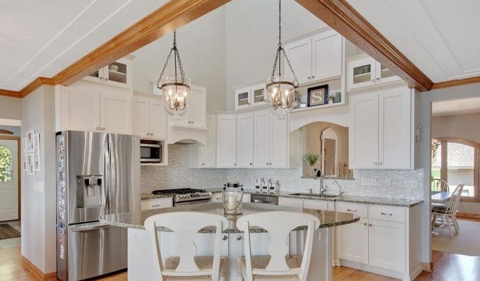
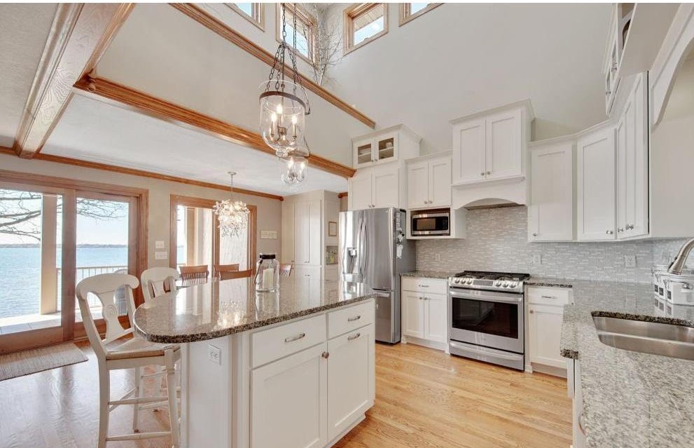
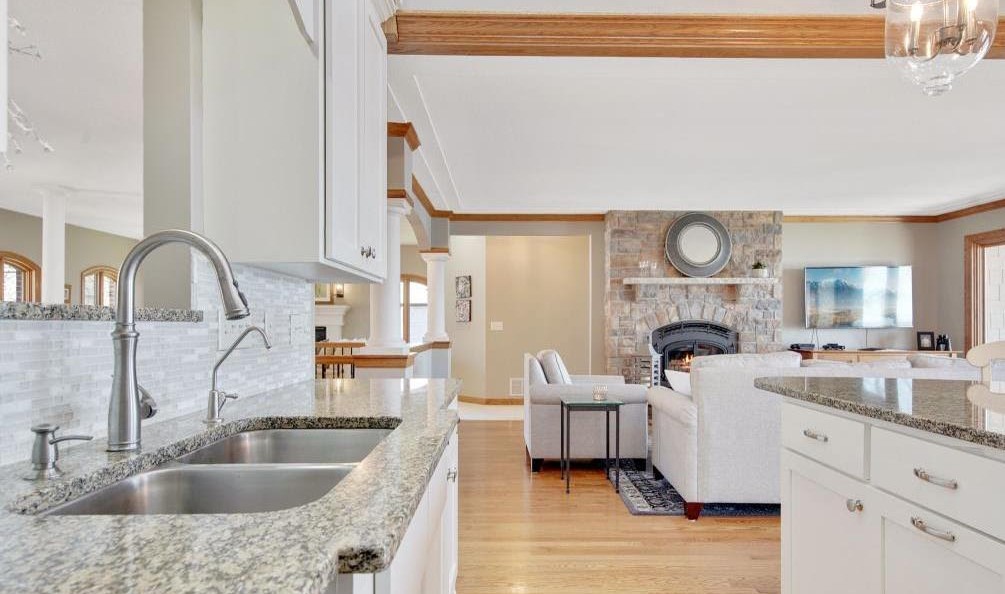
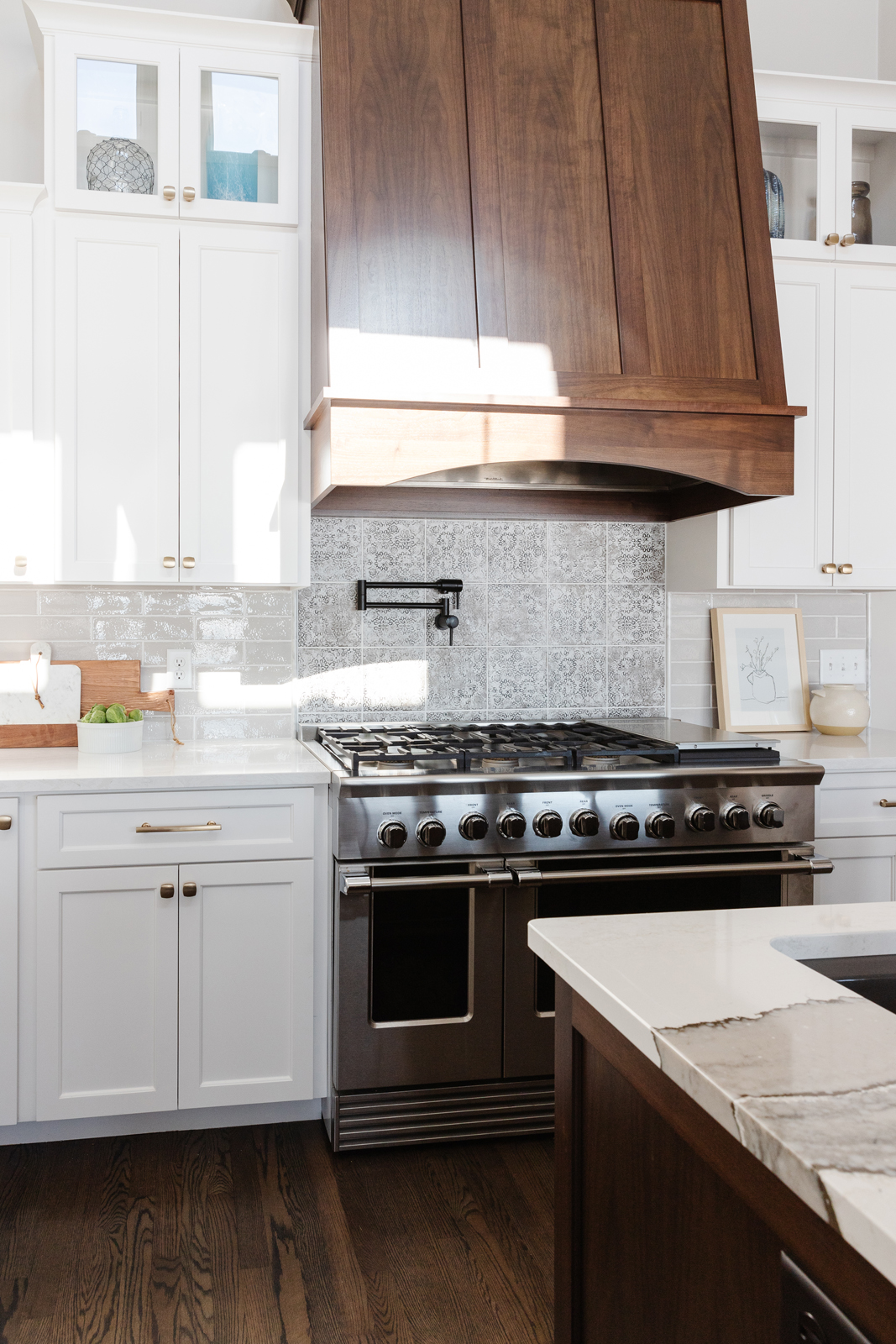
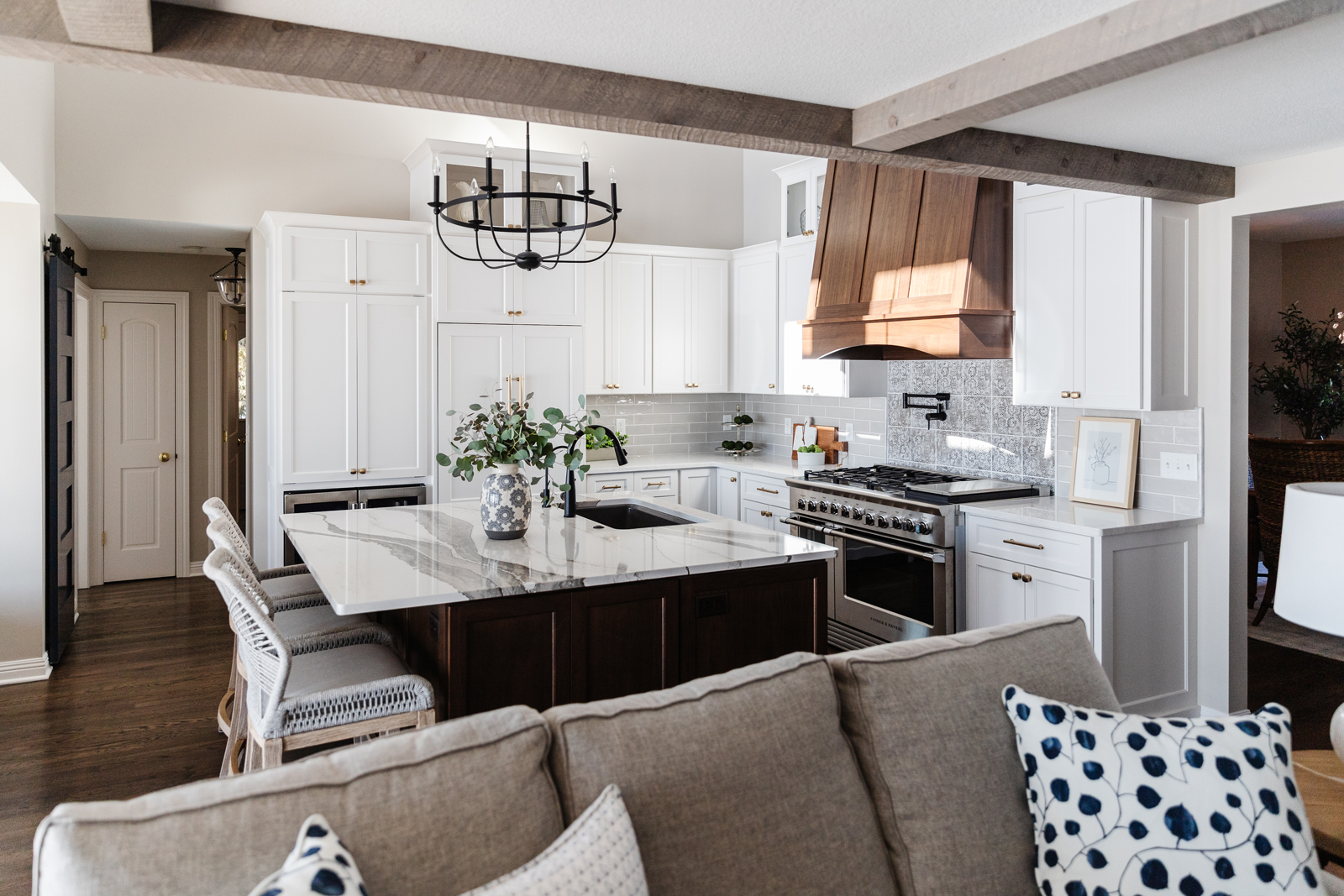
Looking at the before photos, you’re probably thinking “There’s nothing wrong with that kitchen”! It was a very nice kitchen, but there were some problems that our clients really wanted to fix. Problem #1 – there was a pass-through window behind the sink looking into the formal dining room. Ideally, we wanted the view to be of the beautiful lake when they were at the sink, not the dining room. They also lacked storage and preferred to have more cabinets. We closed up the window, moved the sink to the center island, and moved the oven and cooktop to where the sink was. This also allowed us to build a beautiful black walnut hood vent over the cooktop, adding a gorgeous symmetry to that wall.
THE BEFORE
THE AFTER
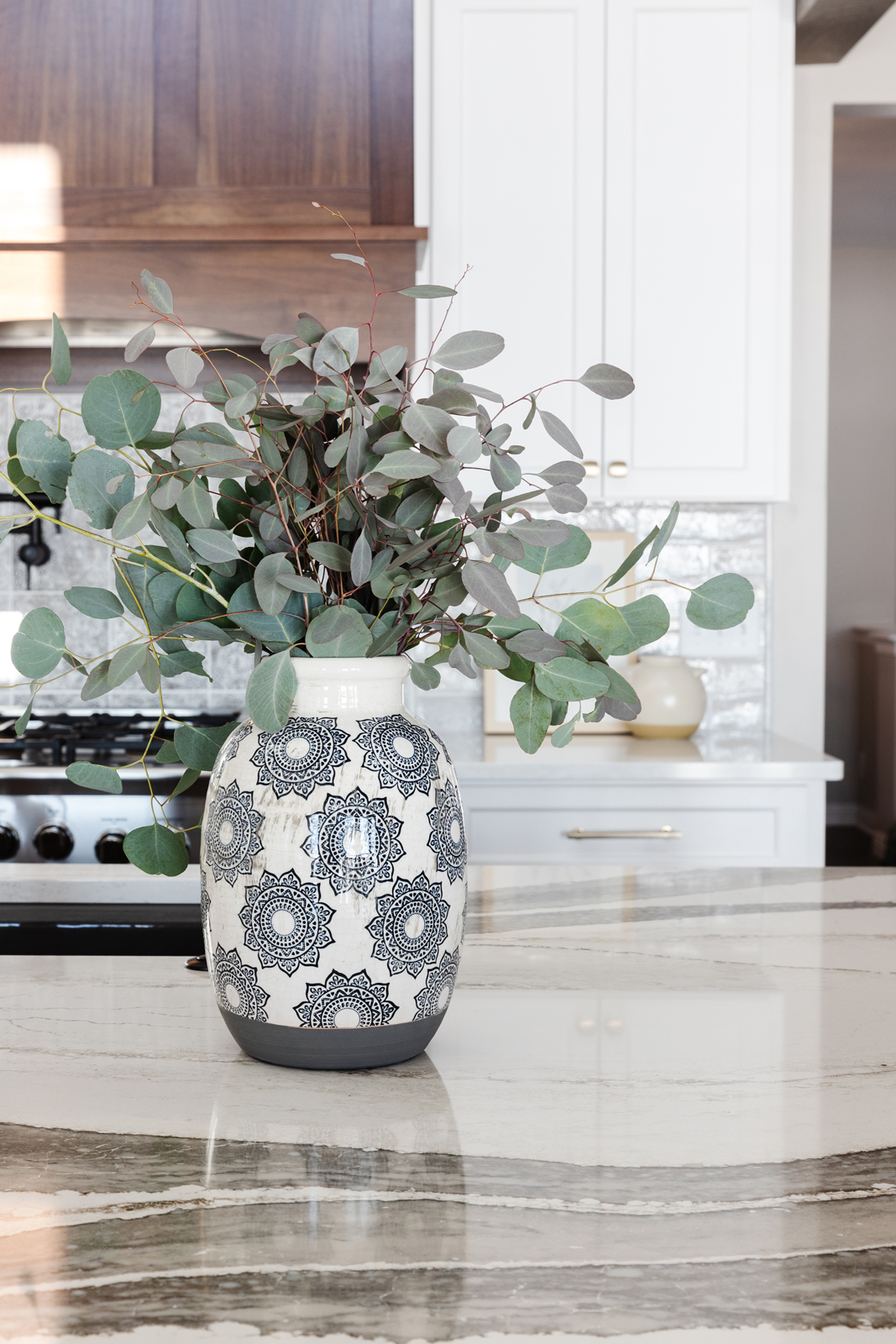
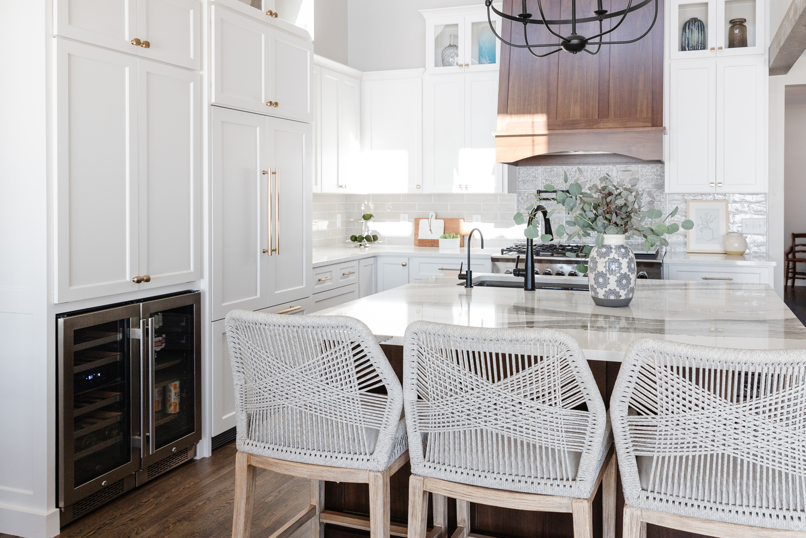
Problem #2 – the center island was an odd shape and only allowed for 2 people to sit. We designed a new island that was square and more functional, holding the sink, dishwasher, pull-out double trash bin, and three stools. We made the island out of black walnut to match with the hood vent and add warmth and richness to the kitchen. We used brushed antique gold cabinet hardware because it looks beautiful on both the white cabinets as well as the black walnut cabinetry.
Problem #3 – They didn’t have enough cooking or refrigerator capacity. The new kitchen boasts a beautifully paneled French-drawer refrigerator, plus double wine/beverage refrigerators, a luxurious double oven with six gas burners and a griddle! We also added a fantastic coffee and microwave station with pocket doors to hide things when you don’t want to see them.
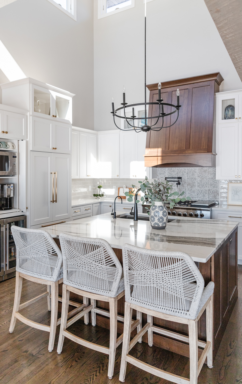
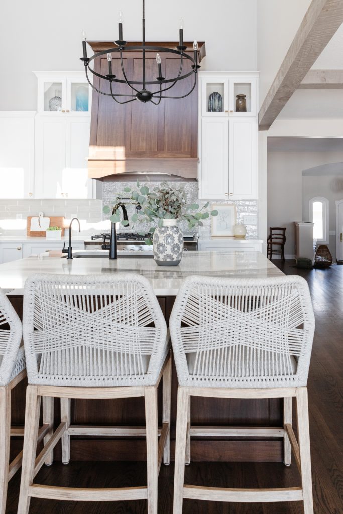
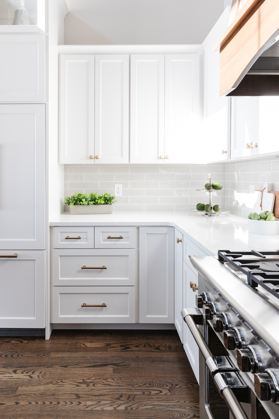
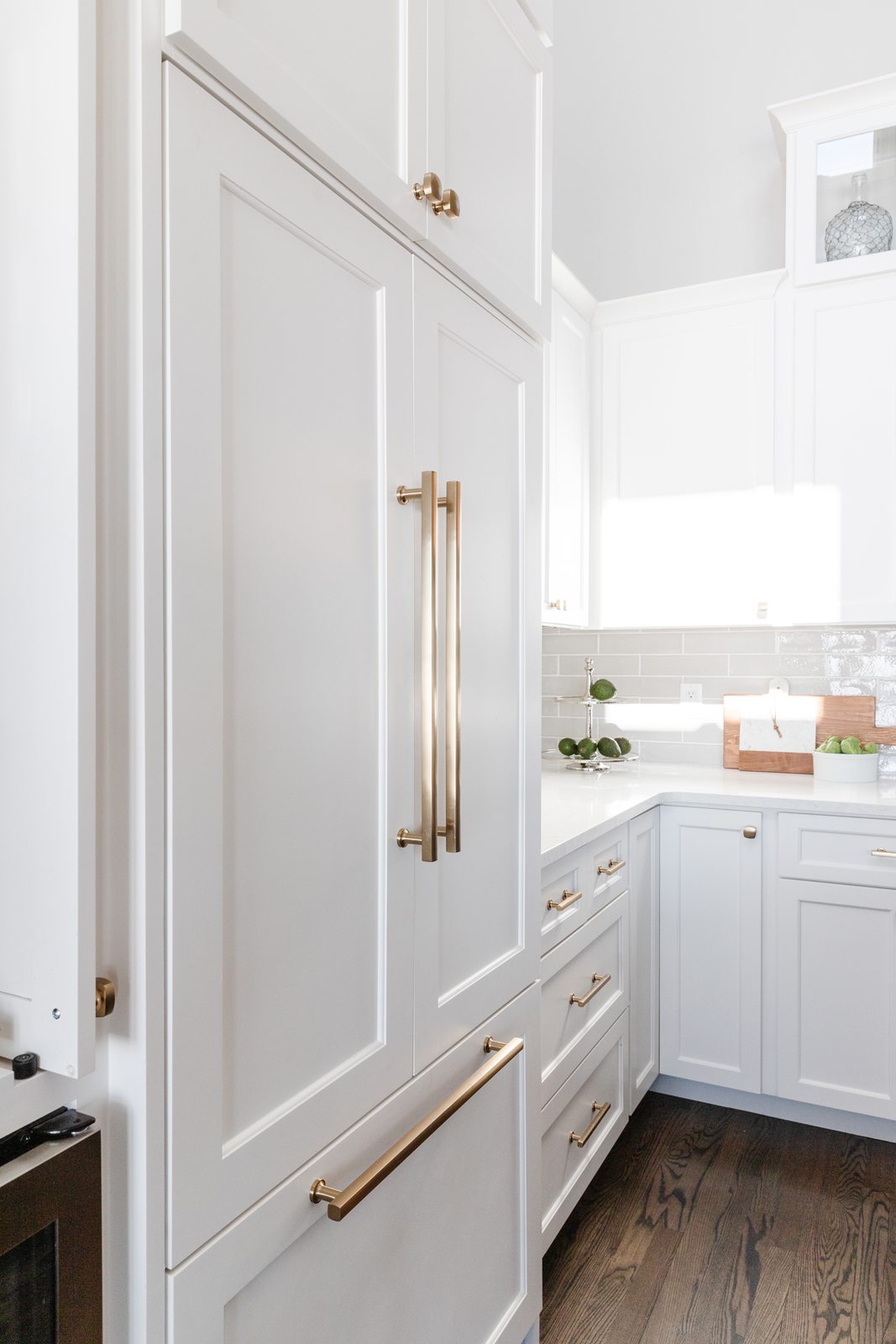
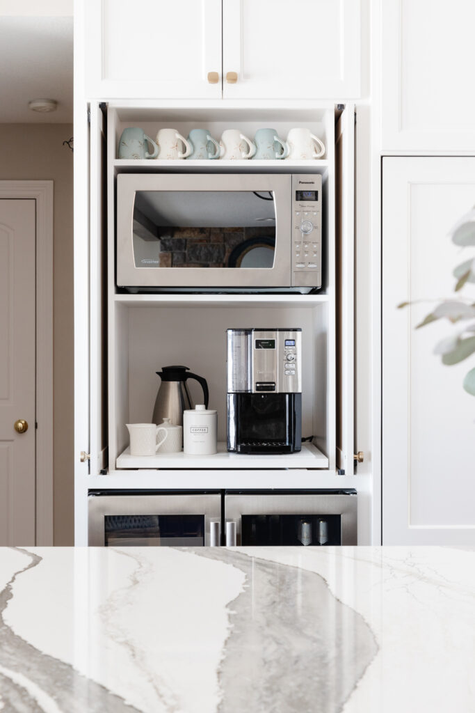
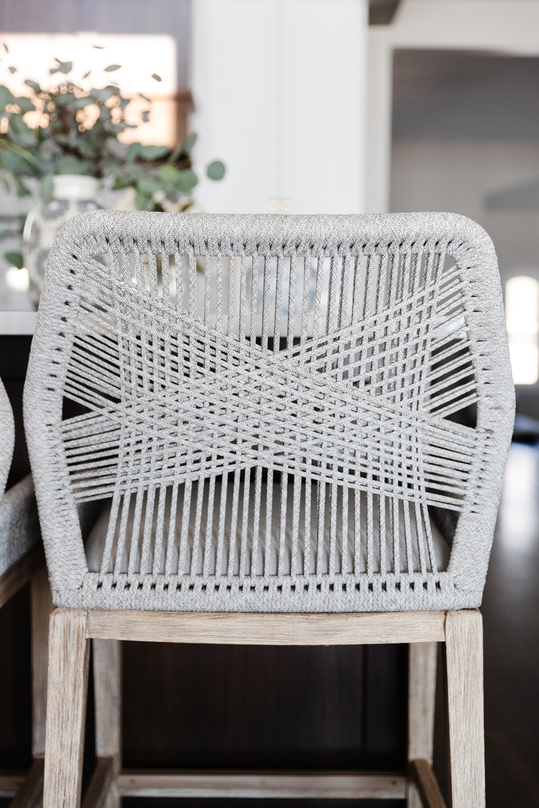
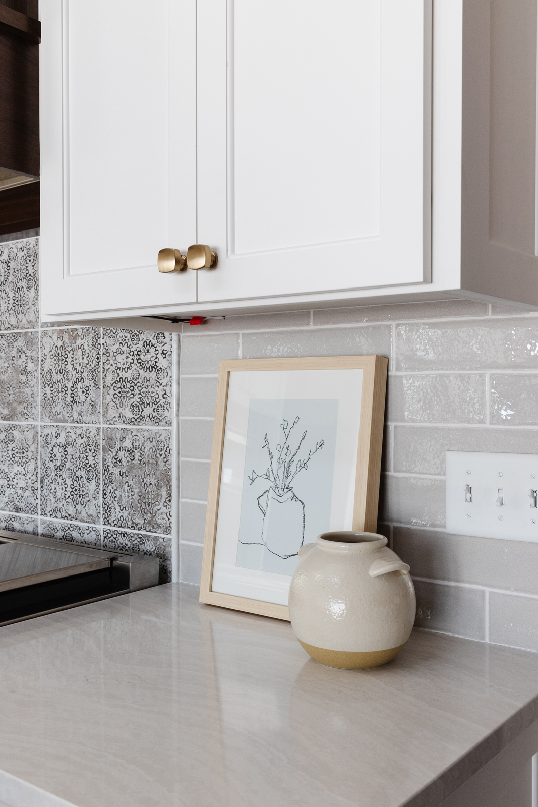
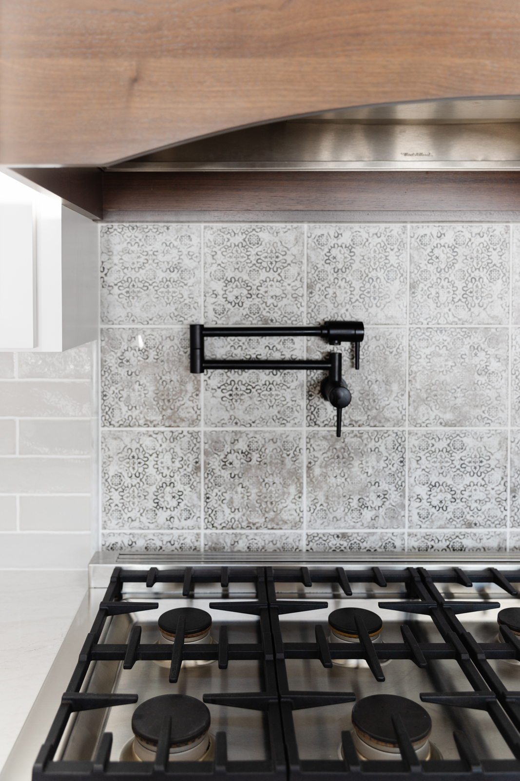
Problem #4 – the ceiling is only vaulted over the kitchen area and there was a really odd soffit with a ledge where the previous owner had fake plants. It covered part of the kitchen and just felt so awkward and was not balanced. We removed the soffit ledge and the honey oak trim pieces. This immediately made the kitchen feel more spacious and intentional. Removing the dated oak trim pieces was a huge improvement as well.
Problem #5 – no pantry. We removed the bank of cabinets over by the dinette and converted that space plus the closet behind it into a walk-in pantry. The guest bedroom had 2 closets, which was not necessary. We closed off the smaller closet on the bedroom side and moved the opening to the hallway side. It was made wider by moving the wall into the dinette area a bit as well. Now there is a lot more storage with this new walk-in pantry. Lastly, a fun navy blue sliding door was added for a punch of color!
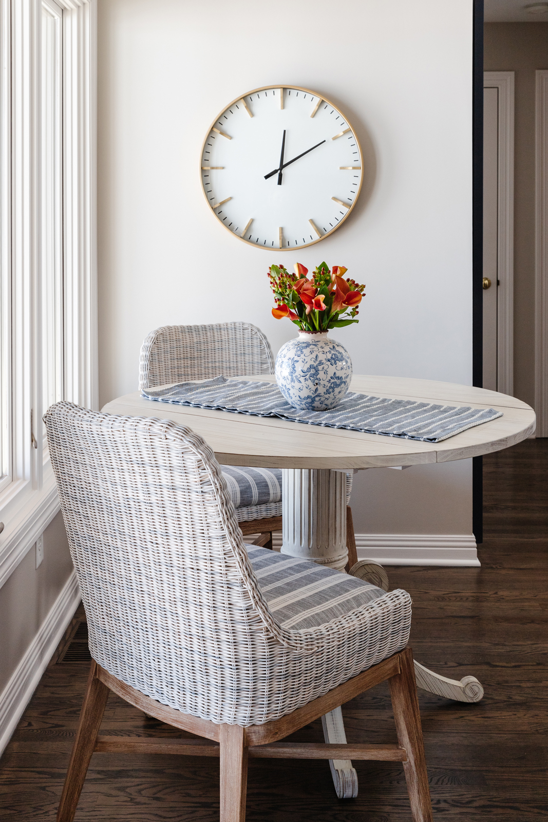
So, how about this dinette space? What a cozy little spot to sit and enjoy a morning cup of coffee while taking in beautiful waterfront views! The washed wood table and woven chairs bring in a coastal feel and vacation vibes. We reupholstered the seat cushions with a denim blue striped fabric that is not only pretty, but is a Crypton kid-proof fabric that will hold up to any kinds of spills or messes. By removing the section of cabinetry that was there and making a walk-in pantry instead, that also freed up the wall space. Now we could put the dinette furniture there without being in the way of opening cabinets.
THE HEARTH ROOM
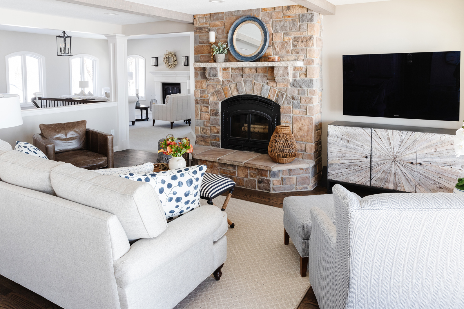
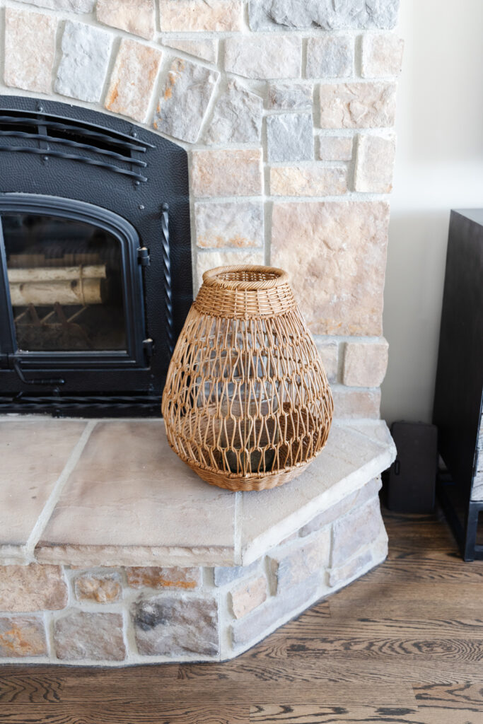
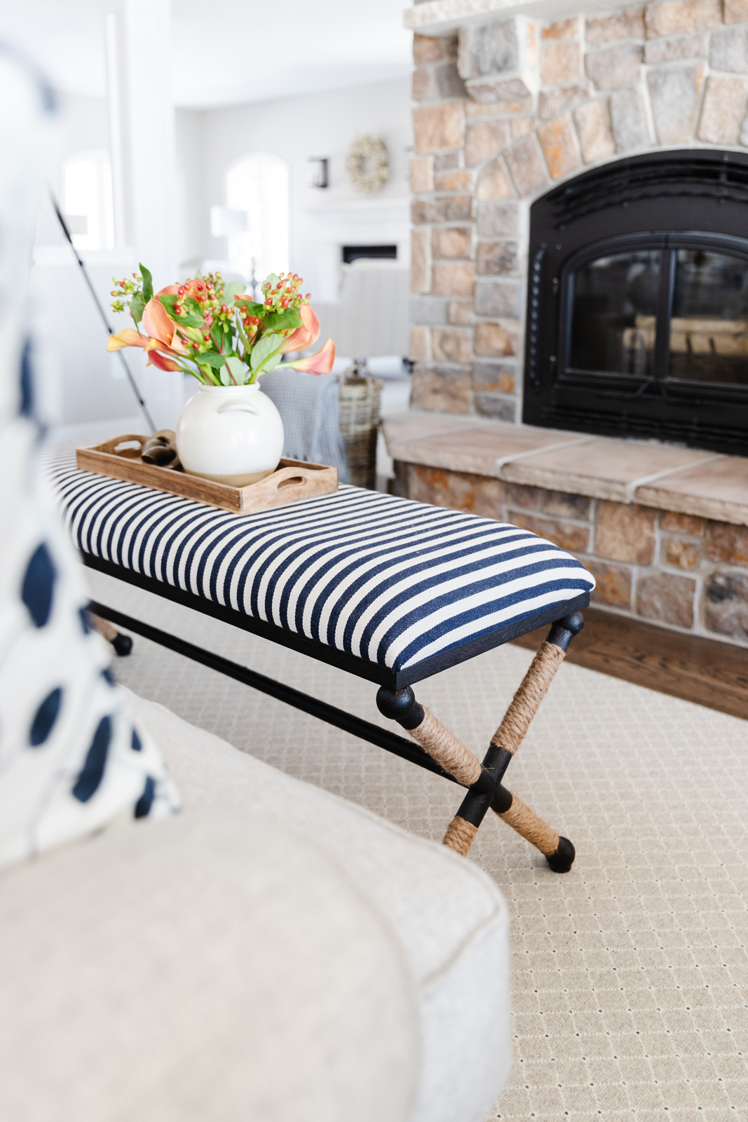
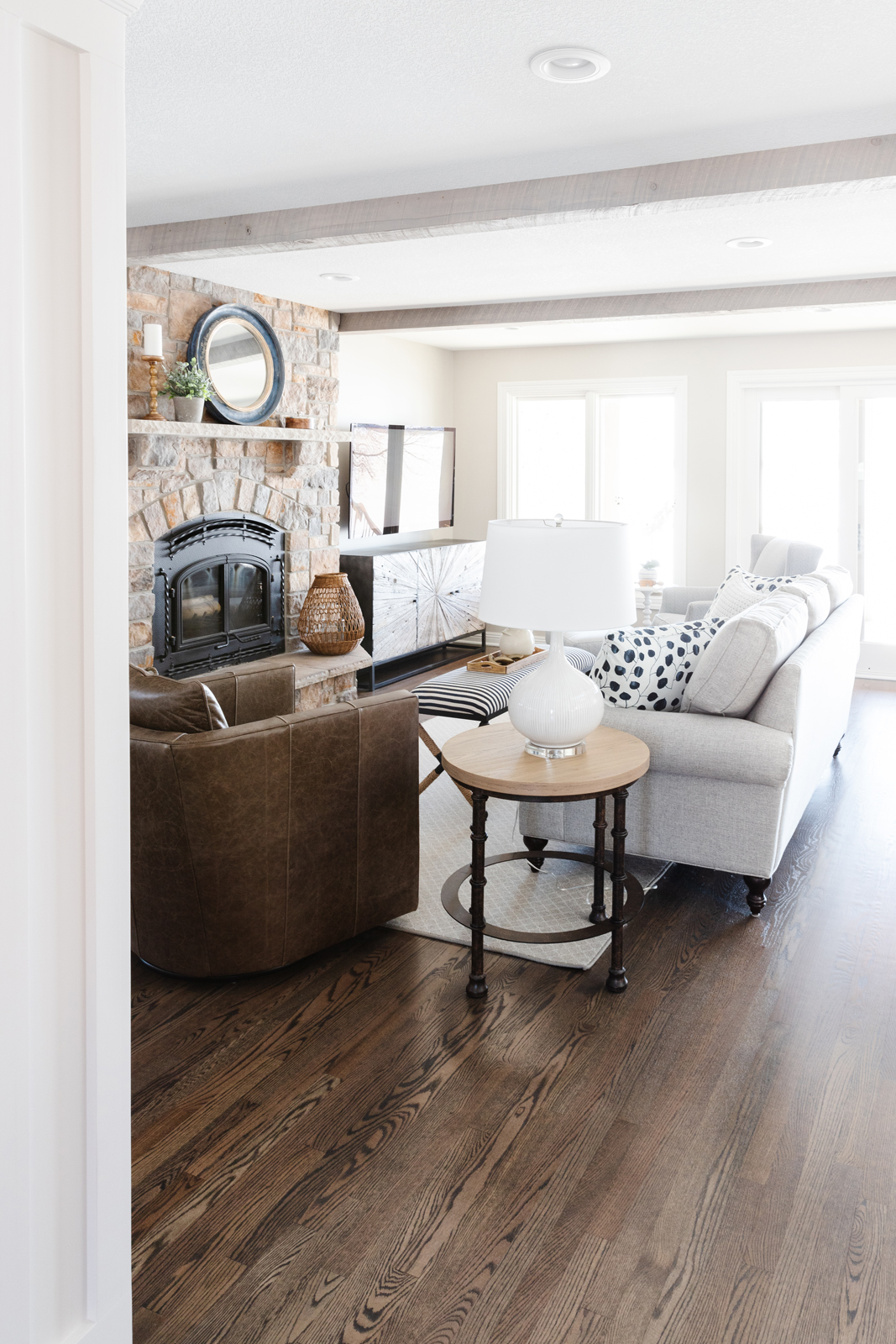
Since the kitchen is the heart of the home, and because we wanted to orient most of the house to enjoy the backyard views, it was important to create a space to relax and unwind close to the kitchen and back windows. The existing fireplace was already very nice, so the only thing we really needed to do was add cozy furniture. We did bring in rustic wood beams to frame out and create a more finished look between the ceiling heights in the kitchen, dinette and hearth room. They also add a lot of warmth and bring in added interest to this space. All of the hardwood floors were refinished and stained a beautiful walnut brown color. Goodbye orange oak floors! It’s amazing what a simple color change does for floors! We also painted all of the windows, baseboards and trim a fresh white, which immediately updated the house and made it feel brand new. All of the recessed lighting was updated to warm LED lights. The racetrack ceiling detail was removed over the hearth room and all of the popcorn ceilings on the main floor were given a fresh knock-down texture and painted.
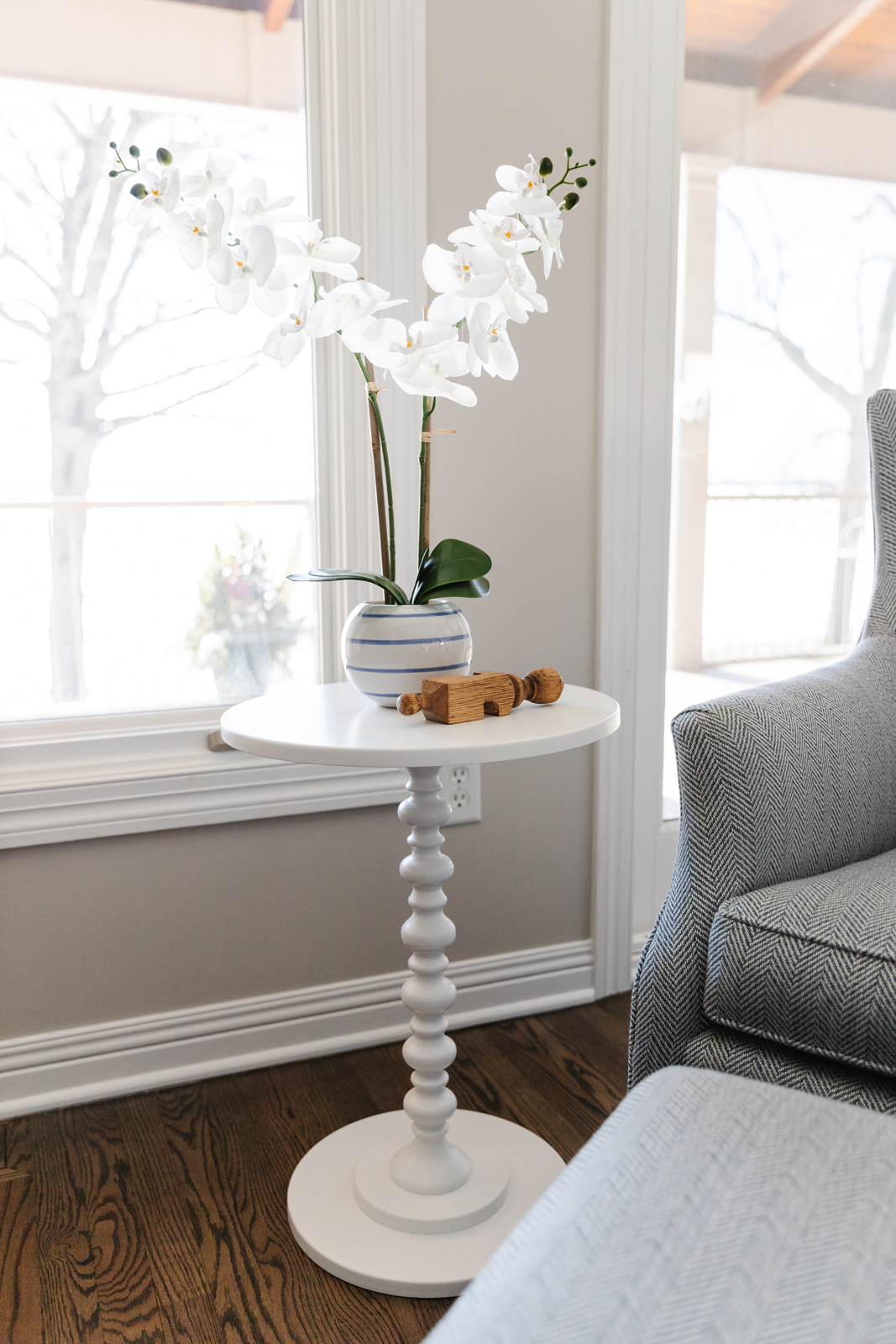
Do you see the little oak corbel laying on the white end table? The inside joke is that the piece is part of the old trim detail around the kitchen ceiling and soffit! Anne & Dave kept it as a humorous memento from the old kitchen. We thought it would be fun to display it as a decorative object. Nothing better than a good conversation piece, right?
We hope you enjoyed seeing Part I of this transformation. We can’t wait to share the owner’s suite, laundry room, guest bedroom & bathroom with you next time!
Be sure to subscribe to our blog to have Part II sent right to your inbox next week! Sign up by clicking here.
XO, Interior Impressions Team
Nice! What’s the wall color/brand?
Which room are you asking about? They are not all the same.
What is the name of the floor in the entryway? It’s gorgeous! I’m looking for something like that to update my entry.
The floor is from WD Flooring in Minneapolis. It is a beautiful black walnut set in a herringbone pattern
It turned out so beautiful! Also I’m in love with the paint colors! What colors are the kitchen and entry?
Thanks so much! We used Sherwin Williams Worldly Gray.