Happy New Year & Hello 2020! It is astounding that a new decade is here and we are looking full steam ahead on our upcoming projects and partnerships. However, we can’t forget the amazing ones we accomplished in 2019, like this project reveal of the Earthy Modern Refresh. This project entailed building up from what the homeowners had: beautiful woodwork, solid furniture, massive ceiling heights and breathtaking windows. These homeowners wanted to update their home but stay away from some trends from the 2010s that we talked about in last week’s blog post, such as making everything white and gray. By mixing warm and cool tones and incorporating their love of global prints and geometric shapes we were able to accomplish a warm and comfortable living space for this family to bring them into the new decade. We brightened up the walls to soak up all the natural light coming in the luxurious windows and toned down the red tones in the wood floors to a soothing chocolate finish.
FOYER
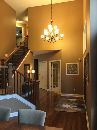
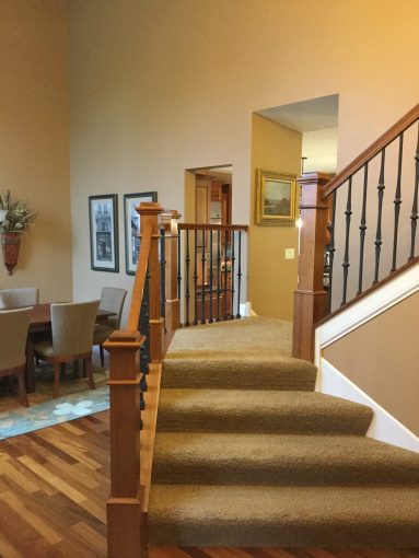
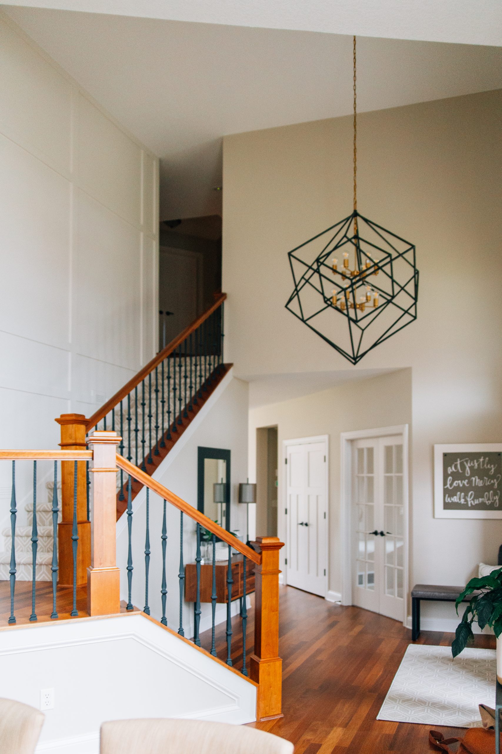
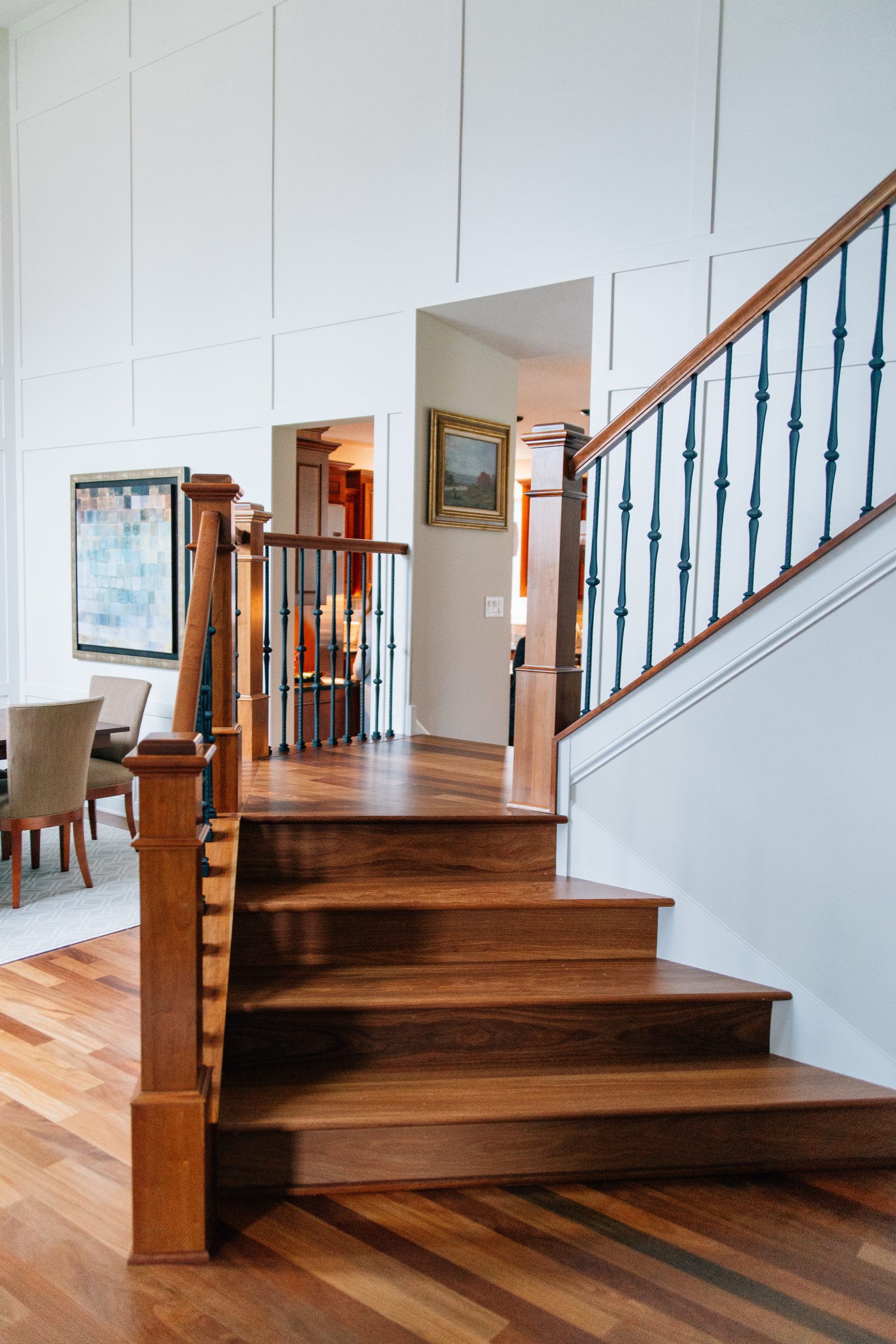
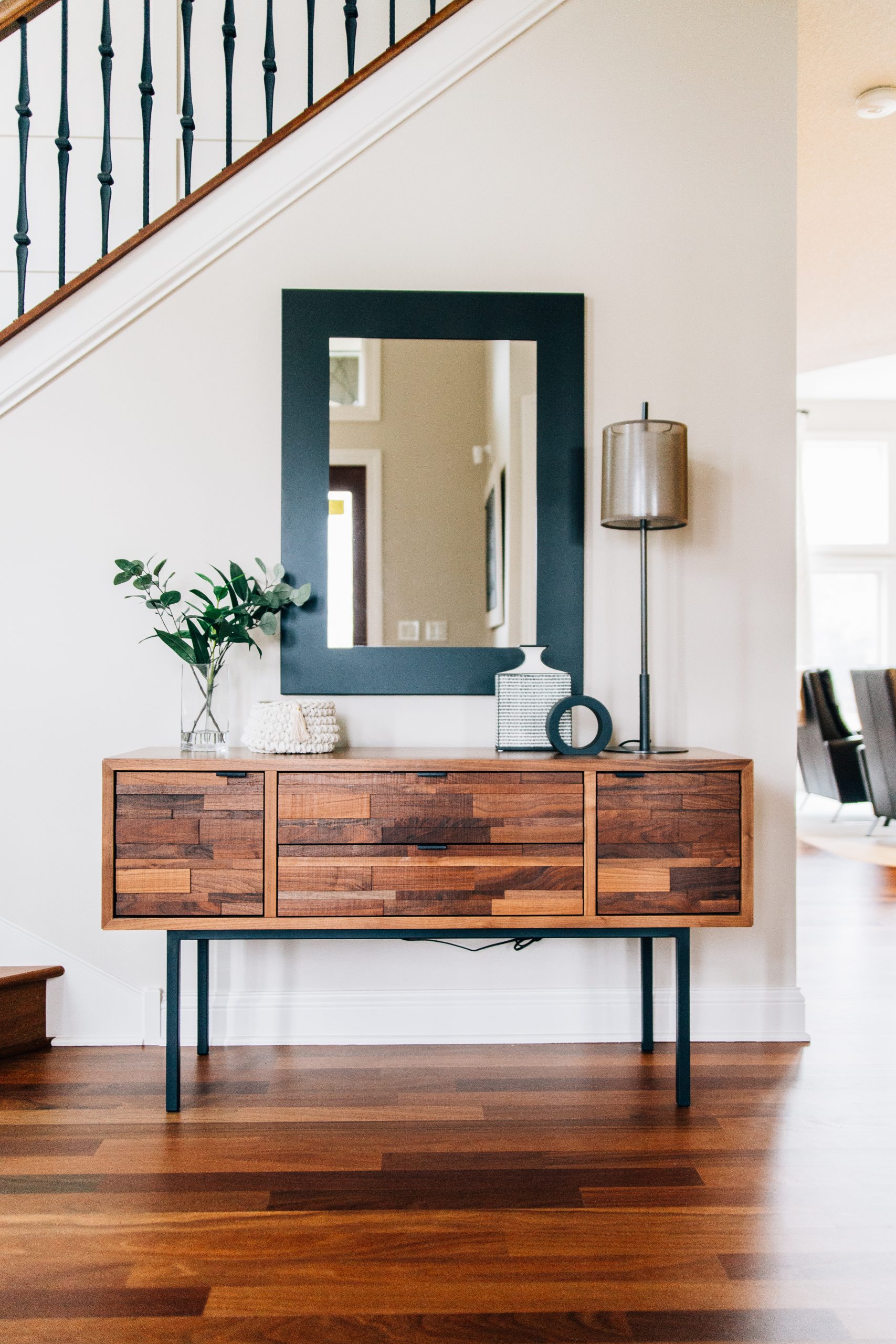
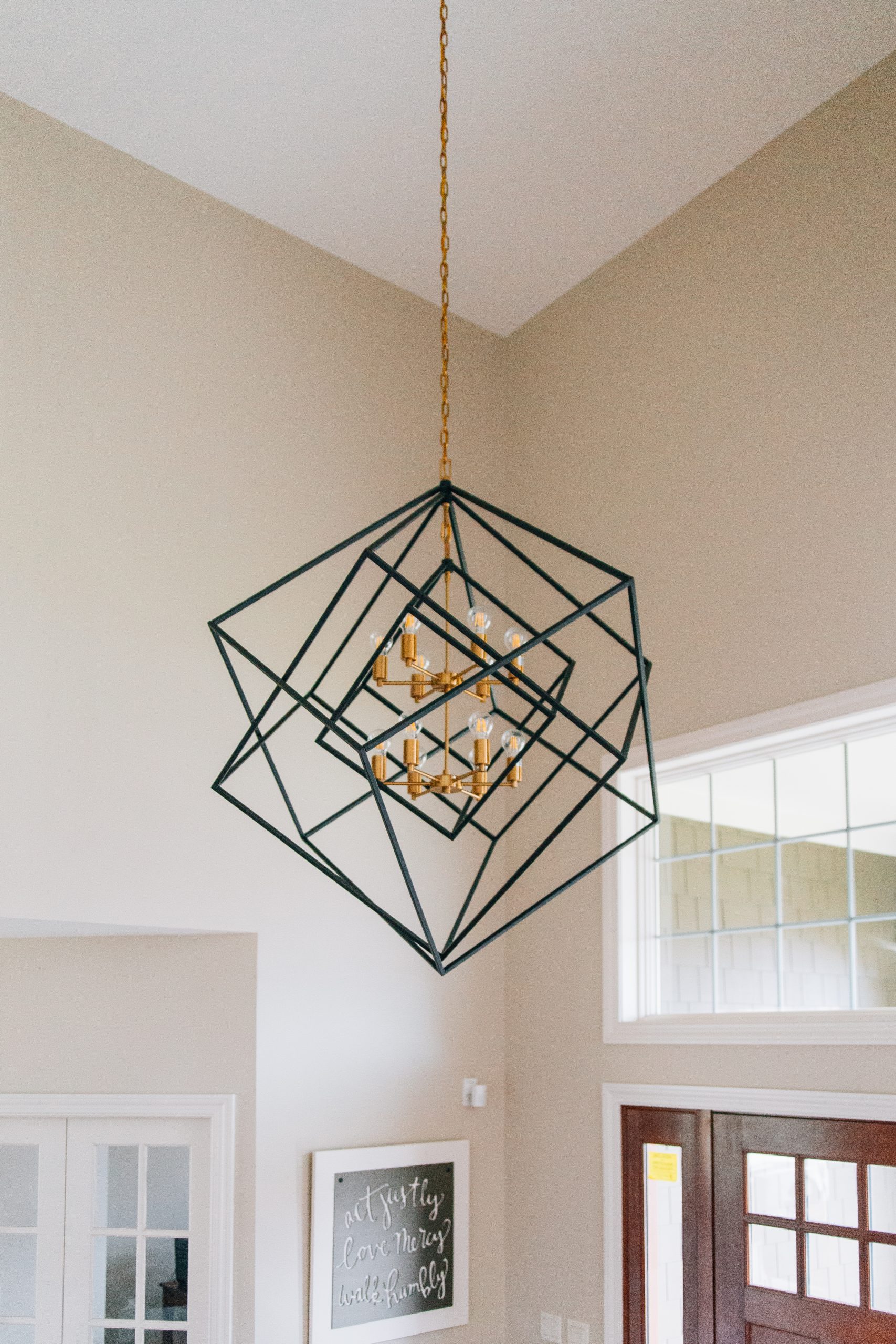
From the first step into the front door, you are greeted with soaring ceilings and a beautiful staircase. The two-story walls received a custom designed millwork application to add texture and create a seamless flow into the adjoining dining room. The carpet was removed on the entire staircase and from the landing down, new wood was installed to match the beautiful floors below. New carpet in a geometric pattern leads up to the second story. A modern, sculptural new light fixture adds a ton of interest to replace the dated chandelier. A new console table and bench with accessories welcome guests in and makes the space feel like it’s saying, “you’re home!”
DINING ROOM
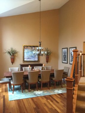
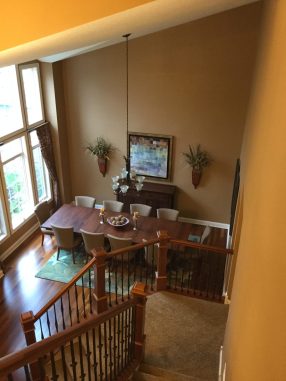
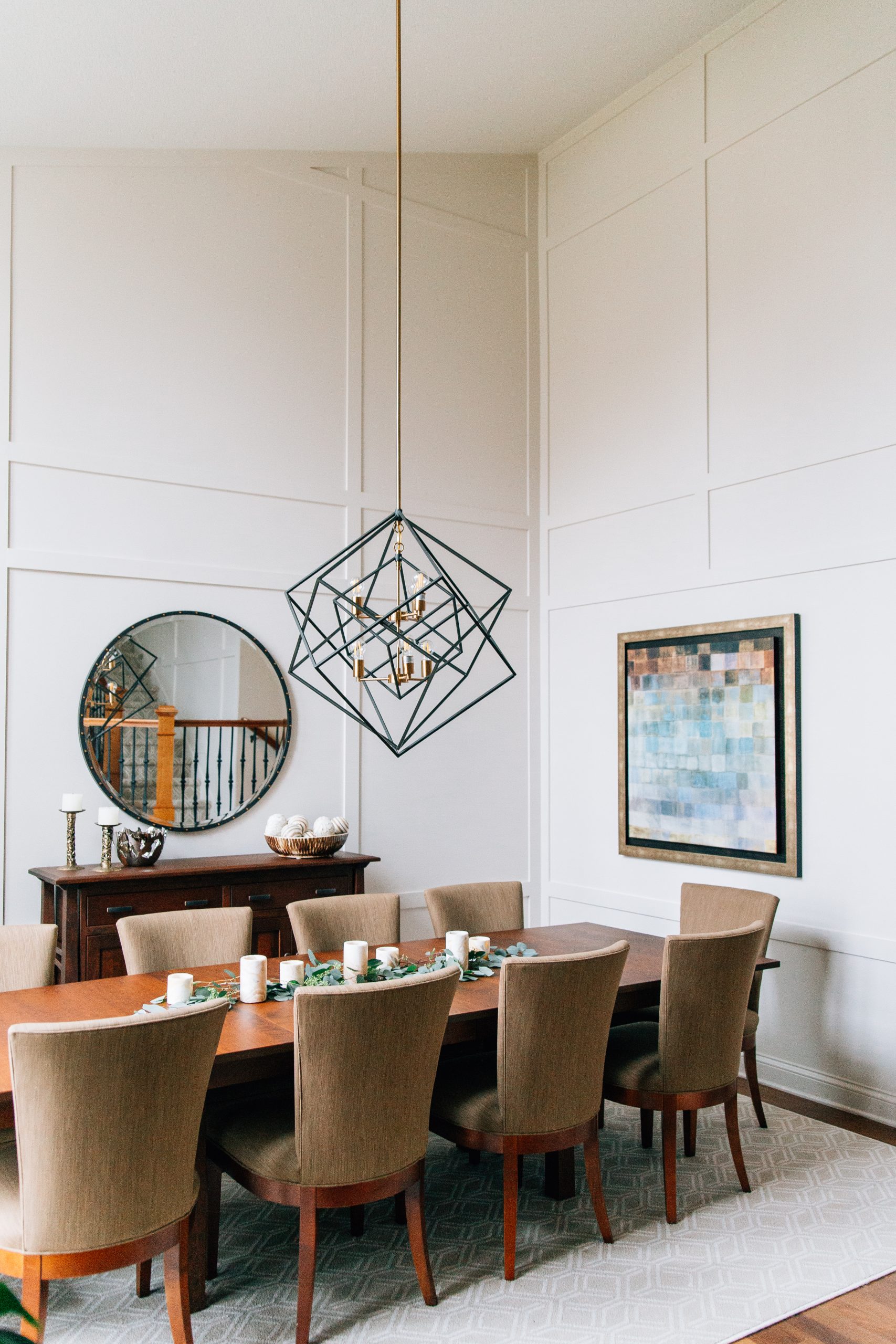
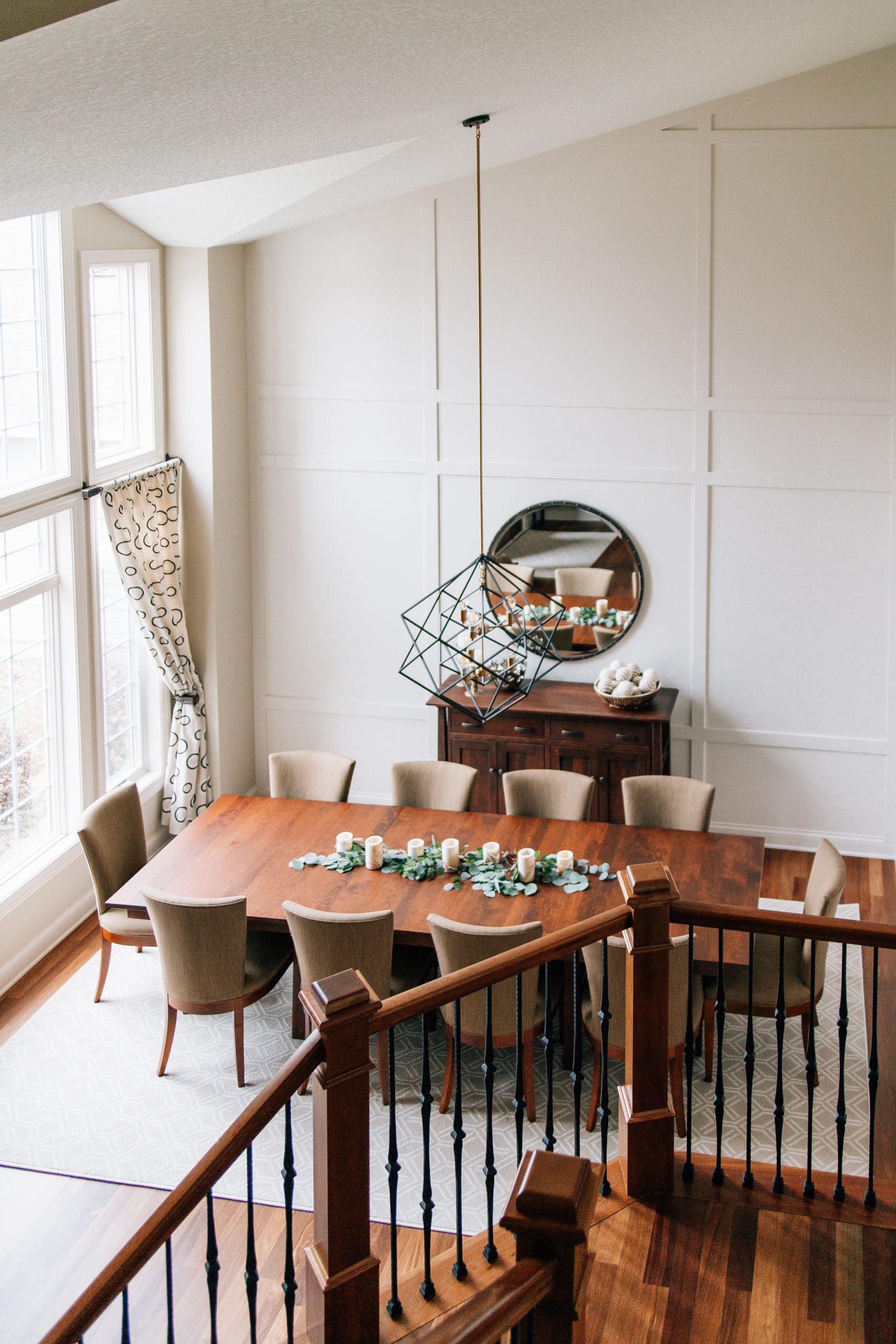
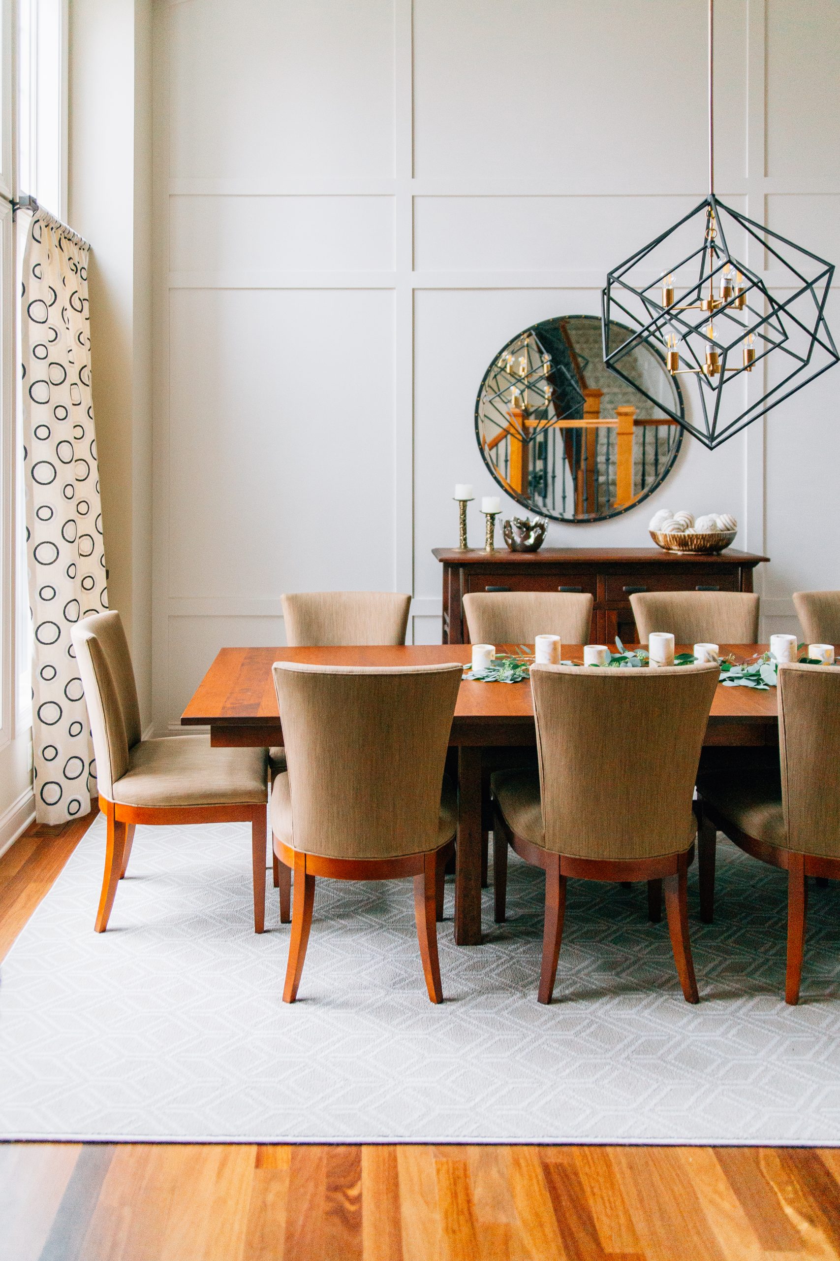
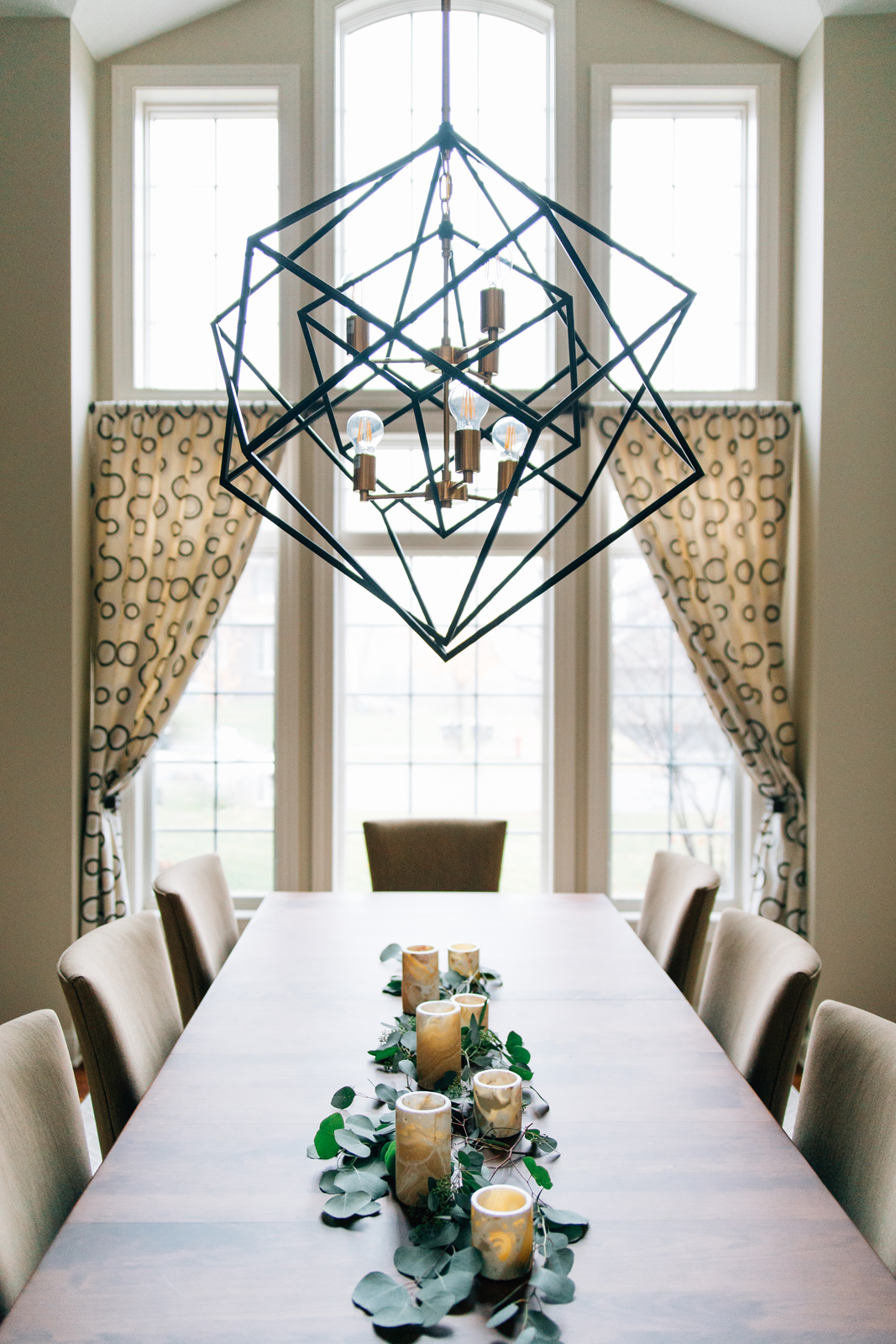
Wow, right?! Many festivities can be celebrated all year in this stunning space. The grid wall is such a dramatic feature to complement the amazing front windows. New window treatments add more pattern to the the square shapes throughout the rest of the room. The homeowners’ existing dining table and chairs fit perfectly into the space to give it the refresh it deserved. A massive area rug was custom made to fit underneath the dining table and match the carpeting on the stairs. The geometric light fixture is the same style as the one in the foyer, but a different scale. Earthy accessories make the room cozy and inviting.
DINETTE
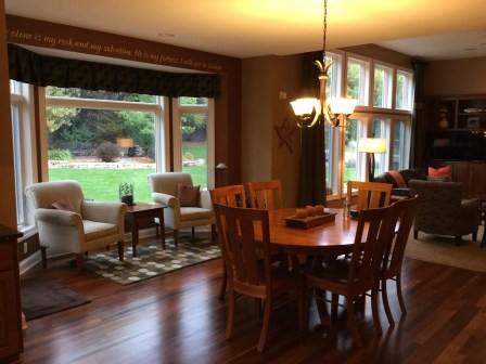
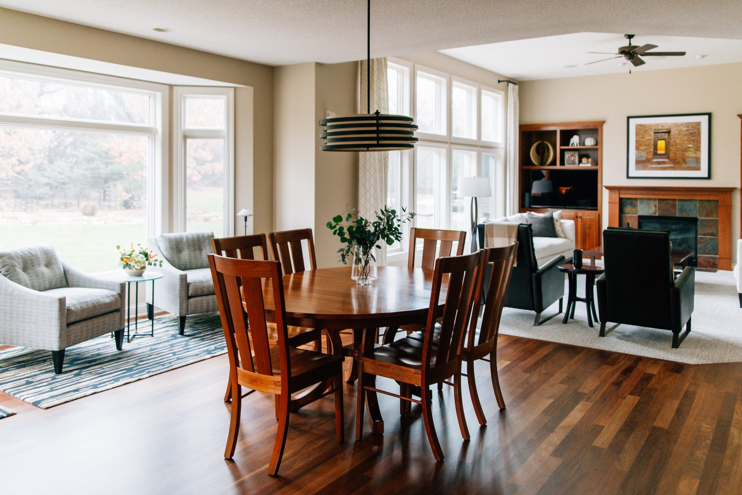
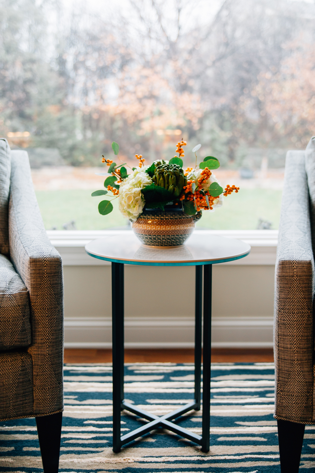
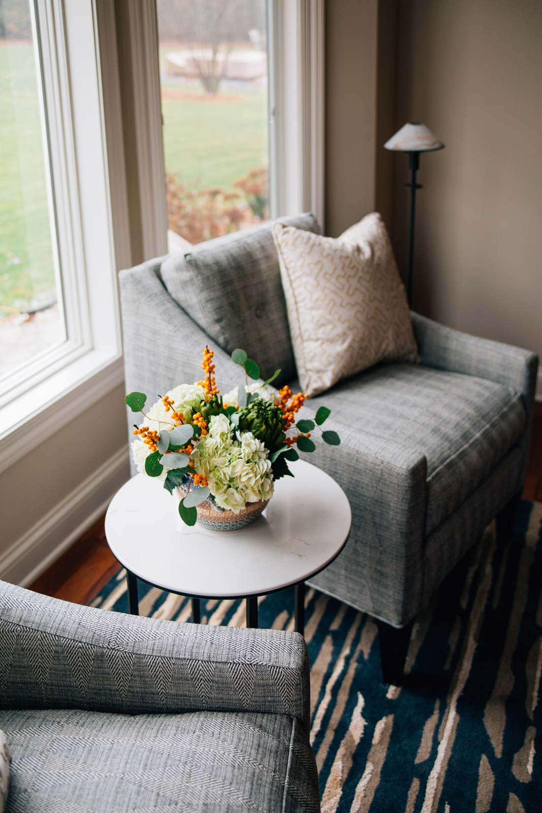
The views in the back of the house get even better! Next to large picture windows, the homeowners can enjoy a slow morning reading and drinking something warm in their new side chairs. These custom made beauties are so cozy and sport a neutral upholstery with a nod to the homeowners’ love for global prints. A larger new rug divides the space from the dinette and adds a subtle pop of color. The same dining set stayed in place and was illuminated by a modern light fixture. We removed the valance and the script writing over the window to keep the window as open as possible and allow the backyard view to take center stage. The lighter paint color also made this space feel much brighter and more spacious and sunny.
LIVING ROOM
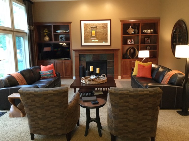
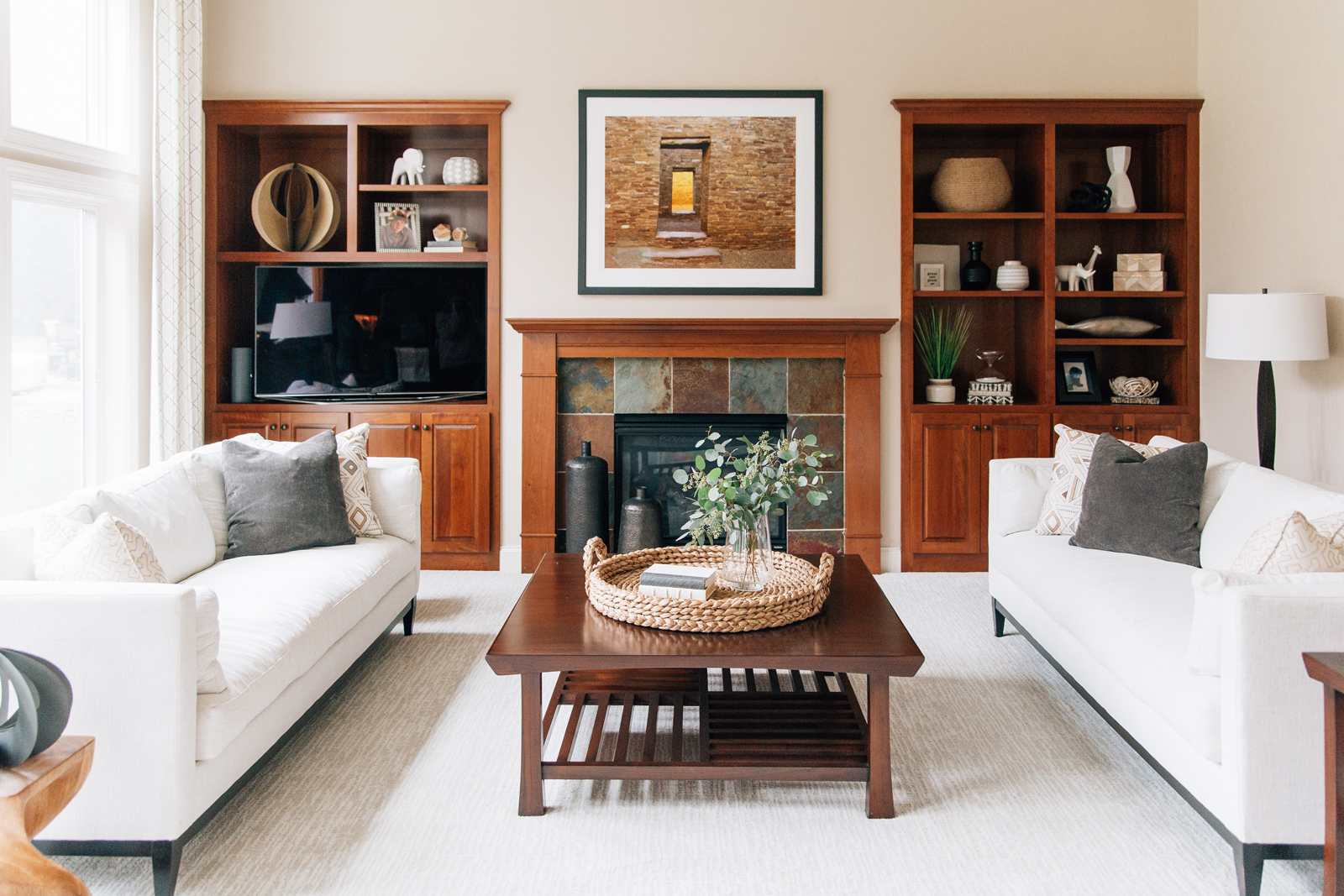
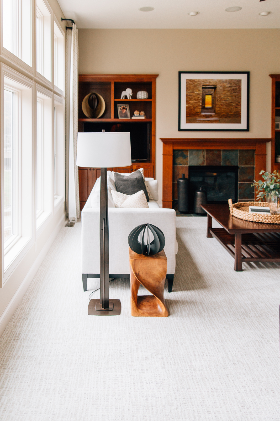
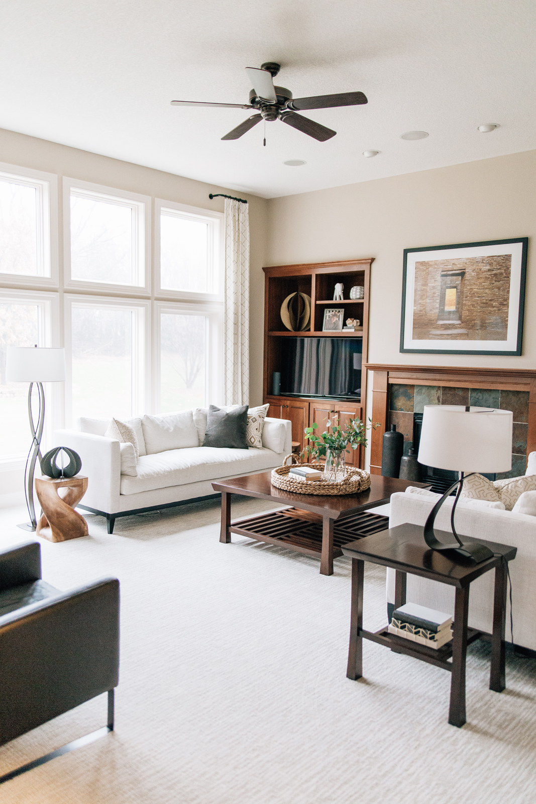
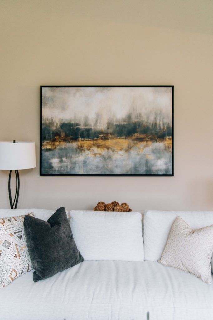
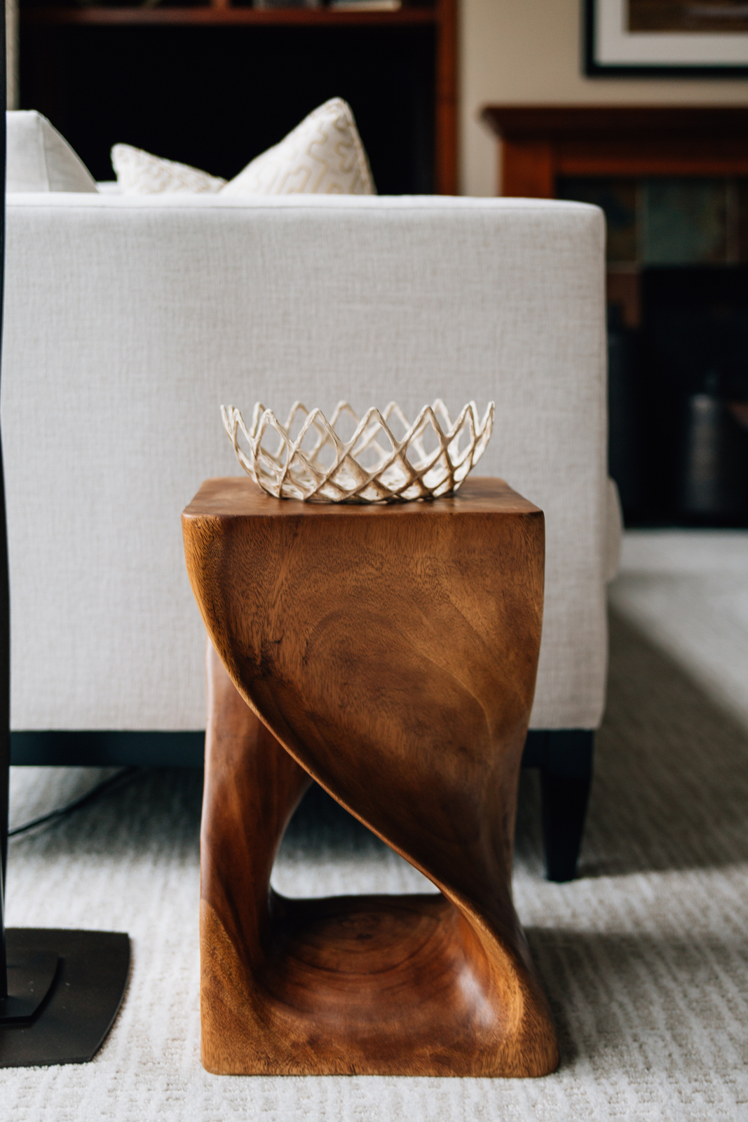
Case in point that you do not have to paint out all the wood work in your home to update it! The homeowners were set that they wanted to keep the beautiful warm wood tones in their cozy living room. We played off these natural elements with organic materials and textures throughout, such as the woven basket on the coffee table and twine balls and wood platter. A pair of new sofas, side chairs, artwork and accessories fill this room to complement and enhance what was there. Window treatment panels flank the breathtaking windows and add more pattern to love.
This home now reflects the personality of the owners – happy, welcoming, comfortable and filled with sunshine. We truly enjoyed working with this couple so much that we were sad when the project was finished! We are thrilled that they can now enjoy their beautiful home with a new fresh look.
XO,
The Interior Impressions Team
Leave a Reply