Let us preface this post by saying: fill your home with things you love. Do not buy decor for the sake of buying decor. Now that we have that out of the way, we are sharing our tips and tricks for styling coffee tables, bookcases, fireplace mantles, countertops and open shelving. A lot of our clients come to us looking for a solution to decorate their beautiful built-ins and furniture. It can be challenging to collect and piece together items and partner them on a shelf with something that’s complementary and doesn’t outshine its neighbor. We have come up with a recipe to achieve a cohesive, intentional, and stylish #shelfie-worthy moment. Read on to learn how to style your shelves.
CREATE A STAGE
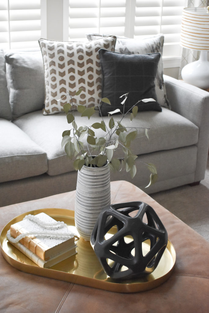
A “stage” such as a tray, flat platter or pedestal corrals decor pieces together to look intentional and uncluttered. On a coffee table or ottoman, place a tray in a low traffic corner or center and accessorize with stacked books, a dash of greenery, stylish coasters, and fun accessories. A tray also makes life a little easier when it comes time for game night and you need to clear your coffee table for a serious game of Monopoly. A stack of books laid horizontally adds height to a shelf and is the perfect perch for a small plant or sculpture. A small cake pedestal next to your kitchen sink can be home to your dish soap, dish brush or sponge, and a small vase of flowers.
VARIATION
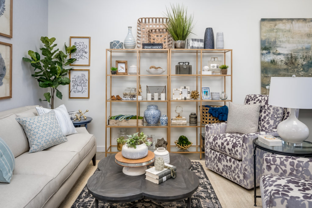
Creating variation is incredibly important in styling your space. Opposites attract, so they say. Layer tall and short candlesticks, round vases next to rectangular boxes, and mix textures between woods, metals, greenery, and pottery. If you’re rocking a monochromatic color palette, using a variety of wood tones, metal finishes, and shades will add just enough differentiation. And even if your bookshelves are strictly for books *gasp!*, arrange by a variety of heights, colors and thickness to create an interesting visual.
BALANCE > SYMMETRY
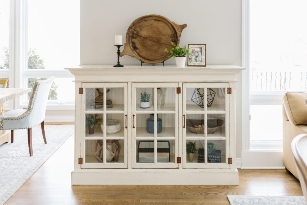
A trick for finding balance in decorating is to work in a diagonal. In the image above, there is a diagonal theme of single sculptures so each column has a shelf with only one decor piece on it. The horizontal stack of books are in opposite corners of the case, and all the greenery is on a different row and column from each other. If asymmetrical visuals make you uneasy, feel free to go the symmetry route. The balanced path allows for more variation and presents a more curated look.
LESS IS MORE
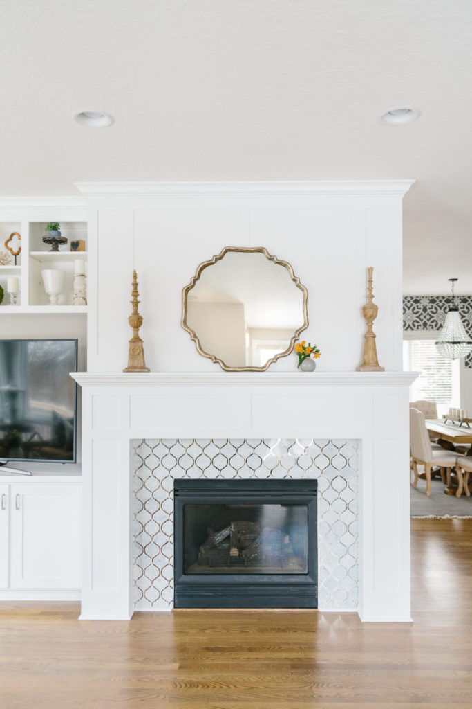
Not every inch needs to be covered, not every shelf needs to be filled. White space is a good thing. Give your decor spaces some breathing room between their neighbors. This mantle has pieces with beautiful details and curved lines that pay homage to the tile surround; it would be a mistake to hide them amongst clutter. Large items, such as a basket or large piece of art, can stand alone on a shelf and doesn’t need to be layered with a smaller piece in front of or in it. Let it be. If you have smaller items, create variation in height and don’t overcrowd pieces.
GREENERY, ALWAYS
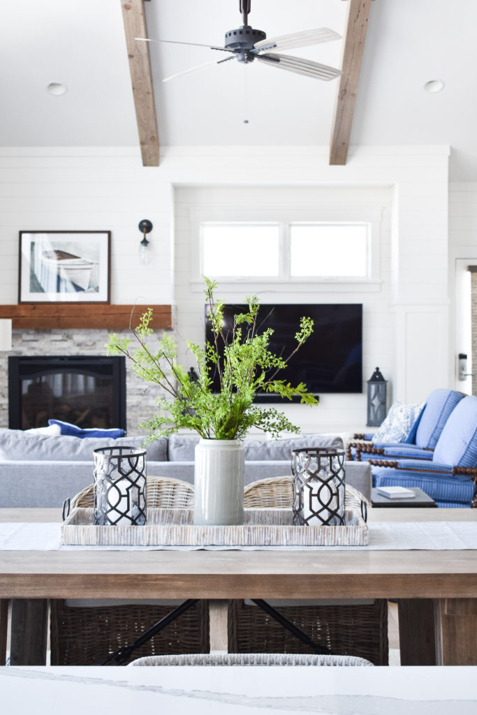
Whether real or faux, plants should always be incorporated into your decor to bring a little liveliness and fresh color, or perceived freshness. All the images we shared today sport greenery and/or flowers. If you’re not up for the commitment of becoming a plant parent, we are big advocates for “forever” plants that hold no risk of dying! Green doesn’t have to be in your room’s color palette either; plants and flowers will always be a welcomed color.
Take time styling your bookcases, mantles, countertops and coffee tables to collect pieces you love and are personal to you, your family and your style. Bring home items from your travels, hunt antique stores or Grandma’s house, and buy items that simply make you happy. As always, if you’re feeling stuck, we’re happy to help you style your shelves!
Cheers to the weekend,
Interior Impressions Team
Leave a Reply