A young family purchased a Woodbury home with remodeling in mind right away. Designer, Amy Leferink, met with the couple before they closed on the home to make a plan. The biggest challenges they faced were the layouts of the kitchen, mudroom and laundry room. We removed some walls to allow for more kitchen space and a walk in pantry. This also allowed for a larger center island with more seating and greater functionality. The layout of the living room was also not ideal, as the fireplace was at a weird angle and taking up space. Check out the transformation below!
ENTRYWAY
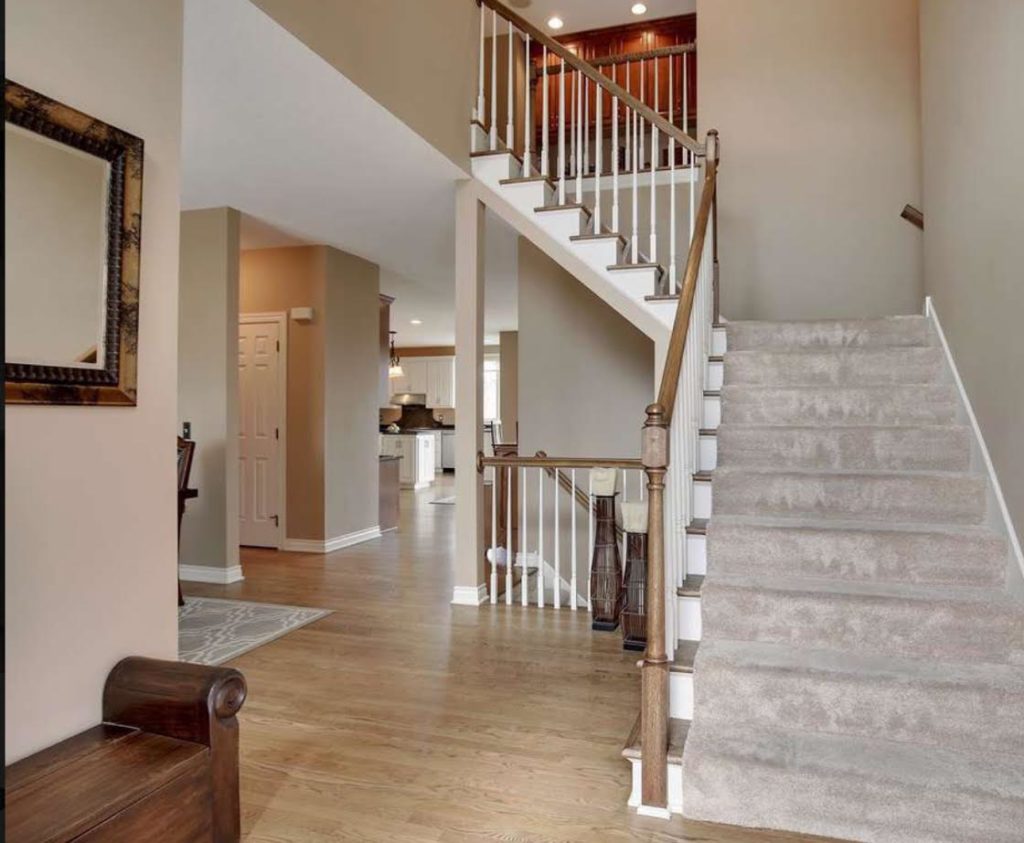
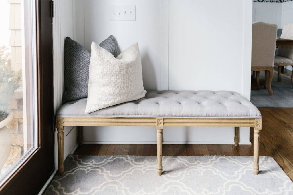
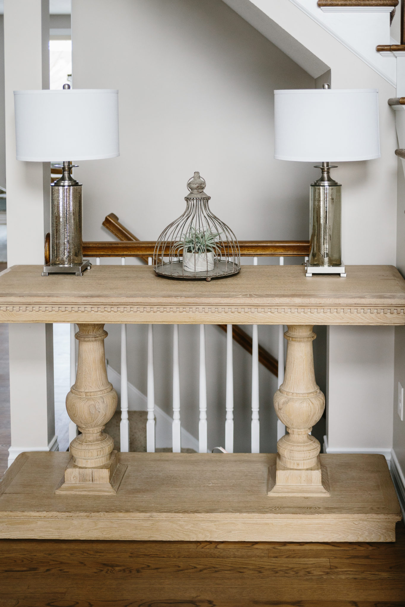
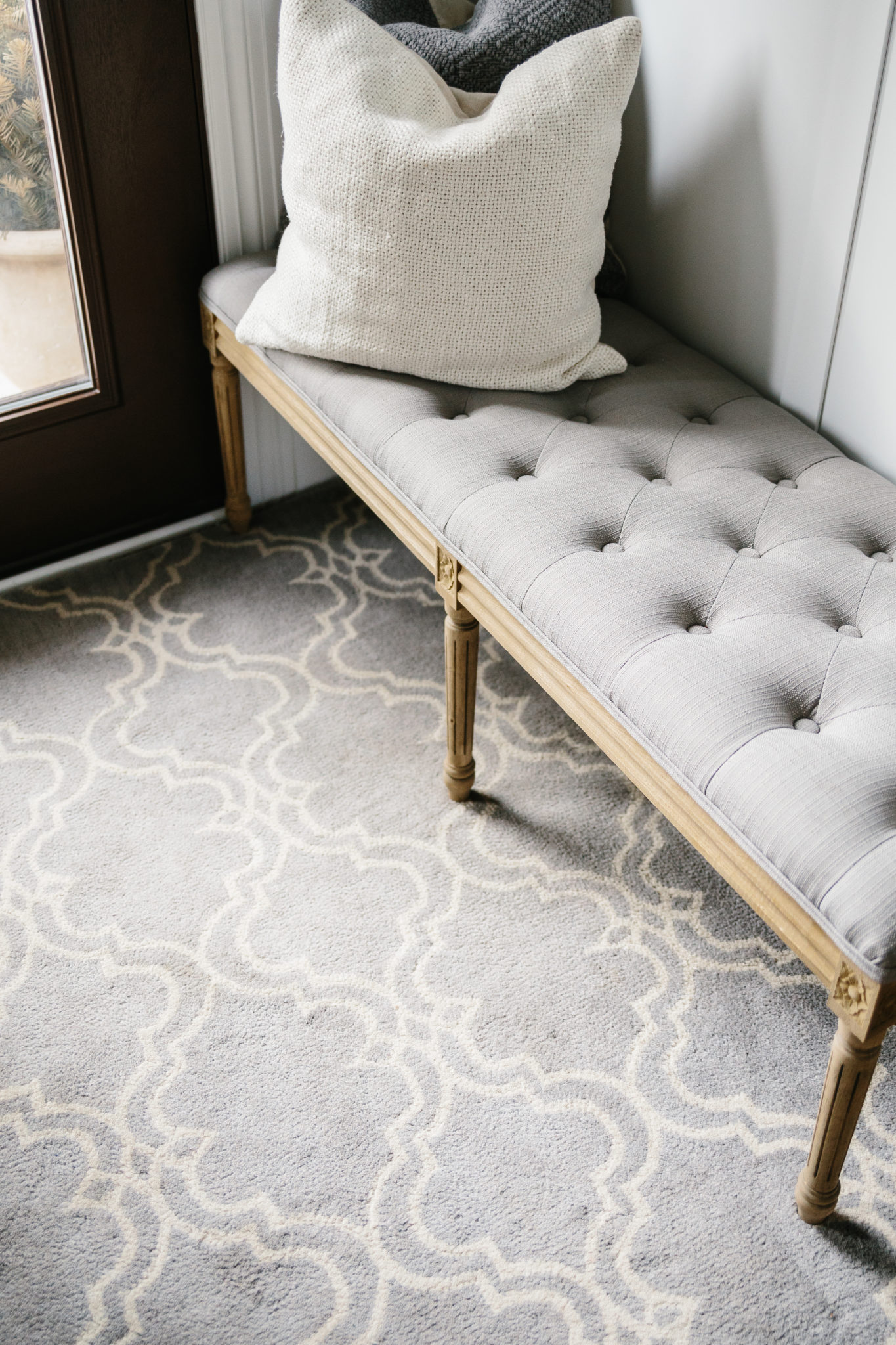
A soft, patterned rug welcomes guests into the home in the entryway. A statement console table says “hello” with intricate woodwork details. A cozy bench and pillows invites guests to get comfortable and stay a while. Beautiful wainscoting leads you into the rest of the home, including the dining room around the corner.
FORMAL DINING ROOM
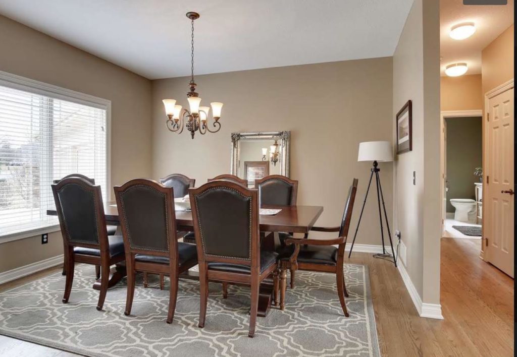
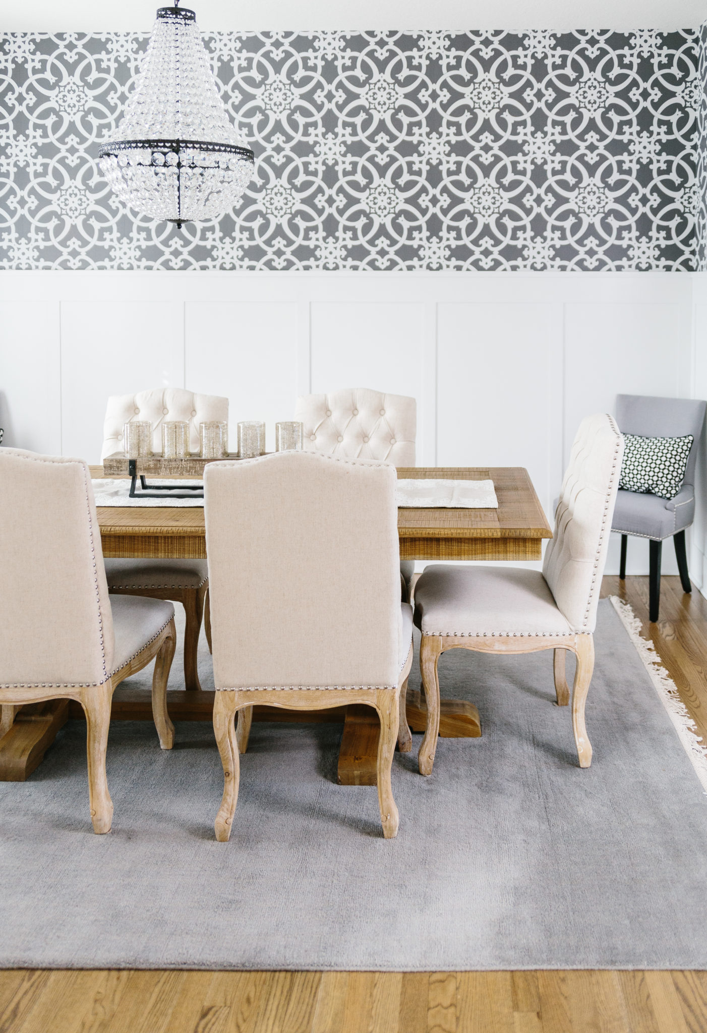
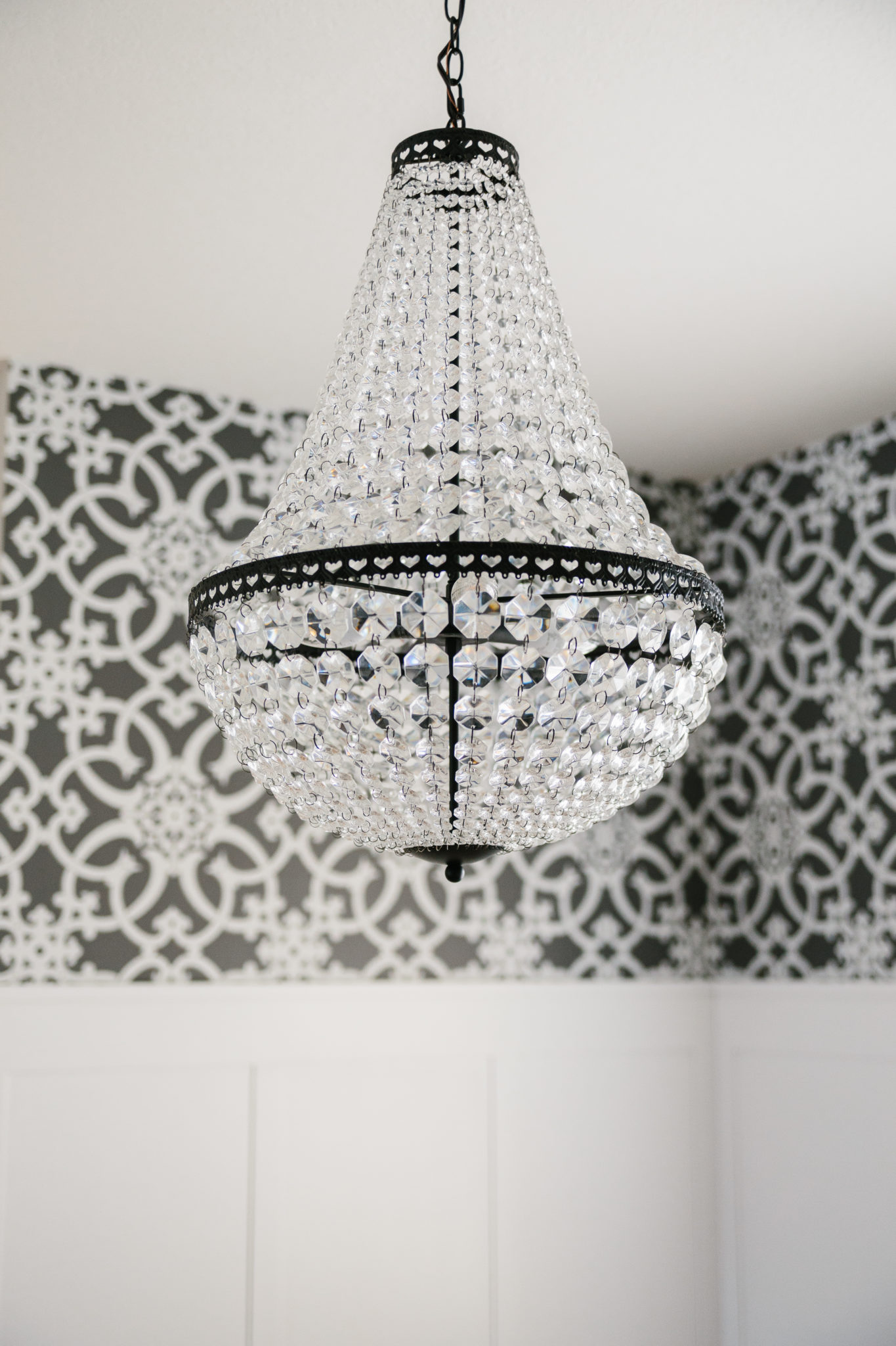
Wainscoting and a bold wallpaper choice make this room stand out. Not to mention the stunning chandelier to add elegance and luxurious charm. Sticking to the neutrals with a natural wood dining table, beige tufted dining chairs with nailhead trim, and a soft gray rug keeps the room bright and soft.
LIVING ROOM
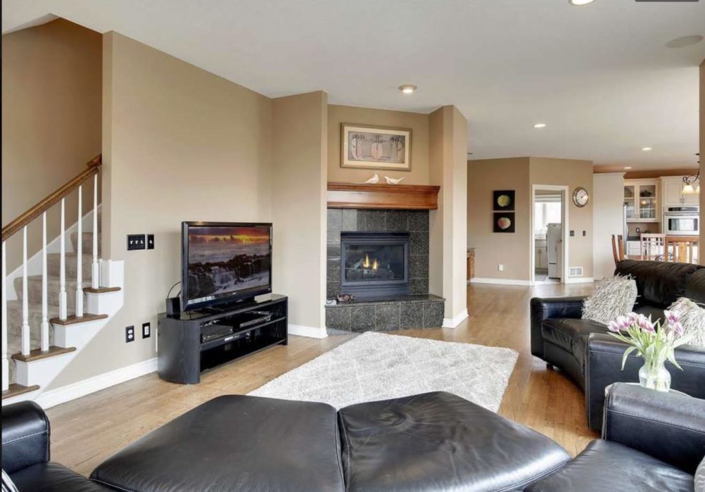
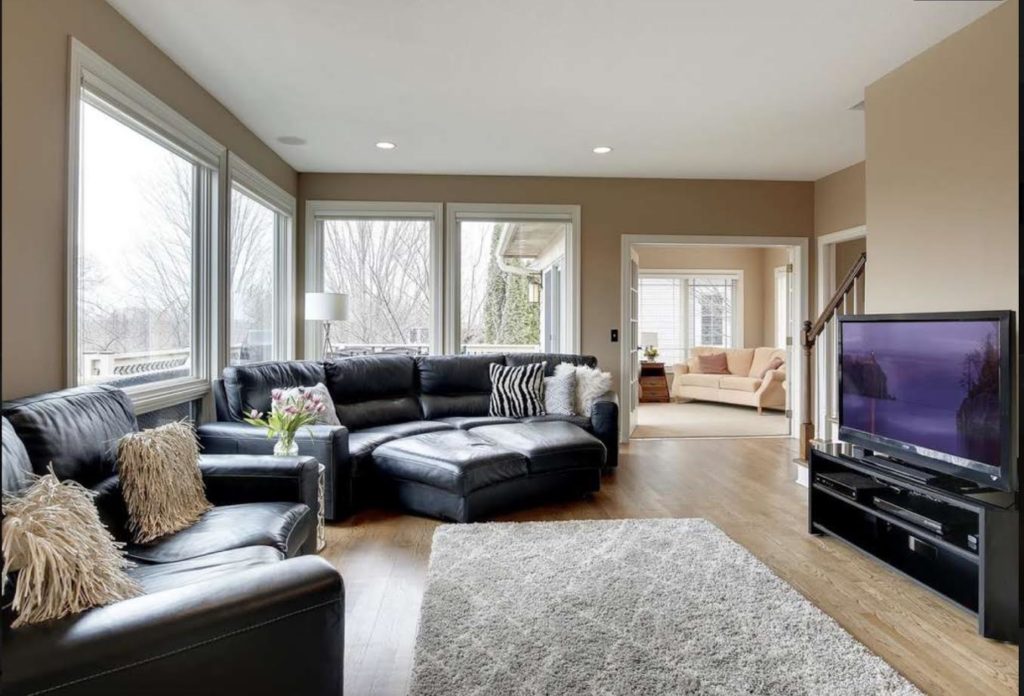
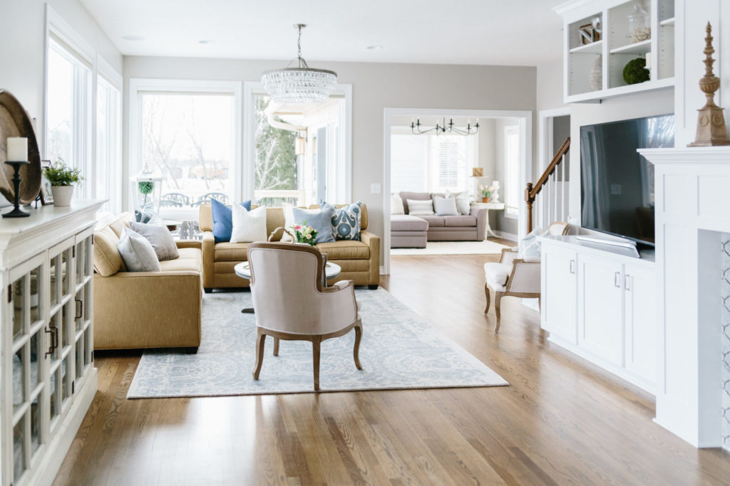
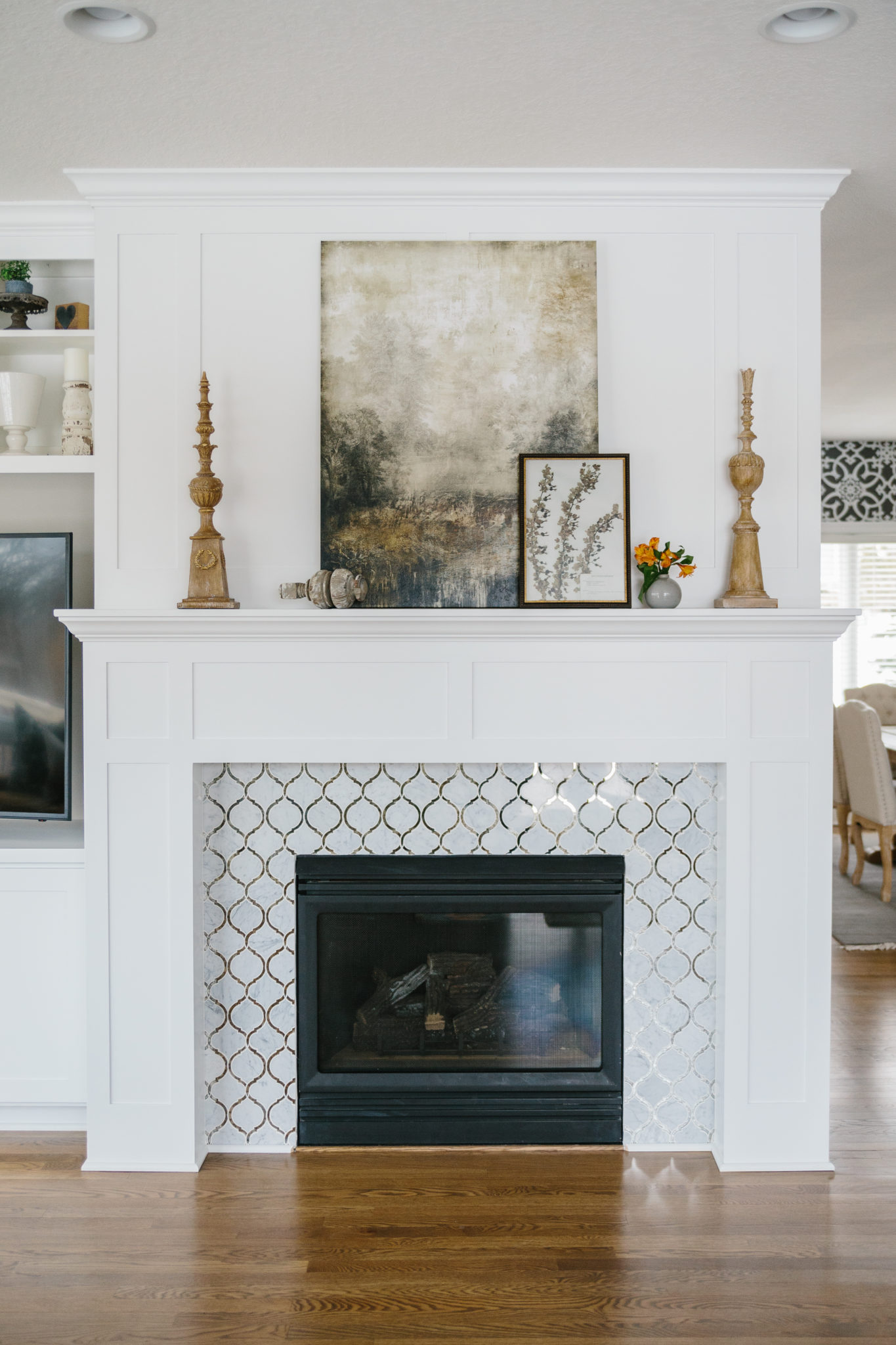
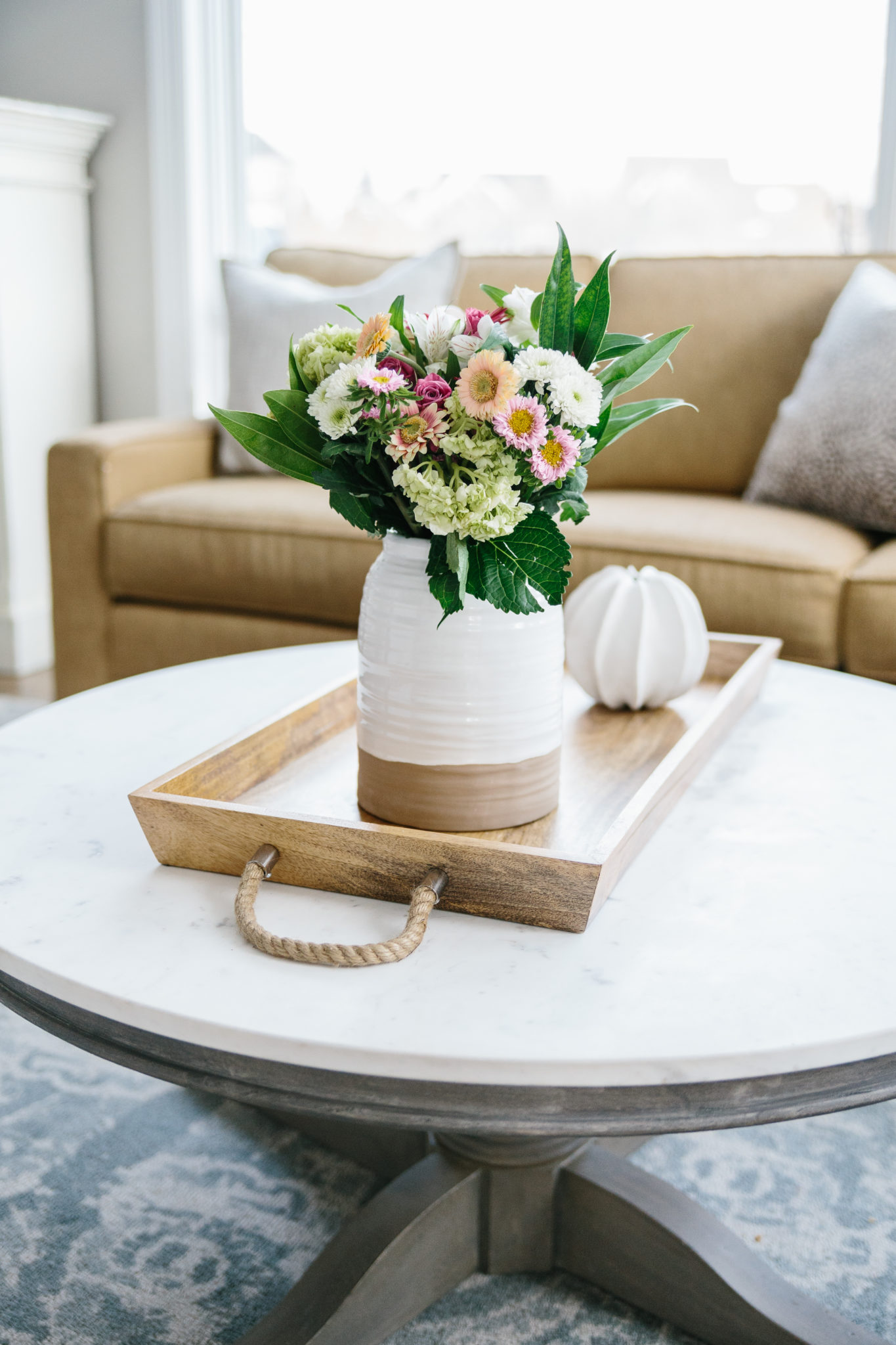
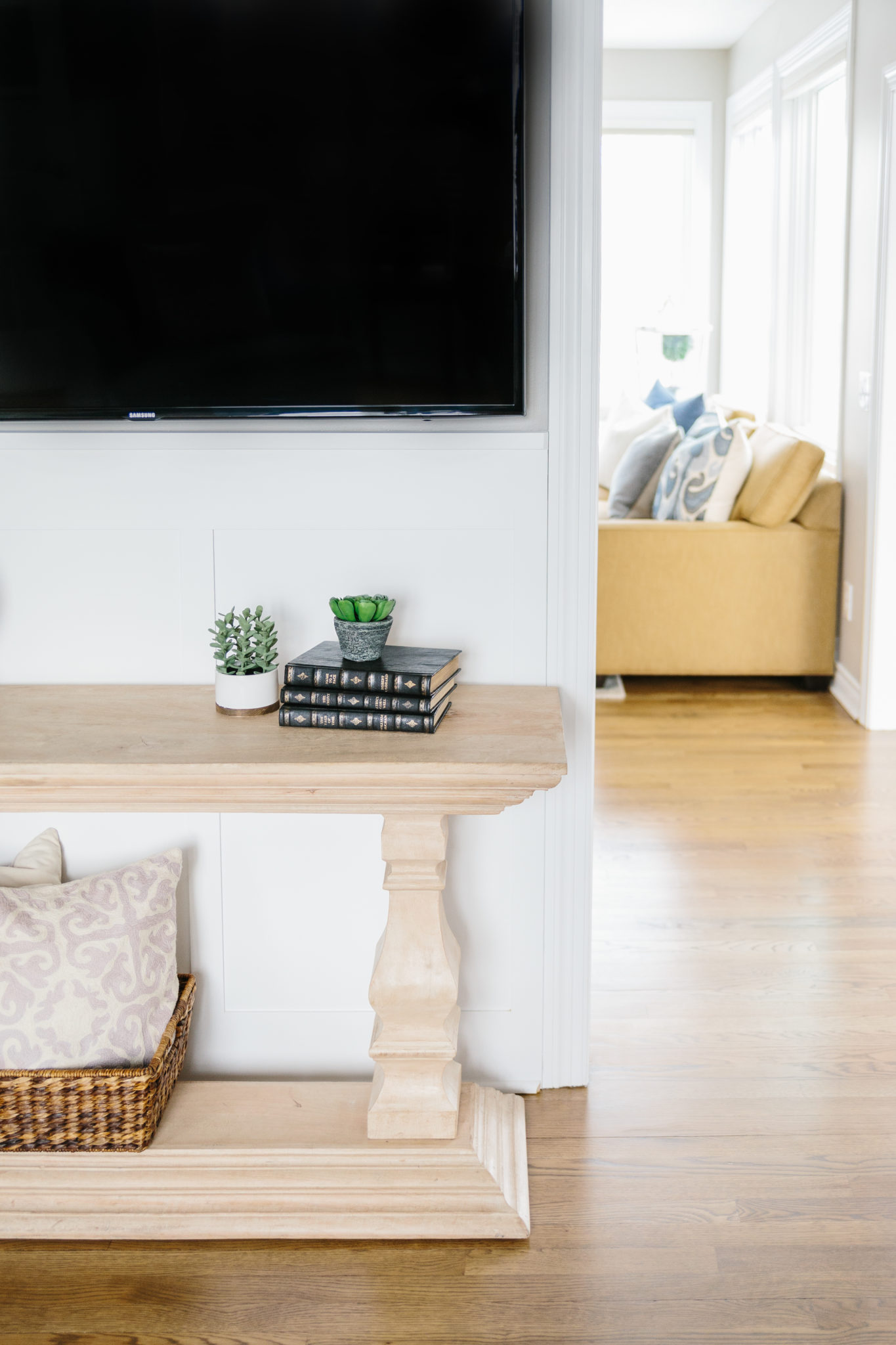
The mix of cool and warm colors in this living room makes it extra inviting. In the original plan, the fireplace was angled and there was a lot of unused space surrounding the tv and entertainment console. The fireplace was removed and moved to be aligned with the current wall, and a built-in entertainment center was created to fill out the space. A gorgeous chandelier, craftsmanship details, and elegant fireplace surround tile are a few of our favorite elements of this room.
SUN ROOM
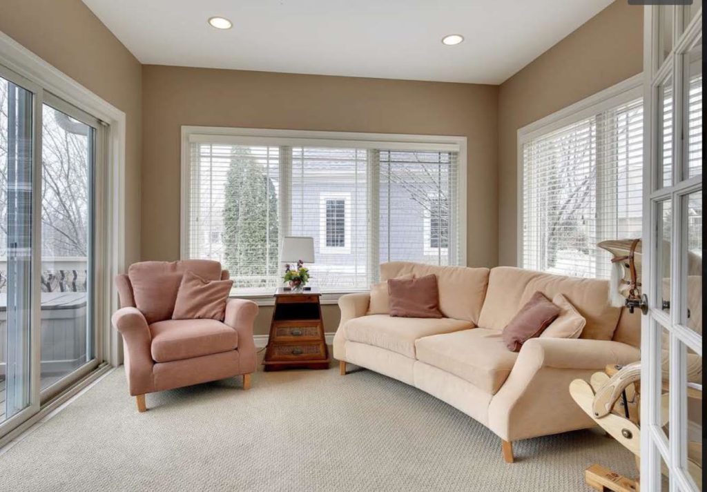
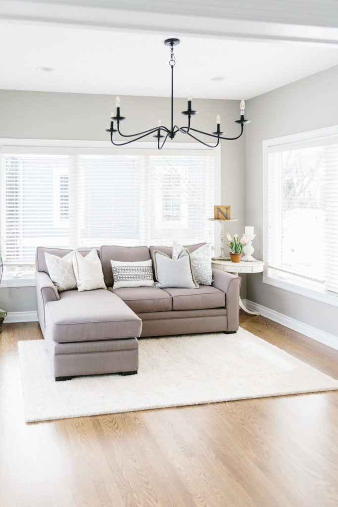
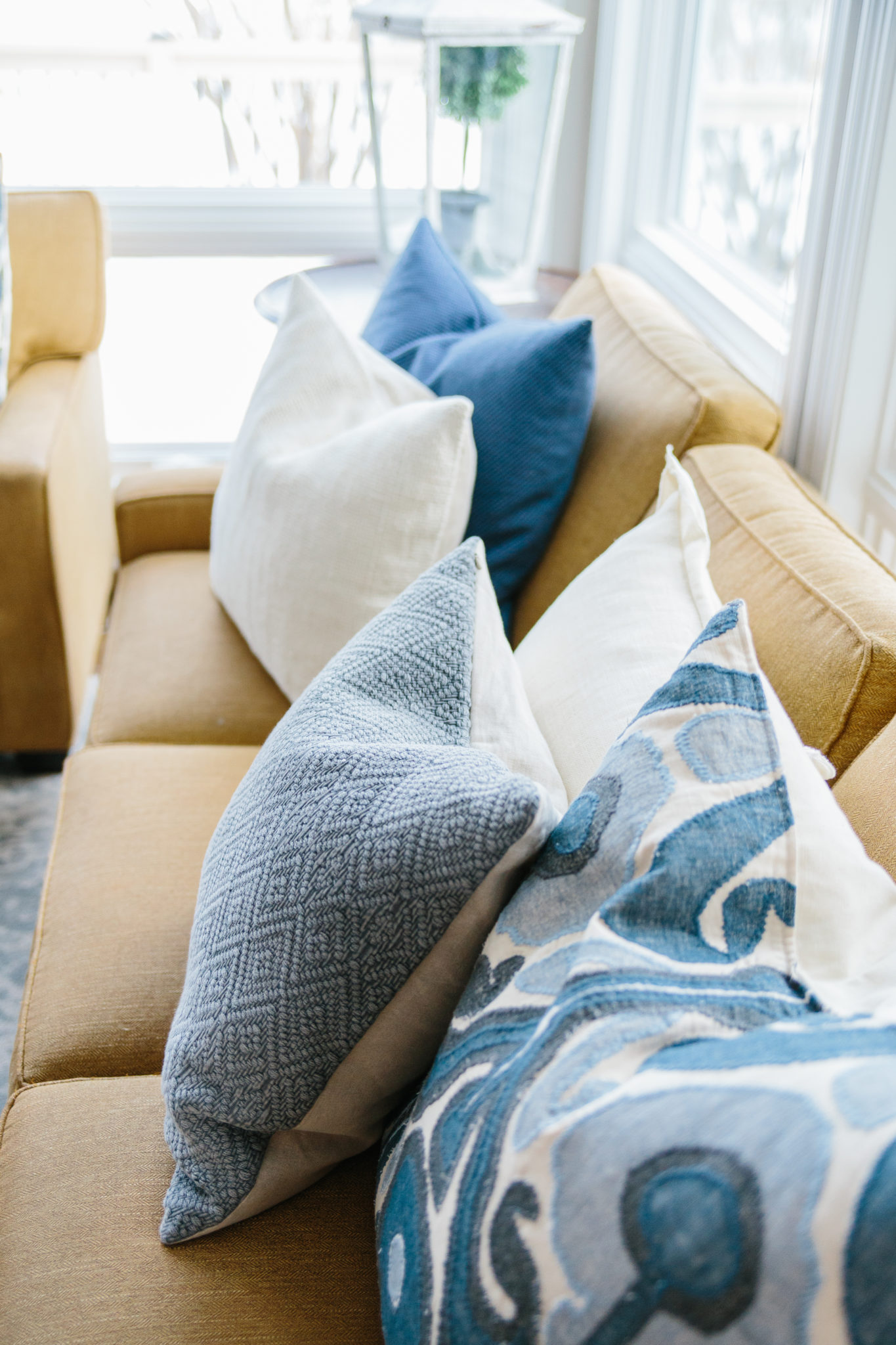
The sunroom received a fresh coat of paint and hardwood floors replaced the carpet, flowing in from the main living room. A modern farmhouse style chandelier was a great addition to the space, and new furniture that fit the space better was added. This sunroom is now equally cozy and functional.
DINETTE
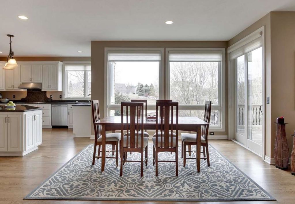
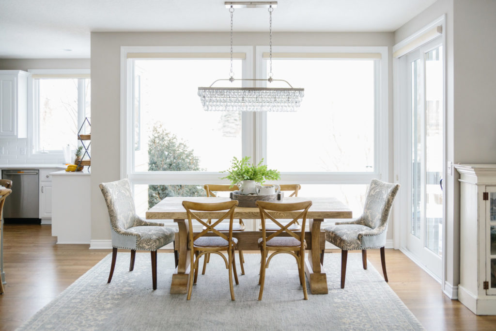
The dinette went from nice to “wow” with additions including the eye-catching chandelier, soft palette rug, patterned captain’s chairs with nailhead trim, and a new dining table as well as dining chairs. The fresh paint color throughout the home makes everything feel light and airy. One thing that was not added, but the home was blessed with to begin with, was all of those grand windows! So much light floods into every room on the main level.
KITCHEN
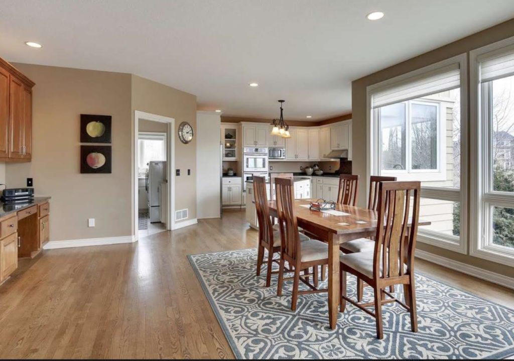
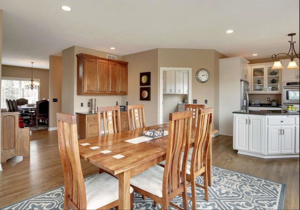
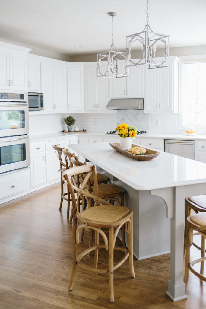
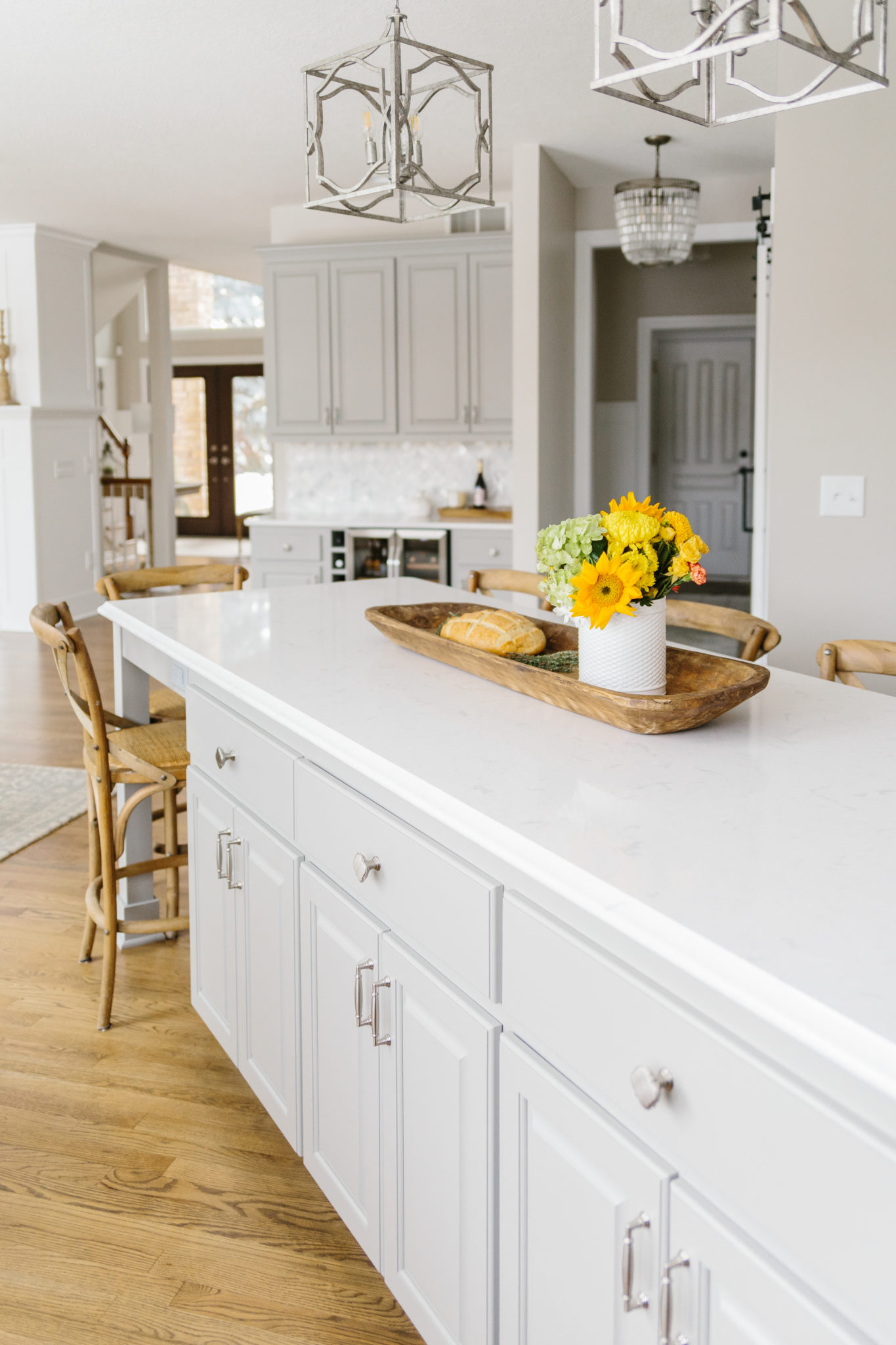
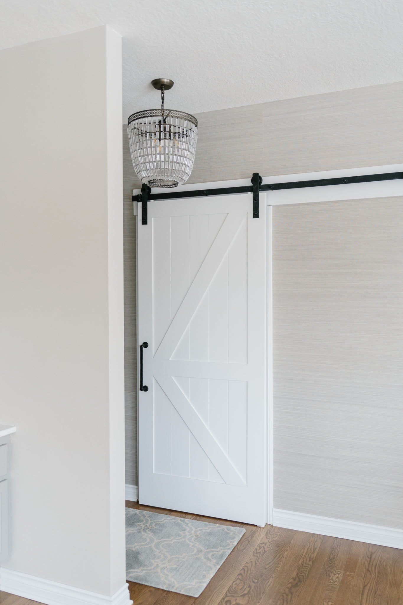
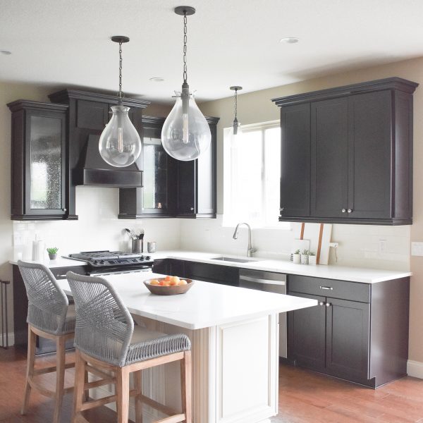
As you can see, there was a large laundry room and unused space in the before photos above. We reconfigured the laundry/mudroom, added a single wall and a small alcove/hallway with a sliding barn door. This also made for ability to move the refrigerator along the existing wall of cabinets and appliances, rather than against a stand alone wall. The built-in office nook was converted into a dry bar with a wine fridge. The cabinets were painted a soft gray, to match the island. The island was reconfigured to make room for more seating and a more functional shape. New countertops, backsplash, light fixtures, and hardware freshened up the kitchen and we think it turned out beautifully! It’s simply gorgeous and we love the warm wood tones with the white and gray cabinetry.
POWDER BATHROOM
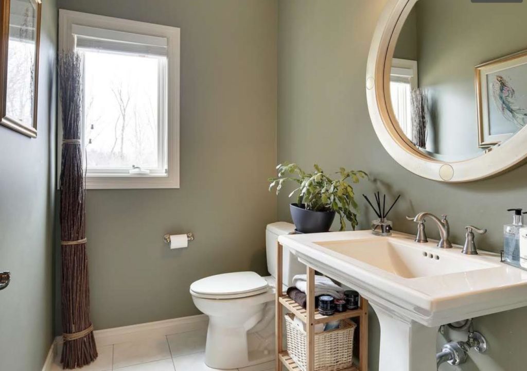
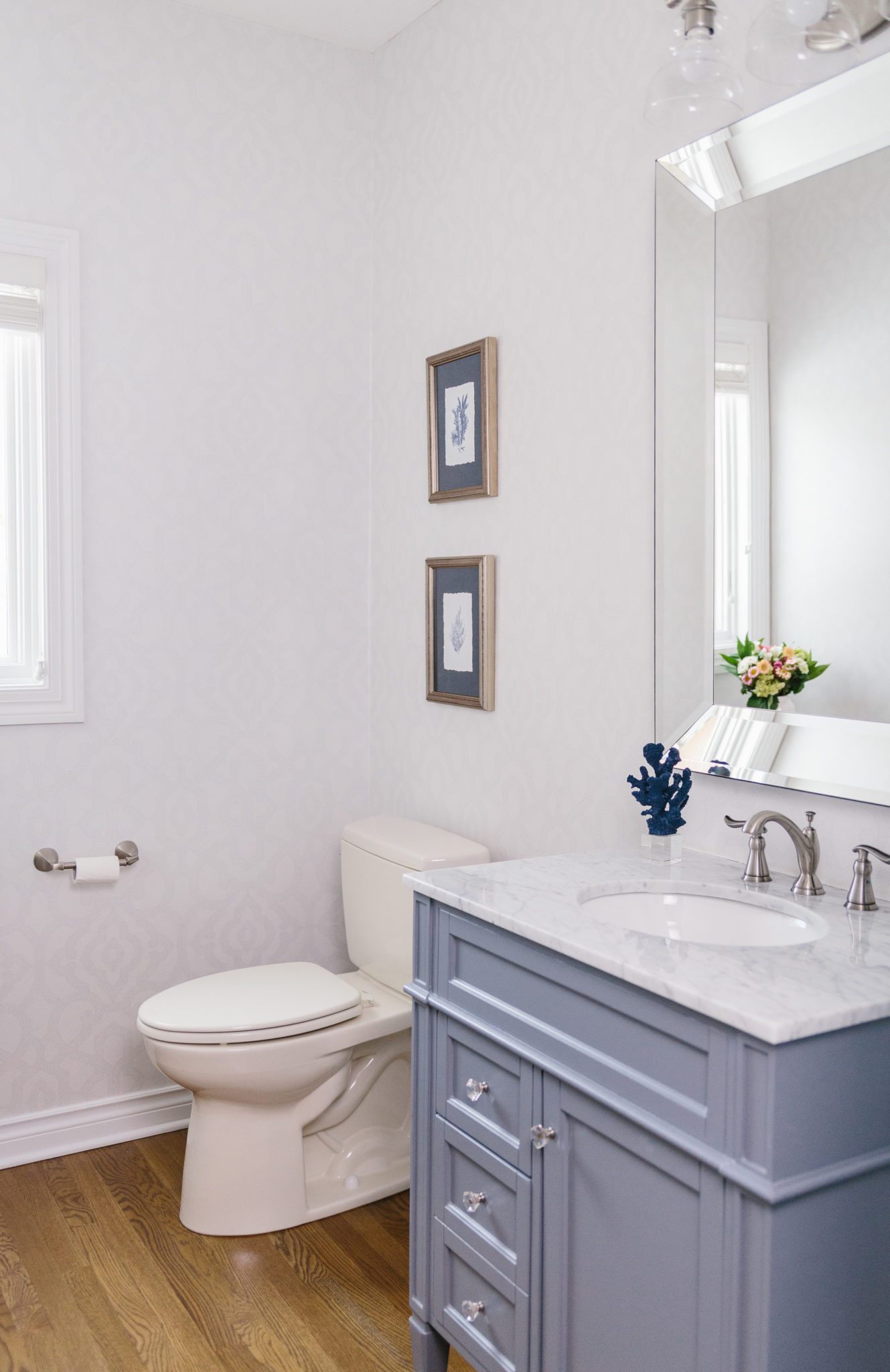
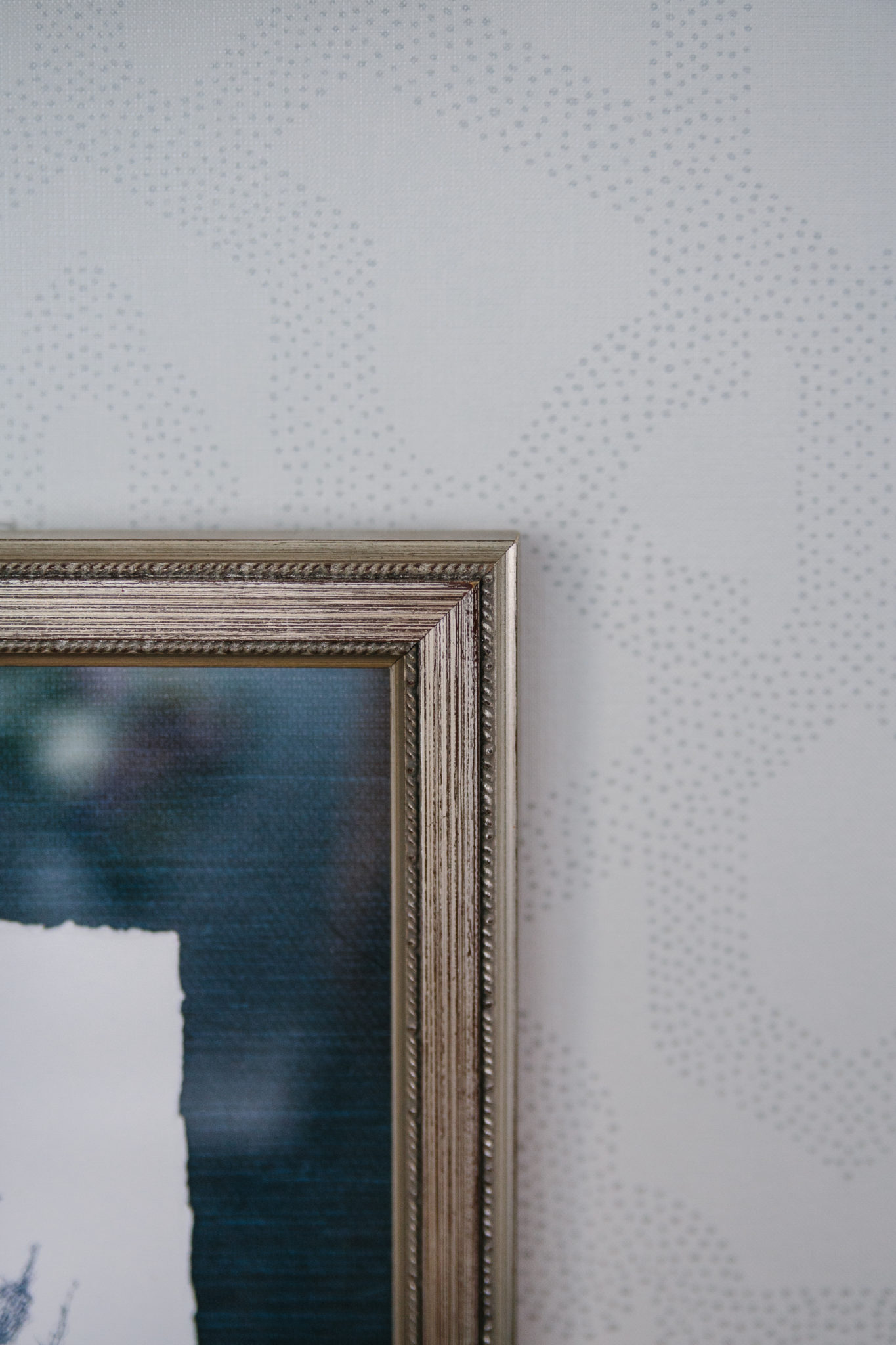
The only thing that remained in the powder bathroom was the toilet. Everything else was replaced. We added a soft patterned wallpaper, custom slate blue vanity with nickel fixtures and crystal hardware. We also changed out the mirror, light fixture, and added accessories to give this space a fresh boost of energy and style.
SITTING ROOM
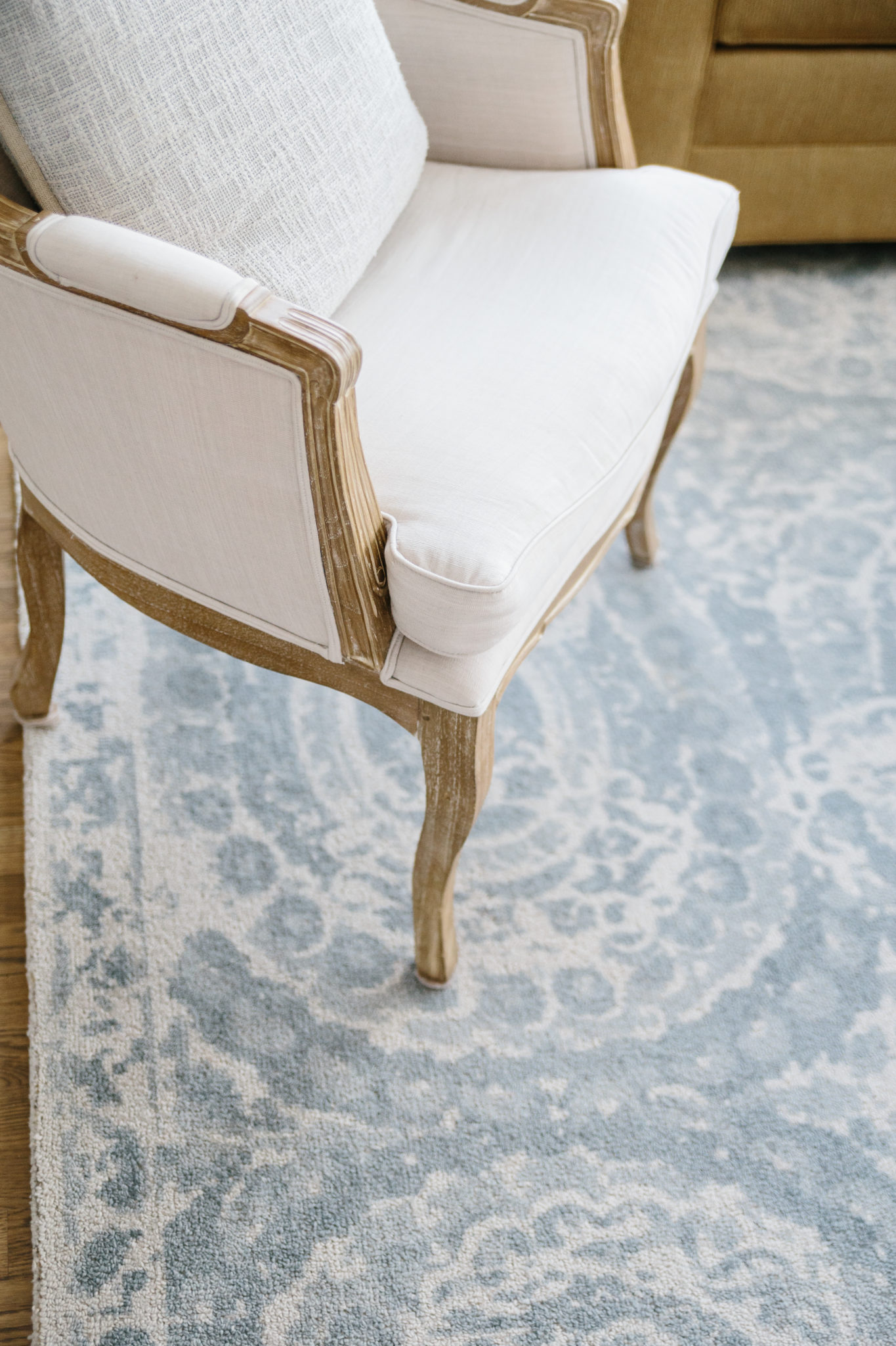
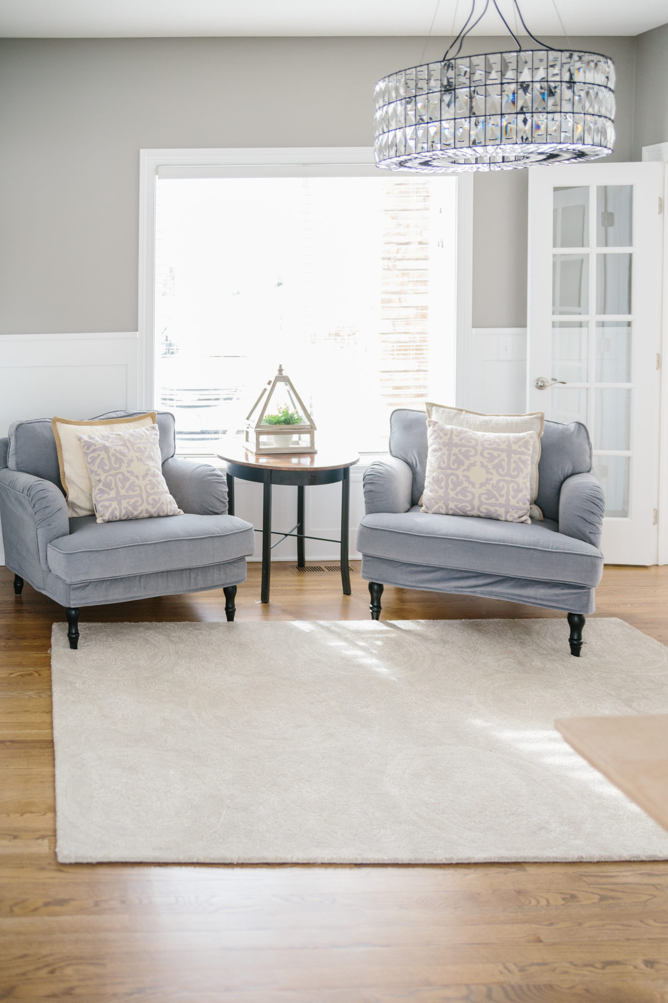
The sitting room got an upgrade with new furniture, accessories, new paint, and wainscoting. Now a cozy spot to catch up on weekly shows, read the paper, or dive into a good book.
Thanks for reading! We love the dramatic transformation in this home, and hope you love it as much as we do!
Have a wonderful weekend,
Interior Impressions team

Leave a Reply