My husband and I moved into our West Lakeland home in 2013. We’ve jokingly labeled it “Amy’s Fixer Upper,” because Tad would have been fine keeping it “as is”. Anyone that knows me knows that I could never live in a house without making it a place I love to be. See how this dated and dark craftsman-style space transformed into a designer’s spa-like master retreat!
THE PROBLEMS:
- There were rustic hickory cabinets and a brown porcelain tile countertop with a Craftsman style backsplash. This was not the aesthetic we were going for!
- The toilet area did not provide enough privacy with just 2 half walls. (What’s the point of that?)
- The shower felt closed off and cramped. There was a low ceiling over the shower area and no glass to allow light in.
- The shower tile was dark and dated.
- The plumbing fixtures were leaking.
- The main floor tile was unattractive and the grout was falling apart.
- The light fixtures were dated and not to Amy’s liking.
- The baseboards were made from tile and the casements and window trim were maple. Amy wanted to make them all white to brighten up the room.
THE DESIGN PROCESS:
You would think that being a designer would make remodeling and design selections easier, but it’s actually the opposite! Because we are exposed to so many choices and see new products constantly, it is very difficult to choose things that are more permanent. We are afraid that we will see something we like better a month later.
I really struggled with this bathroom project. The first challenge was selecting tile. Tile is like jewelry…there are so many beautiful patterns and colors! I love so many of the trendy looks right now, such as patterned cement/encaustic tile, black-paned shower doors, bold colored cabinetry (like navy), and brushed gold fixtures. Because we are remodeling pretty much our entire house and the cost of these renovations has far exceeded our original budget, I decided to stick with a very classic, timeless look. Because, who can afford to change up the style of their master bathroom every few years? I chose classic cararra marble tile and countertops, adding a little glam with the cut marble decorative tile in the shower and around the tub backsplash. The most difficult decision was the corner jacuzzi tub. Ideally, we really loved the idea of taking it out and putting in a free-standing soaking tub. The problem was that we discovered that this process would be very costly and difficult. We’re talking like $5,000 costly! Practicality prevailed, and we decided to leave the corner tub and just change out the surrounding tile. That money could go toward so many other remodeling projects that are still on the list!
UNDER CONSTRUCTION
THE CHANGES:
We did A LOT of the work ourselves to save on costs. Here’s the list of what was done:
- Remove shower walls, dropped ceiling, and toilet area half-walls
- Re-configure step to bathtub, taking out the angled portion
- Add walls and pocket door to enclose toilet area
- Remove all tile
- Remove all baseboards, casements and trim
- Put up new sheetrock
- Move shower plumbing to opposite wall
- Install new tile on floor, shower walls, shower floor, and bathtub surround
- Add frameless glass shower enclosure
- Have vanity cabinetry professionally painted
- Add new countertop, undermount porcelain sink, and all new plumbing fixtures
- Add new custom framed mirror
- Add new light fixtures, including adding wiring for a beautiful chandelier over the tub
- New cabinet hardware, towel hooks and toilet paper holder
- Paint walls a silvery blue
- Add all new baseboards, casements and window trim
- Add custom shutters
- Professionally paint all doors white and add new door hardware
Whew!! This project took a lot longer than planned, but we think the hard work and effort was definitely worth it.
THE AFTER:
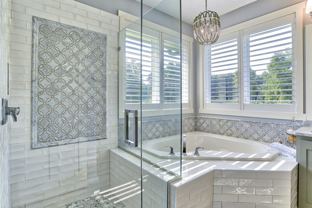

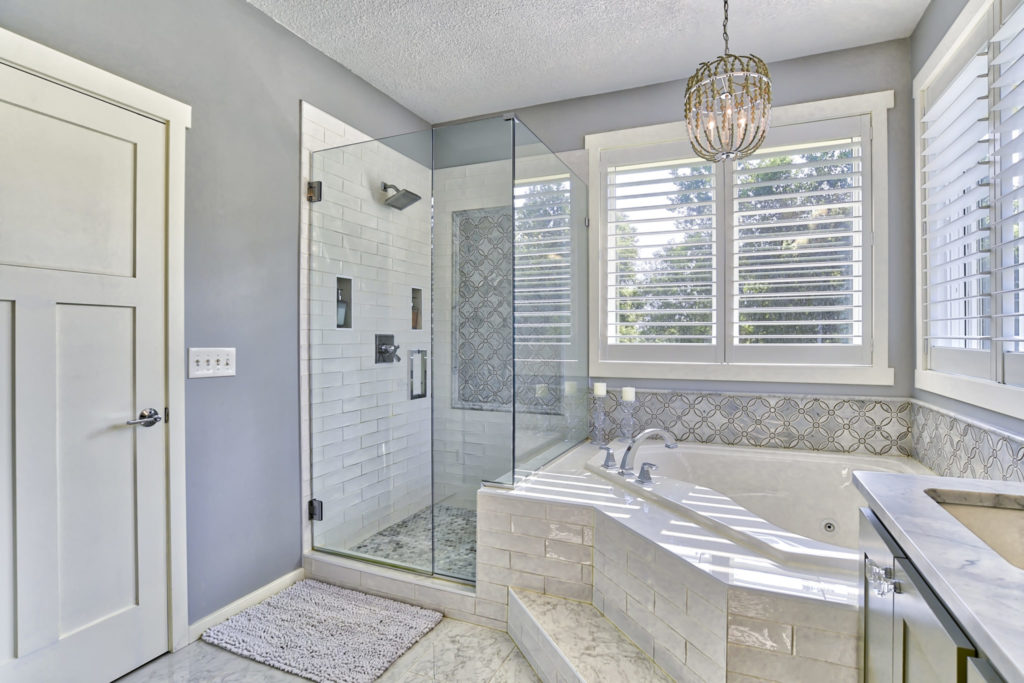
With a new neutral palette, this master bathroom is serene, sparkling and filled with light. A Spa-like feel is guaranteed as you step into the luxurious bathtub, and glamorous tile throughout the bathroom that makes it feel truly luxurious. By getting rid of the wall between the shower and the bathtub and replacing it with glass, it really opened up the space. The shower no longer feels claustrophobic and is now filled with light. The soft gray painted cabinetry has a clean, sleek look paired with crystal and chrome knobs and pulls. We can now enjoy spending time in this room and getting ready in the morning brightens our day!

I am humbled and honored to share that this bathroom project was chosen by Spaces Magazine to be featured in the October Kitchen & Bath issue. It even made the front cover! If you haven’t done so already, be sure to pick up your copy of Spaces Magazine at All Inc, Kowalski’s, Bachmann’s, or Hirshfield’s.

Happy weekend,
Amy
Leave a Reply