Each year, designers await with much anticipation the announcement of the Color of the Year from Pantone and Benjamin Moore.
Pantone chooses a color each year that it expects to dominate fashion, products, design and life, as well as reflect current moods or sentiments, CNN Money reports.
This year, Pantone selected Greenery as the 2017 Color of the Year! The company describes it as a “fresh and zesty yellow-green shade that evokes the first days of spring when nature’s greens revive, restore and renew.” It is a symbol of new beginnings.
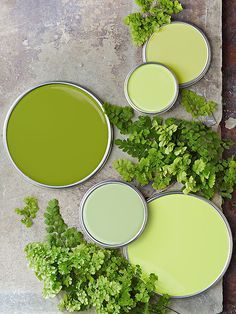
We are excited to see this revitalizing and refreshing shade. You may wonder how to decorate with this hue in your home. Greenery can be a versatile shade, lending itself to many color combinations. You can pair it with neutral shades, bright colors, deep shades, and metallic. Below are other ways to incorporate this strong color into your space:
1) Incorporate splashes or pops of Greenery to create an overall cohesive look. If you want a warmer look, use tans and browns. Here are a few wonderful accessories we have in the store to incorporate into your room:
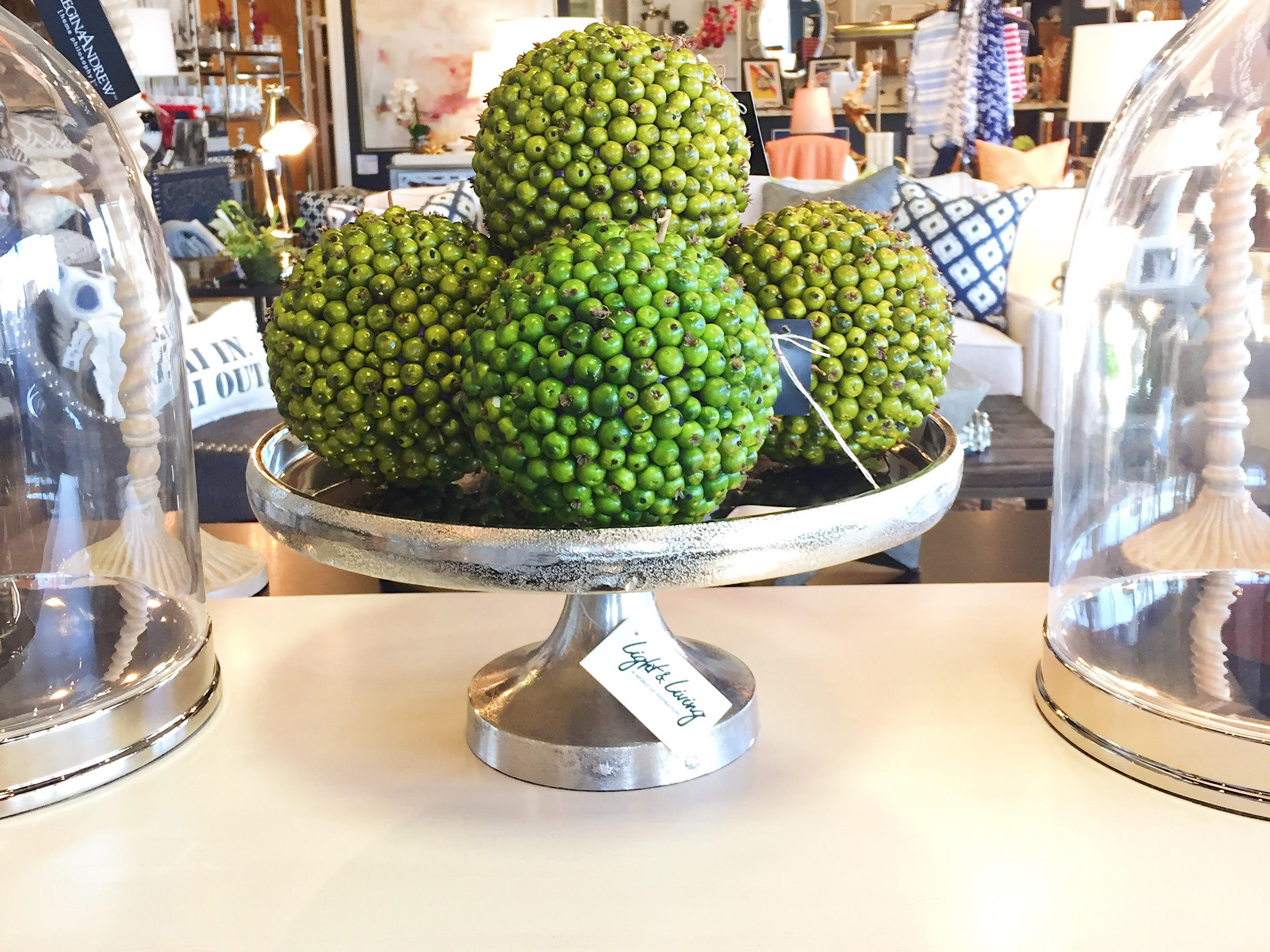
Green Berry Ball $22.50/ea
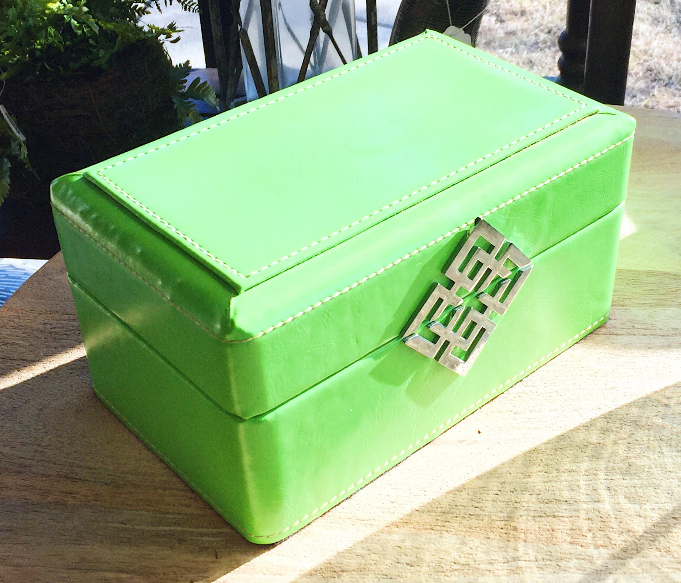
Decorative Georgi Box $18.00
2) Incorporate this color in floral designs! Use a white container to create a clean, fresh look. You can also incorporate greenery through topiaries, accessories, or fun plants, all of which are sold at our store!
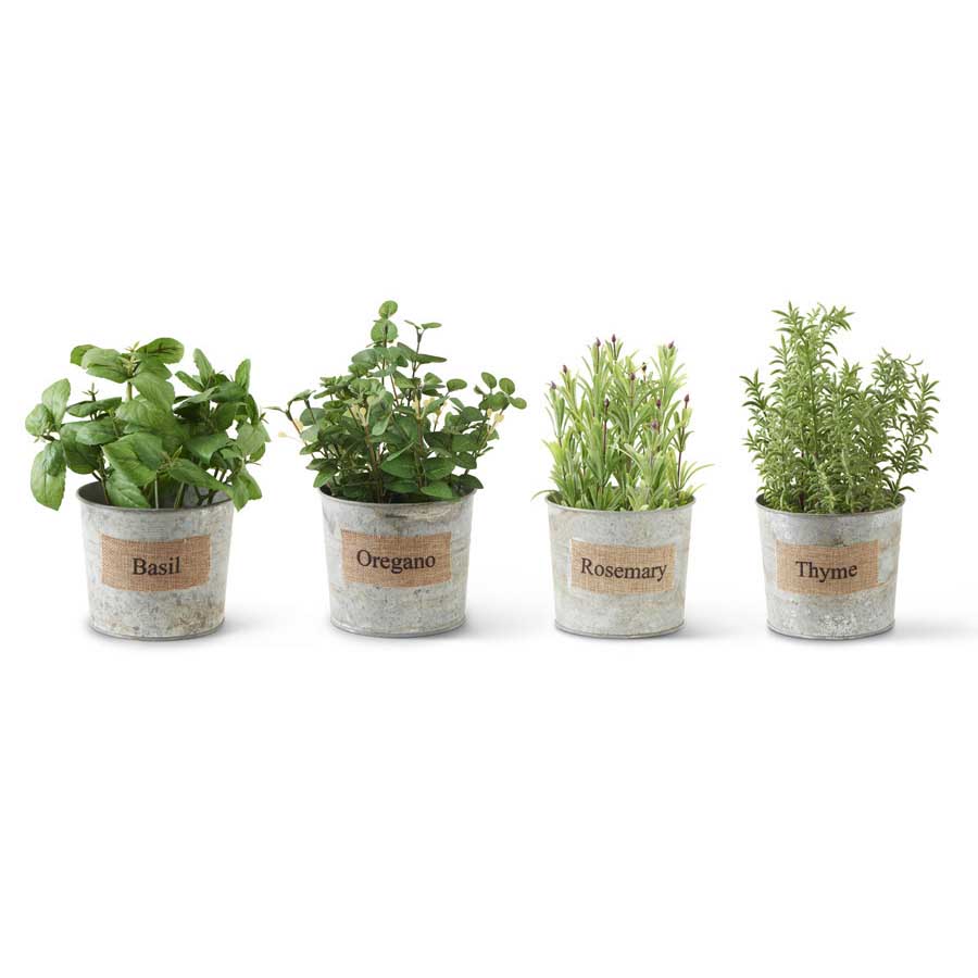
Faux Greenery, Plands & Herbs
3) Want a quick, easy way to use this shade without breaking the bank? Keep your table linens white, but add green napkins, table cloths or table runners for minimal cost.
4) Don’t forget pillows. One of the easiest ways to introduce Greenery into your home and stay on budget is to use this color in pillow combinations – mixing solids and patterns. We have countless fabrics in our design center that can be made into custom pillows!
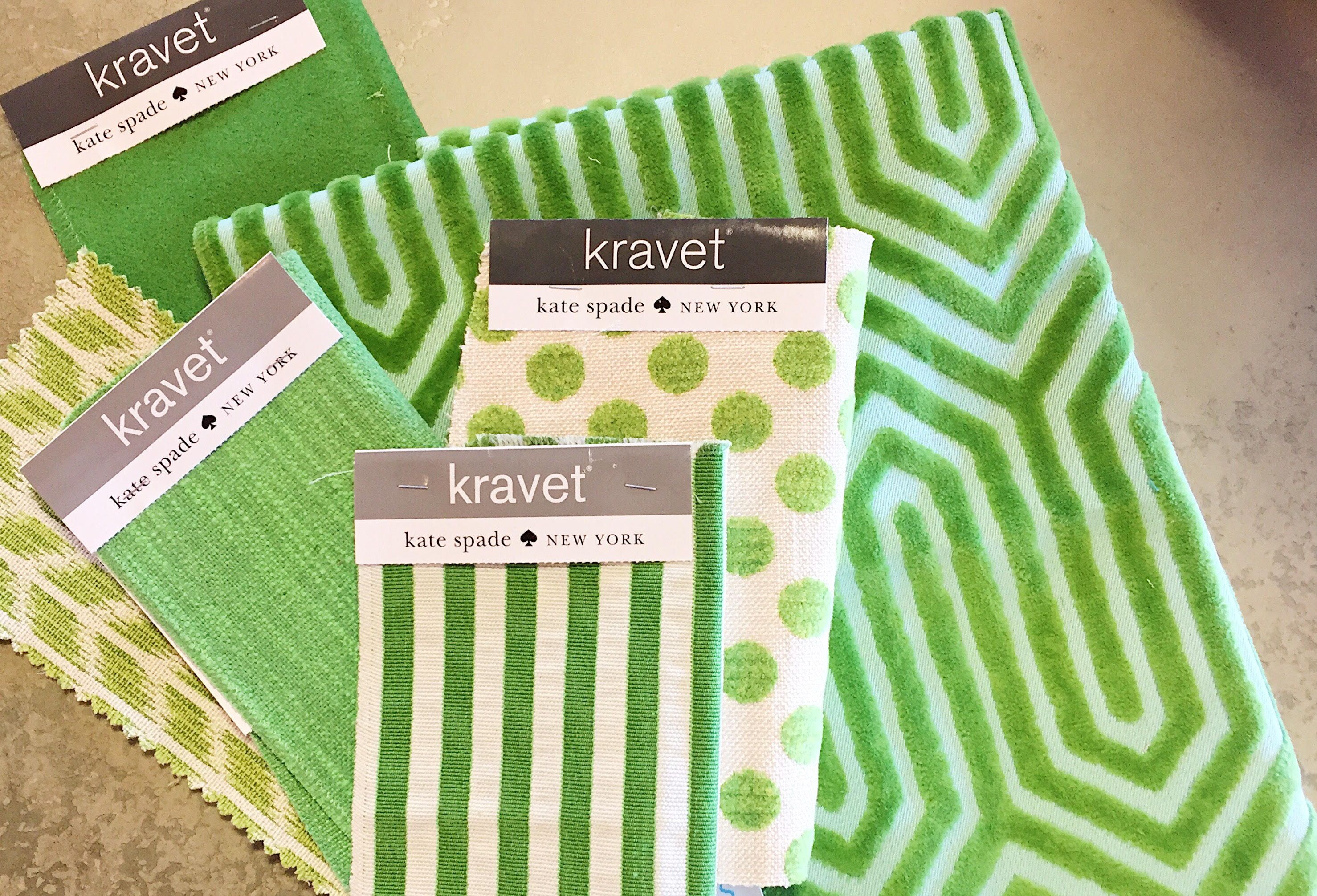
If you are still wondering, “Why Greenery?” Let us share this quote with you from Laurie Pressman, the Pantone Color Institute Vice President:
“Greenery signifies beginnings: a fresh New Year; healthier food resolutions and growing vegetarian trends; grass and the outdoors during spring and summer.
“There’s a growing desire to reconnect with Nature and what is real, and find ways to disconnect from technology. We need a break. We need to stop and breathe,” Laurie Pressman, the Pantone Color Institute’s vice president, told to FORBES.
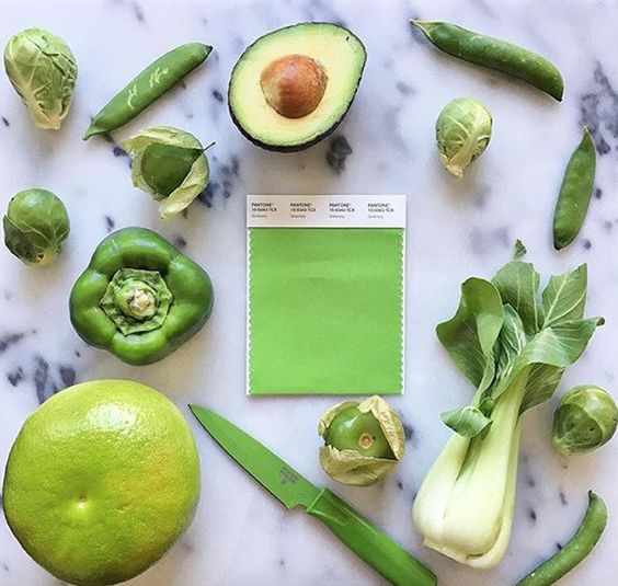
And now for Shadow – Benjamin Moore’s 2017 Color of the year. We are really excited about this one!
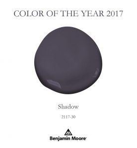
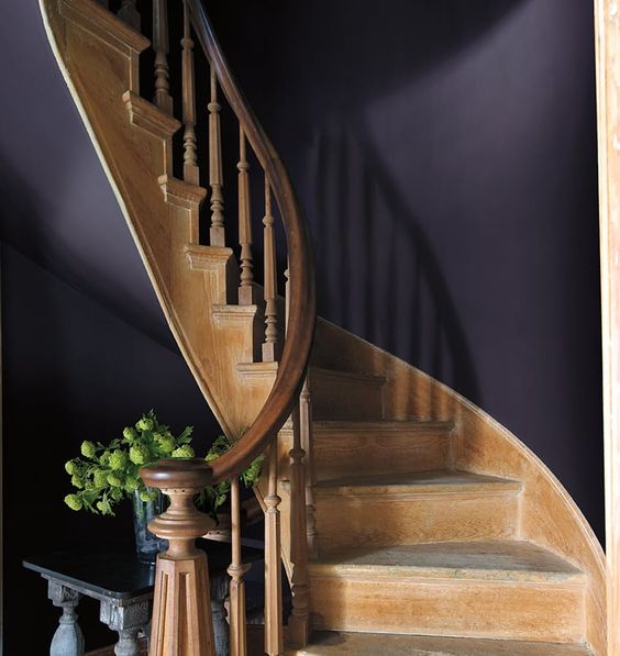
In recent years whites, creams and beiges have ruled the design world, Benjamin Moore is taking a bold step away from this safe choice. Benjamin Moore Creative Director, Ellen O’Neill describes Shadow as a color that “ebbs and flows with its surroundings, and light brings it to life. Rich, royal amethyst can fade into the soft lilac-grey of distant mountains or morph into lustrous coal.”
This deep amethyst color can be a wonderful compliment to classic colors. Don’t be afraid to pair shadow with other jewel tones, such as ruby or emerald.
You can also incorporate Shadow into your space through soft goods and textural elements such as throw blankets, rugs and pillows.
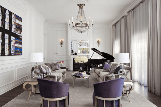
(Living Room by Smith Fieldstone Associates)
As you follow the latest, most current design trends, you will see both Greenery and Shadow incorporated everywhere, especially fashion and design. We can’t wait to see what 2017 brings!
Leave a Reply